Engineering Statistics Handbook Episode 7 Part 15 pps
Bạn đang xem bản rút gọn của tài liệu. Xem và tải ngay bản đầy đủ của tài liệu tại đây (83.86 KB, 14 trang )
response implies that the theoretical worst is Y = 0 and the theoretical best is Y =
100.
To generate the contour curve for, say, Y = 70, we solve
by rearranging the equation in X3 (the vertical axis) as a function of X1 (the
horizontal axis). By substituting various values of X1 into the rearranged equation,
the above equation generates the desired response curve for Y = 70. We do so
similarly for contour curves for any desired response value Y.
Values for
X1
For these X3 = g(X1) equations, what values should be used for X1? Since X1 is
coded in the range -1 to +1, we recommend expanding the horizontal axis to -2 to
+2 to allow extrapolation. In practice, for the dex contour plot generated
previously, we chose to generate X1 values from -2, at increments of .05, up to +2.
For most data sets, this gives a smooth enough curve for proper interpretation.
Values for Y What values should be used for Y? Since the total theoretical range for the
response Y (= percent acceptable springs) is 0% to 100%, we chose to generate
contour curves starting with 0, at increments of 5, and ending with 100. We thus
generated 21 contour curves. Many of these curves did not appear since they were
beyond the -2 to +2 plot range for the X1 and X3 factors.
Summary In summary, the contour plot curves are generated by making use of the
(rearranged) previously derived prediction equation. For the defective springs data,
the appearance of the contour plot implied a strong X1*X3 interaction.
5.5.9.10.2. How to Interpret: Contour Curves
(2 of 2) [5/1/2006 10:31:39 AM]
5. Process Improvement
5.5. Advanced topics
5.5.9. An EDA approach to experimental design
5.5.9.10. DEX contour plot
5.5.9.10.4.How to Interpret: Best Corner
Four
corners
representing
2 levels for
2 factors
The contour plot will have four "corners" (two factors times two settings
per factor) for the two most important factors X
i
and X
j
: (X
i
,X
j
) = (-,-),
(-,+), (+,-), or (+,+). Which of these four corners yields the highest
average response
? That is, what is the "best corner"?
Use the raw
data
This is done by using the raw data, extracting out the two "axes factors",
computing the average response at each of the four corners, then
choosing the corner with the best average.
For the defective springs data, the raw data were
X1 X2 X3 Y
- - - 67
+ - - 79
- + - 61
+ + - 75
- - + 59
+ - + 90
- + + 52
+ + + 87
The two plot axes are X1 and X3 and so the relevant raw data collapses
to
X1 X3 Y
- - 67
+ - 79
- - 61
+ - 75
- + 59
+ + 90
- + 52
+ + 87
5.5.9.10.4. How to Interpret: Best Corner
(1 of 2) [5/1/2006 10:31:39 AM]
Averages which yields averages
X1 X3 Y
- - (67 + 61)/2 = 64
+ - (79 + 75)/2 = 77
- + (59 + 52)/2 = 55.5
+ + (90 + 87)/2 = 88.5
These four average values for the corners are annotated on the plot. The
best (highest) of these values is 88.5. This comes from the (+,+) upper
right corner. We conclude that for the defective springs data the best
corner is (+,+).
5.5.9.10.4. How to Interpret: Best Corner
(2 of 2) [5/1/2006 10:31:39 AM]
5. Process Improvement
5.5. Advanced topics
5.5.9. An EDA approach to experimental design
5.5.9.10. DEX contour plot
5.5.9.10.6.How to Interpret: Optimal Curve
Corresponds
to ideal
optimum value
The optimal curve is the curve on the contour plot that corresponds to
the ideal optimum value.
Defective
springs
example
For the defective springs data, we search for the Y = 100 contour
curve. As determined in the steepest ascent/descent section, the Y =
90 curve is immediately outside the (+,+) point. The next curve to the
right is the Y = 95 curve, and the next curve beyond that is the Y =
100 curve. This is the optimal response curve.
5.5.9.10.6. How to Interpret: Optimal Curve
[5/1/2006 10:31:45 AM]
Table of
coded and
uncoded
factors
With the determination of this setting, we have thus, in theory, formally
completed our original task. In practice, however, more needs to be done. We
need to know "What is this optimal setting, not just in the coded units, but also in
the original (uncoded) units"? That is, what does (X1=1.5, X3=1.3) correspond to
in the units of the original data?
To deduce his, we need to refer back to the original (uncoded) factors in this
problem. They were:
Coded
Factor
Uncoded Factor
X1 OT: Oven Temperature
X2 CC: Carbon Concentration
X3 QT: Quench Temperature
Uncoded
and coded
factor
settings
These factors had settings what were the settings of the coded and uncoded
factors? From the original description of the problem, the uncoded factor settings
were:
Oven Temperature (1450 and 1600 degrees)1.
Carbon Concentration (.5% and .7%)2.
Quench Temperature (70 and 120 degrees)3.
with the usual settings for the corresponding coded factors:
X1 (-1,+1)1.
X2 (-1,+1)2.
X3 (-1,+1)3.
Diagram To determine the corresponding setting for (X1=1.5, X3=1.3), we thus refer to the
following diagram, which mimics a scatter plot of response averages oven
temperature (OT) on the horizontal axis and quench temperature (QT) on the
vertical axis:
5.5.9.10.7. How to Interpret: Optimal Setting
(2 of 5) [5/1/2006 10:31:45 AM]
The "X" on the chart represents the "near point" setting on the optimal curve.
Optimal
setting for
X1 (oven
temperature)
To determine what "X" is in uncoded units, we note (from the graph) that a linear
transformation between OT and X1 as defined by
OT = 1450 => X1 = -1
OT = 1600 => X1 = +1
yields
X1 = 0 being at OT = (1450 + 1600) / 2 = 1525
thus
| | |
X1: -1 0 +1
OT: 1450 1525 1600
and so X1 = +2, say, would be at oven temperature OT = 1675:
| | | |
X1: -1 0 +1 +2
OT: 1450 1525 1600 1675
and hence the optimal X1 setting of 1.5 must be at
OT = 1600 + 0.5*(1675-1600) = 1637.5
5.5.9.10.7. How to Interpret: Optimal Setting
(3 of 5) [5/1/2006 10:31:45 AM]
Optimal
setting for
X3 (quench
temperature)
Similarly, from the graph we note that a linear transformation between quench
temperature QT and coded factor X3 as specified by
QT = 70 => X3 = -1
QT = 120 => X3 = +1
yields
X3 = 0 being at QT = (70 + 120) / 2 = 95
as in
| | |
X3: -1 0 +1
QT: 70 95 120
and so X3 = +2, say, would be quench temperature = 145:
| | | |
X3: -1 0 +1 +2
QT: 70 95 120 145
Hence, the optimal X3 setting of 1.3 must be at
QT = 120 + .3*(145-120)
QT = 127.5
Summary of
optimal
settings
In summary, the optimal setting is
coded : (X1 = +1.5, X3 = +1.3)
uncoded: (OT = 1637.5 degrees, QT = 127.5 degrees)
and finally, including the best setting of the fixed X2 factor (carbon concentration
CC) of X2 = -1 (CC = .5%), we thus have the final, complete recommended
optimal settings for all three factors:
coded : (X1 = +1.5, X2 = -1.0, X3 = +1.3)
uncoded: (OT = 1637.5, CC = .7%, QT = 127.5)
If we were to run another experiment, this is the point (based on the data) that we
would set oven temperature, carbon concentration, and quench temperature with
the hope/goal of achieving 100% acceptable springs.
5.5.9.10.7. How to Interpret: Optimal Setting
(4 of 5) [5/1/2006 10:31:45 AM]
Options for
next step
In practice, we could either
collect a single data point (if money and time are an issue) at this
recommended setting and see how close to 100% we achieve, or
1.
collect two, or preferably three, (if money and time are less of an issue)
replicates at the center point (recommended setting).
2.
if money and time are not an issue, run a 2
2
full factorial design with center
point. The design is centered on the optimal setting (X1 = +1,5, X3 = +1.3)
with one overlapping new corner point at (X1 = +1, X3 = +1) and with new
corner points at (X1,X3) = (+1,+1), (+2,+1), (+1,+1.6), (+2,+1.6). Of these
four new corner points, the point (+1,+1) has the advantage that it overlaps
with a corner point of the original design.
3.
5.5.9.10.7. How to Interpret: Optimal Setting
(5 of 5) [5/1/2006 10:31:45 AM]
5. Process Improvement
5.6. Case Studies
5.6.1.Eddy Current Probe Sensitivity Case
Study
Analysis of
a 2
3
Full
Factorial
Design
This case study demonstrates the analysis of a 2
3
full factorial design.
The analysis for this case study is based on the EDA approach discussed
in an earlier section.
Contents The case study is divided into the following sections:
Background and data1.
Initial plots/main effects2.
Interaction effects3.
Main and interaction effects: block plots4.
Estimate main and interaction effects5.
Modeling and prediction equations6.
Intermediate conclusions7.
Important factors and parsimonious prediction8.
Validate the fitted model9.
Using the model10.
Conclusions and next step11.
Work this example yourself12.
5.6.1. Eddy Current Probe Sensitivity Case Study
[5/1/2006 10:31:46 AM]
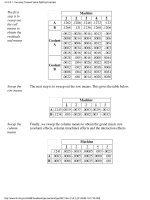
Data Used
in the
Analysis
There were three detector wiring component factors under consideration:
X1 = Number of wire turns1.
X2 = Wire winding distance2.
X3 = Wire guage3.
Since the maximum number of runs that could be afforded timewise and
costwise in this experiment was n = 10, a 2
3
full factoral experiment
(involving n = 8 runs) was chosen. With an eye to the usual monotonicity
assumption for 2-level factorial designs, the selected settings for the
three factors were as follows:
X1 = Number of wire turns : -1 = 90, +1 = 1801.
X2 = Wire winding distance: -1 = 0.38, +1 = 1.142.
X3 = Wire guage : -1 = 40, +1 = 483.
The experiment was run with the 8 settings executed in random order.
The following data resulted.
Y X1 X2 X3
Probe Number Winding Wire Run
Impedance of Turns Distance Guage Sequence
1.70 -1 -1 -1 2
4.57 +1 -1 -1 8
0.55 -1 +1 -1 3
3.39 +1 +1 -1 6
1.51 -1 -1 +1 7
4.59 +1 -1 +1 1
0.67 -1 +1 +1 4
4.29 +1 +1 +1 5
Note that the independent variables are coded as +1 and -1. These
represent the low and high settings for the levels of each variable.
Factorial designs often have 2 levels for each factor (independent
variable) with the levels being coded as -1 and +1. This is a scaling of
the data that can simplify the analysis. If desired, these scaled values can
be converted back to the original units of the data for presentation.
5.6.1.1. Background and Data
(2 of 2) [5/1/2006 10:31:46 AM]
Plot the
Data: Dex
Scatter Plot
The next step in the analysis is to generate a dex scatter plot.
Conclusions
from the
DEX
Scatter Plot
We can make the following conclusions based on the dex scatter plot.
Important Factors: Factor 1 (Number of Turns) is clearly important. When X1 = -1, all 4
senstivities are low, and when X1 = +1, all 4 sensitivities are high. Factor 2 (Winding
Distance) is less important. The 4 sensitivities for X2 = -1 are slightly higher, as a group,
than the 4 sensitivities for X2 = +1. Factor 3 (Wire Gage) does not appear to be important
at all. The sensitivity is about the same (on the average) regardless of the settings for X3.
1.
Best Settings: In this experiment, we are using the device as a detector, so high sensitivities
are desirable. Given this, our first pass at best settings yields (X1 = +1, X2 = -1, X3 =
either).
2.
There does not appear to be any significant outliers.3.
5.6.1.2. Initial Plots/Main Effects
(2 of 4) [5/1/2006 10:31:46 AM]
Check for
Main
Effects: Dex
Mean Plot
One of the primary questions is: what are the most important factors? The ordered data plot and
the dex scatter plot provide useful summary plots of the data. Both of these plots indicated that
factor X1 is clearly important, X2 is somewhat important, and X3 is probably not important.
The dex mean plot shows the main effects. This provides probably the easiest to interpert
indication of the important factors.
Conclusions
from the
DEX Mean
Plot
The dex mean plot (or main effects plot) reaffirms the ordering of the dex scatter plot, but
additional information is gleaned because the eyeball distance between the mean values gives an
approximation to the least squares estimate of the factor effects.
We can make the following conclusions from the dex mean plot.
Important Factors:
X1 (effect = large: about 3 ohms)
X2 (effect = moderate: about -1 ohm)
X3 (effect = small: about 1/4 ohm)
1.
Best Settings: As before, choose the factor settings that (on the average) maximize the
sensitivity:
(X1,X2,X3) = (+,-,+)
2.
5.6.1.2. Initial Plots/Main Effects
(3 of 4) [5/1/2006 10:31:46 AM]
Comparison
of Plots
All of these plots are used primarily to detect the most important factors. Because it plots a
summary statistic rather than the raw data, the dex mean plot shows the main effects most clearly.
However, it is still recommended to generate either the ordered data plot or the dex scatter plot
(or both). Since these plot the raw data, they can sometimes reveal features of the data that might
be masked by the dex mean plot.
5.6.1.2. Initial Plots/Main Effects
(4 of 4) [5/1/2006 10:31:46 AM]