presentation zen Simple ideas on presentation design and delivery phần 5 potx
Bạn đang xem bản rút gọn của tài liệu. Xem và tải ngay bản đầy đủ của tài liệu tại đây (1.57 MB, 24 trang )
Storyboarding in Slide Sorter/Light Table view. If you have a clear sense of your
structure, you can skip Step 3 and start building the flow of your presentation directly
in slideware. Create a blank slide using a template of your choosing (or the simplest
version of your company's template if you must use it). usually choose a blank slide
and then place a simple text box inside it with the size and font I'll use most often.
(You can create multiple master slides in PowerPoint and Keynote.) Then I duplicate
several of these slides, since they will contain the visual content of my presentation,
short sentences or single words, images, quotes, charts & graphs, etc. The section
slides—what presentations guru Jerry Weismann calls bumpers/ides—should be a
different color wi
th enough contrast that they stand out when you see them in the
slide sorter view. You can have these slides hidden so that you see them only when
planning in Slide Sorter view if you prefer; however, in my case, these slides will
serve to give visual closure to one section and open the next section.
Now that I have a simple structure in the Slide Sorter view, I can add visuals that
support my narrative. I have an introduction where I introduce the issue or the
pain" and introduce the core message. I then use the next three sections to
support my assertions or "solve the pain" in a way that is interesting and
informative but that never loses sight of the simple core message.
For detailed advice about creating your story using the Slide Sorter view,
recommend Cliff Atkinson's Beyond Bullet Points (Microsoft Press).
88 Presentation Zen
Chapter 4 Crafting the Story 89
ABOVE
Rough outline from Step Two
for a presentation I created on presentation
design.
RIGHT The start of the storyboarding
process in Step
Four for the same
presentation. The total number of slides used
was over I50 for the talk, but here you can
see the simple structure before slides were
added to the appropriate sections.
Nancy Duarte
CEO of Duarte Design, the world's leading presentation design firm.
Clients include Al Gore and the biggest companies in Silicon Valley
and beyond.
www.duarte.com
Nancy Duarte talks about storyboards and the
process of presentation design.
Much of our communication today exhibits the
quality of intangibility. Services, software,
causes, thought leadership, change
management, company vision—they're often
more conceptual than concrete, more
ephemeral than firm.And there's nothing
wrong with that. But we regularly struggle
when communicating these types of ideas
because' they are essentially invisible. It's
difficult to share one's vision when there's
nothing to see. Expressing these invisible ideas
visually, so that they feel tangible and
actionable, is a bit of an art form, and t
he best
place to start is not with the computer. A pencil
and a sheet of paper will do nicely.
Why take this seemingly Luddite approach?
Because presentation software was never
intended to be a brainstorming or drawing
tool.The applications are simply containers for
ideas and assets, not the means to generate
them.Too many of us have fallen into the trap
of launching our presentation applications to
prepare our content. In reality, the best
creative process requires stepping away from
technology and relying on the same tools of
expression we grew up with—pens, pencils,
crayons if you're into hardcore regression.The
goal is to generate ideas—not necessarily
pictures yet—but lots of ideas.These can be
words, diagrams or scenes; they can be literal
or metaphorical; the only requirement is that
they express your underlying thoughts.The
best thing about this process is that you don't
need to figure out how to use drawing tools or
where to save the file. Everything youneed you
already have (and don't say you can't draw;
you're just out of practice).
This means you can generate a large quantity
of ideas in a relatively short amount of
time.And that's what we're going for right now:
quantity.
For me, one idea per sticky note is
preferable. And I use a Sharpie.The reason? If
it takes more space than a Post-it and
requires more detail than a Sharpie can
provide, the idea is too complex. Simplicity is
the essence of clear communication.
Additionally, sticky notes make it easy to
arrange and re-arrange content until the
structure and flow feels right. On the other
hand, many people on my team use a more
traditional storyboarding approach,
preferring to linearly articulate detailed
ideas.That's fine, too.The point is not to
prescribe exactly how to work, but to
encourage you to generate a lot of ideas and
to do so quickly.
Often ideas come immediately. That's good,
but avoid the potential pitfall of going with the
first thing that comes to mind. Continue to
sketch and force yourself to think through
several more ideas. It takes discipline and
tenacity—especially when it feels like you
solved it on the first try. Explore words and
word associations to generate several ideas.
Use mind mapping and word-storming
techniques to create yet more ideas (digital
natives might prefer mind mapping software
for this phase). Stronger solutions frequently
appear after four or five ideas have percolated
to the top. Continue generating ideas even if
they seem to wander down unrelated paths;
you never know what you might find, after
all.Then, once you've generated an enormous
amount of ideas, identify a handful that meet
the objective of the vision or concept you're
trying to communicate. It matters less what
form they take at this point than that they get
your message across.
By the way, cheesy metaphors are a cop-
out. If you feel tempted to use a picture of
two hands shaking in front of a globe, put the
pencil down, step away from the desk, and
think about taking a vacation or investigating
aromatherapy. Push yourself to generate out-
of-the-box ideas.Take the time and spend the
creative energy because the payoff will be a
presentation people not only remember, but
one they take action on.
Now, begin to sketch pictures from the ideas.
These sketches become visual triggers that
spark more ideas.The sketching process should
be loose and quick—doodles really. Search
through stock houses, magazines, even
YouTube for images and vignettes to reference
while sketching. Generate as many pictures as
you can, and while that's happening start to
think about layout to ensure that the elements
work spatially on a slide. In this way, sketching
serves as proof-of-concept because ideas that
are too complex or time consuming or costly
will present themselves as ripe for elimination.
Don't worry about throwing things away—
that's why you generated a lot of ideas in the
first place. In fact, you're ultimately going to
have to throw all of them away except for one
(designers recognize this as the destructive
aspect of the creative process; it's a good
thing).
Some of the ideas you generate may
require multiple scenes built across a few
slides versus a snapshot on a single slide.
On the other hand, sometimes it's as simple
as using the perfect picture or diagram.
Getting your great idea across might require
that you manipulate an image, create a
custom illustration or produce a short video.
Focus on whatever works best, not on the
idea that's easiest to execute.
Now, find a colleague and walk them
through your sketches. Have them give you
feedback on what works best in the context
of your audience and personal style.They'll
likely have insights that will improve your
idea.
Here's where it gets a bit more difficult.
Depending on the concept you've identified as
the one best suited to convey your idea, you
may or may not have the skills to execute the
idea digitally. Be prepared to enlist the help of
a designer (you did plan far enough ahead to
make sure you've got one available, right?)
There's no shame in seeking professional help,
after all; what's important is effective
communication, regardless of whether or not
you have the skill set to execute it.
Insider Tip I: If you prefer the storyboarding
approach, streamline it by creating six blank
text slides in your master template. Print them
out as 6-up handouts and you'll have a master
storyboard sheet with miniature blank slides in
the correct aspect ratio. Each slide contains t
he
graphical background elements from your
template, and anything you sketch would be
within the framework of any visual brand
elements in your template.
InsiderTip 2:When sketching for a client, it's
important to listen to what they say, but it's
more important to identify the underlying
intent of what they didn't say. Sketch while
they talk so they can see how their words are
being interpreted.Try to sketch three unique
ideas that accurately reflect their content.
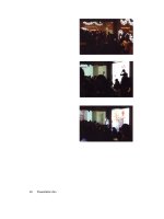
Brainstorming with Nancy Duarte
(far
left) and
two of her staff Paula and Victoria, in the head
office of Duarte Design in Silicon Valley.
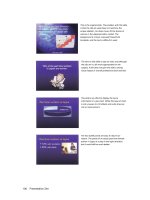
Duarte Design giving a glimpse of how pros
refine the visualization of their ideas on paper
before creating slides in software.
Finished slides in digital form
If you feel tempted to use a picture
of two hands shaking in front of a
globe, put the pencil down, step
away from the desk, and think about
taking a vacation or investigating
aromatherapy.
- Nancy Duarte
Editing and Restraint
I am a bit of a Star Wars geek. Over the years, as I've learned more about the
incredible creativity (and hard work) behind Lucas's films, I realized that we mere
mortals can learn much about presentations (which are essentially opportunities to
tell our story) by listening to the advice of master storytellers like George Lucas, and
others.
As I researched the numerous interviews over the years of Lucas talking about the
making of the Star Wars films, one key idea often discussed was the importance of
editing like mad to get the story down to about two hours. To do this, they
scrutinized every scene to make sure that the scene—no matter how cool it was—
actually contributed to the story. If during the editing process a scene was judged to
be superfluous to the story in any way, it was cut (or trimmed, if the length was the
only problem). They were very keen on keeping to the two-hour format because this
was in the best interest of the audience.
We have all seen scenes from movies that left us scratching our heads wondering
how they contributed to the story. Perhaps the director felt the scene was so
technically cool or so difficult to make that he just couldn't stand the thought of not
including it in the film. But that would be a poor reason to include a scene. As far as
presentations go, we also have all seen people include data, facts, or graphics, or a
seemingly unrelated anecdote that just did not contribute to the speaker's overall
point (which we were probably at a loss to find anyway). Presenters often include
superfluous items because they are perhaps proud of their work and want to show it
off, even if it really did not help support the speaker's particular point.
Moral of the story: always keep the audience in mind by first keeping your talk as
short as you can and still doing an effective job telling your story, and second, after
you have prepared your presentation, go back and edit like crazy, eliminating parts
that are not absolutely crucial to your overall point or purpose of the talk. You must
be ruthless. When in doubt, cut it out.
It's paramount that we be ruthless editors of our own material. We have to make
the tough choices, choosing even not do something (because it is not meeting your
standards, for example). The hardest thing can be deciding to cut and even
abandon material altogether, but it must be done.
Chapter 4 Crafting the Story 95
Many people are not good at editing their presentations because they are afraid.
They figure that nobody ever got fired for including too much information. Better
safe than sorry, they say. But this leads to lots of material and wasted time. Covering
your butt by including every thing under the sun is not the right place to be coming
from; it's not the most appropriate motivation. It is after all only a presentation and
no matter how much you include, someone will always say, "hey why didn't you say!"
Difficult people are out there, but don't play to them and do not let fear guide your
decisions.
Designing a tight presentation which has the facts right but does so by giving
simple, concrete anecdotes that touch people's emotions is not easy work, but it's
worth it. Every successful presentation has elements of story to it. Your job is to
identify the elements of your content that can be organized in a way that tells a
memorable story.
96 Presentation Zen
In Sum
Make your ideas sticky by keeping things simple, using examples and
stories, looking for the unexpected, and tapping into people's emotions.
A presentation is never just about the facts.
Brainstorm your topic away from the computer, chunk (group) the most
important
bits. Identify the underlying theme and be true to that theme (core
message) throughout the creation of the presentation.
Make a storyboard of your ideas on paper—and then use software to lay out
a solid structure that you can see.
Show restraint at all times and bring everything back to the core message.
Chapter 4 Crafting the Story 97
Our lives are frittered away by detail;
simplify, simplify.
- Henry
Simplicity:
Why It Matters
As our daily lives have become more complex, more and more people look to
incorporate simplicity into their lives. But finding simplicity in the workplace
seems harder these days, not easier. Professionally, people are terrified of being
simple for fear of being labeled a lightweight. So "when in doubt, add more" is
often the guiding principle.
There is a fundamental misunderstanding of simplicity and what it means to be
simple today. Many people confuse simple, for example, with simplistic and
simplism or that which is dumbed-down to the point of being deceptive or
misleading. "Simple" to some people means necessarily a kind of
oversimplification of an issue, which ignores complexities and creates obfuscation
and outright falsehoods. Politicians are often guilty of this type of
oversimplification. But this is not the kind of simplicity I am talking about here. The
kind of simplicity I am talking about does not come from a place of laziness or
ignorance, rather it comes from an intelligent desire for clarity that gets to the
essence of an issue, something which is not easy to do. Simplicity is not easy, in
fact, it is hard.
Simplicity—along with other precepts such as restraint and naturalness—are key
ideas found in Zen and the Zen arts. Arts like the tea ceremony, haiku, ikebana, and
sumi-e, which can take many years, or indeed, a lifetime to master. There is nothing
easy about them, although when performed by a master, they may seem beautifully
simple. It is difficult to give a definition of simplicity, but when I say we need to
create messages and design visuals that are simple, I am not talking about taking
shortcuts, or ignoring complexities, or endorsing meaningless sound bytes and
shallow content. When I use the word simple (or simplicity), I am referring to the
term as being essentially synonymous with clarity, directness, subtlety,
Chapter 5 Simplicity: Why It Matters 103
essentialness, and minimalism. Designers, such as interaction designers, for
example, are constantly looking for the simplest solution to complex problems. The
simple solutions are not necessarily easiest for them, but the results may end up
being the "easiest" to use for the end user.
The best visuals are often ones designed with an eye toward simplicity. Yet, this
says nothing about the specifics of a visual presentation. That will depend on the
content and context. For example, even the best visuals used in support of a
presentation for one audience on, say, quantum mechanics, may appear
complicated and confusing to a different audience. Simplicity is often used as a
means to greater clarity. However, simplicity can also be viewed as a consequence.
A consequence, that is, of our careful efforts to craft a story and create supporting
visuals that focus on our audience's needs in a clear and meaningful way.
Simplicity is an important design principle, but simplicity itself is not a panacea.
Though people usually err on the side of making presentation slides more
complicated than they need to be, it is indeed possible to be "too simple."
Simplicity is the goal, but as Einstein said, "Make everything as simple as possible
but no simpler."
104 Presentation Zen
Steve Jobs and the Zen Aesthetic
Apple co-founder and CEO Steve Jobs is one of the best presenters in the world of
business today. Jobs is clear and to the point. His presentations generate a lot of
positive buzz and always release yet another wave of viral communication about the
presentation's content. This happens in part because the content is easily grasped
and remembered by both the media and regular customers. You can't "spread the
word" if you don't get what the word is. With Jobs's public presentations, there is
both a verbal and visual clarity. This is what great leaders do. Ben McConnell and
Jackie Huba, authors of Creating Customer Evangelists (Kaplan Business) make a
good observation
about Jobs:
`Jobs does just what a leader is supposed to do: Provide a vision of where the
company ship
is headed and make sure everyone understands it."
Part of Jobs's great clarity can be seen even in the slides that accompany his talks.
I am stretc
hing things a bit here, but there is almost a "Zen aesthetic" to Steve
Jobs's presentation visuals. In Jobs's slides you can see evidence of restraint,
simplicity, and powerful yet subtle use of empty space.
Bill Gates, one of the most powerful and philanthropic businessmen of our time,
provides a lesson in contrast. In a typical presentation with slides, Gates and his staff
do what millions of other PowerPoint users do daily—they use PowerPoint in a way
that does not help their cause. The problems with Gates's slides are all too common:
too many elements on one slide, over use of bullet points (including long lines of
text), cheesy-looking images, too many colors, overused gradation (even the text
has gradation), weak visual communication priority, and an overall impression of
clutter on-screen.
Both Steve Jobs and Bill Gates use slides to complement their talks. The biggest
difference, however, is that Jobs's visuals are a big part of his talk. The visuals do
not overpower him but they are a necessary component of the talk, not just
ornamentation
or notes to remind him what to say. Jobs uses the slides to help him
tell a story and he interacts with them in a natural way, rarely turning his back on
the audience. Jobs uses the huge backlit screen behind him in the same spirit at
least that George Lucas uses the screen: to help tell a story. Lucas uses actors,
visuals, and effects to convey his message, Jobs uses visuals and his own words and
natural presence to tell his story. Jobs's slides flow smoothly with his talk.
Chapter 5 Simplicity: Why It Matters 105
Photo
courtesy of Golf Murphy
Photo courtesy of
Christoph Dernbach
(www.mr-gadget.de)
In Bill Gates's case the slides are often not
only of low aesthetic quality, they simply do not
really help the Chairman's narrative very much.
Bill's slides are often not really necessary; they
are more of an ornament or a decoration off to
the side. In many instances Bill Gates would be
better off just pulling up a stool and sharing his
ideas and then answering questions that
audience members could have submitted
before the talk so that he could select which he
would answer. You don't have to use slideware
for every presentation, but if you do, the
visuals should seem a part of the show, not
something "over there" off to the side.
I like Bill Gates a lot and from what people at
Microsoft tell me, he's also a nice guy and a
pleasure to speak with. One on one he's
engaging. But when it comes to his public
keynote presentations—and the visuals that
accompany those talks—there is much he could
learn about "presenting differently" from Steve
Jobs. Bill Gates's keynotes are not terrible, they
are just very average and unremarkable. His
owerPoint-driven style is "normal" and
"typical" and his presentations are largely
unmemorable as a result. Bill Gates is a
remarkable man, his presentations should be
remarkable too.
If you are going to get up in front of a lot of
people and say that the design of your
strategy matters and that the design of your
integrated software matters, then at the very
least the visuals you use—right here and right
now, at this moment in time with this particular
audience—also need to be the result of
thoughtful design, not hurried decoration.
106 Presentation Zen
Kanso, Shizen, Shibumi
Zen itself is not concerned with judging this design to be "good" or that design to
be "bad." Still, we can look to some of the concepts in the Zen aesthetic to help us
improve our own visuals with an eye toward simplicity.
Kanso (Simplicity)
A key tenet of the Zen aesthetic is kanso or simplicity. In the kanso concept,
beauty and visual elegance are achieved by elimination and omission. Says artist,
designer, and architect, Dr. Koichi Kawana, "Simplicity means the achievement of
maximum effect with minimum means." When you examine your visuals, then, can
you say that you are getting the maximum impact with a minimum of graphic
elements, for example? When you take a look at Jobs's slides and Gates's slides,
how do they compare for kanso?
Shizen (Naturalness)
The aesthetic concept of naturalness or shizen "prohibits the use of elaborate
designs and over refinement," according to Dr. Kawana. Restraint is a beautiful
thing. Talented jazz musicians, for example, know never to overplay but instead to
be forever mindful of the other musicians and find their own space within the music
and within the moment they are sharing. Graphic designers show restraint by
including only what is necessary to communicate the particular message for the
particular audience. Restraint is hard. Complication and elaboration are easy and
are common. The suggestive mode of expression is a key Zen aesthetic. Dr. Kawana,
commenting on the design of traditional Japanese gardens, says: "The designer
must adhere to the concept of miegakure since Japanese believe that in expressing
the whole the inte
rest of the viewer is lost."
Chapter 5 Simplicity: Why It Matters 107
Shibumi (Elegance)
Shibumi is a principle that can be applied to many aspects
of lfe. Concerning visual communication and graphic
design, shibumi represents elegant simplicity and articulate
brevity, an understated elegance. In Wabi-Sabi Style,
(Gibbs Smith Publishers), authors James and Sandra
Crowley comme
nt on the Japanese deep appreciation of
beauty in this sense:
"Their (Japanese) conceptualization relegates elaborate
ornamentation and vivid color usage to the bottom of the
taste levels , excess requires no real thought or creativity.
The highest level of taste moves beyond the usage of brilliant colors and heavy
ornamentation to a simple and subdued refinement that is the beauty of shibumi,
which represents the ultimate in good taste through conscious reserve. This is the
original less is more' concept. Less color—subdued and elegant usage of color,
less clutter "
In the world of slide presentations, you do not always need to visually spell
everything out. You do not need to pound every detail into the head of each
member of your audience either visually or verbally. Instead, the combination of
your words, along with the visual images you project, should motivate the viewer
and arouse his imagination, helping him to empathize with your idea and visualize
your idea far beyond what is visible in the ephemeral PowerPoint slide before him.
The Zen aesthetic values include (but are not limited to):
Simplicity
Subtlety
Elegance
Suggestive rather than the descriptive or obvious
Naturalness (i.e., nothing artificial or forced),
Empty space (or negative space)
Stillness, Tranquility
Eliminating the nonessential
All of these principle
s can be applied to slide design, Web design, and so
on.
108 Presentation Zen
Wabi-Sabi Simplicity
I first learned of wabi-sabi while studying sado
(Japanese tea ceremony) many years ago in the
Shimokita Hanto
of Aomori, a rural part of northern
Japan—a perfect place to experience traditional
Japanese values and concepts. While studying sado, I
began to appreciate the aesthetic simplicity of the
ritual, an art that is an expression of fundamental Zen
principles such as purity, tranquility, and a respect for
nature and the desire to live in harmony with it.
The ideals of wabi-sabi come from Japan, and the
origins are based on keen observations of nature. Wabi
literally means "poverty" or lacking material wealth and
all its possessions, yet at the same time feeling free
from depending on worldly things, including social
status. There is an inward feeling of something higher.
Sabi means "loneliness" or "solitude," the feeling you
might have while walking alone on a deserted beach
deep in contemplation. These two concepts come
together to give us an appreciation for the grace and
beauty of a scene or a work of art, while remaining fully
aware of its ephemerality and impermanence.
Some Westerners may be familiar with the term
wabisabi through wabi-sabi-inspired design, a kind of
earthy interior design which is balanced, organic, free
from clutter and chaos, and somehow quite beautiful
in its simple presentation, never appearing
ostentatious or decorated.
The ideals of wabi-sabi are most applicable to such
disciplines as architecture, interior design, and the fine
arts. But we can apply the principles to the art of
digital storytelling (presentations with AV
support/integration) as well. Wabi-sabi embraces the
"less is more" idea that is often talked about and often
ignored in today's society. Visuals created with a sense
of wabi-sabi are ones which are never accidental,
arbitrary, cluttered, or busy.
Chapter 5 Simplicity: Why It Matters 109
They may be beautiful, perhaps, but never superfluous or decorative. They will be
harmonious and balanced, whether symmetrical or asymmetrical. The elimination
of distraction and noise can certainly help begin to make visuals with greater
clarity.
A Zen garden is also a lesson in simplicity. Open space without ornamentation, a
few rocks carefully selected and placed, raked gravel. Beautiful. Simple. The Zen
garden is very different from many gardens in the West that are absolutely filled
with beauty, so much beauty, in fact, that we miss much of it. Presentations are a bit
like this. Sometimes, we're presented with so much visual and auditory stimulation in
such a short time that we end up understanding very little and remembering even
less. We witnessed a large quantity of "stuff," but what of the quality? Is it not the
quality of the evidence and the experience that matters, rather than, say, merely the
amount of data or
the length of the experience?
Living here in Japan all these years, I have had many chances to experience the
Zen aesthetic, either while visiting a garden, practicing zazen in a Kyoto temple, or
even while having a traditional Japanese meal out with friends. I am convinced that
a visual approach which embraces the aesthetic concepts of simplicity and the
removal of the nonessential can have practical applications in our professional lives
and can lead ultimately to a more enlightened design. I do not suggest you judge a
presentation visual the same way you do a work of art, of course. But understanding
the essence of Zen simplicity can have practical applications in your creative work,
including the design of your presentation visuals.
110 Presentation Zen
The "Fish Story"
After I presented for a large tech company in Silicon Valley, I
received this note below from Deepak, an engineer in the
audience. This little story illustrates the idea of reducing the
nonessential.
Dear Garr When you talked about reducing the text on
the slides, I was reminded of a story from my childhood in
India. If I remember it right, it goes like this:
When Vijay opened his store, he put up a sign that
said: "We Sell Fresh Fish Here." His father stopped by
and said that the word "We" suggests an
emphasis on
the seller rather than the customer, and is really not
needed. So the sign was changed to "Fresh Fish Said
Here."
His brother came by and suggested that the word
"here" could be done away with—it was superfluous.
Vijay agreed and changed the sign to "Fresh Fish
Sold."
Next, his sister came along and said the sign should
just say "Fresh Fish." Clearly, it is being sold; what
else could you be doing?
Later, his neighbor stopped by to congratulate him.
Then he mentioned that all passers-by could easily tell
that the fish was really fresh. Mentioning the word
fresh actually made it sound defensive as though
there was room for doubt about the freshness. Now
the sign just read: "FISH."
As Vijay was walking back to his shop after a break
he noticed that one could identify the fish from its
smell from very far, at a distance from which one
could barely read the sign. He knew there was no
need for the word "FISH."
Chapter 5 Simplicity: Why It Matters 111