The Hidden Power of Photoshop Elements 4 PHẦN 7 pot
Bạn đang xem bản rút gọn của tài liệu. Xem và tải ngay bản đầy đủ của tài liệu tại đây (3.64 MB, 36 trang )
The black fill in the Plant Selection layer should not cover any of the flowers, and it
should have a slightly soft edge. Later we will use this content to load a selection and make
short work of the image adjustment.
Making a Selection of the Object (Calculations)
A second way to select the lily is by helping to define the selection of the shape with calcula-
tions. This section does not follow from the previous one but substitutes for it. You may find
a number of ways to do something similar to what is suggested here using calculations. The
idea is to take whatever advantages you see in the image, successfully make an enhancement
to get the result you need, and lessen the amount of work you have to do manually.
The lily is the brightest element in the image, and that generally makes it a pretty easy tar-
get for this kind of selection and open to a lot of other possibilities. For example, you might
just be able to use the Threshold tool to define most of your selection. In a similar way, the
darkest, most saturated, least saturated, or most color-defined image areas can all provide
the information you need to make a calculated selection—depending on the separations you
choose to make, the image you are working on, and what you want to achieve. We’ll look to
a calculation to bring out your result in a way that is partially specific to this image.
1. Starting with the tigerlily.psd image, make an RGB separation by using the RGBL
Components Only tool under the Power_Separations category in Effects.
2. View all the components, and then delete the Blue component layer. You won’t need
it for this calculation, because it offers very little practical distinction in the object you
are trying to separate. However, take a look at it to see why it isn’t helpful.
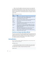
Figure 7.16
The gray area of this
figure shows the
area that should be
filled when you have
completed step 11.
isolating image elements ■ 191
4456c07.qxd 3/1/06 3:06 PM Page 191
3. Leave the Green and Luminosity components visible; then set the Luminosity compo-
nent layer to Linear Dodge mode. Doing this will emphasize the bright information in
the Green component. Light areas will get much lighter. Most of the flower will turn
pure white.
4. Move the Red component layer to the top of the layer stack, and set it to Multiply
mode. Other options that produce similar results are Overlay and Hard Light. The red
is more consistently dark around the flower, and setting it to one of these modes uses
the natural contrast of the Red component to darken the perimeter area outside the
flower. This should help darken the area around the flower to black, while leaving
the flower itself pure white. This will result in a pretty good outline of the petals in
black-and-white. See Figure 7.18.
5. Merge the layers used in the calculation (Green, Luminosity, and Red) to a new layer,
and name the layer Plant Selection. It is not yet a selection, but you will use this layer
just like the Plant Selection layer in the manual technique.
6. Get a brush and touch up the rough outline of the flowers made with the calculation.
To touch up, either fill in any areas you don’t need to select by painting over those
areas with black, or paint with white to remove black areas to add to the selected part
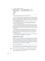
Red
Luminosity
Green
Blue
Figure 7.17
The basic image
components split
out as shown here.
The Blue component
offers few advan-
tages, but Red, Green,
and Luminosity do.
192 ■ chapter 7: Altering Composition
4456c07.qxd 3/1/06 3:06 PM Page 192
of the mask. Once you have either the black or white part of the mask complete, you
can use it to finish the job (use the Magic Wand with 0 Tolerance to select the area
you have completed, and then invert the selection and fill with the opposite color).
While touching up, you will want to use a larger brush (50–70 pixels diameter) that is
90%–95% hard. Press D to get default colors, and switch between those colors using
X to exchange foreground and background colors.
7. When you have finished with the touch-up, double-click Clear Grayscale and then
double-click Commit Transparency, both found in the Power_Masking category of
Effects in the Hidden Power tools. This will first create the appearance of the mask
and then commit the transparency. It creates a mask based on the black-and-white
content of the Plant Selection layer. The white areas will be transparent.
8. Change the Opacity of the Plant Selection layer to 0 percent, and/or turn off the
Visibility.
As an alternative to painting, you could use a selection tool such as the lasso to select larger
areas of the image to fill with black or white. Other options include doing a levels correction
to emphasize content or making other calculations.
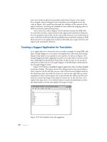
Figure 7.18
While this outline is
not perfect, it uses
existing image infor-
mation to enhance
the image content
to make manual
adjustment easier
and quicker than
using manual selec-
tion alone.
isolating image elements ■ 193
4456c07.qxd 3/1/06 3:06 PM Page 193
9. Delete the Green, Red, Luminosity, and Composite layers by dragging them to the
trash icon in the Layers palette.
10. Change the Source layer back to the Background by activating the Source layer and
choosing Layer
➔ New ➔ Background From Layer.
This series of steps should create a layer filled with black that is nearly identical to the
manual selection made in the previous set of steps.
SELECTING FLYAWAY HAIR?
A common request in user forums on the Internet is the ability to quickly select a subject’s fly-
away hair. This can be challenging: there is no guaranteed way to make that kind of selection
and no one-size-fits-all methodology. If the hair is photographed against a distinct color
(such as a blue or green screen), it may be a better idea to apply the advantage posed by the
background color to create a mask rather than attempting to make an absolutely nutty selec-
tion based on the thin wisps of hair. Similarly to the techniques used in “Making a Selection of
the Object (Calculations),” you might build a color range mask either using Hue/Saturation or
Blend Mask. If you target the mask correctly to the color range of the background, you can
use it to drop in whatever background replacement you want or use it to create a selection
that enables you to isolate the wisps to their own layer.
Alpha Channels in Elements Images
Since each of the previous sections talks about storing a selection as a layer, this seems
like a good spot to discuss saving selections as alpha channels. An alpha channel is like a
hidden layer and acts as a means of storing a selection, only you can’t see it in the Layers
palette; it is stored in the same way color is stored (as a component), but the alphas don’t
affect image color. When the alpha channels are loaded, they re-create the selection that
was stored—exactly. You can use the alphas to store and resurrect selections of the objects.
One of the improvements made to Photoshop Elements in version 2 was the ability to
save, load, and delete alpha channels by choosing the Save Selection, Load Selection, and
Delete Selection functions, respectively. (For those using Photoshop Elements 1, the Hid-
den Power tools include a way to work with alphas.) To save a selection, you should have
the selection active and choose Save Selection from the bottom of the Selection menu.
Later, after saving the selection, you can load it again at any time by choosing Load Selec-
tion from the Selection menu.
The only problem with saving and loading selections in Elements is that you can’t see
alpha channels, so you have to work a little blind and partly from memory. If you store a
lot of selections in any one image, there isn’t a quick way to purge them from your images.
194 ■ chapter 7: Altering Composition
4456c07.qxd 3/1/06 3:06 PM Page 194
(If you’re still using either version 1 or 2, see my website, www.hiddenelements.com, for
information about procuring the appropriate Hidden Power tools.)
For version 4 of Elements, I’ve provided two Hidden Power tools to help you work
with selections: Del Selections And Alphas, and Preview Selection found in the
Power_Extras category of Effects. Del Selections and Alphas will help you purge selections
from your image without having to delete them one at a time, or it can help you separate
out selections into separate documents. Removing the alphas will help keep your images
trim in file size. Preview Selection will provide a brief preview of any of the saved selec-
tions you choose. You’ll work with alphas to save and load your selections, so we’ll look at
how to save and load in the following procedures.
To store a selection, you have to have one active. You can use the selection layer you
created to load a selection and then save that as an alpha channel.
1. Hold down the Command/Ctrl key and click on the Plant Selection layer in the
Layers palette.
2. Choose Save Selection from the Select menu.
3. Type a name for your selection/alpha channel in the field provided in the dialog
for the name. For this example, enter Plant Selection.
4. Click OK to accept the changes and save the selection by the name you entered.
That is all there is to saving a selection. Once it is saved, you can actually go ahead and
delete the Plant Selection layer. Before you do, try loading the selection so you can be sure
you have it all working right. Just choose Load Selection on the Select menu. When the
dialog box appears, select the name you entered in step 3 above from the Selection drop-
down list (it will be selected for you if it is the only alpha in the image). If a selection
shows up around the plant, you have successfully stored the selection. Go ahead and delete
the Plant selection layer. To Delete an alpha channel and permanently remove a stored
selection from you image, just choose Delete Selection from the Select menu. When the
dialog box appears, choose the name of the alpha channel that you want to delete, and
click OK to accept the change. Do not delete the Plant Selection, as you will be using it in
the next section.
If you have an image where you’ve saved a bunch of selections and you want to purge
them all, the Del Selections And Alphas tool in the Power_Extras category in Effects can
help you out. All you have to do is double-click Del Selections And Alphas, and the Hid-
den Power tool will separate all the channels in the image and then ask you which you
want to combine to re-create your image. If the image was RGB, you would choose RGB
from the drop-down list in the dialog to tell Elements what type of file it should make;
then choose the color channels. In an RGB image, the RGB channels will be separated into
filename.red, filename.green, and filename.blue (where filename stands for the name of
isolating image elements ■ 195
4456c07.qxd 3/1/06 3:06 PM Page 195
the image before you split it; if you are splitting a file you hadn’t saved, the filename will
be
Untitled with a number: Untitled-#). The image will be reassembled from the sources
you choose.
A selection is represented on-screen by the selection outline. This selection outline tells
only part of the story about what is actually selected. The outline shows only where the
selection is at least 50 percent effective. If there is grayscale in your selection or feathering,
the only way you’ll know exactly what total area will be affected is by previewing the selec-
tion. Hidden Power provides the Preview Selection tool to preview any saved selection.
To preview a selection as grayscale, be sure you’ve saved the selection you want to pre-
view in the current image, and then double-click Preview Selection in the Power_Extras
category of the Hidden Power tools on the Effects palette. This tool will prompt you to
select a saved alpha. When you have made the choice, the selection will preview automati-
cally and then fade. When the preview disappears, a message will appear telling you the
preview is complete. Do not interrupt the process. Try it out by running the tool and
choosing the Plant Selection alpha.
These few tools should add powerful selection-storage and selection-management fea-
tures to your repertoire. The method that you use for storing the selection is not as critical
as the result. You can use the layer-storage method or the alpha storage and garner the
same result. Storing the selection as an alpha assures you won’t lose it by flattening the
image, and it keeps the Layers palette free of clutter. We will use the stored alpha with the
process in the next section.
Using Stored Selections to Isolate an Object
Whether you made your selection manually or with the help of calculations, should now
have stored the Plant Selection layer as an alpha channel that will enable you to manipu-
late elements in the image.
1. Load the Plant Selection layer as a selection by choosing Load Selection from the Selec-
tion menu and choosing the Plant Selection alpha from the channel drop-down list.
2. Activate the Background layer.
3. Copy and paste (Command+J / Ctrl+J). This will paste the plant into a new layer.
Change the layer name to Plant.
4. Load the selection again by choosing Reselect from the Selection menu or pressing
Command+Shift+D / Ctrl+Shift+D. Choose Select
➔
Invert (Command+Shift+I /
Ctrl+Shift +I) to invert the selection.
5. Activate the Background layer.
6. Copy and paste the background to create a new layer. Name the layer Plant Back-
ground. Figure 7.19 shows a breakdown of the layers in detail and in the Layers
palette.
196 ■ chapter 7: Altering Composition
4456c07.qxd 3/1/06 3:06 PM Page 196
Your layers should be in the exact order shown in the fig-
ure. Isolating the background might have taken you one step
further than you expected to go. However, you may need the
plant background on its own layer. The reason for this is that
the color from the plant could bleed into the background
when you make certain adjustments to the layer if the objects
aren’t separate. Treating them as separate objects keeps the
reactions separate. We’ll look at some instances where that
can be an issue in the next section, where we use the layers
that have been created for changes to improve the image.
Making the Isolated Changes
Now that the image elements have been isolated into their
own layers, you can edit them individually. By adding lay-
ered changes over the background, such as a manual drop
shadow, or even replacing the background, you can improve
separation or change the entire image. First, let’s place the
drop shadow and blur the background to see how that
improves the image.
1. Activate the Plant Background layer.
2. Apply a Gaussian Blur (Filter
➔
Blur
➔
Gaussian Blur).
The radius should be broad enough to significantly blur
the background, but the setting is your choice (probably
5–10 pixels in radius is enough). If you click the Lock
Transparent Pixels option for the layer on the Layers
palette before the blur, solid pixels on the layer will
remain solid. The result should be a smoother look to
the background.
3. Load the Plant layer as a selection by Command+ clicking
it / Ctrl+clicking it in the Layers palette. Create a new layer,
and drag it below the Plant layer (between the Plant
layer and the Plant Background layer). Name the layer
Drop Shadow. The selection will be used to create a
drop shadow on the new layer.
4. Adjust the selection. For this example we will both
Expand and Feather the selection (find these tools on
the Select menu). Expanding will give you a broader base
isolating image elements ■ 197
Figure 7.19
The layers you have
left will be the origi-
nal Background, the
Plant Background,
and the Plant neatly
stacked from the
bottom up in the
Layers palette.
4456c07.qxd 3/1/06 3:06 PM Page 197
around the area of the plant, and Feathering will blend in the effect of the shadow
at the edges and into the background. The stronger you want the effect to be, the
broader you should make both. Try Expand and Feather settings of 10 pixels.
5. Fill the selection with black. Set the layer mode to Multiply to ensure that areas of the
image below the shadow darken. You can control the intensity of the effect by using
layer opacity. Figure 7.20 shows the original, the drop shadow, and the result.
Blurring the background does several things, including smoothing out the image noise
rather handily and making the depth of field seem that much greater (a blurrier background
adds an appearance of distance from the background). Placing the drop shadow increases
the local contrast around the plant and enhances the separation from the background.
At this point, you may want to try painting in some highlights or working with other
effects and correction, but the basic purpose of isolating these image objects has been
accomplished. You can replace the background entirely (Figure 7.21) or work to enhance
the background and control the effects (Figure 7.22). The point is that isolation of objects
gives you the control to do so.
Original
Result
Drop Shadow
Figure 7.20
This example shows
shadowing to
enhance separation.
Other options, such
as using white for
the shadow, could
add separation
between a dark
object and its
dark background.
198 ■ chapter 7: Altering Composition
4456c07.qxd 3/1/06 3:06 PM Page 198
Along the line of working with isolated elements in your images is working with sepa-
rate elements and images that you may want to composite. We’ll look at how to work with
those situations in the next few sections.
Compositing Image Elements
In times of image trouble, one of the greatest options to have is the availability of more
than one source image with which to work. If you take several shots of the same scene, you
are really safeguarding yourself for any corrections you might have to make. For example,
if you are taking one of those artificially posed group shots (we all do it at some time or
another), and you take one shot, you may find that Bessy blinked and Billy had a finger up
his nose. If you pause a moment and take another shot, Billy and Bessy might be fine while
Uncle Dom is fending off a bee and one of the twins has run off. Neither of the shots is
good by itself, but since they were taken at the same time, you can use elements from each
to create one good image. It is probably more time-efficient to go find the twin and try
one more shot, but in a pinch, you have the information you need for the completed
image. Just composite a shot including Bessy without the blink and the more flattering
pose for Billy from the second shot to fix the first.
This same philosophy works to help you fix any number of other problems. Say you
go out and shoot a great picture of a balloon race starting off in the early morning as they
float up the hillside at the peak of fall foliage. The image is perfect, except for one balloon
Figure 7.22
Working with the background to enhance the interesting parts
and blackwashing the rest creates a more natural and effective
background.
Figure 7.21
A popular replacement for background could be a sky, a tree
trunk, a background with some effects, or something shot
specifically for the purpose. In any case (as is the case here),
shadowing or glow can be added to keep the objects distinct.
compositing image elements ■ 199
4456c07.qxd 3/1/06 3:06 PM Page 199
basket that is partially in the image and seems like a mistake, or the billboard ad you
can’t crop out, or the electrical wires, or a water tower If you wait a moment and snap
another image, the balloons will have moved and you’ll have a different view of the back-
ground—and perhaps a different way to crop the image. If you wait till the balloons are
above the hillside, you can take a clean shot of the hill by itself, revealing a whole fresh set
of autumn leaves, and then place the balloons wherever you want. If you take a shot of
the balloons against the sky, you gain the advantage of easily isolating them to later mix
and match the positions of the balloons as you’d prefer. More source material in the
same light, from the same angle, can be far better than having to repeat information in
the image that is cloned from one place to another. As long as the images are good, you’ll
have more freedom to use different parts of different images to create the image you were
looking for in the first place.
This type of multi-image thinking can be turned right on its head to help you make
better shots and solve creative problems. You may set up shots that you take in parts on
purpose to get a better result.
For example, say you are taking a product shot of the teapot in Figure 7.23 to sell on
a website. There is a little more than meets the eye because there are several internal
parts, and you’d like to show them all in one image. Lighting multiple objects in a
scene can get tricky: objects in close proximity can block lighting and cast shadows
over one another—not always in a flattering way. One way to rid yourself of the light-
ing problem is to shoot each part that you want to include and then assemble the
shots into one final image. This enables you to make the best of each part and simpli-
fies the process: you make one lighting setup, shoot each of the parts so you can easily
extract it from the background—perhaps even take a picture of just the background—
and then make a composite of the parts. This is similar to isolating objects in your
images as we did in the previous section, but because you are shooting objects with
the intent to isolate them later, your work in selecting and isolating the objects can
be much easier.
If you take pictures of the parts of the teapot separately, all you have to do is compile
them in a single image. Simple, right? You may have to create a background, unless you
take an image to use for that separately. You can spend a lot of time with this one depend-
ing on how meticulous you are. The results will be much different than if you had just
placed all the objects together in a clump and shot a lot of pictures trying to get the
right one.
At this point, a detailed step-by-step procedure that walks you through the process
would really be superfluous and counterproductive, and it would thwart your creativity. If
you have followed the idea of the previous sections, now it is time to put that understanding
200 ■ chapter 7: Altering Composition
4456c07.qxd 3/1/06 3:06 PM Page 200
Figure 7.23
This teapot contains
several different
pieces.
compositing image elements ■ 201
4456c07.qxd 3/1/06 3:06 PM Page 201
to work for you and apply the process. Here is an outline of the steps to take in creating an
image composite:
1. Collect the Image Parts I’ve already shot the image parts for you, and the files are
included on the CD in a folder called
Teapot. There are five: the glass, the harness, the
insert holder, the top, and the basket. Open all the images.
2. Extract the Image Parts Isolate the objects in each image, and copy and paste each ele-
ment into a new layer. Use whatever method you want to use to make the selection prior
to isolating the parts—you may even want to mix techniques. The previous section with
the plant may provide some guidelines for accomplishing selection and isolation. In some
instances, calculations can prove to be pretty easy because the blue parts of the pot will
provide an easy target. However, the glass and basket have highlights and a lack of color,
which may be a bit more challenging. To make this a little more interesting, the separate
shots are not all color-correct, so you might want to fix that (see suggestions for color
correction in chapter 6). You can match the color across the pieces either by making an
adjustment to each image according to the background or by correcting the background
to gray. I’m not sure how it happened, but one of these darned objects got shot in slightly
different light. See how even the best-planned images can easily go awry?
3. Create/Obtain the Background Image You can use a totally flat background, or you can
add a little interest and make it seem more realistic with a slight gradient—perhaps mul-
tiple gradients—and a touch of noise. Make a background large enough to hold all the
objects, and create the content for the background. Suggestions include borrowing the
background from a public domain website (please be careful of copyright restrictions)
or quickly making up your own. I have included a grayscale version of the background
pictured in Figure 7.24 on the CD (
Background.psd), but it may need to be colored, and
I encourage you to make your own. The background you create is up to you, but it
should be at least twice as wide as the widest object and twice as tall as the tallest, with
the same ppi. You’ll have to remember one additional challenge: that glass on the pot is
supposed to be transparent, so whatever you end up with as a background has to some-
how make sense with what you can see through the glass. You might want to take care
of that with color masking.
4. Combine the Image Parts Move all the objects into the background image you have
chosen to use, and arrange the objects in positions roughly as you want them to appear.
This may require not only moving positions of the objects but ordering the layers as well
so objects appear in front of and behind other objects as desired. You can arrange the
objects however you want to within the image, either following the example or creating
your own order.
202 ■ chapter 7: Altering Composition
4456c07.qxd 3/1/06 3:06 PM Page 202
5. Make the Image Parts Work Together Make
adjustments to the objects in the image to
make them work in concert. Now that all of
the objects are in one place, it will be easier to
see what looks unnatural. For the most part,
this will be because there are no shadows.
Create drop shadows for each of the objects
individually, and link the object layers to their
shadows (to link, highlight both layers and
click the Link icon on the Layers palette).
Often, just a simple, soft, semiopaque shadow
outlining the base of the object will do. This
helps to blend the elements and make them
interact—rather than seeming like disparate
pieces of a puzzle that were pasted into an
image. You may want to create these shadows manually by using black, a feathered brush,
and a layer with the mode set to Multiply just below the object (similar to what we did
with the plant, but applying the effect manually). Be conscious also of areas where ele-
ments cross. For example, if you overlap the glass onto the harness, part of that harness
should probably show through the glass. Your adjustments will have to reflect that.
When you are finished compositing the elements, the image might look something
like Figure 7.25.
While this may seem like a lot of trouble to go through, if the results you are looking
for are that the image is clear and the objects are rendered well, this may be a good solu-
tion. Your other choice would be obtaining lighting equipment that can help you light
objects and reduce shadows (such as a light box). However, the real point is that com-
positing elements is possible—and sometimes even desirable. And the process always
uses the same steps:
1. Collect the image parts.
2. Extract the image parts.
3. Create/obtain the background image.
4. Combine the image parts.
5. Make the image parts work together.
Let’s look at one more example of compositing in creating a panorama and the advan-
tages it poses for interesting image composition.
compositing image elements ■ 203
Figure 7.24
This light gradient
background was
made entirely from
simple applications
of the Gradient tool
and should serve as
a fine place to insert
the objects. You can
try to imitate this,
or you can just
make your own
background.
4456c07.qxd 3/1/06 3:06 PM Page 203
Creating a Panorama
Similar to the exercises in the last few sections—and with elements of each—is creating a
panorama by stitching together consecutive shots taken in a horizontal or vertical plain.
Images shot for a panorama are taken in a series—usually in quick succession—and the
series of images is connected to create a continuous landscape. The photos are usually
taken in a vertical or horizontal pan to capture a broader or taller area than you would
normally get in a single frame with whatever camera and lens you are using. Because you
take several overlapping images shot in succession (perhaps using a tilt [vertical move-
ment] or pan [horizontal movement] of a tripod), your resulting image will have more
image information once stitched together and can be enlarged more than a single frame
of the same scene.
Good panoramas are a little tricky to shoot and often tricky to stitch together seam-
lessly. Lighting conditions change as you pivot the camera, and cameras in any type of
auto-exposure mode will try to compensate for that between shots. This leaves you with a
lot of tone and color changes to correct in post-processing. Taking some care while shoot-
ing the source images for the panorama will help simplify processing. Instead of looking
Figure 7.25
The composite of
the parts will show a
clear rendering of
each component
without the trouble
you’d otherwise
have with shadows
in trying to light all
the parts at once.
204 ■ chapter 7: Altering Composition
4456c07.qxd 3/1/06 3:06 PM Page 204
forward to corrections, you can avoid some of them by switch the camera to a manual
mode first—before shooting any of the images. This will keep the exposure setting the
same for each frame in your panorama and will make matching the exposure of the indi-
vidual frames similar and your work at the computer a lot easier later. Setting up your
camera on a tripod for the movement can also help by keeping the frames mostly aligned.
When you shoot the frames, you will want 30–50 percent overlap to give yourself plenty of
room to blend one image into the next as you stitch them together.
A good way to see how panoramas go together is to try an example. Instead of sending
you out to shoot some source images, the shots for this exercise are included on the CD.
The panorama shots are shown in Figure 7.26.
Left.psd
Panorama_Sample.psd
Middle-Left.psd
Middle-Right.psd Right.psd
Figure 7.26
The composite of
the parts will show
a clear rendering of
each component
without the trouble
you’d otherwise
have with shadows
in trying to light all
the parts at once.
creating a panorama ■ 205
4456c07.qxd 3/1/06 3:06 PM Page 205
During editing to make these images stitch together smoothly, you will likely have to
pull out all the stops and use almost all we’ve done so far to get a good result. If you open
the source images (left.psd, middle-left.psd, middle-right.psd, and right.psd), you will
notice some noise in the images, and the color may need a little correction—though it is
possible to forgo most of these corrections until after the images are stitched together, as
long as you keep them in their own layers.
Photoshop Elements provides a tool for helping you work with panoramas. Now is a
good time to test it out, though we will explore an entirely manual method. To take a look
at what the panorama tool does, with the
four source images open, choose File ➔
New ➔ Photomerge Panorama. The
Photomerge dialog will appear with a
listing of the files you have open (see
Figure 7.27). If there are images that
you have open that you don’t want in
the panorama, eliminate them from the
list at this time by selecting them and
then using the Remove button; then
accept the changes by clicking OK. The program will attempt to align the shots for
you, and while it will make a valiant effort, I have never quite found it to be right on
the money.
In the case of our example images, you may find that the tool actually gives up and
places only two or three of the images in the workspace, leaving some of the source in the
thumbnail bar at the top of the screen. Your results will often vary if you close the Photo-
merge dialog and try the process again. With the dialog open and the images in it, you can
click on and drag the source components out of and into the thumbnail bar (Lightbox)
and adjust positions of the images in the main preview panel. As you move the source
images, note that the angle of blending between the images changes as they overlap.
You can zoom into or out from the image using the Zoom tool or Navigator slider.
You can rotate individual source images by selecting the Rotation tool (you will likely
not have to use this if you shot your image series using a tripod). You can view other pre-
views by using the Perspective tool (change to Perspective mode in the Settings panel,
and click on one of the source images with the tool) and by clicking Advanced Blending.
While all these tools are interesting, the one I find most useful is the Keep As Layers check
box. Check this box to be sure the images are compiled in a new image in separate layers
so you will have the ability to adjust and move them using all of the tools you are familiar
with in Elements. In other words, I find that Photomerge is most useful for helping you set
up and rough in the panorama, rather than completing it.
206 ■ chapter 7: Altering Composition
Figure 7.27
The initial dialog for
Photomerge allows
you to select the
images you will be
using for the
panorama, either
from images that
are already open or
images accessible by
your computer.
4456c07.qxd 3/1/06 3:06 PM Page 206
With this brief introduction to the panorama tool, we will use it in the steps below
to set up your panorama, and then we’ll complete the adjustment of parts manually to
achieve the final result:
1. Close all the images you currently have open.
2. Choose Photomerge Panorama from the New submenu on the File menu.
3. Browse for the images you want to use in the panorama by clicking the Browse
button and selecting them from the Hidden Power CD. For this example (and your
first attempt), open the trimmed images in the Trimmed folder (left_trimmed.psd,
middle-left_trimmed.psd, middle-right_trimmed.psd, and right_trimmed.psd). For
later attempts, you might try the untrimmed images for more of a challenge. When
you have selected the images, click the OK button to accept the changes; the images
will open and will be added to the main Photomerge dialog.
4. When the images are all in the Photomerge dialog, make adjustments as desired by
moving the images in relationship to one another, adjusting the overlaps and posi-
tions for a best rough fitting.
5. Check the Keep As Layers box on the Photomerge dialog, and click OK to accept the
changes. The images will be collected in a new image with the layers named according
to the filenames you have incorporated. See Figure 7.28.
6. Adjust the layer order so the layers are stacked right_trimmed.psd, middle-right_
trimmed.psd, middle-left_trimmed.psd, and left_trimmed.psd, from bottom to
top as pictured in Figure 7.28.
7. Add a layer mask to the top three layers using the Hidden Power Layer Mask tool
in the Power_Masking category of Effects. This will place a blank layer mask in the
Layers palette next to each of the source images.
8. Activate the Middle-right_trimmed.psd layer in the Layers palette, and click on the
mask thumbnail.
9. Choose the Gradient tool, and set the gradient to black-to-white (left to right). Set
the gradient options to Linear Gradient, Normal mode, 100% Opacity, and check
Reverse, Dither, and Opacity.
10. Apply a gradient from about 2 inches to the left of where middle-right_trimmed.psd
falls off into right_trimmed.psd, to about
1
/
4
″ to the left of that same edge. Apply the
tool left to right. The mask should erase the right edge of middle-right_trimmed.psd,
revealing right_trimmed.psd below.
11. Activate the middle-left_trimmed.psd layer, and apply a gradient to the mask in the
same way you applied the mask in the previous step, starting about 2 inches from
the left of where the middle-left_trimmed.psd layer falls off into the middle-right_
trimmed.psd layer and ending about
1
/
4
″ before the edge.
creating a panorama ■ 207
Figure 7.28
The layers in the
new image reflect
the positioning
accepted in the Pho-
tomerge dialog. No
blending will be
incorporated.
4456c07.qxd 3/1/06 3:06 PM Page 207
12. Activate the left_trimmed.psd layer, and apply a gradient to the mask in the same
way you applied the mask in the previous step, starting about 2 inches from the left
of where the left_trimmed.psd layer falls off into the middle-left_trimmed.psd layer
and ending about
1
/
4
″ before the edge. Once you have completed this step, the layers
should look like they do in Figure 7.29.
13. Touch up the masks to smooth out the transitions between the image layers. You can
use the brush tool to paint in black to remove areas from view or paint in white to
reveal them again. You can adjust the gradient tool opacity and apply that over a
broader range to feather transitions better. You can also dodge/burn. Take a look at
the adjustments made in the panorama sample by viewing only one of the source
layers at a time.
14. Once you have blended the image to your satisfaction, you may want to do some
color correction. Color Balance, Levels, Curves Presets and Hue/Saturation were all
used in the sample to brighten the result and shift the image to more of a sunrise
color. See previous chapters and specifically the chapter on color correction for more
information on using these tools.
After the image has been blended and color corrected, it is a good time to crop and
reshape the image. This image provides some interesting challenges. The horizon is not
straight, and there is an osprey far off in the distance to the upper left of the image—
almost out of the frame. You will find that just trying to adjust the horizon using trans-
form will distort the pelican unpleasantly and may result in cropping out the osprey. The
solution is to get the pelican on its own layer. Take the following steps:
15. Create a new layer at the top of the stack and copy the content of the
image to it. Name the layer Composite. This gives you a fresh source to
work from that compiles all the changes you have made thus far.
16. Select the pelican and copy it to its own layer (label the layer Pelican).
Use a feathered selection so the bird blends into the background. Separat-
ing the pelican also allows you to move it in the image to adjust the com-
position if desired.
The sample image panorama_sample.psd shows an example of dodging where the dodging
is done using layers instead of the dodging tool. A new layer is created and set to Screen
mode, and then white is painted in over areas that are to be brightened. Opacity of the layer
is then used to temper the effect.
208 ■ chapter 7: Altering Composition
Figure 7.29
After applying the
Gradient tool, masks
for the layers should
all be white to the left
and black to the
right, as shown here.
4456c07.qxd 3/1/06 3:06 PM Page 208
17. Duplicate the Composite layer, and use the transform tool to straighten the horizon
by pulling down the right-bottom controller, as pictured in Figure 7.30. Name the
layer Tone. You’ll see why in a moment.
18. With the horizon straight, you may want to try some noise reduction. You will note
that the low light has riddled the image with color noise. Duplicate the Tone layer and
name the new layer Color. Change the mode to Color, and apply a Motion blur of
7–10 pixels. Because of the horizontal feel of the image (the horizon, clouds, and
waves are all mostly horizontal), the color will tend to blend in more naturally than
using a Gaussian or other nondirectional blur. You can also make a selection of the
sky and apply a few pixels of blurring to the tone there to smooth out the spottiness.
You see that this project has run through a gamut of
things discussed in this chapter to make both small and
grand adjustments to the image to improve the com-
position. The main key to getting good results with
this image is in keeping objects separate and attacking
problem areas one at a time. We will continue to look
at taking images through the entire process of correc-
tion and enhancement in the next chapter.
creating a panorama ■ 209
Figure 7.30
Pulling down this
one controller
leaves the osprey
virtually untouched
but straightens the
ocean horizon.
4456c07.qxd 3/1/06 3:06 PM Page 209
4456c07.qxd 3/1/06 3:06 PM Page 210
Chapter 8
The Image Process in Action
We’ve looked at multiple facets of image correction and adjustment, and now it is time to
put them all together. Using a sample image supplied on the CD, we will step through the
process of correction and adjustment from start to finish to show how the process works
in practice.
The base process used for the image will follow suggested Hidden Power procedures,
and it may go a step further than you would expect to embellish images. You don’t have
to agree with or even like the embellishments, but you should understand the procedures
and how they fit into the process of getting to the image result. We will take a critical look
at the photo before stepping through the procedures so that we can outline the goals for
the image.
The goal of this chapter is to have you see how the procedures outlined in the previous
chapters work together on a real-world image, so you can apply the steps and concepts to
your own images.
4456c08.qxd 3/1/06 3:06 PM Page 211
The Wild Stallion
The image in Figure 8.1 was taken on the outer banks of North Carolina on a private
guided tour of a remote coastal area—likely the only major existing coastal area in the
continental U.S. that has not been developed. The image is available on the Hidden Power
CD (wildstallion.X3F). Note that the .X3F filename extension, which you may never have
seen before, is the proprietary extension for “raw” files from Sigma cameras. Elements will
recognize this file as a Camera RAW file when you attempt to open it.
This particular area of the Outer Banks is accessible only by taking a half-hour off-road
ride down ocean beaches in a four-wheel-drive vehicle that can navigate beach sands—it is
an area literally beyond where the road ends. The reason to make the trek is that the area
is one of the few remaining places where there are actually wild mustangs—and certainly
the only place on the Outer Banks where the advertised “wild horses” actually run free.
Since the image was taken on an excursion that likely won’t be repeated, it is a keeper
almost regardless of quality. This handsome stallion struck a pose just as the wind was
tossing his mane. While it is an interesting image, there are a few ways that it can be
improved. For example, the image is, admittedly, a little soft, though it was shot with a
fairly fast shutter speed in daylight (see the “EXIF Metadata” sidebar). Let’s review our
image-processing checklist (from Chapter 3) before getting together a specific outline
of changes to perform.
Figure 8.1
We’ll use this image
(wildstallion.X3F)
from the CD to run
through the correc-
tion process.
212 ■ chapter 8: The Image Process in Action
4456c08.qxd 3/1/06 3:06 PM Page 212
EXIF METADATA
Your camera captures EXIF (Exchangeable Image File) information at the time of exposure. You
can use this data to track exposure information at the time of capture. You can find it in
Photoshop Elements by choosing File Info from the File menu. The following data was listed
for the example image under the Camera Data 1 category.
Camera Make/Model: Sigma SD9
Date and Time: 7/13/05, 2:38 PM
Shutter Speed: 1/350 sec
Aperture: 6.7
ISO: 200
Lens: Sigma 70–300mm DL
This information can both track what you did to capture the image and give hints as to
the quality of the capture. For example, the 70–300 DL lens performs better with a smaller
aperture, so this image is apt to be a little soft.
General Image Editing Steps Review
The following list of steps was taken from the list of steps suggested in Chapter 3. We’ll
follow this editing checklist in processing the
wildstallion.X3F image in the next section.
1. Be sure that your monitor is calibrated and that you have set up your preferences and
tested your output.
2. Store the original image file safely and work with a copy to do all of your image editing.
3. Have in mind a target range for the resolution and a color mode for the final image.
4. Evaluate the image.
5. Make general color and tonal corrections.
6. Make general damage corrections.
7. Make compositional changes, including cropping, compositing, and replacing
image parts.
8. Make targeted color and tonal corrections to selected parts of the image.
9. Save the layered RGB version of the image.
10. Simplify the image.
11. Optimize the image for output and use.
12. Save the image in output file format.
13. Package the image on proper media for output and use.
the wild stallion ■ 213
4456c08.qxd 3/1/06 3:06 PM Page 213
Applying the Image Editing Checklist to a Specific Image
We will assume at this point that you have taken the initiative to calibrate your monitor
and build the ICC profile you need for properly viewing your images on screen (checklist
step 1). Image storage (checklist step 2) is taken care of by providing the RAW file on the
CD. The image on the CD cannot be overwritten, so it is safely archived. We will be pro-
cessing the image using full resolution, which will allow a 9.5
" × 6.3" photo-quality print-
out of the result (checklist step 3).
Now we are ready to evaluate the image (checklist step 4).
Open the image in Photoshop Elements. We’ll attempt to coax out the best source to
work with by opening the
.X3F image. This RAW file format will provide the opportunity to
make some adjustments to the image that may not be possible otherwise because you will
be manipulating the preprocessed image source. Opening the image will kick off the Cam-
era RAW plug-in, where you will be able to adjust the image initially to your preference
using the raw captured data. The settings used for this example are pictured in Figure 8.2.
After you accept the RAW file conversion, the image will open in Elements. Despite
adjustments, the color seems a little wanting. While the horse is a brilliant chestnut color,
the greenery seems a bit washed out. Overall, the image may appear a little dark, but that
is by design (and preference). We’ll make both general (checklist step 5) and selective
(checklist step 8) color corrections in order to solve these problems. General corrections
will follow standard Hidden Power suggestions for Levels correction and Color Balance.
Selective corrections might occur before or after compositional correction, but they will
likely include shifting the color of the greenery with Hue/Saturation and perhaps adjusting
the color of the horse and its mane.
While there isn’t really any damage that needs correction (checklist step 6), there are
some potential distractions, such as the fence pillar just above and to the left of the mane
and the white bird droppings at the left edge of the photo on the stallion’s back. Perhaps we
can even address the white spot on the horse’s forehead and the flat coloring on the ear (to
the viewer’s left). We can remove the pillar by careful cloning/healing, and we can elimi-
nate the droppings with a quick cropping that will also move the horse’s head to a slightly
more dramatic position toward the center of the photo. Once we’ve made all these changes,
we’ll add a few additional effects to adjust the sharpness/softness of the image. Then it
will be time to save the working version of the image (checklist step 9) and then simplify
(checklist step 10) and save it again as optimized output (checklist steps 11 and 12). The
assumption is that you will save the result to your hard drive for output (checklist step 13).
The odd size is simply due to the capture resolution of the camera, which is 2268 × 1512 pixels.
At 240 ppi, which is optimal for most photo-quality printers, the size works out to 9.5" × 6.3."
214 ■ chapter 8: The Image Process in Action
4456c08.qxd 3/1/06 3:06 PM Page 214
The summary above takes care of all the points in the editing checklist, so we are ready to
go. Assuming you have opened the image and made the Camera RAW adjustments pictured
in Figure 8.2, let’s move on to the corrections. The following procedure steps concentrate on
Figure 8.2
This RAW conver-
sion can be different
if you don’t plan to
follow the example
exactly; however,
the settings must be
exactly as they are
here to resemble the
later dialogs and
changes.
the wild stallion ■ 215
4456c08.qxd 3/1/06 3:06 PM Page 215