User Interface Design for Mere Mortals PHẦN 3 pptx
Bạn đang xem bản rút gọn của tài liệu. Xem và tải ngay bản đầy đủ của tài liệu tại đây (9.75 MB, 31 trang )
have been described in the computing media as “unfriendly.”When you use a
program or service,Windows Vista in its default mode opens a dialog box ask-
ing you to grant permission to run the program. This interface feature could
be a deterrent to adoption of Vista for those users who are aggravated by tak-
ing the extra step to click the Allow button in the dialog box to use their sys-
tem. Such features could also provide competitors like Apple an opportunity
to tell Windows users that their operating system doesn’t employ these secu-
rity features and offers a better user experience.
Mac OS X
The Mac OS has long been considered the leader in operating system tech-
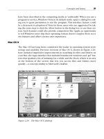
nology and usability. Previous versions of Mac OS X, shown in Figure 2.20,
have included impressive improvements in searching for files and folders on
your Mac,the Aqua interface that included translucent windows and “gel”but-
tons that sparked a lot of imitating for a while, and the Dock, which is an area
at the bottom of the screen that lets you access files and folders more
quickly—a concept similar to Microsoft’s taskbar.
Concepts and Issues 39
Figure 2.20 The Mac OS X desktop.
Leopard is another incremental improvement to the Mac OS that provides
more evolutionary search and interface features based on user feedback.
However, the Aqua interface is starting to get long in the tooth, and the
improvements that Microsoft has made in its interface have put it about on
par with the Mac OS. With the Intel transition complete, in 2008, Steve Jobs
and company may decide to reveal Mac OS 11 (or XI or X1), which will sport
a new interface.
Linux
Linux still has two major competing user interfaces, largely because Linux is
an open operating system. Until Linux users settle on one interface,there may
not be a concerted push to make Linux more accessible to individual com-
puter users. As of this writing, version 3.5 is the latest version of KDE, as
shown in Figure 2.21. A new version of KDE, version 4, is due for release in
late 2006 or early 2007, but in terms of user interface design, it’s already
behind the curve. A new version of GNOME is also under development.
Whether these new versions will bring these GUIs on a par with Windows
Vista and the Mac OS remains to be seen.
40 Chapter 2
Figure 2.21 The KDE desktop.
Web Design Improvements
Many of the Web design improvements in the decade of the 2000s have hap-
pened “under the hood,”specifically with the languages used to produce Web
sites. Extensible Markup Language,orXML, is a language that is a cousin of
HTML; both are built from the same ancestor: the Standard Generalized
Markup Language (SGML). XML is designed to better share information
between different systems on the Internet. As a result, HTML code is going
away and is being replaced by sites written in a hybrid of HTML and XML,
called (of course) XHTML. The difference you’ll see in your browser is faster
performance with database-driven Web sites.
Thanks to years of people discussing what’s good and bad about Web sites,
Web design has progressed beyond the days where people used dark blue
text on a black background and thought it was cool—and expected people to
be able to read it, too. However, new Web designers may not be aware of
design requirements, and some Web sites serve as instructional aids to show
new designers what not to do, as shown in Figure 2.22.
Concepts and Issues 41
Figure 2.22 A poorly designed Web site.
Figure courtesy of Michelle Blowers, Owner, Gold Nugget Webs (www.goldnuggetwebs.com).
Unfortunately, there are still enough limitations in Web design that, if a
designer is not aware of them, it could cause serious trouble, as I’ll explain in
the next section.
What’s Still Not Fixed
Not all operating systems, and especially all Web browsers, speak the same
language—they all like to tweak their programs to add a new feature that no
one else has, ostensibly to give their product a competitive edge. However,
the tweaking can aggravate users and designers.
For example, each major Web browser can display a Web page slightly differ-
ent from its competitors. You also have to design a Web site using a few com-
mon fonts and a set number of colors, called Web-safe colors. This is because
not all Web users have the same fonts installed on their computers or the
same number of colors available, so designing a Web site according to what
looks best to you may look nothing like what you intended on someone else’s
computer.
What’s more,programs running under the same operating system may not use
the same conventions,which helps undermine the idea of having similar com-
mands across all programs to make things easier for the user. For example, I
like using keystroke combinations (like Shift+F1) instead of picking a menu
option with the mouse because it’s faster. However, the keystroke combina-
tions for accessing the spell checker are different for WordPerfect and
Word—WordPerfect uses Ctrl+F1 but Word uses F7.
Perhaps the biggest problem with user interface design is that it’s largely
static—the standard GUI has been in use for nearly 35 years as of this writing,
and although it has been refined over the years, there isn’t a new (and hope-
fully more effective) way of interacting with a computer. The problem also
includes GUI applications, which have been tweaked incrementally over the
years, but application interfaces are similar to interfaces from older versions
released 10 years ago.
However, Microsoft may have something in the works regarding a new user
interface in the next major release of Windows, and there are other interfaces
under development that could see the light of day during the second decade
of the 21st century.
42 Chapter 2
Future Plans
Whether the changes are just evolutionary or revolutionary, user interfaces
will continue to change. This section provides a peak into the near future of
what those changes might be like.
Windows Vienna
Vienna is the code name for Version 7 of the Windows operating system. The
Vienna name replaced the new version’s original name, Blackcomb. Many of
the features that were promised in Windows Vista have been scheduled for
individual release—perhaps as Vista service packs—between now and
Vienna’s release, and others have been moved back to Vienna.
One of those changes is a complete revamping of the user interface based on
Microsoft research during the past decade or so. Microsoft is good at reveal-
ing hints that may or may not be included with the next version of Windows.
What’s more, Microsoft has a track record of announcing new features that
get pushed back due to time constraints or technological issues, so it’s always
best to take what Microsoft says with a grain of salt.
Mac OS
In 2006, Apple’s focus was more on hardware than software. It decided to
migrate all its Macintosh computers from running on the PowerPC chips to
running on Intel chips. This change is designed to provide Apple with more
powerful portable and desktop computers.
Apple released the latest version of Mac OS X, called Leopard, in early 2007,
but more significant changes may be in store now that the Intel transition is
complete. Whatever Steve Jobs has up his sleeve for the next version of Mac
OS, he’s not letting on.
Web Browsers and Their Impact on Design
Web browsers have forced operating systems to adopt new functionality
to deal with Internet issues such as blocking pop-up ads. User interface
design has also integrated the use of online help directly from Web sources,
which requires a presentation of that data that is easy to find and under-
stand. And there is the issue of accessibility for all users, which was dis-
cussed in Chapter 1.
Concepts and Issues 43
As the line between the computer desktop and the Web browser blurs with
the capability for users to have always-on Internet broadband connections
(such as cable and DSL),Web formatting and design restrictions are beginning
to affect user interface design. Web technologies such as Flash, the de facto
standard for creating animated objects on the Web as well as creating ani-
mated Web sites, have made Web sites more interactive than ever.
For example,the Rich Internet Application System (RIAS) uses Flash to create
a Web interface that looks more like an interface on the user’s desktop. This
RIAS interface is a graphical shell that appears over the HTML pages,much as
the Windows interface was a shell over the DOS CLI from the first version of
Windows through the release of Windows Millennium Edition in 2000.
Another example is that Windows Vista lets you search the Internet from the
desktop.
A Web development area of great interest is the Web-based application,where
users will be able to use applications such as word processors and spread-
sheets directly from a Web site and won’t have to install software on their
computer. Application service providers (ASPs) are already in operation and
make applications available on the Web.
Application subscriptions and rentals have the attention of larger companies
such as Google, which announced the Google Spreadsheet in 2006. The
Google Spreadsheet allows users to share spreadsheet data through the Web
with other users, thus bypassing the need to use existing programs. In addi-
tion to the advent of open-source software,this development is a tremendous
challenge for companies like Microsoft that have used the proprietary model
of software design and sales, especially because these software sales provide
dependable revenue for the companies that produce that software.
Up-and-Coming Interfaces
Several new and interesting interfaces are currently being designed and
researched. One or more of these interfaces could make their way into our
lives at some point in the future.
•
Attentive interfaces
manage the users’ attention by guiding them
through a process and warning them about any potential problems,
such as the lack of required input from the user that will prevent the
application from completing the desired task. The interface is designed
to understand what the user is doing so that the interface can react
44 Chapter 2
accordingly. For example, the interface will watch for any change in
visual attention or if the user has turned to give attention to something
else.
•
Gesture interfaces
rely on hand gestures for input. If you watched the
movie Minority Report, you saw that the computers of 2054 used ges-
ture interfaces as users would move their hands and arms to manipu-
late objects on the computer.
•
Reflexive interfaces
allow users to define and control the entire system
through the user interface, such as changing the command verbiage to
suit their needs and expectations.
•
Tangible interfaces
give physical form to tangible pieces of information.
For example, the Marble Answering Machine by Durrell Bishop
(Wikipedia, 2006) has a marble that represents a message on the
answering machine. When you drop the marble into a dish, the answer-
ing machine plays back the message. The movie Minority Report used
a similar feature, where the predicted outcome of murder events was
not reported on a computer screen, but in the form of a marble that
had the information etched on it.
•
Zooming interfaces
is an evolutionary outgrowth of the GUI. Therefore,
zooming interfaces sport the acronym ZUI, for zooming user interface.
A ZUI represents objects in different levels of scale and detail. As you
pan across an infinite desktop that consists of various objects in various
levels of detail, you can select an object to enlarge it to view or work on
it, and then you can shrink it again when you’re finished. ZUIs don’t use
windows; instead, they use vector graphics to represent objects. One
example of a ZUI is MSN.com Maps, in which you enter an address,
MSN.com shows you the map, and then lets you zoom in and out as you
see fit. See Figure 2.23.
• The
A
A
rchy interface
is a new interface proposed by the late Jef Raskin, a
human-computer interface expert who started the Macintosh project at
Apple in the 1970s. Raskin left Apple in 1982 and started his own com-
pany, where he eventually developed a product that integrated an early
version of the Archy interface in 1987. That product was the Canon
Cat.
This interface is text based and doesn’t use GUI features. Instead, the
Archy interface uses leaping, which lets you move on the screen via
an incremental text search. You can also insert and execute commands
at any point in the interface; all you have to do is hold down the
Concepts and Issues 45
command key (which is the Caps Lock key) and type the command.
Archy also fills in the command name automatically.
The Archy interface also uses a ZUI called Zoomworld that you can
interface with using a mouse. Hyperlinks are embedded in each icon,
and as you move the zoom area closer to the object, the object gets big-
ger so you can examine more of the information and decide if you want
to expand the object.
• The
brain-computer interface
is perhaps the most direct interface of all.
People will not have microprocessor chips installed in their heads any-
time soon, but rudimentary brain-computer interfaces have been devel-
oped that allow humans and monkeys to control a cursor on a screen.
Related interfaces have shown promise in using implants that are con-
trolled by the brain to overcome noncongenital deafness and blindness.
46 Chapter 2
Figure 2.23 MSN.com Maps, a zooming user interface example.
Usability Terms
Chauncy Wilson, a senior member of the Society for Technical Communica-
tion (STC), notes that the word usability can be traced back to 1382 accord-
ing to the Oxford English Dictionary online (www.oed.com),and that the first
reference to usability can be traced back to 1842. (Wilson, Chauncey.“Usabil-
ity and User Experience Design: The Next Decade.”Intercom (January 2005):
6[nd]9.) Today, the Merriam-Webster Online dictionary (www.m-w.com) has
two rather terse definitions for usability:
1. Capable of being used.
2. Convenient and practicable for use.
These definitions do little to explain what usability is. Dumas and Redish
(1999) provide a straightforward definition of what usability is: “The people
who use the product can do so quickly and easily to accomplish their own
tasks.” Dumas and Redish base this definition of usability on four points:
1. Usability requires focus on the users.
2. People use products to be productive.
3. Users are busy people trying to accomplish tasks.
4. Users decide when a product is easy to use.
As personal computing technology became widely available, companies
placed a greater emphasis on improving users’ experiences with computers
as more people who used hardware and software products were increasingly
lay people using computers at home and in the office instead of computing
professionals.
This shift in priorities gave rise to several different buzzwords related to
usability, including usability engineering, user-centered design, and user
experience engineering.
The increased focus on usability studies over the past 25 years or so has cate-
gorized those who engage in usability studies into three categories.
Concepts and Issues 47
Usability Engineers
A usability engineer is someone who provides usability services. Usability
services are any activities that improve the user experience of anything a per-
son uses to accomplish a task. This can include the design of a software appli-
cation, the creation of a user guide, the creation of training services, and the
creation of a Web site.
Usability Scientists
A usability scientist is someone who has formal training in usability research
and development disciplines. These disciplines include usability science,
usability engineering, human factors engineering, and ergonomics. Usability
scientists usually hold advanced degrees in one of the cognitive science
fields.
User Experience Professionals
A user experience professional is someone who can fit into one of the other
two categories, or it can be someone in a company, office, or department that
isn’t a formal usability engineer or works in a usability engineering depart-
ment, but someone who does provide usability services.
For example, most technical writers are passionate about making printed or
online documentation as easy to read and use as possible. What’s more, tech-
nical writers have had to expand their repertoire to include some program-
ming, Web design, and even software and hardware design.
As a result, more technical communicators are becoming usability engineers
or are simply expanding their repertoire even more by learning about usabil-
ity testing and techniques and offering these services to their internal and
external customers.
Types of Usability Design
There are three major types of usability design:
•
Documentation design
, which is the design of paper and online docu-
mentation that serves as a reference for users. Technical writers lead
the charge to produce documentation design and employ usability
techniques, including user and task analysis, which I’ll discuss later in
this chapter.
48 Chapter 2
•
Interface design
, which is the process of designing a software or hard-
ware interface that users find attractive and easy to use. GUI design
requirements have taken some issues of software design off the table,
but GUIs do not automatically result in good software interface design.
•
Web design
, which is the process of designing Web sites, which are a
number of connected pages to present information to the reader.
User Analysis Terms
As the study of usability and user analysis has matured, processes for user
design and usability testing have emerged. The leading process for user
design is the Goal-Directed Design Process. Usability testing falls into three
categories: quick and dirty, formative, and summative.
The Goal-Directed Design Process
Cooper and Reimann (2003) produced the Goal-Directed Design Process for
software engineering and user design. The Goal-Directed Design Process was
designed to keep everyone in the loop, keep guesswork out of the design
process, and provide a clear rationale for decisions. If you’re on a product
project team, it may adhere to this process. You’ll learn more about the Goal-
Directed Design Process and applying it to your interface design in Chapter 5,
“How Users Behave.”
Testing Methods
When you want to test the usability of something against the user’s goals,test-
ing falls into three different categories.
•
Quick and dirty
—This type of usability testing is usually performed
after the product has been produced. These tests can be in the form of
print or online questionnaires or direct feedback from the users
through customer support calls or e-mail messages. If the users don’t
like the products, you’ll know from angry customers’ phone calls or
low product sales.
•
Formative
—This type of usability testing occurs during the develop-
ment of a product (Bias et al., 2005). You’ve likely heard the term beta
testers to refer to those people who test the usability and functionality
Concepts and Issues 49
of software. These testers provide direct feedback about the good and
bad of the product. Users generally don’t see printed documentation
until the product is released, so any formative testing of printed docu-
mentation is usually limited to internal users. However, beta testers can
test online help within software to make sure the help is usable and
accessible.
• Summative—Summative testing takes place when a product has
reached a certain stage of development defined by the project team and
the testers want to find out how much progress has been made in the
product’s development (Bias et al., 2005). This type of testing uses met-
rics to evaluate the efficiency, effectiveness, and satisfaction of the prod-
uct being tested. The draft of printed or online user documentation, if
any exists,is usually available during this stage so that beta testers can
provide feedback about the usefulness of the documentation.
Ideally,you should conduct user and task analysis to gain understanding about
your users. User and task analysis is the process of learning about ordinary
users by observing them in action (Hackos and Redish, 1998). Chapter 3,
“Making the Business Case,” covers the user’s goals, and Chapter 5 discusses
user and task analysis in greater detail.
User Analysis Trends
Wilson (2005) identified six trends for usability that people should pay par-
ticular attention to in the months and years ahead.
• The focus of product design and evaluation will be the total user expe-
rience. This chapter has already discussed the total user experience in
some detail, and you’ll learn more about it in Chapter 6,“Analyzing Your
Users.”
• Employers will ask usability practitioners to provide more evidence of
their impact on the company’s return on investment (ROI). You’ll learn
more about ROI and how to calculate it for your management team in
Chapter 3.
• Social psychology is becoming more important in the design of new
collaboration and e-commerce technologies. Chapter 6 will discuss the
psychology of everyday things and how it affects users.
50 Chapter 2
• Business skills and savvy will become important criteria in hiring usabil-
ity and user experience practitioners. Chapter 3 goes into this concept
in greater detail.
• Facilitation skills will become as important as design and evaluation
skills. You’ll learn more about facilitation skills starting with Chapter 9,
“Usability,” where you’ll learn how to plan your usability test.
• The validity and reliability of cherished usability methods will be exam-
ined. There aren’t many standards currently for procedures, data analy-
sis, or reporting, so much of usability testing and research is still in its
formative stages.
Accessibility Issues
Another user interface and analysis trend not on this list, but one you should
be aware of, is the need to design user interfaces to meet the needs of users
with special accessibility issues due to disability or age-related impairments.
The following disabilities can affect computer users:
• Complete or partial blindness
• Color blindness
• Deafness or difficulty hearing
• Cognitive disabilities, such as autism and dyslexia
• Motor and dexterity limitations, including paralysis and carpal tunnel
syndrome
Operating system manufacturers have incorporated numerous accessibility
features into their operating systems. Some of these features work in concert
with assistive technologies,which are hardware devices designed to meet the
needs of disabled users. These technologies include alternative keyboards and
pointing devices, wands and sticks, sip-and-puff systems, and touch screens.
If you’re developing software or a Web site, you need to be aware of Section
508 issues that the U.S. government mandates as well as Web site accessibility
guidelines published by the World Wide Web Consortium (commonly
referred to as W3C). Other countries, including Australia and the United King-
dom, also have disability antidiscrimination legislation that affects user inter-
face accessibility.
Concepts and Issues 51
Section 508 Accessibility
Section 508 is the section that in 1998 amended the Rehabilitation Act of
1973. If you’re going to develop a user interface for a government agency,Sec-
tion 508 requires you to develop interfaces that are accessible to federal
employees who have disabilities. Section 508 is separate from the Americans
with Disabilities Act, which was passed in 1990.
For software and hardware product developers, as well as Web designers, you
need to be aware of the following features to include in your product:
•
Software programs
—Programs must include usability features for the
visually impaired, including the use of alternate keyboard navigation, as
well as the ability to interact with speech recognition products.
•
Telecommunications products
—Include accessibility for people who
are deaf or hard of hearing, such as integration with TTY devices.
•
Videos or multimedia products
—Captioning of multimedia products
that appear in software or on a Web site, and the capability to turn cap-
tioning on or off.
•
Kiosks and
d
other closed products
—These systems must include accessi-
bility features, such as the capability to activate a speaker system so that
information can be dictated aloud.
•
Web sites and applications
—Use text labels that describe graphics on
the screen through the use of ALT tags, which are small pieces of text
attached to the graphic that tell the user what the graphic is about.
When you move the mouse pointer over the graphic, the ALT tag box
appears and displays the graphic description next to the pointer.
The U.S. government lists 16 different guidelines that a Web site must meet
before the site complies with Section 508 requirements. Those guidelines are
available on the Section 508 Web site at www.section508.gov.
Web Site Accessibility
In 1999, the W3C passed the first version of its Web Content Accessibility
Guidelines that provided recommendations for creating accessible Web sites.
These guidelines include the following:
52 Chapter 2
• Provide equivalent alternatives to auditory and visual content.
• Don’t rely on color alone. In other words, make sure that text and
graphics are understandable if you don’t use color.
• Use markup and style sheets, and do so properly.
• Clarify natural language usage.
• Create tables that transform gracefully. In other words, make sure that
tables use the proper HTML commands that identify the table compo-
nents as a table to browsers that access pages through a Braille display
or dictate pages through speech output.
• Ensure that pages featuring new technologies transform gracefully,
meaning that pages should be accessible even when newer technolo-
gies such as scripts are not supported or turned off.
• Ensure user control of time-sensitive content changes.
• Ensure direct accessibility of embedded user interfaces.
• Design for device-independence.
• Use interim solutions so that older browsers display your Web site cor-
rectly.
• Use W3C technologies and guidelines.
• Provide context and orientation information.
• Provide clear navigation mechanisms.
• Ensure that documents are clear and simple.
You can review the Version 1.0 guidelines in their entirety at
www.w3.org/TR/WAI-WEBCONTENT.
In May 2006, the W3C published the working draft of version 2.0 of the Web
Content Accessibility Guidelines. Instead of using specific guidelines as with
version 1.0, version 2.0 offers four guiding principles:
1. Content must be perceivable. For example, the foreground must be dis-
tinguishable from the background.
2. Interface components in the content must be operable. For example,
help users avoid mistakes and easily overcome any mistakes that occur.
3. Content and controls must be understandable, meaning that text must
be understandable and placement of text must be consistent.
4. Content should be robust enough to work with current and future user
Concepts and Issues 53
agents, including assistive technologies. You must ensure that content is
accessible or provide an accessible alternative.
The version 2.0 working draft has been criticized for being too vague, and
perhaps taking a step backward in terms of Web accessibility. You can view
the entire working draft at www.w3.org/TR/WCAG20/.
Operating System Accessibility
Currently, all four major operating systems—Windows, Mac OS, Linux/KDE,
and Linux/GNOME—have accessibility features built in. You can activate
accessibility features in the “control panel” area of the GUI that lets you
manipulate operating system features. These features can include the follow-
ing:
• Changing the font size, color, and size of objects on the desktop, such as
increasing the size of icons and changing to high-contrast color
schemes
• Enlarging a portion of the screen for greater visibility through a magni-
fier
• Enlarging the cursor and changing the cursor blink rate
• Enlarging the screen by changing the screen resolution
• Displaying captions for speech and sounds
• Displaying warnings for system sounds that the user should know
about
• Setting window command options to have the computer read text
aloud through the computer’s speakers
• Changing the size and speed of the mouse pointer
• Highlighting or dragging the mouse pointer without holding down the
mouse button
• Allowing users to press one key at a time for key combinations
• Moving the mouse pointer with the numerical keypad on the keyboard
• Hearing tones when you press certain keys
This is only a short list of available accessibility options; it is not exhaustive.
What is more, some of these features may not be available in all operating
systems. However, this list should give you a good idea of the accessibility
54 Chapter 2
features available in the operating system for which you design your software.
Make a note of this for your customers. Check the information about accessi-
bility on the operating system manufacturer Web site; all four operating sys-
tems contain information about their accessibility features,such as the Ease of
Access window in Windows Vista, as shown in Figure 2.24.
Concepts and Issues 55
Figure 2.24 The Ease of Access window in Windows Vista.
Summary
The chapter began with a discussion of basic computer terminology and con-
cepts. This was followed by the three types of interface models: batch inter-
faces, the command-line interface (CLI), and the graphical user interface
(GUI). You learned the differences in these three interface models, and vari-
ous types of hardware user interface models that work in concert with soft-
ware interfaces to control access to a computer.
Design improvements and aggravations were covered next.You learned about
design improvements in the latest operating systems released in 2006, the
Web technologies behind the scenes and the design techniques for Web
pages,and some of the issues that still need to be addressed,including the fact
that the current desktop GUI is getting stale.
A discussion of future user interface plans for the three major operating sys-
tems—Windows, Mac OS, and Linux—followed. Of the three major operating
systems, Microsoft’s plans for the next major release of Windows are the most
concrete at this point, and its plans include a major change in how we inter-
act with our computers. You also learned about up-and-coming interfaces that
could change the way we interact with computers in the future, from atten-
tive interfaces to brain-computer interfaces.
Usability terms were covered next. You learned what the definition of usabil-
ity is and what usability is designed to do from the 1999 definition by Dumas
and Redish: “The people who use the product can do so quickly and easily to
accomplish their own tasks.”You also read about the three types of usability
design: documentation design, interface design, and Web design.
Next was a discussion of usability analysis terms. You learned about the goal-
directed process and how to use the process to ask a number of important
questions about your users. Then you learned about the different types of
testing methods available,and why you should conduct user and task analysis.
The chapter continued with trends in usability design so that you know
what’s required of usability analysis today. The primary trend is the focus on
total user experience in product design and evaluation. Social and business
skills are other trends in usability design. You also learned about the short-
comings of usability analysis and where you can find more information about
usability analysis in this book.
The chapter ended with a discussion about accessibility and how it affects
user interface design. You should always incorporate accessibility features
into your software or hardware product, as well as your Web site, to meet the
needs of your customers. You also learned about how operating systems have
integrated accessibility features so that users with disabilities can access soft-
ware programs and Web sites.
56 Chapter 2
Review Questions
Now it’s time to review what you’ve learned in this chapter before you move
on to Chapter 3. Ask yourself the following questions, and refer to Appendix
A to double-check your answers.
1. What is the definition of a graphical user interface (GUI)?
2. What are the three major GUI operating systems in use today?
3. What are the main parts of a GUI?
4. What is the Internet?
5. What is the World Wide Web?
6. What are the three user interface model eras?
7. Why is Web design still a significant challenge?
8. Why does Web design have an impact on user interface design?
9. What is a ZUI?
10. How do Dumas and Redish define usability?
11. What are the three types of usability titles or occupations discussed in
this chapter?
12. When do you employ quick and dirty testing?
13. When do you employ summative testing?
14. Why is the validity and reliability of user interface methods being exam-
ined?
15. Why is accessibility important?
16. What legislation establishes statutory accessibility requirements in the
United States.?
Concepts and Issues 57
This page intentionally left blank This page intentionally left blank
3
Making the Business Case
“Drive thy business; let not that drive thee.”
—Benjamin Franklin
Topics Covered in This Chapter
Gaps Between Stakeholders
Developing a Business Case Framework
The Benefits of Good Design
The Case for Profitability
Proving ROI
The Usability Engineering Life Cycle
In the days of the Internet revolution from the mid to late 1990s and early
2000s, any company related to the Internet—or computing in general—was
considered gold. Indeed,many companies without a comprehensive business
plan received funding because they were involved with the Internet.
Those days are long gone. Although the go-go days are over, what’s been left
in its wake is a more mature realization about what’s needed to survive. You
need all the help you can get to beat the competition. And, as always, cus-
tomer satisfaction is the key to survival and growth.
This is why usability analysis is so important—it lets you understand how
your users react to your user interface so you learn what’s wrong and what’s
right in your user interface design, as well as any other peripheral materials
that ship with your product, such as the documentation. Usability analysis
includes early customer involvement to gauge their reaction to and produc-
tivity with an interface. This feedback gives you the opportunity to make
59
changes before you release your product to your customers, which can result
in more satisfied customers.
User interface design, usability design, and usability testing are all strongly
linked. Without good user interface design, users won’t like your product,
whether it’s a software product, hardware product, or Web site. Without
usability design and testing, you’ll never know if your design is useful until
you receive input from the public. If your user interface is a flop, you and your
project team will have to spend time, money, and effort fixing problems that
could have been fixed during the development process, not to mention that
the product team will have to endure customer service headaches.
To show the benefits of good interface and usability design to your stakehold-
ers, you need to make a strong business case. The business case not only
explains design benefits to company stakeholders, but also how the company
benefits from the investment, called return on investment or ROI.
The first step is to identify and understand not only the users’ goals, but also
the goals of the various stakeholders in your company. Then you need to cre-
ate an overall plan for your project to present to your stakeholders so you can
get your plan approved. The plan should not only address the benefits from
good design, but the plan should also discuss who in the company benefits
from good design. As part of that discussion, you should make the case for
profitability. Finally,you should make an ROI study that shows just how much
money you expect will be made from the investment based on reasonable
estimates of time and money.
Gaps Between Stakeholders
The product creation system includes four distinct stakeholder groups
(Donoghue, 2002):
• Users
• Engineers and designers
• Sales and marketing personnel
• Managers
Each group has its own stake in the success of the product, be it a hardware,
software,or Web product (or some combination of the three). Therefore,each
60 Chapter 3
group has different expectations of what it wants the product to be. These
different expectations create gaps between the stakeholders that you must
bridge in your usability business case.
What Users Expect
Users expect to have a successful experience with the product or documen-
tation the first time around. Because the users are the people who determine
whether something is useful, the characteristics of your users will go a long
way toward determining what is actually usable, as Chapter 5,“How Users
Behave,” will discuss in greater detail. However, users look for some general
goals when they use a product, whether the product is a Web site, a software
program, or a piece of hardware such as a cell phone (Donoghue, 2002):
• The product must be easy to learn.
• The product must solve the user’s needs.
• The product help must be both easily accessible and effective in resolv-
ing the user’s problem quickly.
Your customer base will likely have other criteria that define success, and
these criteria will be more specific to the product. For example, if you have a
Web site, your customers will want to get to the information in the fewest
clicks possible.
What Engineers or Designers Expect
Product engineers and designers expect that they will largely be left alone to
produce their product. They don’t want to spend a lot of time fixing prob-
lems that arise after the product has been shipped, or having to answer ques-
tions from internal and external customers about how something works. In
my experiences as a technical writer, I’ve found that during the development
process, engineers and designers liked me to ask them as few questions as
possible, and they liked it even more if those questions required short
answers.
Making the Business Case 61
62 Chapter 3
What Sales and Marketing People Expect
Sales and marketing people expect an outcome that makes as much money
for the company as possible. There are a number of internal and external fac-
tors that sales and marketing people look at when a new product is released,
including these:
• The company’s client base and contacts, especially if there are good
candidates to be usability test subjects.
• The public environment, such as the public and the media. The public
and the media can be good or bad for business depending on the sub-
ject matter. Poor reviews of a software product can negatively affect
sales, but favorable reviews can help make the jobs of sales and market-
ing people easier.
• Macro forces, including economic, political, and technological. For
example, if you sell software to airline and trucking companies, the
high cost of fuel may prevent them from spending money on your
product, no matter how much they like your product. Your product
may also require people to have the latest version of the operating sys-
tem they use or the latest service releases installed for your program to
run properly.
• Competing businesses. Businesses are always looking for every advan-
tage, so sales and marketing people are always researching the compe-
tition to identify and exploit weaknesses, or perceived weaknesses, in
competing products.
What Managers Expect
Managers expect to see how a product or initiative affects the bottom line,
which is the only thing that matters in business. Therefore, managers want to
see a cost-benefit analysis to gauge the company’s ROI from usability testing.
Managers want this analysis to include the following so they can decide
whether usability design and testing is feasible:
• How much usability design and testing will cost. These costs must
not only be projected to what you plan to test in the short term, but
what you want to test in the long term. For example, if you develop a
software product that will be upgraded over time, you may want to
include usability tests for subsequent versions.
• What will be tested. For example, will you test a software product, the
associated customer support Web site, or both?
• How many other resources are needed, including people, facilities, and
equipment. For example, if you need to conduct in-person usability test-
ing using computers in your lab or on the customer site, you need to
include the costs and people involved. You should also measure the
amount of work people do in terms of people days that your usability
project will use.
You can be sure that the higher you go up the corporate ladder in the com-
pany, executives are aware of not only the expectations of the manager mak-
ing the decision, but also of other departments in the company.
Developing a Business Case Framework
Now that you have identified what the benefits are, you need to tie your
usability plan to the entire production process. If possible, you should start
the usability process at the same time the project design process begins.
Starting the usability process at the beginning allows you to couch the design
of not only the usability tests but also the product interface and documenta-
tion in terms of the total user experience. The user experience is a five-step
process (Donoghue,2002) that encompasses the entire customer experience:
1. The process starts with the business goals. These customer goals can
include, but are not limited to, converting customers, increasing reten-
tion, and increasing transactions.
2. The project team factors in the customer goals, including ease of learn-
ing, a solution that solves the users’ needs, and access to help when
needed. That help should also be designed to resolve users’ needs
quickly. Help design usually falls under the purview of the documenta-
tion specialist. Chapter 4,“Good Design,”expands on the need for good
documentation design.
3. The appropriate project team members design the user interface or
documentation to meet both the business and customer goals.
Making the Business Case 63


