Statistical Process Control 5 Part 8 pdf
Bạn đang xem bản rút gọn của tài liệu. Xem và tải ngay bản đầy đủ của tài liệu tại đây (207.98 KB, 35 trang )
232 Cumulative sum (cusum) charts
lines at 3SE (Chapter 6). We shall use this convention in the design of cusum
charts for variables, not in the setting of control limits, but in the calculation
of vertical and horizontal scales.
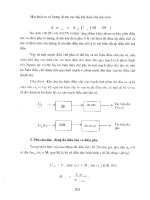
When we examine a cusum chart, we would wish that a major change –
such as a change of 2SE in sample mean – shows clearly, yet not so obtusely
that the cusum graph is oscillating wildly following normal variation. This
requirement may be met by arranging the scales such that a shift in sample
mean of 2SE is represented on the chart by ca 45° slope. This is shown in
Figure 9.3. It requires that the distance along the horizontal axis which
represents one sample plot is approximately the same as that along the vertical
axis representing 2SE. An example should clarify the explanation.
In Chapter 6, we examined a process manufacturing steel rods. Data on rod
lengths taken from 25 samples of size four had the following
characteristics:
Grand or Process Mean Length, X = 150.1 mm
Mean Sample Range, R = 10.8 mm.
We may use our simple formula from Chapter 6 to provide an estimate of the
process standard deviation, :
= R/d
n
where d
n
is Hartley’s Constant
= 2.059 for sample size n =4
Hence, = 10.8/2.059 = 5.25 mm.
This value may in turn be used to calculate the standard error of the
means:
Figure 9.3 Slope of cusum chart for a change of 2SE in sample mean
Cumulative sum (cusum) charts 233
SE = /
ͱස
n
SE = 5.25
ͱස
4 = 2.625
and 2SE = 2 ϫ 2.625 = 5.25 mm.
We are now in a position to set the vertical and horizontal scales for the cusum
chart. Assume that we wish to plot a sample result every 1 cm along the
horizontal scale (abscissa) – the distance between each sample plot is 1 cm.
To obtain a cusum slope of ca 45° for a change of 2SE in sample mean,
1 cm on the vertical axis (ordinate) should correspond to the value of 2SE or
thereabouts. In the steel rod process, 2SE = 5.25 mm. No one would be happy
plotting a graph which required a scale 1 cm = 5.25 mm, so it is necessary to
round up or down. Which shall it be?
Guidance is provided on this matter by the scale ratio test. The value of the
scale ratio is calculated as follows:
Scale ratio =
Linear distance between plots along abscissa
Linear distance representing 2SE along ordinate
.
Figure 9.4 Scale key for cusum plot
234 Cumulative sum (cusum) charts
The value of the scale ratio should lie between 0.8 and 1.5. In our example if
we round the ordinate scale to 1 cm = 4 mm, the following scale ratio will
result:
Linear distance between plots along abscissa = 1 cm
Linear distance representing 2SE (5.25 mm) = 1.3125 cm
and scale ratio = 1 cm/1.3125 cm = 0.76.
This is outside the required range and the chosen scales are unsuitable.
Conversely, if we decide to set the ordinate scale at 1 cm = 5 mm, the scale
Table 9.3 Cusum values of sample means (n = 4) for steel rod cutting process
Sample
number
Sample mean,
x (mm)
(x – t) mm
(t = 150.1 mm)
Sr
1 148.50 –1.60 –1.60
2 151.50 1.40 –0.20
3 152.50 2.40 2.20
4 146.00 –4.10 –1.90
5 147.75 –2.35 –4.25
6 151.75 1.65 –2.60
7 151.75 1.65 –0.95
8 149.50 –0.60 –1.55
9 154.75 4.65 3.10
10 153.00 2.90 6.00
11 155.00 4.90 10.90
12 159.00 8.90 19.80
13 150.00 –0.10 19.70
14 154.25 4.15 23.85
15 151.00 0.90 24.75
16 150.25 0.15 24.90
17 153.75 3.65 28.55
18 154.00 3.90 32.45
19 157.75 7.65 40.10
20 163.00 12.90 53.00
21 137.50 –12.60 40.40
22 147.50 –2.60 37.80
23 147.50 –2.60 35.20
24 152.50 2.40 37.60
25 155.50 5.40 43.00
26 159.00 8.90 51.90
27 144.50 –5.60 46.30
28 153.75 3.65 49.95
29 155.00 4.90 54.85
30 158.50 8.40 63.25
Cumulative sum (cusum) charts 235
ratio becomes 1 cm/1.05 cm = 0.95, and the scales chosen are acceptable.
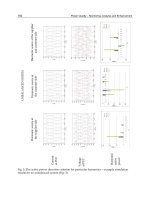
Having designed the cusum chart for variables, it is usual to provide a key
showing the slope which corresponds to changes of two and three SE (Figure
9.4). A similar key may be used with simple cusum charts for attributes. This
is shown in Figure 9.2.
We may now use the cusum chart to analyse data. Table 9.3 shows the sample
means from 30 groups of four steel rods, which were used in plotting the mean
chart of Figure 9.5a (from Chapter 5). The process average of 150.1 mm has
Figure 9.5 Shewhart and cusum charts for means of steel rods
236 Cumulative sum (cusum) charts
been subtracted from each value and the cusum values calculated. The latter
have been plotted on the previously designed chart to give Figure 9.5b.
If the reader compares this chart with the corresponding mean chart certain
features will become apparent. First, an examination of sample plots 11 and 12
on both charts will demonstrate that the mean chart more readily identifies
large changes in the process mean. This is by virtue of the sharp ‘peak’ on the
chart and the presence of action and warning limits. The cusum chart depends
on comparison of the gradients of the cusum plot and the key. Secondly, the
zero slope or horizontal line on the cusum chart between samples 12 and 13
shows what happens when the process is perfectly in control. The actual
cusum score of sample 13 is still high at 19.80, even though the sample mean
(150.0 mm) is almost the same as the reference value (150.1 mm).
The care necessary when interpreting cusum charts is shown again by
sample plot 21. On the mean chart there is a clear indication that the process
has been over-corrected and that the length of rods are too short. On the cusum
plot the negative slope between plots 20 and 21 indicates the same effect, but
it must be understood by all who use the chart that the rod length should be
increased, even though the cusum score remains high at over 40 mm. The
power of the cusum chart is its ability to detect persistent changes in the
process mean and this is shown by the two parallel trend lines drawn on
Figure 9.5b. More objective methods of detecting significant changes, using
the cusum chart, are introduced in Section 9.4.
9.3 Product screening and pre-selection
Cusum charts can be used in categorizing process output. This may be for the
purposes of selection for different processes or assembly operations, or for
despatch to different customers with slightly varying requirements. To perform
the screening or selection, the cusum chart is divided into different sections of
average process mean by virtue of changes in the slope of the cusum plot.
Consider, for example, the cusum chart for rod lengths in Figure 9.5. The first 8
samples may be considered to represent a stable period of production and the
average process mean over that period is easily calculated:
⌺
8
i=1
x
i
/8 = t + (S
8
– S
0
)/8
= 150.1 + (–1.55 – 0)/8 = 149.91.
The first major change in the process occurs at sample 9 when the cusum chart
begins to show a positive slope. This continues until sample 12. Hence, the
average process mean may be calculated over that period:
Cumulative sum (cusum) charts 237
⌺
12
i=9
x
i
/4 = t + (S
12
– S
8
)/4
= 150.1 + (19.8 – (–1.55))/4 = 155.44.
In this way the average process mean may be calculated from the cusum score
values for each period of significant change.
For samples 13 to 16, the average process mean is:
⌺
16
i=13
x
i
/4 = t + (S
16
– S
12
)/4
= 150.1 + (24.9 – 19.8)/4 = 151.38.
For samples 17 to 20:
⌺
20
i=17
x
i
/4 = t + (S
20
– S
16
)/4
= 150.1 + (53.0 – 24.9)/4 = 157.13.
For samples 21 to 23:
⌺
23
i=21
x
i
/3 = t + (S
23
– S
20
)/3
= 150.1 + (35.2 – 53.0)/3 = 144.17.
For samples 24 to 30:
⌺
30
i=24
x
i
/7 = t + (S
30
– S
23
)/7
= 150.1 + (63.25 – 35.2)/7 = 154.11.
This information may be represented on a Manhattan diagram, named after its
appearance. Such a graph has been drawn for the above data in Figure 9.6. It
shows clearly the variation in average process mean over the time-scale of the
chart.
9.4 Cusum decision procedures
Cusum charts are used to detect when changes have occurred. The extreme
sensitivity of cusum charts, which was shown in the previous sections, needs
to be controlled if unnecessary adjustments to the process and/or stoppages
are to be avoided. The largely subjective approaches examined so far are not
very satisfactory. It is desirable to use objective decision rules, similar to the
238 Cumulative sum (cusum) charts
Figure 9.6 Manhattan diagram – average process mean with time
control limits on Shewhart charts, to indicate when significant changes have
occurred. Several methods are available, but two in particular have practical
application in industrial situations, and these are described here. They are:
(i) V-masks;
(ii) Decision intervals.
The methods are theoretically equivalent, but the mechanics are different.
These need to be explained.
V-masks
In 1959 G.A. Barnard described a V-shaped mask which could be
superimposed on the cusum plot. This is usually drawn on a transparent
overlay or by a computer and is as shown in Figure 9.7. The mask is placed
over the chart so that the line AO is parallel with the horizontal axis, the vertex
O points forwards, and the point A lies on top of the last sample plot. A
significant change in the process is indicated by part of the cusum plot being
covered by either limb of the V-mask, as in Figure 9.7. This should be
followed by a search for assignable causes. If all the points previously plotted
fall within the V shape, the process is assumed to be in a state of statistical
control.
The design of the V-mask obviously depends upon the choice of the lead
distance d (measured in number of sample plots) and the angle . This may be
Cumulative sum (cusum) charts 239
made empirically by drawing a number of masks and testing out each one on
past data. Since the original work on V-masks, many quantitative methods of
design have been developed.
The construction of the mask is usually based on the standard error of the
plotted variable, its distribution and the average number of samples up to the
point at which a signal occurs, i.e. the average run length properties. The
essential features of a V-mask, shown in Figure 9.8, are:
᭹ a point A, which is placed over any point of interest on the chart (this is
often the most recently plotted point);
᭹ the vertical half distances, AB and AC – the decision intervals, often
±5SE.
᭹ the sloping decision lines BD and CE – an out of control signal is
indicated if the cusum graph crosses or touches either of these lines;
᭹ the horizontal line AF, which may be useful for alignment on the chart –
this line represents the zero slope of the cusum when the process is
running at its target level;
᭹ AF is often set at 10 sample points and DF and EF at ±10SE.
The geometry of the truncated V-mask shown in Figure 9.8 is the version
recommended for general use and has been chosen to give properties broadly
similar to the traditional Shewhart charts with control limits.
Figure 9.7 V-mask for cusum chart
240 Cumulative sum (cusum) charts
Decision intervals
Procedures exist for detecting changes in one direction only. The amount of
change in that direction is compared with a predetermined amount – the
decision interval h, and corrective action is taken when that value is exceeded.
The modern decision interval procedures may be used as one- or two-sided
methods. An example will illustrate the basic concepts.
Suppose that we are manufacturing pistons, with a target diameter (t) of
10.0 mm and we wish to detect when the process mean diameter decreases –
the tolerance is 9.6 mm. The process standard deviation is 0.1 mm. We set a
reference value, k, at a point half-way between the target and the so-called
Reject Quality Level (RQL), the point beyond which an unacceptable
proportion of reject material will be produced. With a normally distributed
variable, the RQL may be estimated from the specification tolerance (T) and
the process standard deviation (). If, for example, it is agreed that no more
than one piston in 1000 should be manufactured outside the tolerance, then the
RQL will be approximately 3 inside the specification limit. So for the piston
example with the lower tolerance T
L
:
RQL
L
= T
L
+ 3
= 9.6 + 0.3 = 9.9 mm.
Figure 9.8 V-mask features
Cumulative sum (cusum) charts 241
Figure 9.9 Decision interval one-sided procedure
and the reference value is:
k
L
=(t + RQL
L
)/2
= (10.0 + 9.9)/2 = 9.95 mm.
For a process having an upper tolerance limit:
RQL
U
= T
U
– 3
and
k
U
=(RQL
U
+ t)/2.
Alternatively, the RQL may be set nearer to the tolerance value to allow a
higher proportion of defective material. For example, the RQL
L
set at T
L
+ 2
will allow ca. 2.5 per cent of the products to fall below the lower specification
limit. For the purposes of this example, we shall set the RQL
L
at 9.9 mm and
k
L
at 9.95 mm.
Cusum values are calculated as before, but subtracting k
L
instead of t from
the individual results:
Sr = ⌺
r
i=1
(x
i
– k
L
).
This time the plot of Sr against r will be expected to show a rising trend if the
target value is obtained, since the subtraction of k
L
will always lead to a
positive result. For this reason, the cusum chart is plotted in a different way.
242 Cumulative sum (cusum) charts
As soon as the cusum rises above zero, a new series is started, only negative
values and the first positive cusums being used. The chart may have the
appearance of Figure 9.9. When the cusum drops below the decision interval,
–h, a shift of the process mean to a value below k
L
is indicated. This
procedure calls attention to those downward shifts in the process average that
are considered to be of importance.
The one-sided procedure may, of course, be used to detect shifts in the
positive direction by the appropriate selection of k. In this case k will be higher
than the target value and the decision to investigate the process will be made
when Sr has a positive value which rises above the interval h.
It is possible to run two one-sided schemes concurrently to detect both
increases and decreases in results. This requires the use of two reference
values k
L
and k
U
, which are respectively half-way between the target value
and the lower and upper tolerance levels, and two decision intervals –h and h.
This gives rise to the so-called two-sided decision procedure.
Two-sided decision intervals and V-masks
When two one-sided schemes are run with upper and lower reference values,
k
U
and k
L
, the overall procedure is equivalent to using a V-shaped mask. If the
distance between two plots on the horizontal scale is equal to the distance on
the vertical scale representing a change of v, then the two-sided decision
interval scheme is the same as the V-mask scheme if:
k
U
– t = t – k
L
= v – tan
and
h = –h = dv tan = d | t – k|.
A demonstration of this equivalence is given by K.W. Kemp in Applied
Statistics (1962, p. 20).
Chapter highlights
᭹ Shewhart charts allow a decision to be made after each plot. Whilst rules
for trends and runs exist for use with such charts, cumulating process data
can give longer term information. The cusum technique is a method of
analysis in which data is cumulated to give information about longer term
trends.
᭹ Cusum charts are obtained by determining the difference between the
values of individual observations and a ‘target’ value, and cumulating
these differences to give a cusum score which is then plotted.
Cumulative sum (cusum) charts 243
᭹ When a line drawn through a cusum plot is horizontal, it indicates that the
observations were scattered around the target value; when the slope of the
cusum is positive the observed values are above the target value; when the
slope of the cusum plot is negative the observed values lie below the target
value; when the slope of the cusum plot changes the observed values are
changing.
᭹ The cusum technique can be used for attributes and variables by
predetermining the scale for plotting the cusum scores, choosing the target
value and setting up a key of slopes corresponding to predetermined
changes.
᭹ The behaviour of a process can be comprehensively described by using
the Shewhart and cusum charts in combination. The Shewhart charts are
best used at the point of control, whilst the cusum chart is preferred for a
later review of data.
᭹ Shewhart charts are more sensitive to rapid changes within a process,
whilst the cusum is more sensitive to the detection of small sustained
changes.
᭹ Various decision procedures for the interpretation of cusum plots are
possible including the use of V-masks.
᭹ The construction of the V-mask is usually based on the standard error of
the plotted variable, its distribution and the average run length (ARL)
properties. The most widely used V-mask has decision lines: ± 5SE at
sample zero ± 10SE at sample 10.
References
Barnard, G.A. (1959) ‘Decision Interval V-masks for Use in Cumulative Sum Charts’, Applied
Statistics, Vol. 1, p. 132.
Duncan, A.J. (1986) Quality Control and Industrial Statistics, 5th Edn, Irwin, Homewood IL,
USA.
Kemp, K.W. (1962) Applied Statistics, Vol. 11, p. 20.
244 Cumulative sum (cusum) charts
Discussion questions
1 (a) Explain the principles of Shewhart control charts for sample mean and
sample range, and cumulative sum control charts for sample mean and
sample range. Compare the performance of these charts.
(b) A chocolate manufacturer takes a sample of six boxes at the end of
each hour in order to verify the weight of the chocolates contained
within each box. The individual chocolates are also examined visually
during the check-weighing and the various types of major and minor
faults are counted.
The manufacturer equates 1 major fault to 4 minor faults and accepts a
maximum equivalent to 2 minor physical faults/chocolate, in any box.
Each box contains 24 chocolates.
Discuss how the cusum chart techniques can be used to monitor the
physical defects. Illustrate how the chart would be set up and used.
2 In the table below are given the results from the inspection of filing
cabinets for scratches and small indentations.
Cabinet No. 1 2 3 4 5 6 7 8
Number of Defects 1 0 3 6 3 3 4 5
Cabinet No. 9 10 11 12 13 14 15 16
Number of Defects 10 8 4 3 7 5 3 1
Cabinet No. 17 18 19 20 21 22 23 24 25
Number of Defects 4 1 1 1 0 4 5 5 5
Plot the data on a suitably designed cusum chart and comment on the
results.
(See also Chapter 8, Discussion question 7)
Cumulative sum (cusum) charts 245
3 The following record shows the number of defective items found in a
sample of 100 taken twice per day.
Sample
number
Number of
defectives
Sample
number
Number of
defectives
14212
22221
34230
43243
52252
66260
73271
81283
91290
10 5 30 3
11 4 31 0
12 4 32 2
13 1 33 1
14 2 34 1
15 1 35 4
16 4 36 0
17 1 37 2
18 0 38 3
19 3 39 2
20 4 40 1
Set up and plot a cusum chart. Interpret your findings. (Assume a target
value of 2 defectives.)
(See also Chapter 8, Discussion question 5)
246 Cumulative sum (cusum) charts
4 The table below gives the average width (mm) for each of 20 samples of
five panels. Also given is the range (mm) of each sample.
Sample
number
Mean Range Sample
number
Mean Range
1 550.8 4.2 11 553.1 3.8
2 552.7 4.2 12 551.7 3.1
3 553.9 6.7 13 561.2 3.5
4 555.8 4.7 14 554.2 3.4
5 553.8 3.2 15 552.3 5.8
6 547.5 5.8 16 552.9 1.6
7 550.9 0.7 17 562.9 2.7
8 552.0 5.9 18 559.4 5.4
9 553.7 9.5 19 555.8 1.7
10 557.3 1.9 20 547.6 6.7
Design cumulative sum (cusum) charts to control the process. Explain the
differences between these charts and Shewhart charts for means and
ranges.
(See also Chapter 6, Discussion question 10)
5 Shewhart charts are to be used to maintain control on dissolved iron
content of a dyestuff formulation in parts per million (ppm). After 25
subgroups of 5 measurements have been obtained,
⌺
i=25
i=1
x
i
= 390 and ⌺
i=25
i=1
R
i
= 84,
where x
i
= mean of ith subgroup;
R
i
= range of ith subgroup.
Design appropriate cusum charts for control of the process mean and
sample range and describe how the charts might be used in continuous
production for product screening.
(See also Chapter 6, Worked example 2)
Cumulative sum (cusum) charts 247
6 The following data were obtained when measurements were made on the
diameter of steel balls for use in bearings. The mean and range values of
sixteen samples of size 5 are given in the table:
Sample
number
Mean dia.
(0.001 mm)
Sample
range (mm)
Sample
number
Mean dia.
(0.001 mm)
Sample
range (mm)
1 250.2 0.005 9 250.4 0.004
2 251.3 0.005 10 250.0 0.004
3 250.4 0.005 11 249.4 0.0045
4 250.2 0.003 12 249.8 0.0035
5 250.7 0.004 13 249.3 0.0045
6 248.9 0.004 14 249.1 0.0035
7 250.2 0.005 15 251.0 0.004
8 249.1 0.004 16 250.6 0.0045
Design a mean cusum chart for the process and plot the results on the
chart.
Interpret the cusum chart and explain briefly how it may be used to
categorize production in pre-selection for an operation in the assembly of
the bearings.
7 Middshire Water Company discharges effluent, from a sewage treatment
works, into the River Midd. Each day a sample of discharge is taken and
analysed to determine the ammonia content. Results from the daily
samples, over a 40 day period, are given in the table on the next page.
(a) Examine the data using a cusum plot of the ammonia data. What
conclusions do you draw concerning the ammonia content of the
effluent during the 40 day period?
(b) What other techniques could you use to detect and demonstrate
changes in ammonia concentration. Comment on the relative merits of
these techniques compared to the cusum plot.
(c) Comment on the assertion that ‘the cusum chart could detect changes
in accuracy but could not detect changes in precision’.
(See also Chapter 7, Discussion question 6)
8 Small plastic bottles are made from preforms supplied by Britanic
Polymers. It is possible that the variability in the bottles is due in part to
the variation in the preforms. Thirty preforms are sampled from the
248 Cumulative sum (cusum) charts
Ammonia content
Day Ammonia
(ppm)
Temperature
(°C)
Operator
1 24.1 10 A
2 26.0 16 A
3 20.9 11 B
4 26.2 13 A
5 25.3 17 B
6 20.9 12 C
7 23.5 12 A
8 21.2 14 A
9 23.8 16 B
10 21.5 13 B
11 23.0 10 C
12 27.2 12 A
13 22.5 10 C
14 24.0 9 C
15 27.5 8 B
16 29.1 11 B
17 27.4 10 A
18 26.9 8 C
19 28.8 7 B
20 29.9 10 A
21 27.0 11 A
22 26.7 9 C
23 25.1 7 C
24 29.6 8 B
25 28.2 10 B
26 26.7 12 A
27 29.0 15 A
28 22.1 12 B
29 23.3 13 B
30 20.2 11 C
31 23.5 17 B
32 18.6 11 C
33 21.2 12 C
34 23.4 19 B
35 16.2 13 C
36 21.5 17 A
37 18.6 13 C
38 20.7 16 C
39 18.2 11 C
40 20.5 12 C
Cumulative sum (cusum) charts 249
extruder at Britanic Polymers, one preform every five minutes for two and
a half hours. The weights of the preforms are (g).
32.9 33.7 33.4 33.4 33.6 32.8 33.3 33.1 32.9 33.0
33.2 32.8 32.9 33.3 33.1 33.0 33.7 33.4 33.5 33.6
33.2 33.8 33.5 33.9 33.7 33.4 33.5 33.6 33.2 33.6
(The data should be read from left to right along the top row, then the
middle row, etc.)
Carry out a cusum analysis of the preform weights and comment on the
stability of the process.
9 The data given below are taken from a process of acceptable mean value
µ
0
= 8.0 and unacceptable mean value µ
1
= 7.5 and known standard
deviation of 0.45.
Sample number x Sample number x
1 8.04 11 8.11
2 7.84 12 7.80
3 8.46 13 7.86
4 7.73 14 7.23
5 8.44 15 7.33
6 7.50 16 7.30
7 8.28 17 7.67
8 7.62 18 6.90
9 8.33 19 7.38
10 7.60 20 7.44
Plot the data on a cumulative sum chart, using any suitable type of chart
with the appropriate correction values and decision procedures.
What are the average run lengths at µ
0
and µ
1
for your chosen decision
procedure?
10 A cusum scheme is to be installed to monitor gas consumption in a
chemical plant where a heat treatment is an integral part of the process.
The engineers know from intensive studies that when the system is
operating as it was designed the average amount of gas required in a
period of eight hours would be 250 therms, with a standard deviation of 25
therms.
250 Cumulative sum (cusum) charts
The following table shows the gas consumption and shift length for 20
shifts recently.
Shift number Hours
operation (H)
Gas
consumption (G)
1 8 256
24 119
3 8 278
4 4 122
5 6 215
6 6 270
7 8 262
8 8 216
9 3 103
10 8 206
11 3 83
12 8 214
13 3 95
14 8 234
15 8 266
16 4 150
17 8 284
18 3 118
19 8 298
20 4 138
Standardize the gas consumption to an eight-hour shift length, i.e.
standardized gas consumption X is given by
X =
G
H
ϫ 8.
Using a reference value of 250 hours construct a cumulative sum chart
based on X. Apply a selected V-mask after each point is plotted.
When you identify a significant change, state when the change
occurred, and start the cusum chart again with the same reference value of
250 therms assuming that appropriate corrective action has been taken.
Cumulative sum (cusum) charts 251
Worked examples
1 Three packaging processes
Figure 9.10 shows a certain output response from three parallel packaging
processes operating at the same time. From this chart all three processes seem
to be subjected to periodic swings and the responses appear to become closer
together with time. The cusum charts shown in Figure 9.11 confirm the
periodic swings and show that they have the same time period, so some
external factor is probably affecting all three processes. The cusum charts also
show that process 3 was the nearest to target – this can also be seen on the
individuals chart but less obviously. In addition, process 4 was initially above
target and process 5 even more so. Again, once this is pointed out, it can also
be seen in Figure 9.10. After an initial separation of the cusum plots they
remain parallel and some distance apart. By referring to the individuals plot
we see that this distance was close to zero. Reading the two charts together
gives a very complete picture of the behaviour of the processes.
2 Profits on sales
A company in the financial sector had been keeping track of the sales and the
percentage of the turnover as profit. The sales for the last 25 months had
remained relatively constant due to the large percentage of agency business.
During the previous few months profits as a percentage of turnover had been
below average and the information in Table 9.4 had been collected.
Figure 9.10 Packaging processes output response
252 Cumulative sum (cusum) charts
Figure 9.11 Cusum plot of data in Figure 9.10
Table 9.4 Profit, as percent of turnover, for each 25 months
Year 1
Month Profit %
Year 2
Month Profit %
January 7.8 January 9.2
February 8.4 February 9.6
March 7.9 March 9.0
April 7.6 April 9.9
May 8.2 May 9.4
June 7.0 June 8.0
July 6.9 July 6.9
August 7.2 August 7.0
September 8.0 September 7.3
October 8.8 October 6.7
November 8.8 November 6.9
December 8.7 December 7.2
January Yr 3 7.6
Cumulative sum (cusum) charts 253
After receiving SPC training, the company accountant decided to analyse
the data using a cusum chart. He calculated the average profit over the period
to be 8.0 per cent and subtracted this value from each month’s profit figure.
He then cumulated the differences and plotted them as in Figure 9.12.
The dramatic changes which took place in approximately May and
September in Year 1, and in May in Year 2 were investigated and found to be
associated with the following assignable causes:
May Year 1 Introduction of ‘efficiency’ bonus payment scheme.
September Year 1 Introduction of quality improvement teams.
May Year 2 Revision of efficiency bonus payment scheme.
The motivational (or otherwise) impact of managerial decisions and actions
often manifests itself in business performance results in this way. The cusum
technique is useful in highlighting the change points so that possible causes
may be investigated.
3 Forecasting income
The three divisions of an electronics company were required to forecast sales
income on an annual basis and update the forecasts each month. These
Figure 9.12 Cusum chart of data on profits
254 Cumulative sum (cusum) charts
forecasts were critical to staffing and prioritizing resources in the
organization.
Forecasts were normally made one year in advance. The one month forecast
was thought to be reasonably reliable. If the three month forecast had been
reliable, the material scheduling could have been done more efficiently. Table
9.5 shows the three month forecasts made by the three divisions for 20
consecutive months. The actual income for each month is also shown.
Examine the data using the appropriate techniques.
Solution
The cusum chart was used to examine the data, the actual sales being
subtracted from the forecast and the differences cumulated. The resulting
cusum graphs are shown in Figure 9.13. Clearly there is a vast difference in
forecasting performance of the three divisions. Overall, division B is under-
forecasting resulting in a constantly rising cusum. A and C were generally
over-forecasting during months 7 to 12 but, during the latter months of the
period, their forecasting improved resulting in a stable, almost horizontal line
Table 9.5 Three month income forecast (unit ϫ 1000) and actual (unit ϫ 1000)
Month Division A
Forecast Actual
Division B
Forecast Actual
Division C
Forecast Actual
1 200 210 250 240 350 330
2 220 205 300 300 420 430
3 230 215 130 120 310 300
4 190 200 210 200 340 345
5 200 200 220 215 320 345
6 210 200 210 190 240 245
7 210 205 230 215 200 210
8 190 200 240 215 300 320
9 210 220 160 150 310 330
10 200 195 340 355 320 340
11 180 185 250 245 320 350
12 180 200 340 320 400 385
13 180 240 220 215 400 405
14 220 225 230 235 410 405
15 220 215 320 310 430 440
16 220 220 320 315 330 320
17 210 200 230 215 310 315
18 190 195 160 145 240 240
19 190 185 240 230 210 205
20 200 205 130 120 330 320
Cumulative sum (cusum) charts 255
cusum plot. Periods of improved performance such as this may be useful in
identifying the causes of the earlier over-forecasting and the generally poor
performance of division B’s forecasting system. The points of change in slope
may also be useful indicators of assignable causes, if the management system
can provide the necessary information.
Other techniques useful in forecasting include the moving mean and
moving range charts and exponential smoothing (see Chapter 7).
4 Herbicide ingredient (see also Chapter 8, Worked example 2)
The active ingredient in a herbicide is added in two stages. At the first stage
160 litres of the active ingredient is added to 800 litres of the inert ingredient.
To get a mix ratio of exactly 5 to 1 small quantities of either ingredient are
then added. This can be very time-consuming as sometimes a large number of
additions are made in an attempt to get the ratio just right. The recently
appointed Mixing Manager has introduced a new procedure for the first
mixing stage. To test the effectiveness of this change he recorded the number
of additions required for 30 consecutive batches, 15 with the old procedure
and 15 with the new. Figure 9.14 is a cusum chart based on these data.
What conclusions would you draw from the cusum chart in Figure 9.14?
Figure 9.13 Cusum charts of forecast v. actual sales for three divisions
256 Cumulative sum (cusum) charts
Solution
The cusum in Figure 9.14 uses a target of 4 and shows a change of slope at
batch 15. The V-mask indicates that the means from batch 15 are significantly
different from the target of 4. Thus the early batches (1–15) have a horizontal
plot. The V-mask shows that the later batches are significantly lower on
average and the new procedure appears to give a lower number of
additions.
Figure 9.14 Herbicide additions