Professionali Phone and iPod touch Programming phần 7 pdf
Bạn đang xem bản rút gọn của tài liệu. Xem và tải ngay bản đầy đủ của tài liệu tại đây (872.36 KB, 32 trang )
Chapter 7: Integrating with iPhone Services
168
When the address shown previously is located in Google Maps, the marker is generically labeled 1000
Massachusetts Ave Boston MA
. However, you can specify a custom label by appending the URL with
+(Label+Text) , as shown in the following example:
<a href=” />+Armitage’s+Office)”>Jack Armitage’s Office</a>
Figure 7-10 shows the custom label in Google Maps.
Figure 7-10: Customizing the Google Maps label
You can specify a location using latitude and longitude coordinates as well:
<a href=” Summer Retreat</a>
c07.indd 168c07.indd 168 12/7/07 2:53:46 PM12/7/07 2:53:46 PM
Chapter 7: Integrating with iPhone Services
169
To get directions, use the saddr= parameter to indicate the starting address and daddr= parameter to
specify the destination address, as shown in the following example:
<a href=” />+Boston,+MA”>Directions To Office</a>
Figure 7-11 displays the map view when this link is clicked.
Figure 7-11: Programming driving directions
Google Maps on its public Web site has an extensive set of parameters. However, except where noted
previously, none of these are supported at this time. You cannot, for example, use the
t= parameter to
specify the Satellite map, the
z= parameter to indicate the map zoom level, or even layer=t to turn on
the Traffic display. The user needs to perform those steps interactively.
c07.indd 169c07.indd 169 12/7/07 2:53:47 PM12/7/07 2:53:47 PM
Chapter 7: Integrating with iPhone Services
170
In order to add Google Maps integration with iProspector, two new capabilities need to be added to its
Contact panel. First, multiline, read-only address information needs to be displayed in its own box.
Second, a new action button style needs to be created to emulate the button functionality of the native
iPhone Contact UI.
Creating a Contacts Address Box
To define an address box, define a div with a new style named rowCuiAddressBox . Inside of it, add a
cui label and then cui p elements for each line of the address:
<fieldset>
<div class=”rowCuiAddressBox”>
<label class=”cui”>work</label>
<p class=”cui”>1520 Main Street</p>
<p class=”cui”>Boston, MA 01210</p>
</div>
</fieldset>
Next, going back to cui.css, four new styles need to be defined:
.rowCuiAddressBox {
position: relative;
min-height: 24px;
border-bottom: 1px solid #999999;
-webkit-border-radius: 0;
text-align: left;
}
.rowCuiAddressBox > p.cui {
box-sizing: border-box;
margin: 0;
border: none;
text-align: left;
padding: 2px 10px 0 80px;
height: 30px;
background: none;
font-weight: bold;
}
fieldset > .rowCuiAddressBox:first-child {
padding-top: 12px;
border-bottom: none !important;
}
fieldset > .rowCuiAddressBox:last-child {
min-height: 25px;
text-align: left;
border-bottom: none !important;
}
c07.indd 170c07.indd 170 12/7/07 2:53:47 PM12/7/07 2:53:47 PM
Chapter 7: Integrating with iPhone Services
171
The :first-child and :last-child styles are used to ensure proper padding and sizing of the
contents of the box.
To style the address box label, one additional selector needs to be added onto the previously defined
.row > label.cui rule:
.row > label.cui, .rowCuiAddressBox > label.cui {
position: absolute;
margin: 0 0 0 14px;
line-height: 42px;
font-weight: bold;
color: #7388a5;
}
The display-only address box is now ready.
Creating Service Buttons
Two new links are needed to add Google Maps integration. One link will display a map of the contact
and a second will provide driving directions. Here is the
fieldset definition:
<fieldset>
<div class=”row”>
<a class=”cuiServiceButton” target=”_self”
href=” To
Office</a>
</div>
<div class=”row”>
<a class=”cuiServiceButton” target=”_self”
href=” />+Boston,+MA”>Directions To Office</a>
</div>
</fieldset>
These two links are assigned to the cuiServiceButton class. The first link displays a map of the
specified address in Boston, while the second link provides driving directions between Holden, MA
and the Boston address. Once again, to get around the way iUI handles events in iui.jss, you need to
specify the
target=”_self” parameter.
Back over in cui.css, one new style needs to be added:
.cuiServiceButton {
display: block;
margin: 0;
border: none;
padding: 12px 10px 0 0px;
(continued)
c07.indd 171c07.indd 171 12/7/07 2:53:47 PM12/7/07 2:53:47 PM
Chapter 7: Integrating with iPhone Services
172
text-align: center;
font-weight: bold;
text-decoration: inherit;
height: 42px;
color: #7388a5;
box-sizing: border-box;
}
This style emulates the look of the action buttons (centered blue text, and so on) in the native iPhone
Contact UI.
There is one final tweak that needs to be made to iui.jss before the
cuiServiceButton links work as
expected. If you recall, an
else if condition is added to trap for service links inside of the
addEventListener( “click”, event(function) ) function. You need to add an additional test so
that both
cuiServiceLink and cuiServiceButton classes are evaluated. To do so, modify the line of
code as specified here:
else if ( (link.getAttribute(“class”) == “cuiServiceLink” ) ||
( link.getAttribute(“class”) == “cuiServiceButton”) )
Now that the cuiServiceButton link class is ready to go, you need to add one last button to the
iProspector Contact panel to finish it off — a services button that automatically composes a reminder
email to the Contact. The following HTML code combines
mailto: link functionality and the
cuiServiceButton style:
<fieldset>
<div class=”row”>
<a class=”cuiServiceButton” target=”_self” href=”mailto:
?subject=Meeting&body=Dear Jack, I look forward to our
upcoming meeting together this Friday at 8am. Sincerely, Jason
Malone&cc=”>Email Reminder</a>
</div>
</fieldset>
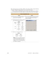
Figure 7-12 shows the display of these cuiServiceButton links inside of iProspector.
The iProspector Contact panel is now fully enabled to emulate both the look and functionality of the
built-in iPhone Contact UI.
Listing 7-1 displays the prospector.html file, Listing 7-2 displays the cui.css file, and Listing 7-3 displays
the modified function block inside of iui.jss.
(continued)
c07.indd 172c07.indd 172 12/7/07 2:53:47 PM12/7/07 2:53:47 PM
Chapter 7: Integrating with iPhone Services
173
Listing 7-1: prospector.html
<!DOCTYPE html PUBLIC “-//W3C//DTD XHTML 1.0 Strict//EN”
“ /><html xmlns=” /><head>
<title>iProspector</title>
<meta name=”viewport” content=”width=320; initial-scale=1.0; maximum-scale=1.0;
user-scalable=0;”/>
<style type=”text/css” media=”screen”>@import “ /iui/iui.css”;</style>
<style type=”text/css” media=”screen”>@import “ /iui/cui.css”;</style>
<script type=”application/x-javascript” src=” /iui/iui.js”></script>
</head>
<body>
<! Top iUI toolbar >
<div class=”toolbar”>
<h1 id=”pageTitle”></h1>
Figure 7-12: Enabled Contact buttons that integrate
with Google Maps and Mail
(continued)
c07.indd 173c07.indd 173 12/7/07 2:53:48 PM12/7/07 2:53:48 PM
Chapter 7: Integrating with iPhone Services
174
Listing 7-1 (continued)
<a id=”backButton” class=”button” href=”#”></a>
<a class=”button” href=”#searchForm”>Search</a>
</div>
<! Top-level menu >
<! Customers, Orders, Settings, and About menus not enabled for this sample >
<ul id=”home” title=”iProspector” selected=”true”>
<li><a href=”#leads”>Sales Leads</a></li>
<li><a href=”#customers”>Customers</a></li>
<li><a href=”#orders”>Order Fulfillment</a></li>
<li><a href=”#settings”>Settings</a></li>
<li><a href=”#about”>About</a></li>
</ul>
<! Sales Leads menu >
<ul id=”leads” title=”Sales Leads”>
<li class=”group”>A</li>
<li><a href=”#Jack_Armitage”>Jack Armitage</a></li>
<li><a href=”#Jason_Armstrong”>Jason Armstrong</a></li>
<li class=”group”>B</li>
<li><a href=”#Bob_Balancia”>Bob Balancia</a></li>
<li><a href=”#Sara_Billingsly”>Sara Billingsly</a></li>
<li><a href=”#Uri_Bottle”>Uri Bottle</a></li>
<li><a href=”#Larry_Brainlittle”>Larry Brainlittle</a></li>
<li class=”group”>C</li>
<li><a href=”#Carl Carlsson”>Carl Carlsson</a></li>
<li><a href=”#John_Charleston”>John Charleston</a></li>
<li class=”group”>D</li>
<li><a href=”#Bill_Drake”>Bill Drake</a></li>
<li><a href=”#Randy_Dulois”>Randy Dulois</a></li>
</ul>
<! Contact panel >
<div id=”Jack_Armitage” title=”Contact” class=”panel”>
<div class=”cuiHeader”>
<img class=”cui” src=”jackarmitage.png”/>
<h1 class=”cui”>Jack Armitage</h1>
<h2 class=”cui”>IBM Corp.</h2>
</div>
<fieldset>
<div class=”row”>
<label class=”cui”>office</label>
<a class=”cuiServiceLink” target=”_self” href=”tel:(765) 555-1212”
onclick=”return (navigator.userAgent.indexOf(‘iPhone’) != -1)”>(765) 555-1212</a>
</div>
<div class=”row”>
<label class=”cui”>mobile</label>
<a class=”cuiServiceLink” target=”_self” href=”tel:(765) 545-1211”
onclick=”return (navigator.userAgent.indexOf(‘iPhone’) != -1)”>(765) 545-1211</a>
</div>
<div class=”row”>
<label class=”cui”>email</label>
<a class=”cuiServiceLink” target=”_self”
href=”mailto:” onclick=”return
(navigator.userAgent.indexOf(‘iPhone’) != -1)”></a>
</div>
c07.indd 174c07.indd 174 12/7/07 2:53:48 PM12/7/07 2:53:48 PM
Chapter 7: Integrating with iPhone Services
175
</fieldset>
<fieldset>
<div class=”rowCuiAddressBox”>
<label class=”cui”>work</label>
<p class=”cui”>1520 Main Street</p>
<p class=”cui”>Boston, MA 01210</p>
</div>
</fieldset>
<fieldset>
<div class=”row”>
<a class=”cuiServiceButton” target=”_self”
href=” To
Office</a>
</div>
<div class=”row”>
<a class=”cuiServiceButton” target=”_self”
href=” />+Boston,+MA”>Directions To Office</a>
</div>
</fieldset>
<fieldset>
<div class=”row”>
<a class=”cuiServiceButton” target=”_self” onclick=”return
(navigator.userAgent.indexOf(‘iPhone’) != -1)”href=”mailto:?subject
=Meeting&body=Dear Jack,<br/>I look forward to our upcoming meeting together
<strong>this Friday at 8am.</strong><br/>Sincerely,<br/>Jason Malone&cc=jason@
iphogcorp.com”>Email Reminder</a>
</div>
</fieldset>
</div>
<! iUI Search form >
<form id=”searchForm” class=”dialog” action=”search.php”>
<fieldset>
<h1>Contact Search</h1>
<a class=”button leftButton” type=”cancel”>Cancel</a>
<a class=”button blueButton” type=”submit”>Search</a>
<label>Name:</label>
<input type=”text” name=”name”/>
<label>Company:</label>
<input type=”text” name=”company”/>
</fieldset>
</form>
</body>
</html>
Listing 7-2: cui.css
/* cui Contacts Extension to Joe Hewitt’s iUI */
/* Contact Header */
.panel h1.cui {
margin: 5px 0 0px 80px;
font-size: 20px;
font-weight: bold;
(continued)
c07.indd 175c07.indd 175 12/7/07 2:53:48 PM12/7/07 2:53:48 PM
Chapter 7: Integrating with iPhone Services
176
Listing 7-2 (continued)
color: black;
text-shadow: rgba(255, 255, 255, 0.75) 2px 2px 0;
top: 5px;
clear: none;
}
.panel h2.cui {
margin: 0 0 30px 80px;
font-size: 14px;
font-weight: normal;
color: black;
text-shadow: rgba(255, 255, 255, 0.75) 2px 2px 0;
top: 43px;
clear: none;
}
.panel img.cui {
margin: 0px 15px 5px 0px;
border: 1px solid #666666;
float: left;
-webkit-border-radius: 5px;
}
.panel > div.cuiHeader {
position: relative;
margin-bottom: 0px 0px 10px 14px;
}
/* Contact Fields */
.row > label.cui, .rowCuiAddressBox > label.cui {
position: absolute;
margin: 0 0 0 14px;
line-height: 42px;
font-weight: bold;
color: #7388a5;
}
.cuiServiceLink {
display: block;
margin: 0;
border: none;
padding: 12px 10px 0 80px;
text-align: left;
font-weight: bold;
text-decoration: inherit;
height: 42px;
color: inherit;
box-sizing: border-box;
}
.cuiServiceButton {
display: block;
margin: 0;
border: none;
padding: 12px 10px 0 0px;
text-align: center;
font-weight: bold;
text-decoration: inherit;
c07.indd 176c07.indd 176 12/7/07 2:53:48 PM12/7/07 2:53:48 PM
Chapter 7: Integrating with iPhone Services
177
height: 42px;
color: #7388a5;
box-sizing: border-box;
}
a[cuiSelected], a:active {
background-color: #194fdb !important;
color: #FFFFFF !important;
}
.row[cuiSelected] {
position: relative;
min-height: 42px;
border-bottom: 1px solid #999999;
-webkit-border-radius: 0;
text-align: right;
background-color: #194fdb !important;
color: #FFFFFF !important;
}
.row[cuiSelected] > label.cui {
position: absolute;
margin: 0 0 0 14px;
line-height: 42px;
font-weight: bold;
color: #FFFFFF;
}
fieldset > .row[cuiSelected]:last-child {
border-bottom: none !important;
}
/* Contact Address Box (Display-only) */
.rowCuiAddressBox {
position: relative;
min-height: 24px;
border-bottom: 1px solid #999999;
-webkit-border-radius: 0;
text-align: left;
}
.rowCuiAddressBox > p.cui {
box-sizing: border-box;
margin: 0;
border: none;
text-align: left;
padding: 2px 10px 0 80px;
height: 30px;
background: none;
font-weight: bold;
}
fieldset > .rowCuiAddressBox:first-child {
padding-top: 12px;
border-bottom: none !important;
}
fieldset > .rowCuiAddressBox:last-child {
min-height: 25px;
text-align: left;
border-bottom: none !important;
}
c07.indd 177c07.indd 177 12/7/07 2:53:48 PM12/7/07 2:53:48 PM
Chapter 7: Integrating with iPhone Services
178
Listing 7-3: Modified portion of iui.js
addEventListener(“click”, function(event)
{
var link = findParent(event.target, “a”);
if (link)
{
function unselect() { link.removeAttribute(“selected”); }
if (link.href && link.hash && link.hash != “#”)
{
link.setAttribute(“selected”, “true”);
iui.showPage($(link.hash.substr(1)));
setTimeout(unselect, 500);
}
// Begin cui insertion
else if ( (link.getAttribute(“class”) == “cuiServiceLink” ) || ( link
.getAttribute(“class”) == “cuiServiceButton”) )
{
var curRow = findParent( link, “div” );
curRow.setAttribute(“cuiSelected”, “true”);
setTimeout(function() {
curRow.removeAttribute(“cuiSelected”);
}, 500);
return;
}
// End cui insertion
else if (link == $(“backButton”))
history.back();
else if (link.getAttribute(“type”) == “submit”)
submitForm(findParent(link, “form”));
else if (link.getAttribute(“type”) == “cancel”)
cancelDialog(findParent(link, “form”));
else if (link.target == “_replace”)
{
link.setAttribute(“selected”, “progress”);
iui.showPageByHref(link.href, null, null, link, unselect);
}
else if (!link.target)
{
link.setAttribute(“selected”, “progress”);
iui.showPageByHref(link.href, null, null, null, unselect);
}
else
return;
}
}, true);
c07.indd 178c07.indd 178 12/7/07 2:53:49 PM12/7/07 2:53:49 PM
Enabling and Optimizing
Web Sites for iPhone
and iPod touch
Oh, the irony. On the same day that I began writing a chapter on enabling Web sites for iPhone and
iPod touch, I would realize firsthand the frustration of browsing sites that just don ’ t work with my
iPhone. My boys and I were watching the third quarter of a Monday Night Football game when
the electricity suddenly went out because of a town - wide outage. Because my son ’ s favorite team
was playing, he was frantic. What ’ s happening in the game? Are the Titans still winning? I immediately
pulled out my iPhone and confidently launched Mobile Safari in search of answers. But upon
going to NFL.com, I discovered that its live updating scoreboard is Flash only. I was left with a
gray box with a Lego - like block in its place. I then pointed the browser to the official Tennessee
Titans site, only to discover useless Lego blocks scattered across its front page as well. We then
spent the rest of the outage scouring the Web, looking for a site to help us.
If you manage a Web site, Apple ’ s release of iPhone and iPod touch introduce a whole new way of
thinking in the design and development of a site. In the past, you could design a minimalist, text -
only style sheet for mobile users — fully expecting your normal Web site to be viewed only by
desktop browsers. However, expectations of iPhone and iPod touch users are not so modest. They
are expecting to view the full Web in the palm of their hands. Therefore, as you design and develop
your Web site, you will want to consider the level of support you wish to provide for these Apple
devices — whether to offer mere compatibility, device friendliness, or even a design specifically
targeting them. This chapter goes over the four tiers of enabling your Web site for Mobile Safari:
❑ Tier 1: Compatibility
❑ Tier 2: Navigation friendliness
❑ Tier 3: Device - specific style sheets
❑ Tier 4: Dedicated alternative site
c08.indd 179c08.indd 179 12/7/07 2:54:36 PM12/7/07 2:54:36 PM
Chapter 8: Enabling and Optimizing Web Sites for iPhone and iPod touch
180
Tier 1: iPhone/iPod touch Compatibility
The first tier of support for iPhone and iPod touch is simply making your Web site work for iPhone and
iPod touch. Fortunately, because Mobile Safari is a sophisticated browser, far closer in capability to a
desktop than a mobile browser, this is usually not problematic. However, there are some gotchas that
you need to avoid. These include:
❑ Flash media
❑ Java applets
❑ Scalable vector graphics (SVG)
❑ Plug - ins
❑ CSS property position:fixed
❑ JavaScript functions showModalDialog() and print() and several mouse events (see Chapter 5 )
❑ HTML element input type=”file”
Given its widespread popularity and desktop install base, Flash is the thorniest incompatibility for many
Web designers and developers. Until the iPhone ’ s release, Flash support was typically considered a
given except for a relatively small percentage of users. In fact, many designers could take it for granted
that if a user was coming to their site without Flash support, then they probably were not a target visitor
anyway and so they could either ignore them or simply refer them to the Adobe download page. How-
ever, with the release of iPhone and iPod touch, those assumptions are now invalid. Web designers are
thus forced to rethink their reliance on a technology that they had become dependent upon. Figures 8 - 1
Figure 8-1: Flash-based site that attracts desktop users . . .
c08.indd 180c08.indd 180 12/7/07 2:54:37 PM12/7/07 2:54:37 PM
Chapter 8: Enabling and Optimizing Web Sites for iPhone and iPod touch
181
Figure 8-2: . . . leaves iPhone/iPod touch users out
in the cold.
Therefore, if you plan on using Flash for an interactive portion of a page, then you should plan to
degrade gracefully to a static graphic or alternative content. At a minimum, you should at least do what
Adobe does (see Figure 8 - 3 ) in placing a disclaimer over Flash content. It ’ s not ideal, but it is better than
the Lego block. Or, if you have a Flash - driven site (such as the one shown in Figure 8 - 1 ), then you should
consider an alternative HTML site or, if warranted, even an iPhone/iPod touch – specific site.
In order to detect Flash support, one solution is to use SWFObject, an open source JavaScript library that
is used for detecting and embedding Flash content (available at
blog.deconcept.com/swfobject ).
SWFObject is not iPhone/iPod – touch specific, but encapsulates the Flash Player detection logic, making
it easy for you to degrade gracefully for Mobile Safari. For example, the following code will display a
and 8 - 2 demonstrate the harsh reality, in which a state - of - the - art Web site that looks amazing in Safari for
Mac OS X never accounts for iPhone and iPod touch users.
c08.indd 181c08.indd 181 12/7/07 2:54:37 PM12/7/07 2:54:37 PM
Chapter 8: Enabling and Optimizing Web Sites for iPhone and iPod touch
182
Figure 8-3: Adobe homepage
Flash file for Flash - enabled desktop browsers, but will display a splash .png graphic for non - Flash
visitors, including iPhone and iPod touch users:
< !DOCTYPE html PUBLIC “-//W3C//DTD XHTML 1.0 Strict//EN”
“ >
< html xmlns=” >
< head >
< title > Company XY Home Page < /title >
< meta name=”viewport” content=”width=780” >
< script type=”text/javascript” src=”swfobject.js” > < /script >
< /head >
< body >
< div id=”splashintro” >
< a href=”more.html” > < img src=”splash_noflash.png”/ > < /a >
< /div >
c08.indd 182c08.indd 182 12/7/07 2:54:38 PM12/7/07 2:54:38 PM
Chapter 8: Enabling and Optimizing Web Sites for iPhone and iPod touch
183
< script type=”text/javascript” >
var so = new SWFObject(“csplash.swf”, “company_intro”, “300”, “240”, “8”,
“#338899”);
so.write(“splashintro”);
< /script >
< /body >
< /html >
As you can see, the swfobject.js library file is added to the homepage. When Flash is available, the script
replaces the content of the
splashintro div with Flash media. But, when Flash is not supported, then
appropriate content is substituted inside the
splashintro div .
Therefore, at a minimum, you should seek to make your Web site fully aware and compatible for Mobile
Safari users.
Tier 2: Navigation - Friendly Web Sites
Once your Web site degrades gracefully for iPhone and iPod touch users, you have achieved a base level
of support for these mobile devices. However, while a user may be able to see all of the content on a Web
site, that does not mean that it is easy for Mobile Safari users to navigate and read. A wide section of text,
for example, becomes a stumbling block for iPhone and iPod touch users to read because horizontal
scrolling is required when the user zooms in to read it. With this in mind, the second tier of support is
to structure the site in a manner that is easy for Mobile Safari to zoom and navigate.
Working with the Viewport
As mentioned in Chapter 2 , a viewport is a rectangular area of screen space within which a Web page
is displayed. It determines how content is displayed and scaled to fit onto the iPhone and iPod touch.
Using the viewport is analogous to looking at a panoramic scenic view of a mountain range through
a camera zoom lens. If you want to see the entire mountainside, then you zoom out using the wide
angle zoom. As you do so, you see everything, but the particulars of each individual mountain becomes
smaller and harder to discern. Or, if you want to see a close - up picture of one of the peaks, then you
zoom in with the Telephoto lens. Inside of the camera ’ s viewfinder, you can no longer see the range as a
whole, but the individual mountain is shown in terrific detail. The
viewport meta tag in Mobile Safari
works much the same way, allowing you to determine how much of the page to display, its zoom
factor, and whether you want the user to zoom in and out or whether they need to browse using one
scale factor.
The way in which Mobile Safari renders the page is largely based on the
width (and/or initial-scale )
property of the
viewport meta tag. With no viewport tag present, Mobile Safari will consider the Web
page it is loading as being 980 pixels in width, and then shrinks the page scaling so that the entire page
width can fit inside of the 320 - pixel viewport (see Figure 8 - 4 ). Here is the default declaration:
< meta name=”viewport” content=”width=980;user-scalable=1;”/ >
c08.indd 183c08.indd 183 12/7/07 2:54:38 PM12/7/07 2:54:38 PM
Chapter 8: Enabling and Optimizing Web Sites for iPhone and iPod touch
184
Figure 8-4: A 980px–wide Web page scaled to fit
in iPhone
Suppose your Web site is only 880 pixels wide. If you let Mobile Safari stick with its default 980 - pixel
setting, then the page is scaling more than it needs to. Therefore, to adjust the viewport magnification,
you can specify a width optimized for your site:
< meta name=”viewport” content=”width=880”/ >
Figures 8 - 5 and 8 - 6 show the noticeable difference between a 980 - and an 880 - width viewport for an
880 - pixel width site.
With this declaration, instead of trying to fit 980 pixels into the 320 pixels of width, it only needs to shrink
880 pixels. Less scaling of content is needed (.363 scale instead of .326), making the site easier to use for
iPhone and iPod touch users. Note that the
viewport meta tag will not affect the rendering of the page
in a normal desktop browser.
c08.indd 184c08.indd 184 12/7/07 2:54:38 PM12/7/07 2:54:38 PM
Chapter 8: Enabling and Optimizing Web Sites for iPhone and iPod touch
185
Figure 8-5: The default width creates empty
space on the right side.
Figure 8-6: The Viewport is adjusted to better fit the
Web page.
In addition to the width property, you can also programmatically control the scale of the viewport when
the page initially loads through the
initial-scale parameter. For example, if you wanted to set the
initial scale to be .90, the declaration would be:
< meta name=”viewport” content=”initial-scale=.9;user-scalable=1;”/ >
Once the page loads, however, the user is able to change the scale factor as they want using pinch and
double - tap gestures as long as the
user-scalable property is set to true (the default). If you want to
limit the scale range, you can use the
minimum-scale and maximum-scale properties:
< meta name=”viewport” content=”initial-scale=.9;maximum-scale=1.0;minimum-
scale=.8;user-scalable=1;”/ >
In this way, the user has the ability to pinch and zoom, but only to the extent that you want to allow.
c08.indd 185c08.indd 185 12/7/07 2:54:38 PM12/7/07 2:54:38 PM
Chapter 8: Enabling and Optimizing Web Sites for iPhone and iPod touch
186
If you develop a site or application specifically for iPhone/iPod touch, you want to size the page to the
viewport (as discussed in Chapters 2 and 3 ) by setting the
width=device-width ( device-width is a
constant) and
initial-scale=1.0 . Because the scale is 1.0, you don ’ t want the user to be able to rescale
the application interface, so the
user-scalable property should be disabled. Here ’ s the declaration:
< meta name=”viewport” content=”width=device-width; initial-scale=1.0; maximum-
scale=1.0; user-scalable=0;” >
Table 8 - 1 lists the viewport properties. You don ’ t need to set every property. Mobile Safari will infer
values based on the properties you have set.
Keep in mind that the
width attribute does not refer to the size of the Mobile Safari browser window,
but instead the perceived size of the page in which Mobile Safari shrinks down to be displayed properly
on the mobile device.
Table 8-1: viewport Meta Tag Properties
Property Default Value
Minimum
Value
Maximum
Value Description
width 980 200 10000 Width of viewport
height based on aspect
ratio
223 10000 Height of viewport
initial-scale fit to screen minimum-scale maximum-scale Scale to render when
page loads
user-scalable 1 (yes) 0 (no) 1 (yes) If yes, user can change
scale through pinch
and double-tap
minimum-scale 0.25 >0 10 Use to set the lower
end for scaling
maximum-scale 1.6 >0 10 Use to set the higher
end for scaling
Although it ’ s not generally recommended, you can specify the width of the content to be greater than the
viewport width, but that will require the user to scroll horizontally.
Note that iPhone 1.1.1 and above support two new width and height constants:
device-width (width of
device in pixels or
320 ) and device-height (height of device in pixels or 480 ).
c08.indd 186c08.indd 186 12/7/07 2:54:39 PM12/7/07 2:54:39 PM
Chapter 8: Enabling and Optimizing Web Sites for iPhone and iPod touch
187
Turning Your Page into Blocks
One of the most important ways to make your Web site friendly for iPhone and iPod touch users is turn
your Web page into a series of columns and blocks. Columns make your page readable like a newspaper
and help you avoid wide blocks of text that cause users to horizontally scroll left and right to read.
When an element is double - tapped, iPhone looks at element that is double - tapped and finds its closest
block (
div , ol , ul , table , and so on.) or image ancestor. If a block is found, then Safari zooms the con-
tent to fit the block ’ s content based on the
viewport tag ’ s width property value and then centers it. If an
image is tapped, then Mobile Safari zooms to fit the image and centers it. If already zoomed, then zoom
out occurs.
Figure 8 - 7 shows a sample page with a relatively simple structure, but one that makes it difficult for the
iPhone/iPod touch to zoom in on. The table is defined at a fixed width of 1000px, and the first column
takes up 875px of that space. The text above the table spans the full document width, but because it is
outside of any block, Mobile Safari can do no zooming when the text is double - tapped. The user is
forced to go to landscape mode and pinch to get readable text, but it still scrolls off the right of the
screen (see Figure 8 - 8 ).
Figure 8-7: Unfriendly page on page load
c08.indd 187c08.indd 187 12/7/07 2:54:39 PM12/7/07 2:54:39 PM
Chapter 8: Enabling and Optimizing Web Sites for iPhone and iPod touch
188
However, with a few simple tweaks, you can transform the page into something far easier for iPhone
and iPod touch to work with. First, you can add a
viewport meta tag to gain greater control over
the width:
< meta name=”viewport” content=”width=950”/ >
Next, you enclose the paragraph into a div block element and transform it into a column (say 50 percent
of page):
< div style=”width:50%” >
< /div >
In the real world, you would obviously want to tailor the entire page design around a more column -
based approach.
Third, you make the table to be sized by percentage (90 percent of width) rather than the fixed width
of 1000px:
< table width=”90%” border=”1” cellspacing=”1” cellpadding=”1” >
< tr >
< th width=”75%” valign=”top” scope=”col” > < div align=”center” > Column1 < /div > < /th >
< th width=”25%” valign=”top” scope=”col” > Column2 < /th >
< /tr >
< tr >
< /table >
Figure 8-8: Zooming to a cell
c08.indd 188c08.indd 188 12/7/07 2:54:39 PM12/7/07 2:54:39 PM
Chapter 8: Enabling and Optimizing Web Sites for iPhone and iPod touch
189
Figure 8-9: The text block is now readable.
Even with these rudimentary changes, the page becomes easier to browse when you double - tap the
page, as shown in Figure 8 - 9 .
Figure 8 - 10 shows the model block - based Web page that is easily navigated with double - tap and pinch
gestures of iPhone and iPod touch.
c08.indd 189c08.indd 189 12/7/07 2:54:40 PM12/7/07 2:54:40 PM
Chapter 8: Enabling and Optimizing Web Sites for iPhone and iPod touch
190
Defining Multiple Columns (Future Use)
Safari 3 and Mozilla - based browsers provide support for new CSS3 properties that enable you to create
newspaper - like, multicolumn layouts. For a content block, you can specify the number of columns,
width of the columns, and the gap between them. Because Internet Explorer does not currently support
multiple columns, these style properties are prefixed with
-webkit and -moz :
-webkit-column-count: 2;
-moz-column-count: 2;
-webkit-column-width: 200px;
-moz-column-width: 200px;
-webkit-column-gap: 13px;
-moz-column-gap: 13px;
Unfortunately, the current version of Mobile Safari does not support these properties. However, be
watching for their future support. When Mobile Safari does support multicolumns, it can offer an easy
way to transform existing content into the columnar structure that iPhone and iPod touch users love.
Tier 3: Custom iPhone/iPod touch Styles
An iPhone and iPod touch user can navigate a Tier 2 Web site with double - tap, pinch, and flick gestures,
but that does not necessarily mean that it is easy or enjoyable to do so. Panning and scrolling across the
screen can become quickly tiresome after the excitement over the “ full Web ” wears off. Users will
quickly find themselves returning to sites that provide a richer, more tailored experience for Mobile
Safari. The easiest way to do this is to create custom styles specifically for iPhone and iPod touch.
Figure 8-10: The prototype structure of an
easy-to-browse page
c08.indd 190c08.indd 190 12/7/07 2:54:40 PM12/7/07 2:54:40 PM
Chapter 8: Enabling and Optimizing Web Sites for iPhone and iPod touch
191
Media Queries
If you wish to specify a style sheet for iPhone and iPod touch usage, you can use a CSS3 media query.
iPhone and iPod touch do not support the dumbed down
handheld or print media types. Instead, iPhone
and iPod touch look for the
screen media type. You can then use the link element to set specific styles
for iPhone and iPod touch by looking only for devices that support screen and have a maximum width
of 480px:
< link media=”only screen and (max-device-width: 480px)”
rel=”stylesheet” type=”text/css” href=”iphone-ipod.css”/ >
Or, to set iPhone/iPod touch – specific styles inside a particular CSS style sheet, you could use:
@media only screen and (max-device-width: 480px) {
/* Add styles here */
}
The link element and the CSS rule would apply only to devices that have a maximum width of 480
pixels. And, for browsers that do not support the
only keyword, they will ignore the rule anyway.
However, the problem is that, under certain situations, Internet Explorer 6 and 7 fail to ignore this rule
and will render the page anyway using the iPhone/iPod touch – specific style sheet. As a result, you need
to guard against this possibility by using IE ’ s conditional comments:
< ! [if !IE] > >
< link media=”only screen and (max-device-width: 480px)”
rel=”stylesheet” type=”text/css” href=”iphone-ipod.css”/ >
< ! < ![endif] >
Internet Explorer will now ignore this link element, because the [if !IE] indicates that the enclosed
code should only be executed outside of IE.
Therefore, if you would like to have a default style sheet for normal browsers and a custom style sheet
for iPhone and iPod touch users, you would use the following combination:
< link media=”screen and (min-device-width: 481px)”
rel=”stylesheet” type=”text/css” href=”default.css”/ >
< ! [if !IE] > >
< link media=”only screen and (max-device-width: 480px)”
rel=”stylesheet” type=”text/css” href=”iphone-ipod.css”/ >
< ! < ![endif] >
Text Size Adjustment
Normally, the font size of a Web page adjusts automatically when the viewport is adjusted. For instance,
after a double - tap gesture, Mobile Safari looks at the zoomed width of the content block and adjusts the
text to zoom in proportion. This behavior makes the text easier to read for typical uses, though it can
affect absolute positioning and fixed layouts. However, if you would like to prevent the text from
resizing, then use the following CSS rule:
-webkit-text-size-adjust: none;
c08.indd 191c08.indd 191 12/7/07 2:54:40 PM12/7/07 2:54:40 PM
Chapter 8: Enabling and Optimizing Web Sites for iPhone and iPod touch
192
In general, for most Web site viewing, you will want to keep this property enabled. For iPhone/iPod
touch – specific applications in which you want more control over scaling and sizing, you will want to
disable this option.
Case Study
Consider a case study example, the Web site of Operation Classroom, a nonprofit organization doing
educational work in Africa. Keep in mind that the style sheet of each Web site will need to be optimized
in a unique manner, but this case study will demonstrate some of the common issues that will crop up.
Figure 8 - 11 displays a page from the site with a basic
viewport meta tag set at width=780 , which gives
it the best scale factor for the existing page structure. However, even when the viewport setting is
optimized, a user will still need to double - tap in order to read any of the text on the page. What ’ s more,
the top - level links are difficult to tap unless you pinch and zoom first.
Figure 8-11: The prototype structure of an
easy-to-browse page
c08.indd 192c08.indd 192 12/7/07 2:54:40 PM12/7/07 2:54:40 PM


