the focal easy guide to photoshop cs 2 phần 7 pps
Bạn đang xem bản rút gọn của tài liệu. Xem và tải ngay bản đầy đủ của tài liệu tại đây (888.98 KB, 22 trang )
Windows Print Dialog
In the Windows Print dialog, select the
appropriate printer from the printer list,
and click on Properties . . . to access
that printer’s print properties dialog.
The Properties dialog is different for
each type or printer, but almost all
printer drivers have options for media
type, print mode, and/or print quality.
Set the Paper Type option dropdown to
match the paper type you want. (You’ll
only have choices of the manufacturer’s
papers; here Epson’s “Matte Paper –
Heavyweight.”) Set the Quality option
to the highest-quality setting available.
If available set the print mode to
Automatic, Photo, or Quality.
Look for the Color Management
options for your printer; these may be
available on the Advanced page for
the printer driver. The default
Color Management option is set
Color Controls or Automatic for
many printers. This works best for
most printers. Your printer may also
have an option for ICM; this may
allow your printer-to-printer images
in color spaces other than sRGB.
Check the printer manual for details
on ICM.
Finally, click on Print to print the
image.
PRINTING
123
K52001-Ch04.qxd 8/19/05 2:18 PM Page 123
THE FOCAL EASY GUIDE TO PHOTOSHOP CS2
124
In the Printer driver dialog, select the paper or media to exactly match the
paper you are using, set the driver to print the highest quality, and set the
printer’s Color Management to Color Controls or Automatic. You might also use
ColorSync or ICM for color management.
Online Printing Services
Online printing services allow you to upload your images via the Internet and
have high-quality prints made onto traditional photographic media. Online
printing services have some great advantages: they produce images with the
look and feel of traditional photos, they’re generally cheaper than similar inkjet
prints, they don’t require a complex printer dialog, and they typically offer sizes
from 4Љϫ6Љ (15 cm ϫ 10 cm) up to poster size (20Љϫ30Љ). The only major
disadvantage of online printing services is the printing is somewhere other than
your desktop so takes to get the final prints.
Photoshop CS2 supports online printing directly via Adobe Photoshop Services
handled in North America and Europe by Kodak EasyShare Gallery. Similar
services are available in other parts of the world.
Kodak EasyShare is an excellent example of a consumer online service. Prints
from Kodak EasyShare can be excellent if you conform to their requirements.
To print with Kodak EasyShare, an image must be saved as a Jpeg file in the sRGB
color space. If your image is already a Jpeg file in sRGB, you can skip to Step 5:
1 To duplicate your image select
Image>Duplicate Image…
Give the duplicate image a simple
name – “my image web print,” for
example. If your image has layers, select the option Duplicate Merged
Layers Only.
2 Make sure your image is in the sRGB color space (to convert to sRGB, see
page 107).
3 Make sure your image is set to 8 Bits per channel to make a Jpeg file.
Select Image>Mode>8 Bits/Channel.
K52001-Ch04.qxd 8/19/05 2:18 PM Page 124
4 Save your image as a Jpeg file, select File>Save As…, set Format to Jpeg
and click OK. In the Jpeg properties dialog, set quality to 9 – “High.”
5 Send a single file to print online by selecting File>Print Online in
Photoshop. But more often, you want to save a set of images and print
them all together. Once you have a set of images ready, open Adobe
Bridge by selecting File>Browse…
In Adobe Bridge, select the
images you want to print
online, and then select
Tools>Photoshop
Services>Photo Prints…
This opens the Kodak
EasyShare Gallery and loads
your images. (The first time
you access Photoshop
Services you need to register
with them, i.e., supply some
basic information and create
a login id and password.) Within Kodak EasyShare, merely select the prints for
each image and check out. If you made sure your images were in the correct
format, excellent images will arrive in a few days.
PRINTING
125
K52001-Ch04.qxd 8/19/05 2:18 PM Page 125
THE FOCAL EASY GUIDE TO PHOTOSHOP CS2
126
Advanced Printing
The main focus of advanced printing is printing with printer profiles designed
specifically for your printer and paper. The main advantage of printing with
profiles is a more precise match between monitor and printer right before
printing. This allows careful editing of print colors on the computer before you
print and the ability to use most or all of the color range available from your
printer. In order to print with profiles, you will need to obtain the appropriate
profiles for your printer.
Manufacturer’s profiles The easiest source of profiles is from the appropriate
paper manufacturer (including the printer manufacturer for the papers that they
sell for that printer). Printer profiles are widely available for a modest number of
photo printers on the web sites of a number of paper manufacturers. Many make
excellent profiles for their papers and a number of printers popular with
professional print makers. Epson, Ilford, Kodak, Legion Paper, Red River Paper,
Pictorico, and others provide printer profiles for their papers via the Internet. And
often the paper box provides a web site for profiles. You need to obtain profiles
for your specific printer model and paper type. Usually, profiles are only
available for the printer manufacturer’s inks, but if the printer can use multiple
types of ink (like the Epson 2200 or R2400 printers), be careful about which inks
you use. Additionally, find specific instructions for each profile on configuring
the printer driver. If the driver settings are not configured on your computer the
same as the instructions for the printer profile, the profile won’t print properly.
Custom profiles You can also have custom profiles made for you by a
professional profile service. These have some good advantages but cost money.
A quick Google for “custom printer profiles” found several services for around
US$40/€30. These companies provide a test target and instructions on how to
best print this target. Once you print the target, snail mail the physical target to
the profile service and they e-mail you the specific profile. Purchase a profile for
each paper type you’ll be using.
Installing profiles Once you download the profiles, you need to install them.
Some of the manufacturer’s profiles include an installer that install the profile for
you, but most require you install them yourself.
K52001-Ch04.qxd 8/19/05 2:18 PM Page 126
On Mac OSX, copy the profiles to the appropriate directory. If you
have admin privileges for your computer (most users running
their own desktop computers have admin privileges), use the
<drive>/Library/ColorSync/Profiles folder. Just move the profile
files to this location. If you don’t have admin privileges, use the
<drive>/Users/<username>/Library/ColorSync/Profiles folder.
You’ll have private access to profiles in this folder. Once installed, you’ll be able
to use these profiles from within Photoshop.
On Windows XP, install the profile by right-clicking on the
profile and selecting Install Profile from the context menu.
This action copies the profile to the appropriate directory.
Profile names Profiles can be named almost anything, but
there’s a general consensus that a good profile name includes a reference to the
printer model, paper, and ink (if appropriate). A typical Epson profile is named
“EP2200 EnhancedMatte 2880MK.icc” – the printer is EP2200 (Epson 2200), the
paper Enhanced Matte, the ink Matte Black (MK), and the printer resolution 2880
dots per inch (dpi). With some practice, understanding profile name will become
a snap.
Set Up the Proof
One advantage of printing with profiles is the ability to Soft Proof the image
before printing. Soft proofing allows Photoshop to mimic the look of the final
print on the monitor:
1 To set up soft proof,
select View>Proof
Setup>Custom…
2 For Device to
Simulate select the
printer profile for
the printer/paper
combination you’ll use to print.
PRINTING
127
Mac icc icon
K52001-Ch04.qxd 8/19/05 2:18 PM Page 127
THE FOCAL EASY GUIDE TO PHOTOSHOP CS2
128
3 Set Rendering Intent to “Relative Colorimetric.” (More on rendering
intents on the web site.)
4 Turn on Black Point Compensation. This matches the black point in your
image to the black of the ink used by the printer.
5 Use the Simulate Paper Color option to better mimic the look of the print
in the proof. Often selecting this option makes the image appear washed
out. So don’t select this option for bright white photo papers, but
definitely use it for papers that are noticeably off-white.
6 Save a proof setup you use often
by clicking the Save button. Give it
a useful name incorporating the
printer and paper names, like
“EPR2400 Prem Luster.” This name
then appears at the bottom of the
View>Proof Setup menu for easy
access in the future.
7 Photoshop now displays a soft proof of how your image will print using
this profile. There might be some minor color shifts in the print to correct
at this point. Display a new view without the soft proof by selecting
Window>Arrange>New Window… for before and after views. The title
for each view displays if a profile was applied to it.
Resolving Out of Gamut Colors
Quality profiles yield very little color shift with the “Relative Colorimetric” rendering
intent. But no profile can perfectly resolve the printing of “unprintable” colors;
that is, out of gamut colors.
Out of gamut colors simply cannot be rendered by your print on the target
paper – deal with it. If you take the trouble to print with profiles, you should work
to resolve out of gamut colors manually:
1 Display the out of gamut colors by selecting View>Gamut Warning…
As illustrated, pixels that contain colors out of gamut display with a gray
K52001-Ch04.qxd 8/19/05 2:18 PM Page 128
overlay. If no pixels
display gray, or if there
are only a few “speckles”
of gray on the image,
don’t worry about the
gamut and print the
image.
If there are large areas of
solid gray in the image,
shift these colors to
printable colors. Printing an image with large areas of out of gamut colors
results in an image with large patches of solid color.
2 Use the Replace Color tool to shift out of gamut colors. Select
Image>Adjustments>Replace Color…
3 Move the cursor
over the image and
click on one of the
large patches of
gray. This makes the
out of gamut color
the Color at the top
of the Replace
Color dialog.
4 Next, select a color
in gamut to replace
this color. Click on the color square for the Result color. This brings up the
Color Picker. Move the cursor over the image and click on a color that is
similar to the out of gamut color, but in gamut. When you click on a
replacement color, the gray of the gamut warning dramatically reduces.
Try a few colors to see which color provides the best result. Click OK to
close the dialog.
PRINTING
129
K52001-Ch04.qxd 8/19/05 2:19 PM Page 129
THE FOCAL EASY GUIDE TO PHOTOSHOP CS2
130
5 It’s important to preview the change. Select Undo/Redo (/ϩZ)
a couple of times to turn the replace color change on and off.
6 Finally, reduce
the effect of the
Replace Color
tool to as low a
value as possible.
Select Edit>
Fade Replace
Color… Reduce
the opacity of
the Fade until the
gamut warning
begins to appear
again. It’s best to
print with some gamut warning, so you’re printing right at the edge of the
gamut and taking advantage of the full range of printable colors.
It is possible that you will need to perform the Replace Color adjustment more
than once for different colors. Repeat these steps until the gray of the gamut
warning is reduced to a mere speckle.
ctrl
K52001-Ch04.qxd 8/19/05 2:19 PM Page 130
Printing with Profiles
Once you’ve adjusted the image to fix the out of gamut colors in the Soft Proof,
printing is similar to the basic printing steps:
1 Select File>Print with Preview… In the Print with Preview Dialog, select
Page Setup to access the page setup dialog, then select the appropriate
paper size and orientation.
In the Print area, select the Proof option. This also displays the profile you
set up earlier.
In the Options area, set Color Handling to No Color Management. Color
management has already been handled by the Proof setup. Finally, set
Proof Setup Preset to Current Custom Setup and turn off Simulate Paper
Color and Simulate Black Ink.
PRINTING
131
K52001-Ch04.qxd 8/19/05 2:19 PM Page 131
THE FOCAL EASY GUIDE TO PHOTOSHOP CS2
132
2 Click Print to access the Print dialogs. Once again the dialog is different
between Mac and Windows.
Mac Print Dialog
3 In the Mac Print dialog,
select the Print Settings
option to set the settings
within the printer driver.
Here you need to know
the appropriate printer
settings for the profile
you’re using. The profile
is useless without knowing
the appropriate printer
settings. Use the
instructions that came
with the profile to set up
the Print Settings options appropriately. This includes appropriate settings
for media, print quality, resolution, and color management. For most
printer profiles, set the color management options to “no color
management” – unless specified otherwise.
Finally, click on Print to print the image.
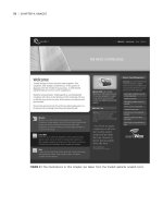
Windows Print Dialog
In the Windows Print Dialog, select the
appropriate printer from the printer list
and click on Properties . . . to access the
print properties dialog for the selected
printer:
4 Here you need to know the
appropriate printer settings for
the profile you’re using. The profile
is useless without the appropriate
K52001-Ch04.qxd 8/19/05 2:19 PM Page 132
printer settings. Use the instructions that came with the profile to set up
the Print Settings options appropriately. This includes appropriate settings
for media, print quality, resolution, and color management. For most
printer profiles, set the color management options are sent to “no color
management” – but not always.
Finally, click on Print to print the image.
PRINTING
133
K52001-Ch04.qxd 8/19/05 2:19 PM Page 133
K52001-Ch04.qxd 8/19/05 2:19 PM Page 134
CHAPTER
5
ADVANCED
OPTIONS
K52001-Ch05.qxd 8/19/05 2:23 PM Page 135
This chapter provides a location for all the advanced techniques that should be
included in a book on image editing in Photoshop because they are commonly
used. But these techniques require some advanced knowledge that is best left
until after you have a solid understanding of the basics of Photoshop.
A key for many of the tasks included in this chapter is the process of blending
layers. The next section provides a description on how layers are blended.
Examples of blending layers are included in several tasks in this chapter.
The Toning section provides important techniques for adjusting image tone
using tools other than the basic level and curves tool. These include more
precise techniques for using levels and curves, contrast masking, dodging and
burning, and shadows and highlights. These techniques can replace similar
basic adjustments provided in Chapter 3, The Image Editing Workflow.
The Color section primarily provides additional options for adjusting the color
balance of an image. A simple technique for using the Auto Color tool, and
techniques for precisely correcting known colors like grays or skin tones are
provided.
The section on Black and White (B&W) images provides techniques for converting
images from color into B&W, and a simple technique for toning B&W images to
simplify printing them.
Finally, the section on Photographic techniques provides a series of tasks that
apply different looks to the image for aesthetic effects. These include adding film
grain, adding an interesting edge, or applying Soft Focus.
Blending Layers
Finally, I include some discussion on blending layers. This is an advanced topic
on creating more sophisticated blending of layers. Some of the advanced tasks
in this book include steps that use these techniques for blending layers; this
topic should help you understand how layer blending works.
Up to this point, a layer completely replaces the pixels of the layers that lay
below it. Adjustment layers perform an adjustment on the pixels of the image,
and replace these pixels with the new, adjusted pixels. Image layers merely
replace pixels that are laid below them on the layers palette. You can use masks
that are used to define where each layer is visible.
THE FOCAL EASY GUIDE TO PHOTOSHOP CS2
136
K52001-Ch05.qxd 8/19/05 2:23 PM Page 136
A layer can also be blended with the image below.
There are two basic options for blending layers –
opacity and blending modes. Both are important for
blending layers. The default opacity for a layer is 100%.
The default blending mode for a layer is Normal – the
pixels of this layer merely replace the pixels below it.
For many cases, these values work well, but let’s
consider changing them.
You cannot change the blending mode or opacity of the Background layer.
Opacity
The opacity of a layer is easy to understand. Lowering the opacity makes the
image semi-transparent. Opacity is the opposite of transparency – a 100% opaque
layer can’t be seen through at all; at 50% opacity, the layer is 50% transparent, and
the layer blends 50/50 with the pixels below; at 0% opacity, the layer is 100%
transparent, and you can see right through the layer. Just select the top-most
layer in your image and change the opacity of the layer to play around with it.
Lowering the effect of adjustment layers Photoshop is a tool that demands
some subtlety for editing images. Even after many years working with it, I still
often make my adjustments too strong as I work through the editing process.
Opacity is a great way to “turn-down” an adjustment layer. If you decide during
the editing process that a particular adjustment layer is a bit too strong, you can
reduce it by merely reducing the opacity of that layer – an adjustment layer set to
50% opacity is essentially the same as applying the adjustment at 50%. Lowering
the opacity also works for Merged Image layers – in fact, it is great for Merged
Image layers, since it makes it easy to adjust the effect of a Merged Image layer
without having to rebuild it.
Blending affects There are some affects that work best by mixing a layer with
the image below by lowering the opacity. Typically, a Merged Image layer is
created for the current image, a Photoshop filter is applied to the image, and the
opacity is lowered to blend the filtered image with the image below the layer.
The Soft Focus affect blends a blurred image with the sharp image using the
Gaussian Blur filter and a lower opacity.
ADVANCED OPTIONS
137
K52001-Ch05.qxd 8/19/05 2:23 PM Page 137
Blending Modes
The blending model for a layer sets how the resulting
pixels in that layer blend with the pixels of layers
below it to create the resulting pixel in the final image
(what you see on the screen). The default “Normal”
blending mode merely takes the pixels of the current
layer and replaces the pixels that were below.
The various blending modes can be divided into four
basic categories: Darken, Lighten, Contrast, and Color
modes. The Darken modes make the image. The
Lighten modes make the image lighter. And the Contrast
modes make the image darker where the current layer
is darker than middle gray, or make the image lighter
where the current layer is lighter than middle gray. The
Color modes cause the current layer to only change the Hue, Saturation, Color (Hue
and Saturation), or Luminosity (density) of the image. (The Dissolve, Difference, and
Exclusion modes are used mostly for special cases.)
To understand the blending modes, you need to think of a pixel for the top layer
as having three basic components; the pixel combination of all the layers below
the current layer, the pixel generated by the current layer, and the resulting pixel
in the final image – the resulting pixel is the pixel that is actually displayed on the
screen, and is passed on upwards to other layers.
The “Normal”
blending mode is
simple. The current
layer merely replaces
the pixel of the layers
below the current
layer.
A common blending mode is “Luminosity”; this mode takes the luminosity from
pixels in the current layer and combines these with the color from the pixels
below to create a new pixel; one with the old color combined with the new
THE FOCAL EASY GUIDE TO PHOTOSHOP CS2
138
Darken
modes
Lighten
modes
Contrast
modes
Color
modes
Resulting pixel
in final image
Pixel in current
layer
Pixel below
blending layer
Normal Luminosity Multiply
Multiply
Use
luminosity
Replace
K52001-Ch05.qxd 8/19/05 2:23 PM Page 138
luminosity. The other color blending modes behave similarly, changing only
the hue, saturation, or color of the pixel.
This mode is especially useful if
you want a layer to only change the
luminosity (or density) of the image.
It is common for adjustment layers
that apply significant density
changes to also result in some
moderate color changes. A curves
adjustment layer that adds a moderate amount of contrast can also result in a
slight change in color – changing the blending mode of this curves adjustment
layer forces the layer to only change the luminosity and not change the color.
The color blending modes can be used for most common adjustment layers
that adjust brightness, contrast, color, or saturation. In general, a brightness or
contrast layer should only change luminosity (so the blending mode should be set
to luminosity); a color or saturation layer should only change color or saturation.
Another common blending mode is the “Multiply” mode – this mode takes the
pixel in the current layer and “multiplies” it with the pixel below it (don’t worry
about the actually process of multiplying). The multiple mode results in a darker
pixel than either of the original pixels. The opposite blending mode is “Screen” –
this mode takes the pixel in the current layer and “multiplies” it with the inverse
of the pixel below it. The screen mode results in a lighter pixel.
The Overlay blending mode is a compromise between lighten and darken; where
the current layer is dark, the resulting image is darker; where the current layer is
light, the resulting image is lighter.
ADVANCED OPTIONS
139
Original Contrast added
normal
Contrast added
luminosity
Original layers
Multiply blending
(darkens image)
Screen blending
(lightens image)
Overlay blending
(lightens and darkens)
K52001-Ch05.qxd 8/19/05 2:23 PM Page 139
Advanced Adjustments – Tonal
The tonal value of a pixel is merely its brightness; given this simplicity, the
adjustments to tonal value are generally very easy to perform. But this simplicity
often hides the importance of these basic adjustments; good tonal adjustments
often result in very dramatic changes to an image.
Additionally, the tone of an individual pixel is usually less important, than the
relative value to other pixels, or the tonal contrast of the image. Contrast can
apply to the overall image (the global contrast), and can apply just to nearby
pixels (local contrast) – both are key to good image editing.
Contrast is a complex idea in photography. Contrast is the juxtaposition
of differences within an image. Photographers often limit contrast to
differences in tone, but it is essential to understand the broader definition
of contrast to place it as a foundation of image design. Contrast can involve
tone, form, texture, color, saturation, focus, sharpness, or even subject
matter – all of which can help define the parts of an image. You should
keep in mind the various forms of contrast (tone, color, etc.) in your
images.
In this section, I will introduce various techniques that I use to edit the tone of
the image – these all really involve editing the tonal contrast (global and local)
of the image.
The B&W point adjustment is one of the simplest adjustments that you can
make to your images, but it is often the most important adjustment. This is
one of the most effective techniques for improving tonal contrast to your
image.
These are all techniques that I commonly perform on my images: Dodging and
Burning for quick, local edits to tone; Curves Adjustments with Locking Points to
make subtle changes to a few tones; Contrast Masking to reduce overall contrast
while maintaining apparent sharpness; Shadows and Highlights Adjustment to
maintain detail in Shadows or Highlights.
THE FOCAL EASY GUIDE TO PHOTOSHOP CS2
140
K52001-Ch05.qxd 8/19/05 2:23 PM Page 140
Precise B&W Point Adjustment
In general, all images should have full contrast, from maximum black to minimum
white. Usually, there should also be some detail in these B&W tones. The density
of maximum black should be precisely set so the shadows still retain some
density variation; I call this “nearly black”. Similarly the highlights should print
“nearly white”. The Levels tool is excellent for adjusting the image pixels to
these values precisely.
1 Create a new levels adjustment layer by selecting Layer>New
Adjustment Layer>Levels… Name this layer “B&W Points”.
2 Examine the
histogram for
your image;
ideally the
histogram will
cover the full
range of tones
from black to
white.
3 Slide the black
input slider
towards the right,
the dark pixels in
the image will turn
slightly darker.
Move the slider
over just until the
first pixels become
pure black. To do
this precisely, hold
down the / key while moving the black slider; the view of the
image will go white, with a few points of black. The pixels shown as black
will be turned pure black by this adjustment. You should adjust the black
input slider until a few pixels are set to black.
alt
ADVANCED OPTIONS
141
Move the black-point slider while holding the
/ key
alt
K52001-Ch05.qxd 8/19/05 2:23 PM Page 141
4 Next slide white
input slider
towards the left
to set the white
pixels; pressing
the / key
while moving the
white slider will
show those pixels
that will be shifted
towards white.
Typically, the white point should be set so that just a few pixels will
display as pure white; you may even wish to pull back the white point from
making any pixels pure white. Solid white parts of the image often appear
artificial and may lack any smooth details that you might expect in your
highlights.
Your image should now have maximum contrast from black to white.
When working on
color images, holding
the / key will
show the pure black or
white pixels in color.
These show the effect
for each color channel
in the image. Just work
as if these pixels were
not color; adjust the
B&W points so that
just a few pixels are set to pure black or pure white.
Some Points on B&W Point Adjustments
The classic rule for setting the B&W points suggests that an image should have
full contrast; from pure black to pure white with some shadow and highlight
alt
alt
THE FOCAL EASY GUIDE TO PHOTOSHOP CS2
142
Move the white-point slider while holding the
/ key
alt
Color images will display the “white” pixels for each
channel – adjust these to show just a few points of color.
K52001-Ch05.qxd 8/19/05 2:23 PM Page 142
detail. But the truth is more complicated, there are really more options for
controlling the full contrast of an image.
■
When printing images with strong, specular highlights (such as this image of
an engine), you may wish to push the white point until these strong
highlights appear as a solid point of white in the image.
■
For images with smooth highlights
(such as portraits), you may wish to
maintain a separation between the
highlights and pure white. Pushing
the whites of a portrait to pure white
may appear ghastly.
■
When printing B&W images, set the
black point to ensure some areas of
pure black. Areas of near black with
detail often appear to be merely dark gray. Adjust your black input value
such that a larger area of the image are printed purely black.
■
When printing color images, set the B&W levels to ensure printing with
detail; color images often do not need pure black or pure white pixels.
Easy Dodging and Burning
This is a common and easy technique for mimicking the process of two
traditional darkroom techniques – dodging or burning. Dodging results in
lightening part of the image; burning results in darkening part of the image.
Dodging and Burning also affect local contrast; dodging a light area of an image
ADVANCED OPTIONS
143
Nearly white highlights Specular (pure white) highlights
A portrait with
“full” contrast
A portrait without
pure white values
K52001-Ch05.qxd 8/19/05 2:23 PM Page 143
will reduce the local contrast, burning a light area of an image will increase it;
the converse applies for dark areas. This technique uses an image layer filled
with gray pixels and set to use the “overlay” blending mode; the layer can be
locally painted lighter for dodging, and darker for burning.
You could do dodging and burning on a single layer, but you should consider
separate layers for each part of the image that you edit; this makes changes to
these edits at a later time easier.
Dodging
1 Create a New Image Layer;
Layer>New>Layer….
Name it “Dodge”; change
the blending mode to
“Overlay”, and check the
option to fill with Overlay-
neutral color (50% gray).
2 Change the foreground and
background colors to the
default; White and Black;
press the D key. Your
foreground color should
now be white. Choose the
paintbrush tool, set the
brush’s opacity to a low
value: 10–30%. Remember
that you can change the size,
edge hardness, and opacity
of the brush easily using the keyboard (see Paintbrushes on page 26).
3 Paint the area of the image that you wish to Dodge.
4 If the edges of the dodge layer are too obvious, you can blur the dodge
layer using the Gaussian Blur filter.
THE FOCAL EASY GUIDE TO PHOTOSHOP CS2
144
Paint with a white paint brush with a low
opacity over the image to dodge
K52001-Ch05.qxd 8/19/05 2:23 PM Page 144