WEB DESIGN AND MARKETING SOLUTIONS FOR BUSINESS WEBSITES phần 7 doc
Bạn đang xem bản rút gọn của tài liệu. Xem và tải ngay bản đầy đủ của tài liệu tại đây (1.19 MB, 38 trang )
Marketing material only goes so far in selling goods. Since it’s designed to persuade, people
are understandably wary; after all, no one wants to
admit to being persuaded. As with pur-
chasing a house, prospective buyers will rarely base a major financial decision on the agent’s
brochure—they want to explore the grounds, look in the closets, flush the toilets, tap on the
walls, and generally poke around the space to get a better feel for the investment.
A public support area offers people the same opportunity to evaluate products and services.
It allows them to get their questions of nuance answered—the tiny details that can affect the
final decision. It also enables people to see if the prospective vendor meets their expecta-
tions for support itself, if there is interaction between customers and the host within the site
(e.g., in a forum), and how the company treats suggestions, criticism, and praise.
Support options
Over the years, different techniques and technologies for customer support have surfaced.
Some of them are as old as the Web itself (e.g., the ubiquitous FAQ); others are a result of
new technology opening up opportunities for service (such as interactive chat). As we dis-
cussed in the beginning of the chapter, some companies will require minimal customer
support, and others will necessitate complex portals to meet client demands.
The FAQ
The FAQ is an Internet standard. When the list of topics is thorough and the answers are
good, a simple list of common queries can be extremely effective. The vast majority of
people understand what a FAQ is, and because of this, many will try to answer their ques-
tion there first—especially if the subject matter is fundamental. Consider it the first line of
support.
A FAQ can be as topically deep as a company wishes, but there is a fine line between too
minimal an approach and overwhelming the visitor with content. The goal of a FAQ should
be to address exactly what its name implies—questions that are common among users or
prospects. Riddling the section with minor technical details, esoteric scenarios, frivolous
assumptions, and other distracting riffraff can be as detrimental as leaving out major
answers.
Usability is a key ingredient to the success of a FAQ. The design should be clean and read-
able, with an emphasis on categorization and scanning, all of which will help people find
their question faster.
Avoid the easy yes/no
In terms of content, questions should be phrased to avoid simple yes-or-no answers.
Responses should be moderately detailed, but completely resolve the query. Imagine
browsing a FAQ for a fabric company. Here is an example of a poorly structured inquiry:
Question: Do you offer custom patterns?
Answer: Yes.
CUSTOMER SUPPORT
225
10
8393CH10.qxd 8/6/07 3:12 PM Page 225
While this accurately answers the question, it provides no detail, and does not help the
reader find out
how the company addresses custom patterns, much less the next step in
using those services. FAQs can be leveraged as minor marketing vehicles. If a prospect sees
everything they want in your product after consulting the FAQ, help them make contact
with your company to procure their business. Here is an improved example:
Question: I’m interested in your fabric, but what if I need a custom pattern?
Answer: Acme Textiles is happy to address the unique needs of our customers by offering
a full range of custom pattern reproduction on all of our fabric options. For pricing, please
see our
detailed pricing chart, or call 1-800-555-8866 to speak with our knowledgeable
sales staff.
Notice that the question could not be answered with a simple yes or no—it demands an
explanation. In this example, the response is immediately affirmative while boasting about
the company’s great product line, and follows that up with two simple options for getting
more information. The response weaves a subtle marketing flavor into the text, which
works well for FAQs addressing prospects. For FAQs handling the problems of existing cus-
tomers, much more straightforward language is appropriate. Here’s an example:
Question: I was shipped the wrong color. What do I do?
Answer: While we strive for accuracy in ordering, we occasionally make mistakes. Please
call our support staff immediately at 1-800-555-8866 to receive instructions for returning
the incorrect order, and to confirm the details of the correct order so we can ship it with-
out delay.
This response admits that the company is at fault, and provides a means of immediate rec-
tification. There is no attempt to market services or speak over the customer’s head—just
a straightforward reply to a very real problem. We’ll cover writing support content later in
the chapter.
Designing the FAQ
The architecture of a FAQ is clear-cut: there is a list of questions, and each one has an
answer. If there are a substantial number of entries, the FAQ should have subheads to
intelligently categorize the content. The simplicity of the content opens the door for dif-
ferent design options. Listing the questions in a linear fashion can be complemented with
simple collapse/expand JavaScript functionality that dramatically shortens the initial page
length and has more of a table-of-contents feel, as shown in Figure 10-2.
For deeper FAQs, a slightly different architecture should be considered. One popular
option is to keep the list of questions in the top half of the web page, and all of the
answers in the bottom half. When people click a question from the leading list, they are
transported to the point of the web page where the answer starts. This is accomplished
through simple inline anchor tags. For instance, this might be the question at the top of
the page:
<a href="#custompattern">I'm interested in your fabric, ➥
but what if I need a custom pattern?</a>
WEB DESIGN AND MARKETING SOLUTIONS FOR BUSINESS WEBSITES
226
8393CH10.qxd 8/6/07 3:12 PM Page 226
And this might be the answer further down:
<p id="custompattern">Acme Textiles is happy to address the unique ➥
needs of our customers by offering a full range of custom pattern ➥
reproduction on all of our fabric options. For pricing, please ➥
see our <a href="/pricing.html">detailed pricing chart</a>, or ➥
call 1-800-555-8866 to speak with our knowledgeable sales staff.</p>
Figure 10-2. The example on the left shows frequently asked questions in a single, linear
format; the example on the right demonstrates how that same list can be shortened with
simple expand/collapse JavaScript functionality.
This, like the earlier example, presents the questions like a table of contents, but can still
be used when JavaScript is disabled. It also gives each FAQ entry a unique URL, such as
www.acmetextiles.com/faq.html#customfabric, so that they can be individually book-
marked or referenced from another page.
When a FAQ begins to expand, the section must branch out beyond a single web page.
One central list of all questions can be maintained on one page, but each question links to
a separate, individual web page for the entry, so a user might arrive at a URL like
www.acmetextiles.com/faq/custom-color. This flattened architecture allows for a more
scalable system.
Bear in mind that if a multi-page hierarchy becomes necessary, the content begins to
stretch the fundamental definition of a FAQ, and we find ourselves reaching the next stop
along the knowledge management train ride: the knowledgebase.
The Knowledgebase
A company’s knowledgebase (alternately written as two words—knowledge base—or
abbreviated KB) is a very rich, content-oriented environment that houses everything the
corporation wants to share about their products or services. For smaller or service-heavy
companies, a FAQ fulfills this need nicely. For companies producing an array of products,
or whose technology touches many industries and third-party products, a knowledgebase
is essential for collecting, organizing, and presenting a nearly unlimited amount of infor-
mation.
CUSTOMER SUPPORT
227
10
8393CH10.qxd 8/6/07 3:12 PM Page 227
Knowledgebases are extremely popular with software companies. Microsoft’s Help and
Support center is one of the most well-known knowledgebases.
2
It contains thousands upon
thousands of public articles that can be referenced by employees, consultants, IT profes-
sionals, and the general troubleshooting public. Other major software and technology com-
panies such as Novell, Apple, Texas Instruments, and Corel retain similar environments.
Standardized format vs. the library approach
The content of a knowledgebase typically takes two paths. The first is a standardized
article format, where all content is presented in the same template, searchable within the
same section, and typically tagged with a unique ID number. This is how Microsoft
operates—every article has a unique code (e.g., 907586) that gives the article a permanent
identity in the knowledgebase database. This code is placed in a prominent position inside
the article’s web page so that users can note it for future reference.
The second methodology treats the knowledgebase as a traditional library. It becomes
a repository of a variety of document formats, with little or no design continuity between
them, tied together only by the fact that they somehow support the customer. See
Figure 10-3 for an example of a library-style approach.
Figure 10-3. A knowledgebase can take on a library-like feel when it houses a variety
of document types.
WEB DESIGN AND MARKETING SOLUTIONS FOR BUSINESS WEBSITES
228
2.
8393CH10.qxd 8/6/07 3:12 PM Page 228
Neither of these approaches is better than the other—it depends entirely on the internal
definition of the knowledgebase. A singular format is easier to maintain from a database
point of view as every document will follow the same template for content and metadata,
but there is value in distributing generic help files, PDF documentation, whitepapers, and
more in their natural state.
Search: Don’t deploy without it
Because a knowledgebase is designed to contain a vast amount of content—quite possibly
more than any other part of the corporate website—it must be designed to help users find
very specific, targeted information. Where a FAQ must be easy to browse, a knowledge-
base must be easy to search. In fact, providing the opportunity to browse is secondary in
importance; only a severe minority of users will even attempt to manually navigate a
knowledgebase of any substantial size.
A knowledgebase requires a dedicated search, and should not be lumped into the general
site search. Users should know before they enter a single word that the results will be
exclusive to the knowledgebase.
Designing search for a knowledgebase is a bit different than general site search. Since
there is typically a voluminous amount of information to sift through, it has to be treated
as more of a general web search, with the search box prominent and focused on immedi-
ate use. See Figure 10-4 for an example.
Figure 10-4. The knowledgebase search should be simple and prominent.
As you can see from Figure 10-4, a knowledgebase-specific search should have the following:
A prominent presence in the page: The landing page for a knowledgebase should
have the search function highlighted, front and center, without any ambiguity
about its functionality and exclusivity.
A long search field: Typical queries are two or three words long; for a knowledge-
base, this could easily be a much lengthier string. For instance, users might search
Microsoft’s Help and Support center for an entire error message—a precise string
that could be a dozen or more words.
An additional filter: This optional filter confines searches to certain products or
document types (whitepaper, documentation, third-party technical article), or any
other segregation that makes sense to the user. If a filter is used, the default should
always be to search the entire knowledgebase.
Lack of complexity: Do not ask users to only type in human-like questions, never
mention Boolean search phrases, and make the link to any advanced search capabil-
ity small with the understanding that a minute percentage of users will actually use it.
CUSTOMER SUPPORT
229
10
8393CH10.qxd 8/6/07 3:12 PM Page 229
Documentation
How many times have you purchased a product, put it together, and promptly threw away
the manual? How many times have you purchased software, got it installed, and misplaced
the documentation at exactly the same time the program crashes? Almost every product
comes with
some documentation, from quick install guides to 500-page tomes. These
printed materials are hard to replace once they’ve been lost, and companies rarely sell the
documentation separately.
The support section of a website is the perfect medium for delivering digital versions of
product documentation. The good news is that this material almost never needs to be
converted to HTML. PDF is ideal—most users will be looking for a replica of the actual
printed material, which can contain copious screenshots, illustrations, symbols, variations
in typography, and complex layouts designed to convey the information accurately.
Best practices in long-format PDFs
Ordering a double tall nonfat latte at Starbucks requires more time than page layout pro-
grams such as Quark Xpress, Adobe InDesign, or even Microsoft Word need to convert a
manual into a web-ready PDF. Chapter 8 covered some important tips for rendering short
marketing collateral as PDFs, including keeping the file size small, linking links, retaining
the integrity of text, and more. All of these practices still apply. However, product docu-
mentation can be lengthy, and in order to keep file sizes manageable, apply these addi-
tional practices:
Squeeze the compression just a little more: In Chapter 8 we advocated using the
preset
[Smallest File Size] when rendering a PDF. If a document contains a lot of
images, consider reducing the
pixels per inch variables even further—72 for color
images and 200 for monochrome images.
Build a table of contents: Acrobat enables users to craft a table of contents using
the
Bookmarks feature, which produces a list of page links in the left column so
that the audience can easily jump around the document without manually scrolling
through every page linearly. Some programs, such as Microsoft Word, automati-
cally generate this list when rendering a PDF when the content is marked up with
appropriate headers.
Forums
At the time of this writing, the Web 2.0 fad/buzzword is sweeping the Internet like a virulent
mist, clinging to and infecting hundreds of marketing roadmaps, software specs, and busi-
ness plans as forward-thinking companies try to grab onto the next wave. At the center of
these new marketing channels is user-generated content—fan blogs, social networks, con-
tent syndication, API mash-ups, and more. It’s a great set of ideas, except that it’s largely
been done before with simple, pedestrian forums.
A forum can be a massive asset to a company’s support effort. By acknowledging that their
customers have a voice—and that many of them are just as smart as their own employees—
companies can be confident that their forums will grow into sprawling repositories of
information. If traditional knowledgebases are bonsai trees, carefully pruned and tended
by the corporation, forums are creeping ivy, expanding organically in all directions at once,
fertilized by the constant tides of member activity.
WEB DESIGN AND MARKETING SOLUTIONS FOR BUSINESS WEBSITES
230
8393CH10.qxd 8/6/07 3:12 PM Page 230
Both have their purpose, but over time, a forum can prove to be an irreplaceable source
of information to customers as well as provide three key assets to companies:
1. Community building: Over time, forums often become the central hub for cus-
tomers, because of the sense of common ground. It’s where the topmost fraction
of corporate evangelists engage in flame wars with the bottom-most fraction of
disgruntled customers, with oceans of lurkers, moderators, and curiosity seekers in
between.
2. Information repository: The most active forums have dozens of posts every hour. In
time, the community’s knowledge becomes the definitive source of information,
and searches through the forum’s archive can dwarf the searches in a company’s
FAQ or knowledgebase. The differentiating advantage for users is that the forum
might contain the answer to a question so esoteric that the knowledgebase has no
record of it.
3. Direct, constant access to the customer mindset: The value of this cannot be
understated. Company moderators can read discussions in the deepest threads,
introduce new threads with important announcements, perform searches on spe-
cific products to see what people have said about them, and much more.
Forums tend to grow at exponential rates. Once enough users become part of the system,
more users will hear of it, and then it will grow more, and then even more people will hear
about it, and then it will grow even larger. The larger it gets, the richer the information
becomes. See Figure 10-5 for a forum that encapsulates this organic knowledge growth.
Figure 10-5. Forum content grows organically as members slowly feed the
system posts over a long period of time.
CUSTOMER SUPPORT
231
10
8393CH10.qxd 8/6/07 3:12 PM Page 231
Forum platforms
Thankfully for developers, webmasters, designers, and the rest of the website team, there
are plenty of forum software platforms to choose from. Most are free, some are add-ons
to current CMSs (e.g., licensed users of ExpressionEngine can purchase the forum module),
and almost all share some common administrative features like thread closing, user ban-
ning, spam control, and so forth. Here are just a few popular options.
IP.Board. Formerly known as Invision Power Board, this rich forum software is ideal for
enterprise-class installations. Along with phone and e-mail support direct from the com-
pany (IPS), the software has a bucket of features, including a detailed administrative area,
customizable interface, and powerful moderation features. There is also a focus on com-
munity content, and socializing the forum experience. IP.Board enables members to create
buddy lists, user ratings, detailed profiles, RSS feeds, and more.
3
In addition to all the built-in features, IPS also provides a host of snap-on functionality,
including IP.Gallery (photo management), IP.Blog (integrated blogs for forum members),
and IP.Downloads (a file manager that users can employ for all types of downloadable con-
tent). These deeply expand the IP.Board environment, and help create a unified social area
for members of a support forum.
PhpBB. This software has been around since 2000, and is one of the most feature-rich and
stable forum packages available for free.
4
PhpBB (a snapshot of which can be seen in
Figure 10-6) is completely open source, and runs on MySQL and PHP. Its features are com-
parable to other major platforms: comprehensive back-end and admin, full thread and
member management, a rich member profile section (including the ability to tag other
members as “friends” or “foes”), and a well-designed search function.
Since there is no formal company backing phpBB, support comes through the large and
active community (which can be found at the website’s own internal forum) and a detailed
set of documentation. There is no option for paid support, although you can buy a phpBB
t-shirt to fund the development team.
PunBB. In the early 2000s, a new breed of alternative forum software packages began
turning up. This generation focused on two things: a stripped-down feature set (meaning
that all the bells, whistles, and functionality bling in software like IP.Board is largely lost)
and a stronger adherence to web standards (which means that the chunky, artery-clogging,
table-based layouts of phpBB are replaced with light and zesty CSS-based layouts). PunBB
is part of this new generation.
5
What it fails to deliver in volume of features is made up for
in streamlined functionality, fast-loading pages, and much easier customization. PunBB is
also free and open source, and actually has more platform options than its brother, phpBB.
(The forum shown in Figure 10-5 is driven by PunBB.)
Forum administration
The one significant disadvantage to maintaining a community forum is the amount of time
needed to moderate members, threads, and spam. For small forums—a few hundred
WEB DESIGN AND MARKETING SOLUTIONS FOR BUSINESS WEBSITES
232
3. www.invisionpower.com
4. www.phpbb.com
5.
8393CH10.qxd 8/6/07 3:12 PM Page 232
members and maybe a few dozen posts a day—a single person can sufficiently monitor
the activity. For larger forums—those over 1,000 members—several moderators are
needed to keep discussions on track. As you can see in Figure 10-6, a moderator has the
power to lock threads, delete posts, and ban users, but is also expected to contribute to
good conversations, and even answer questions from members as needed.
Figure 10-6. This screen from phpBB shows how administrators can ban usernames, IP addresses,
and e-mail addresses.
People expect to post whatever they want on a company-sponsored forum, even if it
reflects negatively on the host. Moderators have to be exceedingly judicial in how they
wield their power. Arbitrarily deleting content, from single posts to entire threads, will
quickly cultivate a bad reputation, and users will be reluctant to discuss legitimate support
issues in a place that does not foster free discussion. A “benevolent dictator” approach
tends to work better than “overreacting jerk.”
That being said, there are always people who post off-topic spam or caustic and destruc-
tive comments. These are the threads that administrators have to watch for, and delete or
lock ruthlessly. Think of a forum as any traditional community. People will congregate
where they know there are like-minded fellows, especially when they sense that the envi-
ronment is being tended by a considerate but firm-handed authority.
On top of all that, administrators have to constantly weed out spam messages. Each system
comes with different levels of spam control, and many members of the community have
contributed plug-ins and system modifications that help stem the flow. For instance, in
phpBB, there is a modification file that allows URL posting from active members only, not
guests. In PunBB, there is the option to verify all registrations so that moderators can
review individual member sign-ups. There is, unfortunately, no magic script that filters all
spam. Keeping the forum clean requires constant updating of spam-deterring methods, as
well as brute-force deletion of unwanted posts.
CUSTOMER SUPPORT
233
10
8393CH10.qxd 8/6/07 3:12 PM Page 233
Running a forum inside a support portal is not a small undertaking. The community
requires constant attention. Fighting spam and banning troublesome members is a full-
time gig, but the opportunity to communicate directly with customers and prospects (and
mine their thoughts for product enhancements and marketing ideas) more than makes up
for the less glamorous aspects of the job.
Dedicated support contact
Despite advances in technology, and despite the massive investments companies have
made in building rich support portals, the most effective way of maintaining high levels of
customer satisfaction is to provide a direct means of contact, and respond in a timely
manner.
Logically—and realistically—the deepest knowledgebase and most active forums cannot
possibly address every issue a customer might have with your product or service. These
can deter a large percentage of direct customer contact and save a company a wad of
cash, but at some point, a customer is going to contact you for one of two reasons:
1. They’ve looked for their answer elsewhere and cannot find it.
2. They don’t want to look for their answer. They just want someone to tell them.
A search on Amazon.com for “customer service” returns more than 50,000 books. Chances
are that most of them are probably pretty good, and their advice practical and actionable
for companies of all sizes in all industries. Whether you read them or not, remember one
thing—when a customer contacts you through the support portal, they are asking for help.
They are vulnerable. They need you. Nowhere else on your site is clear communication
and usability so important, and at no other time will a company be able to make such a
strong statement about its integrity and dedication to good customer service as when its
mettle is tested.
Instant messaging
While it’s not realistic to slap an AIM or MSN Messenger handle up on your support portal
(unless you do it for each member of the support team), it is possible to implement an
internal, generic chat window that customers can use. The functionality is not that differ-
ent from a phone system. People enter their name and wait in a queue for the next avail-
able agent; once they come online, the agent and customer simply type back and forth in
real time.
This technology does not even have to be custom developed. There are plenty of vendors
that specialize in enterprise-grade chatting systems. Akeni, for instance, produces a range
of products for help desk applications, secure messaging, messaging within just a LAN, and
more.
6
For companies on a budget, there are smaller solutions with open source licenses.
Phone number
The oldest of the support options, the eternal phone number for technical support is very
much alive in an era of interactive technical triumphs. This traditional medium is popular
WEB DESIGN AND MARKETING SOLUTIONS FOR BUSINESS WEBSITES
234
6. www.akeni.com
8393CH10.qxd 8/6/07 3:12 PM Page 234
precisely because it eschews the new wave of portal interfaces, downloads, search
algorithms, knowledge management, and the rest of the buzzwords gumming up people’s
ability to get a clear answer. Like an arrow fired over a field of wheat, a phone call bypasses
the chaff and gets right to the point.
However, phone calls can be just as frustrating as web-based support. First, the phone
number has to be in an obvious place on the website; making users search is only going to
further upset them before they actually punch the digits, which just deepens the hole the
customer service representative has to dig the company out of. Publish the number boldly,
on every page of the support section. Also publish the hours of operation (noting the time
zone), and, if technically possible, how long the wait currently is.
And for the record, there’s no good reason to put an image of a young, perfectly styled,
headset-wearing, big-smile-with-dimples woman standing by to solve your problems. We
all understand that call centers are not staffed with people who double as stock photog-
raphy models (see Figure 10-7). Also, do not bother taking photos of your own support
people. Visitors will not know the difference, and staff come and go.
Figure 10-7. It is not necessary to put an image of a shiny woman next to your support number. It
won’t fool anyone.
In addition, make sure the number somehow goes to a person. Designing call center
phone menus is far beyond the scope of this book, but keep in mind that at the end of the
day, everyone just wants to talk to another human being about their problem. Automated
menus are not sympathetic, and rarely help. Just facilitating an actual conversation can go
great lengths in fostering a positive customer interaction.
The support contact form
Without question, the contact form is one of the most important aspects of a company’s
customer service efforts. This is the one constant that should be maintained in any support
section. Someone will always need help, and e-mail remains the lowest common denomi-
nator of business and customer interaction.
Building a good contact form requires more thought than simply throwing a few fields and
a
Submit button onto a web page. To ensure that the contact form is useful and usable,
there are a few best practices for crafting a positive customer experience:
Keep the form short and usable: Ideally, the form should collect four pieces of
information: name, e-mail, description of the problem (facilitated by a large text
area), and categorization of the problem (e.g., via an area to enter the problem
type or product item number). While it is tempting to ask more questions about
the actual issue, forcing the user to define a problem that they don’t understand
through a series of drop-downs or radio buttons can quickly lead to frustration.
CUSTOMER SUPPORT
235
10
8393CH10.qxd 8/6/07 3:12 PM Page 235
Do not ask for unneeded information: This point ties in with the preceding
one. Asking for someone’s mailing address, for instance, is not appropriate for a
support e-mail. This and other supplementary information can always be collected
in a follow-up conversation.
Make sure optional fields are clearly marked as such: Again, if additional fields are
appended to the core information, make sure the difference between a required
and optional field is explicit. (Chapter 3 discusses this in more depth.)
Provide detailed error messages: Keeping in line with good usability and contin-
gency design, write descriptive error messages in plain language. Avoid cold,
machine-like messages like “ERROR: TYPE 897WTF PLEASE RETYPE EVERYTHING,”
when users click
Submit; instead, provide humanized announcements like “You may
have entered a bad e-mail address; please check the field and try again.”
Test the form: This may sound obvious, but there are plenty of documented cases
where contact forms have simply failed to work. In one case, an e-mail sent
through a national retailer’s support section was returned to the sender asking
them to not send e-mail directly, but to use the contact form in the support sec-
tion,
which they had just used. It is this type of mind-numbing mistake that can be
caught by one internal person actually testing the process.
Provide confirmation: Actually, provide two forms of confirmation. First, when the
user submits the form, immediately return a message on the same screen to con-
firm it went through; second, have an automated e-mail sent to their address let-
ting the subject know the e-mail was successfully received with an estimated time
of response. Reassure the customer that the company is listening and intends to
respond (see the next point).
Respond: There are few things more frustrating for a customer than sending a long,
detailed question only to have it completely ignored, so make sure someone is lis-
tening on the business end. An auto-generated confirmation of delivery is a good
first step, but unless a human being actually addresses the query, everything else is
irrelevant.
Remember that contact forms in the support area will be used when people need help, so
there is no point in complicating the process. Streamlining the form itself, plus confirming
that the message was received, will reduce the chance for errors, build confidence in the
user that you know what you’re doing, and help get their question answered faster.
Providing a simple e-mail address
For small companies who are looking for a simpler solution and do not need to store
information from the contact form in a database (such as for support tickets), a simple
e-mail address may work. The major disadvantage of plain e-mail is that the content is not
regulated—you cannot require users to submit certain pieces of information, such as their
name or the product they have a question about. In this case, the best policy is to place a
polite note next to the link describing what information will help get their question
answered expeditiously, as shown in Figure 10-8.
Also, the support e-mail address should be generic, like
, or
Publishing a specific person’s name is generally not advised because
that person could leave, making the address obsolete. Likewise, there is probably more
WEB DESIGN AND MARKETING SOLUTIONS FOR BUSINESS WEBSITES
236
8393CH10.qxd 8/6/07 3:12 PM Page 236
than one person in a support area, so highlighting a particular representative does not
make much sense.
Figure 10-8. This technical support screen represents several best practices. Customers are
encouraged to review the online documentation before making contact, but if they choose to
contact the technical support, they are provided with phone numbers, the fax number, and two
e-mail addresses based on geographic location. There is also a small note next to the e-mail links
to remind customers to include their product model.
Best practices in the support section
Although a company’s support effort might comprise different elements such as a forum,
FAQ, or knowledgebase, there are several best practices that cover the gamut of a cus-
tomer support section. It cannot be overstated that providing helpful support at the time
of need with a great attitude, fast response times, and a passion for delivering the ideal
solution is the absolute best means of delighting customers. Following these best practices
simply helps make those goals a reality.
CUSTOMER SUPPORT
237
10
8393CH10.qxd 8/6/07 3:12 PM Page 237
Provide direct and helpful content
There is absolutely no worse time to obtusely market to customers than when they’re in
your support area. A website may use a proliferation of buzzwords like “organic IT” or
“pervasive interactions” to market the product on the rest of the site, but a company will
have more success selling ice to penguins than its product when that confusing jargon is
injected into supposedly helpful content. Writing for a support portal needs to accomplish
two things:
1. The content needs to help users find what they need: In a study by Forrester, 72
percent of those polled cited “Direct path to content I am looking for” when asked
about what constitutes a positive experience on a website.
7
This was the leading
answer, eclipsing good menu structure, site search, and personalized features.
Users want to be pointed in the right direction, and rely on strong, clear
messaging to help them.
2. The content needs to help users solve their problems: Leading a camel to the
watering hole is just fine—as long as you don’t ask them to drink vinegar. Actual
help documents need to be penned in a clear, authoritative, knowledgeable voice
that helps readers.
Many companies staff professional helpdesk writers to scribe this information, and most
are exceedingly good at their jobs. This is one area where a permanent staff member who
understands the product or service on the finest level of detail can deliver a surprisingly
high ROI. Consider this excerpt from a document published in ESRI’s knowledgebase
(shown earlier in Figure 10-3):
“Geographic data is represented on a map as a
layer. A layer might represent a particular
type of feature, such as highways, lakes, or wildlife habitats, or it might represent a partic-
ular type of data such as a satellite image, a
CAD drawing, or a terrain elevation surface in
a
triangulated irregular network (TIN). A layer defines how to display the geographic data
it references and where that data is located in your database.”
8
The language is clear, concise, and descriptive. The bold terms (styled this way by the ESRI
writers) are not found in everyday language, but are necessary to convey the information
effectively. In fact, each bold word is actually a hyperlink that takes the user to that spe-
cific term’s entry inside the knowledgebase’s glossary. At first glance, a user’s cerebral cor-
tex might scramble in fear when they see a term like “triangulated irregular
network”—until they realize a definition is a mere click away.
WEB DESIGN AND MARKETING SOLUTIONS FOR BUSINESS WEBSITES
238
7. Charlene Li, “Creating Good Online Content Experiences: Usability Beats Unique Content,
Hands Down,” Forrester, October 24, 2006 (www.forrester.com/Research/Document/
0,7211,39495,00.html).
8. ESRI, “Adding layers to a map” ( />index.cfm?TopicName=Adding_layers_to_a_map).
8393CH10.qxd 8/6/07 3:12 PM Page 238
Microsoft, keeper of one of the deepest libraries of technical knowledge in the world,
publishes the
Microsoft Manual of Style for Technical Publications,
9
a detailed tome that
describes
ad nauseum the nuances of writing technical documents,
10
from using technical
terms consistently to accurately describing user actions as they navigate software.
Adapt to customer needs
This is a difficult point to define sharply, but it can be summarized as updating the support
portal to address new technology, functionality, and content before customers even know
what they’re missing. The goal is to silently refresh the support section to ride waves of
change, not paddle desperately behind after your team has been swamped with inquiries
about the latest new thing.
This, admittedly, could mean a lot of things; each industry has its own particular curve that
needs to be outdistanced in order to remain competitive and relative. Customers expect
their vendor’s website to remain at the forefront of their business—especially a support
portal that is (theoretically) built to cater to those who keep them in business.
Keep content current
Too many companies focus on pushing out the latest product versions and disregard
updating documentation, but not supplying the most current product or service informa-
tion in the support section can be detrimental. When customers arrive, they are seeking
information about the grand new thing being trumpeted about by the media, not obsolete
documents detailing what was hot five years ago.
Product announcements need to be accompanied by every relative piece of documenta-
tion, from help files to new entries in the FAQ. The curious will read these with avid inter-
est; failing to provide them will turn red-hot interest into stone-cold apathy. The world is
far too busy a place to warrant the company or its product a second thought.
Embrace new technology (the rise of mobile access)
Every few years, a new technology enters the consumer market that forces companies to
rethink their marketing efforts. Savvy marketers will see these coming long before they hit
critical mass with the general populace, but these paradigm-shifting events are happening
in much shorter intervals with an ever-shrinking adoption period. For instance, telephones
took nearly 40 years to reach commercial saturation. Websites took only a few, from the
public announcement in 1991 to the realization in 1996 that a web presence was manda-
tory for businesses to compete.
Today, maintaining a corporate website is simply accepted—it’s just something companies
do. But existing in the digital realm is not enough; it’s like building a headquarters and
leaving it empty. Smart marketers keep their eyes on the horizon, and the smartest are
already preparing for the next revolution—mobile access.
CUSTOMER SUPPORT
239
10
9. www.microsoft.com/mspress/books/6074.aspx
10. Nothing like a little “proof by assertion.”
8393CH10.qxd 8/6/07 3:12 PM Page 239
The mobile Web has been long heralded. Before mobile phones became small enough to
fit in a pocket, techies and gadget nerds predicted full media access, from commercial-
free television to movies on demand to lightning-fast Internet access. Today, these are all
real features of most devices. But general acceptance has not been smooth. In the case of
TV and film, licensing issues clogged the delivery; in the case of the Internet, the obscenely
small screens of cell phones and PDAs have hindered the viewing of traditional websites,
leading to very slow adoption.
11
Designing for the mobile Web is different than traditional web design, but companies who
support mobile access now—especially in their support portal, where legitimately useful
content is housed—will have a sharp competitive advantage as the trend reaches critical
mass in the consumer realm.
Break through language barriers
Many companies spend a lot of their time translating their products to different languages
and dialects. The software industry is intimately familiar with the process and costs
involved, because entirely new, separate language files need to be compiled and thor-
oughly checked before the product is released in a new market. This language transfor-
mation involves both of the following processes:
1. Internationalization: Often abbreviated as i18n, this is the preparation of products
to be subject to translation, such as making sure different types of currency or
measurement are understood by the source code.
2. Localization: Often abbreviated as L10n, this is the actual process of translating a
product to a specific country or region.
A support portal’s language options should mirror the product itself. If a company goes
through the effort to move its product from German to English, or from English to
Spanish, marketing to those dialects will be much easier if the supporting material is avail-
able in the same language. Foreseeing these customer needs and accommodating them
before serious issues arise is necessary for retaining strong customer relationships across
borders.
WEB DESIGN AND MARKETING SOLUTIONS FOR BUSINESS WEBSITES
240
11. The adoption is actually very slow in the United States, but fairly advanced in Japan and
European nations. One study by Media-Screen (www.media-screen.com/pocketTOC.html)
places US adoption at 5 percent; another by comScore (www.comscore.com/press/
release.asp?id=1041) says 19 percent and contrasts it with much higher European numbers.
8393CH10.qxd 8/6/07 3:12 PM Page 240
Summary
For many companies, the support section of their website is a primary destination for
users, not a secondary bucket of content perused by the casual browser. People interact
and scour support content with deliberate needs, looking for very specific answers.
Because of this, the support portal—almost more than any other section of a website—
offers the opportunity for a business to show its true colors when it comes to customer
service, responsiveness, thoroughness of content, and general attitude toward helping cus-
tomers and prospects get the most from their product. A bad experience can substantially
damage a customer relationship, while a good one can reaffirm the person’s decision to
buy your product to begin with.
CUSTOMER SUPPORT
241
10
8393CH10.qxd 8/6/07 3:12 PM Page 241
11 CONTINGENCY PLANNING
8393CH11.qxd 8/6/07 3:27 PM Page 243
It’s only a matter of time before something goes wrong on a corporate website. This is not
a hair-brained prediction made with a crystal ball, nor is it arbitrarily negative, glass-half-
empty portending. It’s simply a fact. The Web is not built on a foolproof architecture—
eventually, something will happen that is not supposed to.
While the Web has proven to scale well, from a few dozen domains and a couple hundred
pages (when the most popular website was for the film
Batman Forever) to billions of pages
across millions of domains, human error has proven to scale with equal efficiency. Like a
vast living organism expanding at exponential speed, small pockets of cells fade away as
dozens of new ones rush to fill the void.
Incorrect internal and external links can lead to missing pages, deleted content can still
appear in search engine indexes, and coding errors can manifest in all the wrong places at
all the wrong times. Mix in the fact that individual websites continue to grow and the
problem only folds over several more times. The more people editing a site, the more con-
tent that will be created; the more content that is touched by more people, the greater
the chance of holes appearing in the architecture.
Contingency planning for a corporate website is a priority because it directly affects the
perception of your business. The better you can lead your visitors to the light after they
stray off the main path, the more they will appreciate your consideration and willingness
to help them find the content they’re looking for. When planning, designing, and develop-
ing your corporate site, consider the reasons why someone would need help on your
website:
They find something that is broken: This might be a bad incoming link (they arrived
from another site), a bad internal link, a misbehaving script (either on the server or
in the client with JavaScript), serious display issues (“Why does this site not look
right in Netscape 3?”), or outdated or incorrect content. Pieces of a site that are
broken are a direct result of human error somewhere along the development
line—at some point, someone screwed up.
They can’t figure out what to do: Your links may be sound, your scripts triple-
checked, and your CSS optimized for browsers that never made it out of the ’90s,
but for whatever reason, the user can’t figure out how to use your website. This
is
almost always a design, usability, or accessibility issue, and the web designer is
accountable.
In either case, it’s the corporation’s responsibility to fix the problem. Until the problem is
resolved, however, plan for the unplanned and ensure that your site has effective failsafe
options built into the architecture. This chapter will cover several aspects of contingency
management, from building smart error pages and intelligible search results to proper
page-printing techniques to making sure you have a doomsday page ready to go in the
case of a total domain meltdown.
Redirects and error pages
To draw a rough analogy, a website is like a system of roads. There are several main high-
ways, some smaller bypasses and shortcuts, a bunch of sideshow attractions, and a forest
WEB DESIGN AND MARKETING SOLUTIONS FOR BUSINESS WEBSITES
244
8393CH11.qxd 8/6/07 3:27 PM Page 244
of signs telling people where to go. Wandering off the beaten path will often land visitors
in the middle of an unfriendly error page, most of which seem to have been designed by
system administrators too busy fragging each other in Quake to write server messages with
plain language.
Error messages on most websites are extremely unhelpful. They look completely different
from the rest of the site, throw around technical jargon more freely than candy at a
parade, and rarely offer any way for a visitor to back out of the hole and find the content
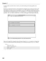
they came looking for. The error screen in Figure 11-1 is actually a mild example: while it
eschews the unfriendly language, it remains decisively unhelpful. This section will discuss
why these error pages exist, how to customize them, and what content needs to be
included to make your visitors’ lives as easy as possible.
Figure 11-1. This exceptionally unhelpful error screen is all too common in corporate
websites.
Crash course in status codes
When most people think of error pages, they think “404,” to the point where it has become
as common a term as
browser or navigation. (“Hey, Chuck, your link’s not working. All I get
is a 404.”) While a 404 is indeed a legitimate error, it is only the tip of the iceberg.
HTTP status response codes are part of the HTTP spec and are intended to give a short
description of the page’s status—whether it’s good or bad, a problem on the server, or a
problem on the user’s end. The first digit of the number indicates the status category of
response code. There are five categories in total.
1xx Informational: There are only a few codes here, and they essentially mean that
the request was received and the process will continue.
2xx Success: These indicate that whatever action was requested has been success-
fully received and processed.
3xx Redirection: This series covers web page redirection.
4xx Client Error: This category is home to several common codes, usually generated
from missing or forbidden content.
5xx Server Error: These occur when something goes awry on the server. They usu-
ally appear when server-side code (Perl, PHP, ASP, and others) is not functioning.
CONTINGENCY PLANNING
245
11
8393CH11.qxd 8/6/07 3:27 PM Page 245
All told, there are nearly 60 standard codes that are tracked by servers.
1
Some codes
remain unused (such as 402, which was intended for micropayments, but has yet to see
the light of day); others are being drafted (like 509, which indicates bandwidth limits have
been exceeded), while others like 404 and 500, are as common as seashells on a beach.
These more prevalent errors, covered in depth in the following subsections, require con-
tingency planning.
200 OK
This is by far the most common status code, but there’s no contingency plan needed
because 200 OK means everything went just swell when the visitor requested the page.
The URL was found, the page was loaded, no redirections were detected, no script errors
occurred, and there were lots of puppies and rainbows. Even though you never see it, this
is the code you want; anything else in this list raises a red flag.
301 Moved Permanently and 302 Found
The 3xx series of HTTP status response codes is a fishy area because although each code is
explicitly defined in the W3C’s spec, many are utilized and interpreted improperly. Luckily
for developers, 99 percent of the time, a corporate website will only need to use 301
Moved Permanently for permanent redirects and a 302 Found for temporary redirects.
Anything else in the 3xx category will have unpredictable results because of inconsistent
interpretation by browsers.
Redirection has always been at the forefront of discussions about search engine position-
ing. Because a lot of malicious web activity relies on sneaky redirects, some methods, like
meta refresh—which uses a meta tag to handle the redirection—are universally frowned
upon by search engines because of their lack of security and history of abuse. Search
engines want to see a permanent redirection, not a temporary one, which is why 301
Moved Permanently remains the
safest means of directing robots to new locations.
There are several easy techniques for handling redirection. For websites running on the
Apache server platform, setting up redirects is a simple matter of editing the
.htaccess
file.
The
.htaccess file sits in the root directory of the site.
2
It is capable of controlling many
aspects of a website, from hiding directories to setting up extension rewriting commands
to banning specific referring URLs. It also enables redirects. To implement a 301 redirect
using an
.htaccess file, simply open the file in a text editor and add the following line,
editing the paths to match your site:
Redirect 301 /old/page.html /new/page/is/here.html
This simple line instructs any incoming user agent (such as a browser or search engine
spider) to bypass
/old/page.html and skip right over to /new/page/is/here.html, the
WEB DESIGN AND MARKETING SOLUTIONS FOR BUSINESS WEBSITES
246
1. For a complete list of response codes, see RFC 2616 in the HTTP spec, found here: www.w3.org/
Protocols/rfc2616/rfc2616-sec10.html
.
2. For more information about the .htaccess file’s capabilities, consult
/>docs/1.3/howto/htaccess.html
.
8393CH11.qxd 8/6/07 3:27 PM Page 246
new location. A 302 Found redirect is very similar. Just leave out the “301” from the string
and the redirect is treated as temporary:
Redirect /old/page.html /new/page/is/here.html
Adding multiple redirects is a no-brainer; simply add an additional line for each one.
Here’s an example:
Redirect 301 /old/page.html /new/page/is/here.html
Redirect 301 /previous/spot.html /fresh/digs/here.html
Redirect 301 /please/avoid/linkrot.html /by/using/redirects.html
Redirect /old-root-page.html /temporary-root-page.html
Some servers use Microsoft IIS, which handles redirects differently than Apache. Instead of
editing an
.htaccess file, developers must open the administrative section and follow
these simple steps:
1. In Internet Services Manager, right click the file or folder you wish to redirect from.
2. Select the A redirection to a URL radio button.
3. Enter the new destination location.
4. Check The exact URL entered above and A permanent redirection for this resource.
5. Click Apply.
For those who do not have access to
.htaccess or IIS, redirects can also be handled with
server-side code. For instance, placing this snippet of PHP code at the beginning of a web
page will properly redirect incoming requests:
<?php
header('HTTP/1.1 301 Moved Permanently');
header('Location: />?>
Similarly, you can use this snippet of ASP.NET code for a page running on Microsoft
servers:
<script runat="server">
private void Page_Load(object sender, System.EventArgs e)
{
Response.Status = "301 Moved Permanently";
Response.AddHeader("Location"," />}
</script>
Even the oldest content should redirect to something to avoid linkrot and prevent users
from getting lost in the site. When pages disappear completely and there’s no indication of
a new location, frustration sets in and visitors will quickly find somewhere else to go.
CONTINGENCY PLANNING
247
11
8393CH11.qxd 8/6/07 3:27 PM Page 247
404 Not Found
Missing content is an all-too-common problem on the Web. The reasons are many.
Websites can get moved to new servers and not all of the pages arrive safely; databases
can get corrupted and dynamic content is simply vaporized into digital ether; someone
types the wrong URL and unknowingly attempts to access a nonexistent page; a website is
redesigned and content gets shuffled into new directories, rendering all incoming links
obsolete. When people encounter any of this missing content, they usually stumble into a
404 Not Found error, the HTTP status response code for a page that is MIA. This usually
elicits a colorful four-letter word from the user.
The best thing to do for missing content is make every effort to ensure that it’s not miss-
ing to begin with. A large part of avoiding 404 pages is setting up redirects to new loca-
tions if the content was moved, or directing people to a page explaining the reasons why
the content was taken down. Unfortunately, there are some situations that are simply out
of the web designer’s control (like a person typing in the wrong URL); in those cases, a
well-designed 404 error page becomes a corporation’s saving grace.
Most 404s are bleak, server-generated pages that contrast sharply with the rest of the site.
Simply having a 404 page that matches the design of the website is a massive first step for-
ward in usability—it immediately puts people at ease, and presents a friendlier environ-
ment for explaining exactly what went wrong. Once you have established design
continuity, it’s time to start adding some content. As shown in Figure 11-2, an error page
should accomplish all of the following:
1. Explain where the user is: Help the visitor understand that they have landed on a
page explaining that the content they are searching for cannot be found. While the
term “404 Not Found” should appear somewhere in the text (because it is the offi-
cial HTTP status response code), this first message should be friendly, clear, and
firm, like a police officer explaining to a tourist that they just turned the wrong way
down a one-way street.
2. List what might have gone wrong: There is a reason the visitor has found them-
selves in a 404 page, so explain common symptoms like mistyped URLs (and com-
mon mistakes therein, like typing an
.html extension instead of a .php extension),
moved content, or a bad referring link.
3. Provide a means for finding the content: Once a visitor understands the content
they tried to access is not obviously available, they need a means to find it. At a
bare minimum, suggest they return to the homepage (useful if they arrived from
another site or search engine) or browse the site map. More useful, however, is
providing a search feature. This gives the user an immediate, familiar route to find
the page they want, and if the search function works well, it will probably be a
clean fix.
4. Enable feedback: There is a chance that the person is intimately familiar with the
company website, and they really think that the missing page should be there. In
that case, it’s important to provide a means of contacting the webmaster directly to
report the issue; this can be done through a direct e-mail link or a short form.
3
WEB DESIGN AND MARKETING SOLUTIONS FOR BUSINESS WEBSITES
248
3. Ian Lloyd wrote a good article for A List Apart called “The Perfect 404,” in which he detailed a
method for providing a single button to report the missing page. You can find the article at
www.alistapart.com/articles/perfect404.
8393CH11.qxd 8/6/07 3:27 PM Page 248
Figure 11-2. This 404 page provides an explanation of why the user might have encountered the
error and some means of finding the content they were looking for, plus a link to the contact form
where they can report the missing content.
Once your error page is built, it’s a simple matter of loading it onto the server. Many CMSs
natively support custom 404 pages inside their engines, but for many websites, an error
page will simply be a static HTML file referenced by the server.
For Apache servers, setting up 404 and other status response code pages is simple. Like
redirects, it uses the
.htaccess file to invisibly route visitors to the appropriate location.
Once your 404 page is on the server, simply instruct Apache on the location by adding a
short line of code to the
.htaccess file:
ErrorDocument 404 /path/to/your-404-page.html
That’s all there is to it. In fact, this same line of code is also used for other error docu-
ments, such as 403 and 500. A typical
.htaccess file might contain the following:
ErrorDocument 403 /path/to/your-403-page.html
ErrorDocument 404 /path/to/your-404-page.html
ErrorDocument 500 /path/to/your-500-page.html
CONTINGENCY PLANNING
249
11
8393CH11.qxd 8/6/07 3:27 PM Page 249
This functionality in Apache can handle any type of error document. For Windows servers
running ASP.NET, the process is a bit different. Open the
web.config file and search for
the following cluster of code:
<configuration>
<system.web>
<customErrors mode="On" defaultRedirect="error.asp">
<error statusCode="404"
redirect="/path/to/your-404-page.asp" />
</customErrors>
</system.web>
</configuration>
From here, you can define the path to the custom error page by editing the central line.
To change this in IIS, open
Internet Services Manager, right-click the website, and select
Properties. Choose the Custom Errors tab. Select 404 (or whatever error needs customiza-
tion) from the list and enter a new path.
500 Internal Server Error
This error occurs when something goes awry on the server. This is not a client-side prob-
lem, but rather an issue in the web software, like a server-side script (Perl, PHP, ASP, and
so forth), or in the database. Receiving this error requires immediate action from the
developer—the problem is not going to fix itself.
In the meantime, the error page for a 500 code can be implemented using the same
Apache and IIS techniques as the 404 page covered in the previous section. The messaging
and technology needs to be handled a bit differently, however. First, the text should
clearly state that there is indeed a problem, but it has nothing to do with the browser or
Internet connection—assure the user that they are not at fault. In addition, provide a
simple e-mail address for contacting the webmaster. The page should be minimal in design
and built in HTML only. Any scripts appearing in a 500 error page may not work at all if
there is a serious problem in the server software, so avoid them.
Site search
Everyone has their comfort zone with the Web. We all know where our favorite sites are,
how frequently they’re updated, and what we can expect in our daily saunter through the
digital realm. We rarely think about the fact that the Web is indeed a cavernous, expand-
ing library of human thought, unprecedented in scope and almost impossible for the
human brain to put into perspective. Even the most voracious consumers of Internet con-
tent are mere ants picking their way through a forest of information.
Search is the only tool we have to put the incomprehensible amount of data into any sem-
blance of order. Search engines specialize in crawling, indexing, ranking, and displaying
web content. While this might sound simple enough, the fact that Google, Yahoo, and
MSN have all made billions of dollars in just the search industry should be some indication
that the world relies heavily on their technology. In fact, the Internet has three character-
istics that make search indispensable:
WEB DESIGN AND MARKETING SOLUTIONS FOR BUSINESS WEBSITES
250
8393CH11.qxd 8/6/07 3:27 PM Page 250