ielts writing task 1 10 academic IELTS essays
Bạn đang xem bản rút gọn của tài liệu. Xem và tải ngay bản đầy đủ của tài liệu tại đây (470.21 KB, 11 trang )
© IELTSPodcast.com / B.Worthington, entire document, IELTS questions and IELTS essay.
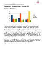
Calorie Source for UK males at different life periods.
Percentage of total intake.
The bar chart shows the different calorific sources of UK males of varying age
groups, 0-24, 25-49 and 50+. The sources are dairy, meat, pulses and vegetables.
Between being born and reaching 24 the main source of calories was dairy products,
with over 40% coming from dairy products, and the other sources equal at around
20%, except pulses which represent around 18%. For the 25-49 age group by far the
largest source was meat at exactly 50% of total calorie intake, followed by dairy at
25%, vegetables at 15% and pulses representing just 10%. Regarding the over 50
group the largest contributor were pulses at well over 60%, followed by meat, dairy
and vegetables in that order.
Overall it is clear each group leans towards one predominant caloric source over the
rest. Pulses were the least favoured choice for the younger groups, with vegetables
also making up a minority contribution amongst every age group.
156
© IELTSPodcast.com / B.Worthington, entire document, IELTS questions and IELTS essay.
Expected City Visits by Country of Origin for 2018 (Thousands/year)
The bar chart shows the forecasted visits to four European cities, London, Paris,
Madrid and Istanbul, from three countries the United States, Canada and Mexico.
The US represents the highest number of expected travellers by a large margin,
followed by Canada then Mexico. In 2018 the most popular destination overall is
Paris and the least popular is Istanbul.
For Americans, in the future their most popular destination will be Paris, at 100
thousand visits, the least Istanbul at 60 000, Madrid's expected travellers reach 70
000 and London's 80 000. In 2018 Istanbul is the most popular for Canadians at 70
000 followed by London and Paris at 50 000 and 45 000, and the least desirable is
Madrid at just 30 000 expected visits. Madrid will be by far the most popular
destination, just over 60 000, the other cities only reach between 20 000 and 25 000.
To summarise the graph shows that each country has widely varying preferences, the
most marked being Mexico's preference for Madrid, America's favourite would be
Paris and Canada's Istanbul.
177
© IELTSPodcast.com / B.Worthington, entire document, IELTS questions and IELTS essay.
Council Expenditure by Three Regions in the UK, 2014
Yorkshire Derbyshire Lancashire
The three pie charts show the distribution of spending between three counties in
northern England in 2014.
Of the 3 regions Yorkshire spent the most on education, followed by Lancashire, and
finally Derbyshire. Derbyshire spent the most on leisure, representing about 35%,
Yorkshire spent 25% and Lancashire slightly more at 30%. Derbyshire also spent the
most on community care, reaching 20%, while the other two spent less, Yorkshire at
18% while Lancashire at 12%.
All 3 counties spent a similar proportion on the environment between 5 -10%,
Derbyshire having the highest amount. Social services expenditure was at 15% for
Yorkshire, 10% for Lancashire and just 3% for Derbyshire representing the lowest of
the three. Regarding the category of other, the amounts were broadly similar,
representing between 7% and 10% for each of the three.
Overall amongst the three regions education and leisure make up the largest
expenses, followed by the environment and social services representing the lowest.
© IELTSPodcast.com / B.Worthington, entire document, IELTS questions and IELTS essay.
Foreign Direct Investment in Australia over 3 years
The bar chart shows the foreign investment of countries in Australia over 3 years,
2011-2014.
In 2011 Malaysia invests the highest however, all countries invested between 80 and
100, except Somalia which invested around 20 USD million. In 2012, all countries
increased the amount invested while Germany almost doubled its investment and
reached 180m USD, the other countries also increased but only by around 15%.
Somalia more than doubled the amount invested and reached 50mUSD.
By 2013 New Zealand had overtaken Germany and had invested 200m USD while
the latter was at 190m USD, both Mexico and Malaysia had increased and reached
140m USD and 130 USD respectively. Somalia almost doubled the amount sent again
to reach 90m USD, to bring it on a par with Thailand. In 2014 investment grew from
each country except Mexico, which remained steady, while Somalia dropped to its
2011 level of around 20m USD.
Overall every country increased their investment in Australia for each consecutive
year bar Somalia which reduced it in the final period.
171
© IELTSPodcast.com / B.Worthington, entire document, IELTS questions and IELTS essay.
SOURCE: />NB. An official IELTS paper would use information much less political, this chart was used entirely for convenience.
The bar chart shows the amount of weekly attacks on targets ranging from Coalition
forces, Iraqi citizens and Iraqi Security forces, in given political periods over a period
of 3 years.
Attacks on coalition forces remain at around 400 per week then reach 600 per week
once the government is established, the frequency of attacks remain at roughly this
level thereafter. Assaults on Iraqi Security forces are greater each period for 7 out of
the 9 periods, thereby reaching an almost 20 fold increase by the end of the time-
scale. Unfortunately attacks on Iraqi civilians also see an increase for every period
reported except in the pre-constitution stage where the fall by more than 50%, only to
rise repeatedly afterwards.
Overall it is clear the amount of attacks have increased, although the largest
proportion is represented by attacks on coalition forces, the group seeing the largest
increase in attacks in percentage terms are the Iraqi security forces.
156
© IELTSPodcast.com / B.Worthington, entire document, IELTS questions and IELTS essay.
SOURCE: />The bar chart shows the changes in public funding for transit expenses over an eight
year period, 2000-2008. There is also a key showing the percentage annual growth
rate of each fund, Local, State and Federal.
Local funds consistently represent the largest contribution throughout the said period,
followed by Federal funds, then State funds. State funds have the highest annual
percentage growth rate of 9.3%, followed closely by Local funds at 9.2%, whereas
Federal funding is only growing at 5.3% annually.
Despite dipping in 2004 and 2005, the general trend is that expenditure is increasing
year on year with total expenditure starting at 9.1 billion USD, and finishing at 16.1.
the State is the smallest contributor overall, however the amount given doubles from
1 billion to 2 billion over the said period. Federal funds increased by around 50%
from 4.3 billion to 6.4 billion.
To summarise, funding for transit capital expenditure is increasing, the largest source
is Local funding, then State. Federal funding contributes the least and is also growing
the least on an annual basis.
176
© IELTSPodcast.com / B.Worthington, entire document, IELTS questions and IELTS essay.
/>NB. An official IELTS paper would use information much less political, this chart was used entirely for convenience.
The bar chart shows the percentage of people registered as eligible voters from state
to state, by race and year, 1965 and 2004.
In 1965 there are clearly more white eligible registered voters than black, the largest
gap between these groups is in Mississippi where blacks reached just 7%, and whites
were at almost 80%. The highest percentage of white registered voters was in
Louisiana, followed by South Carolina. The highest percentage of black registered
voters was in Virginia at just over 40% closely followed by South Carolina.
Regarding 2004 the trend of more white than black registered voters continues in
every state except Mississippi. Furthermore, the percentage of white voters falls in
almost every state. The lowest percentage of black voters is now Virginia at slightly
under 60% whereas the highest reaches 75%, Mississippi.
Overall white voters are still in the majority in almost all cases, however, over the
forty year period the trend points to a harmonising of voter numbers in each state.
169
© IELTSPodcast.com / B.Worthington, entire document, IELTS questions and IELTS essay.
/>The bar chart shows the life expectancy of males and females at birth, and at 65, the
data is from four countries, England, Scotland, Wales and Northern Ireland.
Females from England have the highest life expectancy at 81.5 years, beating women
from Northern Ireland by 6 months. Females from Scotland have the lowest life
expectancy of 79.6 years, meaning a gap of around 13 months between the highest
and lowest. English female life expectancy at 65 is also the highest, and the Scottish
is also the lowest.
Regarding male life expectancy the highest is from England and reaches 77.2, almost
an extra 2 years over the lowest, Scotland, at 74.6. Wales is the second lowest at 76.6
years, followed by N. Ireland at 76.1. At 65 the order is the same with England first,
Wales and N. Ireland broadly similar and Scotland at the lowest with 15.8 years of
life expected after 65.
In all countries observed, and at all age points, women out live men, and regarding
countries, Scotland has the lowest life expectancy while England has the highest.
180
© IELTSPodcast.com / B.Worthington, entire document, IELTS questions and IELTS essay.
/>The bar chart shows the increase in consumption for four countries, Germany, Japan,
the US and China, over a three year period 2011-2013, in billions, in USD.
The US and China both experienced growth in consumption every year, although the
increase was less following each subsequent year. Japan and Germany followed
similar patterns except for in 2012 Germany experienced a negative increase as did
Japan in 2013.
China attained the largest consumption increase in 2011, reaching over 700 (USD
billions), Japan was responsible for the largest fall in consumption, experiencing a
fall of almost 800 (USD billions). Throughout the entire period China consistently
grew its consumption the highest, while Germany was repeatedly the country with
lowest growth except in 2013 when it was Japan.
Overall the majority of the countries experienced positive increase in consumption
except individual countries during 2012 and 2013.
142
© IELTSPodcast.com / B.Worthington, entire document, IELTS questions and IELTS essay.
Figure 7.1.4 Average monthly telecommunications retail revenues, 2012
/>The bar chart shows the average monthly revenue from retail telecommunication
subscribers from eight countries in North America, Europe, Asia and Oceania. Each
country is represented by three bars, green for mobile, brown for data, and blue for
services.
In practically all cases services represents the highest revenue source per client,
followed by data and internet and lastly mobile. Australia has the highest revenue per
customer for services at $109, however overall Japan has the highest revenue per
customer because data and mobile revenues are considerably higher than the other
countries.
Italy has the lowest revenue figures overall, with mobile revenue at $16, data at $44,
and services at $51. The North American figures are broadly similar, both countries
reach around $90 for services, $65 for data and between $53-$44 for mobile. The
UK, Germany and France have similar figures except France has the highest data
revenue for the European countries.
The lowest revenue figures are found in Europe, the highest are in Asia, namely
Japan, while North American revenue numbers in the middle.
174
© IELTSPodcast.com / B.Worthington, entire document, IELTS questions and IELTS essay.
International Student Enrolment in British Universities 2009-2014
The bar chart shows the percentage of international student enrolled in British
universities in two years, 1990 and 2014.
For the majority of the universities managed to increase the percentage of
international students preset at their institutions. The universities that experienced the
largest gain were the Scottish ones, Glasgow jumped from 4% to 6%, while
Edinburgh's percentage doubled from 3% to 6%. In England, Huddersfield also grew
its percentage of foreign students considerably. The university with the largest
percentage in both 1990 and 2014 was Brighton, 12% and 13% respectively.
The only university to loose international students in percentage terms was Cardiff,
falling from 2% to 1%. All universities underwent some change except Liverpool
whose proportion of international students remained stable at 8%. Manchester, Bristol
and Leeds each experienced an increase albeit of a smaller proportion, in the range of
1-2 percentage points growth.
Over the twenty four year period changes in the percentage of students enrolled has
fluctuated but generally towards an upward trend. The decrease was in Cardiff and
falls short of the leader Brighton, by 12 points.
180
Manchester
Liverpool
Birmingham
Brighton
Glasgow
Edingbourogh
Bristol
Leeds
Huddersfield
Cardif
0
2
4
6
8
10
12
14
YEAR 2009
YEAR 2014