WRITING TASK 1 COLLECTION
Bạn đang xem bản rút gọn của tài liệu. Xem và tải ngay bản đầy đủ của tài liệu tại đây (1.23 MB, 46 trang )
LINE CHART
The line graph below gives information on cinema attendance in the UK.
Write a report for a university lecturer describing the information given.
You should write at least 150 words.
model answer:
The given line graph illustrates information on the percentage of people who went to the
movies in the United Kingdom between 1990 and 2010. The people's attendance is divided
into four different age groups.
Overall, younger people seemed to, and are predicted to, be more active in movie going
than their older counterparts. However, all four age groups showed a gradual increase in
attendance numbers during the given period, except for a slight drop between 1995 and
2000.
To be specific, a larger percentage of people between the ages of 24 and 34 went to, and
are expected to, go to the cinema than those in any other age group. Approximately 51% of
the respondents from this age group are expected to attend movies in 2010 compared with
only 38% in 1990. Even in the group that had the smallest number of movie goers, those
between the ages of 44 and 54, there was an increase of 6% in their attendance.
(161 words)
The graph shows Underground Station Passenger Numbers in London.
Summarise the information by selecting and reporting the main features, and
make comparisons where relevant.
You should write at least 150 words.
You should spend about 20 minutes on this task.
model answer:
The graph shows the fluctuation in the number of people at a London underground station
over the course of a day.
The busiest time of the day is in the morning. There is a sharp increase between 06:00 and
08:00, with 400 people using the station at 8 o'clock. After this the numbers drop quickly to
less than 200 at 10 o'clock. Between 11 am and 3 pm the number rises, with a plateau of
just under 300 people using the station.
In the afternoon, numbers decline, with less than 100 using the station at 4 pm. There is
then a rapid rise to a peak of 380 at 6pm. After 7 pm, numbers fall significantly, with only a
slight increase again at 8pm, tailing off after 9 pm.
Overall, the graph shows that the station is most crowded in the early morning and early
evening periods.
Write a report describing the information in the graph below.
You should write at least 150 words.
You should spend about 20 minutes on this task.
model answer:
The line graph shows estimated sales of gold in Dubai for 12 months in 2002 in millions of
dirhams. There were two main seasons for gold sales.
The main season for sales is in the December to May period. Sales were consistently above
200 million dirhams per month, rising sharply to a peak of 350 million dirhams in March.
However, for the next four months, sales declined steadily, reaching an annual low of 120
million dirhams in July.
In August, there was a sudden increase. Sales almost doubled, rising from 120 million
dirhams in July to 210 million dirhams in August. This was followed by a drop in September,
back to the July figure.
From September to October, sales recovered, from 120 to 180 million. In October and
November, sales remained steady, and there was a small increase in December to 190
million dirhams.
In conclusion, the main sales period is in the early part of the year, slumping in the
summer, except for a sudden increase in August.
You should spend about 20 minutes on this task.
Write a report for a university lecturer describing the information in the graph.
Write at least 150 words.
Consumption of Fast Food in the UK
Model answer 1
The graph shows changes in the amount of fast food consumed in the UK between 1970 and 1990.
Several trends are apparent. First, Britons are eating more and more fast food. Secondly, the type of fast
food has changed.
In 1970, the most popular fast food was fish and chips. Over 300g were consumed each week. By 1990,
however, this had fallen to just over 200g - a 50% drop. Consumption of other fast foods such as pizza
and hamburgers increased, however. The amount of pizza eaten shot up from about 20g a week to more
than 270g, overtaking fish and chips in the late 1980s. Hamburger consumption also increased, rising
from about 80g in 1970 to almost 300g in 1990.
Accompanying this change in the choice of foods was an increase in the amount of fast food consumed.
In 1970, British consumers ate about 450g a week of fast food. In 1990, on the other hand, this had more
than doubled, to 1000g.
Model answer 2
The graph shows the amount of fast food eaten between 1970 and 1990 in grams per person per week.
Overall, the amount of fast food eaten more than doubled.
The amount of fish and chips eaten declined slightly. In 1970, the consumption was about 300g/week.
This fell to 220g/week in 1990.
In contrast, sales of hamburger and pizza rocketed. In 1970, very little pizza was eaten - less than
50g/week. This rose to 280g/week by 1990. In the same period, hamburger sales shot up by more than
500%, from 100g/week in 1970 to 500 grams in 1990.
In conclusion, although there was a big increase in the consumption of pizza and hamburger, sales of fish
and chips decreased.
Write a report for a university lecturer describing the information in the graph
below.
You should write at least 150 words.
Allow yourself 20 minutes for this task.
model answer:
The graph compares the rate of smoking in men and women in Someland between the
years 1960 and 2000. It can be clearly seen that the rate of smoking for both men and
women is currently declining and that fewer women have smoked throughout the period.
In 1960, 600 men in every 1,000 was smoking. This number decreased gradually to 500 by
1974 and continued to decrease but more steeply to 250 in 2000. In contrast, the rate of
smoking in women in 1960 was very low at only 80 in every 1,000. By 1968 this increased
to 170, and increased again but more steeply to 320 in 1977. The rate of female smokers
then remained stable at 320 until 1984 at which point the figures began to decline and had
dropped to 200 by 2000.
In conclusion we can see that the rate of smoking in men dropped throughout the whole
period but was always at a higher level than the female figures. The rate of smoking in
women increased until 1977 but then decreased for the rest of the period.
You should spend about 20 minutes on this task.
Eating sweet foods produces acid in the mouth, which can cause tooth decay. (High acid levels
are measured by low pH values)
Describe the information below and discuss the implications for dental health.
You should write at least 150 words.
model answer:
Anyone who has visited a dentist has been told that eating excessive amounts of sweets risks harming
the teeth. This is because sweets lower pH levels in the mouth to dangerous levels.
When the pH level in the mouth is kept above 5.5, acidity is such that teeth are unlikely to be in danger of
decay. Sweet foods, however, cause pH in the mouth to drop for a time, and the longer pH levels remain
below 5.5, the greater the opportunity for decay to occur.
By comparing fruit sugar, cane sugar and honey, which are all common ingredients of sweet foods, we
find that cane sugar lowers pH levels for the longest period, thus producing the greatest risk of the three.
Approximately five minutes aftfter consuming cane sugar, pH levels drop to as little as pH 3.5. They then
begin to rise slowly, but do not rise above pH 5.5 until at least 30 minutes have elapsed. By contrast, fruit
sugar, which causes the mouth's acidity to fall to just above pH 4, poses a danger for a shorter period:
tooth decay is unlikely 20 minutes after consumption. Honey appears an even less risky substance.
Though acidity falls to about pH 4.75 within five minutes of consumption, it returns to above pH 5.5 in
under fifteen minutes.
The implications, then, are that people who insist on eating sweet foods should be aware of the
ingredients, and that fruit sugar or honey appear preferable to cane sugar.
(242 words)
BAR CHART
Model answer
The charts shows the oil resources held, together with the proportions consumed within the same area
each year, in different areas of the world.
It is obvious that the region holding the most oil resources is the Middle East, with 56.52%, over a half of
total world oil resources while in the United States and Asia, the level of oil consumed each year is for
more away from the oil resources they hold. The percentage of total world oil consumption of United
States and Asia are 25.48% and 26.21% respectively. They are the highest oil consumption region in the
world.
Another place that is worth mentioned will be the Western Europe. With about twenty percent of total
world oil consumption, the Western Europe merely holds less than 1.5% of the oil resources in the World.
Regions that are not mentioned above have the close percentage between oil holding and consuming
whereas Canada has the highest level of oil holding than consuming, the respective figures are 14.84%
and 2.48%.
Overall, the charts suggest that Middle East is the only majority at oil resources held, while Asia, United
States and western have the highest level at oil resources imported.
(197 words)
model answer:
The chart shows male and female graduates from the Higher Colleges of Technology
colleges in the UAE.
The most outstanding feature of the graph is female graduates outnumber males in all the
colleges. For example, in Dubai, there are 30% more women graduates than men. There
are also large differences in Al Ain and in Ras Al Khaimah. However, the number of men and
women is almost equal in the colleges in Abu Dhabi.
There are also big differences in the sizes of the colleges. Ras Al Khaimah has less than 300
students altogether, while Abu Dhabi has about 600 and Dubai has almost 1000
In summary, women outnumber men in all the colleges, and there are significant
differences in the sizes of the colleges.
The graph shows estimated oil production capacity for several Gulf countries
between 1990 and 2010.
Summarise the information by selecting and reporting the main features, and
make comparisons where relevant.
You should write at least 150 words.
You should spend about 20 minutes on this task.
model answer:
The graph shows Oil Production Capacity in millions of barrels per day for selected Gulf
countries. There are several features in this graph.
The most significant feature is that oil production will increase sharply in almost all the
countries shown. Kuwait and Iraq are both expected to double their output between 1990
and 2010, with Kuwait's production rising from 1.8 million barrels per day (bpd) in 1990 to
3.8 in 2010. Iran will also increase its output by a slightly smaller amount. After remaining
steady at 2.5 million bpd from 1990 to 2000, the UAE's output is expected to approach 4.0
million bpd in 2010. Only Qatar's production is predicted to fall, back to 0.8 million bpd after
a slight rise in 2000.
However, the greatest increase will be from Saudi Arabia. In 1990, its output capacity at 8.5
million bpd exceeded the combined production of Iran, Iraq and Kuwait. This lead is
expected to continue with a 75% increase in production to 14.5 million bpd 2010.
In summary, while most of the countries are expected to show increases, Saudi Arabia will
maintain and strengthen its position as the major producer.
Write a report describing the information in the graph below.
You should write at least 150 words.
You should spend about 20 minutes on this task.
model answer:
The chart shows striking changes in the fertility rate of women in six Gulf countries – Saudi
Arabia, the UAE, Oman, Qatar, Kuwait and Bahrain between 1990 and 2000.
In the ten year period, there was a decline in the number of births per woman in all
countries. The biggest declines were in two countries which had low fertility rates at the
start of the decade, Bahrain and the UAE.
Fertility rates vary greatly between the six countries. Oman and Saudi Arabia had the
highest rates, with over seven births per woman in 1990. This compared with around 4
births per woman in Bahrain and the UAE, and just 3.75 in Kuwait
By 2000, the rate had fallen below three births per woman in Kuwait, Bahrain and the UAE,
with a drop of over 25% in a decade in the UAE. However, in Saudi Arabia and Oman, the
rates fell by just 20%, from 7.0 to 5.5.
In summary, there were major decreases in birth rates in all countries, but some countries
in the region have double the fertility rate of others.
Write a report for a university lecturer describing the information below.
You should write at least 150 words.
You should spend about 20 minutes on this task.
model answer:
The graph shows weekly expenditure on fast food in Britain by food and income group.
There are two main trends. First, the expenditure is directly related to income. Secondly,
there are differences in the types of fast food eaten by each group.
The amount of money spent on fast food is related to income. People in the high-income
group spent the most - over 85 pence per person per week. People in the low-income group
spent the least - less than half of what the high-income earners spent.
The type of fast food eaten also depends on the group. High-income earners spent 3 times
more on hamburgers than people in the low-income group. Pizza was generally the least
favorite food. Fish and chips was the most popular food with the low-income group but
consumption was fairly similar among all groups.
The diagram below shows the average hours of unpaid work per week done by
people in different categories. (Unpaid work refers to such activities as childcare
in the home, housework and gardening.)
Describe the information presented below, comparing results for men and women
in the categories shown. Suggest reasons for what you see.
You should write at least 150 words.
You should spend about 20 minutes on this task.
model answer:
The diagram reveals that the number of hours per week spent in unpaid work is unequally
distributed between men and women.
In households where there are no children, women are reported to work some 30 hours per
week in such tasks as housework and gardening. Men's contribution to these unpaid jobs
averages a considerably lower 18 hours.
When children enter the household, however, the inequality becomes even more
pronounced. In families of 1 - 2 children, men maintain approximately the same number of
hours of unpaid work as in childless households, but the number of hours women work in
the home rises to 52 per week, much of it, on doubt, due to childcare responsibilities.
Interestingly, when there are three or more children in the household, men are found to
work even fewer hours around the house than before the appearance of the third child.
Whereas women's unpaid hours rise to approximately 56 per week, the corresponding figure
for men, 16, actually represents a decrease.
The data suggest that the increased presence of women in the paid work force has yet to
lead to an increased role for men in the home.
The graphs below show the types of music albums purchased by people in Britain
according to s3x and age.
Write a report for a university lecturer describing the information shown below.
You should write at least 150 words.
You should spend about 20 minutes on this task.
model answer:
The three graphs provide an overview of the types of music people purchase in the UK. At
first glance we see that classical music is far less popular than pop or rock music.
While slightly more women than men buy pop music, the rock market is dominated by men
with 30% buying rock, compared to 17% of women. From the first graph we see that
interest in pop music is steady from age 16 to 44 with 20% of the population continuing to
buy pop CDs after the age of 45.
The interest in rock music reaches its peak among the 25 to 34 year olds, though it never
sells as well as pop. Interest also drops off after the age of 35 with an even sharper fall
from age 45 onwards, a pattern which is the opposite to the classical music graph.
The chart below gives information about global sales of games software, CDs and
DVD or video.
Write a report for a university lecturer describing the information.
You should write at least 150 words.
You should spend about 20 minutes on this task.
model answer:
The chart shows the changes in the sales of video material / DVDs, games software and CDs
around the world in billions of dollars over a three-year period. It can be seen that the sales
of videos / DVDs and games software have increased, while the sales of CDs have gone
down slightly.
Between 2000 and 2003, the sale of videos and DVDs rose by approximately 13 billion
dollars. In 2000, just under 20 billion dollars worth of these items were sold, but in 2003,
this figure had risen to a little over 30 billion dollars.
The sales of games software also rose during this period, but less sharply. Sales increased
from about 13 billion dollars in 2000 to just under 20 billion dollars three years later. By
contrast, during the same time period, the sale of CDs fell from 35 billion dollars in 2000 to
about 32.5 billion dollars in 2003.
PIE CHART
You should spend about 20 minutes on this task.
The pie charts below give information about world population in 1900 and 2000.
Summarise the information by selecting and reporting the main features, and make comparisons where
relevant.
Write at least 150 words.
Writing Tip
We can use either present simple tense or past simple tense when describing data in pie charts. Whichever tense you
choose, remember to be consistent throughout your whole answer.
Model answer
The pie charts illustrate changes in the population of different areas of the world between 1900 and 2000. The major
regions are represented as percentages of the total world population.
From 1900 to 2000, the percentage of people living in Africa more than doubled from 4.5% to 10%, while Latin
America’s proportion almost tripled in the same period. On the other hand, the percentage of population in Europe
and Asia decreased over the last century. Europe’s percentage dropped from 25% to 14%, while Asia declined from
60% to 54%. North America’s percentage however, remained constant at 5% in 1900 and 2000. The Middle East
and North Africa, a new category in 2000, represented 6% of world population.
Overall, this represents a huge increase in the number of humans on the planet, from 1.6 billion to 6 billion in just
one century. Most of this population growth has occurred in developing countries.
(151 words)
You should spend about 20 minutes on this task.
The pie charts below show the average household expenditures in a country in 1950 and 2010.
Summarise the information by selecting and reporting the main features, and make comparisons
where relevant.
Write at least 150 words.
Average Household Expenditures by Major Category
Model answer
Look at the phrases in italic. Choose the phrase which sounds more formal.
The two pie charts give information about what households spent their money on / household expenditure
on goods and services in 1950 and 2010. It is immediately obvious that there are some quite significant
differences / some things are significantly different between the two charts.
In 2010 the largest proportion of expenditure was / most money was spent on food whereas in 1950 it
was on housing, with food for just 11.2%. There is a great difference in terms of the amount of money
people’s spent on housing / housing expenditure between the two years. In 1950 72.1% ofthe total
household budget / the total of what households spent went towards housing, compared to only 22% in
2010.
There has been a notable increase in / People have notably increased the amount of money spent on
transportation between the two dates. In addition, the charts show a significant rise in the proportion of
money spent on health care / that people spent more on health care in 2010 compared to 1950.
There are some similarities, however. For example, in both 1950 and 2010 people spent a similar
proportion on education. / the proportion of education expenditure was roughly the same.
Show Answers - Hide Answers
Writing Tip
When comparing statistics we usually say: Comparing the figures for 1950 and 2010, we can see some
quite significant differences between the two charts. NOT Compared the figures for 1950. We
use compared to or compared with as follows: Compared to 1950, housing expenditure in 2010 was
relatively low. NOT Comparing with 1950. Or: Housing expenditure in 1950 was quite high compared
to/with 2010. NOT comparing to 2010.
You should spend about 20 minutes on this task.
The pie charts below show electricity generation by source in New Zealand and Germany in 1980
and 2010.
Summarise the information by selecting and reporting the main features, and make comparisons
where relevant.
Write at least 150 words.
Electricity Generation by Source in New Zealand
Electricity Generation by Source in Germany
Model answer
The charts compare the sources of electricity in New Zealand and Germany in the years 1980 and 2010.
Between these years, electricity generation almost doubled, rising from 127 units to 200 in New Zealand,
and from 107 to 214 units in Germany.
In 1980 New Zealand used coal as the main electricity source (56 units) and the remainder was produced
from natural gas, hydro power (each producing 30 units) and petroleum (which produced only 11 units).
By 2010, coal had become the fuel for more than 75% of electricity produced and only hydro continued to
be another significant source supplying approximately 20%.
In contrast, Germany used coal as a source for only 28 units of electricity in 1980, which was matched by
natural gas. The remaining 49 units were produced largely from petroleum and nuclear power, with hydro
contributing only 7 units. But by 2010 nuclear power, which was not used at all in New Zealand, had
developed into the main source, producing almost 75% of electricity, at 155 units, while coal and
petroleum together produced only 55 units. Other sources were no longer significant.
Overall, it is clear by 2010 these two countries relied on different principal fuel sources: New Zealand
relied on coal and Germany on nuclear power.
(210 words)
You should spend about 20 minutes on this task.
The two graphs show the main sources of energy in the USA in the 1980s and the 1990s.
Write a report for a university lecturer describing the changes which occurred.
Write at least 150 words.
Model answer
The two graphs show that oil was the major energy source in the USA in both 1980 and 1990 and that
coal, natural gas and hydroelectric power remained in much the same proportions. On the other hand,
there was a dramatic rise in nuclear power, which doubled its percentage over the ten years.
Oil supplied the largest percentage of energy, although the percentage decreased from 42% in 1980 to
33% in 1990. Coal in 1990 was the second largest source of energy, increasing its proportion to 27%
from 22% in the previous decade. Natural gas, the second largest source in 1980 at 26%, decreased its
share very slightly to provide 25% of America’s energy ten years later. There was no change in the
percentage supplied by hydroelectric power which remained at 5% of the total energy used. Nuclear
power the greatest change: in 1990 it was 10%, twice that of the 1980s.
(152 words)
You should spend about 20 minutes on this task.
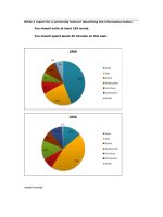
Write a report for a university lecturer describing the information shown below.
You should write at least 150 words.
model answer:
In this analysis we will examine three pie charts. The first one is headed ‘World Spending.’ The second is
‘World Population’ and the third is ‘Consumption of Resources.’
In the first chart we can see that people spend most of their income (24%) on food. In some countries this
percentage would obviously be much higher. Transport and then housing are the next major expenses at
18% and 12% respectively. Only 6% of income is spent on clothing.
In the second chart entitled ‘World Population’, it is not surprising to find that 57% of people live in Asia. In
fact China and India are two of the most populated countries in the world and they are both situated on
this continent. Europe and the Americans account for nearly 30% of the total, whilst 10% of people live in
Africa.
Finally, the third chart reveals that the USA and Europe consume a huge 60% of the world’s resource.
To sum up, the major expenditure is on food, the population figures are the highest for Asia and the major
consumers are the USA and Europe.
(182 words)
You should spend about 20 minutes on this task.
The charts below show US spending patterns between 1966 and 1996.
Write a report for a university lecturer describing the information below.
Write at least 150 words.
Model answer
The pie charts show changes in American spending patterns between 1966 and 1996.
Food and cars made up the two biggest items of expenditure in both years. Together they comprised over
half of household spending. Food accounted for 44% of spending in 1966, but this dropped by two thirds
to 14% in 1996. However, the outlay on cars doubled, rising from 23% in 1966 to 45% in 1996.
Other areas changed significantly. Spending on eating out doubled, climbing from 7% to 14%. The
proportion of salary spent on computers increased dramatically, up from 1% in 1996 to 10% in 1996.
However, as computer expenditure rose, the percentage of outlay on books plunged from 6% to 1%.
Some areas remained relatively unchanged. Americans spent approximately the same amount of salary
on petrol and furniture in both years.
In conclusion, increased amounts spent on cars, computers, and eating out were made up for by drops in
expenditure on food and books.
Write a report for a university lecturer describing the information in the two
graphs below.
You should write at least 150 words.
Allow yourself 20 minutes for this task.
model answer:
The pie charts compare the highest level of education achieved by women in Someland
across two years, 1945 and 1995. It can be clearly seen that women received a much
higher level of education in Someland in 1995 than they did in 1945.
In 1945 only 30% of women completed their secondary education and 1% went on to a first
degree. No women had completed post-graduate studies. This situation had changed
radically by 1995. In 1995, 90% of women in Someland had completed secondary education