Presentation Zen simple ideas on presentation design and delivery 2011
Bạn đang xem bản rút gọn của tài liệu. Xem và tải ngay bản đầy đủ của tài liệu tại đây (17.19 MB, 314 trang )
Praise for Presentation Zen: Simple Ideas on Presentation Design and
Delivery, Second Edition
“It's often the slim books that have the most impact. Strunk and White for proper English.
Robert’s Rules of Order for running meetings. Both deceptively short, with huge impact. To
these I find it easy to add Presentation Zen for moving an audience. Embrace this wonderful
guide and gain the power of crafting simple and clear messages. Garr Reynolds provides
techniques and examples in a manner that, quite naturally, adheres to the same principles
as what he teaches.”
—Ric Bretschneider, Senior Program Manager,
PowerPoint Development Team 1993-2010
“Garr is a beacon of hope for frustrated audiences everywhere. His design philosophy and
fundamental principles bring life to messages and can invigorate careers. His principles of
simplicity are as much a journey of the soul as they are restraint of the mouse.”
—Nancy Duarte, CEO, Duarte, Inc., and
author of slide:ology and resonate
“Presentation Zen changed my life and the lives of my clients. As a communications specialist,
I was searching for a way to create visuals that support the narrative without detracting from
the story. The philosophy and approach so elegantly explained in Garr's book will inspire your
audience. Don't even think of giving another presentation without it!”
—Carmine Gallo, author of The Presentation
Secrets of Steve Jobs
“Garr has broken new ground in the way we think about the power of presentations, and more
important, has taught an entire generation of communicators how to do a better job. Don’t
miss this one.”
—Seth Godin, legendary presenter
and author of We Are All Weird
“If you care about the quality and clarity of your presentations—and you should—pick up this
book, read every page, and heed its wisdom. Presentation Zen is a contemporary classic.”
—Daniel H. Pink, author of
Drive and A Whole New Mind
“Four years ago, Garr’s Presentation Zen literally changed the world of communications. Almost
overnight, what was once fluffy, stale, and boring became sharp, brisk, and even (can we say
it?) fun. A million radically-improved speeches later, the world is ready for a refresher—and
just when we need it most, Garr delivers the magic again.”
—Dan Roam, author of Blah-Blah-Blah
and The Back of the Napkin
This page intentionally left blank
presentation zen
Simple Ideas on Presentation Design and Delivery
d
n
2n Edupitdio
te
a d
revised &
Garr Reynolds
Presentation Zen: Simple Ideas on Presentation Design and Delivery
Second Edition
Garr Reynolds
New Riders
1249 Eighth Street
Berkeley, CA 94710
510/524-2178
510/524-2221 (fax)
Find us on the Web at: www.newriders.com
To report errors, please send a note to
New Riders is an imprint of Peachpit, a division of Pearson Education
Copyright © 2012 by Garr Reynolds
Senior Editor: Karyn Johnson
Copy Editor: Kelly Kordes Anton
Production Editor: Cory Borman
Proofreader: Roxanna Aliaga
Indexer: Emily Glossbrenner
Design Consultant in Japan: Mayumi Nakamoto
Book Cover and Interior Design: Garr Reynolds
Notice of Rights
All rights reserved. No part of this book may be reproduced or transmitted in any form by any means,
electronic, mechanical, photocopying, recording, or otherwise, without the prior written permission of
the publisher. For information on getting permission for reprints and excerpts, contact permissions@
peachpit.com.
Notice of Liability
The information in this book is distributed on an “As Is” basis without warranty. While every precaution
has been taken in the preparation of the book, neither the author nor Peachpit shall have any liability
to any person or entity with respect to any loss or damage caused or alleged to be caused directly or
indirectly by the instructions contained in this book or by the computer software and hardware products
described in it.
Trademarks
Many of the designations used by manufacturers and sellers to distinguish their products are claimed
as trademarks. Where those designations appear in this book, and Peachpit was aware of a trademark
claim, the designations appear as requested by the owner of the trademark. All other product names and
services identified throughout this book are used in editorial fashion only and for the benefit of such
companies with no intention of infringement of the trademark. No such use, or the use of any trade
name, is intended to convey endorsement or other affiliation with this book.
ISBN-13: 978-0-321-81198-1
ISBN-10:
0-321-81198-4
987654321
Printed and bound in the United States of America
To Mom & Dad
Table of Contents
Acknowledgments, ix
Foreword by Guy Kawasaki, x
INTRODUCTION
Presenting in Today’s World, 5
PREPARATION
Creativity, Limitations, and Constraints, 31
Planning Analog, 45
Crafting the Story, 77
DESIGN
Simplicity: Why It Matters, 115
Presentation Design: Principles and Techniques, 131
Sample Visuals: Images & Text, 187
DELIVERY
The Art of Being Completely Present, 215
Connecting with an Audience, 231
The Need for Engagement, 253
NEXT STEP
The Journey Begins, 285
Photo Credits, 292
Index, 294
viii
Acknowledgments
This book would not have been possible without
a lot of help and support. I’d like to thank the
following people for their contributions and
encouragement:
Nancy Duarte and Mark Duarte and all the
amazing staff at Duarte, Inc. in Silicon Valley,
including Nicole Reginelli and Paula Tesch for
their constant support.
At New Riders: Michael Nolan who asked me
to write this book originally and Karyn Johnson
who oversaw the book development this time
around and gave me the freedom to do it my
way (yeah, like the song). Kelly Kordes Anton
and Roxanna Aliaga, for bringing more clarity to
my writing and uncovering errors and offering
advice for improvement. Mimi Heft for her
help with the design and the cover. Hilal Sala,
for her great help and guidance in the first
edition, and to Cory Borman, for his talent and
guidance in production on this edition.
Guy Kawasaki, Seth Godin, David S. Rose,
Daniel Pink, Dan Heath and Rick Heath,
Rosamund Zander, Jim Quirk, and Deryn Verity
for their enlightened advice and content in the
early stages of the process.
Jumpei Matsuoka and all the cool people at
iStockphoto.com for their tremendous support
with the images and the special offer that’s
included at the back of this book.
Designer Mayumi Nakamoto for teaching
me more than I wanted to know (or thought
possible) about Adobe InDesign. June Cohen
and Michael Glass at TED for their help with
the images. Daniel Lee at Mojo for his help
with the credits. Aaron Walker, Tom Grant’s
producer in Japan, for his great assistance.
The Design Matters Japan community
including Toru Yamada, Shigeki Yamamoto,
Tom Perry, Darren Saunders, Daniel Rodriguez,
Kjeld Duits, David Baldwin, Nathan Bryan,
Jiri Mestecky, Doug Schafer, Barry Louie, and
many, many others.
Back in the States, a big thank you to those
who contributed ideas and support, including
Debbie Thorn, CZ Robertson, David Roemer,
Gail Murphy, Ric Bretschneider, Howard
Cooperstein, Dan Roam and Carmine Gallo.
And thanks to Mark and Liz Reynolds for their
fantastic B&B at the beach.
I’d like to thank the thousands of subscribers
to the Presentation Zen blog and to all the blog
readers who have contacted me over the years
to share their stories and examples, especially
Les Posen in Australia.
Although I could not include all the slides
in this book, I want to thank all the people
who submitted sample slides, including: Jeff
Brenman, Chris Landry, Scott B. Schwertly, Jill
Cadarette, Kelli Matthews, Luis Iturriaga, Dr.
Aisyah Saad Abdul Rahim, Marty Neumeier,
Markuz Wernli Saito, Sangeeta Kumar, Allysson
Lucca, Pam Slim, Jed Schmidt, Merlin Mann,
and many others. Also, a big thank you to
Dr. Andreas Eenfeldt in Stockholm and Phil
Waknell and Pierre Morsa in Paris.
And, of course, my biggest supporter in
all this was my wife, Ai, who was always
understanding and a great source of inspiration
and ideas (and occasionally, chocolate-chip
cookies).
ix
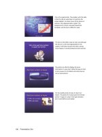
Foreword by Guy Kawasaki
Because this is a book about presenting better with slides,
I thought it would be appropriate to show the foreword
as a slide presentation. As far as I know, this is the first
foreword in history presented in a book as a series of
presentation slides. Now, good slides should enhance a live
talk; slides are not meant to tell the whole story without
you there. But from the slides on the next page, I think
you can get my point. If I were to give a live talk about why
you should buy this book, the slides would look something
like this.
Guy Kawasaki
Author of Enchantment: The Art of
Changing Hearts, Minds, and Actions,
and former chief evangelist of Apple
www.guykawasaki.com
x
xi
xii
Presentation Zen
introduction
Chapter 1 Presenting in Today’s World
1
Simplicity is the ultimate sophistication.
— Leonardo da Vinci
This page intentionally left blank
4
Presentation Zen
Presenting in
Today’s World
1
With successful presentations in Tokyo behind me, I boarded the 5:03 p.m.
Super Express bound for Osaka complete with my ekiben (a special kind of
Japanese lunch box or bento sold at train stations) and a can of Asahi beer
in hand. The quintessential “Japan experience” for me is zipping through
the Japanese countryside aboard cutting-edge rail technology while sampling
traditional Japanese delicacies with my chopsticks, sipping Japanese beer,
and catching glimpses of temples, shrines, and even Mount Fuji outside the
spacious side window. It’s a wonderful juxtaposition of the old and the new—
and a pleasant way to end the day.
While in the midst of savoring the contents of my bento, I glanced across
the aisle to see a Japanese businessman with a pensive look on his face as he
reviewed a printed deck of PowerPoint slides. Two slides per page, one page
after another filled with boxes crammed with reams of Japanese text in several
different colors. No empty space. No graphics except for the company logo
at the top of each slide box. Just slide after slide of text, subject titles, bullet
points, and logos.
Were these slides the visual support for a live oral presentation? If so, I
sympathized with the audience. Since when can an audience read and listen
to someone talk at the same time (even if they could actually see the 12-point
text on the screen well enough to read it)? Were the slides used merely as a
kind of document printed in PowerPoint? If so, I pitied both the author and
the reader because PowerPoint is not a tool for document creation. Boxes of
bullet points and logos do not make for a good handout or report. And judging
by the way the man flipped back and forth between the printed slides, perhaps
frustrated by the ambiguity of the content, this was becoming apparent to him.
What a contrast in the presentation of content, I thought to myself: The
beautifully efficient, well-designed Japanese bento before me containing
nothing superfluous, compared with the poorly designed, difficult-to-understand
deck of printed PowerPoint slides across the aisle. Why couldn’t the design
Chapter 1 Presenting in Today’s World
5
and presentation of business and technical content for a live talk have more in
common with the spirit of the simple bentos sold at Japanese train stations?
For example, the Japanese bento contains appropriate content arranged in the
most efficient, graceful manner. The bento is presented in a simple, beautiful,
and balanced way. Nothing lacking. Nothing superfluous. Not decorated, but
wonderfully designed. It looks good, and it is good. A satisfying, inspiring, and
fulfilling way to spend 20 minutes. When was the last time you could say the
same about a presentation you saw?
A delicious Japanese bento and a slide presentation may seem to have
nothing in common. But it was at that moment, rolling across Japan at 200
miles an hour many years ago, that I had a realization: something needed to
be done to end the scourge of bad PowerPoint slides and the lifeless narration
that accompanies them—and I could do something to help. In Japan, just
like everywhere else in the world, professionals suffer through poorly designed
presentations on a daily basis. Presentations in which the slides often do
more harm than good. It is not enjoyable, and it is not effective. I knew that
if I could begin to help others look at preparation, design, and delivery of socalled “PowerPoint presentations” in a different way, perhaps I could do my
small part to help others communicate far more effectively. That moment on
the Bullet Train—somewhere between Yokohama and Nagoya—was when I
began writing this book. I started by sharing my thoughts on the Presentation
Zen website, a blog that would go on to become the world’s most visited site
on presentation design.
This book has three sections: Preparation, Design, and Delivery. Along the
way, I’ll provide a good balance of principles and concepts, inspiration, and
practical examples. I’ll even show you before-and-after photos of the actual
bento box that was the inspiration for this book. Before reviewing the current
state of presentations today—and why presentations matter now more than
ever before—let’s first look at what is meant by “Presentation Zen.”
6
Presentation Zen
The Presentation Zen Approach
This is not a book about Zen. This is a book about communication and about
seeing presentations in a slightly different way, a way that is in tune with our
times. Although I make several references to Zen and the Zen arts along the
way, my references are far more in the realm of an analogy than the literal.
Literally, the tradition of Zen or Zen practice has nothing to do directly with
the art of presenting in today’s world. However, our professional activities—
especially professional communications—can share the same ethos as Zen.
That is, the essence or the spirit of many principles found in Zen concerning
aesthetics, mindfulness, connectedness, and so on can be applied to our daily
activities, including presentations.
A teacher for one who seeks enlightenment would say that the first step
for the student is to truly see that life is somehow out-of-sync or off-kilter,
that there is “suffering” if you will. And that this “out-of-kilterness” is a
consequence of our own attachment to things that are inconsequential.
Likewise, the first step to creating and designing great presentations is to be
mindful of the current state of what passes for “normal” presentations and
that what is “normal” today is off-kilter with how people actually learn and
communicate.
Each situation is different. But we all know, through our own experiences,
that presentations in business and academia can cause a good degree of
“suffering” for audiences and presenters alike. If we want to communicate
with more clarity, integrity, beauty, and intelligence, then we must move
beyond what is considered to be “normal” to something different and far
more effective. The principles I am most mindful of through every step of the
presentation process are restraint, simplicity, and naturalness: Restraint in
preparation. Simplicity in design. Naturalness in delivery. All of which, in the
end, lead to greater clarity for us and for our audiences.
In many ways, few of the basics have changed since the time of Aristotle
some 2,300 years ago, or from the basic advice given by Dale Carnegie in the
1930s. But what may seem like common sense regarding presentations is not
common practice. The Presentation Zen approach challenges the conventional
wisdom of making slide presentations in today’s world and encourages people
to think differently about the design and delivery of their presentations.
Chapter 1 Presenting in Today’s World
7
An Approach, Not a Method
Presentation Zen is an approach, not a method. Method
implies a step-by-step, systematic, planned, and linear
process. Method suggests a definite and proven procedure
that you can pick off a shelf and follow from A to Z in a
logical, orderly fashion. As an approach, Presentation Zen
suggests a road, a direction, a frame of mind—perhaps
even a philosophy—but not a formula of proven rules to be
followed. Methods are important and necessary. But there
are no panaceas, and I offer no prescriptions for success.
Success depends on you and your own unique situation.
However, I do offer guidelines and some things to think
about that may run contrary to conventional wisdom on
how to make live presentations with multimedia.
Similarly, Zen itself is an approach to life and a way of
being rather than a set of rules or dogma to be followed
by all in the same way. Indeed, there are many paths to
enlightenment. At the heart of Zen is the need for personal
awareness and the ability to see and discover. Zen is
practical. It’s concerned with the here and now. And the
practical and the here and now are also our concern with
presentations. The aim of this book is to help professionals
free themselves from the pain of creating and delivering
presentations by helping them see presentations in a way
that is different, simpler, more visual, more natural, and
ultimately far more meaningful.
8
Presentation Zen
Each Case Is Different
Not all presentation situations are appropriate for using
multimedia. For example, if you have a small audience
and data-intensive materials to discuss, a handout of the
materials with a give-and-take discussion is usually more
appropriate. In many situations, a whiteboard, flipcharts,
or a paper with detailed figures would make for better
support. Each case is different. The discussions in this
book, however, center on those presentations for which
multimedia is a good fit for your unique situation.
This book is not directly about software tools. Yet, by
keeping principles such as restraint and simplicity in mind,
you can use the lessons here to help you design better
visuals that are appropriate to a given situation. When it
comes to software functions, I don’t think the challenge is
to learn more, but rather to ignore more so that you can
focus on the principles and the few techniques that are
important. Software techniques are simply not our chief
concern.
Characterizing master swordsman Odagiri Ichiun’s ideas
on technique, Zen scholar Daisetz T. Suzuki says, “The
first principle of the art is not to rely on tricks of technique.
Most swordsmen make too much of technique, sometimes
making it their chief concern.” Most presenters, however,
make the software their chief concern in the preparation
process and delivery. This often produces cluttered visuals
and talks that are neither engaging nor memorable.
Yes, the basics of software are important to know.
Delivery techniques and “do’s and dont’s” are useful to
understand. But it’s not about technique alone. The “art
of presentation” transcends technique and enables an
individual to remove walls and connect with an audience—
to inform or persuade in a very meaningful, unique moment
in time.
Chapter 1 Presenting in Today’s World
9
Presentations Today
It seems that computer-generated slide presentations have been around
forever, but in truth they’ve only been in common use for about 20 to 25
years. PowerPoint 1.0 was created in Silicon Valley in 1987 by Robert Gaskins
and Dennis Austin as a way to display presentations on a Mac. It was cool.
And it worked. They sold the application later that year to Microsoft. A version
for Windows hit the market a couple years later, and (oy vey!) the world hasn’t
been the same since. As popular author Seth Godin—who’s seen more bad
presentations than any man should be subjected to—says in his 2001 e-book
Really Bad PowerPoint (the best-selling e-book of that year): “PowerPoint
could be the most powerful tool on your computer, but it’s not. It’s actually a
dismal failure. Almost every PowerPoint presentation sucks rotten eggs.”
Over the years, a primary reason so many presentations given with the aid
of slides or other multimedia have failed is that the visual displays served as
nothing more than containers for reams of text. According to John Sweller, who
developed the cognitive load theory in the 1980s, it is more difficult to process
information if it is coming at us both verbally and in written form at the same
time. Since people cannot read and listen well at the same time, displays filled
with lots of text must be avoided. On the other hand, multimedia that displays
visual information, including visualizations of quantitative information, can be
processed while listening to someone speak about the visual content.
Most of us know intuitively that when given 20 minutes to present, using
screens full of text does not work. Research supports the concept that it is
indeed more difficult for audiences to process information when it is presented
in spoken and written form at the same time. So perhaps it would be better
to just remain silent and let people read the slides. But this raises the issue:
Why are you there? A good oral presentation is different from a well-written
document, and attempts to merge them result in poor presentations and poor
documents, as I explain later in this book.
10
Presentation Zen
Still a Long Way to Go
While presentation technology has evolved over the years, the presentations
themselves have not necessarily evolved. Today, millions of presentations are
given every day with the aid of desktop applications such as PowerPoint and
Keynote, and cloud-based applications such as Google Docs and Prezi. Yet,
most presentations remain mind-numbingly dull, something to be endured
by both presenter and audience alike, or heavily decorated and animated
affairs with excessive motion that distracts from even well-researched content.
Presentations are still generally ineffective, not because presenters lack
intelligence or creativity, but because they have learned bad habits and they
lack awareness and knowledge about what makes for a great presentation.
Although presentation techniques have changed as digital technology
has progressed, the fundamentals of what makes an effective presentation
today are essentially the same as they ever were. The principles of restraint,
simplicity, and naturalness are still key, regardless of what software you use—
and even if you use no digital tools at all. And no matter how much we use
software in a live presentation, as much as possible
the tools and techniques must be used only to clarify,
simplify, and support the personal connection that
develops between an audience and a speaker. The
latest tools and technology can be great enablers and
amplifiers of our messages, but they must be used
wisely and with restraint in a way that feels natural and
real, otherwise they become barriers to communication.
No matter how impressive technology becomes in
the future, no matter how many features and effects
are added, the technology of the soul has not changed.
Technologies such as PowerPoint and Keynote—and
new tools such as Prezi—are only useful to the degree
that they make things clearer and more memorable, and
strengthen the human-to-human connection that is the
basis of communication. Used well, multimedia has the
power to do this.
Chapter 1 Presenting in Today’s World
11
Presentation Generation
The ability to stand and deliver a powerful presentation that engages each
audience member’s whole mind has never been more important than today.
Some have called our modern era the “presentation generation.” One reason
that the ability to speak passionately, clearly, and visually is more important
today than ever before is the fantastic reach our talks can have, largely thanks
to the power of online video. What you say and what you present visually can
now be captured easily and cheaply in HD video and broadcast around the
world for anyone to see. The potential of your speech or presentation to change
things—maybe even change the world—goes far beyond just the words spoken.
Words are important; but if it was just about words, we could create a detailed
document, disseminate it, and that would be that. An effective presentation
allows us to amplify the meaning of our words.
While speaking about the power of online video to spread innovative ideas
at the TED Global conference in Oxford, England, in 2010, TED Curator
Chris Anderson spoke of the great power of face-to-face communication
and presentations to influence change. Anderson underscored the fact that
information usually can be taken in faster by reading—but a necessary depth
and richness is often missing. Part of the effectiveness of a presentation is
the visual impact and the show-and-tell aspect of it. The presentation visuals,
the structure, and the story are compelling aspects of a presentation, even a
recorded presentation that is put up on the Web. However, as Anderson says,
there is much more to it than that:
“There’s a lot more being transferred than just words. It is in that nonverbal
portion that there’s some serious magic. Somewhere hidden in the physical
gestures, the vocal cadence, the facial expressions, the eye contact, the
passion…. There are hundreds of subconscious clues that go to how well
you will understand and whether you are inspired.”
We are wired for face-to-face communication, Anderson says. “Face-to-face
communication has been fine tuned by millions of years of evolution. That’s
what’s made it into this mysterious powerful thing it is. Someone speaks, and
there is resonance in all these receiving brains. [Then] the whole group acts
together. This is the connective tissue of the human super organism in action.
It has driven our culture for millennia.”
12
Presentation Zen