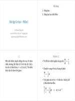
Giao trinh bai tap statistics 1
Bạn đang xem bản rút gọn của tài liệu. Xem và tải ngay bản đầy đủ của tài liệu tại đây (688.43 KB, 29 trang )
STATISTICS
FREQUENCY DISTRIBUTIONS & GRAPHS
Vuong Ba Thinh
1
Statistics
ACKNOWLEDMENT
This slides are composed using the book:
Allan G. Bluman , Elementary Statistics: A Step by Step
Approach, eighth edition 2012.
2
Statistics
OUTLINE
Organizing Data
Histograms, Frequency Polygons, and Ogives
Other Types of Graphs
R functions
Q&A
3
Statistics
Introduction
Raw Data Organizing Data Presenting Data
Example: a study on the ages of the top 50 wealthiest people
in the world raw data
4
Statistics
Organizing Data
How?
5
Statistics
Organizing Data (1)
Frequency Distribution
A frequency distribution consists of classes and their corresponding
frequencies
Each raw data value is placed into a quantitative or qualitative
category called a class
The frequency of a class then is the number of data values contained
in a specific class
6
Statistics
Organizing Data (2)
A frequency distribution is the organization of raw data
in table form, using classes and frequencies
Two types of frequency distributions: frequency distribution,
grouped frequency distribution
7
Statistics
Organizing Data (3)
Categorical Frequency Distributions
nominal or ordinal-level data
EX: Twenty-five army inductees were given a blood test to
determine their blood type. The data set is
Construct a frequency distribution for the data.
8
Statistics
Organizing Data (4)
9
Statistics
Organizing Data (5)
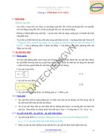
Grouped Frequency Distributions
grouped frequency distribution: When the range of the
data is large, the data must be grouped into classes that are
more than one unit in width
EX: a distribution of the number of hours that boat batteries
lasted is the following
10
Statistics
Organizing Data (6)
To construct a frequency distribution, follow these rules:
There should be between 5 and 20 classes
It is preferable but not absolutely necessary that the class width be an
odd number
The classes must be mutually exclusive
The classes must be continuous
The classes must be exhaustive
The classes must be equal in width
11
Statistics
Organizing Data (7)
12
Statistics
Applying the Concepts
The data represent the ages of our Presidents at the time they
were first inaugurated.
1. Were the data obtained from a population or a sample? Explain
your answer.
2. What was the age of the oldest President?
3. What was the age of the youngest President?
4. Construct a frequency distribution for the data.
13
Statistics
Applying the Concepts (2)
5. Are there any peaks in the distribution?
6. ldentify any possible outliers.
7. Write a brief summary of the nature of the data as shown in
the frequency distribution.
14
Statistics
Histograms, Frequency Polygons, & Ogives
A picture is worth a thousand words
15
Statistics
Histograms
The histogram is a graph that displays the data by using
contiguous vertical bars (unless the frequency of a class is 0)
of various heights to represent the frequencies of the classes.
EX: Construct a histogram to represent the data shown for
the record high temperatures for each of the 50 states
16
Statistics
Frequency Polygons
The frequency polygon is a graph that displays the data by
using lines that connect points plotted for the frequencies at
the midpoints of the classes. The frequencies are represented
by the heights of the points.
EX:
17
Statistics
Ogives
The ogive is a graph that represents the cumulative
frequencies for the classes in a frequency distribution.
Cumulative frequency graphs are used to visually represent
how many values are below a certain upper class boundary.
EX:
18
Statistics
19
Statistics
Relative Frequency Graphs
20
Statistics
Other Types of Graphs
Bar graph, Pareto chart, time series graph, and pie graph.
A bar graph represents the data by using vertical or
horizontal bars whose heights or lengths represent the
frequencies of the data.
21
Statistics
Other Types of Graphs (2)
A Pareto chart is used to represent a frequency distribution
for a categorical variable, and the frequencies are displayed
by the heights of vertical bars, which are arranged in order
from highest to lowest.
EX: Number of Homeless
22
Statistics
Other Types of Graphs (3)
A time series graph represents data that occur over a
specific period of time.
EX: Workplace Homicides
23
Statistics
Other Types of Graphs (4)
A pie graph is a circle that is divided into sections
according to the percentage of frequencies in each category
of the distribution.
EX: blood types of the army inductees
24
Statistics
Misleading Graphs
25
Statistics