phân tích ý nghĩa Logo Vietel dựa trên Yếu tố thương hiệu
Bạn đang xem bản rút gọn của tài liệu. Xem và tải ngay bản đầy đủ của tài liệu tại đây (1.56 MB, 21 trang )
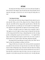
The logo was designed based on the idea of the
formation
of
single
quotes.
This
image
represents Viettel always respectfully listen and
feel the idea of everyone - customers, partners,
This is the content of the Brand (slogan) of
Viettel: Say it your way.
On symbol Viettel, have story continuity, because the quotation marks are designed to go from small to large strokes strokes back to,
showing constant innovation always creative. If you respect someone's statement, you will quote in quotation marks. This is also very
relevant to the slogan "Say it your way". Viettel cares and respects the individual needs of its clients and employees. "
Viettel block letters in the middle represent the viewpoint of development, brand
vision Viettel always been focused on the development, always concerned about
customers, Viettel letters designed to link to each other, express coherence,
consensus, rubbing shoulders in the membership of the consortium.
Blue is represents the sky, the color of the rising
aspirations, the color of the creative space and suitable for
military symbol.
Yellow represents the earth, the color of warmth, intimacy.
White is the background of Viettel, expressed sincere,
honest and kind.
The harmony between heaven,earth and man show favorable
development.
Among the telecom companies on the market today, Viettel is the first
company that gets into the minds of customers with a very different idea of
personalizing the service of telecommunications and listening each customer
in Vietnam.
According to trademark experts, Viettel has a better view of brand and
slogan than other telecom companies in Vietnam.