IELTS writing task 1 tổng hợp bài mẫu band 9
Bạn đang xem bản rút gọn của tài liệu. Xem và tải ngay bản đầy đủ của tài liệu tại đây (1.57 MB, 32 trang )
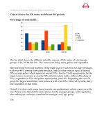
1. age distribution
The charts below compare the age structure of the populations of France and India in
1984.
The two charts compare the populations of France and India in terms of age
distribution by gender in the year 1984.
It is clear that the population of India was younger than that of France in 1984, with a
noticeably larger proportion of people aged under 20. France, on the other hand, had a
significantly larger percentage of elderly inhabitants.
In India, close to 14% of people were aged 5 or under, and each five-year age bracket
above this contained an increasingly smaller proportion of the population. France’s
population, by contrast, was more evenly distributed across the age ranges, with
similar figures (around 7% to 8% of all people) for each five-year cohort between the
ages of 0 and 40. Somewhere between 10% and 15% of all French people were aged
70 or older, but the equivalent figure for India was only 2%.
Looking more closely at gender, there was a noticeably higher proportion of French
women than men in every cohort from age 50 upwards. For example, almost 3% of
French 70- to 75-year-olds were women, while just under 2% were men. No
significant gender differences can be seen on the Indian population chart.
(199 words, band 9)
2.pie
The pie charts below show how dangerous waste products are dealt with in three
countries.
The charts compare Korea, Sweden and the UK in terms of the methods used in each
country to dispose of harmful waste.
It is clear that in both the UK and Sweden, the majority of dangerous waste products
are buried underground. By contrast, most hazardous materials in the Republic of Korea
are recycled.
Looking at the information in more detail, we can see that 82% of the UK’s dangerous
waste is put into landfill sites. This disposal technique is used for 55% of the harmful
waste in Sweden and only 22% of similar waste in Korea. The latter country recycles
69% of hazardous materials, which is far more than the other two nations.
While 25% of Sweden's dangerous waste is recycled, the UK does not recycle at all.
Instead, it dumps waste at sea or treats it chemically. These two methods are not
employed in Korea or Sweden, which favour incineration for 9% and 20% of dangerous
waste respectively.
(159 words, band 9)
3. The diagrams below show how houses can be protected in areas which are prone to
flooding.
Here's
my
full
band
9
report:
The diagrams compare two different methods of defence for homes which are at risk of
being
flooded.
The key difference between the diagrams is that they show flood protection with and
without a stopbank. In either case, the at-risk home is raised on stilts above ground level.
The first diagram shows how a stopbank acts as a flood barrier to stop river water from
flooding homes. The stopbank is a small mound of land next to the river that is higher
than the 100-year flood level, and prevents the river from bursting its banks. Nearby
houses can be built on stilts to prevent flooding from rainwater, and a floodgate beneath
the stopbank can be opened to allow this ‘ponding’ to drain off into the river.
When there is no stopbank, as shown in the second diagram, there will be nothing to
stop the river from flooding. In this case, the solution is to put buildings on stilts. The
height of the stilts is measured so that the floor of the house is 300mm above the 100year flood level. This measurement is called the ‘freeboard’.
4. The table below shows the amount of waste production (in millions of tonnes) in
six different countries over a twenty-year period.
The chart compares the amounts of waste that were produced in six countries in the
years 1980, 1990 and 2000.
In each of these years, the US produced more waste than Ireland, Japan, Korea,
Poland and Portugal combined. It is also noticeable that Korea was the only country
that managed to reduce its waste output by the year 2000.
Between 1980 and 2000, waste production in the US rose from 131 to 192 million
tonnes, and rising trends were also seen in Japan, Poland and Portugal. Japan’s waste
output increased from 28 to 53 million tonnes, while Poland and Portugal saw waste
totals increase from 4 to 6.6 and from 2 to 5 million tonnes respectively.
The trends for Ireland and Korea were noticeably different from those described
above. In Ireland, waste production increased more than eightfold, from only 0.6
million tonnes in 1980 to 5 million tonnes in 2000. Korea, by contrast, cut its waste
output by 12 million tonnes between 1990 and 2000.
5. The table below shows changes in the numbers of residents cycling to work in
different areas of the UK between 2001 and 2011.
The table compares the numbers of people who cycled to work in twelve areas of the
UK in the years 2001 and 2011.
Overall, the number of UK commuters who travelled to work by bicycle rose
considerably over the 10-year period. Inner London had by far the highest number of
cycling commuters in both years.
In 2001, well over 43 thousand residents of inner London commuted by bicycle, and
this figure rose to more than 106 thousand in 2011, an increase of 144%. By contrast,
although outer London had the second highest number of cycling commuters in each
year, the percentage change, at only 45%, was the lowest of the twelve areas shown in
the table.
Brighton and Hove saw the second biggest increase (109%) in the number of residents
cycling to work, but Bristol was the UK’s second city in terms of total numbers of
cycling commuters, with 8,108 in 2001 and 15,768 in 2011. Figures for the other eight
areas were below the 10 thousand mark in both years.
(172 words, band 9)
6. The diagram below shows how solar panels can be used to provide electricity for
domestic use.
The picture illustrates the process of producing electricity in a home using solar panels.
It is clear that there are five distinct stages in this process, beginning with the capture
of energy from sunlight. The final two steps show how domestic electricity is connected
to the external power supply.
At the first stage in the process, solar panels on the roof of a normal house take energy
from the sun and convert it into DC current. Next, this current is passed to an inverter,
which changes it to AC current and regulates the supply of electricity. At stage three,
electricity is supplied to the home from an electrical panel.
At the fourth step shown on the diagram, a utility meter in the home is responsible for
sending any extra electric power outside the house into the grid. Finally, if the solar
panels do not provide enough energy for the household, electricity will flow from the
utility grid into the home through the meter.
Note:
I've underlined examples of the two language features that make process diagram
descriptions special: 'steps' language, and passive verbs.
7. The bar graph shows the global sales (in billions of dollars) of different types of
digital games between 2000 and 2006.
The bar chart compares the turnover in dollars from sales of video games for four
different platforms, namely mobile phones, online, consoles and handheld devices,
from 2000 to 2006.
It is clear that sales of games for three out of the four platforms rose each year, leading
to a significant rise in total global turnover over the 7-year period. Sales figures for
handheld games were at least twice as high as those for any other platform in almost
every year.
In 2000, worldwide sales of handheld games stood at around $11 billion, while console
games earned just under $6 billion. No figures are given for mobile or online games in
that year. Over the next 3 years, sales of handheld video games rose by about $4 billion,
but the figure for consoles decreased by $2 billion. Mobile phone and online games
started to become popular, with sales reaching around $3 billion in 2003.
In 2006, sales of handheld, online and mobile games reached peaks of 17, 9 and 7 billion
dollars respectively. By contrast, turnover from console games dropped to its lowest
point, at around $2.5 billion.
8.
The map shows the growth of a village called Chorleywood between 1868 and 1994.
It is clear that the village grew as the transport infrastructure was improved. Four
periods of development are shown on the map, and each of the populated areas is near
to the main roads, the railway or the motorway.
From 1868 to 1883, Chorleywood covered a small area next to one of the main roads.
Chorleywood Park and Golf Course is now located next to this original village area.
The village grew along the main road to the south between 1883 and 1922, and in 1909
a railway line was built crossing this area from west to east. Chorleywood station is in
this part of the village.
The expansion of Chorleywood continued to the east and west alongside the railway
line until 1970. At that time, a motorway was built to the east of the village, and from
1970 to 1994, further development of the village took place around motorway
intersections with the railway and one of the main roads.
9. The chart below shows the process of waste paper recycling.
The flow chart shows how waste paper is recycled. It is clear that there are six distinct
stages in this process, from the initial collection of waste paper to the eventual
production of usable paper.
At the first stage in the paper recycling process, waste paper is collected either from
paper banks, where members of the public leave their used paper, or directly from
businesses. This paper is then sorted by hand and separated according to its grade, with
any paper that is not suitable for recycling being removed. Next, the graded paper is
transported to a paper mill.
Stages four and five of the process both involve cleaning. The paper is cleaned and
pulped, and foreign objects such as staples are taken out. Following this, all remnants
of ink and glue are removed from the paper at the de-inking stage. Finally, the pulp can
be processed in a paper making machine, which makes the end product: usable paper.
(160 words, band 9)
Note: I joined the introduction and overview together because they were both short. Try
to analyse the essay - why is it worth band 9?
10. The chart below shows the total number of Olympic medals won by twelve
different countries.
The bar chart compares twelve countries in terms of the overall number of medals that
they have won at the Olympic Games.
It is clear that the USA is by far the most successful Olympic medal winning nation. It
is also noticeable that the figures for gold, silver and bronze medals won by any
particular country tend to be fairly similar.
The USA has won a total of around 2,300 Olympic medals, including approximately
900 gold medals, 750 silver and 650 bronze. In second place on the all-time medals
chart is the Soviet Union, with just over 1,000 medals. Again, the number of gold
medals won by this country is slightly higher than the number of silver or bronze medals.
Only four other countries - the UK, France, Germany and Italy - have won more than
500 Olympic medals, all with similar proportions of each medal colour. Apart from the
USA and the Soviet Union, China is the only other country with a noticeably higher
proportion of gold medals (about 200) compared to silver and bronze (about 100 each).
(178 words, band 9)
11.
The table compares the percentages of people using different functions of their mobile
phones between 2006 and 2010.
Throughout the period shown, the main reason why people used their mobile phones
was to make calls. However, there was a marked increase in the popularity of other
mobile phone features, particularly the Internet search feature.
In 2006, 100% of mobile phone owners used their phones to make calls, while the
next most popular functions were text messaging (73%) and taking photos (66%). By
contrast, less than 20% of owners played games or music on their phones, and there
were no figures for users doing Internet searches or recording video.
Over the following 4 years, there was relatively little change in the figures for the top
three mobile phone features. However, the percentage of people using their phones to
access the Internet jumped to 41% in 2008 and then to 73% in 2010. There was also a
significant rise in the use of mobiles to play games and to record video, with figures
reaching 41% and 35% respectively in 2010.
Note:
The above essay isn't perfect, but it's still good enough for a band 9. You are not
expected to write a masterpiece in only 20 minutes.
12.
The line graph compares average yearly spending by Americans on mobile and landline
phone services from 2001 to 2010.
It is clear that spending on landline phones fell steadily over the 10-year period, while
mobile phone expenditure rose quickly. The year 2006 marks the point at which
expenditure on mobile services overtook that for residential phone services.
In 2001, US consumers spent an average of nearly $700 on residential phone services,
compared to only around $200 on cell phone services. Over the following five years,
average yearly spending on landlines dropped by nearly $200. By contrast, expenditure
on mobiles rose by approximately $300.
In the year 2006, the average American paid out the same amount of money on both
types of phone service, spending just over $500 on each. By 2010, expenditure on
mobile phones had reached around $750, while the figure for spending on residential
services had fallen to just over half this amount.
(162 words, band 9)
13. The diagram shows the life cycle of the honey bee. Two things to consider are:
how to summarise the diagram before describing the stages in detail
whether to use active or passive verb forms
The diagram illustrates the various stages in the life of a honey bee. We can see that the
complete life cycle lasts between 34 and 36 days. It is also noticeable that there are five
main stages in the development of the honey bee, from egg to mature adult insect.
The life cycle of the honey bee begins when the female adult lays an egg; the female
typically lays one or two eggs every 3 days. Between 9 and 10 days later, each egg
hatches and the immature insect, or nymph, appears.
During the third stage of the life cycle, the nymph grows in size and sheds its skin three
times. This moulting first takes place 5 days after the egg hatches, then 7 days later, and
again another 9 days later. After a total of 30 to 31 days from the start of the cycle, the
young adult honey bee emerges from its final moulting stage, and in the space of only
4 days it reaches full maturity.
(169 words, band 9)
14.The climograph below shows average monthly temperatures and rainfall in the city
of Kolkata.
The chart compares average figures for temperature and precipitation over the course
of a calendar year in Kolkata.
It is noticeable that monthly figures for precipitation in Kolkata vary considerably,
whereas monthly temperatures remain relatively stable. Rainfall is highest from July to
August, while temperatures are highest in April and May.
Between the months of January and May, average temperatures in Kolkata rise from
their lowest point at around 20°C to a peak of just over 30°C. Average rainfall in the
city also rises over the same period, from approximately 20mm of rain in January to
100mm in May.
While temperatures stay roughly the same for the next four months, the amount of
rainfall more than doubles between May and June. Figures for precipitation remain
above 250mm from June to September, peaking at around 330mm in July. The final
three months of the year see a dramatic fall in precipitation, to a low of about 10mm in
December, and a steady drop in temperatures back to the January average.
(173 words, band 9)
15.
The bar charts compare students of different ages in terms of why they are studying and
whether they are supported by an employer.
It is clear that the proportion of students who study for career purposes is far higher
among the younger age groups, while the oldest students are more likely to study for
interest. Employer support is more commonly given to younger students.
Around 80% of students aged under 26 study to further their careers, whereas only 10%
study purely out of interest. The gap between these two proportions narrows as students
get older, and the figures for those in their forties are the same, at about 40%. Students
aged over 49 overwhelmingly study for interest (70%) rather than for professional
reasons (less than 20%).
Just over 60% of students aged under 26 are supported by their employers. By contrast,
the 30-39 age group is the most self-sufficient, with only 30% being given time off and
help with fees. The figures rise slightly for students in their forties and for those aged
50 or more.
(178 words, band 9)
16. The chart below shows numbers of incidents and injuries per 100 million
passenger miles travelled (PMT) by transportation type in 2002.
The bar chart compares the number of incidents and injuries for every 100 million
passenger miles travelled on five different types of public transport in 2002.
It is clear that the most incidents and injuries took place on demand-response vehicles.
By contrast, commuter rail services recorded by far the lowest figures.
A total of 225 incidents and 173 injuries, per 100 million passenger miles travelled,
took place on demand-response transport services. These figures were nearly three
times as high as those for the second highest category, bus services. There were 76
incidents and 66 people were injured on buses.
Rail services experienced fewer problems. The number of incidents on light rail trains
equalled the figure recorded for buses, but there were significantly fewer injuries, at
only 39. Heavy rail services saw lower numbers of such events than light rail services,
but commuter rail passengers were even less likely to experience problems. In fact, only
20 incidents and 17 injuries occurred on commuter trains.
(165 words, band 9)
17. The graph below shows the proportion of the population aged 65 and over
between 1940 and 2040 in three different countries.
The line graph compares the percentage of people aged 65 or more in three countries
over a period of 100 years.
It is clear that the proportion of elderly people increases in each country between 1940
and 2040. Japan is expected to see the most dramatic changes in its elderly
population.
In 1940, around 9% of Americans were aged 65 or over, compared to about 7% of
Swedish people and 5% of Japanese people. The proportions of elderly people in the
USA and Sweden rose gradually over the next 50 years, reaching just under 15% in
1990. By contrast, the figures for Japan remained below 5% until the early 2000s.
Looking into the future, a sudden increase in the percentage of elderly people is
predicted for Japan, with a jump of over 15% in just 10 years from 2030 to 2040. By
2040, it is thought that around 27% of the Japanese population will be 65 years old or
more, while the figures for Sweden and the USA will be slightly lower, at about 25%
and 23% respectively.
(178 words, band 9)
18. The table below gives information on consumer spending on different items in
five different countries in 2002.
Percentage of national consumer expenditure by category - 2002
The table shows percentages of consumer expenditure for three categories of products
and services in five countries in 2002.
It is clear that the largest proportion of consumer spending in each country went on
food, drinks and tobacco. On the other hand, the leisure/education category has the
lowest percentages in the table.
Out of the five countries, consumer spending on food, drinks and tobacco was
noticeably higher in Turkey, at 32.14%, and Ireland, at nearly 29%. The proportion of
spending on leisure and education was also highest in Turkey, at 4.35%, while
expenditure on clothing and footwear was significantly higher in Italy, at 9%, than in
any of the other countries.
It can be seen that Sweden had the lowest percentages of national consumer expenditure
for food/drinks/tobacco and for clothing/footwear, at nearly 16% and just over 5%
respectively. Spain had slightly higher figures for these categories, but the lowest figure
for leisure/education, at only 1.98%.
19. The graph and table below give information about water use worldwide and water
consumption in two different countries.
The charts compare the amount of water used for agriculture, industry and homes
around the world, and water use in Brazil and the Democratic Republic of Congo.
It is clear that global water needs rose significantly between 1900 and 2000, and that
agriculture accounted for the largest proportion of water used. We can also see that
water consumption was considerably higher in Brazil than in the Congo.
In 1900, around 500km³ of water was used by the agriculture sector worldwide. The
figures for industrial and domestic water consumption stood at around one fifth of that
amount. By 2000, global water use for agriculture had increased to around 3000km³,
industrial water use had risen to just under half that amount, and domestic consumption
had reached approximately 500km³.
In the year 2000, the populations of Brazil and the Congo were 176 million and 5.2
million respectively. Water consumption per person in Brazil, at 359m³, was much
higher than that in the Congo, at only 8m³, and this could be explained by the fact that
Brazil had 265 times more irrigated land.
(184 words, band 9)
20. The chart below shows information about changes in average house prices in five
different cities between 1990 and 2002 compared with the average house prices in
1989.
The bar chart compares the cost of an average house in five major cities over a period
of 13 years from 1989.
We can see that house prices fell overall between 1990 and 1995, but most of the cities
saw rising prices between 1996 and 2002. London experienced by far the greatest
changes in house prices over the 13-year period.
Over the 5 years after 1989, the cost of average homes in Tokyo and London dropped
by around 7%, while New York house prices went down by 5%. By contrast, prices
rose by approximately 2% in both Madrid and Frankfurt.
Between 1996 and 2002, London house prices jumped to around 12% above the 1989
average. Homebuyers in New York also had to pay significantly more, with prices
rising to 5% above the 1989 average, but homes in Tokyo remained cheaper than they
were in 1989. The cost of an average home in Madrid rose by a further 2%, while prices
in Frankfurt remained stable.
(165 words)
21. The table below shows the proportion of different categories of families living in
poverty in Australia in 1999.
The table gives information about poverty rates among six types of household in
Australia in the year 1999.
It is noticeable that levels of poverty were higher for single people than for couples,
and people with children were more likely to be poor than those without. Poverty
rates were considerably lower among elderly people.
Overall, 11% of Australians, or 1,837,000 people, were living in poverty in 1999.
Aged people were the least likely to be poor, with poverty levels of 6% and 4% for
single aged people and aged couples respectively.
Just over one fifth of single parents were living in poverty, whereas only 12% of
parents living with a partner were classed as poor. The same pattern can be seen for
people with no children: while 19% of single people in this group were living below
the poverty line, the figure for couples was much lower, at only 7%.
(150 words, band 9)
22. The map below is of the town of Garlsdon. A new supermarket (S) is planned for
the town. The map shows two possible sites for the supermarket.
The map shows two potential locations (S1 and S2) for a new supermarket in a town
called Garlsdon.
The main difference between the two sites is that S1 is outside the town, whereas S2
is in the town centre. The sites can also be compared in terms of access by road or
rail, and their positions relative to three smaller towns.
Looking at the information in more detail, S1 is in the countryside to the north west of
Garlsdon, but it is close to the residential area of the town. S2 is also close to the
housing area, which surrounds the town centre.
There are main roads from Hindon, Bransdon and Cransdon to Garlsdon town centre,
but this is a no traffic zone, so there would be no access to S2 by car. By contrast, S1
lies on the main road to Hindon, but it would be more difficult to reach from
Bransdon and Cransdon. Both supermarket sites are close to the railway that runs
through Garlsdon from Hindon to Cransdon.
23.
The bar chart compares consumer spending on six different items in Germany, Italy,
France and Britain.
It is clear that British people spent significantly more money than people in the other
three countries on all six goods. Of the six items, consumers spent the most money on
photographic film.
People in Britain spent just over £170,000 on photographic film, which is the highest
figure shown on the chart. By contrast, Germans were the lowest overall spenders,
with roughly the same figures (just under £150,000) for each of the six products.
The figures for spending on toys were the same in both France and Italy, at nearly
£160,000. However, while French people spent more than Italians on photographic
film and CDs, Italians paid out more for personal stereos, tennis racquets and
perfumes. The amount spent by French people on tennis racquets, around £145,000, is
the lowest figure shown on the chart.
Note:
- I tried to keep the essay short (154 words) by selecting carefully.
- It's difficult to change spend, but I used spending, spenders and paid out.
24. The diagrams below show some principles of house design for cool and for warm
climates.
The diagrams show how house designs differ according to climate.
The most noticeable difference between houses designed for cool and warm climates
is in the shape of the roof. The designs also differ with regard to the windows and the
use of insulation.
We can see that the cool climate house has a high-angled roof, which allows sunlight
to enter through the window. By contrast, the roof of the warm climate house has a
peak in the middle and roof overhangs to shade the windows. Insulation and thermal
building materials are used in cool climates to reduce heat loss, whereas insulation
and reflective materials are used to keep the heat out in warm climates.
Finally, the cool climate house has one window which faces the direction of the sun,
while the warm climate house has windows on two sides which are shaded from the
sun. By opening the two windows at night, the house designed for warm climates can
be ventilated.
(162 words, band 9)
25. The diagram below shows the water cycle, which is the continuous movement of
water on, above and below the surface of the Earth.
The picture illustrates the way in which water passes from ocean to air to land during
the natural process known as the water cycle.
Three main stages are shown on the diagram. Ocean water evaporates, falls as rain,
and eventually runs back into the oceans again.
Beginning at the evaporation stage, we can see that 80% of water vapour in the air
comes from the oceans. Heat from the sun causes water to evaporate, and water
vapour condenses to form clouds. At the second stage, labelled ‘precipitation’ on the
diagram, water falls as rain or snow.
At the third stage in the cycle, rainwater may take various paths. Some of it may fall
into lakes or return to the oceans via ‘surface runoff’. Otherwise, rainwater may filter