price steve ielts writing task 1 academic how to improve you
Bạn đang xem bản rút gọn của tài liệu. Xem và tải ngay bản đầy đủ của tài liệu tại đây (3.99 MB, 122 trang )
AlsobyStevePrice
HowtoImproveyourIELTSTestbandscores
IELTSReading:HowtoimproveyourIELTSReadingbandscore
IELTSSpeaking-Howtoimproveyourbandscore
IELTSWritingTask2:HowtoImproveYourIELTSBandScore
IELTSListening:HowtoimproveyourIELTSbandscore
IELTSTask1Writing(Academic)Test:HowtoimproveyourIELTSbandscore
Standalone
ProposalWriting-SmartBids,TendersandProposals
AlsobyAdonisEnricuso
HowtoImproveyourIELTSTestbandscores
IELTSReading:HowtoimproveyourIELTSReadingbandscore
IELTSSpeaking-Howtoimproveyourbandscore
IELTSWritingTask2:HowtoImproveYourIELTSBandScore
IELTSListening:HowtoimproveyourIELTSbandscore
IELTSTask1Writing(Academic)Test:HowtoimproveyourIELTSbandscore
Contents
Copyright
HowThisBookHelpsYou
UnderstandingBandScore
TheIELTsWritingTask1(Academic)
9TechniquesforBetterIELTSWritingTask1BandScore
ChapterTechnique1:Readingthegivendata
ChapterTechnique2:Identifyingandchoosingthesignificantdetails
ChapterTechnique3:Structuringtheessay
ChapterTechnique4:Paraphrasingthetopicquestion
ChapterTechnique5:Statinggeneraltrends
ChapterTechnique6:Relatedverbs,nouns,adverbsandadjectives:describing
trends;describingproportionsandapproximations
ChapterTechnique7:Statingothersignificantdetails
ChapterTechnique8:Grammar:conjunctions;verbtenses;voices;sentence
structures
ChapterTechnique9:Languageforcomparisonandcontrast
ChapterHowtogetthebandscoresyouneed
ChapterIELTSPreparationChecklist
ChapterHelpfulResources
Copyright©2013,STMPAssociatesLtd.
Firstpublishedin2013
TheCopyright ofthis document is vestedinSTMP Associates Ltd.,the parentcompanywhich ownsthe
PassIELTSHigherbrand,thewww.passieltshigher.comwebsite,andrelatedproducts,andthedocumentis
soldonlyforthepurposeforwhichitissupplied.
All rights reserved. This book or any portion thereof may not be disclosed, reproduced, or used in any
manner whatsoever without the express written permission of the publisher except for the use of brief
quotationsinabookreview.
Publisher:
STMPAssociatesLtd.
27,OldGloucesterStreet
London,EnglandWC1N3XX
www.passieltshigher.com
Thenamesofcompaniesandwebsiteaddressesareprovidedforinformationofreaderswithnointention
whatsoevertoinfringeoncopyrightortrademarks.
All trademarks and registered trademarks appearing in this guide are the property of their respective
owners.
Theinformationcontainedinthisbookisforinformationpurposesonly.
Usersofthisbookareadvisedtodotheirownduediligencewhenitcomestomakinglearningdecisions,
and all information, products, and services that have been provided or recommended should be
independentlyverifiedbyyourownqualifiedprofessionals.Byreadingthisbook,youagreethattheauthors
and/orthepublisherarenotresponsibleforthesuccessorfailureofyourIELTSTest.
FormoreinformationontheIELTSTest,pleasevisittheofficialwebsiteatwww.IELTS.org.
AbouttheAuthors
Steve Price is creator and owner of Pass IELTS Higher (a business of STMP Associates Ltd.). He is
passionate about delivering high-quality information and coaching products to students of IELTS. His
visionistohelpIELTScandidateshelpthemselvestohigherbandscores.
DonEnricusoisaferventaficionadooftheEnglishlanguage.Ateacherbyheart,heholdsanABEnglish
degreeandaTESOLcertificate(SchoolofTEFL,Canada).CurrentlyheisstudyingforanMAinapplied
linguisticsatatopuniversityinthePhilippines.HecoachescandidatesfromallovertheworldinIELTS
skillsandEnglishproficiency.
Authors’Acknowledgements
The authors would like to thank Andrea Price, Fatimah Imam, Jedi Reston, and James England for their
practicalsupportandencouragementduringthecreationofthisbook.
FrontcoverdesignbyJediReston
HowThisBookHelpsYou
This book gives you, the IELTS Test candidate, detailed guidance on how you
canimproveyourIELTSWritingTask1(Academic)Testbandscore.
TheIELTSWritingTask1(Academic)Testisnodifferentfromanyotherexam
ortesttype.Therearetechniques,whichcanbepractisedandwhichwillplace
candidatesinabetterpositiontoanswereachgivenquestiontype.
ThisbookteachesyouthosetechniquesfortheIELTSWritingTask1(Academic)
Test.
Both Task 1 and Task 2 are rated based on four criteria: Task Achievement,
Coherence and Cohesion, Lexical Resource and Grammatical Range and
Accuracy.
Scoresrangefrom0to9,anda0.5ratemayalsobegiven.
Thefourcriteriaareofequalweight.Sotheremustalsobeanequalamountof
preparation.
Duringyourpracticeandpreparation,don’tmisstokeepreferringbackandforth
tothisdescriptor.Thiswillthoroughlyguideyouasyouprogress.
This knowledge is the icing on your IELTS preparation cake. In a favourable
way,ofcourse.
The next table shows a comprehensive description of the English language
capabilitiesrequiredineachbandscore.
The first question in the IELTS Academic Writing Test asks you to make an
essayofatleast150words.
In the question you will see an image that is either a table, graph, chart, map,
diagramoracombinationofanytwoofthem.Basically,thistaskrequiresyouto
succinctlyreportthesignificant(majorandminor)information.
Theadvisableamountoftimetoaccomplishthistaskis20minutes.
9TechniquesforBetterIELTSWritingTask1(Academic)BandScore
Thetechniquesarelistedbelow,andeachlinkstoachapterinthisbookwhich
teachesIELTSTestcandidatesthenecessaryskills.
Technique1:Readingthegivendata
Technique2:Identifyingandchoosingthesignificantdetails
Technique3:Structuringtheessay
Technique4:Paraphrasingthetopicquestion
Technique5:Statinggeneraltrends
Technique 6: Related verbs, nouns, adverbs and adjectives: describing
trends;describingproportionsandapproximations
Technique7:Statingothersignificantdetails
Technique 8: Grammar: conjunctions; verb tenses; voices; sentence
structures
Technique9:Languageforcomparisonandcontrast
ChapterTechnique1:Readingthegivendata
Whatarethetypesofdataintask1oftheWritingtest?
Intask1,whereyouareaskedtowriteanessayof150words(minimum),the
content will depend on what type of data are given in the topic question. It is
presentedinagraph,chart,table,diagram,ormap(whichisnotreallycommon).
Sometimes,acombinationofanyofthemisalsoused.
Whyisitimportanttoanalysethedata?
Beforeconstructingyouressay,itisaprerequisitetogooverthedata,asitisthe
bestwaytostartwiththetaskitself.Failingtodosowouldcauseincoherence
andtoomuchdelayduringthemaximumof20minutesintendedforyouinthis
partoftheexam.Youshouldalsocarefullyunderstandeverythingyouseeonthe
exampaper—fromtheinstructionstothedetailsofthegivenfigure.
Howarethedataanalysed?
Readandunderstandtheheadingcarefully.Thatalonewillgiveyouanoverview
ofthedatarepresentedbythechartorgraph.Then,lookattheitemsfromtopto
bottomorfromlefttoright.
Formapsanddiagrams,alwaysstartwiththebiggerorgeneralpicture,orfind
thestartingpointfirstandfollowthewholeprocess.Thesearetheexactdatato
beinterpreted.
Studyhowthesedataarepresented,andtakenoteofeverypatterninvolved.
Finally, try to be discriminating as to which sets of information are most
significant. You don’t have to pay attention to those that do not show much
distinction. Follow the aforementioned steps as you take a look at a certain
figure.
Howistheinformationinterpreted?
Based on the given figures, look for significant data such as the biggest or
smallestnumber(fortables),startingpoint(fordiagrams),longestorshortestbar
(forcharts),andhighestorlowestpoint(forgraphs).
Notice how these data are presented in terms of patterns and trends. Is there a
decreasing or increasing movement of items (for tables)? What does the arrow
suggest? Are there two or more arrows (for diagrams)? How are the points
moving? Are they moving up or down, or are they fluctuating (for charts and
graphs)?
Activities
1. Payattentiontotheheadingorquestionofeachfigureandunderlineits
keywords.
2. Brieflystatewhatthegivenitemsrepresent.
3. Doyouseeanygeneraltrendsormovementsoftheitemsordata
presented?Whatarethese?
Answertheabovequestionswitheachofthefiguresinthefollowingslides:
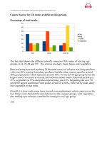
Figure1.TheLineGraph
The graph below shows global energy demand, measured in millions of
tonnesoilequivalent,overaperiodofsixdecades.
ResponsetoActivityA
The graphbelowshowsglobalenergydemand,measuredinmillionsoftonnes
oilequivalent,overaperiodofsixdecades.
Fromtheunderlinedphrasesabove,youalreadyunderstandthebasicpointsto
lookatinthegivenlinegraph.Thereisameasurementofenergyinaparticular
period.
ResponsetoActivityB
Thegivenitemsalongtheverticalaxisrepresentamountsofenergyrequiredor
allocated for each year shown in the horizontal axis. Hence, their range of
measurement has an upward direction, while the chronological order is to the
right.
ResponsetoActivityC
Ifyoulookatthesixcolouredlinesfoundinthegraph,it’sveryobviousthatan
increasing trend is common among them. So, through time, the demand of
energymeasuredinmillionsoftonnesisgenerallyincreasing.
Figure2.TheBarChart
The chart below reveals how the number of vulnerable households in fuel
poverty,measuredinmillions,changesbetween1996and2006.
ResponsetoActivityA
The chart below reveals how the number of vulnerable households in fuel
poverty,measuredinmillions,changesbetween1996and2006.
With the underlined phrases, you may initially understand the tally of the
number of households under a particular social condition. Also, these numbers
willbecomparedastowhethertheyincreaseordecreaseoveragivenperiod.
ResponsetoActivityB
Ontheverticalaxisisthenumberofhouseholdsvulnerabletofuelpoverty.The
givenrangeisupto4.5millionhouseholdsalthoughtheactualhighestnumber
associatedwiththedataisonly4million.Hence,thereisanintervalof500,000
or half a million. On the horizontal axis is the chronological presentation of
yearsassociatedwithfuelpovertyinEnglandaftereconomiceffects.
ResponsetoActivityC
Thefirstnoticeabletrendisthegradualdecreaseinnumberasprojectedbythe
vertical bars from 1996 to 2003—steadily through 2004. Then, in the two
succeedingyears,thereisagradualincreaseinnumber.
Figure3.ThePieChart
Thepiechartbelowillustrateshowthetotalamountofglobalemissionsof
carbondioxideissharedbydifferentnationsintheyear2003.
ResponsetoActivityA
The pie chart below illustrates how the total amount of global emissions of
carbondioxideissharedbydifferentnationsintheyear2003.
Thetopicabovesuggeststhattherearecertaincountriesresponsibleforcarbon
dioxide emissions. Their numbers are combined to come up with a total
measurementinaparticularyear.
ResponsetoActivityB
Eachdivisionofthewholefigure,representedwithadistinctcolour,showsits
proportion to the total amount of global carbon emissions. The higher the
number,themoreresponsibleeachnationshouldbeforsuchaphenomenon.
ResponsetoActivityC
There is no certain trend or movement in this chart. Instead, it is very easy to
determineandcomparethenumbersastheyarecolourcoded.
Figure4.TheDoublePieChart
ThetwopiechartsbelowpresenttheUK’stotalamountofcarbondioxide
emissions, expressed in million tonnes, in 2004 and the percentages of the
fourcomponentsofresidentialcarbondioxideemissioninthepreviousyear.
ResponsetoActivityA
The two pie charts below present the UK’s total amount of carbon dioxide
emissions,expressed in millions of tonnes,in2004and the percentages of the
fourcomponentsofresidentialcarbondioxideemissioninthepreviousyear.
Theykeywordsandphrasesabovemean thattherearetwoseparatepiecharts.
The first one is for the total amount of carbon dioxide emissions in a given
country,andthesecondonedemonstrateshowcertaincomponentscontributeto
thetotalamountofoneofthefoursectorsgiven.
ResponsetoActivitiesBandC
As discussed in the preceding lesson, the divisions of each pie represent the
percentage that each item holds. Thus, they are easily detected through colour
coding,andthereisnotrendassociated.
Figure5.TheCombinationofTableandLineGraph
Thetableandthegraphbelow,withthefourcontributingentities,illustrate
theprojectedamountsofcarbonemissionsintheUKfrom1990to2050and
demonstratethegeneraltrendrespectively.
ResponsetoActivityA
Thetableandthegraphbelow,withthefourcontributingentities,illustratethe
projected amounts of carbon emissions in the UK from 1990 to 2050 and
demonstratethegeneraltrendrespectively.
Fortheunderlinedphrases,thereisaconnectionbetweenthetwogivenfigures.
ThefirstonepresentsthetotalamountofcarbonemissionsintheUKsharedby
the given entities. This data is projected over the period shown, and the
correspondingtrendisdemonstratedinthenextfigure.
ResponsetoActivityB
Thecolumnundereachsectorshowsalistofnumbers.Thesenumbersarethe
actualamountsofcarbonemissionsexpressedinmillionsoftonnes.Thefurthest
left-handcolumncontainsthe6decadeswheneachmeasurementwasrecorded,
while the furthest right-hand one tallies the total amount of carbon emissions
fromthefoursectorsforeachdecade.
ResponsetoActivityC
Thefigurenexttothetableisalinegraph.Itshowsthegeneraltrendofthedata
presented.Itisthenobviouslyanincreasingonesincethelineismainlyinthe
upward direction. Although it does not specify the four major contributing
sectorstothetotalamountofcarbonemissionsintheUK,thetotalamountfor
eachdecadeisstillshowninaparticularorderrangingupto200milliontonnes
(themaximum).Itcanbeclearlyseenthatthehighestamountprojectedisinthe
year2050,at162.6milliontonnesofcarbondioxide.
Figure6.TheTable
The table below presents the UK’s projected proportions of carbon
emissions,measuredinmillionsoftonnes,contributedbyfoursectorsfrom
1990to2050.
ResponsetoActivityA
The table below presents the UK’sprojected proportions of carbon emissions,
measuredinmillionsoftonnes,contributedbyfoursectorsfrom1990to2050.
Theunderlinedphrasesabovearewhatthetableshows.Therearefoursectors
thatcontributetothetotalamountofcarbondioxideemissionsintheUKovera
period.
ResponsetoActivityB
Thisisexactlythesametableusedinthepreviouslesson;soistheanswerfor
thispart.
ResponsetoActivityC
Thereisanincreasingtrendofitemsinthisfigure,aswhatthelinegraphinthe
previouslessondemonstrated.
Figure7.TheDiagram
The diagram below shows that the UK’s energy system, when the use of
fossilfuelsto
generateelectricityisaddedtotheirusesintransportandprovidingheat,is
reliantonfossilfuels.
ResponsetoActivityA
The diagram below shows that theUK’s energy system, when the use of fossil
fuels to generate electricity is added to their uses in transport and providing
heat,isreliantonfossilfuels.
Theunderlinedwordsandphrasesabovearethemajorelementsofthediagram.
Theyarepresentedinasystematicwayinordertobereadandunderstoodeasily
andclearly.
ResponsetoActivityB
The first group of items at the leftmost part of the diagram are the sources of
energy. Then, they are categorised (as indicated by the two different colours)
basedontheconceptof‘energyform’.Finally,theitemsatrightmostpartarethe
servicestheysupport.
ResponsetoActivityC
Thediagramsimplyshowshowthesourcesofenergyworkinthesystem—from
theirrawformsuntiltheyareutilisedforvariouspurposes.
Figure8.TheNaturalProcessDiagram
The diagram below shows the carbon cycle, which is the endless chain of
processesintheatmosphere,lithosphere,andhydrosphere.
ResponsetoActivityA
The diagram below shows the carbon cycle, which is the endless chain of
processesintheatmosphere,lithosphereandhydrosphere.
The underlined words and phrases above give guide of the entire carbon cycle
itself.Youjustneedtofollowtheprocessesonebyone.
ResponsetoActivityB
Thearrowsserveasyourguideinlookingattheentirecycle.Somedirections,
likeupward,showwherethecarbonshouldbegoing.Sincethecycleisalready
namedinthediagram,itisthenveryeasytoconnecttheprocesses.
ResponsetoActivityC
Aprocessdiagramdoesn’thaveanytrendatall.
ChapterTechnique2:Identifyingandchoosingthe
significantdetails
Whyisitimportanttoidentifythemajorandminorideas?
Thesetofdatamaybesooverwhelmingintermsofquantitythatinyouressay,
which needs to be completed in 20 minutes, it’s impossible to describe
everything. So make sure to prioritise the most important and relevant points.
Whendevelopedwell,theywilldefinitelyachievecoherence.
Whyisthereaneedtochoosethepointstobeincludedintheessay?
Speakingofcoherence,thedatatobewrittendownshouldbewellchosen,and
the decision is yours only to make. Each of us has distinct ways of writing. It
also means that we have different styles in expressing our thoughts. What is
important in Writing task 1 is that you give what is required. Answer the task
andsupportitwithappropriatedetails.Asforthestyle,discoverandmasteryour
own.
Howarethemajorandminordetailsidentified?
Forthemajororgeneraldetails,lookintothetopicquestionorheading—ifthere
are any—first. As learned in lesson 1, the keywords will give you the main
points to consider. Confirm if these are really the major details by referring to
the chart, graph, table, diagram, or map. The minor ones either describe or
supportthemajordetails.
Howaresignificantpointschosen?
Some significant points such as the highest and the lowest values (for graphs,
chartsandtables),thefirstandthelaststeps(forprocessdiagrams),thestarting
andfinishingpoints(fordiagrams),andthemarksormarkedlocations,distance,
location,anddirection(formaps)areveryessentialforthistask.Fortheitemsor
partsofanyofthesetsofdata,itisnecessarytosaysomethingabouteach.So
determinethemostsignificantfeature.
Activity
Lookingatthesamesetsofdata(aswiththepreviouslesson),identifythe
significantdetails.Whataretheothersignificantpointstoconsiderineach
setofdata?
Set1
The graph below shows global energy demand, measured in millions of
tonnesoilequivalent,overaperiodofsixdecades.
Answer
Ontheverticalaxisisascaleofnumbersinmillionsoftonnes(0–6,000).
Onthehorizontalaxisisachronologicalrange(1970–2030).
Thelinesinthemiddlerefertothesourcesofenergy(indicatedbythelinesof