Tài liệu Excel 2010 part 20 ppt
Bạn đang xem bản rút gọn của tài liệu. Xem và tải ngay bản đầy đủ của tài liệu tại đây (896.31 KB, 10 trang )
190
55
22
##
11
44
33
00
88
99
66
77
!!
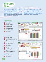
6
Click Axis Titles ( ).
7
Click Primary Horizontal Axis
Title.
8
Click Title Below Axis.
•
Excel adds the title.
9
Type the title.
0
Click .
!
Click Primary Vertical Axis
Title.
@
Click Rotated Title (not
shown).
•
Excel adds the title.
#
Type the title.
1
Click the chart.
2
Click the Layout tab.
3
Click Chart Title ( ).
4
Click Above Chart.
•
Excel adds the title.
5
Type the title.
Add Chart Titles
You can make your chart easier to read and
easier to understand by adding one or more
titles to the chart. For example, you can add a
chart title, which is a title that appears at the
top of the chart and is usually a word or short
phrase that describes the chart data.
You can also add titles to the chart axes. The
primary horizontal axis title is a title that
appears below the chart’s category (X) axis; the
primary vertical axis title is a title that appears
the left of the chart’s value (Y) axis.
Add Chart
Titles
13_577639-ch11.indd 19013_577639-ch11.indd 190 3/15/10 2:47 PM3/15/10 2:47 PM
191
CHAPTER
11
•
Excel adds the labels to the
chart.
1
Click the chart.
2
Click the Layout tab.
3
Click Data Labels ( ).
4
Click the position you want to
use for the data labels.
Note: Remember that the
position options you see depend
on the chart type.
Add Data Labels
You can make your chart easier to read by
adding data labels. A data label is a small text
box that appears in or near a data marker and
displays the value of that data point.
Excel offers several position options for the
data labels, and these options depend on the
chart type. For example, with a column chart
you can place the data labels within or above
each column, and for a line chart you can place
the labels to the left or right, or above or
below, the data marker.
Add Data
Labels
11
22
33
44
13_577639-ch11.indd 19113_577639-ch11.indd 191 3/15/10 2:47 PM3/15/10 2:47 PM
192
11
22
33
44
•
Excel moves the legend.
1
Click the chart.
2
Click the Layout tab.
3
Click Legend ( ).
4
Click the position you want to
use for the legend.
Position the Chart Legend
You can change the position of the chart
legend, which is a box that appears alongside
the chart and serves to identify the colors
associated with each data series in the chart.
By default, the legend appears to the right of
the chart’s plot area, but you might prefer a
different location.
For example, you might find the legend easier
to read if it appears to the left of the chart.
Alternatively, if you want more horizontal room
to display your chart, you can move the legend
above or below the chart.
Position the
Chart Legend
13_577639-ch11.indd 19213_577639-ch11.indd 192 3/15/10 2:47 PM3/15/10 2:47 PM
193
CHAPTER
11
6
Click .
7
Click Primary Vertical
Gridlines.
8
Click the vertical gridline
option you prefer.
•
Excel displays the vertical
gridlines.
Display Chart Gridlines
1
Click the chart.
2
Click the Layout tab.
3
Click Gridlines ( ).
4
Click Primary Horizontal
Gridlines.
5
Click the horizontal gridline
option you prefer.
•
Excel displays the horizontal
gridlines.
You can make your chart easier to read and
easier to analyze by adding gridlines.
Horizontal gridlines extend from the vertical
(value) axis and are useful with area, bubble,
and column charts. Vertical gridlines extend
from the horizontal (category) axis and are
useful with bar and line charts.
Major gridlines are gridlines associated with the
major units: the values you see displayed on
the vertical and horizontal axes; minor gridlines
are gridlines associated with the minor units:
values between each major unit.
Display Chart
Gridlines
11
22
33
44
55
66
77
88
13_577639-ch11.indd 19313_577639-ch11.indd 193 3/15/10 2:47 PM3/15/10 2:47 PM
194
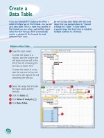
11
22
33
44
•
Excel adds the data table
below the chart.
1
Click the chart.
2
Click the Layout tab.
3
Click Data Table ( ).
4
Click Show Data Table with
Legend Keys.
•
If you prefer not to display the
legend keys, click Show Data
Table.
Display a Data Table
You can make it easier for yourself and others
to interpret your chart by adding a data table.
A data table is a tabular grid where each row is
a data series from the chart, each column is a
chart category, and each cell is a chart data
point.
Excel gives you the option of displaying the
data table with or without legend keys, which
are markers that identify each series.
Display a
Data Table
13_577639-ch11.indd 19413_577639-ch11.indd 194 3/15/10 2:47 PM3/15/10 2:47 PM