Tài liệu Black and White in Photoshop CS3 and Photoshop Lightroom P2 docx
Bạn đang xem bản rút gọn của tài liệu. Xem và tải ngay bản đầy đủ của tài liệu tại đây (723.81 KB, 10 trang )
Black and White in Photoshop CS3 and Photoshop Lightroom
16
make a few adjustments in brightness and contrast during the process. The
pro le created then tells other applications (like Photoshop) how to convert
or translate the color settings embedded from the capture device so that the
image is displayed accurately on the monitor.
How often should I calibrate?
Just like you may want to change the oil in your vehicle every 3000 miles or
wax and edge your skis to maximize their optimum performance periodically,
a monitor needs the same kind of regular tune-ups and care to perform well
over time.
• Monitors should be calibrated every 2–4 weeks depending on the amount
of usage.
• For the most accurate results, be sure to let the monitor warm up for at least
30 minutes in order to stabilize before calibration is performed.
• Periodic calibration will help maintain consistent color display on the
monitor over time.
Settings for calibration will vary depending on your output. If you are
working in your own closed loop system – that is your own camera, printer
and monitor – our best recommendation would be to work with daylight
settings, 6500 K and Gamma 2.2 as a starting point for most users. This setting
is usually best for working with Adobe 1998. If working with Piezography inks,
results have often been more accurate using a D-50 or 5000 K calibration
setting. You will need to experiment to nd the best settings consistent with
your work ow and output variables.
IV. Software
Set photoshop color management policies and color
working spaces
The next step in our color management system is to set up the software
color policies to interpret the color information correctly on your calibrated
monitor! Just like the choices we have in setting the digital camera to a
speci c color capture space, we will want to set Photoshop policies to match
the camera capture settings.
There are very few image browsers that o er control over the viewing color
space. Instead, most software applications can only display the images in the
color space of the operating system. In Windows XP, as well as most older
versions of Windows, that would be sRGB (remember that is the smallest
working space, which is not recommended for print reproduction work).
Images captured in the Adobe RGB working space will appear on screen
somewhat at and desaturated when (incorrectly) viewed in sRGB.
Photoshop is, however, an incredibly color savvy software that o ers the
best environment in which we can view Adobe RGB images, ProPhoto RGB,
Color Management for Black and White
17
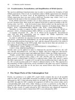
Photoshop default color working space and default color policies. Notice the RGB is set to sRGB
Photoshop color working space for Digital Darkroom print reproduction with inkjet printers
Black and White in Photoshop CS3 and Photoshop Lightroom
18
or images de ned by any other color space. You can, with accurate color
display for each space simultaneously view an sRGB image in a side by side
comparison with an Adobe RGB image.
To specify color settings in Mac OS, choose Edit Menu Ͼ Color Settings
and in Windows choose Photoshop Menu Ͼ Color Settings to bring
up the color Settings Dialog Box in Photoshop. The dialogue box is the
single most important place where color management information is
gathered and controlled – one box, one convenient location. As incredibly
color savvy as Photoshop is, however, it unfortunately ships out to users
set with sRGB as the default working space, which is not the most ideal
setting for print-oriented photographers. It is therefore necessary
to make some changes in color setting policies before image editing
begins.
Photoshop Color Management Policies and the Editing
Color Working Space
Color Management Policies are simply a set of rules de ning protocol for
opening les into Photoshop with or without embedded pro les. The color
working space speci es what colors (brightness and hues) will be available
when working in Photoshop. Whichever color working space you choose
to work in directly e ects how many colors you will be able to see on your
monitor and potentially reproduce in the print. The color space choices for
image editing in Photoshop are Adobe RGB 1998, ProPhoto RGB, ColorMatch
and sRGB. (See “Set Up Color Working Spaces”, page 7 for de nitions.)
Working Gray Policies
Grayscale does have its own governing pro les independent of RGB or CMYK.
However, it is important to note that the grayscale pro les do not contain any
information about the papers nor the color of the inks, which are all factors
in creating neutral values in producing a black and white prints with desktop
Color Management for Black and White
19
printers. (See Phase 5 “Print Pro ling and Printer Settings”, page 25 for more
information.)
The Gray working space determines how a grayscale image will look on
your monitor. Within the grayscale working space, we have access to
gamma settings, dot gain curves and the ColorSync Gray Working Space
(Mac only) as well as the ability to customize the dot gain to speci c
requirements.
1. Gamma settings de ne the brightness of the midtone values on screen.
The choices of gamma settings enable you to base the display quality
equivalent to either a Macintosh (1.8) or PC (2.2) monitor, although there is
evidence that all monitors have become 2.2 these days, whether it is Mac
or PC.
Gray Gamma 2.2 is probably the best for most users, but feel free to
experiment. This setting anticipates the viewing conditions of a PC monitor
(important for web graphics), and the darkening is roughly equivalent to a
25% dot gain setting.
2. The Dot Gain settings, choices of either 10%, 15%, 20% or 30%, depend
on your printing conditions. The dot gain settings darken the on-screen
image, e ectively anticipating the e ect of the ink dot gain (or spread)
during on-press reproduction.
(To set your own dot gain pro le, choose “Custom” from the top of the
pop-up.) Note that these values only lighten or darken the appearance of
an image, while the actual output values are not a ected.
If you are outputting primarily to inkjet printers matching the Gray Working
space to the RGB color space is a good move. Simply translated if you
are working in Adobe RGB or sRGB, use Gamma 2.2. If you are working in
ProPhoto RGB or Colormatch RGB, choose 1.8. This prevents any additional
gamma adjustments as we switch back and forth between color and
grayscale images.
If you work in a prepress environment, it is best to match the grayscale space
to the dot gain of the black ink. North American Prepess 2 setting presets will
create this match. Consult your service provider for customized settings in
accordance with press speci cations.
Black and White in Photoshop CS3 and Photoshop Lightroom
20
CMYK Working Space
Desktop inkjet printers from most of the major manufacturers (like Epson,
HP and Canon) actually require RGB data rather than CMYK data to produce
prints, even though these printers operate in a CMYK working space. What
this means to the average user is that the choice you make for CMYK settings
will have no in uence in the actual image output (to an inkjet printer).
Therefore, the CMYK settings are better left to the default US Web Coated
(SWOP) v2 until you need to work with o set press. As press settings vary, you
need to consult your service provider for best conversion settings according
to the speci cations of the printer and output variables.
CMYK working spaces are essentially printing processes characterized by
various ink-and-paper combinations, dot gain settings and separation options
such as ink limits. If you have a custom press pro le, you would select it as
© Leslie Alsheimer
Color Management for Black and White
21
your CMYK working space. When you perform a mode change to or from
CMYK, Photoshop will use the CMYK working-space pro le for the conversion.
Photoshop will also use the CMYK working-space pro le when you open a
CMYK image that lacks an embedded pro le.
If you need to convert images to CMYK but do not have a custom press pro le,
and one is not available from your printer, select one of the pro les provided
by Adobe, basing it on the type of printing process and paper that will be
used, such as US Web Coated (SWOP) v2.
As with RGB working spaces, Photoshop provides the ability to create
custom CMYK working-space pro les. This is useful if your print provider
does not have a pro le but can tell you what separation settings to use when
converting your images to CMYK.
Spot Working Space
The Spot working space is somewhat similar to the grayscale space, but for
spot colors. The options available are a series of ve preset dot gain settings
and the means for customizing the dot gain curve if desired. The Spot working
space provides a setting for spot colors, such as Pantone colors, that may be
used in the printing process. Similar to CMYK settings, spot settings are the
most crucial when working with o set press and depend on ink and paper
combinations to be determined. Leave this setting unchanged at the default
until press speci cations require otherwise.
Color Management Policies
Color management policies therefore determine how to handle documents
that do not match your chosen color working space. These policies provide
guidelines for how Photoshop should proceed when a document is opened,
color data is imported into an active document with color spaces that do
not match the set policies. With speci ed prede ned color management
settings, Photoshop can proceed within the user de ned color management
work ow as standard protocol for all documents and color data that you
Black and White in Photoshop CS3 and Photoshop Lightroom
22
open or import. These color management policies look for the color pro le
associated with a document or imported color data and compares the pro le
(or lack of pro le) with the current editing working space settings in order to
make default color management decisions for conversion and color display.
If the pro le is missing or does not match the working space, Photoshop
displays a warning message that indicates the default action for the policy (as
long as the alert option is selected in the color settings). For a newly created
document, the color work ow usually operates behind the scenes; unless
otherwise speci ed, the document uses the working space pro le associated
with its color mode for creating and editing colors.
In this text, we are going to set the color management policies to convert all
incoming documents to the speci ed working space. This simply means the
active radial button chosen will be to pre set Convert to the Working space.
However, you will always be able to choose otherwise.
Pro le mismatches
If you are presented with an “Embedded Pro le Mismatch” dialog when
you open an image, this means that the image was captured or created in
a di erent working space than your chosen working-space policies. This
warning dialogue is how you tell Photoshop to proceed with opening the
document. Your choices are the following: (1) Use the embedded pro le
instead of the working space. (2) Convert to the working space and
Color Management for Black and White
23
(3) Discard the embedded pro le (do not color manage). In most instances,
it is best to go ahead and convert everything over to your set working space
in order to simplify and standardize your work ow, unless of course there is
reason to keep the image in the space in which it was created.
It is still important to note however that, the optimum color space will not
always be a match for what you set in the camera. With midtone heavy and/or
overly saturated Adobe RGB images captured from the D1X and EOS-1D,
for example, assigning the ColorMatch RGB color space often o ers a more
realistic and pleasing color translation with problem images.
Missing pro le
This warning dialogue box is not a good one to receive. This means that the
document le does not have any pro les or translators to convey information
about the color of the image. Photoshop will have no idea where this le came
from, nor how to translate its color information accurately and will have to just
guess at color. Photoshop can do a pretty darn good job at guessing, but that is
really like me giving a blank piece of 4ϫ5 lm to my students and asking them
to shoot the image and process it in the chemical darkroom without knowing
its ISO or lm type. It would be fairly di cult for even a well-seasoned pro to
render a good exposure and development time with virtually no information
about the lm. In this case the pro le will need to be assigned. If you know that
the image came from an sRGB space or any other for example, you would rst
assign sRGB, or the known space, and then convert to the working space. If the
incoming source is unknown, assign the working RGB and move on from there.
How to set: Photoshop color management policies
Setting up your Photoshop color management policies and preferences is
absolutely essential before you begin working in Photoshop. Remember,
these are the settings that specify the handling of color pro les associated
with the RGB, CMYK and Grayscale color modes in every document. This
means that the color management settings a ect how images are displayed
on screen, and how Photoshop operates color separations. These pro les
are known as working spaces. Being aware of your color settings and image
Black and White in Photoshop CS3 and Photoshop Lightroom
24
pro les will help you produce consistent color results for the most common
on-screen and print output conditions.
Edit Menu Ͼ Color Settings You may choose a preset color management
con guration from the settings menu or customize one of your own. Adobe
sets the default workspace for web work, which is far too limiting for print
output with high quality photographs. We are going to create custom settings
for print output.
RGB Ͼ Adobe RGB (1998) is today’s industry standard. This space is best
for RGB print production work. You may want to research ProPhoto RGB for
details on whether it might work for you.
Color Match Ͼ this space can be an excellent choice when working with
o set press and converting to CMYK. It is also recommended for working with
Piezography ink sets.
sRGB Ͼ is an excellent choice for images destined for the web.
Custom setting configurations
can be saved and renamed.
Save custom
configuration
with personalized title
and description.
Gray Policy
For most users 2.2
is an excellent choice.
Color Management Policies
standardize working space
protocol and activates alert
system for mismatches.
Choose RGB Working space
in accordance with workflow
and output variables. Adobe 1998
is a good choice for most users
doing print production work.
Save and Name
It is important to save your custom settings so that they can be reused and
shared with other Adobe applications that use the same color management
work ows, as well as with other users. The color management settings that
you customize in the Color Settings dialog box are contained in a preferences
le called Color Settings.
Color Management for Black and White
25
Comment
Enter your own description of the settings you just created for future reference.
Important note:
Lightroom Users need
to make sure that
the Photoshop color
management settings
match the output color
space in the Adobe
Lightroom export
settings. Images may
have distinctly di erent
colors than in Lightroom
if the settings are not
congruent.
V. Print Pro ling and Printer Settings
Set up the print driver with correct pro les for output
Once a color space tagged image makes it from the camera (or scanner)
and passes onto a calibrated monitor, and is edited through Photoshop and
Lightroom, the next step is to pass the image out through the printer onto
paper or other surfaces. This phase of the work ow requires a print pro le. A
print pro le tells the printer how to translate and convert the colors from the
monitor so that the image outputs correctly onto the paper. This translation is
speci ed according to the type of printer, paper, surface and ink the image will
be output onto. Every paper, however, will require a di erent pro le because
every paper, ink, printer combination has a di erent color gamut, or ability to
reproduce colors. For instance, glossy papers have the ability to produce more
saturated colors than matte surfaces. Most printers come with a number of
common paper pro les installed with their drivers. These “canned” pro les are
a great start in making the monitor to print color translation relatively well.
At some point, however, you might want to invest in custom pro les, made
speci cally for your printer, paper and ink combinations. Custom pro les can
be purchased online at an exceptional price from Santa Fe Camera’s on-line
store: www.santafecameracenter.com or call (866) 922-6372 for more information.
Because every paper, ink, printer combination requires a di erent pro le,
and the print settings in both the Photoshop and printer dialogue boxes are
neither simple nor user friendly, many common mistakes inevitably happen. If
the print driver options are not set correctly, using the correct pro le, it will be
di cult to even come close to replicating the image you see on your monitor
to the output print. See Chapter 6, “Printing”, for more in-depth step-by steps
on print pro les and printer driver settings.
Note:
The default location
of the Color Settings
le varies by operating
system; use your
operating system’s
Find command to locate
this le.