Tài liệu Flash Builder 4 and Flex 4 Bible- P7 ppt
Bạn đang xem bản rút gọn của tài liệu. Xem và tải ngay bản đầy đủ của tài liệu tại đây (885.6 KB, 50 trang )
Chapter 8: Using Flex Visual Controls
271
groupName=”buttonGroup”/>
</s:VGroup>
</s:Application>
On the Web
The code in Listing 8.4 is available in the Web site files in the chapter08 project as RadioButtonDemo.
mxml
.
n
Figure 8.10 shows the application displaying the resulting RadioButton controls and a pop-up
window created by the
Alert class that’s displayed when the user clicks a RadioButton or oth-
erwise selects a new value.
Tip
The RadioButtonGroup control dispatches the change event whenever its selectedValue property
changes. It also dispatches an
itemClick event when the user clicks on any of the group’s member objects.
n
FIGURE 8.10
An application with RadioButton controls
Other Data Entry Controls
The Flex framework includes these other controls that can be used to collect data from the applica-
tion’s user:
l
NumericStepper
l
DateField
l
DateChooser
l
ColorPicker
14_488959-ch08.indd 27114_488959-ch08.indd 271 3/5/10 2:25 PM3/5/10 2:25 PM
Please purchase PDF Split-Merge on www.verypdf.com to remove this watermark.
Part II: Designing Flex Applications
272
Each of these controls is designed to support data entry for a particular type of data.
Tip
In the Flex 4 SDK, the NumericStepper control has been rewritten as a Spark component. The MX versions
of the
DateField, DateChooser, and ColorPicker controls are the most recent versions and can be used
in Flex 4 applications.
n
The NumericStepper control
The NumericStepper is a compound control that’s designed for numeric data entry. It includes
a
TextInput control for direct entry and a set of buttons that increment and decrement the con-
trol’s current value.
The
NumericStepper doesn’t have its own label property, so it’s typically paired with a
Label control or wrapped in a FormItem container, which has a label property. This code
declares a simple
NumericStepper wrapped in an HGroup with a Label:
<s:HGroup>
<s:Label text=”Enter value:”/>
<s:NumericStepper id=”myStepper” value=”5”/>
</s:HGroup>
As shown in Figure 8.11, the control displays its value property, and the user can change it.
FIGURE 8.11
A NumericStepper control
The NumericStepper supports these properties that determine its behavior:
l
minimum. The minimum permitted value; defaults to 0.
l
maximum. The maximum permitted value; defaults to 10.
l
stepSize. The amount to increment or decrement when the control’s buttons are clicked;
defaults to
1.
l
maxChars. The maximum length of the value that can be directly typed into the control.
14_488959-ch08.indd 27214_488959-ch08.indd 272 3/5/10 2:25 PM3/5/10 2:25 PM
Please purchase PDF Split-Merge on www.verypdf.com to remove this watermark.
Chapter 8: Using Flex Visual Controls
273
This NumericStepper has a minimum value of 5, a maximum value of 25, and a stepSize
of 5:
<mx:NumericStepper id=”myStepper”
minimum=”5” maximum=”25” stepSize=”5”/>
The NumericStepper control’s value property is bindable and can be used in a binding
expression or ActionScript statement to get the value the user has entered:
<s:Label text=”You entered: {myStepper.value}”/>
Date controls
Two data entry controls are designed to show or select a date value:
l
DateChooser. Displays a calendar from which the user selects a date.
l
DateField. Displays a TextInput and a small calendar icon. When either is clicked, a
calendar is displayed for date selection.
The DateChooser control
The DateChooser control presents an interactive calendar that displays a month and year and
enables the user to do the following:
l
Navigate forward and back one month at a time
l
Select a single date, multiple dates, or a range of dates with mouse operations
The following code declares a simple
DateChooser control:
<mx:DateChooser id=”myDateChooser”/>
The DateChooser control supports Boolean properties named allowMultipleSelection
and
allowDisjointSelection that respectively enable a user to select multiple and non-con-
tiguous dates. Changing either property causes changes in the control’s visual presentation.
As shown in Figure 8.12, the
DateChooser is presented as a visual calendar from which the user
makes selections.
The DateField control
The DateField control presents the user with an input control and a small calendar icon. By
default, when the user clicks either the icon or the input, a calendar control pops up that looks the
same as the
DateChooser and enables the user to make his selection. However, unlike the
DateChooser component, only a single date value can be selected.
14_488959-ch08.indd 27314_488959-ch08.indd 273 3/5/10 2:25 PM3/5/10 2:25 PM
Please purchase PDF Split-Merge on www.verypdf.com to remove this watermark.
Part II: Designing Flex Applications
274
FIGURE 8.12
A DateChooser control
The following code declares a simple DateField control:
<mx:DateField id=”myDateField”/>
As shown in Figure 8.13, the DateField is presented as an input control and icon which, when
clicked, present a calendar control.
The
DateField control has a Boolean property named editable that’s set to false by
default. When set to
true, the user can click into the input area and type a date value.
FIGURE 8.13
A DateField control
14_488959-ch08.indd 27414_488959-ch08.indd 274 3/5/10 2:25 PM3/5/10 2:25 PM
Please purchase PDF Split-Merge on www.verypdf.com to remove this watermark.
Chapter 8: Using Flex Visual Controls
275
Date entry properties and methods
The DateChooser and DateField controls share a common set of properties that enable you
to control their behavior and collect their data. Table 8.4 describes these properties and their
capabilities.
TABLE 8.4
Date Entry Control Properties
Property Data Type Description Default
selectedDate Date
The currently selected date value.
null
showToday Boolean
Determines whether the current date
is highlighted.
true
dayNames Array
An array of String values used as
labels for the day names.
[ “S”, “M”, “T”, “W”,
“T”, “F”, “S” ]
minYear Int
The minimum allowed year.
1900
maxYear Int
The maximum allowed year.
2100
disabledDays Array
An array of integer values indicating
by zero-based index days that aren’t
selectable.
[]
Setting of [0,6] would dis-
able Sunday and Saturday
disabledRanges Array of
Object
A set of disabled ranges. Each range
has named properties of
range-
Start
and rangeEnd typed as
Date values.
[]
selectableRange Object
A selectable range. Requires named
properties of
rangeStart and
rangeEnd typed as Date values.
null
Other useful properties are described in the API documentation for DateField and
DateChooser.
The ColorPicker control
The ColorPicker control enables a user of your application to select from one of standard “web-
safe” colors. It displays a button and, when clicked, a palette of colors. The currently selected color
is represented by the control’s
selectedColor property, which returns a uint (unsigned inte-
ger) value. You can pass the value of the control’s
selectedColor to any other style or property
which expects a color value.
Note
The ColorPicker control has not been rewritten in the Spark component framework for Flex 4. The MX ver-
sion of the control, however, works fine in Flex 4 applications.
n
14_488959-ch08.indd 27514_488959-ch08.indd 275 3/5/10 2:25 PM3/5/10 2:25 PM
Please purchase PDF Split-Merge on www.verypdf.com to remove this watermark.
Part II: Designing Flex Applications
276
The application in Listing 8.5 displays a ColorPicker control. When the user selects a color,
a
change event is dispatched. The code in the event handler function sets the application’s
backgroundColor style to the color that’s selected by the application user:
LISTING 8.5
An application using a color picker
<?xml version=”1.0” encoding=”utf-8”?>
<s:Application xmlns:fx=”
xmlns:s=”library://ns.adobe.com/flex/spark”
xmlns:mx=”library://ns.adobe.com/flex/mx”
backgroundColor=”#EEEEEE”>
<fx:Script>
<![CDATA[
import mx.events.ColorPickerEvent;
protected function colorPicker_changeHandler(
event:ColorPickerEvent):void
{
this.setStyle(“backgroundColor”, event.target.selectedColor);
}
]]>
</fx:Script>
<s:Panel title=”Using the ColorPicker control”
horizontalCenter=”0” top=”20” width=”300”>
<s:layout>
<s:HorizontalLayout paddingTop=”20” paddingRight=”10”
paddingLeft=”20” paddingBottom=”10”/>
</s:layout>
<s:Label text=”Choose an application background color:”/>
<mx:ColorPicker id=”colorPicker” selectedColor=”#EEEEEE”
change=”colorPicker_changeHandler(event)”/>
</s:Panel>
</s:Application>
On the Web
The code in Listing 8.5 is available in the Web site files in the chapter08 project as ColorPickerDemo.
mxml
.
n
Figure 8.14 shows the resulting application, with a ColorPicker control inside a Panel.
14_488959-ch08.indd 27614_488959-ch08.indd 276 3/5/10 2:25 PM3/5/10 2:25 PM
Please purchase PDF Split-Merge on www.verypdf.com to remove this watermark.
Chapter 8: Using Flex Visual Controls
277
FIGURE 8.14
The ColorPicker control
Using Interactive Controls
Beyond the data entry controls I described previously, certain controls are designed for user inter-
action that can be used in a variety of applications. In this section, I describe the
ScrollBar and
Slider controls.
The ScrollBar controls
There are two versions of the ScrollBar control:
l
HScrollBar. For a horizontal scrollbar.
l
VScrollBar. For a vertical scrollbar.
A
ScrollBar control has four graphic elements: a track, a button, and two arrows. The user
changes the control’s current value by clicking and dragging the button, clicking above or below
the button, or clicking one of the arrows. The
ScrollBar returns its current value through its
scrollPosition property. The scrollPosition property isn’t bindable, so typically it han-
dles
ScrollBar interactions by listening for the scroll event, which is dispatched each time the
position of the button changes.
Cross-Reference
The Flex 4 SDK also includes a new Scroller component that’s designed to enable scrolling in Spark contain-
ers such as the new version of
Panel. I describe how to use the Scroller component in Chapter 10.
n
14_488959-ch08.indd 27714_488959-ch08.indd 277 3/5/10 2:25 PM3/5/10 2:25 PM
Please purchase PDF Split-Merge on www.verypdf.com to remove this watermark.
Part II: Designing Flex Applications
278
ScrollBar properties
The new Spark versions of the VScrollBar and HScrollBar controls are extended from the
ScrollBar superclass, which implements the properties described in Table 8.5.
TABLE 8.5
ScrollBar Properties
Property Data Type Description Default
Value Number
The position of the scroll button relative to the top of a
VScrollBar or the left of an HScrollBar. This property is
bindable.
null
Minimum Number
The minimum value of scrollPosition. 0
Maximum Number
The maximum value of scrollPosition. 100
pageSize Number
Determines delta of change in pixels when user clicks before
or after the scroll button.
20
The change event
The change event is dispatched each time the user interacts with the ScrollBar control. Its
event object is typed as an event class named
mx.events.ScrollEvent, which has a posi-
tion
property containing the new scrollPosition.
In the application in Listing 8.6, the
HScrollBar control’s new scrollPosition is displayed
in a
Label control whose text property is changed each time the scroll event is handled:
LISTING 8.6
An application using a scroll bar
<?xml version=”1.0” encoding=”utf-8”?>
<s:Application xmlns:fx=”
xmlns:s=”library://ns.adobe.com/flex/spark”
xmlns:mx=”library://ns.adobe.com/flex/mx”>
<s:layout>
<s:VerticalLayout horizontalAlign=”center” paddingTop=”20”/>
</s:layout>
<fx:Script>
<![CDATA[
[Bindable]
protected var scrollPos:Number;
protected function myScrollBar_changeHandler(event:Event):void
{
scrollPos = event.target.value;
}
14_488959-ch08.indd 27814_488959-ch08.indd 278 3/5/10 2:25 PM3/5/10 2:25 PM
Please purchase PDF Split-Merge on www.verypdf.com to remove this watermark.
Chapter 8: Using Flex Visual Controls
279
]]>
</fx:Script>
<s:Label id=”scrollLabel” fontSize=”18” fontWeight=”bold”
text=”Current scroll position: {scrollPos}”/>
<s:HScrollBar id=”myScrollBar” width=”300”
minimum=”0” maximum=”300” pageSize=”100”
change=”myScrollBar_changeHandler(event)”/>
</s:Application>
On the Web
The code in Listing 8.6 is available in the Web site files in the chapter08 project as RadioButtonDemo.
mxml
.
n
Figure 8.15 shows the HScrollBar and Label controls.
FIGURE 8.15
An HScrollBar and a Label control displaying its current position
The Slider controls
There are two versions of the Slider control:
l
HSlider. For a horizontal slider.
l
VSlider. For a vertical slider.
A
Slider control displays a track and a “thumb” graphic that enables the user to select a value by
clicking and dragging the thumb. You allow the slider to select any value within a range or restrict
it to selecting values at particular intervals. The control also can display two thumb icons to repre-
sent starting and ending values.
The user interacts with the
Slider control by clicking and dragging the thumb icon or by click-
ing before or after the thumb. If the user clicks before or after the thumb, the slider slides to the
selected position. If the
Slider has implemented snapping through the snapInterval prop-
erty, the thumb slides to the snapping position that’s closest to where the mouse click occurred.
14_488959-ch08.indd 27914_488959-ch08.indd 279 3/5/10 2:25 PM3/5/10 2:25 PM
Please purchase PDF Split-Merge on www.verypdf.com to remove this watermark.
Part II: Designing Flex Applications
280
The Slider controls return their current value through the value property. The value prop-
erty is bindable, so you can handle
Slider interactions through either binding expressions or
events. Each time the
Slider control’s value changes, it dispatches the change event.
Slider properties
The VSlider and HSlider are extended from the Slider superclass, which implements the
properties described in Table 8.6.
TABLE 8.6
Slider Properties
Property Data Type Description Default
value Number The currently selected value of the Slider based on
thumb position. Relevant only when
thumbCount is 1.
0
minimum Number
Minimum value of the Slider. 0
maximum Number
Maximum value of the Slider. 10
snapInterval Number
When set a value other than 0, enforces snapping to par-
ticular intervals between minimum and maximum. If set
to 0, sliding is continuous.
0
The application in Listing 8.7 declares a horizontal Slider. Its value is displayed in a Label
control through a binding expression.
LISTING 8.7
An application using a slider
<?xml version=”1.0” encoding=”utf-8”?>
<s:Application xmlns:fx=”
xmlns:s=”library://ns.adobe.com/flex/spark”
xmlns:mx=”library://ns.adobe.com/flex/mx”
creationComplete=”executeBindings(true)”>
<s:layout>
<s:VerticalLayout horizontalAlign=”center” paddingTop=”50”/>
</s:layout>
<s:HSlider id=”mySlider” width=”300”
minimum=”0” maximum=”300”
snapInterval=”50”/>
<s:Label fontSize=”18” fontWeight=”bold”
text=”Current slider position: {mySlider.value}”/>
</s:Application>
14_488959-ch08.indd 28014_488959-ch08.indd 280 3/5/10 2:25 PM3/5/10 2:25 PM
Please purchase PDF Split-Merge on www.verypdf.com to remove this watermark.
Chapter 8: Using Flex Visual Controls
281
On the Web
The code in Listing 8.7 is available in the Web site files in the chapter08 project as SliderDemo.mxml.
n
Figure 8.16 shows the resulting application.
FIGURE 8.16
A horizontal slider
Slider events
The Slider controls also support a set of events that enable you to detect and handle changes to
the
Slider control’s value with ActionScript event handlers. Slider events include the following:
l
change. Dispatched when the control’s value property changes as a result of a user
gesture.
l
thumbDrag. Dispatched when the user drags the thumb icon.
l
thumbPress. Dispatched when the user presses on the thumb icon with the left mouse
button.
l
thumbRelease. Dispatched when the user releases the thumb icon.
The
change event dispatches an event object typed as flash.events.Event, while the
thumbDrag, thumbPress, and thumbRelease events dispatch an object typed as spark.
events.TrackBaseEvent
.
Using the Image and BitmapImage
Controls
The Flex SDK presents images with the MX Image and the Spark BitmapImage control. The MX
Image control can be used to present images that are downloaded from a server at runtime,
loaded from the local hard disk at runtime (for AIR applications only, because Web applications
don’t have access to the local file system), or embedded in the Flex application. The Spark
14_488959-ch08.indd 28114_488959-ch08.indd 281 3/5/10 2:25 PM3/5/10 2:25 PM
Please purchase PDF Split-Merge on www.verypdf.com to remove this watermark.
Part II: Designing Flex Applications
282
BitmapImage control, which is implemented as a primitive class (rather than as a component),
supports embedding of images but is not able to download images from the Web or load images
from the local file system at runtime.
The
Image and BitmapImage controls can be declared in either MXML or ActionScript. You
determine which image is presented with the
source property.
When used to load images at runtime, the MX
Image control’s source property is set to a full
URI (Uniform Resource Identifier) path (subject to Flash Player security restrictions) or a location
that’s relative to the application location.
Tip
For Web applications, the application location is the Web server and folder from which the application’s SWF
file is downloaded. For desktop applications, the application location is the folder on the hard disk in which the
AIR application is installed.
n
Flash Player and Adobe AIR can load these types of images at runtime:
l
JPEG
l
GIF
l
PNG
l
SWF
Tip
SWF files are treated as static images by the Image control, but if the SWF file was built in the Flash authoring
environment and incorporates animation, the animation plays successfully in the Flex application.
n
Cross-Reference
For more complex uses of content built in the Flash authoring environment, see the description of creating
Flash components in Chapter 5.
n
This code declares an MX Image control that loads a graphic file named flower1.jpg at run-
time from an
assets subfolder of the application’s location folder:
<mx:Image source=”assets/flower1.jpg”/>
Figure 8.17 shows the application displaying the graphic.
You can also load images at runtime by setting the
Image control’s source property with a binding
expression. This
Image downloads and displays a new image file each time the value of a bindable
variable named
selectedImage changes:
<mx:Image source=”assets/{selectedImage}”/>
Notice that the value of the source property combines a literal value containing the location of
the file and a binding expression containing the filename.
14_488959-ch08.indd 28214_488959-ch08.indd 282 3/5/10 2:25 PM3/5/10 2:25 PM
Please purchase PDF Split-Merge on www.verypdf.com to remove this watermark.
Chapter 8: Using Flex Visual Controls
283
FIGURE 8.17
An application displaying an image with the Image control
Resizing images
The Image and BitmapImage controls size themselves by default based on the native dimen-
sions of the original graphic image file. For example, if the image is 200 pixels wide by 300 pixels
high and you don’t declare a specific size, the control sizes itself to those dimensions.
You can resize images at runtime with the
Image control’s height and width properties. Both
properties reflect the image size in pixels. If you set only one of these dimension properties, the
Image control automatically calculates and resets the other dimension to maintain the image’s
original aspect ratio (the ratio of width to height). If this size is smaller than the original image, the
image will appear smaller, but the entire
Image control will be larger.
If you set both the height and width and don’t exactly match the original aspect ratio, set the con-
trol’s
maintainAspectRatio property to false to enable it to skew the image:
<mx:Image source=”graphics/flower1.jpg”
height=”200” width=”400”
maintainAspectRatio=”false”/>
Figure 8.18 shows the image with explicit height and width properties and maintain
AspectRatio
set to false.
14_488959-ch08.indd 28314_488959-ch08.indd 283 3/5/10 2:25 PM3/5/10 2:25 PM
Please purchase PDF Split-Merge on www.verypdf.com to remove this watermark.
Part II: Designing Flex Applications
284
FIGURE 8.18
An image with specific width and height and maintainAspectRatio set to false
Embedding images
When you embed an image in a Flex application, you expand the size of the application by the size
of the graphic file. At runtime an embedded image is displayed instantly, rather than having to be
loaded from the Web or disk; the result is an improvement in perceived application performance,
as well as the ability to import SVG (Scalable Vector Graphics) images in your Flex application.
You can embed images in a Flex application in two ways. If you want to embed an image once and
always display it in the same location, use this syntax:
<s:BitmapImage source=”@Embed(‘graphics/flower1.jpg’)”/>
Because you’re embedding the image in a particular instance of the Image control, you can’t easily
reuse the embedded image elsewhere in the application. If you want an embedded image that can
easily be bound to various controls, use the
[Embed] metadata tag and a Class variable declara-
tion inside a Script section:
[Embed(source=”graphics/flower1.jpg”)]
[Bindable]
public var flowerImage:Class;
Then set the BitmapImage control’s source property to the variable name using a binding
expression:
<s:BitmapImage source=”{flowerImage}”/>
Tip
When you embed images with the [Embed] metadata tag, you have the freedom to display the embedded
image anywhere in the application. This is the same technique I described earlier when discussing using
embedded images as
Button control icons.
n
14_488959-ch08.indd 28414_488959-ch08.indd 284 3/5/10 2:25 PM3/5/10 2:25 PM
Please purchase PDF Split-Merge on www.verypdf.com to remove this watermark.
Chapter 8: Using Flex Visual Controls
285
New Feature
Flex 4 adds two elements named <fx:Library> and <fx:Definition> that can be used to define reus-
able visual elements in an MXML file. The following application defines a graphical element named
FlowerImage based on a BitmapImage and then presents it twice:
<?xml version=”1.0” encoding=”utf-8”?>
<s:Application xmlns:fx=”
xmlns:s=”library://ns.adobe.com/flex/spark”
xmlns:mx=”library://ns.adobe.com/flex/mx”>
<fx:Library>
<fx:Definition name=”FlowerImage”>
<s:BitmapImage source=”@Embed(‘assets/flower1.jpg’)”/>
</fx:Definition>
</fx:Library>
<s:HGroup horizontalCenter=”0” top=”20” gap=”15”>
<fx:FlowerImage/>
<fx:FlowerImage/>
</s:HGroup>
</s:Application>
n
Changing images at runtime
You can change which image is displayed at runtime in a few different ways. The MX Image con-
trol’s
source property can be reset to a String, indicating the relative location of an image to be
loaded at runtime. With both the MX
Image and the Spark BitmapImage, you can set source
to a variable that references an embedded image. This code embeds two images and switches the
source of the Image control to one of the variable references when the button is clicked:
<fx:Script>
<![CDATA[
[Embed(source=”assets/flower1.jpg”)]
[Bindable]
public var flowerImage1:Class;
[Embed(source=”assets/flower2.jpg”)]
[Bindable]
public var flowerImage2:Class;
]]>
</fx:Script>
<s:BitmapImage id=”myImage” source=”{flowerImage1}”/>
<s:Button label=”Change Image” click=”myImage.source=flowerImage2”/>
You also can set the source property using a binding expression. This code uses a group of
RadioButton controls to enable the user to switch between the two embedded images:
<fx:Declarations>
<s:RadioButtonGroup id=”flowerGroup”/>
</fx:Declarations>
<s:BitmapImage source=”{flowerGroup.selectedValue}”/>
<s:RadioButton value=”{flowerImage1}” label=”Image 1”
groupName=”flowerGroup” selected=”true”/>
14_488959-ch08.indd 28514_488959-ch08.indd 285 3/5/10 2:25 PM3/5/10 2:25 PM
Please purchase PDF Split-Merge on www.verypdf.com to remove this watermark.
Part II: Designing Flex Applications
286
<s:RadioButton value=”{flowerImage2}” label=”Image 2”
groupName=”flowerGroup”/>
You also can change images at runtime with the MX Image control’s load() method. The
load() method accepts a single argument that can be either a String for a runtime loaded
image or a variable referencing an embedded image. This code shows a
Button control with a
click event handler that causes a new image to be loaded at runtime:
<mx:Image id=”myImage” source=”assets/flower1.jpg”/>
<s:Button label=”Change Picture”
click=”myImage.load(‘assets/flower2.jpg’)”/>
Tip
It doesn’t matter whether you use the load() method or simply change the value of the source property.
Both actions have the same effect on the MX
Image control.
n
Summary
In this chapter, I described the nature of Flex controls and the details of some of the most useful
controls in the Flex framework. You learned the following:
l
Flex visual components consist of containers and controls.
l
A container is a visual component that contains other objects.
l
A visual control presents information to the user and can also be interactive.
l
Controls can be used for application layout, to display data, and to collect data from the
user.
l
The new Spark components include these text controls: Label, RichText,
RichEditableText, TextInput, and TextArea.
l
Layout controls include HRule, VRule, and Spacer.
l
Button controls include Button, CheckBox, RadioButton, and PopupButton.
l
Other data entry controls include NumericStepper, DateField, DateChooser, and
ColorPicker.
l
Other interactive controls include HScrollBar, VScrollBar, HSlider, and
VSlider.
l
The MX Image control displays images that are loaded at runtime or embedded in the
Flex application.
l
The Spark BitmapImage control is a lighter weight primitive (rather than a complete
component) that only works with embedded images.
14_488959-ch08.indd 28614_488959-ch08.indd 286 3/5/10 2:25 PM3/5/10 2:25 PM
Please purchase PDF Split-Merge on www.verypdf.com to remove this watermark.
287
CHAPTER
Working with Text
IN THIS CHAPTER
Using advanced text layout
Controlling fonts
Using device fonts
Embedding fonts
Setting font rotation
Using formatter classes
W
hen you present text in a Flex application, many choices and
tools can determine how text is displayed and processed. Text
values can be “hard-coded” in an application, retrieved from a
data source (such as database on a server), and stored in memory as con-
stants or variables.
When text is presented to the user in visual control, you select many font
settings, including the font typeface and its size, weight, and style. In this
chapter, I describe the various tools available for text processing and presen-
tation in Flex. I describe these strategies and techniques:
l
Using the Flash Text Engine (FTE) to present complex text
l
Selecting device fonts for text display that are already installed on
the client computer
l
Embedding fonts to tightly control text display regardless of the
state of the client computer
l
Formatting of text values with the formatter family of classes
Any discussion of text presentation in Flex must include the use of
Cascading Style Sheets (CSS) to select font typefaces and styles, and the use
of visual controls that are specifically designed for text presentation, such as
the
Label and RichText controls. (Refer to Chapter 8 for a detailed dis-
cussion about the use of visual controls and Chapter 11 for more informa-
tion about CSS.) In this chapter, I describe uses of styles that are specifically
designed to control text presentation, and I expand on the use of the
Label
and
RichText controls in presenting text to the user.
On the Web
To use the sample code for this chapter, import the chapter09.fxp Flex
project from the Web site files into your Flash Builder workspace.
n
15_488959-ch09.indd 28715_488959-ch09.indd 287 3/5/10 2:26 PM3/5/10 2:26 PM
Please purchase PDF Split-Merge on www.verypdf.com to remove this watermark.
Part II: Designing Flex Applications
288
Using Advanced Text Layout
Flex 4 applications require Flash Player 10, whether the application is deployed over the Web or
on the desktop with Adobe AIR. One of the benefits of this most recent version of Flash Player is
its capability to present complex text with an element of the software known as the Flash Text
Engine (FTE) and the Text Layout Framework (TLF).
The FTE supports these features:
l
Bidirectional and vertical text layout
l
Support for more than 30 alphabets and character sets, including Arabic, Hebrew,
Chinese, Japanese, Korean, Thai, Lao, the major writing systems of India, and others
l
Advanced typographical control, including kerning, masks, blends, whitespace handling,
margins, and indentations
l
Display of text across multiple columns
The following new text controls, initially described in Chapter 8, support the features of the FTE
and TLF:
l
Label
l
RichText
l
RichEditableText
l
TextInput
l
TextArea
The FTE is a set of classes that support complex text presentation. These classes are a part of Flash
Player 10 and are available to all Flash documents regardless of whether they’re built with the Flex
SDK or the Flash authoring environment. The TLF is a separate framework, provided in the set of
classes packaged in the component library file
textLayout.swc. This SWC file is included with
the Flex 4 SDK, so its classes are available to all Flex 4 applications.
Presenting richly formatted text
As I previously described in Chapter 8, the RichText, RichEditableText, and TextArea
controls support the
content and textFlow properties, which you can use to describe richly
formatted text. When you set the
content property’s value with a child element in an MXML
declaration, you can include a number of tags that create various layout and visual effects. Each tag
is the equivalent of an ActionScript class that’s provided as part of the TLF.
Table 9.1 shows the tags you can include in a content string, their ActionScript equivalents.
15_488959-ch09.indd 28815_488959-ch09.indd 288 3/5/10 2:26 PM3/5/10 2:26 PM
Please purchase PDF Split-Merge on www.verypdf.com to remove this watermark.
Chapter 9: Working with Text
289
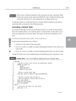
TABLE 9.1
TLF Tags and Equivalent Classes
Tag Class Description
<s:div> DivElement
Defines a horizontal block with no implicit vertical
white space above or below.
<s:p> ParagraphElement
Defines a horizontal block with implicit vertical white
space above and below.
<s:span> SpanElement
Defines a section of text to which various text styles
can be applied.
<s:a> LinkElement
Defines a section of text that, when clicked, links to a
Uniform Resource Locator (URL).
<s:img> InlineGraphicElement
Defines an inline graphic.
<s:br> BreakElement
Defines a line feed.
<s:tab> TabElement
Defines a tab character.
<s:tcy> TCYElement
Causes text to be drawn horizontally within a line that
otherwise is laid out vertically.
You declare each of the TLF tags with the Spark XML namespace prefix of s:, as shown in the
application in Listing 9.1. The application’s
RichText object has its content set to display text
with mixed font sizes and font faces, and bold and italicized characters.
LISTING 9.1
An application with richly formatted text
<?xml version=”1.0” encoding=”utf-8”?>
<s:Application xmlns:fx=”
xmlns:s=”library://ns.adobe.com/flex/spark”
xmlns:mx=”library://ns.adobe.com/flex/mx”>
<s:layout>
<s:VerticalLayout horizontalAlign=”center” paddingTop=”20” gap=”20”/>
</s:layout>
<s:RichText id=”myRichText”>
<s:content>
<s:p fontSize=”10” fontFamily=”_sans”>
A small normal paragraph in a serif font</s:p>
<s:p fontSize=”14” fontWeight=”bold” fontFamily=”_serif”>
A medium bold paragraph in a sans serif font</s:p>
<s:p fontSize=”18” fontFamily=”_typewriter”>A large
<s:span fontStyle=”italic”>mixed-text</s:span>
paragraph in a typewriter font</s:p>
</s:content>
</s:RichText>
</s:Application>
15_488959-ch09.indd 28915_488959-ch09.indd 289 3/5/10 2:26 PM3/5/10 2:26 PM
Please purchase PDF Split-Merge on www.verypdf.com to remove this watermark.
Part II: Designing Flex Applications
290
On the Web
The code in Listing 9.1 is available in the Web site files as RichTextDemo.mxml in the chapter09 project.
n
Figure 9.1 shows the resulting application. Line feeds and vertical space in the RichText object
result from the
<p> tags, and text is displayed in various font styles based on the fontWeight,
fontStyle, and fontFamily attributes.
FIGURE 9.1
An application with a RichText object
Each of the container elements, including <s:p>, <s:div>, and <s:span>, support many attri-
butes that match identically named styles. These include, but are not limited to:
l
backgroundColor
l
color
l
fontFamily
l
fontSize
l
fontStyle
l
fontWeight
l
lineHeight
l
lineThrough
l
textAlign
l
textDecoration
l
textIndent
l
textRotation
l
whiteSpaceCollapse
For example, the application in Listing 9.2 defines two paragraphs. Each paragraph has its first line
indented 20 pixels and justifies the text to expand and fill the entire line. The first paragraph has a
marginBottom setting of 10 pixels to add vertical white space between the paragraphs.
15_488959-ch09.indd 29015_488959-ch09.indd 290 3/5/10 2:26 PM3/5/10 2:26 PM
Please purchase PDF Split-Merge on www.verypdf.com to remove this watermark.
Chapter 9: Working with Text
291
LISTING 9.2
An application with content that uses text styles
<?xml version=”1.0” encoding=”utf-8”?>
<s:Application xmlns:fx=”
xmlns:s=”library://ns.adobe.com/flex/spark”
xmlns:mx=”library://ns.adobe.com/flex/mx”>
<s:RichText id=”myText” width=”200” horizontalCenter=”0” top=”20”>
<s:content>
<s:p textIndent=”20” textAlign=”justify”>Lorem ipsum dolor sit amet,
consectetuer adipiscing elit. Praesent aliquam, justo convallis
luctus rutrum, erat nulla fermentum diam, at nonummy quam ante ac
quam.</s:p>
<s:p textIndent=”20” textAlign=”justify”>Maecenas urna purus,
fermentum id, molestie in, commodo porttitor, felis. Nam blandit quam
ut lacus. Quisque ornare risus quis ligula.</s:p>
</s:content>
</s:RichText>
</s:Application>
On the Web
The code in Listing 9.2 is available in the Web site files as TextIndentDemo.mxml in the chapter09 project.
n
Figure 9.2 shows the resulting application.
FIGURE 9.2
A RichText object that uses text justification and indentation
15_488959-ch09.indd 29115_488959-ch09.indd 291 3/5/10 2:26 PM3/5/10 2:26 PM
Please purchase PDF Split-Merge on www.verypdf.com to remove this watermark.
Part II: Designing Flex Applications
292
Presenting text in columns
The new text controls support columnar display. Use these properties to define the number and
size of the columns and gutters (gaps between the columns):
l
columnCount. Set to auto (the default) or a numeric value from 1 to 50.
l
columnWidth. Set as a Number to indicate the columnar width in pixels.
l
columnGap. Set as a Number to determine the width of the gap between the columns in
pixels.
The application in Listing 9.3 presents a
RichText object with three columns. The text in the
control’s content property flows from one column to the next.
LISTING 9.3
Displaying text in multiple columns
<?xml version=”1.0” encoding=”utf-8”?>
<s:Application xmlns:fx=”
xmlns:s=”library://ns.adobe.com/flex/spark”
xmlns:mx=”library://ns.adobe.com/flex/mx”>
<s:RichText id=”myTextArea” width=”500” height=”75”
columnCount=”3” columnWidth=”150” columnGap=”25”
horizontalCenter=”0” top=”20”>
<s:content>
Lorem ipsum dolor sit amet, consectetuer adipiscing elit.
Praesent aliquam, justo convallis luctus rutrum, erat
nulla fermentum diam, at nonummy quam ante ac quam.
Maecenas urna purus, fermentum id, molestie in,
commodo porttitor, felis. Nam blandit quam ut lacus.
Quisque ornare risus quis ligula.
</s:content>
</s:RichText>
</s:Application>
On the Web
The code in Listing 9.3 is available in the Web site files as ColumnDemo.mxml in the chapter09 project.
n
Figure 9.3 shows the resulting text layout in multiple columns.
Using bidirectional text
The new Flex 4 text controls support bidirectional text; that is, if you want to present a string that
includes both Latin characters and an alphabet that runs right to left, such as Hebrew or Arabic,
15_488959-ch09.indd 29215_488959-ch09.indd 292 3/5/10 2:26 PM3/5/10 2:26 PM
Please purchase PDF Split-Merge on www.verypdf.com to remove this watermark.
Chapter 9: Working with Text
293
the text engine will present the text successfully if you set the control’s direction property to a
value of
rtl (right to left).
The application in Listing 9.4 uses a
RichText control that displays some text that’s a mixture of
Latin characters such as those used in English, plus some words in Hebrew.
FIGURE 9.3
A text control laying out text in multiple columns
LISTING 9.4
Presenting bidirectional text
<?xml version=”1.0” encoding=”utf-8”?>
<s:Application xmlns:fx=”
xmlns:s=”library://ns.adobe.com/flex/spark”
xmlns:mx=”library://ns.adobe.com/flex/mx”>
<s:RichText id=”myText” width=”200” fontSize=”18”
direction=”rtl” horizontalCenter=”0” top=”20”>
<s:content>
<![CDATA[
]]>
</s:content>
</s:RichText>
</s:Application>
On the Web
The code in Listing 9.4 is available in the Web site files as RTLDemo.mxml in the chapter09 project.
n
Figure 9.4 shows the resulting display, successfully mixing the two alphabets.
15_488959-ch09.indd 29315_488959-ch09.indd 293 3/5/10 2:26 PM3/5/10 2:26 PM
Please purchase PDF Split-Merge on www.verypdf.com to remove this watermark.
Part II: Designing Flex Applications
294
FIGURE 9.4
A RichText control displaying mixed text
Controlling Fonts with Cascading
Style Sheets
Cascading Style Sheets (CSS) constitute one of the most important tools you have for modifying
the appearance of text on the screen. In this section, I describe specific styles and their values that
you can use to change how
Label, RichText, TextInput, or TextArea controls present
textual information.
Cross-Reference
I describe more extensive use of CSS in Flex applications in Chapter 11.
n
In Flex 3, some font styles could be used with both device and embedded fonts, while others could
be used only with embedded fonts. In Flex 3 applications, you could apply these styles to all fonts:
l
fontFamily. Determines the typeface.
l
color. Determines the typeface color.
l
fontSize. Determines the font size.
l
fontWeight. Selects a bold font.
l
fontStyle. Selects an italicized font.
l
textDecoration. Selects an underlined font.
These styles had an effect only on embedded fonts:
l
kerning. Enables adjustments to the horizontal gap between characters.
l
fontAntiAliasType. Enables the use of these advanced anti-aliasing styles:
l
fontGridType. Determines whether to measure fonts based on pixels or subpixels.
l
fontThickness. Determines the thickness of font glyph edges.
l
fontSharpness. Determines the sharpness of font glyphs.
15_488959-ch09.indd 29415_488959-ch09.indd 294 3/5/10 2:26 PM3/5/10 2:26 PM
Please purchase PDF Split-Merge on www.verypdf.com to remove this watermark.
Chapter 9: Working with Text
295
In Flex 4, you can apply all font styles to all text, regardless of whether the application is using a
device font or an embedded font.
Selecting fonts
You select which typeface you want to use with the fontFamily (or font-family) style. This
Label control presents its text in the Arial typeface with an inline style declaration:
<s:Label fontFamily=”Arial” text=”Hello World”/>
When you declare the fontFamily style in an embedded or external style sheet, you can
use either the camel-case version of the style name,
fontFamily, or the hyphenated version,
font-family. This type selector sets an application’s default font for the Label and RichText
controls to
Times New Roman:
<fx:Style>
@namespace s “library://ns.adobe.com/flex/spark”;
s|Label, s|RichText {
font-family:”Times New Roman”;
}
</fx:Style>
Cross-Reference
I describe the use of namespaces to label type selectors in Flex 4 CSS declarations in Chapter 11.
n
Tip
When you designate a typeface that has spaces in its name, always wrap the font name in quotation marks. If
you don’t use quotes, the CSS parser removes the spaces from the font name, resulting in a font name Flash
Player might not recognize.
For example, a font declared with a name of
Bookman Old Style Bold without surrounding quotes is trans-
formed internally to
BookmanOldStyleBold and no longer matches up correctly with its actual font on the
client system.
n
Caution
If you misname a typeface in a fontFamly declaration, Flash Player renders the unrecognized font as the
client system’s default
serif typeface, which is typically Times Roman.
n
Two types of fonts can be used in Flex applications:
l
Device fonts. Typefaces that are installed on the client system.
l
Embedded fonts. Typefaces that are embedded in a compiled Flex application and
delivered to the client system as part of the application SWF file.
Table 9.2 lists the pros and cons of using device versus embedded fonts.
15_488959-ch09.indd 29515_488959-ch09.indd 295 3/5/10 2:26 PM3/5/10 2:26 PM
Please purchase PDF Split-Merge on www.verypdf.com to remove this watermark.


