Tài liệu Web Application Design Patterns- P9 pdf
Bạn đang xem bản rút gọn của tài liệu. Xem và tải ngay bản đầy đủ của tài liệu tại đây (2.16 MB, 30 trang )
CHAPTER 8 Rich Internet Applications
226
(CAROUSEL). By combining real-time aspects of data update with relevant
visual effects, RIAs tend to make web application interactions effi cient, effec-
tive, and pleasurable.
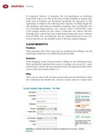
RICH-TEXT EDITOR
Problem
Information entered by users may benefi t from richer formatting, such as bold,
underline, italic, and bulleted list. In addition, the information may be better
presented using colors, tables, images, and hyperlinks. Although this can be
achieved with HTML, users cannot be expected to know HTML, and even if they
do, they cannot be expected to provide valid HTML. In some instances, allowing
users to directly enter HTML (or JavaScript) may lead to security breaches as well.
Solution
Allow users to enter information using rich-text editors with necessary controls
for formatting and inserting images and hypertext links ( Figure 8.1 ).
Why
Plain text can go only so far. In applications where information is targeted to
be used by others, such as email and blogs, it is important for users to empha-
size certain information by making it bold, underlined, italicized, or presented
with a different color. In some instances (e.g., blogs, job sites), it may also be
important to provide supporting information such as tables, images, and links
to other web pages. Although this is possible by allowing users to enter their
information in snippets of HTML, they cannot be expected to be familiar with
it. Allowing users to enter HTML may take more development effort to ensure
that user-entered HTML is valid and that it doesn’t break the presentation of
the rest of the page.
Rich-text editors, because of their WYSIWYG (What You See Is What You Get)
nature, are easier ways to format text and can be converted to HTML both for
storage and to allow users to see the effects of their selections immediately.
Moreover, rich-text editors are easy for users who are likely to be familiar with
similar interactions in offi ce-productivity applications such as Microsoft Offi ce,
Corel WordPerfect Suite, OpenOffi ce, and so forth.
FIGURE 8.1
Yahoo! Mail offers users a rich-text editor for composing emails. Note that it also
offers the option of inserting emoticons (i.e., “ smileys ” ).
227
How
Rich-text editors are typically used as part of a larger application and for spe-
cifi c data-entry tasks such as composing an email or creating a blog entry. So,
it’s important to show users the text-entry areas that can be formatted using
rich-text controls and the formatting options that are available (e.g., bold,
underline, italic, bulleted list, hyperlink, images, etc.).
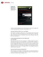
OFFER USERS ALTERNATIVE TEXT INPUT OPTIONS
Some users may not want to use rich-text options. When feasible, offer alterna-
tive text-input options such as plain text or HTML. In email applications, for
example, consider providing a text option ( Figure 8.2 ). In blogs, on the other
hand, offer the option to enter HTML directly ( Figure 8.3 ). Ensure that user-
entered scripts (e.g., JavaScript) in HTML code are removed before saving the
information to prevent security breaches.
OFFER ONLY RELEVANT RICH-TEXT FORMATTING CONTROLS
It is not necessary to offer all possible controls to users, just those most users
are likely to use. For example, Gmail does not offer any controls for creating
Rich-Text Editor
FIGURE 8.2
Gmail offers users the option to switch the email text from rich text to plain text.
FIGURE 8.3
Blogger invites users to enter their posts in either rich-text or HTML format.
CHAPTER 8 Rich Internet Applications
228
tables when composing an email ( Figure 8.4 ). This does not mean that emails
using rich-text editors should never offer users the option to create tables, but
it is acceptable to restrict the set of rich-text controls.
ALLOW USERS TO ENLARGE THE TEXT-INPUT AREA
When users ’ text input is lengthy, viewing the composed text in the available
area may be diffi cult. In such cases, allow users to enlarge text-input areas and/
or preview messages before posting. For example, Gmail (see Figure 8.4 ) and
Yahoo! Mail (see Figure 8.1 ) both offer users the option to enlarge the text-
input area, which launches the editor in a separate window so it can be enlarged
as necessary ( Figure 8.5 ).
FIGURE 8.4
Gmail does not offer users any controls to create tables when composing an
email.
FIGURE 8.5
By launching the email editor in a separate window and allowing it to be resized
as necessary, Gmail offers users a way to view larger amounts of information.
229
Related design patterns
RICH-TEXT EDITORS are comparable to LIVE PREVIEW — both are WYSIWYG
tools. While RICH-TEXT EDITORS refl ect the effects of the changes, LIVE
PREVIEW allows users to view the effects of their confi guration choices on an
item or the interface itself.
RICH FORM
Problem
Some of the ineffi ciencies in fi lling out forms are caused by the need for users
to wait after submitting the form for it to be validated. Fixing validation errors
requires the form to be resubmitted and revalidated. In some instances, users
have to be asked to fi ll out forms in short chunks because the dependencies in
user choices can only be determined after the submitted form has been sub-
jected to necessary business rules — for example, offering users a choice for a
purchase order or credit card information based on their choice of billing.
Solution
In addition to patterns discussed in Chapter 2, such as FORGIVING FORMAT,
INPUT HINTS/PROMPTS, SMART DEFAULTS, and REQUIRED FIELD INDICA-
TORS, use interactive forms that validate users ’ input as it is entered, preventing
errors by offering users only valid choices. In addition, wherever possible, show
dependent or subordinate choices closer to the parent selection ( Figure 8.6 ).
Why
A non – rich form requires users to enter data and submit the form to the
server for validation or send bits of selections to the server to show dependent
choices. The user is then presented with either the “ success ” page or errors to
be corrected with an accompanying page refresh. Using a rich form not only
eliminates page refreshes but also can possibly prevent them altogether by
identifying errors at the source. Users also feel in control as errors and prompts
are now well integrated with the form.
How
Design the form so that user input is validated either as it is being entered or
when the user moves to the next form element (or the focus is removed from the
current form element). If the data input or selection is invalid, present appropri-
ate prompts or messages so that users can correct errors immediately ( Figure 8.7 ).
DESIGN THE FORM TO MINIMIZE ERRORS
Not only can rich forms validate user input as users are fi lling out the form,
they can also help minimize errors in the fi rst place. For example, as shown
in Figure 8.6 , the AUTOSUGGEST/AUTOCOMPLETION pattern can offer users
valid options while entering data; effective calendar controls can ensure valid
Rich Form
CHAPTER 8 Rich Internet Applications
230
(a)
(b)
FIGURE 8.6
Yahoo! FareChase uses a combination of RIA technologies to make this form
“ rich ” : (a) the AUTOCOMPLETE pattern for “ From ” and “ To ” fi elds, (b) showing only valid dates
for departure and arrival dates by disabling invalid dates, and (c) hiding the “ Return ” date when
users indicate a one-way fl ight.
(c)
date selections; and enabling or disabling appropriate controls as per user
selections can minimize incorrect data entry. Other common design elements
include “ drilldown ” approaches to ensure that users see only correct dependent
options ( Figure 8.8 ) and password strength meters to ensure that users select
secure passwords ( Figure 8.9 ).
231
Autosuggest/Autocompletion
FIGURE 8.7
When registering,
Picnik validates
information as soon
as it is entered.
Once validated,
form elements are
supplemented with
appropriate icons to
indicate if entered
information is valid.
FIGURE 8.8
As users select a
make, Kelly’s Blue
Book updates the “ All
Models ” dropdown
menu by offering
them only valid
choices.
FIGURE 8.9
As users enter passwords, a password strength meter rates the password from
weak to strong, enabling users to choose better passwords.
Related design patterns
As shown in the examples, richness in forms is achieved by patterns such as
AUTOSUGGEST/AUTOCOMPLETION as they respond to users ’ input to show
only valid choices to prevent errors. A SLIDER pattern (aiding user entry for
data ranges) and DELAY/PROGRESS INDICATORS (communicating progress
during user waiting periods) are also common with RICH FORMS.
AUTOSUGGEST/AUTOCOMPLETION
Problem
Because the total number of possible items at the outset is fairly large, present-
ing users a standard dropdown list is not feasible when users enter data such
CHAPTER 8 Rich Internet Applications
232
as dates, email addresses, search terms, and so forth. However, it is possible to
predict these data based on task context or partial user input. In addition, text
being entered may be lengthy or diffi cult to remember, making errors likely
and resulting in suboptimal user experience.
Solution
Suggest possible alternatives as users enter data and allow them to select one of
the suggested alternatives ( Figure 8.10 ).
Why
By suggesting matches and allowing users to select from a list, not only is the
interaction made more effi cient, since users can quickly focus on the correct
choice, but the potential for errors is minimized as well. Because recognition is
easier than recall , it is easier for users to recognize the correct syntax or format
of information from available choices than recall it — for example, it’s easier to
pick San Antonio (SAT) from a list of airports than to remember the code for it.
How
The user interface element for this pattern is a text box that allows free-form
data entry. As users type, they are shown a list of items (below the text box)
that closely match what has been typed so far. As users continue to type, the list
continues to narrow down until the desired item is suggested or no matching
items are found. In cases where related information is available for suggested
FIGURE 8.10
Google combines AUTOSUGGEST options with search results. As users enter a
term, they see a menu showing potential search terms along with the total number of matched
results. Users can click the desired suggestion in the menu or navigate to it using the up and
down arrow keys.
NOTE
For non-RIA applications, where potential choices for users are fi nite, users would typically
be offered a “ Select ” button next to the text fi eld. Clicking “ Select ” would open a pop-up
window (or take users to another page) to allow users to select the desired item from a
paginated or scrolling list; users may be offered a search mechanism as well.
233
items and could help users make a correct choice, include it as well. For exam-
ple, when entering an email address, show both the address and name ( Figure
8.11 ), or when entering the city in an air travel – reservation application, show
both the city and airport code ( Figure 8.12 ). Another example is to indicate the
total number of matches for a given search query, as done by Google Suggest
(see Figure 8.10 ).
ENABLE KEYBOARD ACCESS TO SELECT AN ITEM
IN THE SUGGESTED LIST
Asking users to take their hands off the keyboard and use the mouse to select
an item from the suggested list would be ineffi cient. Therefore, allow users to
navigate within the suggested list of items using the up and down arrow keys,
and select highlighted items using either the “ Enter ” or “ Tab ” key. For search
applications, the “ Enter ” key can take users directly to the search results page
and for web applications that have additional fi elds, move the focus to the next
logical form element.
HIGHLIGHT THE FIRST MATCH IN THE SUGGESTED LIST
Highlight the very fi rst match in the suggested list (see Figures 8.11 and 8.12 )
and allow users to select it by pressing the “ Tab ” or “ Enter ” key. The applica-
tion should then populate the text fi eld with the highlighted item. However,
it is important that users indicate their intent by pressing the “ Tab ” or “ Enter ”
key and that the application not infer users ’ intent and type the rest of the text
for them.
Autosuggest/Autocompletion
FIGURE 8.11
Yahoo! Mail shows both
matching names and
email addresses when
users enter a recipient’s
email address.
FIGURE 8.12
Kayak shows both city and airport codes when users specify departure and
arrival locations.
CHAPTER 8 Rich Internet Applications
234
Related design patterns
The AUTOSUGGEST/AUTOCOMPLETION pattern is typically used in RICH
FORMS and DYNAMIC QUERYING to restrict users ’ input to valid choices and
thus prevent errors.
EDIT-IN-PLACE
Problem
When users are creating or editing items with just a few properties (no more
than three or four), showing a pop-up window, or taking users to a separate
“ editor ” page makes the interaction ineffi cient. This is because users have to
launch the editor, make changes, save those changes, and wait for the page to
refresh to see updated information.
Solution
Allow users to create a new item or make changes to the properties of an exist-
ing item “ in place ” using a lightweight editor ( Figure 8.13 ). In some instances,
it is better to offer users the “ edit-in-place ” option only for editing a few chunks
of information of existing items but not for creating new items. For example,
in a bug-tracking application, changing an existing bug’s status is more suit-
able for edit-in-place, but creating a new bug entry may not be benefi cial with
(a)
FIGURE 8.13
When users hover over an editable to-do item, Basecamp shows “ Edit, ”
“ Delete, ” and “ Move ” options (a). When they click “ Edit, ” they are shown the to-do item editor
with the “ Save this item ” and “ Cancel ” options (b).
(b)
235
edit-in-place, since entering a bug requires entering several pieces of informa-
tion such as a brief title, description, steps to recreate the bug, and so forth.
Why
Allowing users to change an item’s properties in its original context, without
popping up a separate window or going to a new page, is a far easier way to
provide or change a few snippets of data. Requiring users to go to a separate
page makes the interaction discontinuous because users have to wait for the
editor to load and then switch their attention to a new context.
How
When users activate an edit feature, put the item in the “ edit ” mode by show-
ing its properties in editable fi elds (i.e., text boxes, dropdown buttons, or other
form controls as necessary). Users can then make necessary changes and either
save or cancel their changes to return to the “ read ” mode ( Figure 8.14 ).
If necessary, use more space for the “ edit ” mode. In addition, since being able
to edit text may be a new experience for web users, provide necessary prompts
or instructions to let users know how the feature works; providing instructions
and/or actions when users hover over an editable item is a common way to
inform users.
SELECT THE TEXT FOR ITEMS WITH ONLY ONE
EDITABLE PROPERTY
If the item being changed has only one editable property (e.g., name or title),
select the item’s text so that users can simply overwrite existing text ( Figure 8.15 ).
Related design patterns
When edited information is being saved, it’s often useful to show a DELAY/
PROGRESS INDICATOR to confi rm the “ save ” action’s progress. When using
Edit-In-Place
(a)
FIGURE 8.14
In Basecamp,
users can edit a
time-tracking item
in-line. When a
user clicks “ Edit ”
next to a list
item (a), the item
becomes editable
and “ Edit ” and
“ Delete ” options
are replaced
by “ Save ” and
“ Cancel ” (b).
(b)
CHAPTER 8 Rich Internet Applications
236
EDIT-IN-PLACE for a new item, a SPOTLIGHT/YELLOW-FADE technique may
be used to indicate the addition of items.
OVERVIEW-PLUS-DETAIL
Problem
When presented with a large dataset, users may want to zoom in to different
areas of the dataset to access detailed information. At other times, users may
want to zoom out to a higher “ overview ” level to get reoriented. Requiring
users to go back and forth between an overview and a detail view makes navi-
gating the information space extremely ineffi cient.
Solution
Show users both the overview and detail view panes with a movable viewport
in the overview pane that shows the zoomed-in area ( Figure 8.16 ).
Why
When working with information spaces that are too large to fi t on screens, users
have to access information by zooming in and out to view the desired detail.
FIGURE 8.15
Flickr allows users to edit a photo’s title by clicking on it. When users click the
title, the text of the title is selected by default, allowing them to overwrite it.
FIGURE 8.16
Google Maps show the overview pane in the bottom-right corner with a
viewport highlighting the currently zoomed-in area.
237
By allowing users to view details of the areas of interest while simultaneously
seeing the overview (albeit in a much coarser resolution), the need to zoom
out to access other areas of the information space is eliminated. Allowing users
to move or manipulate viewports also makes it easy to quickly navigate the
information space without losing context. Moreover, showing viewports in the
overview pane provides a sense of where the user is in the information space;
in essence, it answers the common orientation-related question: Where am I?
This pattern is based on one of the basic principles of information visualiza-
tion: focus plus context.
First, the user needs both overview (context) and detail information
(focus) simultaneously. Second, information needed in the overview
may be different from that needed in detail. Third, these two types of
information can be combined within a single (dynamic) display, much as
in human vision. (Card et al., 1999, p. 307)
The main design implication of this principle is to show selected regions of
interest in greater detail (i.e., focus) and to preserve a global view at reduced
detail (i.e., context) in such a way that all information is visible simultaneously.
How
Make the overview pane available to users at all times. It can be positioned as
an inset pane within the detail pane (see Figure 8.16 ) or positioned next to the
detail pane ( Figure 8.17 ).
Show the viewport within the overview, highlighting the currently zoomed-in
portion of the detail pane. Allow users to drag the viewport within the over-
view pane to zoom in to different areas within the overview. If users can pan
information in the detail pane, move the viewport in the overview pane along
with it. If feasible, allow users to adjust the viewport size to change the dataset’s
Overview-Plus-Detail
FIGURE 8.17
Google Finance positions the overview and detail panes, one above the other,
and allows users to see detailed price trends for a stock by letting them adjust the viewport size
in the overview pane.
CHAPTER 8 Rich Internet Applications
238
scale in the detail pane. For example, Google Finance allows users to change
the viewport size so they can zoom in or out of the date range for the stock
price – trend chart (see Figure 8.17 ).
Related design patterns
When zooming and panning the detail area or moving and/or resizing the
viewport, using DRAG-AND-DROP is necessary. Additionally, some type of
visual effects (ANIMATION/TRANSITIONS) may be employed to allow users
to maintain the visual continuity between states.
DYNAMIC QUERYING
Problem
When presented with a large number of items, users may want to “ tune ” their
criteria to reduce the number of items to a manageable set. Although tradi-
tional fi ltering mechanisms address the problem (see the FILTERING pattern in
Chapter 6), user interaction can become cumbersome, since with every fi ltering
choice users need to “ submit ” their criteria and wait for the page to refresh to
see an updated item list.
Solution
Allow users to fi lter items using a set of interactive controls (i.e., sliders, check-
boxes, radio buttons, and so forth) so that with each selection, they can see
updated results without having to wait for the page to refresh ( Figure 8.18 ).
Why
In traditional web applications, fi ltering requires users to make narrowing
selections, submit them to the server, and wait to view the updated result set
after a refresh. With every fi ltering choice, users go through the same process,
leading to an interrupted experience. RIAs eliminate the explicit “ submit ”
action and accompanying page refreshes, thus providing a more fl uid and inter-
active experience.
FIGURE 8.18
Blue Nile allows users to narrow diamond choices by allowing them to fi lter by
price, cut, color, clarity, and carat. The range for each choice is selected by users using sliders.
239
How
Show criteria to users as a set of checkboxes, sliders, radio buttons, and links
along with results. As users make different selections, narrow or expand the
results set without any page refreshes, enabling users to immediately see the
effects of their choices ( Figure 8.19 ).
To the extent possible, make all choices visible to users and minimize the use
of dropdown lists or hidden (cascading) options.
Related design patterns
Although DYNAMIC QUERYING is a powerful way to show users a fi ltered
dataset in almost real time, processing delays are inevitable. Therefore, the
DELAY/PROCESS INDICATORS pattern commonly accompanies this pattern.
LIVE PREVIEW
Problem
Unlike off-the-shelf, mass-produced products, many new products can be cus-
tomized to users ’ preferences along one or more product attributes. For example,
when purchasing a car, users may customize its color, trim, and other options
and accessories. However, not being able to see the effect of their choices can
leave users unsure about their selections and prevent them from exploring
other possibilities. In addition, asking users to wait to see the effect of their
changes after every selection can become tiresome.
Live Preview
FIGURE 8.19
Kayak allows users to fi lter matching fl ights by the number of stops, airline,
arrival and departure times, arrival and departure airports, and several other options.
CHAPTER 8 Rich Internet Applications
240
Solution
Show users a preview of the item with their selections immediately without hav-
ing to “ submit ” their choices and waiting for the page to refresh ( Figure 8.20 ).
Why
Allowing users to preview the results of their selections makes it easier for them
to decide whether they want to keep, change, or discard their choices. Also, by
offering immediate feedback, live preview invites exploration not possible with
traditional web applications, which require users to make selections, request a
preview, and wait for the application to show the effects of their choices.
This is similar to the RICH-TEXT EDITOR pattern where users customize text
in terms of color and formatting and can see the results immediately in a
WYSIWYG fashion.
How
Offer users customization options along with an image of the actual item. As
users choose different options, update the item’s image to refl ect their choices.
CONSIDER SHOWING MULTIPLE VIEWS OF THE CUSTOMIZED ITEM
For three-dimensional items or items with multiple surfaces, consider showing
users multiple views of the customized item so that they clearly understand the
impact of their choices. For example, Nike allows users to view the customized
shoe from a variety of angles such as top view, side view, front view, and so
forth ( Figure 8.21 ). Similarly, BMW allows users to switch between the front
and back views to customize the exterior (see Figure 8.20 ) and between the
driver’s view and dashboard view to customize the interior (see Figure 8.22 ).
FIGURE 8.20
BMW allows users to customize their vehicles by allowing them to select
exterior and interior colors (among other options). As users make selections, their choices are
immediately refl ected in the image and in price. BMW also offers “ Undo ” and “ Redo ” options,
making it easy for users to return to their previous choices.
241
Lands End, on the other hand, offers not only the front and back view but also
a view showing a model wearing the customized item ( Figure 8.23 ).
Related design patterns
As mentioned, the LIVE PREVIEW pattern is similar to the RICH-TEXT EDITOR
pattern in that it attempts to provide a WYSIWYG view of users ’ selections as
they are made. In addition, preview is useful when users are customizing the
interface; CUSTOMIZATION is a relevant pattern as well (see Chapter 4).
DRAG-AND-DROP
Problem
Traditional web applications require indirect methods for rearranging or
reordering data items. For example, users can reorder a list of items in one of
two ways: select the desired item and choose up or down actions or enter the
Drag-and-Drop
FIGURE 8.21
NIKEiD
presents users a
customized view from a
variety of angles.
FIGURE 8.22
BMW offers users the driver’s side view and dashboard view when they are
customizing the car’s interior.
CHAPTER 8 Rich Internet Applications
242
FIGURE 8.23
Lands End shows a model wearing the customized clothing.
FIGURE 8.24
My MSN allows
users to drag-and-
drop columns to
customize column
order.
desired order of items in text fi elds and select a “ reorder ” action. Although
both these approaches are reasonable, they do not provide users immediate
feedback of their actions and can be cumbersome for even relatively short lists.
Solution
Allow users to directly manipulate data items and/or page components using a
drag-and-drop interaction style ( Figure 8.24 ).
243
Why
In non-RIA web applications, moving or rearranging of data items typically
requires taking users to another page, where the effects of the changes are
not visible until the desired rearrangement is submitted to the server and the
original page is updated to refl ect the new order or layout. Employing direct-
manipulation methods similar to those common in most desktop applications
(e.g., deleting a document by dragging it to the trash) can make the interaction
effi cient and encourage exploration.
How
Allow users to drag data items (or components) from their current place, move
them to a new location and place, and drop them there. Drag-and-drop may be
used for the following:
■
Rearranging items on a list ( Figure 8.25 ).
■
Moving overlaying pop-ups from one location to another ( Figure 8.26 ).
■
Building lists such as adding an item to the shopping cart ( Figure 8.27 ).
■
Indicating an action ( Figure 8.28 ).
■
Resizing an object ( Figure 8.29 ).
When supporting drag-and-drop, it is important that the user interface is respon-
sive and changes are shown instantly without any delays.
Drag-and-Drop
FIGURE 8.26
Live Maps from Microsoft allows users to move the scratch pad pop-up using
drag-and-drop. It also increases the transparency of the scratch pad, allowing users to see the
map and to indicate the “ dragging ” mode.
FIGURE 8.25
Ta-Da Lists allows users to reorder items in their list using a drag-and-drop
mechanism.
CHAPTER 8 Rich Internet Applications
244
FIGURE 8.27
Rally allows users to move items from the Product Backlog to a Release, which
aids planning and developing high-level estimates.
FIGURE 8.28
iGoogle allows users to drop a “ portlet ” onto a tab, which indicates the action
of moving it to that tab. This example shows the “ Stock Market ” portlet being dragged from the
“ Home ” tab to the “ Finance ” tab.
FIGURE 8.29
Picnik allows users to
resize an image using
drag-and-drop.
OFFER NECESSARY AFFORDANCE FOR
DRAG-AND-DROP AREAS
It is important that the user interface clearly indicate what is (and is not)
“ draggable, ” and which areas are (and are not) valid “ drop ” zones. This can be
accomplished by:
■
Showing clear handles for dragging.
■
Changing the cursor to a “ move ” icon ( ) when it hovers over “ draggable ”
items by setting the CSS cursor property to move . When using drag-and-drop
245
Slider
for resizing, use the “ resize ” icon ( ) by setting the CSS cursor property to
nw-resize , sw-resize , w-resize , and so on, as appropriate.
■
Highlighting drop zones when an item is dragged over it.
■
Not highlighting nondrop zones, which should show a “ not allowed ”
icon ( ), by setting the CSS cursor property to not-allowed .
FIGURE 8.30
Picnik uses a variety of sliders to allow users to control image parameters such
as highlights, shadows, histogram, exposure, contrast, and so on.
NOTE
Drag-and-drop is not accessible to users with visual and/or motor disabilities. Therefore,
the interface should always use drag-and-drop interaction redundantly and offer other
more accessible ways to allow rearrangement of data items. See Chapter 11 for more
information on accessibility.
Related design patterns
The DRAG-AND-DROP pattern is also used to make selections using SLIDERS in
DYNAMIC QUERYING and moving or adjusting viewport sizes in OVERVIEW-
PLUS-DETAIL.
SLIDER
Problem
Specifying one or more values between a range of values is error-prone, as users
have to know valid values. In addition, they also need to know the precision of
the desired input (e.g., 10 versus 10.1 versus 10.12). Although such information
can be included in the page design, the page may get cluttered as the number
of form elements requiring such data input increase.
Solution
Offer users a slider control specifying an acceptable range of values. Users can then
drag the slider(s) to set a value ( Figure 8.30 ) or a range of values ( Figure 8.31 ).
Why
For traditional web applications, because of a lack of native support for the slider
control in the current version of HTML, users are offered a text fi eld, a set of radio
CHAPTER 8 Rich Internet Applications
246
buttons, or dropdown lists to specify one or more values within a range. However,
sliders provide an easier and more direct method of selecting a value within a
range (Galitz, 2002). In addition, they prevent user errors when compared with
entering values in text fi elds. Another important advantage of sliders is that the
data range can be continuous as well as discrete, and the design of the slider can
convey the appropriate precision of user input. It is also faster to select values using
sliders when compared to a selection involving a text-input fi eld or radio buttons.
How
Allow users to set one value or a range of values by dragging and dropping the
slider(s) in the slider control. In addition to drag-and-drop, enable users to
click directly on the arm to move the slider to the clicked location. Allow users
to control the slider using the left, right, up, and down arrow keys on the key-
board as well. It is important that the arrow keys match the orientation of the
slider — that is, left and right arrow keys should work for horizontal sliders and
up and down arrow keys should work for vertical sliders. However, it is good
practice to have the other set of arrow keys work as well. Finally, where feasible,
allow users to simply enter the value in a text fi eld ( Figure 8.32 ).
FIGURE 8.31
Kayak uses two handles for each “ Flight Times ” slider to allow users to set a
range for “ Leave ” and “ Return ” times.
FIGURE 8.32
Splashup (from Faux Labs) allows users to specify colors by entering RGB (red,
green, blue) values or the corresponding hexadecimal values. Because of the context and users ’
familiarity with color selection in other desktop-based image-editing applications, providing
verbal descriptors for the sliders is not necessary.
247
Most slider implementations are for selecting a value on a continuous scale
within a range of available values. However, when users may only select dis-
crete values within a given range, use a discontinuous slider that, when
dragged, jumps from one value to another to prevent users from considering a
value between two discrete values ( Figure 8.33 ). Users should be able to click
on any discrete value to have the slider jump to that value.
USE DESCRIPTIVE ANCHORS FOR SLIDER ARM VALUES
When using sliders for continuous values, use anchor labels (i.e., descriptors
or icons) at the end of the slider arm (see Figure 8.33 ). For sliders with discrete
values, use labels at each end as well as for each major value on the slider arm
(see Figure 8.33 ). For sliders conveying colors or other multiattribute values,
labels may not be necessary; however, show all attribute values such as RGB or
hexadecimal values for colors (see Figure 8.32 ).
INFORM USERS OF THE SELECTED VALUE(S)
For both continuous- and discrete-value sliders, users should always know the
value(s) they have selected. In addition, when selected values affect more than
one value (e.g., specifying a color using RGB, CMYK [cyan, magenta, yellow,
black], or hexadecimal values), show users all the values (see Figure 8.32 ).
Related design patterns
The DRAG-AND-DROP pattern is essential to make slider controls work
because users drag the slider to indicate their selections. Slider controls are also
commonly used in DYNAMIC QUERYING and may be applicable in RICH
FORMS to specify one or more values within a range.
ANIMATIONS/TRANSITIONS
Problem
An important usability heuristic is to “ keep users informed ” of changes in the
interface (Nielsen and Molich, 1990). When using RIAs, often only a part of the
Animations/Transitions
FIGURE 8.33
CheapTickets uses a discontinuous slider to allow users to specify fi lter criteria
for hotels ’ star rating and user score.
CHAPTER 8 Rich Internet Applications
248
interface is changing, and it is quite likely that users will be unaware of those
changes because they are focusing on other interface areas. In addition, when
users are interacting with the application causing the page’s state to change — for
example, showing the next set of photos when using the CAROUSEL pattern
or zooming in and out of an image — showing users just the fi nal state without
showing intermediate states can be abrupt and disorienting, since they may fi nd
it diffi cult to understand the relationship between the initial and fi nal states.
Solution
Use appropriate visual effects (i.e., transitions and animations) to direct users ’
attention to page changes ( Figure 8.34 ).
Why
Because our peripheral vision is attuned to detect movement (Faraday and
Sutcliffe 1997; Peterson and Dugas, 1972), using animation to direct users ’
attention to changes on the page is a useful and effective technique, especially
for RIAs, where the page does not refresh with changes in the page’s content.
Animations and transitions also have an aesthetic value that cannot be ignored.
They make web applications appear interactive and dynamic and contribute to
the characterization of RIAs as “ cool, ” an attribute commonly lacking in tradi-
tional web applications, which are limited to relatively static images and lay-
outs in their visual designs.
How
For RIAs, use animation when page elements change appearance but not posi-
tion ( Figure 8.35 ; see also Figure 8.46 later in the chapter) or when they move
from one position to another but not necessarily change appearance (see
Figure 8.34 ).
FIGURE 8.34
When an item is added to the shopping cart, Gap slides the shopping cart down
on the same page to indicate that the selected item was added to the cart. This eliminates
the need to take users to the shopping cart page and have a “ Continue Shopping ” button, an
interaction approach commonly followed on most non-RIA e-commerce sites.
249
Users may be shown a very simple animation to demonstrate that the system is
busy loading information or saving data ( Figure 8.36 ; see also the ICONS pat-
tern in Chapter 12).
In some instances, a similar animation may be used to force a delay, indicat-
ing to users that their request was received. When the animation disappears,
they know that the request was processed and they can resume; an animated
progress bar may be used for longer wait times (see the DELAY/PROGRESS
INDICATOR pattern next). Upon successfully processing user requests, the
updated element’s background can be faded out to subtly indicate the change
on the page (see the SPOTLIGHT/YELLOW-FADE pattern later in this chapter).
USE TRANSITIONS WHEN INTRODUCING OR REMOVING
CONTENT ON A PAGE
When showing new page content (or exposing hidden content), use appropri-
ate transition effects. For example, when showing new content, consider using a
slide-down (or slide-up, slide-left, or slide-right) transition effect ( Figure 8.37 ).
Slide-up and slide-down transition effects are most common for expand and
collapse actions, respectively, in treelike structures or when using accordion
controls for menus.
Animations/Transitions
(a)
FIGURE 8.35
When users hover over the Amazon’s logo (a), its appearance changes (b),
making it look like a button. It is the most basic type of animation.
(b)
FIGURE 8.36
A commonly used “ please wait ” animated icon for RIAs.
CHAPTER 8 Rich Internet Applications
250
Match the transition direction to the direction implied in the user action. For
example, if users click the “ next ” button, use the slide-left transition; con-
versely, use the slide-right transition when users click the “ back ” button ( Figure
8.38 ; see also the CAROUSEL pattern later in this chapter).
PLAY ANIMATIONS BRIEFLY
The goal of animation should be to attract users ’ attention and inform them
about something. Once that’s done, the animation should either remain static
or disappear; it should not loop endlessly.
(a)
FIGURE 8.37
When users click the “ Invite a new member ” link (a), Campfi re uses a
slide-down transition to show the “ Invite new members ” editor (b).
(b)
FIGURE 8.38
When users click on the “ next ” or “ back ” arrow buttons, Hulu uses slide-left
and slide-right transitions, respectively, to show the next or previous episode feature.


