Tài liệu Web Programming with HTML, XHTML, and CSS Second Edition- P6 doc
Bạn đang xem bản rút gọn của tài liệu. Xem và tải ngay bản đầy đủ của tài liệu tại đây (1.1 MB, 50 trang )
❑ You can change the appearance of several pages by altering just the style sheet rather than each
individual page; this is particularly helpful if you want to change your company’s colors, or the
font used for a certain type of element wherever that element appears across the whole site.
❑ The style sheet can act as a style template to help different authors achieve the same style of
document without learning all of the individual style settings.
❑
Because the source document does not contain the style rules, different style sheets can be attached
to the same document. So you can use the same XHTML document with one style sheet when
the viewer is on a desktop computer, another style sheet when the user has a handheld device,
another style sheet when the page is being printed, another style sheet when the page is being
viewed on a TV, and so on. You reuse the same document with different style sheets for different
visitors’ needs.
❑ A style sheet can import and use styles from other style sheets, making for modular development
and good reuse.
❑
If you remove the style sheet, you make the site more accessible for those with visual impairments,
because you are no longer controlling the fonts and color schemes.
It is fair to say, therefore, that whenever you are writing a whole site, you should be using an external style
sheet to control the presentation, although as you will see in the next chapter you might use several exter-
nal style sheets for different aspects of the site.
CSS Properties
Now that you have learned the background of CSS, how to write CSS rules, and where you can place
those rules, the rest of this chapter looks at the properties you can use to affect the presentation of your
documents. In particular, you will learn the
font, text, border, padding, and margin properties.
The following table shows the main properties available to you from CSS1 and CSS2, all of which you
meet in this chapter or Chapter 8.
Continued
FONT FONT (continued) TEXT (continued) TEXT (continued)
font font-variant text-align white-space
font-family font-weight text-decoration word-spacing
font-size
TEXT
text-indent
BACKGROUND
font-size-adjust color text-shadow background
font-stretch direction text-transform background-
attachment
font-style letter-spacing unicode-bidi background-color
221
Chapter 7: Cascading Style Sheets
59313c07.qxd:WroxPro 3/24/08 11:39 PM Page 221
Please purchase PDF Split-Merge on www.verypdf.com to remove this watermark.
BACKGROUND
(continued)
BORDER (continued) DIMENSIONS
(continued)
TABLE (continued)
background-image border-top-style min-width table-layout
background-position
border-top-width width
LIST and MARKER
background-repeat border-width
POSITIONING
list-style
BORDER MARGIN
bottom list-style-image
border margin clip
list-style-position
border-bottom margin-bottom left list-style-type
border-bottom-color
margin-left overflow marker-offset
border-bottom-style
margin-right right
GENERATED
CONTENT
border-bottom-width
margin-top top content
border-color
PADDING
vertical-align counter-increment
border-left padding z-index counter-reset
border-left-color padding-bottom
OUTLINES
quotes
border-left-style padding-left outline
CLASSIFICATION
border-left-width padding-right outline-color clear
border-right padding-top outline-style cursor
border-right-color
DIMENSIONS
outline-width display
border-right-style
height
TABLE
float
border-right-width
line-height border-collapse position
border-style max-height border-spacing visibility
border-top max-width caption-side
border-top-color min-height empty-cells
222
Chapter 7: Cascading Style Sheets
59313c07.qxd:WroxPro 3/24/08 11:39 PM Page 222
Please purchase PDF Split-Merge on www.verypdf.com to remove this watermark.
I will not cover certain properties in this book, either because they are very rarely used or because there
is little support for them. (For example, I avoid covering aural style sheets because there are not many
aural browsers that support them.) You can find out more about these properties on the following web
sites (or you can pick up a book dedicated to CSS):
❑
www.w3.org/style/css/
❑ www.devguru.com/Technologies/css/quickref/css_index.html
❑ www.w3schools.com/css/css_reference.asp
Controlling Fonts
Several properties allow you to control the appearance of text in your documents. These can be split into
two groups:
❑ Those that directly affect the font and its appearance
❑ Those that have other formatting effects upon the text
The table that follows lists the properties that directly affect the font.
Property Purpose
font
Allows you to combine several of the following properties into one
font-family
Specifies the family of font to be used (the user must have this installed
on his or her computer)
font-size
Specifies the size of a font
font-weight
Specifies whether the font should be normal, bold, or bolder than the
containing element
font-style
Specifies whether the font should be normal, italic, or oblique (an
oblique font is the normal font on a slant rather than a separate italic
version of the font)
font-stretch
Allows you to control the width of the actual letters in a font (not
spaces between them)
font-variant
Specifies whether the font should be normal or small caps
font-size-adjust
Allows you to alter the aspect ratio of the size of characters of the font
223
Chapter 7: Cascading Style Sheets
59313c07.qxd:WroxPro 3/24/08 11:39 PM Page 223
Please purchase PDF Split-Merge on www.verypdf.com to remove this watermark.
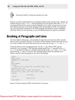
Before you start looking at fonts, it’s important to understand a few issues. Perhaps most importantly, a
font is not the same thing as a typeface:
❑ A typeface is a family of fonts, such as the Arial family.
❑ A font is a specific member of that family, such as Arial 12-point bold.
You will often see the terms used interchangeably, but it is helpful to be aware of the distinction.
Typefaces tend to belong to one of two groups: serif and sans-serif fonts. Serif fonts have extra curls on
letters. For example, the following l contains a serif on the top of the letter leaning back and at the bottom of
the letter, whereas sans-serif fonts have straight ends to the letters. The third common example of a typeface
is of a monospaced serif font. Every letter in a monospaced font is the same width, whereas non-monospace
d
fonts have different widths for different letters. (In serif and sans-serif fonts, the l tends to be narrower
than the m.) See Figure 7-4 for an example.
Figure 7-4
In general print theory, serif fonts are easier to read for long periods of text. However, on the Internet this
does not hold true; many people find serif fonts harder to read on a screen, largely because the resolution
of the screen is not as good as printed words. This makes sans-serif fonts easier to read onscreen because
they are not so detailed.
To study the properties that affect fonts, most of the examples will follow a similar structure using para-
graphs of text; each
<p> element carries a class attribute with a different value:
<p class=”one”>Here is some text.</p>
<p class=”two”>Here is some text.</p>
<p class=”three”>Here is some text.</p>
The use of the class attribute allows you to add different styles to different elements that share the
same name.
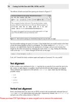
The font-family Property
The font-family property allows you to specify the typeface that should be used. The big drawback
with this property is that those viewing the page must have this font on their computers; otherwise they
will not see the page in that font. You can, however, specify more than one font so that, if the user does
not have your first choice of font, the browser looks for the next font in the list (
ch07_eg02.css).
p.one {font-family:arial, verdana, sans-serif;}
p.two {font-family:times, “times new roman”, serif;}
p.three {font-family:courier, “courier new”, serif;}
serif font sans-serif font monospace font
224
Chapter 7: Cascading Style Sheets
59313c07.qxd:WroxPro 3/24/08 11:39 PM Page 224
Please purchase PDF Split-Merge on www.verypdf.com to remove this watermark.
If a font name contains spaces, such as times new roman or courier new, you should place the
name in double quotation marks.
Figure 7-5 shows what this example would look like in a browser; you can see the different types of font
used for each paragraph (
ch07_eg02.html).
Figure 7-5
The comma-separated list of fonts you can use should end with one of five generic font names so that the
computer can use its default generic font if it cannot find any of the typefaces you specify:
One thing to keep in mind when choosing fonts is that they can each be of different heights or widths, so
you will probably want to choose a similar-sized font as an alternative to your first choice. For example,
Courier New is a lot shorter and wider than Impact (which is quite tall and narrow). If you designed your
page with one font in mind, the layout can be significantly different should a second-choice font be a
different size.
When designers want to use a specific typeface that is not likely to be on the majority of users’ computers,
they tend to use a GIF image for that text. It is generally frowned upon to use images for large sections
of text, but for logos or headings and other small amounts of text, this is a good solution. If you do this,
remember that you must provide the text that would be seen in the image as the value of the alt
attrib
ute.
Generic font name Type of font Example
serif
Fonts with serifs
Times
sans-serif
Fonts without serifs
Arial
monospace
Fixed-width fonts
Courier
cursive
Fonts that emulate handwriting
Comic Sans
fantasy
Decorative fonts for titles, and so on
Impact
225
Chapter 7: Cascading Style Sheets
59313c07.qxd:WroxPro 3/24/08 11:39 PM Page 225
Please purchase PDF Split-Merge on www.verypdf.com to remove this watermark.
There are several efforts to allow you to use fonts that others are not likely to have on their computers that
involve downloading the font in question; however, most fonts are copyrighted and — like software —
cannot simply be distributed by the purchaser. In addition, many users are wary of downloading files
from web sites, so this cannot be relied upon as a technique for achieving the look you require. If you
really want to use a non-standard font for small amounts of text, an alternative to images is a combi-
nation of Flash and JavaScript in SIFR, which allows you to create some interesting effects
( />The font-size Property
The font-size property enables you to specify a size for the font. You can specify a value for this property
in several ways:
❑ Absolute size
❑ Relative size
❑ Length
❑ Percentage (in relation to parent element)
The following values are absolute sizes:
xx-small x-small small medium large x-large xx-large
The following two values are relative sizes:
smaller larger
Length can be expressed in one of the following units of length:
px em ex pt in cm pc mm
You will see what each of these different units means later in the chapter in the section “Lengths” (as
they are used in conjunction with several properties, not just fonts). Probably the most common is
px for
pixels.
A percentage is calculated as a proportion of the element that contains the text:
2% 10% 25% 50% 100%
For example:
p.one {font-size:xx-small;}
p.twelve {font-size:12px;}
p.thirteen {font-size:3pc;}
p.fourteen {font-size:10%;}
Figure 7-6 shows you how some of these different font sizes work in the browser. (ch07_eg03.html
and ch07_eg03.css contain several examples of different ways of specifying size and compare how
they look.)
226
Chapter 7: Cascading Style Sheets
59313c07.qxd:WroxPro 3/24/08 11:39 PM Page 226
Please purchase PDF Split-Merge on www.verypdf.com to remove this watermark.
Figure 7-6
The font-weight Property
Most fonts have different variations, such as bold and italic. While many well-made fonts have com-
pletely different versions of each character for bold text, browsers tend to use an algorithm to calculate
and add to the character’s thickness when it is supposed to be bold. Because it uses an algorithm, it means
you can also create a lighter version of fonts, too. This is what the
font-weight property is for.
227
Chapter 7: Cascading Style Sheets
59313c07.qxd:WroxPro 3/24/08 11:39 PM Page 227
Please purchase PDF Split-Merge on www.verypdf.com to remove this watermark.
The possible values for font-weight are:
normal bold bolder lighter 100 200 300 400 500 600 700 800 900
So you assign a bold font like this (ch07_eg04.css):
p.one {font-weight:normal;}
p.two {font-weight:bold;}
p.three {font-weight:bolder;}
p.four {font-weight:lighter;}
p.five {font-weight:100;}
p.six {font-weight:200;}
Figure 7-7 shows you how these values appear in the browser (ch07_eg04.html).
Figure 7-7
Of these values,
bold is most commonly used, although you might also come across the use of normal
(especially if a large body of text is already in bold and an exception has to be created).
The font-style Property
The font-style property allows you to specify that a font should be normal, italic, or oblique, and
these are the values of the
font-style property; for example:
p.one {font-style:normal;}
p.two {font-style:italic;}
p.three {font-style:oblique;}
228
Chapter 7: Cascading Style Sheets
59313c07.qxd:WroxPro 3/24/08 11:39 PM Page 228
Please purchase PDF Split-Merge on www.verypdf.com to remove this watermark.
Figure 7-8 shows you how these values appear in the browser (from ch07_eg05.css).
Figure 7-8
The font-variant Property
There are two possible values for the font-variant property: normal and small-caps. A small caps
font looks like a smaller version of the uppercase letterset.
For example, look at the following paragraph, which contains a <span> with a class attribute
(ch07_eg06.html):
<p>This is a normal font, but then <span class=”smallcaps”>there
are some small caps</span> in the middle.</p>
Now look at the style sheet (ch07_eg06.css):
p {font-variant:normal;}
span.smallcaps {font-variant:small-caps;}
As you can see from Figure 7-9, the rule associated with the <span> element indicates that its content
should be shown in small caps.
Figure 7-9
229
Chapter 7: Cascading Style Sheets
59313c07.qxd:WroxPro 3/24/08 11:39 PM Page 229
Please purchase PDF Split-Merge on www.verypdf.com to remove this watermark.
The font-stretch Property
The font-stretch property sets the width of the actual letters in a font (not the space between them).
It
can take either relative or fixed values. The relative values are as follows:
normal wider narrower
The fixed values are as follows:
ultra-condensed extra-condensed condensed semi-condensed semi-expanded
expanded extra-expanded ultra-expanded
For example, you can make a condensed Arial font using the following syntax:
p {font-family:arial; font-stretch:condensed;}
Unfortunately, however, this property is not supported by either IE 7 or Firefox 2.
The font-size-adjust Property
As I mentioned earlier in the chapter, fonts can be different heights and widths. A font’s aspect value is the
ratio between the height of a lowercase letter x in the font and the height of the font. The
font-size-
adjust
property allows you to alter the aspect value of a font.
For example, Verdana has an aspect value of 0.58 (which means that when the font’s size is 100 px, its
x-
height is 58 pixels). Times New Roman has an aspect value of 0.46 (which means that when the font’s
size is 100 px, its x-height is 46 pixels). This makes Verdana easier to read at smaller sizes than Times
New Roman. By altering a font’s aspect value you can, therefore, change its height.
Unfortunately, neither Firefox 2 nor IE 7 supports this property.
Text Formatting
In addition to the font properties, you can use several properties to affect the appearance or formatting
of your text. They are listed in the table that follows.
Property Purpose
color
Specifies the color of the text
text-align
Specifies the alignment of the text within its containing element
vertical-align
Vertical alignment of text within containing element and in relation
to containing element
text-decoration
Specifies whether the text should be underlined, overlined,
strikethrough, or blinking text
230
Chapter 7: Cascading Style Sheets
59313c07.qxd:WroxPro 3/24/08 11:40 PM Page 230
Please purchase PDF Split-Merge on www.verypdf.com to remove this watermark.
The color Property
The color property allows you to specify the color of the text. The value of this property can either be a
hex code for a color or a color name. (The way in which colors are specified for the Web is discussed fur-
ther in Appendix D.)
For example, the following rule would make the content of paragraph elements red (
ch07_eg07.html):
p {color:#ff0000;}
The text-align Property
The text-align property works like the deprecated align attribute would with text. It aligns the text
within its containing element or the browser window. See the table that follows for possible values.
Value Purpose
left
Aligns the text with the left border of the containing element
right
Aligns the text with the right border of the containing element
center
Centers the content in the middle of the containing element
justify
Spreads the width across the whole width of the containing element
Property Purpose
text-indent
Specifies an indent from the left border for the text
text-transform
Specifies that the content of the element should all be uppercase,
lowercase, or capitalized
text-shadow
Specifies that the text should have a drop shadow
letter-spacing
Controls the width between letters (known to print designers as
kerning)
word-spacing
Controls the amount of space between each word
white-space
Specifies whether the white space should be collapsed, preserved,
or prevented from wrapping
direction
Specifies the direction of text (similar to the dir attribute)
unicode-bidi
Allows you to create bidirectional text
231
Chapter 7: Cascading Style Sheets
59313c07.qxd:WroxPro 3/24/08 11:40 PM Page 231
Please purchase PDF Split-Merge on www.verypdf.com to remove this watermark.
For example, you can see how these work in a table that is 500 pixels wide. Here are the rules for each row
(
ch07_eg08.css):
td.leftAlign {text-align:left;}
td.rightAlign {text-align:right;}
td.center {text-align:center;}
td.justify {text-align:justify;}
Figure 7-10 shows you how these work.
Figure 7-10
The vertical-align Property
The vertical-align property is useful when working with inline elements, in particular images and
portions of text. It allows you to control their vertical positioning within the containing element.
span.footnote {vertical-align:sub;}
It can take several values, as you can see in the table that follows.
Value Purpose
baseline
Everything should be aligned on the baseline of the parent element (this is
the default setting).
sub
Makes the element subscript. With images, the top of the image should be on
the baseline. With text, the top of the font body should be on the baseline.
super
Makes the element superscript. With images, the bottom of the image should
be level with the top of the font. With text, the bottom of the descender (the
parts of letters such as g and p that go beneath the line of text) should align
with the top of the font body.
top
The top of the text and the top of the image should align with the top of the
tallest element on the line.
232
Chapter 7: Cascading Style Sheets
59313c07.qxd:WroxPro 3/24/08 11:40 PM Page 232
Please purchase PDF Split-Merge on www.verypdf.com to remove this watermark.
This property may also accept a length and a percentage value.
You can try out all of these in your browser using
ch07_eg09.html.
Figure 7-11 shows you some of these values.
Figure 7-11
Value Purpose
text-top
The top of the text and the top of the image should align with the top of
the tallest text on the line.
middle
The vertical midpoint of the element should be aligned with the vertical
midpoint of the parent.
bottom
The bottom of the text and the bottom of the image should align with the
bottom of the lowest element on the line.
text-bottom
The bottom of the text and the bottom of the image should align with the
bottom of the lowest text on the line.
233
Chapter 7: Cascading Style Sheets
59313c07.qxd:WroxPro 3/24/08 11:40 PM Page 233
Please purchase PDF Split-Merge on www.verypdf.com to remove this watermark.
The text-decoration Property
The text-decoration property allows you to specify the values shown in the table that follows.
For example, here are these properties used on separate paragraphs:
p.underline {text-decoration:underline;}
p.overline {text-decoration:overline;}
p.line-through {text-decoration:line-through;}
p.blink {text-decoration:blink;}
Figure 7-12 shows you the properties that are demonstrated in ch07_eg10.html. Note that the blink
property works in Netscape and Firefox only.
Figure 7-12
The text-indent Property
The text-indent property allows you to indent the first line of text within an element. For example,
here you can see that the first line of the second paragraph has been indented. The following is the
XHTML in ch08_eg11.html:
<p>This paragraph should be aligned with the left-hand side of the browser. </p>
<p class=”indent”>The content of this paragraph should be indented by 3 em. </p>
Value Purpose
underline
Adds a line under the content.
overline
Adds a line over the top of the content.
line-through
Like strikethrough text, with a line through the middle. In general, this
should be used only to indicate text that is marked for deletion.
blink
Creates blinking text (which is generally frowned upon and considered
annoying).
234
Chapter 7: Cascading Style Sheets
59313c07.qxd:WroxPro 3/24/08 11:40 PM Page 234
Please purchase PDF Split-Merge on www.verypdf.com to remove this watermark.
Now, here is the rule that indents the second paragraph (ch08_eg11.css):
.indent {text-indent:3em;}
You can see what this looks like in Figure 7-13.
Figure 7-13
The text-shadow Property
The text-shadow property is supposed to create a drop shadow, which is a dark version of the word just
behind it and slightly offset. This has often been used in print media, and its popularity has meant that is
has gained its own CSS property in CSS2. The value for this property is quite complicated because it can
take three lengths, optionally followed by a color:
.dropShadow { text-shadow: 0.3em 0.3em 0.5em black}
The first two lengths specify X and Y coordinates for the offset of the drop shadow, while the third speci-
fies a blur effect. This is then followed by a color, which can be a name or a hex value.
Unfortunately, this property does not work in IE 7 or Firefox 2, although an example has been provided
with the download code in
ch07_eg12.html and ch07_eg12.css.
The text-transform Property
The text-transform property allows you to specify the case for the content of an element. The possible
values are shown in the table that follows.
Value Purpose
none
No change should take place.
capitalize
The first letter of every word should be capitalized.
uppercase
The entire content of the element should be uppercase.
lowercase
The entire content of the element should be lowercase.
235
Chapter 7: Cascading Style Sheets
59313c07.qxd:WroxPro 3/24/08 11:40 PM Page 235
Please purchase PDF Split-Merge on www.verypdf.com to remove this watermark.
Look at the following four paragraphs, all of which look like this (but with different values for the class
attribute):
<p class=”none”><i>The Catcher in the Rye</i> was written by J.D. Salinger</p>
Here you can see the four different values for the text-transform property in use (ch07_eg13.css):
p.none {text-transform:none;}
p.Capitalize {text-transform:Capitalize;}
p.UPPERCASE {text-transform:UPPERCASE;}
p.lowercase {text-transform:lowercase;}
Figure 7-14 shows you how the paragraphs would appear in a browser with these styles applied.
Figure 7-14
The letter-spacing Property
The letter-spacing property is supposed to control something that print designers refer to as tracking: the
gap between letters. Loose tracking indicates that there is a lot of space between letters, whereas tight tracking
refers to letters being squeezed together. No tracking refers to the normal gap between letters for that font.
The possible values are
normal or a unit of length (which is the next topic). For example
(
ch07_eg14.css which is used with ch07_eg14.html):
span.wider {letter-spacing:10px;}
Figure 7-15 gives you an indication of what this looks like.
Figure 7-15
236
Chapter 7: Cascading Style Sheets
59313c07.qxd:WroxPro 3/24/08 11:40 PM Page 236
Please purchase PDF Split-Merge on www.verypdf.com to remove this watermark.
The word-spacing Property
The word-spacing property is supposed to set the gap between words. Its value should be a unit of
length. For example (ch07_eg15.css used with ch07_eg15.html):
span.wider {word-spacing:20px;}
Figure 7-16 gives you an indication of what this looks like.
Figure 7-16
The white-space Property
The white-space property controls whether or not white space is preserved within and between block
level elements. By default, a browser changes any two or more spaces next to each other into a single
space, and makes any carriage returns a single space, too. The white-space property offers the same
results as the XHTML <pre> element and nowrap attribute. See the table that follows for the possible
values for this property.
For example, you can use the
white-space property like so (ch07_eg16.css):
.pre {white-space:pre;}
.nowrap {white-space:nowrap;}
Unfortunately, the value of pre does not work in IE 7, although it does work in Netscape 4/Firefox 1
and later. The
nowrap property works in IE 6 and Netscape 4/Firefox 1 and later. You can see both of
these properties working in Figure 7-17.
Value Meaning
normal
Normal white space collapsing rules are followed.
pre
White space is preserved just as in the <pre> element of XHTML, but the formatting
is whatever is indicated for that element, not just a monospaced font.
nowrap
Text is broken onto a new line only if explicitly told to with a <br /> element;
otherwise text does not wrap.
237
Chapter 7: Cascading Style Sheets
59313c07.qxd:WroxPro 3/24/08 11:40 PM Page 237
Please purchase PDF Split-Merge on www.verypdf.com to remove this watermark.
Figure 7-17
The direction Property
The direction property is rather like the dir attribute and specifies the direction in which the text
should flow. The following table shows the possible values.
For example, here are rules for two paragraphs indicating different directions for the text (ch07_eg17.css
used with ch07_eg17.html):
p.ltr {direction:ltr;}
p.rtl {direction:rtl;}
In practice, both IE and Firefox use this property much as the align attribute is used. The value rtl will
simply right-align text, as you can see in Figure 7-18. Note, however, that the period (or full stop) is to
the left of the sentence in the paragraph that is supposed to be running right to left.
Figure 7-18
Value Meaning
ltr
The text flows from left to right.
rtl
The text flows from right to left.
inherit
The text flows in the same direction as its parent element.
238
Chapter 7: Cascading Style Sheets
59313c07.qxd:WroxPro 3/24/08 11:40 PM Page 238
Please purchase PDF Split-Merge on www.verypdf.com to remove this watermark.
Do not use this property instead of the text-align property, as it will break when new browsers fully
support this property.
The unicode-bidi Property
The unicode-bidi property is designed for internationalization purposes; the bidi part in the name is
short for bi-directional. It allows words to appear in the direction that would be inferred by the Unicode
standard and for authors to specify a change in direction of the elements’ content contrary to the
Unicode standard. See the table that follows for possible values.
It is particularly helpful for inline elements that should be facing a different direction than the rest of the
containing element — for example, if you were using a word that was written in a different direction
because the embed value allows your text to flow in the opposite direction from the rest of the containing
element. If you want to stop this from happening, you can use the
bidi-override value.
Text Pseudo-Classes
While you are learning about text, there are two very helpful pseudo-classes that can help you work with
text. These pseudo-classes allow you to render either the first letter or the first line of an element in a dif-
ferent way than the rest of that element. Both of these are commonly used when laying out text.
The first-letter Pseudo-Class
The first-letter pseudo-class allows you to specify a rule just for the first letter of an element. This is
most commonly used on the first character of a new page, either in some magazine articles or in books.
Here is an example of the first-letter pseudo-class applied to a <p> element carrying a class attribute
whose value is pageOne (ch07_eg18.css which is used with ch07_eg18.html):
p.pageOne:first-letter {font-size:42px;}
You can see the effect of this first-letter pseudo-class in Figure 7-19 (which also shows the next
pseudo-class we will be looking at).
Value Purpose
normal
No directional embedding will be enabled.
embed
The element opens an additional level of embedding, and the intend-
ing Unicode direction will be followed.
bidi-override
Overrides the default directional values of an inline element in order
to allow the
direction property to set the direction in the element
(overrides the Unicode settings).
239
Chapter 7: Cascading Style Sheets
59313c07.qxd:WroxPro 3/24/08 11:40 PM Page 239
Please purchase PDF Split-Merge on www.verypdf.com to remove this watermark.
Figure 7-19
The first-line Pseudo-Class
The first-line pseudo-class should allow you to render the first line of any paragraph differently from
the rest of the paragraph. Commonly this might be in a bold font so that the reader can clearly see an
introduction (for articles) or the first line (for poems).
The name of the pseudo-class is separated from the element it should appear on by a colon:
p:first-line {font-weight:bold;}
Note how, if you resize the window so that there is less text on the first line, only the first line of text in
the browser will be given this new style. You can see the first-line pseudo-class in action in Figure 7-19,
which also demonstrates the first-letter pseudo-class.
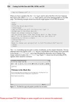
Try It Out A Font Test Page
Now that you’ve learned about using CSS to format text, it is time to try putting what you have learned
into practice by creating a font test page. You will be able to use this page to test whether a browser sup-
ports a font or not.
1. Create a new XHTML document, with the skeleton you are used to creating by now:
<?xml version=”1.0” encoding=”iso-8859-1”?>
<!DOCTYPE html PUBLIC “-//W3C//DTD XHTML 1.0 Transitional//EN”
“ /><html xmlns=” lang=”en”>
<head>
<title>Font test</title>
</head>
<body>
</body>
</html>
2.
Add a <link /> element to an external style sheet. The name of the style sheet will be
font-test.css.
<head>
<title>Font text</title>
<link rel=”stylesheet” type=”text/css” href=”font-test.css” />
</head>
240
Chapter 7: Cascading Style Sheets
59313c07.qxd:WroxPro 3/24/08 11:40 PM Page 240
Please purchase PDF Split-Merge on www.verypdf.com to remove this watermark.
3.
Add four <div> elements to the body of the document, each containing the line “The quick brown
fox jumped over the lazy dog.”
For each element, give it a
class attribute whose value is the name of a different typeface, and
start each sentence with the name of the typeface, too, like this:
<div class=”arial”>Arial: The quick brown fox jumped over the lazy dog.</div>
<div class=”helvetica”>Helvetica: The quick brown fox jumped over the lazy dog.
</div>
<div class=”TimesNewRoman”>Times New Roman: The quick brown fox jumped over the
lazy dog.</div>
<div class=”MrsEaves”>Mrs Eaves: The quick brown fox jumped over the lazy dog.
</div>
4. Save this file as font-test.html.
5. Create a new document in the editor you are using and save the file as font-test.css.
6. Add the selectors for each of the <div> elements you added to your XHTML document:
div.arial
div.helvetica
div.TimesNewRoman
div.MrsEaves
7. Add font-family properties to each of these, and give the value of the typeface specified:
div.arial {font-family:arial;}
div.helvetica {font-family:Helvetica;}
div.TimesNewRoman {font-family:”Times New Roman”;}
div.MrsEaves {font-family:”Mrs Eaves”;}
8. Add another typeface after the one you want to view, and separate the two with a comma. Note
that this second typeface should be very different from the ones you are hoping to see. I am using
Courier, a monospaced font, as the second choice, so it will be clear whether or not the browser
supports the font I have named.
div.arial {font-family:arial, courier;}
div.helvetica {font-family:Helvetica, courier;}
div.TimesNewRoman {font-family:”Times New Roman”, courier;}
div.MrsEaves {font-family:”Mrs Eaves”, courier;}
9.
Add the following rule to make sure that there is adequate space between each line to look at
the fonts:
div {line-height:28px;}
10.
Save this CSS file and open the XHTML page in your browser. You should end up with something
like Figure 7-20.
241
Chapter 7: Cascading Style Sheets
59313c07.qxd:WroxPro 3/24/08 11:40 PM Page 241
Please purchase PDF Split-Merge on www.verypdf.com to remove this watermark.
Figure 7-20
The Mrs Eaves typeface is a serif font, like Times. From Figure 7-20 you can see that the computer this
screenshot was taken on does not have the Mrs Eaves installed because it is showing Courier — a mono-
space font — instead.
One of the exercises at the end of the chapter expands upon this example.
How It Works
The first thing to note about this example is the presence of the <link /> element in the source XHTML
document, which indicates that it should be styled using the
font-test.css style sheet.
<link rel=”stylesheet” type=”text/css” href=”font-test.css” />
This line features three attributes, all of which are required to indicate the relationship between the doc-
ument containing the link and the document it is linking to, and so that the style sheet can be located.
The browser should now use the style sheet to lay out the example as specified in
font-test.css. Each
<div> element in the XHTML document carried a class attribute, which is used by CSS to identify that
particular element’s content and style it differently than other
<div> elements. The value of the class
attributes is the typeface to be checked.
It is the selectors in a CSS rule that determine which elements a rule applies to, and the class selector was
used in the style sheet to individually identify each
<div> element so that different rules could be applied
to each one. For example, the text to be displayed in an Arial typeface was identified like so:
div.arial
The properties were then added inside curly braces that followed the selector. The font-family property
allows you to specify the typeface you want to use for the content of the selected elements (and their
children — because this property is inherited by child elements). A second font that is not similar in appear-
ance
was then specified as the second option if the browser could not find the requested font; this makes
it clear if the browser does not support a font. I used Courier because it is clearly identifiable as a mono-
spaced font.
div.arial {font-family:arial,courier;}
242
Chapter 7: Cascading Style Sheets
59313c07.qxd:WroxPro 3/24/08 11:40 PM Page 242
Please purchase PDF Split-Merge on www.verypdf.com to remove this watermark.
Finally, the line-height property added extra height between each line of text to make the examples mor
e
readable. This property was specified using one selector for every
<div> element rather than repeating
it for each
<div> element.
Selectors
You should be starting to get the hang of writing rules in style sheets that indicate how an element
should appear, but before you look at more of the properties you can use to affect the layout of a docu-
ment, you need to look at some more of the fundamentals, starting with a look at the different ways in
which you can select which element or elements a rule applies to.
You can select elements in several ways, not just by using their names as you have seen in this chapter
(which is, incidentally, known as a simple selector), or using the value of the class attribute in the document
the sheet is styling. You can create selectors that are a lot more specific. In addition to providing the element
name as a selector, you can use the following as selectors.
Universal Selector
The universal selector is an asterisk; it is like a wildcard and matches all element types in the document.
*{}
If you want a rule to apply to all elements, you can use this selector. Sometimes it is used for default values,
such as a font-family and font-size, that will apply to the whole of the document (unless another
more specific selector indicates an element should use different values for these same properties).
It is slightly different from applying default styles to the
<body> element, as the universal selector applies
to every element, and does not rely on the property being inherited from the rules that apply to the <body>
element.
The Type Selector
The type selector matches all of the elements specified in the comma-delimited list. It allows you to apply
the same rules to several elements. For example, the following would match all h1, h2, and
p elements.
h1, h2, p {}
If you have the same rules that apply to several elements, this technique can lead to a smaller style
sheet,
saving bandwidth and load on your server (the computer sending your web pages to those that
request them).
243
Chapter 7: Cascading Style Sheets
59313c07.qxd:WroxPro 3/24/08 11:40 PM Page 243
Please purchase PDF Split-Merge on www.verypdf.com to remove this watermark.
The Class Selector
The class selector allows you to match a rule with an element carrying a class attribute whose value you
specify in the class selector. For example, imagine you had a
<p> element with a class attribute whose
value was
BackgroundNote, like so:
<p class=”BackgroundNote”>This paragraph contains an aside.</p>
You can use a class selector in one of two ways here: First you could simply assign a rule that applies to
any element that has a
class attribute whose value is BackgroundNote, like so, simply preceding the
value of the class attribute with a period or full stop:
.BackgroundNote {}
Or you can create a selector that selects only the <p> elements that carry a class attribute with a value
of
BackgroundNote (not other elements) like so:
p.BackgroundNote {}
If you have several elements that can all carry a class attribute with the same value (for example a <p>
element and a <div> element could both use the class attribute with the same value) and you want the
content of these elements to be displayed in the same manner, you will want to use the former notation.
If the class is specific to the
<p> element, then you should use the latter notation.
The ID Selector
The id selector works just like a class selector, but works on the value of id attributes. But rather than using
a period or full stop before the value of the id attribute, you use a hash or pound sign (#). So, a <p> element
with an id attribute whose value is abstract can be identified with this selector.
p#abstract
Because the value of an id attribute should be unique within a document, this selector should apply only
to the content of one element.
The Child Selector
The child selector matches an element that is a direct child of another. In this case it matches any <b> elements
that are direct children of <td> elements:
td>b {}
This would enable you to specify a different style for <b> elements that are direct children of the <td>
element rather than for <b> elements that appear elsewhere in the document.
Note, however, that this selector applies only to a
<b> element that is a direct child of the parent element.
The following selector does not really make sense because the
<b> element should not be a direct child
of a
<table> element (instead, a <tr> element is more likely to be the direct child of a <table> element):
table>b {}
244
Chapter 7: Cascading Style Sheets
59313c07.qxd:WroxPro 3/24/08 11:40 PM Page 244
Please purchase PDF Split-Merge on www.verypdf.com to remove this watermark.
The less-than symbol (>) is referred to as a combinator.
Unfortunately, IE7 was the first version of Internet Explorer to support the child selector, so before using
this selector on your site, you need to check how many of the visitors to your site use IE7 (you can see
how to do this in Chapter 13). If you still have a lot of visitors using IE6, you should test your web site in
IE6 to make sure it appears as you want it to.
The Descendent Selector
The descendent selector matches an element type that is a descendent of another specified element, at any
level of nesting, not just a direct child. While the less-than symbol was the combinator for the child selec-
tor, for the descendent selector the combinator is the space. Take a look at this example:
table b {}
In this case, the selector matches any <b> element that is a child of the <table> element, which means it
would apply to
<b> elements both in <td> and <th> elements.
This is a contrast to the child selector because it applies to all of the children of the <table> element,
rather than just the direct children.
The Adjacent Sibling Selector
An adjacent sibling selector matches an element type that is the next sibling of another. For example, if you
want to make the first paragraph after any level 1 heading a different style you can use the adjacent sib-
ling selector like so:
h1+p {}
Both elements must have the same element, and this will apply only to the <p> element directly after a
heading.
Unfortunately, IE7 was the first version of Internet Explorer to support the adjacent sibling selector, so
you need to check how many of the visitors to your site use IE7 (you learn how to do this in Chapter 13).
If you still have a lot of visitors using IE6, you should test your web site in IE6 to make sure it appears as
you want it to.
Using Child and Adjacent Sibling Selectors to Reduce
Dependence on Classes in Markup
The child and adjacent sibling selectors are both very important because they can reduce the number of
class attributes you need to add into an XHTML document.
It is very easy to add classes for all kinds of eventualities. For example, you might want the first para-
graph after an <h1> element to be shown in bold, and you might have been tempted to add a class to
the
first <p> element after every <h1> element. This will work, but before you know it your markup
can
be littered with all kinds of classes that are only there to make it easier to control the presentation of
the pages.
245
Chapter 7: Cascading Style Sheets
59313c07.qxd:WroxPro 3/24/08 11:40 PM Page 245
Please purchase PDF Split-Merge on www.verypdf.com to remove this watermark.