Adobe Dreamweaver CS3 Unleashed- P2 ppsx
Bạn đang xem bản rút gọn của tài liệu. Xem và tải ngay bản đầy đủ của tài liệu tại đây (737.7 KB, 50 trang )
used as way of embedding the content of a secondary page within your page within a small scrollable
window. It's important to note, however, that the IFrame is deprecated and it should be replaced
whenever possible with the much more flexible <div> tag.
Frames Menu— Opens the Frameset submenu, which enables you to pick from various options for
splitting the Document window into frames. Frames are covered in more detail in Chapter 8, "Working
with Frames and Framesets."
Form Objects
Covered in much more detail in Chapter 9, "Working with HTML Forms," form objects facilitate interactivity
between your users and your dynamic web applications. Aside from adding form objects by using the Insert,
Form menu, you can visually add form objects from this category.
The list of available objects includes Form, Text Field, Hidden Field, Textarea, Checkbox, Radio Button,
Radio Group, List/Menu, Jump Menu, Image Field, File Field, Button, Label, Fieldset, and various Spry
validation elements including Spry Validation Text Field, Spring Validation Textarea, Spry Validation
Checkbox, and Spry Validation Select.
Data Objects
Throughout the second half of this book, you will become increasingly familiar with data objects. Depending
on what server technology you're using, the Data category of the Insert bar will tailor itself to accommodate
features and functionality of a specific technology. To prove this point I'll briefly create a sample ASP.NET
page. As you can see from Figure 1.22 (before) and Figure 1.23 (ASP.NET site), the Application category
looks slightly different before I created the ASP.NET site than afterwards.
Figure 1.22. The categories of the Insert bar when you're working with a normal HTML file.
[View full size image]
Figure 1.23. The categories of the Insert bar when you're working with an ASP.NET file. Also
notice the new ASP.NET category.
[View full size image]
It's also important to notice that depending on the server technology you decide to use, a new category will
appear to support development for that particular technology. In my case, because I created a new ASP.NET
page, an ASP.NET tab appears, complete with elements that I can use for that technology. Again, server
technologies will be covered in much more detail in the second half of the book.
Spry Objects
The Spry framework is a JavaScript library that provides designers and developers with the capability to
build web pages that offer richer experiences to their site's visitors. With Spry, you can use HTML, CSS, and
a minimal amount of JavaScript to incorporate and visually work with XML data in your HTML documents.
With various "widgets" such as accordions, menu bars, validation elements, effects, and more, it has never
been easier to work with disconnected XML data in an HTML-based web page.
Although we'll cover the Spry framework in much more detail in Chapter 30, "Introducing the Spry
Framework for Ajax," for now, note that the Spry category in the Insert bar outlines various Spry elements,
also shown in Figure 1.24, that you may decide to use within your web pages.
Figure 1.24. The new Spry objects make it easy to insert and work with XML data visually and
interactively.
[View full size image]
Text Objects
As you can see from Figure 1.25, text objects provide a section from the Insert bar from which text can be
easily formatted.
Figure 1.25. Use text objects when manipulating the look of text within the Document window.
[View full size image]
Text objects can be broken into the following categories (moving from left to right):
Font Weights and Styles— Allows you to add a bold (<b>) or strong (<strong>) tag as well as an
italic (<i>) or emphasis (<em>) tag.
Paragraph, Blockquote, & Preformatted— Allows you to format blocks of text with the paragraph
(<p>) tag, indent text with the blockquote (<blockquote>) tag, or preserve the formatting of content
with the preformatted (<pre>) tag.
Headings— Provides three heading options (H1, H2, H3) for your text.
Lists— Allows you to pick from three types of lists: ordered list (numbered) and unordered list
(bulleted) and the required tags within these two types of lists: li (list item). Also shown is the
definition list (dl) including tags contained within the definition list including dt (definition title) and dd
(dictionary definition).
Abbreviations and Acronyms— Assign the abbreviation or acronym tag to text within your page.
Characters (BR sub menu)— Select from a group of predefined special characters from this menu.
The most obvious are listed (line break, non-breaking space, left and right quote, dash, pound, euro,
yen, copyright, registered trademark, and trademark. You can also choose from a character map by
selecting the Other Characters option. Doing so launches the Insert Other Characters dialog, which
allows you to choose from a map of characters supported on your computer.
It's important to note that most text-based formatting features are available from the Property inspector.
Like most of the other features within the Insert bar, the Text category provides a simpler, visual method
for applying text-based formatting.
Favorites
As you familiarize yourself with using the various categories of the Insert bar, you'll quickly begin to realize
that you're using some objects more than others. When this happens you may want to group some of your
favorite objects within the Favorites category, making them quicker and easier to reference. To add an
object to the Favorites category of the Insert bar, follow these steps:
1.
Switch to the Favorites category of the Insert bar. A message within the category will instruct you to
right-click (Control+click) the bar to customize your favorite objects.
2.
Right-click (Control+click) the bar, as the instructions indicate, and select Customize Favorites.
3.
The Customize Favorite Objects dialog box will appear.
4.
Select your favorite objects from the Available Objects section on the left and add them to the Favorite
Objects section on the right by clicking the double-arrow button in the center (see Figure 1.26).
Figure 1.26. Add your favorite objects from the Available Objects list to the Favorite
Objects list.
[View full size image]
5.
Click OK.
Your new favorite objects will now be added to the Favorites category of the Insert bar. If you'd like to
remove favorite objects, simply select each favorite from the Favorite objects list in the Customize Favorite
Objects dialog and choose the trash can icon.
The Property Inspector
If you haven't noticed by now, the Property inspector is the horizontal pane located directly underneath the
Document window shown in Figure 1.27.
Figure 1.27. The Property inspector adjusts its editable properties based on the task at hand.
[View full size image]
The Property inspector—unlike any other piece of Dreamweaver's user interface—automatically tailors itself
to the task at hand. For instance, up to this point I've demonstrated simple "Hello World" examples using
both plain text and tables. Although we won't begin to cover the concepts until later chapters, this is the
perfect opportunity to discuss the adjustments that the Property inspector will make for each element, and
subsequent other elements, that you will work with throughout the book.
Tip
If the Property inspector is not visible, you can always make it visible by selecting Window,
Properties.
So far you may have noticed that the Property inspector provides options for editing fonts, colors,
indentation, alignments, and so on by placing your cursor within a blank Document window. This is known
as a text-based Property inspector. Although we'll be using the Property inspector for a lot of the examples
within the book, it's important to note the changes that the Property inspector makes when working with
other elements. To demonstrate this, I'll quickly add a table to the Document window by selecting Insert,
Table, modifying some of the options from the Insert Table dialog box, and choosing OK. With the Table now
within the Document window, try placing your cursor somewhere inside the table. As you'll see, the Property
inspector changes to accommodate editable properties for a cell. Now let's try using a feature that you've
already learned: the Tag Selector. This time with your cursor inside the table, select the <table> tag from
the Tag Selector. Again, as you can see from Figure 1.28, the Property inspector changes, this time to the
Table Property inspector.
Figure 1.28. Selecting the table tag from the Tag Selector causes the Property inspector to
change to the Table Property inspector.
[View full size image]
The important concept to remember here is that the Property inspector will change to accommodate any
selected element. Because there are so many elements to work with in Dreamweaver, the Property
inspector can be deceptively tough to figure out—especially if you're working with an element that you're
unfamiliar with. Just remember—if you're working with the text, the Property inspector will accommodate
text; if you're working with tables, the Property inspector accommodates Tables, and so on.
A couple of other elements that are worth mentioning appear within the Property inspector no matter what
element is selected. These four elements are also highlighted in Figure 1.28 and are described with more
detail next:
Element Icon— Every possible HTML element that can be modified within the Property inspector is
represented by its own icon.
Quick Help— Opens the Dreamweaver help menu with the element you're working with as the
indexed topic.
Quick Tag Editor— Similar to right-clicking (Control+clicking) a tag within the Tag Selector and
choosing Edit Tag, the Quick Tag Editor allows you to quickly format attributes and values for a tag
without having to switch to Code view.
Disclosure Triangle— If you haven't noticed yet, the Property inspector is divided into two sections
by a horizontal line running down the middle. The basic properties (located in the top half) and
advanced properties (located in the bottom half) can be collapsed and expanded by selecting this icon.
Panels
Dreamweaver contains many panels, toolbars, inspectors, and menus to aid in the development of your web
pages. Although we've talked about a select few options centralized within and around the Document
window, this section focuses on the myriad of other panels that are also at your disposal.
Interacting with Panels
Dreamweaver includes a library of panels, all organized within panel groups and readily available from the
Window menu. Opening a panel and its associated panel group is a matter of choosing the panel you want
from the Window menu. For instance, because we'll be talking about the CSS Styles panel shortly, I'll select
it from the Window menu. As you can see from Figure 1.29, the panel, along with the AP Elements panel,
opens as the CSS panel group, docked above the Files panel group.
Figure 1.29. The CSS Styles panel can be opened by selecting CSS Styles from the Window menu.
[View full size image]
You can also undock panels by dragging them out of their docked state. For instance, if I wanted to make
the Design panel group a free-floating panel, I would simply click, hold, and drag from the icon just to the
left of the text and within the blue menu bar similar to Figure 1.30.
Figure 1.30. Panels can be docked and undocked freely.
[View full size image]
The reverse is also possible by dragging the panel group back into the list of panels on the right side of the
development area. You can also minimize and open panels by selecting the name from the blue menu bar or
choosing the small arrow icon next to the name.
Every panel supports its own unique functionality. This is made obvious by the small icons located on the
bottom right of the panel. Advanced options for every panel are also available from the panel Options menu,
easily accessed by selecting the icon located on the far right of the blue menu bar and shown selected in
Figure 1.31.
Figure 1.31. Every panel features a panel Options menu that includes advanced features related
to the specific panel.
[View full size image]
At the bottom of the panel Options menu, you'll notice six distinct options that are consistent with every
panel menu and are also available from the context menu (right-clicking/Control+clicking on the blue menu
bar) of the panel. These six options are the following:
Help— Opens the Dreamweaver Help index with the selected panel as the selected topic.
Group <Panel Name> with— Choose this option if you want to associate a specific panel with a
different group. You can also select the New Panel Group option if you want to disassociate a panel
with its group and make it free standing.
Close <Panel Name>— Choose this option when you want to close a specific panel. You can always
reopen it within its panel group by selecting the specific option from the Window menu.
Rename Panel Group— Opens the Rename Panel Group dialog box. Choosing this option allows you
to customize the name of the panel group.
Maximize Panel Group— Expands the panel group so that it consumes the entire vertical area of the
panel menu on the right side of the development area. Doing this while docked causes other panels to
automatically minimize.
Close Panel Group— Closes the panel group. After a panel group has been closed, it must be
reopened from the Window menu.
The CSS Styles Panel
Part of the CSS panel group, the CSS Styles panel allows you to create and work with styles and style
sheets. You can make the CSS Styles panel visible or hide it by selecting CSS Styles from the Window menu.
The CSS Styles panel will be covered in greater depth in Chapter 6, "Page Formatting Using Cascading Style
Sheets."
The AP Elements Panel
Also part of the CSS panel group, the AP Elements panel allows you to name and change the stacking order
and visibility of AP Elements within the Document window after they've been added. You can make the AP
Elements panel visible or hide it by selecting AP Elements from the Window menu or by pressing the F2
shortcut key.
The AP Elements panel will be covered in greater depth in Chapter 7, "Page Structuring Using Cascading
Style Sheets."
The Application Panel Group
As you begin to build dynamic applications toward the second half of the book, the Application panel group
will become your best friend. The Application panel group, which includes the Databases, Bindings, Server
Behaviors, and Components panels will be covered extensively in the second half of the book.
The Files Panel
Part of the Files panel group, and covered with more detail in the next chapter, the Files panel is a
centralized repository for managing sites and files within sites. At its most basic level, the Files panel acts
similar to your operating system's file explorer in that it allows you to browse your computer, network, and
desktop. It also lists FTP and RDS servers, again, covered in more detail in the next chapter. You can make
the Files panel visible or hide it by selecting Files from the Window menu or by pressing the F8 key.
The Assets Panel
Also part of the Files panel group, the Assets panel is an integrated image, color, URL, Flash, Shockwave,
movie, script, template, and Library Item management window. From this panel you have various options
for managing and working with the features listed previously as well as adding and customizing favorites
you use most often. You can make the Assets panel visible or hide it by selecting Assets from the Window
menu or by pressing the F11 (Option+F11) key.
The Snippets Panel
The last panel available within the Files panel group is the Snippets panel. The Snippets panel allows you to
create and store scripts, markup, and notes that you use and reuse most frequently while developing web
pages. Dreamweaver ships with a set of snippets that include text, navigation, meta (which includes meta
tags), JavaScript, header, form, footer, content table, comment, and accessibility snippets. You can make
the Snippets panel visible or hide it by selecting Snippets from the Window menu.
There are numerous snippets that you can add to your documents. So many, in fact, that I won't attempt to
cover them all here. Instead, I'll show you how to easily add a snippet to your page, and then show you how
to create your own snippets from code. Adding snippets to your page is as easy as finding a snippet that you
like and that relates to the functionality you need, and then simply adding it to the page. To add a snippet
to your page, follow these steps:
1.
As an example, find the Close Window Button snippet located within the Form Elements category in the
Snippets panel.
2.
After you've selected it, you should see the snippet code within the panel's Preview pane similar to
Figure 1.32.
Figure 1.32. The snippet's code will appear within the Snippets panel's Preview pane.
[View full size image]
3.
Drag the snippet onto the Document window. You can also select the snippet and choose the Insert
button located near the bottom-left corner of the Snippets panel. Furthermore, you could also double-
click the snippet to insert it wherever your cursor is positioned within the Document window.
4.
To preview the functionality, save your work and then select the Preview In Browser option (or press
F12/Option+F12) from the Preview/Debug in Browser menu within the Document toolbar.
As you can see from Figure 1.33, selecting the button within the browser causes the browser window to
attempt to close itself.
Figure 1.33. The Close Window Button snippet is a piece of code that causes the browser window
to close.
[View full size image]
This is a small example of using the Snippets panel, but it clearly demonstrates the possibilities. I encourage
you to explore the different snippets because they will greatly improve your development efficiency.
You may also want to add to the Snippets panel. For instance, if you write lengthy code that you don't want
to replicate every time you need to use it, you can add it as a snippet for easier reference and use. To
create a new snippet, follow these steps:
1.
As an example, switch to Code view, and then add the following code snippet that causes a table row
to change color when the user's mouse rolls over the row:
<table width="125" border="0" cellspacing="0" cellpadding="0">
<tr onMouseOver="javascript:this.style.backgroundColor='Silver';"
onMouseOut="javascript:this.style.backgroundColor='White';">
<td align="center"><a href="#">Hello World</a></td>
</tr>
</table>
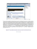
The code added to the page will resemble lines 9–14 shown in Figure 1.34.
Figure 1.34. Add some code to the page within Code view that we can later turn into
a snippet.
[View full size image]
2.
Highlight the code, right-click (Control+click) to access the context menu, and choose Create New
Snippet.
3.
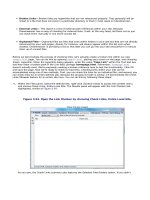
The Create New Snippet dialog box appears, allowing you to give your snippet a name, description,
type, and so on. Fill in the blanks so that your dialog box resembles Figure 1.35.
Figure 1.35. Give your new snippet a name, description, and associative type.
[View full size image]
4.
Click OK. The new snippet will be added to the Snippets panel automatically.
Note
Snippets are added to the Snippets panel and are placed into the folder where your cursor was last
positioned. You can reposition your snippet by dragging it into a new folder or creating a new folder
altogether by selecting the New Snippet Folder icon located at the bottom right of the Snippets
panel.
You can use your new snippet by selecting it and dragging it over to the Document window as much as you
want. To view it in the browser, choose Preview In Browser or press F12 (Option+F12).
The Tag Inspector Panel Group
The Tag Inspector panel group, which includes the Attributes and Behaviors panels, is a handy panel to use
for setting various attributes of selected HTML tags and styles. Although the true benefits of this panel set
will become more obvious as the book unfolds, you can see the power of the Attributes panel immediately
by placing your cursor within the code of your page and then expanding the nodes within the Attributes
panel. As Figure 1.36 illustrates, various attributes and their values associated with a selected tag are
outlined within the panel.
Figure 1.36. The Attributes panel outlines attributes and their values for a selected tag.
[View full size image]
You can begin to see that the Attributes panel mirrors functionality in the Property inspector. The obvious
difference, however, is that the Attributes panel is a more technical and less visual approach to the
attributes of a specific tag. You can also switch between a categorized and list view by selecting the
appropriate button located just under the tab itself. You can make the Tag Inspector panel group visible or
hide it by selecting Tag Inspector from the Window menu or by pressing F9 (Option+Shift+F9).
The Behaviors Panel
Also part of the Tag Inspector panel group, the Behaviors panel allows you to work with a myriad of prebuilt
JavaScript behaviors. With a single click of the Add (+) button, a list of behaviors are immediately available
to your web pages. You can make the Behaviors panel visible or hide it by selecting Behaviors from the
Window menu or by pressing Shift+F4.
The Behaviors panel will be covered in greater depth in Chapter 10, "Using Dreamweaver Behaviors."
The Results Panel
As mentioned in an earlier section, the Results panel is a centralized location for performing searches, page
validation, browser compatibility checks, checking links, creating site reports, and so on. You can interact
with the Results window in one of two ways. You can make the Results window visible or hide it by selecting
Results from the Window menu or by pressing F7. Furthermore, the Results panel will automatically appear
when using functionality it exposes, such as the FTP log, Find and Replace, and more.
The true power of this panel will become evident as the book unfolds.
The Reference Panel
The Reference panel is a handy set of reference books built directly into a panel. References ranging from a
ColdFusion Function, ColdFusion Markup, ASP, ASP.NET, CSS, HTML, JavaScript, JSP, PHP, SQL, XML, XSLT,
and Accessibility are all included. You can make the Reference panel visible or hide it by selecting Reference
from the Window menu or by pressing Shift+F1.
The History Panel
At its most basic functionality, the History panel provides a visual, historical list of steps performed. The
panel features a slider that you can use to scroll through steps in the history. In contrast to selecting Edit,
Undo or pressing Ctrl+Z, the History panel also allows you to select a specific point in time to return to.
Other features include the capability to create commands by highlighting a set of steps, right-clicking
(Control+clicking), and choosing Save As Command. Commands are covered in much more detail in Chapter
13, "Enhancing Workflow." You can make the History panel visible or hide it by selecting History from the
Window menu.
The Frames Panel
You can use the Frames panel when working with frames and framesets, covered in more detail in Chapter
8, "Working with Frames and Framesets." You can make the Frames panel visible or hide it by selecting
Frames from the Window menu or by pressing Shift+F2.
The Code Inspector
As you can see from Figure 1.37, the Code Inspector is a detached code window.
Figure 1.37. The Code Inspector is a detached code window that mirrors the functionality and
look of Code view.
[View full size image]
The only real difference between the Code Inspector and Code view is that the Code inspector lets you
continue working within the Design view, at the same time offering a detached, floating coding
environment—perfect for dual monitor environments. You can make the Code Inspector visible or hide it by
selecting Code Inspector from the Window menu or by pressing F10 (Option+F10).
The Timelines Panel
As you will see in Chapter 16, "Working with the Timeline," the Timelines panel is a frame-based window
that facilitates animation and interactivity with objects in the Document window. You can make the
Timelines panel visible or hide it by selecting Timelines from the Window menu or by pressing Alt+F9
(Option+F9).
Workspace Layouts
Whereas older versions of Dreamweaver allowed Windows users to select from two predefined workspace
layouts (coder and designer), Dreamweaver CS3 affords the opportunity to choose from other, more specific
window layouts and offers both Windows and Mac users the capability to create your own. Available by
choosing one of the three options from the Workspace Layout submenu, you can easily choose from a
preconfigured layout style including Coder (Windows only), Designer (Windows only), and Dual (for working
in dual monitor setups). Choosing one of these options configures the panels and windows according to the
predefined layout.
Optionally, you can create your own workspace layout. To create your own workspace layout, follow these
steps:
1.
Organize windows and panels within Dreamweaver according to how you would like to work.
2.
Choose Window, Workspace Layout, Save Current. The Save Workspace Layout dialog appears.
3.
Enter a name for your new layout and click OK. The new layout will appear within the Workspace
Layout submenu.
If you want to delete a workspace layout, choose Window, Workspace Layout, Manage. Select the layout
name you want to remove and click Delete. The saved workspace layout will be removed from the list. Of
course, you can also rename a layout by choosing the layout and then selecting the Rename button. This
launches the Rename Workspace Layout dialog, in which you can rename your layout and then click OK to
apply the changes.
The Menu Bar
The last development-related component to be covered is arguably the most obvious, the menu bar.
Although Dreamweaver offers an assortment of panels, toolbars, and inspectors, the menu bar always
remains consistent and never needs to be hidden or made to be visible. Just about every feature we've
covered thus far can be inserted, modified, or referenced through the menu bar, with few exceptions. A
generic list of menu items is listed next, complete with highlights:
Dreamweaver— This Mac only menu, also referred to as the Application menu, contains the About,
Keyboard Shortcuts, Preferences, and Quit menu options for Mac users.
File— Contains common file-based operations such as New, Open, Close, Save, and Revert. Highlights
include the capability to preview your page in the browser, check your page against a validator or
target browser, and maintain Design Notes.
Edit— Allows you to perform common editing tasks such as undo, redo, cut, copy, paste, and select
all. Highlights include the capability to set user preferences for Windows users.
View— Anything associated with Document window viewing preferences can be found here, including
visual aids; rulers; grid; the Code, Split, and Design views, and head content.
Insert— Anything that can be inserted into your document can be found within this menu.
Alternatively, you can access these options visually by way of the Insert bar by choosing Window,
Insert or pressing Ctrl+F2 (Command+F2).
Modify— After you've inserted objects you'll want to have the capability to manipulate them
somehow. Although most properties can be changed through panels or the Property inspector, the
Modify menu is a much more thorough list of modifiable properties.
Text— Manipulate text objects through this menu. Highlights include the capability to check your
spelling.
Commands— Commands are similar to plug-ins or macros. They are prebuilt components that
execute or insert content within the Document window. We'll discuss Commands in much more detail
in Chapter 13, "Enhancing Workflow."
Site— After you've defined a site, all site-related options can be found within this menu. Highlights
include the capability to scan your site for broken links, change links, and even generate site reports.
Window— All panels can be opened through the Window menu. Highlights include the capability to
hide all panels or to cascade and tile open Document window instances.
Help— Access the Dreamweaver, Spry, ColdFusion, and other help windows from this menu.
Highlights include access to the built-in tutorials, forums, and support center, as well as Activating or
Deactivating the program.
Summary
As you've seen in this chapter, Dreamweaver provides numerous panels, windows, inspectors, toolbars, and
menus for making development easier. The challenge is now putting everything together that you've learned
conceptually about the myriad of panels and windows so that they make sense in practice. In the next
chapter, we'll begin the transition by creating a simple web page. As you'll see, the panels, inspectors, and
windows will make much more sense after you've started putting the concepts you've learned here into
production.
Chapter 2. Building a Web Page
IN THIS CHAPTER
Creating a New Document
Working with Documents in Design View
Inserting Time and Date
Inserting a Horizontal Rule
Working with Images
Working with Hyperlinks
Working with a Web Page in Code View
In the previous chapter, you learned about the many windows, bars, panels, and menus that Dreamweaver
includes to aid you in the development of your web pages. You learned that the Document window is the
heart of Dreamweaver and where most of your creative energy will be focused. You also learned that the
Document window is surrounded by a myriad of panels contained within user customizable panel groups that
facilitate the addition of functionality for your pages, a feature-rich inspector to assist you in the addition of
properties for elements within the Document window, and a complete menu bar that structures every
Dreamweaver feature into an easy-to-use grouped list of options.
Beyond the simplicities of learning the user interface lies creating an actual web page. In this chapter, you'll
take the foundation that you gained in the previous chapter and build on it to create a simple web page.
Using the many panels, inspectors, and windows that you explored in the previous chapter, you'll create a
new page in Design view, work with text within the Document window, add images to your web page,
examine linking using hyperlinks, and finally, learn how to work with your web pages in Code view.
You can work with the examples in this chapter by downloading the support files from
www.dreamweaverunleashed.com. You'll want to save the files contained within the
Chapter02\Exercises\Beginning\VectaCorp folder in an easy-to-find location. I'll place mine in
C:\VectaCorp\Chapter02.
Creating a New Document
In the previous chapter, you learned that the Start Page is a handy window used to open new, existing, or
recently accessed documents. Although the Start Page will work fine when Dreamweaver has been opened
for the first time, it does little good, if we need to create a new document when document window instances
are already open. In such cases, you'll want to use the New Document dialog box. Accessible by selecting
File, New, and shown in Figure 2.1, the New Document dialog box enables you to create new documents
based on an existing predefined skeleton file, create new documents based on a prebuilt template, and so
on.
Figure 2.1. The New Document dialog box enables you to open new documents, new
preconfigured documents, and ready-made templates.
[View full size image]
Note
You can also create a new document by right-clicking (Control+click) the defined site (covered with
greater depth in the next chapter) in the Files panel and selecting the New File option from the
Context menu, by clicking the Files panel options menu and selecting File, New File, by using the
keyboard shortcut Ctrl+N on Windows and +N on a Mac, or by using the New File object on the
Standard toolbar.
Note
You're probably wondering why there are so many different types of files to choose from in the New
Document dialog box. The reason is simple. Because all web pages require a minimum set of tags,
Dreamweaver provides what are known as skeleton files. The skeleton files that you see in the New
Document dialog box help get you started by including tags that the developer must add anyway. For
instance, all HTML pages require <html>, <head>, <body>, and <!doctype> tags. Because this is the
case, choosing the HTML option from the Blank Page category results in a new Document window
instance created, complete with the required tags inserted within Code view.
As you can see from Figure 2.1, the New Document window exposes the following features:
Category list— This list includes all selectable page categories.
Page Type list— After an option has been selected from the Category list, the Page Type list will
display all selectable skeleton files that coincide with the particular category type.
Layout list— Available when most Blank Page types and Blank Template types are selected, the
Layout list outlines numerous CSS-based layouts that you might want to take advantage of for
structuring your web pages. These options will be covered with greater depth in Chapter 7, "Page
Structuring Using Cascading Style Sheets." When the Page from Sample category is selected, this list
displays a set of prebuilt Adobe web page layouts instead.
Preview pane— When a preview is available, the Preview pane displays a small thumbnail of the
selected page type.
Description pane— When necessary, the Description pane outlines the features and benefits of the
selected page type.
Document Type (DTD)— This menu allows you to pick from a predefined list of DTDs for your
document. A DTD states what tags and attributes are used to describe content within an XML or HTML
document, where each tag is allowed, and which tags can appear within other tags. Remember, these
rules are outlined by the World Wide Web consortium (W3C) and are outlined within Document Type
Definition on W3C servers. When you run Dreamweaver's built-in page validator, the page is validated
against the DTD you select here. Options within this list include None, HTML 4.01 Transitional, HTML
4.01 Strict, XHTML 1.0 Transitional, XHTML 1.0 Strict, XHTML 1.1, and XHTML Mobile 1.0.
Layout CSS— With this new version of Dreamweaver, the product team made a serious push toward
integrating more CSS-based page structuring features. You may have noticed that the new Layout
category outlines numerous CSS-based page layouts that you can take advantage of. As you will see in
Chapter 7, the Layout CSS menu allows you to choose options that place the CSS code within the
<head> tag of the page, in an external CSS document, or as a link in your own styles from an existing
CSS file.
Attach CSS File— Click the Attach Style Sheet icon to launch the Attach Style Sheet dialog box. You
can choose this option when you have a prebuilt CSS document that you'd like to link into the newly
created page.
Create Document/Template— This option is accessible when a layout contained within the Starter
Page (Basic) category is selected from the Page from Sample type. The option allows you to insert the
page as either a single document or as a sitewide template.
Help— The option launches Dreamweaver's Help window with the New Document dialog box as the
indexed selection.
Preferences— This option launches the Preferences dialog box with the New Document category
selected. Use this option to change preferences for creating new documents. These options will be
covered in Chapter 4, "Defining Preferences."
Get More Content— This option launches the Dreamweaver Exchange. Use this feature to search for
more prebuilt skeleton, page design, and template pages.
The focal point of the New Document dialog box lies in the categories and associated page types. These are
outlined next:
Blank Page— Includes skeleton files for creating new HTML, HTML Template, Library Item, XSLT,
ActionScript, CSS, JavaScript, XML, ASP JavaScript, ASP VBScript, ASP.NET C#, ASP.NET VB,
ColdFusion, ColdFusion Component, JSP, and PHP pages.
Blank Template— Includes skeleton files for creating new dynamic template pages for ASP
JavaScript, ASP VBScript, ASP.NET C#, ASP.NET VB, ColdFusion, HTML, JSP, and PHP.
Page from Template— Choose this category to browse templates that you build. As you'll see in
Chapter 3, "Dreamweaver Site Management" and Chapter 14, "Working with Templates," user-built
templates are stored within defined sites. When this option is selected, the Page Type category
outlines your list of defined sites. Choosing a defined site will reveal any templates associated with
that site within the Template for Site "<selected site>" list.
Page from Sample— Select this option to reveal a subcategory of prebuilt CSS, Frameset, Themed
Starter Pages, and Basic Starter Pages within the Sample Folder list. Choosing a folder from the
Sample Folder list reveals numerous prebuilt pages within the Sample Page list. The four types of
sample folders that you'll see here are outlined in the following list:
CSS Style Sheets— Includes a myriad of prebuilt style sheets that you can use to add style and
flare and even structure to your web pages. We'll cover this topic in more depth in Chapter 6,
"Page Formatting Using Cascading Style Sheets."
Framesets— Includes a number of prebuilt frameset pages that you can use. We'll cover this
topic in more depth in Chapter 8, "Working with Frames and Framesets."
Starter Page (Theme)— Tastefully designed, the Themed Starter Pages category includes
various web pages that you can use to get your creative juices flowing. By default, Dreamweaver
ships with entertainment, health and nutrition, lodging, personal training, restaurant, spa, and
travel themed starter pages.
Starter Page (Basic)— Similar to the CSS Page Designs category, this category features some
basic commerce, data, text, image, and UI page designs. As you'll see in Chapter 14, all
selectable page types can be inserted as either a simple page or a template by selecting the
Template option button just below the description window.
Other— Includes skeleton files for creating new ActionScript Communications, ActionScript Remote,
C#, EDML, Java, text, TLD, VB, VBScript, and WML pages.
Now that you've gotten a thorough tour of the New Document dialog box, let's use it to create a new HTML
page that we can use throughout the chapter. To create a new HTML page, follow these steps:
1.
Choose the Blank Page option from the Category pane.
2.
Choose the HTML option from the Page Type list.
3.
Choose the <none> option from the Layout list, and then click the Create button. The New Document
dialog box will close and a new HTML Document window instance will appear, similar to Figure 2.2.
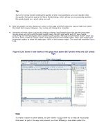
Figure 2.2. A new Document window instance can be created from the Blank Page,
HTML category within the New Document dialog box.
[View full size image]
4.
If necessary, switch to Design view by clicking the Design button within the Document toolbar, and
then immediately save your document (choose File, Save) to the folder that contains the examples for
this chapter (C:\VectaCorp\Chapter02). I'll call mine index.html.
Tip
Most web-hosting providers accept default files named index.html, home.html, and default.html.
Naming your starting page with one of these three names guarantees that you won't have to type a
fully qualified path such as Instead, because
I've saved my filename with a standard default page name (index.html), I can limit the URL
reference to www.vectacorp.com. Again, because most web-hosting providers use index, home, and
default as standard start page names, falling in line with this naming convention makes referencing
your domain easier in the long run.


