Adobe Dreamweaver CS3 Unleashed- P3 potx
Bạn đang xem bản rút gọn của tài liệu. Xem và tải ngay bản đầy đủ của tài liệu tại đây (940.4 KB, 50 trang )
As you can see, the options in the drop-down menu don't resemble point or pixel sizes; instead, they refer
to HTML sizes. Although the default size of the page is set as an absolute value of 3, you have the option of
selecting from a list of absolute or relative sizes for your page. The absolute size is a straight number from 1
through 7, with 1 being the smallest and 7 being the largest. With relative sizes, you can either add to or
subtract from the default font size of the page, otherwise known as the base font. For example, because the
default font is 3, you can add to that value by choosing +1, and the type will appear as an equivalent to an
absolute size 4. To demonstrate this, try experimenting with the various sizes within a new blank page. As
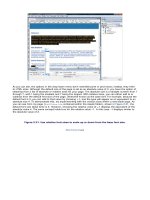
you can see from my page (FontSizes.htm contained within the Assets folder), shown in Figure 2.21, the
default font size (base font) is 3. However, choosing the relative value of +1 displays the equivalent of the
absolute value 4. The same concept holds true for the relative value –1. In this case –1 displays similar to
the absolute value of 2.
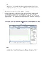
Figure 2.21. Use relative font sizes to scale up or down from the base font size.
[View full size image]
Sounds confusing, right? I wouldn't worry too much about working with fonts and sizes. Development gets
easier and much more flexible after we move into Cascading Style Sheets. For now, let's modify our
example by highlighting the paragraphs of text (not the headings) and choosing an absolute value of 2. As
you can see from Figure 2.22, the text is changed.
Figure 2.22. Change the size of text within our fictitious company's web page to an absolute
value of 2.
[View full size image]
You may need to add additional line breaks before your text to prevent the text from overlapping the
background image.
Text Colors
Yet another frustrating topic in web development is that of choosing the right colors for your website. Unlike
in print publishing programs or word processing programs, where you can choose from a color palette
containing millions of colors, browsers choose from a web-safe color palette of 216 colors that are common
to all computers. This guarantees that the colors we choose will be accurately viewed on browsers,
independent of platform or operating system.
Tip
Web safe refers to the spectrum of 216 colors that are guaranteed to work on a 256-color (8-bit)
computer. When colors were introduced to the Web in the early to mid 1990s, the majority of
developers were designing their web pages on antiquated systems that, at best, had an 8-bit video
card installed. Because the hardware couldn't support a range beyond 256 colors, a web-safe
spectrum of 216 colors was introduced to make web page colors as compatible across the board as
possible. Today, these systems are rare, and the need to rely on the web-safe color spectrum has
diminished greatly. Realistically, the only time you'd need to rely on the 216 web-safe colors is when
development is targeted to small form factor devices such as a PDA or a cell phone.
Dreamweaver organizes web-safe colors within the Text Color palette available just to the right of the Size
menu. Selecting this chip opens the Color palette, also shown in Figure 2.23, and turns the pointer into an
eyedropper, allowing you to not only sample colors from within Dreamweaver's interface but also from any
other application or image that is visible on your screen.
Figure 2.23. The Color palette opens, allowing you to sample from a list of colors directly from
Dreamweaver's interface—or anything else on your screen.
[View full size image]
A complete list of features supported by Dreamweaver's Color palette are outlined next:
Color Cubes— Displays a list of web-safe colors organized within cubes, starting with Black cubes on
the left, followed by grayscale cubes, RGB cubes, CMYK cubes, and so on.
Color Preview— Displays a larger preview of the color when your mouse rolls over a color cube.
Hexadecimal Value— Displays the hexadecimal value of the color when your mouse rolls over the
color cube. Explaining the concept of hexadecimal values can be a lengthy topic. For this reason,
additional information can be found at the following page: en.wikipedia.org/wiki/Hexadecimal_color.
Default Color— Choosing this option returns the selection back to its default color.
System Color Palette— If you have a good idea that the majortity of your users will be browsing to
your site using better-than-average video cards, you can think about using a wider range of colors for
your site. If this is the case, you may want to choose this option to select from your system's color
palette. The system color palette is a predefined color palette that allows you to choose from millions
of colors, rather than only 256.
Options Menu— Click this arrow icon for additonal options, including displaying Color Cubes (default),
Continuous Tone, Windows OS, MAC OS, and Grayscale.
Esc— Press the Esc key on your keyboard to cancel out of the color palette.
To demonstrate the use of color, let's highlight the text on the page and modify the color so that it shows as
blue. To do this, highlight the text and click the color chip; when the pointer turns into an eyedropper,
sample the dark blue color within the header image. The Color palette will close and your text will turn blue.
Furthermore, after you've selected the color, the hexadecimal value will appear in the text box just to the
right of the color chip within the Property inspector (#2477AA).
Text Styles
Just above the Text Color chip within the Property inspector lie two options for modifying the weight
(Bold(B)) and style (Italic(I)) of text in your pages. Bold and italic are two options that you can use in your
web pages, but you're certainly not limited only to these. In fact, you can expand the Styles menu by
choosing Text, Styles to see a complete list of options. Most of the text styles within this list are deprecated,
meaning the World Wide Web Consortium doesn't recommend their use, because they have been replaced,
in most cases, by options within CSS. Bold and italic however, are still common options. To demonstrate
how italic can be used, for instance, create a few line breaks for each of the two client testimonials. Next,
select each testimonial and then click the Italic (I) button within the Property inspector. The text will
become italicized similar to Figure 2.24.
Figure 2.24. Client testimonials become italicized when you highlight them and then click the
Italic button within the Property inspector.
[View full size image]
Text Alignment and Indentations
Similar to a word processor, Dreamweaver includes the capability to align your text. Four alignment options
are available, including left align, center align, right align, and justify. These options are represented by the
four buttons just to the right of the Italic button within the Property inspector. To see the alignment features
in action, open the text file titled footer.txt located in the Assets folder, select all the text, copy it,
and paste it somewhere near the bottom of the web page within Dreamweaver. You may have to include
more paragraph breaks to force the cursor near the bottom of the page. You may want to enhance this
small footer by implementing features that you've already learned, such as changing the font face, font size,
and color. When you're done, center the text using the Align Center button within the Property inspector,
also shown in Figure 2.25.
Figure 2.25. Format the text, and then center align it on the page.
[View full size image]
You can also indent your text by using the Text Indent and Text Outdent buttons located just below the
Right Align and Justify icons within the Property inspector. For instance, if I wanted to indent the text that
appears below the headings, I would select the text and choose Text Indent. The result will appear similar to
Figure 2.26.
Figure 2.26. Choose the Text Indent option to indent your text.
[View full size image]
I'll choose the Text Outdent option next to return my page back to the way it was when I started.
Working with Lists
You can create lists easily within Dreamweaver. Although Dreamweaver supports three types of lists
(Ordered, Unordered, and Definition), arguably the more popular—ordered and unordered lists—are
available directly from the Property inspector by selecting the icons just below the Align Left and Align
Center icons.
Often referred to as bulleted lists, unordered lists, by default, create a bullet circle to the left of the selected
item, whereas ordered lists apply a number instead of a bullet to the left of the item and follow in sequential
order.
Creating a list in Dreamweaver is a simple process that involves nothing more than highlighting the text
items to include in the list and choosing the appropriate option from the Property inspector. Alternatively,
you can place your cursor on the page and choose the list option from the Property inspector. Immediately,
a bullet or number is created. You can type your items as you go, pressing Enter to move to the next line,
creating a new bullet or incrementing number as you go. To use a list, for example, follow these
instructions:
We'll format our list of solutions as a bulleted list. I'm sure you've noticed by now, these solutions are
located just below the heading that reads Our Solutions. To format the list, begin by placing your
cursor just to the right of the text that reads vProspect 2.0 and press Shift+Enter (Shift+Return on a
Mac) to create a line break.
1.
Now place your cursor just before the text that reads vConvert 2.0 and click Enter to create a new
paragraph break.
2.
Repeat steps 1 and 2 for the rest of the solutions.3.
4.
3.
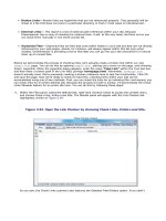
Now highlight all three solutions and click the Unordered List button within the Property inspector. The
three Vecta Corp solutions will now be bulleted similar to Figure 2.27.
4.
Figure 2.27. Create a bulleted list for the company solutions.
[View full size image]
To see what the ordered list looks like, highlight the three solutions again and click the Ordered List icon
within the Property inspector. As you'll see, the bullets become numbers.
You're not limited to plain bullets or numbers when working with lists. For instance, you can format your
lists so that the bullets show as squares, numbers show as letters or Roman numerals, or even format a
specific list item rather than the list as a whole. This can be accomplished by placing your cursor on a list
item and clicking the List Item button within the Property inspector. Choosing this option opens the List
Properties dialog box shown in Figure 2.28.
Figure 2.28. You can modify list item properties by opening the List Properties dialog.
As you can see from Figure 2.28, the dialog is separated into two parts. The top part enables you to modify
the properties of the list as a whole. For instance, with Bulleted List selected in the List type menu, choose
Square from the Style menu and click OK. You'll notice that all the bullets for the list items are changed to
squares. The second half of the dialog (List Item) enables you to modify the properties of an individual list
item rather than the list as a whole. You can choose to work with Roman numerals or letters by selecting
Numbered List from the List type menu and choosing the appropriate option from the Style menu. After
you've done this, you can even create a starting number by entering that value within the Start Count text
box.
The third type of list supported by Dreamweaver is the Definition list. Available by selecting Text, List,
Definition List, the Definition list enables you to create a list that resembles a dictionary definition—where a
definition appears indented below the term. To create your own Definition list, follow these steps:
1.
Create a new blank page for testing purposes.
2.
Copy the welcome text from the previous page and paste it into the new testing page.
3.
Highlight the text and choose Definition List from the List submenu of the Text menu.
4.
Place your cursor just before the second sentence, choose Backspace, and press Enter.
As you can see from Figure 2.29, the "definition" is indented and the list looks very similar to a dictionary
definition.
Figure 2.29. The definition list creates a term with an indented definition.
[View full size image]
Using Special Characters
Dreamweaver includes a library of special characters that you can use within your web pages. Special
characters are text elements that must be inserted using special code because a keyboard key doesn't exist
for it. For instance, left and right quotes, dashes, the Euro symbol, the English Pound symbol, the Japanese
Yen symbol, copyright symbols, registration marks, and trademarks are all considered special characters
and must be inserted using the Text category within the Insert bar (see Figure 2.30).
Figure 2.30. The text category of the Insert bar contains a submenu of special characters.
[View full size image]
Tip
Special characters are also available from the Insert, HTML, Special Characters submenu.
You're also not limited to the special characters outlined within this list. For instance, Dreamweaver includes
a character map that provides numerous other special characters that you can insert into your page. To
open the character map, choose the Other Characters option from the Special Characters submenu. As you
can see from Figure 2.31, the Insert Other Character dialog appears with numerous other special characters.
Figure 2.31. Use the Insert Other Character dialog to insert characters other than those listed
within the submenu.
The last special character that you can insert is the Non-Breaking Space. The Non-Breaking Space, which is
similar to pressing the space bar in most word-processing programs, simply inserts a space. By default,
browsers ignore white space within HTML code. Since this is the case, a Non-Breaking Space, represented by
, must be inserted to alert the browser that a space should be recognized.
Unfortunately, Dreamweaver doesn't map the spacebar to automatically insert a Non-Breaking Space.
Instead, you have to press Ctrl+Shift+Space/ +Shift+Space to insert this special character. If you want
to make inserting a Non-Breaking Space easier, you can modify Dreamweaver Preferences to automatically
insert a Non-Breaking Space when you press the spacebar. To do this, choose Edit, Preferences. From the
General category, enable the Allow Multiple Consecutive Spaces option and click OK. To test the
functionality, place your cursor anywhere on the page and press the spacebar repeatedly. As you can see
from Figure 2.32, which shows the split view, the space is added to the design view, and the special
character is added to the code.
Figure 2.32. The Non-Breaking Space is added to Code view and a normal white space is added to
the Design view.
[View full size image]
Checking Your Spelling
One of the last things that I like to do before calling a web page finished is to check the spelling.
Dreamweaver integrates a spell-checking engine that functions similar to those found in popular word
processing programs. To use the spell checker built in to Dreamweaver, select the Check Spelling option
from the Text menu or press Shift+F7. The Check Spelling dialog box appears. The Check Spelling dialog
includes the following functionality:
Word not found in dictionary— As Dreamweaver scans your document, words that are not found
within Dreamweaver's dictionary are listed here one at a time.
Suggestions and Change To— When the spell checker has located a word that is not in
Dreamweaver's dictionary, it makes a list of suggestions. You can select a word from this suggestion
list and click Change to replace your word with the word highlighted within the Change To text box.
Add to Personal— You can add a word to your personal dictionary so that Dreamweaver doesn't
detect it as a misspelled word the next time you run the spell checker.
Ignore— Ignores and skips over the selected word.
Change— Changes the word within the page to the suggested word.
Ignore All— Ignores all instances of a selected word.
Change All— Changes all instances of a selected word.
When you've finished performing a spell check, you can click Close to return to the Document window.
Inserting the Time and Date
Dreamweaver includes functionality for inserting a time and date stamp. Available from the Insert menu (or
the Common category in the Insert bar), the Date option opens the Insert Date dialog box shown in Figure
2.33.
Figure 2.33. The Insert Date dialog box enables you to insert a time and date stamp.
As you can see from Figure 2.33, the Insert Date dialog enables you to choose a day format, represented by
the Day Format menu, a date format represented within the Date Format menu, and a time format
represented by the Time Format menu. You can also allow Dreamweaver to automatically modify the time
and/or date stamp when the document is saved. To insert a time and date stamp within our project, follow
these steps:
1.
Insert the text Welcome to Vecta Corp just above the existing Welcome heading. You may need to
format the text according to the modifications that you've made on the page thus far.
2.
Place your cursor to the right of the text you just added and choose Insert, Date. The Insert Date
dialog box will appear similar to Figure 2.33.
3.
Pick a date format from the Date format list and choose OK. The date will appear next to the Welcome
to Vecta Corp text.
4.
Format the text, applying a font, size, and color so that it appears similar to Figure 2.34.
Figure 2.34. Insert a date and/or time stamp within your page.
[View full size image]
Inserting a Horizontal Rule
Another simple design element that you can add to your web pages is the horizontal rule. Available from the
Insert, HTML menu, the horizontal rule adds a straight horizontal line across the page. To demonstrate the
horizontal rule, I'll place my cursor just before the footer that we inserted at the bottom of the page. Next,
I'll add the horizontal rule by choosing Insert, HTML, Horizontal Rule. Shown in Figure 2.35, the horizontal
rule adds a straight line across the page at a width of 100%.
Figure 2.35. A horizontal rule is added to the page at a default width of 100%.
[View full size image]
Select the horizontal rule and, in the Horizontal Rule Property inspector, you can now make the following
property modifications:
ID— Uniquely identifies your horizontal rule.
Width— Changes the width in either pixels or percent for the horizontal rule.
Height— Sets the height in pixels for the horizontal rule.
Align— Aligns the horizontal rule left, center, or right on the page. Default is center.
Shading— Enables or disables shading on the horizontal rule. Disabling this box causes the horizontal
rule to be a solid, flat line.
Class— Assigns a CSS class to your horizontal rule.
Go ahead and familiarize yourself with the Horizontal Rule Property inspector by experimenting with the
various settings. For our example, I've modified the properties to resemble Figure 2.36.
Figure 2.36. Modify the width, height, and shading of the horizontal rule.
[View full size image]
Working with Images
One of the more convoluted topics as it relates to the web is that of images. As with fonts, colors, and file
sizes, you're limited in the types of images you can use. In addition, because you're dealing with the Web,
bandwidth becomes an issue. For this reason, images must usually remain small, resulting in degradation of
quality and loss of color variation. Although print publishers have a wide array of image choices, including
EPS, TIF, JPEG, BMP, PCX, PICT, and PNG, and are not limited by file size, web developers are limited to
working with GIF, JPEG, and PNG—and must use tools to optimize the images before they're ready for use
within websites. Knowing what types of images to use can also become an important factor as you design
for the Web. As a general rule, GIF, JPG, and PNG files should be used as follows:
GIF— Graphical Interchange Format (GIF) is used for images or graphics with smaller amounts of
color and graphics without much tonal range. Because GIFs read color in a horizontal line, the more
color the format encounters when reading, the larger the file size. Also, because GIFs read color in a
horizontal line, too much color gradation can result in banding—the process of gradients being broken
up into bands representing a lower dimension of color variation. GIFs also have a color table attached
to them that dictates to the graphic how many colors and which colors can be used in the artwork.
More colors in the color table yield larger file sizes. GIFs can also store transparencies and animations
but are ideal when used for flat, lower-colored graphics.
JPEG— Joint Photographic Experts Group (JPEG) is a lossy compression standard used on graphics
with high tonal ranges, such as photographs. This compression standard removes pixels from an
image to reduce the file size. Too much compression can result in artifacts, which causes the image to
look blurry and unclear. As a general rule, use the JPEG file format when adding pictures that contain a
lot of gradation, such as family photos, to your websites.
PNG— Portable Network Graphics (PNG) was introduced as a replacement to GIF in the mid 1990s and
was supported by the W3C as a proposed web standard in late 1996. As an example of the flexibility of
the PNG format, Adobe Fireworks adopted this format as its native file type. PNG holds a number of
advantages over GIF files on the Web. First, color features are greater in that PNG supports
photorealistic color depths, like JPEG, as well as alpha transparencies, which means you can have 256
levels of transparency instead of just on and off as in GIF, cross-platform control of image brightness,
and two-dimensional interlacing (a method of progressive display that is similar to JPG). Also PNG
compresses 5%–25% better than GIF, making this an attractive format for web developers. The only
thing holding back widespread use of PNG files on the Web was the poor level of support in Microsoft's
Internet Explorer. As of the 2006 release of IE7, the main issues with displaying PNG files have been
addressed, making the use of this format much more viable.
As a general rule, if you're working with flat, solid images, use GIF. However, if you're working with images
with a lot of color gradation, such as photographs, use JPEG.
Inserting Images into a Dreamweaver Document
The traditional Dreamweaver method of inserting an image is to use the browse-to-file method in which you
select Image from the Insert menu, browse to your file, and click Open to insert the image within the page.
However, Dreamweaver also features a drag-and-drop method of inserting images directly from the File list.
Before we jump ahead of ourselves, however, let's review the process of inserting an image by browsing to
the image file using the Select Image Source dialog box. To use this method, follow these steps:
1.
Start by placing your cursor at the top of the page.
2.
Choose the Image option from the Insert menu or select the Image icon from the Images submenu of
the Common category within the Insert bar. Either method will open the Select Image Source dialog
box.
3.
Now browse for the file header.gif located within the Images folder of the project files that you copied
over (located within C:\VectaCorp\Chapter02\Images). As you can see from Figure 2.37, the
filename, an image preview, and dimensions in terms of size and download time based on file size are
displayed within the dialog.
Figure 2.37. Browse to header.gif so that you can see the filename and the image
preview.
[View full size image]
4.
Aside from simple browsing and previewing, the Select Image Source dialog also includes the capability
to browse by file type, enable and disable image previewing, and allows you to set the file path method
(document or site root relative) for the file. For our example, simply click OK.
Note
After you click OK, the Image Tag Accessibility Attributes dialog box appears. Because Accessibility is
a topic that we will devote Appendix A to, for now, click the Change the Accessibility Preferences link
located at the bottom of the dialog. The Preferences dialog will appear with the Accessibility category
selected. Uncheck all four check boxes (Form Objects, Frames, Media, and Images) and click OK.
Click Cancel to close the Image Tag Accessibility Attributes dialog.
The image is inserted at the top of the page and blends in nicely to our background image. You may need to
remove extra line breaks between the image and the date stamp (place your cursor just before the date
stamp and press Backspace on your keyboard) to get your design to look like Figure 2.38.
Figure 2.38. The inserted header image blends in nicely to our background image.
[View full size image]
A second option for inserting images is to drag-and-drop the images directly from the Files panel.
Unfortunately, this method works only when you have a defined site. Because we won't be working with
defined sites until the next chapter, we'll defer discussion of this method until later.
Formatting Images Within a Document
Like every other element that can be inserted into your web pages, images allow you to format numerous
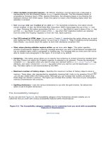
properties directly from the Property inspector. As an example, highlight the three solution elements and
then uncheck the unordered list button to remove the bulleted listing. Now place your cursor to the
immediate left of the first item (vProspect 2.0) and choose Insert, Image. When the Insert Image dialog
appears, browse to the logo_vprospect.gif image and click OK. The image will be inserted next to its
associated text blurb. Repeat this process for the other two solution elements. Your page should currently
resemble Figure 2.39.
Figure 2.39. Remove the list formatting for the three solutions and then add each solution's
representative image.
[View full size image]
Immediately, you'll notice that the text doesn't wrap nicely around the images. Setting the text alignment is
just one of the many features outlined within the Property inspector. A detailed list of each feature, moving
from left to right and from basic to advanced is outlined next:
Image Thumbnail— Shows a small thumbnail of the selected image.
Image Size— Displays the selected image's size in kilobytes.
Image Name— Provides a method for uniquely identifying the selected image.
W and H— Shows the width and height of the image, as defined by the binary makeup of the image.
You may change these values, in which case Dreamweaver will stretch the dimensions of the image
(values will be shown in boldface). However, I don't recommend stretching an image, because it
degrades the quality of the image substantially. Instead, resample an image using an image editor like
Photoshop or Fireworks to resize it.
Src— Short for source, this is the file path to the image on your computer. This value can also be an
external web address, in which case the image shows broken until viewed within the browser.
Link— Add a hyperlink to your image here. Hyperlinks are outlined with more detail later in this
chapter.
Alt— For accessibility reasons, you'll want to enter alternate text here. Entering alternate text is
beneficial for a variety of reasons. First, it allows text-to-speech readers to present the alternate text
to visually impaired users. Second, in Internet Explorer, a yellow ToolTip appears with the alternate
text when a user hovers over the image. Finally, on slower connections, the alternate text appears
first while the image is loading. See Appendix A, "Accessibility," for more about alternate text.
Edit— Dreamweaver incorporates minimal editing functionality within this group of icons. For instance,
you can open the selected image directly in Photoshop or Fireworks for editing or optimizing. You can
also crop, sharpen, or change the brightness or contrast of the image directly in Dreamweaver. This
integration is covered with more detail in Chapter 18, "Integrating with Fireworks and Photoshop." It's
important to point out that changing image properties through these options is permanent. I would
highly recommend that you have a backup of your image before using these features.
Class— Allows you to apply a CSS class to your image.
Image Map— Dicussed with more detail later in this chapter, an image map is a method for creating
multiple hyperlinked hotspots within a selected image.
V Space and H Space— Enter values here to create vertical and horizontal spacing in pixels around
your image.
Target— When a value is added to the Link text box, this menu becomes enabled. Targets, as you will
see, provide a method for targeting browser windows when a user is linked from one web page to the
next.
Low Src— Although you're certainly free to generate high-quality images with large sizes (not
recommended), always create a low-resolution image that you can reference here. This way, the
browser loads the low-resolution image first, while it's loading the high-resolution version.
Border— Use the Border text box to add a border around your image in pixels. The color of the border
depends on the default text color within the page and cannot be independently changed.
Align Left, Center, and Right— Choose from these options to align the image left, center, or right
on the page. Default is Left Align.
Align— Provides options for aligning the text around an image. Options include Baseline, Top, Middle,
Bottom, Text Top, Absolute Middle, Absolute Bottom, Left, and Right. Default is Bottom.
Although we'll eventually use most of these features throughout the book, for now, format the properties of
the image so that you've uniquely named each image and selected the Left option from the Align menu for
each image. The result will resemble Figure 2.40.
Figure 2.40. Modify the name, alt text, and alignment of the image.
[View full size image]
Image Placeholders
Image Placeholders are a handy option to use while you're developing the content of a web page and don't
necessarily have the finished images. After you've inserted an Image Placeholder, you can easily adjust
width and height dimensions to your liking. When you're content with the dimensions, you can then select
the Create option from the Property inspector to launch Fireworks or Photoshop and begin creating the
image. To see how Image Placeholders work, follow these instructions:
1.
Place your cursor just before the Welcome text and choose Insert, Image Objects, Image Placeholder.
2.
The Image Placeholder dialog box appears, enabling you to give your placeholder a name, a width,
height, color, and for accessibility reasons, the option to insert alternate text. For our purposes, name
the placeholder SamplePlaceholder, assign the dimensions of 300 for width and 50 for height.
Change the color to the blue color within the background header bar, and click OK.
3.
The temporary Image Placeholder appears on the page as a solid color image similar to Figure 2.41.
Figure 2.41. The Image Placeholder appears on the page as a solid color image.
[View full size image]
You'll notice that the Image Placeholder includes the name and dimensions. Selecting the Image Placeholder
reveals the Image Placeholder Property inspector, which allows you to freely modify the width, height, and
color. The Image Placeholder Property inspector also features the Create button, which, when clicked, opens
Adobe Fireworks (assuming it is installed), complete with a new document that is sized according to the
Image Placeholder dimensions. We'll be discussing Dreamweaver and Fireworks integration with more detail
in Chapter 18. Again, the idea behind the Image Placeholder is that it allows you to begin the layout of the
page without having all the images at hand. You can use Image Placeholders and then replace the
placeholders with the final images when they become ready.
Rollover Images
Creating images that change appearance when a user's cursor rolls over the image, otherwise known as
rollover images, have traditionally been a tricky task for web developers. In the past, web developers
begged, borrowed, and stole JavaScript code that they could "plug into" their websites to perform this
operation. Fortunately for you, Dreamweaver includes an intuitive Insert Rollover Image dialog, available by
choosing Insert, Image Objects, Rollover Image. To insert a rollover image within the page, follow these
steps:


