Lập trình Androi part 06 potx
Bạn đang xem bản rút gọn của tài liệu. Xem và tải ngay bản đầy đủ của tài liệu tại đây (341.58 KB, 13 trang )
39
39
Chapter
Working with Containers
Containers pour a collection of widgets (and possibly child containers) into specific
structures. If you want a form with labels on the left and fields on the right, you need a
container. If you want OK and Cancel buttons to be beneath the rest of the form, next
to one another, and flush to the right side of the screen, you need a container. Just
from a pure XML perspective, if you have multiple widgets (beyond RadioButton
widgets in a RadioGroup), you need a container just to have a root element to place the
widgets inside.
Most GUI toolkits have some notion of layout management, frequently organized into
containers. In Java/Swing, for example, you have layout managers like BoxLayout and
containers that use them (e.g., Box). Some toolkits, such as XUL and Flex, stick strictly
to the box model, figuring that any desired layout can be achieved through the correct
combination of nested boxes. Android, through LinearLayout, also offers a box model.
In addition, Android supports a range of containers that provide different layout rules.
In this chapter, we will look at several commonly used containers: LinearLayout (the box
model), RelativeLayout (a rule-based model), TableLayout (the grid model), and
ScrollView, a container designed to assist with implementing scrolling containers.
Thinking Linearly
LinearLayout is a box model, in which widgets or child containers are lined up in a
column or row, one after the next. This works in a similar manner to FlowLayout in
Java/Swing, and vbox and hbox in Flex and XUL.
Flex and XUL use the box as their primary unit of layout. If you want, you can use
LinearLayout in much the same way, eschewing some of the other containers. Getting
the visual representation you want is mostly a matter of identifying where boxes should
nest and which properties those boxes should have, such as their alignment in relation
to other boxes.
6
CHAPTER 6: Working with Containers
40
LinearLayout Concepts and Properties
To configure a LinearLayout, you have five main areas of control: the orientation, the fill
model, the weight, the gravity, and the padding.
Orientation
Orientation indicates whether the LinearLayout represents a row or a column. Just add
the android:orientation property to your LinearLayout element in your XML layout,
setting the value to be horizontal for a row or vertical for a column.
The orientation can be modified at runtime by invoking setOrientation() on the
LinearLayout, supplying it either HORIZONTAL or VERTICAL.
Fill Model
Let’s imagine a row of widgets, such as a pair of radio buttons. These widgets have a
“natural” size based on their text. Their combined sizes probably do not exactly match
the width of the Android device’s screen, particularly since screens come in various
sizes. You then have the issue of what to do with the remaining space.
All widgets inside a LinearLayout must supply android:layout_width and
android:layout_height properties to help address this issue. These properties’ values
have three flavors:
You can provide a specific dimension, such as 125px to indicate the
widget should take up exactly 125 pixels.
You can provide wrap_content, which means the widget should fill up
its natural space, unless that is too big, in which case Android can use
word-wrap as needed to make it fit.
You can provide fill_parent, which means the widget should fill up
all available space in its enclosing container, after all other widgets are
handled.
The latter two flavors are the most common, as they are independent of screen size,
allowing Android to adjust your view to fit the available space.
Weight
But what happens if you have two widgets that should split the available free space? For
example, suppose you have two multiline fields in a column, and you want them to take
up the remaining space in the column after all other widgets have been allocated their
space. To make this work, in addition to setting android:layout_width (for rows) or
android:layout_height (for columns) to fill_parent, you must also set
android:layout_weight.
CHAPTER 6: Working with Containers
41
The android:layout_weight property indicates the proportion of the free space that
should go to that widget. For example, if you set android:layout_weight to be the same
nonzero value for a pair of widgets (e.g., 1), the free space will be split evenly between
them. If you set it to be 1 for one widget and 2 for the other widget, the second widget
will use up twice the free space that the first widget does. The weight for a widget is
zero by default.
Another pattern for using weights is if you want to allocate sizes on a percentage basis.
To use this technique for, say, a horizontal layout:
Set all the android:layout_width values to be 0 for the widgets in the
layout.
Set the android:layout_weight values to be the desired percentage
size for each widget in the layout.
Make sure all those weights add up to 100.
Gravity
By default, everything in a LinearLayout is left- and top-aligned. So, if you create a row
of widgets via a horizontal LinearLayout, the row will start flush on the left side of the
screen. If that is not what you want, you need to specify a gravity value. Using
android:layout_gravity on a widget (or calling setGravity() at runtime on the widget’s
Java object), you can tell the widget and its container how to align it in on the screen.
For a column of widgets, common gravity values are left, center_horizontal, and
right for left-aligned, centered, and right-aligned widgets, respectively.
For a row of widgets, the default is for them to be aligned so their text is aligned on the
baseline (the invisible line that letters seem to “sit on”). You can specify a gravity of
center_vertical to center the widgets along the row’s vertical midpoint.
Padding
By default, widgets are tightly packed next to each other. If you want to increase the
whitespace between widgets, you will want to use the android:padding property (or call
setPadding() at runtime on the widget’s Java object). The padding specifies how much
space there is between the boundaries of the widget’s “cell” and the actual widget
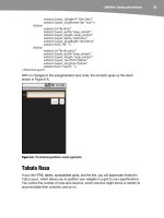
contents, as shown in Figure 6-1.
CHAPTER 6: Working with Containers
42
Figure 6-1. The relationship between a widget, its cell, and the padding values
The android:padding property allows you to set the same padding on all four sides of
the widget, with the widget’s contents centered within that padded-out area. If you want
the padding to vary on different sides, use android:paddingLeft, android:paddingRight,
android:paddingTop, and android:paddingBottom. The value of the padding is a
dimension, such as 5px for 5 pixels’ worth of padding.
If you apply a custom background to a widget (e.g., via the android:background
attribute), the background will be behind both the widget and the padding area. To avoid
this, rather than using padding, you can establish margins, which add whitespace
without extending the intrinsic size of the widget. You can set margins via
android:layout_marginTop and related attributes.
LinearLayout Example
Let’s look at an example (Containers/Linear) that shows LinearLayout properties set
both in the XML layout file and at runtime. Here is the layout:
<?xml version="1.0" encoding="utf-8"?>
<LinearLayout
xmlns:android="
android:orientation="vertical"
android:layout_width="fill_parent"
android:layout_height="fill_parent"
>
<RadioGroup android:id="@+id/orientation"
android:orientation="horizontal"
android:layout_width="wrap_content"
android:layout_height="wrap_content"
android:padding="5px">
<RadioButton
CHAPTER 6: Working with Containers
43
android:id="@+id/horizontal"
android:text="horizontal" />
<RadioButton
android:id="@+id/vertical"
android:text="vertical" />
</RadioGroup>
<RadioGroup android:id="@+id/gravity"
android:orientation="vertical"
android:layout_width="fill_parent"
android:layout_height="wrap_content"
android:padding="5px">
<RadioButton
android:id="@+id/left"
android:text="left" />
<RadioButton
android:id="@+id/center"
android:text="center" />
<RadioButton
android:id="@+id/right"
android:text="right" />
</RadioGroup>
</LinearLayout>
Note that we have a LinearLayout wrapping two RadioGroup sets. RadioGroup is a
subclass of LinearLayout, so our example demonstrates nested boxes as if they were all
LinearLayout containers.
The top RadioGroup sets up a row (android:orientation = "horizontal") of
RadioButton widgets. The RadioGroup has 5px of padding on all sides, separating it from
the other RadioGroup. The width and height are both set to wrap_content, so the radio
buttons will take up only the space that they need.
The bottom RadioGroup is a column (android:orientation = "vertical") of three
RadioButton widgets. Again, we have 5px of padding on all sides and a natural height
(android:layout_height = "wrap_content"). However, we have set
android:layout_width to be fill_parent, meaning the column of radio buttons claims
the entire width of the screen.
To adjust these settings at runtime based on user input, we need some Java code:
package com.commonsware.android.linear;
import android.app.Activity;
import android.os.Bundle;
import android.view.Gravity;
import android.text.TextWatcher;
import android.widget.LinearLayout;
import android.widget.RadioGroup;
import android.widget.EditText;
public class LinearLayoutDemo extends Activity
implements RadioGroup.OnCheckedChangeListener {
RadioGroup orientation;
RadioGroup gravity;
@Override
CHAPTER 6: Working with Containers
44
public void onCreate(Bundle icicle) {
super.onCreate(icicle);
setContentView(R.layout.main);
orientation=(RadioGroup)findViewById(R.id.orientation);
orientation.setOnCheckedChangeListener(this);
gravity=(RadioGroup)findViewById(R.id.gravity);
gravity.setOnCheckedChangeListener(this);
}
public void onCheckedChanged(RadioGroup group, int checkedId) {
switch (checkedId) {
case R.id.horizontal:
orientation.setOrientation(LinearLayout.HORIZONTAL);
break;
case R.id.vertical:
orientation.setOrientation(LinearLayout.VERTICAL);
break;
case R.id.left:
gravity.setGravity(Gravity.LEFT);
break;
case R.id.center:
gravity.setGravity(Gravity.CENTER_HORIZONTAL);
break;
case R.id.right:
gravity.setGravity(Gravity.RIGHT);
break;
}
}
}
In onCreate(), we look up our two RadioGroup containers and register a listener on each,
so we are notified when the radio buttons change state
(setOnCheckedChangeListener(this)). Since the activity implements
OnCheckedChangeListener, the activity itself is the listener.
In onCheckedChanged() (the callback for the listener), we see which RadioGroup had a
state change. If it was the orientation group, we adjust the orientation based on the
user’s selection. If it was the gravity group, we adjust the gravity based on the user’s
selection.
Figure 6-2 shows the result when the layout demo is first launched inside the emulator.
CHAPTER 6: Working with Containers
45
Figure 6-2. The LinearLayoutDemo sample application, as initially launched
If we toggle on the vertical radio button, the top RadioGroup adjusts to match, as shown
in Figure 6-3.
Figure 6-3. The same application, with the vertical radio button selected
If we toggle the center or right radio button, the bottom RadioGroup adjusts to match, as
shown in Figures 6-4 and 6-5.
CHAPTER 6: Working with Containers
46
Figure 6-4. The same application, with the vertical and center radio buttons selected
Figure 6-5. The same application, with the vertical and right radio buttons selected
All Things Are Relative
RelativeLayout, as the name suggests, lays out widgets based on their relationship to
other widgets in the container and the parent container. You can place widget X below
and to the left of widget Y, have widget Z’s bottom edge align with the bottom of the
CHAPTER 6: Working with Containers
47
container, and so on. This is reminiscent of James Elliot’s RelativeLayout for use with
Java/Swing.
RelativeLayout Concepts and Properties
To make your RelativeLayout work, you need ways to reference other widgets within an
XML layout file, plus ways to indicate the relative positions of those widgets.
Positions Relative to Container
The easiest relationships to set up are those that tie a widget’s position to that of its
container:
android:layout_alignParentTop: Aligns the widget’s top with the top
of the container.
android:layout_alignParentBottom: Aligns the widget’s bottom with
the bottom of the container.
android:layout_alignParentLeft: Aligns the widget’s left side with the
left side of the container.
android:layout_alignParentRight: Aligns the widget’s right side with
the right side of the container.
android:layout_centerHorizontal: Positions the widget horizontally at
the center of the container.
android:layout_centerVertical: Positions the widget vertically at the
center of the container.
android:layout_centerInParent: Positions the widget both
horizontally and vertically at the center of the container.
All of these properties take a simple Boolean value (true or false).
NOTE: The padding of the widget is taken into account when performing the various alignments.
The alignments are based on the widget’s overall cell (combination of its natural space plus the
padding).
Relative Notation in Properties
The remaining properties of relevance to RelativeLayout take as a value the identity of a
widget in the container. To do this:
Put identifiers (android:id attributes) on all elements that you will need
to address, of the form @+id/
CHAPTER 6: Working with Containers
48
Reference other widgets using the same identifier value without the
plus sign (@id/ ).
For example, if widget A is identified as @+id/widget_a, widget B can refer to widget A in
one of its own properties via the identifier @id/widget_a.
Positions Relative to Other Widgets
Four properties control the position of a widget in relation to other widgets:
android:layout_above: Indicates that the widget should be placed
above the widget referenced in the property.
android:layout_below: Indicates that the widget should be placed
below the widget referenced in the property.
android:layout_toLeftOf: Indicates that the widget should be placed
to the left of the widget referenced in the property.
android:layout_toRightOf: Indicates that the widget should be placed
to the right of the widget referenced in the property.
Beyond those four, five additional properties can control one widget’s alignment relative
to another:
android:layout_alignTop: Indicates that the widget’s top should be
aligned with the top of the widget referenced in the property.
android:layout_alignBottom: Indicates that the widget’s bottom
should be aligned with the bottom of the widget referenced in the
property.
android:layout_alignLeft: Indicates that the widget’s left should be
aligned with the left of the widget referenced in the property.
android:layout_alignRight: Indicates that the widget’s right should
be aligned with the right of the widget referenced in the property.
android:layout_alignBaseline: Indicates that the baselines of the two
widgets should be aligned (where the baseline is the invisible line that
text appears to sit on).
The android:layout_alignBaseline property is useful for aligning labels and fields so
that the text appears natural. Since fields have a box around them and labels do not,
android:layout_alignTop would align the top of the field’s box with the top of the label,
which will cause the text of the label to be higher on the screen than the text entered
into the field.
So, if you want widget B to be positioned to the right of widget A, in the XML element for
widget B, you need to include android:layout_toRightOf = "@id/widget_a" (assuming
@id/widget_a is the identity of widget A).
CHAPTER 6: Working with Containers
49
Order of Evaluation
It used to be that Android would use a single pass to process RelativeLayout-defined
rules. That meant you could not reference a widget (e.g., via android:layout_above) until
it had been declared in the XML. This made defining some layouts a bit complicated.
Starting in Android 1.6, Android uses two passes to process the rules, so you can now
safely have forward references to as-yet-undefined widgets.
RelativeLayout Example
Now let’s examine a typical “form” with a field, a label, and a pair of buttons labeled OK
and Cancel. Here is the XML layout, pulled from the Containers/Relative sample
project:
<?xml version="1.0" encoding="utf-8"?>
<RelativeLayout
xmlns:android="
android:layout_width="fill_parent"
android:layout_height="wrap_content"
android:padding="5px">
<TextView android:id="@+id/label"
android:layout_width="wrap_content"
android:layout_height="wrap_content"
android:text="URL:"
android:paddingTop="15px"/>
<EditText
android:id="@+id/entry"
android:layout_width="fill_parent"
android:layout_height="wrap_content"
android:layout_toRightOf="@id/label"
android:layout_alignBaseline="@id/label"/>
<Button
android:id="@+id/ok"
android:layout_width="wrap_content"
android:layout_height="wrap_content"
android:layout_below="@id/entry"
android:layout_alignRight="@id/entry"
android:text="OK" />
<Button
android:id="@+id/cancel"
android:layout_width="wrap_content"
android:layout_height="wrap_content"
android:layout_toLeftOf="@id/ok"
android:layout_alignTop="@id/ok"
android:text="Cancel" />
</RelativeLayout>
First, we open the RelativeLayout. In this case, we want to use the full width of the
screen (android:layout_width = "fill_parent"), only as much height as we need
(android:layout_height = "wrap_content"), and have 5 pixels of padding between the
boundaries of the container and its contents (android:padding = "5px").
Next, we define the label, which is fairly basic, except for its own 15-pixel padding
(android:padding = "15px"). More on that in a moment.
CHAPTER 6: Working with Containers
50
After that, we add in the field. We want the field to be to the right of the label and have
the text aligned along the baseline. Also, the field should take up the rest of this “row” in
the layout. These requirements are handled by three properties:
android:layout_toRightOf = "@id/label"
android:layout_alignBaseline = "@id/label"
android:layout_width = "fill_parent"
If we skipped the 15-pixel padding on the label, we would find that the top of the field
was clipped off. That’s because of the 5-pixel padding on the container itself. The
android:layout_alignBaseline = "@id/label" simply aligns the baselines of the label
and field. The label, by default, has its top aligned with the top of the parent. But the
label is shorter than the field because of the field’s box. Since the field is dependent on
the label’s position, and the label’s position is already defined (because it appeared first
in the XML), the field winds up being too high and has the top of its box clipped off by
the container’s padding.
You may find yourself running into these sorts of problems as you try to get your
RelativeLayout to behave the way you want it to.
The solution to this conundrum, used in the XML layout shown above, is to give the label
15 pixels’ worth of padding on the top This pushes the label down far enough that the
field will not get clipped.
The OK button is set to be below the field (android:layout_below = "@id/entry") and
have its right side align with the right side of the field (android:layout_alignRight =
"@id/entry"). The Cancel button is set to be to the left of the OK button
(android:layout_toLeft = "@id/ok") and have its top aligned with the OK button
(android:layout_alignTop = "@id/ok").
Of course, that 15px of padding is a bit of a hack. A better solution, for Android 1.6 and
beyond, is to anchor the EditText to the top of the screen and have the TextView say it
is aligned with the EditText widget’s baseline, as shown in the following example. (In
Android 1.5 and earlier, this was not possible, because of the single-pass rule
interpretation mentioned earlier.)
<?xml version="1.0" encoding="utf-8"?>
<RelativeLayout
xmlns:android="
android:layout_width="fill_parent"
android:layout_height="wrap_content"
android:padding="5px">
<TextView android:id="@+id/label"
android:layout_width="wrap_content"
android:layout_height="wrap_content"
android:text="URL:"
android:layout_alignBaseline="@+id/entry"
android:layout_alignParentLeft="true"/>
<EditText
android:id="@id/entry"
android:layout_width="fill_parent"
android:layout_height="wrap_content"
CHAPTER 6: Working with Containers
51
android:layout_toRightOf="@id/label"
android:layout_alignParentTop="true"/>
<Button
android:id="@+id/ok"
android:layout_width="wrap_content"
android:layout_height="wrap_content"
android:layout_below="@id/entry"
android:layout_alignRight="@id/entry"
android:text="OK" />
<Button
android:id="@+id/cancel"
android:layout_width="wrap_content"
android:layout_height="wrap_content"
android:layout_toLeftOf="@id/ok"
android:layout_alignTop="@id/ok"
android:text="Cancel" />
</RelativeLayout>
With no changes to the autogenerated Java code, the emulator gives us the result
shown in Figure 6-6.
Figure 6-6. The RelativeLayoutDemo sample application
Tabula Rasa
If you like HTML tables, spreadsheet grids, and the like, you will appreciate Android’s
TableLayout, which allows you to position your widgets in a grid to your specifications.
You control the number of rows and columns, which columns might shrink or stretch to
accommodate their contents, and so on.
