Photoshop Elements 3 Solutions: The Art of Digital Photography- P8 pot
Bạn đang xem bản rút gọn của tài liệu. Xem và tải ngay bản đầy đủ của tài liệu tại đây (17.43 MB, 30 trang )
194
CHAPTER
8:
CREATING PANORAMICS
WITH PHOTOMERGE
■
Applying Perspective Control
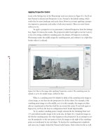
Look at the Settings box in the Photomerge work area shown in Figure 8.3. You’ll see
that Normal is selected and Perspective is not. Normal is the default setting, which
works fine for most landscape and scenic shots. However, at times applying a perspec-
tive improves a panoramic and makes it look more natural. Often you won’t know
unless you try.
To apply a perspective to my panoramic, I selected Perspective from the Settings
box; Figure 8.4 shows the results. The perspective didn’t look right to me but I can try
to fix it by setting a different vanishing point. By default, if Perspective is selected,
Photomerge makes the middle image the vanishing point, and outlines it in a light blue
border when it is selected.
Figure 8.4: Here is the image after applying Perspective control. The vanishing point, by
default, is set to the middle image, outlined in blue.
What is a vanishing point? It’s helpful to think of the vanishing point image as
a base image, or one that sets the perspective for all the others. For example, if the
vanishing point image is in the middle, as it is in this example, the images on either
side are transformed so that they lead the eye toward the center. If you look again at
Figure 8.4, you’ll see the bow-tie configuration that I found objectionable.
To try another vanishing point, I simply selected the Set Vanishing Point tool
( ) and clicked another image in the work area. In Figure 8.5, I made the image on
the left the vanishing point. See what happens to the perspective? In an attempt to cor-
rect the perspective to the new point of view, the images to the right of the vanishing
point are transformed in size and shape. To deselect the vanishing point completely
and start over, I simply clicked the Normal radio button. Undo works for this as well.
4363_ch08_p5.qxd 10/11/04 9:44 PM Page 194
195
■ CREATING A PRECIOUS VIEW
Figure 8.5: This is the result after I applied Perspective control and set the vanishing point
to the image on the far left, outlined in blue.
After experimenting with different vanishing points, I decided to turn
Perspective off and go with the Normal setting.
Manually Arranging Images
In this example, Photomerge automatically arranged my images. But what happens if
your images are shot in such a way that they don’t easily match up and Photomerge
cannot automatically arrange them? If this happens, you’ll see the dialog box shown in
Figure 8.6. Then you will need to arrange the images yourself.
Figure 8.6: This dialog box appears if Photomerge can’t automatically arrange your images.
If this happens, you can still try to arrange them manually.
4363_ch08_p5.qxd 10/11/04 9:44 PM Page 195
196
CHAPTER
8:
CREATING PANORAMICS
WITH PHOTOMERGE
■
You do this by dragging images from Photomerge’s lightbox into the main work
area. Figure 8.7 shows how I have started this process by dragging two of the six
thumbnail representations from the lightbox into the main work area. (I placed my
images into the lightbox by holding the Alt/Option key and clicking Reset, but
Photomerge will automatically place images there if it can’t arrange them.) I then
dragged the other thumbnail representations from the lightbox to the main work area,
placing each one adjacent to the next. Because parts of the underlying image showed
through, it made alignment easier.
Figure 8.7: When you drag one image so that it overlaps another, you can see part of the
underlying image and therefore more easily line up the images.
As similar parts of the adjacent images overlapped, something remarkable
occurred. When Photomerge detected similar areas, it automatically snapped them
together. The more edge detail it had to work with, the easier it was for Photomerge to
line up the adjacent images. (If you have Perspective selected, the program will auto-
matically correct perspective and attempt to compensate for the natural distortion
between images. If you have Perspective turned off, Photomerge still looks for similar
edges and snaps the images together, albeit without any perspective compensation.)
Note: Just because Photomerge can’t find and snap edges of different images together
doesn’t mean it can’t do perspective compensation. If you are trying to arrange your images
manually and Photoshop Elements is still having trouble aligning your images, try the follow-
ing: While clicking and dragging one image on top of another, hold down the Ctrl / key.
When you release the mouse, Photoshop Elements will bypass the attempt to find similar-
edge pixels and go right to the perspective algorithm.
4363_ch08_p5.qxd 10/11/04 9:45 PM Page 196
197
■ CREATING A PRECIOUS VIEW
It’s easy to forget where your vanishing point is. To find it, simply hold down
the Alt/Option key and roll your mouse over the frames. The vanishing point image
has a light blue border, and all the other images have red borders.
Note: To move your images from the work area back into the lightbox, you can drag them
one by one. To move all the images at once back into the lightbox, hold the Alt/Option key.
The Cancel button changes to Reset. Click Reset and start editing your composition again.
Setting Advanced Blending
Next, I tried different blending options. Advanced Blending differentiates between
areas of detail and areas of similar tones or colors. When it detects a lot of detail,
Advanced Blending applies a sharper blending transition. When it detects similar tones
or colors, it applies a more gradual blending transition. In some cases, Advanced
Blending can compensate for different exposures in adjacent frames. On these types of
images, if you don’t use Advanced Blending, you’ll see obvious diagonal banding.
In my image, Advanced Blending added several sharp shafts of light shooting
down from the top of the image. The shafts of light didn’t make any sense, so I attrib-
uted the flaw to a bug in the software. I turned Advanced Blending off, and the arti-
facts disappeared and the blending was just fine. (You can see a preview of the effect
of Advanced Blending by selecting the Preview button from the Photomerge window.)
Note: If you select the Keep as Layers check box, Photomerge keeps individual images
that make up the panorama on separate layers. (If you select Keep as Layers, Advanced
Blending is no longer an option.) Use this option if you are not satisfied with the way
Photomerge blends images. With each image on its own layer, you can use a combination of
the Eraser with either the Clone Stamp tool or Healing Brush tool to blend the images manu-
ally. In Chapter 11, “Extending Dynamic Range with Photomerge,” I’ll show you a way to use
Photomerge and the Keep as Layers option to extend the dynamic range of a digital camera
by merging two or more images with different exposures.
Rendering the Final Panoramic
I clicked the OK button and waited while Photomerge merged the higher-resolution
versions of my images. Up to this point, Photomerge had worked on and displayed
only screen resolution versions of the images. The time it takes for this transformation
depends on the size of the final image and the computer’s processing speed. With the
final panoramic open as a new Photoshop Elements file, I adjusted the Levels controls
and used the Healing Brush tool ( ) to clean up some of the background. Then I
cropped the irregularly shaped image into a rectangle and I was done.
4363_ch08_p5.qxd 10/11/04 9:45 PM Page 197
198
CHAPTER
8:
CREATING PANORAMICS
WITH PHOTOMERGE
■
Creating an Interior Panoramic
How many times have you tried to shoot an interior photo and couldn’t get back far
enough to fully capture the room? Cutting a hole in the wall behind you might help,
but that solution is not practical. Using an expensive super-wide-angle lens might help,
but many of these lenses create a fish-eye look. If you are shooting with a digital cam-
era, forget it. At this time, the widest available lenses for digital cameras aren’t very
wide.
Professional photographer and panoramic/virtual reality expert Scott Highton
encounters logistical problems like this all the time. It’s his business and passion to
push the boundaries of photography, to take it places it could never go before the
advent of the computer. The shot in Figure 8.8 is an example. (The three images that
make up this panoramic are not available on the CD.) Scott created the panoramic of a
large satellite control room of a major telecommunications company by stitching
together three sequenced images with Photomerge. By doing this, he got a fully correct-
ed shot that would have been virtually impossible otherwise.
Figure 8.8: This interior panoramic is made up of three images stitched together with
Photomerge. (Photo by Scott Highton)
Here are the steps Scott took to shoot the images:
1. He set a 35mm camera on a tripod and used an 18mm rectilinear lens. (The rec-
tilinear lens is a corrective lens that makes straight lines appear straight in wide-
angle images.) He used a medium-speed print film, which gave him a lot of
exposure latitude.
2. Using a specially marked tripod head, he shot a sequence of 12 consecutive
images at 30-degree intervals, going well beyond the 120-degree view you see in
Figure 8.8. Scott used all 12 images and another software program to stitch
together a 360-degree panorama for a QuickTime VR presentation, but that’s
another story. (To see Scott’s virtual reality work, go to
www.highton.com.)
3. He processed the film and had the images digitized onto a Kodak Photo CD.
4363_ch08_p5.qxd 10/11/04 9:45 PM Page 198
199
■ CREATING AN INTERIOR PANORAMIC
Scott then took three of the images that covered the field of view he wanted and
in Photoshop Elements he did the following:
1. He selected Photomerge (File New Photomerge Panorama).
2. He clicked the Browse button in the dialog box.
3. He selected the three images.
4. Scott started with the central image by dragging and dropping its thumbnail
into the main work area. With Perspective selected, this image automatically
became his vanishing point image. He then placed the other images on either
side of the vanishing point image. As you can see in Figure 8.9, the images came
in sideways.
Figure 8.9: When an image comes in like this, use the Rotate Image tool to correct it.
5. Scott used the Rotate Image tool ( ) to turn the images 90 degrees. Holding
down the Shift key while turning constrained the move to 45-degree increments.
Because the images could be rotated only one at a time, turning them was time-
consuming and Scott wished Photomerge offered some way to turn all the
images with one command. The images also came in out of order. That’s
because the Photomerge Panorama command doesn’t follow the sequence of the
images in the first Photomerge dialog box but attempts to sequence the images
based on their filenames or numbers. Although this may be annoying, you can
always rearrange the order of the thumbnails in the lightbox by clicking and
dragging.
Note: Photoshop Elements offers several useful Photomerge keyboard shortcuts. You
can use the Zoom tool by pressing Z, and holding down the Alt/Option key toggles Zoom In to
Zoom Out. You can also nudge your images around with the arrow keys, and you can click
and drag your work around the window. Ctrl+Z / +Z will step backward, and Ctrl+Shift+Z /
+Shift+Z will step forward in the Undo history.
4363_ch08_p5.qxd 10/11/04 9:45 PM Page 199
200
CHAPTER
8:
CREATING PANORAMICS
WITH PHOTOMERGE
■
6. Because the images contained a lot of edge detail, they snapped right into place.
The perspective transformation worked well also, and even matched up the lines
in the ceiling. Scott used Advanced Blending with good results (see Figure 8.10).
Figure 8.10: Photomerge corrected the perspective and blended the three images together
nicely. The light blue box shows the vanishing point image. (Photos by Scott Highton)
7. Scott then clicked OK.
8. The final panoramic was nearly perfect. Scott had to only crop, apply the Levels
command, apply a slight Unsharp Mask, and he was done.
Creating an Epic Panoramic
Only a very expensive panoramic camera could have matched the results that Scott
Highton got with a conventional camera and Photomerge, shown in Figure 8.11.
A fish-eye lens would have covered the same field of view but with a huge perceived
distortion. (The five images that make up this panoramic are not available on the CD.)
Figure 8.11: This is actually five images stitched together (Photo by Scott Highton)
4363_ch08_p5.qxd 10/11/04 9:45 PM Page 200
201
■ CREATING AN EPIC PANORAMIC
Figure 8.12: The vanishing point is in the middle. (Photo by Scott Highton)
Scott created this moving panoramic of the Lincoln Memorial in much the same
way that he created the interior shot described in the preceding section. His shooting
technique was basically the same, and once again, he shot this as a 360-degree
panoramic that could be turned into a QuickTime VR as well. His Photomerge settings
were also the same; he kept the Perspective and Advanced Blending settings on. As you
can see in Figure 8.12, he set his vanishing point directly in the middle.
Although this image looks great at first, on closer examination it reveals some
of the limitations of Photomerge on this type of image. If you look on the left in
Figure 8.13, for example, you can see where Photomerge had trouble matching a
column. This is because of the lack of edge contrast that Scott had so much of in the
previous example. You can also see on the right in Figure 8.13 where Photomerge
had trouble correcting the perspective. Still, even with its flaws, it’s a dramatic image.
Figure 8.13: Photomerge had trouble aligning the column because of the lack of edge detail.
It also had trouble correcting the perspective.
4363_ch08_p5.qxd 10/11/04 9:45 PM Page 201
202
CHAPTER
8:
CREATING PANORAMICS
WITH PHOTOMERGE
■
Making a Handheld Vertical Panoramic
I don’t want you to get the impression that the only way to use this cool tool is by
shooting very carefully in a controlled way. You also don’t have to shoot horizontally;
you can shoot up and down and create vertical panoramics. Driving past a mountain
pass in Norway, I stopped and snapped three quick shots, holding the digital camera
by hand. As you can see in Figure 8.14, Photomerge did a fine job stitching the images
together. I didn’t select Perspective because adding a perspective gave the image a dis-
torted look that I wasn’t happy with. I also didn’t select Advanced Blending because
Photomerge worked fine without applying that option.
Figure 8.14: This is actually three handheld shots, stitched together with Photomerge.
4363_ch08_p5.qxd 10/11/04 9:45 PM Page 202
203
■ SHOWING BASEBALL
’
S BIG PICTURE
Note: To create 360-degree panoramics, follow these steps: Shoot a 360-degree
sequence. Then use those images to make three separate 120-degree panoramics with
Photomerge; make sure Cylindrical Mapping is selected and Perspective is deselected.
(Photomerge handles only 120 degrees or fewer at a time.) Next, load the three 120-degree
panoramics into Photomerge and stitch them together, again with Cylindrical Mapping select-
ed and Perspective deselected.
Showing Baseball’s Big Picture
Until recently, illustrator Mark Ulriksen spent a lot of time kneeling on the floor, trying
to assemble batches of 3 × 5 inch prints with tape and scissors to create a panoramic.
After he was finished, he’d use the patched work as a basis for many of his illustra-
tions that appear in The New Yorker magazine.
I talked Mark into trying Photomerge on a series of eight images he took of the
San Francisco Giants at spring training in Arizona a couple of years ago. He shot the
images with a 35mm film camera and used a normal focal length. He didn’t shoot with
Photomerge in mind, and in many cases the images don’t overlap at all. Still, as you
can see in Figure 8.15, he managed to create a fun panoramic that could easily be used
as a basis for one of his illustrations. Now that Mark has tried Photomerge, I don’t
think he’ll ever use tape and scissors again. Figure 8.16 shows one of Mark’s attempts
at changing the vanishing point and his Photomerge settings.
Figure 8.15: Mark Ulriksen created this panoramic from eight images by using Photomerge.
It’s not perfect, but creating it with this command was a lot easier than using tape and
scissors.
4363_ch08_p5.qxd 10/11/04 9:45 PM Page 203
204
CHAPTER
8:
CREATING PANORAMICS
WITH PHOTOMERGE
■
Figure 8.16: Mark played with different vanishing point settings until he got the image he
liked.
Photomerging a Collage
There is no reason why your images need to be in sequence to use Photomerge. I
brought several images into Photomerge and played with different arrangements until I
got the Hockneyesque image you see in Figure 8.17. Sure, I could have created the
montage by cutting and pasting the images into their own Photoshop Elements layer. If
I had done this, though, the process wouldn’t have been nearly as much fun. Every
time I’d want to move a particular image, I’d have to go to its layer, select it, and then
move it. Using Photomerge was much faster and more satisfying.
Figure 8.17: This Hockneyesque collage was created in Photomerge.
4363_ch08_p5.qxd 10/11/04 9:45 PM Page 204
205
■ PHOTOMERGING A COLLAGE
In this case, I chose Normal instead of Perspective (there was no vanishing point
to speak of). To help create a smooth overlap between images, I selected Snap to Image
and Advanced Blending.
Scanning Digital: Creating Scanograms with a Flatbed
Flatbed scanners are mostly used to scan flat art, but there is no reason why the boundaries
can’t be stretched to include inanimate objects such as flowers, coins, and jewelry. If the
cover of the flatbed doesn’t completely close, you may have to play around with different
scanner color and brightness controls. Also, be careful when placing hard objects on the
scanner glass so you don’t scratch it. The following image is a beautiful example created by
photographer Michelle Vignes. She simply placed a whole head of garlic on her flatbed scan-
ner and scanned.
4363_ch08_p5.qxd 10/11/04 9:45 PM Page 205
AaBbC
cDd E
e FfG
g
Hh Ii
4363_ch09_p4.qxd 10/10/04 8:56 AM Page 206
207
■ TAKING TYPE FURTHER
9
Chapter Contents
Adding a Photo Credit
Adding a Copyright Watermark
Making Headline Type
Making Type More Readable
Using Shape Tools to Accent Type
Warping Type
Filling Type with an Image
Adding Effects to Type
Applying Liquify to Type
Taking Type Further
Many times you’ll want to add type to your digital
image. In some cases, type takes a relatively minor
role, such as a small photo credit or caption in
the corner of your digital image. Other times,
as in a poster or a flyer, the type is big, bold,
colorful, and dominant. Creating all kinds of
type is easy with Photoshop Elements’ Type tool,
which makes type that is fully editable so you
can go back to your layered PSD file at any time
and make changes. This chapter covers the basics
of this powerful tool and shows a few of the
myriad ways you can take type further. It also
introduces the Shape tool, which can be used to
set type apart from a background image.
C
E
G
i
4363_ch09_p4.qxd 10/10/04 8:56 AM Page 207
208
CHAPTER
9:
TAKING TYPE FURTHER
■
Adding a Photo Credit
Let’s start with the relatively simple task of creating a photo credit (see Figure 9.1). By
walking step-by-step through the process, you’ll see how the Type tool actually works.
It’s a fairly intuitive tool to use, especially if you are familiar with word-processing
software. However, please take a minute to read the sidebars that accompany this oth-
erwise simple step by step example. Until you’ve grasped some of the basic concepts
behind the Type tool and used it a few times, it won’t always work the way you might
expect it to.
Figure 9.1: To create a photo credit, find an area with similar tones and then use a contrast-
ing color and an easy-to-read font.
Here’s how I made the photo credit text:
1. I selected the Type tool ( ) from the toolbox. If I click and hold the Type tool
icon, or right-click it, four choices appear: Horizontal Type Tool, Vertical Type
Tool, Horizontal Type Mask Tool, and Vertical Type Mask Tool. I chose
Horizontal for this example, but the choice is not critical because I can always
go back and change the orientation later in the options bar.
Note: Type is fully editable as long as it remains as a type layer. If you simplify the type
layer, the type becomes rasterized and has the same properties as any other bitmap element
in your image. You can simplify a layer via the Layers palette pop-up menu or by selecting
Layer Simplify Layer from the menu bar. Why simplify a type layer? There are certain things
you can’t do to a type layer, such as apply Perspective and Distort commands or use any of
the filters or paint tools. I suggest that you make a copy of your type layer and simplify the
copied layer. That way, you can always go back to the original type layer and make changes.
2. Before I typed, I had to choose a font and a font style, size, and color from the
options bar. I also checked that the other options in the Type tool options bar
were appropriate. For example, I wanted to be sure that I didn’t inadvertently
select the Horizontal or Vertical Type. (Photoshop Elements 3 also offers control
over the amount of space between lines of type. This is called leading, and most
of the time the Auto setting in the pop-up menu is the way to go. Generally, the
higher the leading value—measured in points—the greater the distance between
the baseline of one line of type to the baseline of the next line.)
4363_ch09_p4.qxd 10/10/04 8:56 AM Page 208
209
■ ADDING A PHOTO CREDIT
Choosing Fonts and Styles
You must have the bold, italic, and bold italic versions of your font loaded in your system for
these options to be available. You can always choose a faux bold or faux italic from the
options bar. Keep in mind that these faux fonts are only crude approximations of actual fonts
and are machine-made without considering nuances such as spacing and aesthetics.
Before adding type to your digital image, consider your choice of fonts. If you plan to use
small type, say as a photo credit or caption, use a font that holds up and is still readable
when small. Usually, so-called
sans serif
fonts are best for this because they are simpler and
don’t contain decorative flourishes, or
serifs
, at the top or bottom of a character. Two popular
and commonly available sans serif fonts are Arial and Helvetica. If you are using type as a
headline for a poster or flyer, the font can be either serif or sans serif as long as it is read-
able from a distance. Latin Wide and Copperplate are popular headline fonts. If you plan to fill
your type with an image or texture, use the bold version of a heavy font such as Verdana,
Myriad (both sans serif), or Georgia (serif). It’s a good rule of thumb not to mix more than
two fonts on a single image. If you’ve chosen an appropriate font, you also won’t need to
embellish it with too much color or gaudy effects. Photoshop Elements uses the fonts
installed in your system folder. The actual fonts that are available to you will vary.
Font: Arial. This is a sans serif type that is legible even when it’s small.
Font Style: Regular. I want the type to be readable but not necessarily domi-
nant. The other options—Bold, Italic, and Bold Italic—draw more attention
to the type
Font Size: 14pt. The size you use depends on the size of your image. As a
rule of thumb, 72pt type is approximately 1 inch high in an image that is
72dpi. My image is 144dpi, so the pixels are packed relatively tighter, which
reduces 72pt type to about half an inch. Having said this, the fact is I’m
never exactly sure how big my type will look. I experiment until I get the
size I want.
Font Color: Black. I chose a contrasting color to the underlying tonal values.
You can change the color at any time by clicking on the color swatch located
in the options bar. (In earlier versions of Photoshop Elements, you couldn’t
change colors while typing without changing the color of the previous type.)
Anti-aliased: Selected. This smoothens the edges of the type. It also adds
more colors and therefore adds file size. The increased file size is inconse-
quential unless your image is destined for the Web.
3. After selecting my options, I placed my cursor on the upper-right side of the
image and clicked. I chose an area consisting of light, flat tones so my black
type would be easily visible. When I clicked my mouse, an insertion bar in the
shape of an I-beam appeared at the point of clicking. I then typed in my letters.
The baseline of my type lined up with the small line through the bottom of the
I-beam. The I-beam also marked a point of reference for any alignment choices I
made in the options bar.
4363_ch09_p4.qxd 10/10/04 8:56 AM Page 209
210
CHAPTER
9:
TAKING TYPE FURTHER
■
4. As you can see in Figure 9.2, when my letters came to the edge of the image,
they didn’t automatically wrap to another line. They continued off the edge. I
could have pressed the Enter/Return key when I got to the edge of the picture,
which would have created a new line, but instead I continued typing. When I
was finished, I pulled the cursor away from the type until it turned into the
Move tool pointer ( ), at which time I dragged the type into position. You can
also move type in 1-pixel increments by using the arrow keys. To move the type
in 10-pixel increments, hold down the Shift key while using the arrow keys.
Figure 9.2: Type will not wrap to the next line as it does with conventional word-processing
software. It will continue off the edge of the image unless you press the Enter/Return key.
In this case, I just dragged the single line of type into position.
Understanding Type States
Photoshop Elements type can exist in one of three basic states: edit, committed, and simpli-
fied. When type is in the
edit
state, all you can do is edit it; you can’t use other Layer com-
mands from the Layer menu. After type is
committed
, you can edit and apply just about any
Photoshop Elements tool or command, including a layer effect. However, in order to use any
of the painting tools or filters, you must first
simplify
the type layer.
If you have committed your type, you can quickly change the color of your type by double
clicking on the
T in the type layer in the layer palette or selecting the Type tool from the
toolbar and the layer containing the type you wish to change, and clicking on the color
swatch found in the options bar. Click a new color, and the type will change accordingly. You
can also use either of these shortcuts: Alt+Backspace / Option+Delete will fill the type with
the foreground color. Ctrl+Backspace / +Delete will fill it with the background color.
After type has been committed, you can drag it at any time into different positions. Just
select the Move tool ()from the toolbox and click on the type to automatically select the
type layer. A bounding box appears around the selected type. Clicking outside the bounding
box deselects the type. Place the pointer inside the bounding box and drag the type into
position. Be sure that the Auto Select Layer and Show Bounding Box options are selected in
the Move tool options bar.
How do you know which state your type is in? One way is to look at the Layers palette. If the
layer thumbnail contains a
T
, the type is in either edit or committed state. If the layer thumb-
nail doesn’t contain a
T
, it is a simplified layer. If the Cancel and Commit buttons are showing
in the Type tool options bar, the type is in the edit state. If not, it has been committed. If your
type has been simplified and you try to use the Type tool on it, the Type tool will just create a
new type layer. You can’t edit simplified type.
4363_ch09_p4.qxd 10/10/04 8:56 AM Page 210
211
■ ADDING A PHOTO CREDIT
Moving the type automatically committed it. I could have committed it before
this, however, by clicking the Commit button ( ) in the options bar. I also could have
clicked the Cancel button ( ), which would have discarded the type layer. Clicking the
Cancel button discards a type layer only if the type has not been previously committed.
What do you do if you want to go back and change your type? Here’s what I
did to add a copyright symbol and date to the photo credit in Figure 9.1:
1. I made sure the Type tool was selected.
2. I placed the cursor over the type I wished to edit. The cursor turned into an
I-beam insertion point. I placed the insertion point at the end of the word
Washington and clicked. This automatically selected the type layer and put me
back into the edit state. I then typed a copyright (©) symbol and 2004. (On
Windows the copyright symbol is typed by pressing Num Lock on the numeric
keypad, holding down the Alt key, and typing 0169 on the numeric keypad. On
the Mac OS, it’s entered by pressing Option+G.) At this point, I could have
selected all my type and chosen a new font or font style or even changed the
color of the type in the options bar. I also could have changed the orientation
from horizontal type to vertical by selecting the Text Orientation button ( )
from the options bar, but I didn’t. (Only selected type will change if you
choose a new font, size, or color. You do not need to select any type to change
the orientation.)
Note: To select all the type on a type layer, either triple-click anywhere on the type
itself or use the keyboard shortcut Ctrl+A / +A or, in the layers palette, on the type layer,
double-click on the T. Additionally, double-clicking on a word will select all the letters in that
word. You can select individual characters by clicking and dragging the cursor over them, or
by using the Shift+arrow keys. To delete individual characters, position the insertion point in
front of the character you wish to delete, click, and then press the Delete key. You can also
select one or more characters and press Delete.
3. When I was finished, I moved the cursor away from the text and moved the
type into position. Doing this automatically committed my new type.
The edited text is shown in Figure 9.3
Figure 9.3: Edit your type by selecting the Type tool and clicking on the type.
As I said, the basics of the Type tool are pretty simple. Let’s move on.
4363_ch09_p4.qxd 10/10/04 8:56 AM Page 211
212
CHAPTER
9:
TAKING TYPE FURTHER
■
Grabbing Digital: Taking Screen Captures Further
Both the PC and the Mac have built-in commands that create a snapshot of your entire desk-
top window and save the image to the clipboard or, on a Mac, as a PDF file as well. On the PC,
press Ctrl+Print Screen for the entire screen, or Alt+Print Screen for the focused window. To
quickly paste the screen capture into Photoshop Elements, you can select File
New
Image from Clipboard. On the Mac, you also have a few choices. Pressing +Shift+3 creates
a picture file of your entire desktop and saves the file to your desktop in the PDF format.
Pressing +Shift+4 captures a rectangular section of your screen: you can adjust its size. If
you press +Shift+4, and then, before doing anything else, press the spacebar, your cursor
turns into a tiny camera. As you move the camera around the screen, different sections are
highlighted. When you get what you want, click, and only the selected screen element will be
captured. If you hold the Ctrl key when you click to capture a selection, regardless of which
selection method you use, the screen grab is saved to the clipboard, ready for pasting, rather
than saved as a document on your desktop. Third-party alternatives give you much more con-
trol over your screen captures. Check out SnagIt by TechSmith for the PC, or Snapz Pro X by
Ambrosia Software for the Mac. Both enable you to capture the entire screen, a dialog box, a
menu, or a selection of your choice. They give you the capability to capture video frames as
well. Mac OS X ships with the Grab utility, which enables you to save a selection, a window, or
the entire screen in the TIFF file format.
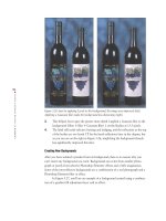
Adding a Copyright Watermark
To guard against unwanted commercial usage of an image, photo agencies and profes-
sional photographers often imprint a faint, but noticeable © symbol over an entire
image. This imprint lives with the image in print or electronic form, telling the viewer
not to use the image for commercial purposes without getting permission—and an
unaltered version of the image—from the photographer.
Here’s how to create a copyright watermark:
1. With the image open, select the Shape tool ( ).
2. In the Shape tool options bar, click the Custom Shape tool icon ( ). Keep the
Custom Shape option set to Unconstrained. Then click the arrow next to the
word Shape to call up the Custom Shape Picker.
3. Click the arrow at the top right of the Custom Shape Picker, and from the
resulting list select Symbols. This brings up the choices shown in Figure 9.4.
(I’ve circled the icons and arrows to click.)
4363_ch09_p4.qxd 10/10/04 8:56 AM Page 212
213
■ ADDING A COPYRIGHT WATERMARK
Figure 9.4: In the Shape tool options bar I selected Custom Shape and Symbols, which
brought up what you see here.
4. Choose the shape to create; I selected the © shape.
5. Drag across your image to define the area you’d like the shape to appear in. I
held the Shift key to constrain the scale and then clicked in the upper-left corner
of my image and dragged my cursor all the way to the bottom of the image, fill-
ing the screen with the © shape.
6. In the Layers palette, set the blend mode to Soft Light and opacity to 50 per-
cent. These settings allow most of the image to show through the shape, as illus-
trated in Figure 9.5. You can choose other blending modes and opacities
depending on how obvious you want to make the symbol.
Figure 9.5: A copyright watermark will help prevent unwanted commercial use of your
image.
4363_ch09_p4.qxd 10/10/04 8:56 AM Page 213
214
CHAPTER
9:
TAKING TYPE FURTHER
■
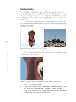
Making Headline Type
Headlines are meant to be bold and catchy, and often they consist of just one or two
words that reinforce the theme or message of the underlying image. The secret to a
good headline is readability and simplicity. This is how I created the headline shown in
Figure 9.6:
Figure 9.6: You can create very large type (here, 120pt) by typing the point size directly into
the Set Type Size box in the Type options bar.
1. With my target image open, I selected the Type tool from the toolbar and set the
following options in the options bar:
Font: Helvetica.
Font size: 120pt.
The secret here is not to feel restricted by the 72pt
maximum displayed in the pop-up window; you can type in any number
you want.
Font color: Black.
2.
I then clicked the sky and typed California.
3. I moved the cursor outside the type area, and it turned into the Move tool
pointer. I dragged the headline into place, which also committed it.
That’s it for now. In the next section, I’ll show you ways of making the headline
even more readable.
4363_ch09_p4.qxd 10/10/04 8:56 AM Page 214
215
■ MAKING TYPE MORE READABLE
Making Type More Readable
Sometimes type needs a little help to make it stand out from a busy or colorful back-
ground. Photoshop Elements has as many techniques to distinguish type from the
background as there are stars in the galaxy. Here are a couple of examples that should
spark your imagination.
Adding a Drop Shadow and Embossment
Figure 9.7 shows the result of adding two layer styles to the word California, making
it easier to read and more interesting.
Figure 9.7: By adding a drop shadow and emboss layer style from the Layer Styles palette,
the type is more readable.
To create this effect, I did the following:
1. In the Layers palette, I selected the type layer containing the word California.
(The California type is in the committed state.)
2. I selected the Type tool from the toolbar. In the Type options bar, I clicked the
arrow next to the Style box, which brought up a pop-up menu. In this menu, I
clicked the arrow on the right side and chose Drop Shadows (see Figure 9.8). I
then chose the Low drop shadow. You can see the effects so far on the left side
of Figure 9.9. (You can also find the layer style Drop Shadows in the Styles and
Effects palette.)
4363_ch09_p4.qxd 10/10/04 8:56 AM Page 215
216
CHAPTER
9:
TAKING TYPE FURTHER
■
Figure 9.8: Select Drop Shadows from the Style pop-up menu.
Figure 9.9: By adding a simple drop shadow, the type is already more readable (left). The
embossment makes it look even better (right).
Note: You can remove a style by selecting the Undo button ()from the shortcuts bar,
or by choosing Layer
Layer Style Clear Layer Style.
4363_ch09_p4.qxd 10/10/04 8:56 AM Page 216
217
■ MAKING TYPE MORE READABLE
3. Next, from the Style box pop-up menu, I chose Bevels; I then chose Scalloped
Edge (see Figure 9.10). The right side of Figure 9.9 shows the effects so far.
Figure 9.10: Select Bevels from the Style pop-up menu.
Note: Layer Styles effects are cumulative. Attributes of a second style are added to the
attributes of the first style, and so on. Unfortunately, you can remove layer styles only
sequentially. You can’t, say, remove the third of five layer styles and keep the rest.
Furthermore, you have to use the Undo command to remove the last layer style, then remove
the next-to-last layer style, and so on. If you upgrade to the full version of Photoshop, layer
styles are more manageable.
4. In the Layers palette, on the type layer containing the word California, I double-
clicked the f with a circle around it. This brought up the dialog box shown in
Figure 9.11. I slightly increased the Shadow Distance but kept the Bevel Size.
(You can also access the style settings by choosing Layer
Layer Style Style
Settings from the main menu bar.)
Figure 9.11: In the Style Settings dialog box, you can control the fine points of a layer style.
4363_ch09_p4.qxd 10/10/04 8:56 AM Page 217
218
CHAPTER
9:
TAKING TYPE FURTHER
■
Using a Gradient
As you can see on the left in Figure 9.12, when you place type with a single color
against an area containing a similar color or contrast, part of the type becomes unread-
able. You can use a Gradient fill to make your type readable across a wider spectrum
of color and contrast (as shown on the right).
Figure 9.12: Black type disappears in the shadow area (left). By applying a Gradient fill to
the type, it is more readable (right).
This is what I did to make the type more visible:
1. I needed to fill my Foreground and Background boxes on the toolbox with con-
trasting colors so that I could use those colors later to make the Gradient tool
work properly. To do this, I used the Eyedropper tool ( ) to select a dark area
from my image. When I clicked the cursor, that dark color became my fore-
ground color. I then clicked the Switch arrows ( ) to swap the foreground
color on the toolbox with the background color. (You can also set the back-
ground color by holding down the Alt/Option key and clicking the Eyedropper
tool on a color.) I then used the Eyedropper tool again to find a contrasting
tone, clicked, and it became the foreground color, which is what I wanted.
2. On the text layer, I held down the Ctrl/ key and clicked on the Layer thumb-
nail. This selected the type. If I didn’t select the type and then applied the
Gradient fill, the fill would fill an entire layer and not just my type.
3. I selected Gradient from the pop-up menu that appeared when I clicked the
Create Adjustment Layer button ( ) at the top of the Layers palette. (Don’t
confuse the Gradient adjustment layer with the Gradient tool in the toolbar. The
Gradient tool will work only on a simplified layer, which is not what you want.)
From the Gradient dialog box that appeared, I selected a linear gradient type
and chose the Foreground to Background gradient fill from the Gradient Picker
pop-up palette. (Now you see why I needed to go through step 1.) Before select-
ing OK, I positioned my cursor on the words Photo by Ana Mikaela, clicked,
and while holding down the mouse button, dragged back and forth across the
text until the gradient looked right. Dragging like this across the type sets the
starting and ending points of the gradient.
4. I linked the two layers together so that if I moved my type layer, the gradient
would move with it. To link the two layers, I selected the type layer in the
Layers palette. Then, in the gradient layer, I clicked in the column immediately
to the left. As you can see in Figure 9.13, the link icon now appears in the col-
umn next to the gradient layer.
4363_ch09_p4.qxd 10/10/04 8:56 AM Page 218