ADOBE INDESIGN CS2 REVEALED- P4 ppsx
Bạn đang xem bản rút gọn của tài liệu. Xem và tải ngay bản đầy đủ của tài liệu tại đây (1.14 MB, 15 trang )
Lesson 3 Navigate Through a Document INDESIGN 1-21
5. Drag the View box in the Navigator palette to
scroll around the page.
6. Click the Zoom Out button five times.
The magnification is reduced to 125%.
7. Click the Navigator palette list arrow, then
click View All Spreads.
The palette now shows all spreads, as shown
in Figure 27.
8. Close Dessert Menu.indd.
You used the Navigator palette to enlarge and reduce
the view of the document and to scroll around the
document.
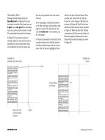
FIGURE 27
Navigator palette showing all spreads
Palette list
arrow
LESSON 4
What You’ll Do
INDESIGN 1-22 Exploring the InDesign Workspace
Accessing InDesign Help
Help! At some point we all need it. When
you do, you can use it to search for answers
to your questions using the InDesign Help
command on the Help menu.
InDesign Help is an online resource. When
you click InDesign Help the Adobe Help
Center window opens, showing the Adobe
InDesign CS2 page, as shown in Figure 28.
You can also access help for Adobe
Illustrator CS2 and Adobe Photoshop CS2
from this window. Click the View Help info
for this product list arrow, then choose the
product you’d like help with. This site con-
tains all the information in the user guide,
plus keyboard shortcuts and additional
information.
QUICKTIP
The Help menu also contains commands for registering
your software, finding out if there are any updates to the
software, and viewing the InDesign page of the Adobe
Systems Web site. The Online Support command brings
you to the support page for InDesign where you can read
about top issues and access tutorials, forums, and
announcements.
You can find information quickly by con-
ducting a search using keywords. To do
so, type your keyword(s) into the text box
at the top of the window, then click
Search. Searching for information this
way is more powerful than using a soft-
ware manual.
In this lesson, you will access help using
the Adobe Help Center.
▼
USE
INDESIGN HELP
Lesson 4 Use InDesign Help INDESIGN 1-23
FIGURE 28
Adobe Help Center
FIGURE 29
"Guides" search results
The Web site offers you the power to do
much broader searches and to view a number
of different topics at a glance that relate to
your search. For example, if you search for
information about guides, you are given a
very thorough list of topics relating to
guides, as shown in Figure 29. Compare
that to using the traditional index in a
book and you will probably agree that this
is a much more comprehensive and effec-
tive solution for accessing information.
View Help info for this
product list arrow
Type keywords into this
text box
CHAPTER SUMMARY
CHAPTER SUMMARY
In this chapter, you explored the work-
space in InDesign CS2; you learned how
to open, close and save a document and
how to work with palettes. You explored
the Toolbox, viewing the various tools at
your disposal when you work in InDesign
CS2. Experimenting with palettes, you
learned how to group and dock them to
manage your workspace. You also learned
how to restore the default arrangement of
palettes by clicking Window on the menu
bar, pointing to Workspace, then clicking
[Default]. You learned how to change
document views, how to use the Zoom
and Hand Tools, how to use the Navigator
and Pages palettes, and how to access
InDesign Help.
What You Have Learned
• The InDesign CS2 workspace
• How to start InDesign CS2
• How to open and save a document
• The identity of important tools in the
Toolbox
• How to group and dock palettes
• How to restore the default workspace
• How to create new windows and change
document views
• How to use the Zoom and Hand Tools
• How to use the Navigator palette
• How to use the Pages palette to move
between pages in the document
• How to access InDesign Help
Key Terms
Workspace The arrangement of win-
dows and palettes that you see on your
monitor, where you work on InDesign
documents.
Pasteboard The blank white area sur-
rounding the document.
Docking palettes Connecting the bot-
tom edge of one palette to the top edge of
another palette, so that both move
together.
Grouping palettes A way to combine
multiple palettes in a single palette win-
dow to conserve workspace.
Spread A set of two document pages
that face each other.
Toolbox The box that contains all the
tools available in InDesign.
Pages palette The palette that shows
icons for every page in a document; used
to navigate quickly through document
pages easily.
Navigator palette An excellent
resource for viewing and moving through
a document.
INDESIGN 1-24 Exploring the InDesign Workspace
2-1
WORKING WITH
TEXT
2
chapter
1.
Format text.
2.
Format paragraphs.
3.
Create and apply styles.
4.
Edit text.
Earth, air, fire, and water—it is said that
these are the four essential elements of
our world. A different quartet establishes
itself as the four main elements of any lay-
out: text, color, illustration, and imagery.
Take a moment to read them again, and
make a mental note of them. We will use
these four elements—text, color, illustra-
tion, and imagery—throughout this book
to reduce the myriad features of InDesign
into four simple categories.
In this chapter, we will focus on working
with text. Like Proteus, the mythological
figure who could change his outer form at
will, text in a layout can appear in a variety
of ways. It is protean—it is versatile. It can
be display text—a bold, dramatic headline
at the center of a page, for example, or a
miniscule footnote tucked away unobtru-
sively. It can be flowed as body copy—
paragraphs of text; or it can appear as
simple page numbers at the lower corner
of a page.
You will be pleased to find that InDesign is
a first-rate application for generating and
editing text. Everything that you want to
do—you can do. With InDesign, your abil-
ity to generate functional, readable text
and beautiful typographic artwork is lim-
ited only by your imagination.
2-2
WORKING WITH
TEXT
chapter
2
2-3
Tools You’ll Use
LESSON 1
What You’ll Do
INDESIGN 2-4 Working with Text
Using the Character Palette
The Character palette, shown in Figure 1,
is the command center for modifying text.
The Character palette works hand in hand
with the Paragraph palette, which is why
they are often grouped together. Where
the Paragraph palette, as its name implies,
focuses on manipulating paragraphs or
blocks of text, the Character palette focuses
on more specific modifications, such as
font, font style, and font size.
In addition to these basic modifications,
the Character palette offers other controls
for manipulating text. You use the palette
to modify leading; to track and kern text;
to apply a horizontal scale or a vertical
scale to text; to perform a baseline shift; or
to skew text. To select text for editing, you
can use the methods shown in the table on
the next page.
Understanding Leading
Leading is the term used to describe the
vertical space between lines of text. This
space is measured from the baseline of
one line of text to the baseline of the next
line of text. As shown in Figure 2, the
baseline is the invisible line on which a
line of text sits. As with font size, leading
is measured in points.
In this lesson, you will use the Character
palette and various keyboard commands
to modify text attributes.
▼
FORMAT
TEXT
Pasting text without formatting
A new feature in InDesign CS2 lets you paste text with or without formatting. When you
copy text, then paste it, it is by default pasted with all of its formatting—its typeface, type
style, type size, and any other formatting that has been applied. Sometimes, this can be
undesirable. For example, if you were pasting that text into a text block that had different
formatting, then you would then need to edit the pasted text to conform to the new for-
matting. This is where the new Edit/Paste without Formatting command comes into play:
It strips the copied text of all its original formatting, then reformats it to match the for-
matting of the text where it is pasted. This is a very useful feature, but perhaps one that is
seldom needed. Make a mental note of it, because when you need it, it will be very handy.
Lesson 1 Format Text INDESIGN 2-5
FIGURE 1
Character palette
FIGURE 2
Examples of leading
Palette list arrow
Type Style list arrow
Leading list arrow
Tracking list arrow
Horizontal Scale
list arrow
Skew text box
Font Family
text box
Font Size text box
Kerning list arrow
Vertical Scale text box
Baseline Shift text box
12 pt text with
14 pt leading
12 pt text with
24 pt leading
12 pt text with
8 pt leading
Leading
Baseline
Making text selections
to select: do the following:
One word Double-click word
One line Triple-click any word in the line
One paragraph Click any word in the paragraph
four times
Entire story Click any word in the story five times
Entire story [Ctrl][A] (Win) or [A] (Mac)
One character to the right of insertion point [Shift]
One character to the left of insertion point [Shift]
One line up from insertion point [Shift]
One line down from insertion point [Shift]
One word to the right of insertion point [Shift][Ctrl] (Win) or [Shift]
(Mac)
One word to the left of insertion point [Shift][Ctrl]
(Win) or [Shift]
(Mac)
One paragraph above insertion point [Shift][Ctrl]
(Win) or [Shift]
(Mac)
One paragraph below insertion point [Shift][Ctrl]
(Win) or [Shift]
(Mac)
INDESIGN 2-6 Working with Text
Scaling Text Horizontally and
Vertically
When you format text, your most basic
choice is which font you want to use and at
what size you want to use it. Once you’ve
chosen a font and a font size, you can fur-
ther manipulate the appearance of the text
with a horizontal or vertical scale.
In the Character palette, horizontal and
vertical scales are expressed as percentages.
By default, text is generated at a 100% hor-
izontal and 100% vertical scale, meaning
that the text is not scaled at all. Decreasing
the horizontal scale only, for example,
maintains the height of the characters but
decreases the width—on the horizontal
axis. Conversely, increasing only the hori-
zontal scale again maintains the height but
increases the width of the characters on the
horizontal axis. Figure 3 shows four exam-
ples of horizontal and vertical scales.
Kerning and Tracking Text
Though your computer is a magnificent
instrument for generating text in myriad
fonts and font sizes, you will often want to
manipulate the appearance of text after you
have created it—especially if you have the
meticulous eye of a designer. Kerning is a
long-standing process of increasing or
decreasing space between a pair of charac-
ters. Tracking is more global. Like kerning,
tracking affects the spaces between letters,
but it is applied globally to an entire word
or paragraph.
Kerning and tracking are standard features
in most word processing applications, but
they are more about typography than word
processing—that is, they are used for set-
ting text in a way that is pleasing to the
eye. Spacing problems with text are usu-
ally more prominent with large size head-
lines than with smaller body copy—this
is why many designers will spend great
amounts of time tracking and kerning a
headline. Figures 4 and 5 show examples of
kerning and tracking applied to a headline.
Note, though, that kerning and tracking
are also used often on body copy as a sim-
ple solution for fitting text within an allot-
ted space.
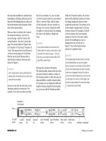
FIGURE 3
Scaling text horizontally and vertically
FIGURE 4
Kerning text
FIGURE 5
Tracking text
Without kerning,
some letters
are spaced
further apart
After Kerning, all
letters are evenly
spaced
Without kerning,
some letters are
very close
Kerned text with
no tracking
Tracked text with greater
space between characters
Lesson 1 Format Text INDESIGN 2-7
InDesign measures both kerning and track-
ing in increments of 1/1000 em, a unit of
measure that is determined by the current
type size. In a 6-point font, 1 em equals
6 points; in a 12-point font, 1 em equals
12 points. It’s good to know this, but you
don’t need to have this information in mind
when kerning and tracking text. Just
remember that the increments are small
enough to provide you with the specificity
that you desire for creating eye-pleasing text.
Creating Superscript
Characters
You are already familiar with superscript
characters, even if you don’t know them by
that term. When you see a footnote in a
book or document, the superscripted char-
acter is the footnote itself, the small num-
ber positioned to the upper-right of a word.
Figure 6 shows a superscripted character.
The only tricky thing about applying a
superscript is remembering how to do it.
The Superscript command, as shown in
Figure 7, is listed in the Character palette
menu. Wait—there’s one more tricky thing
you need to remember about superscripts.
If, for example, you select a 12-point charac-
ter and then apply the Superscript com-
mand, by definition the character will be
smaller in size. However, its point size will
still be identified in the Character palette as
12 points.
Creating Subscript
Characters
The Character palette menu also offers a
command for Subscript. You can think of
Subscript as the opposite of Superscript.
Instead of raising the baseline of the
selected text, the Subscript positions the
text below its original baseline. As with
Superscript, the Subscript command makes
the selected text appear smaller.
Of the two, Subscript is used less often.
Though it is seldom used for footnotes,
many designers use Subscript for trade-
marks and register marks.
Underlining Text
InDesign offers many different options,
commands, and dialog boxes for creating
rules—horizontal, vertical, or diagonal
lines—and for underlining text. That said,
when you want simply to underline
selected text, the most basic method is to
use the Underline command in the
Character palette’s menu. With this com-
mand, the weight of the underline is deter-
mined by the point size of the selected text.
The greater the point size, the greater the
weight of the line.
FIGURE 6
Identifying a superscripted character
FIGURE 7
Locating the Superscript command
Superscripted
character
Superscript Command
INDESIGN 2-8 Working with Text
Modify text attributes
1. Open ID 2-1.indd, then save it as Min-Pin Intro.
2. Click Edit (Win) or InDesign (Mac) on the menu bar,
point to Preferences, then click Units & Increments.
3. In the Keyboard Increments section, change
the Size/Leading value to 1 pt (if necessary),
as shown in Figure 8.
4. Click OK, click the Type Tool , then double-
click the word Introducing at the top of the page.
5. Triple-click Introducing to select the entire line.
6. In the Character palette, click the Font Family list
arrow, click Impact, click the Font Size list arrow,
then click 48 pt, and verify that the Leading text
box contains 57.6 pt, as shown in Figure 9.
TIP You can set the font list in the Character
palette to show only font names or font
names and samples of each font. If this fea-
ture is off, you can turn it back on in the Type
screen of the Preferences dialog box. Select
Font Preview size, then select a display size.
7. Press and hold [Shift][Ctrl] (Win) or
[Shift] (Mac), then press [<] ten times.
The point size is reduced by one point size
every time you press [<].
8. Press and hold [Shift][Ctrl] (Win) or
[Shift] (Mac), then press [>] two times.
The point size is increased by two points.
9. Triple-click by on the second line, change
the font to Garamond or a similar font, click
the Type Style list arrow, click Italic, click
the Font Size list arrow, then click 18 pt.
TIP If the Garamond font is not available to
you, use a similar font.
10.Click the Selection Tool , then note that
the text frame is highlighted, as shown in
Figure 10.
FIGURE 8
Units & Increments section of the Preferences dialog box
FIGURE 9
Character palette
Font Family
list arrow
Font Size
list arrow
Size/Leading
text box
Lesson 1 Format Text INDESIGN 2-9
11.Click Object on the menu bar, click Text
Frame Options, click the Align list arrow,
click Center, then click OK.
You used keyboard commands and the Character
palette to modify text.
Track and kern text
1. Click the Zoom Tool , click and drag the
Zoom Tool pointer around the light green
frame that encompasses the entire headline,
then release the mouse button.
When you drag the Zoom Tool pointer, a
dotted-lined selection rectangle appears.
When you release the mouse, the contents
within the rectangle are magnified.
2. Click the Type Tool , then triple-click the
word Introducing.
3. Click the Tracking list arrow in the Character
palette, then click 200.
The horizontal width of each word increases,
as a consistent amount of space is applied
between each letter, as shown in Figure 11.
4. Change the tracking value to 25.
5. Click between the letters h and e in the word
the, click the Kerning list arrow, then click -50.
The space between the two letters decreases.
6. Click the Kerning up arrow twice to change
the kerning value to -30.
7. Click the Selection Tool .
Your headline should resemble Figure 12.
You used the Character palette to modify tracking
and kerning values applied to text.
FIGURE 10
Text frame indicates a selected text box
FIGURE 11
Increasing the tracking value of selected text
FIGURE 12
Decreasing the kerning value between two letters
Text frame
Text frame handles
Decreased kerning