Professional Information Technology-Programming Book part 26 doc
Bạn đang xem bản rút gọn của tài liệu. Xem và tải ngay bản đầy đủ của tài liệu tại đây (28.23 KB, 8 trang )
brightness. For example, sometimes I want to make the skin tones just a little
lighter or find that it would be better if the sky were a bit darker. Please keep in
mind that right now, I'm only talking about brightness areas that are predominant
in a large part of the image and don't have to be isolated by masking. Masked
channels come later in the workflow.
In case you don't already know, adjusting the contrast curve for a given range of
brightness is easy:
1. Open the Curves dialog, press the Cmd/Ctrl key and the cursor will become
an eyedropper. Click on the tone in the image that is the midtone in the
brightness range that you want to adjust. A black dot will appear at precisely
that brightness location along the Curve line.
2. Repeat the process for any other brightness tones you want to change.
3. Select each Curve line dot one at a time. For each dot, press the Up arrow
key to brighten that tone or the Down arrow key to darken it. Press the
Left/Right arrow keys to move that point to a different position along the
curve.
If necessary, you can isolate the changes you are making to include only a given
brightness range by placing double points above and below the curve point that
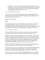
you are moving. Figure 6-9 shows an image and its curve after changing the
brightness and contrast of the midtones in the shadows to bring out a bit more
detail.
Figure 6-9. An image and its curve after changing the brightness and contrast of
the midtones in the shadows to bring out a bit more detail.
The same Curves adjustment layer can be used to change the color tint of a
particular range of brightness. Figure 6-10 shows the before and after of a portrait
in which there is a tint reflecting from a nearby wall. This is something you
couldn't do in Camera Raw, so doing it now is your only chance. You could use the
Color Balance adjustment for this job, but you'd have to make selections to target
the tinted area, so you couldn't apply the same layer to a series of images. This
adjustment is particularly useful if the shadows or highlights are picking up the
reflection of a nearby colored object, for example, a wall or sweater. Follow these
steps:
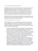
Figure 6-10. The before and after of a portrait in which there is a tint reflecting
from a nearby wall that needed correction. See the orange highlight on the camera-
left ear, top of the sweater, and on the highlighted rim of her face? There may also
be times when you want to increase a tint for atmospheric effect.
1. Press Cmd/Ctrl-click in the image on an area that contains the brightness
level you had in mind.
2. Place two anchor points on either side of the anchor point dot you just
placed, leaving enough space between them so that your change "blends"
with surrounding areas of brightness.
3. Go to the color channel most likely to make the change in tint. Raise the
target anchor dot to intensify the primary color for that channel. Lower it to
intensify the complementary color for that channel. You may need to use
two channels to get or remove exactly the intended shadow tint.
6.2.3. Color Balance
Although the most accurate way to set color balance is to use a gray or color card
with the Levels command (see "Levels Adjustment" earlier in this chapter), the
Color Balance dialog is an excellent way to set color balance subjectively. For
instance, suppose you shoot a landscape before sunset and the color balance doesn't
feel right to you, so you use the Levels approach. Well, maybe it's better but still
doesn't have a strong enough sunset feeling. Figure 6-11 shows the before and after
of this scene.
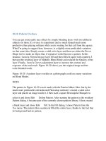
Figure 6-11. A landscape shot just before sunset that looks more like it was shot at
3 p.m. (left) until you "correct" it with the Color Balance adjustment layer (right).
Getting the subjective look I want is simply a matter of dragging sliders until I like
what I see. Always start by correcting the color that most needs correction. Drag
toward the name of that color to intensify the color or toward the name of the
complementary color to diminish the influence of the primary color. The secret
here (as it is for most adjustments) is to be sure the Preview box is checked. The
settings that gave me the sunset feeling are shown in the Color Balance dialog in
Figure 6-12.
Figure 6-12. The settings for creating an orange sunset feeling. You could use the
same method to warm or cool the atmosphere of any image.
NOTE
Many users prefer the Adjustments Variations command instead of the Color
Balance command because they can see the effect before the adjustment and can
see several comparisons at once. However, until Adobe makes Variations work as
an adjustment layer, the only way you can apply the command nondestructively is
to create a copy of a flattened version of your file. To do that, highlight all the
layers, then press Cmd/Ctrl-+ Opt/Alt-E. A new merged layer will appear and you
can use the Variations command on that. Of course, you've added quite a bit more
file size, and you can't try another Variation without repeating the whole process.
6.2.3.1. Hue/Saturation
The Hue/Saturation adjustment layer is most useful for two categories: hue and
saturation (duh?). Seriously, most of the time you'll use both of the dialog's sliders
regardless of what your purpose isyou'll just use them differently. But I haven't yet
told you what the two purposes are, have I?
NOTE
There is a script from Fred Miranda called Velvia Vision that gives you a number
of versatile options for creating truly beautiful and authentic photos that feature
highly saturated colors. Since this script costs a mere $25 and lets you preview the
result before you apply it, I suggest you check it out (www.fredmiranda.com).
There's more on Fred Miranda in Chapter 11.
Assuming your original image wasn't a JPEG, you might wonder why you'd want
to change the saturation of colors in the image when you already had a chance to
do it nondestructively in Camera Raw. Well, first, I suggest you only do it in
Camera Raw when your camera or shooting conditions have simply dulled colors
to a point beyond the norm. If you're doing it to stylize the image, you'll find it
much easier to do different interpretations in Photoshop. You may even want to do
these in a variety of Layer Comps (see Chapter 9) so you can present different
interpretations to the client within the same file. Pumped up saturation can give
your image the look of fantasy or romance. Take a look at the before and after
images in Figure 6-13 to see what I mean to romanticize the image.
Figure 6-13. The image on the left would be considered a nice photo; the image on
the right is saturated (with a lens blur effect added during the Effects processes
described in Chapter 10).
Here's how the Hue/Saturation command was used to enhance the image in Figure
6-13:
1. In this instance, the image needed some adjustments with the Levels and
Curves layers to bring up more detail in the darker areas of the picture and
add color to the sky. So I raised the Curve in the darker shadows and
lowered it in the top third of the highlights.
2. I clicked the Adjustment Layer icon and chose Hue/Saturation. When the
dialog opened, I moved the Hue slider to +5 to favor the greens in foliage.
Then I dragged the Saturation slider to +36.
6.2.3.2. Brightness/Contrast
The Brightness/Contrast adjustment layer can be useful for quick and dirty
lightening, darkening, or contrast. It generally works best when you want to burn
or dodge a small area of the image or the outside of a vignette by first masking a
targeted area of the image. For other applications, it is much better (and less
destructive) to employ the controls in Levels and Curves.
I don't like the old-fashioned elliptical vignettes much, unless I am intentionally
dating the picture. Generally, I vignette to force the viewer to focus attention on
central parts of the imaging by darkening peripheral stuff that could be distracting.
To vignette an image:
1. Use the freehand Lasso tool to draw a loose loop around the edges of the
image, as shown in Figure 6-14.
Figure 6-14. A freehand selection drawn to vignette less important areas on
the outside of the image.
2. Feather the selection as much as necessary and then invert it. Make sure you
keep the selection active.
3. Select Brightness/Contrast from the Adjustment Layers menu at the bottom
of the Layers palette. The adjustment layer will appear. Be sure to move it
above the Levels and Curves layers you've already created. Also, this is
going to be a regional adjustment, so you may want to put it into a Regional
Adjustments Group should you create more of same.
4. Drag the Brightness slider to darken the vignette as much as you like. You
can also play with the Contrast slider. I often flattened the darkened part of
the image to make it even less obtrusive.
6.2.3.3. Channel Mixer
The Channel Mixer has two primary uses: creating bizarre color effects and
making stunning monochrome images (see the "Monochrome Effects" section in
Chapter 10). Figure 6-15 shows you the difference between simply desaturating the
image and using the Channel Mixer with the Monochrome box checked to mix
colors in channels for the black and white tonalities that work best for a particular
image.
Figure 6-15. On the left, a color image after using the Desaturate command; the
image on the right is after the Channel Mixer is used.
6.2.3.4. Photo Filter
The Photo Filter adjustment layer's name is a bit confusing. First of all, it's not
found on the Filters menu. Second, its job is to emulate the glass filters used over
the lens in traditional color photography. You can control the intensity of the effect
by dragging the density slider. The filters that are emulated are: 85, LBA, 81, 80,
LBB, and 82. You can also choose many straightcolor overlay effects. You could
achieve the latter with a combination of solid color layers and blending modes, but
the Photo Filter adjustment layer is quicker and more interactive. Figure 6-16
shows the difference between an image that has simply been desaturated and one
created with the Channel Mixer.
Figure 6-16. A color image as first opened (left) and after treatment with the Photo
Filter's 85 filter (right).
6.2.3.5. Solid Color
The only difference between this adjustment layer and simply filling an empty
layer with any color from the color picker is that a Solid Color adjustment layer
will let you change your mind by simply presenting you with the Color Picker
dialog. A Solid Color adjustment layer, in conjunction with Blend Modes, opens
all sorts of possibilities for special colorization and semi-toning effects. Using a
solid layer on a black and white image creates an image "toned" in the solid color.
In Figure 6-17 shows the result of using a solid color layer on a color image. In this
case, the Solid Color adjustment layer was used with the Overlay Blend Mode at
about 40 percent opacity. For more on using this technique, see "Changing an
Object's Color" in Chapter 8.
Figure 6-17. The original color image (left) and the same image "toned" with a
Solid Color adjustment layer in Overlay Blend Mode at 38 percent fill.
6.2.3.6. Selective Color
This is an amazing way to create color effects in a color image. You do it by
mixing the primary CMYK colors (even though you're working with an RGB
image) as they affect one color at a time. Figure 6-18 shows you the difference for
just one such adjustment. The possibilities are literally infinite.
Figure 6-18. The original color image (left) and the same image(right) after using
the Selective Color adjustment layer in one of an infinite number of combinations.
6.2.3.7. Threshold
Threshold divides the image into pure black and white. You can choose the
luminosity value that makes the dividing line. This is a very easy way to make a
selection that is darker or lighter than the Select Color Range command. Besides,
it's interactive, so you can see what you're doing. You can then make a mask or
selection from the result. You can fine tune that mask by painting on it or by
modifying it in Quick Mask mode. You can also smooth the selection and then
convert it to a pen path. Or you could stroke the selection to create particular
edges. Another trick is to cut and paste the result of the Threshold adjustment into
a mask channel and then use the Gaussian Blur filter and selections to feather the
mask in varying degrees. See Figure 6-19 for a before and after example of adding
details to highlights and shadows using this technique.
Figure 6-19. Specific areas of highlights and shadows were lightened and darkened
by making masks with the Threshold filter.
NOTE
You could use the Threshold adjustment layer to make corrections to the highlights
and shadows that are nondestructive and readjustable. Make one mask for extreme
highlights and another for extreme shadows. Then use each to mask a Levels
adjustment layer. The highlights and shadows in Figure 6-19 can be readjusted and
have an editable mask
6.2.3.8. Gradient
This is a terrific function for creating bizarre color effects. I find that these effects
can be extremely useful for making backgrounds for poster and album cover
photos of entertainers. I'm sure you can find a million other reasons for using them
(see Figure 6-20).
Figure 6-20. The original image (left) and the same image with a gradient map
used as a background for a glamour photo (right).
You can use any gradient in Photoshop's Gradients directory or any gradient that
you make or modify and then save. The gradient automatically maps itself to
brightness values and colors in the target image. If the gradient is monochrome,
you get a monochrome image.
6.2.3.9. Pattern
The Pattern function is pretty cool when you need to quickly create a textured
background layer or when you need a pattern to use for creating a texture. Since
patterns are often made to be seamless, you can easily make them small or large.
They're also cool as backgrounds because they can be lit with the Lighting Effects
filter (boy, would I love Adobe if they made that an adjustment layer), vignetted,
blended with a gradient, or have shadows on them. You could also use the warp
tool or project them onto a 3D shape to make them more credible as object
surfaces. It would take a whole book to go into all the possibilities, but suffice it to
say that Pattern can be a surprisingly versatile and helpful tool. You can see the
result of using it and the Lighting Effects filter in Figure 6-21.
Figure 6-21. A pattern layer (left) and result of using it as a background in
conjunction with the Lighting Effects filter (right).
6.2.3.10. Invert
The Invert function reverses the tones in the image from positive to negative, as
shown in Figure 6-22.
Figure 6-22. A positive black and white image and its negative.
6.2.3.11. Posterize
The Posterize function reduces the image to a number of colors specified in the
resulting dialog box. Figure 6-23 shows an example of an image that has been
reduced from full color to eight colors.
Figure 6-23. A photo before and after posterization.