Professional Information Technology-Programming Book part 27 potx
Bạn đang xem bản rút gọn của tài liệu. Xem và tải ngay bản đầy đủ của tài liệu tại đây (33.08 KB, 7 trang )
6.3. Using Blend Modes on Adjustment Layers
You may think that the adjustments you made to your image in Camera Raw may
have made it unnecessary to go through the adjustments in this chapter. Never
mind. Don't delete the adjustment layers created by your Workflow Layers Action
until you've done everything you want to the image. You can mask either of those
layers to use for a targeted adjustment (see Chapter 7) or use a Blend Mode with
the layer.
Here's another good reason you shouldn't delete them: even when no adjustments
are made in an adjustment layer, Blend Modes can have amazing effects on your
image. And remember, because you did it with an adjustment layer you can
experiment all you want. I will show you the three that are most useful, each in a
before and after on the same image. Remember, you can vary these effects
considerably by adjusting the Opacity and Fill sliders for the adjustment layer.
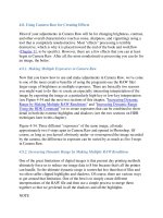
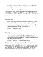
Luminosity
Neutralizes color shifts, as shown in Figure 6-24.
Figure 6-24. An image before and after adding a Curves layer in Luminosity
Blend Mode.
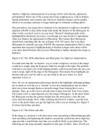
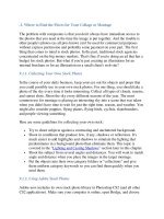
Screen
Creates a high-key effect, which is especially useful for creating a dreamy
mood or adding glamour to a female portrait (see Figure 6-25).
Figure 6-25. An image before and after adding a Curves layer in Screen
Blend Mode.
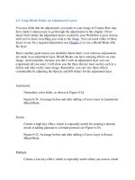
Multiply
Creates a low-key effect, which is especially useful when you want to create
a classical or dark and creepy mood (Figure 6-26).
Figure 6-26. An image before and after adding a Curves layer in Multiply
Blend Mode.
6.4. Changing Hue/Saturation
When the image interpretation you're after is all about color that goes beyond what
you're likely to shoot in the original and exists only in your imagination, it's
definitely time to think about the Hue/Saturation adjustment layer. This is once
instance where it's especially useful to have the nondestructive nature of an
adjustment layer on your side. This command makes it possible to boost the
intensity of colors far beyond anything your screen can see or a printer can print.
So before you even start to use it, turn on the View Gamut Warning command,
especially if you plan to boost saturation rather than reduce it.
As you probably know or will see as soon as you open the dialog, changing the
intensity of colors isn't all this dialog does. It also lets you change the overall Hue
or color balance of the image. Yet another slider lets you change the brightness of
the image's midtones and is especially worth giving a try when you want to bring
the image back into gamut by sacrificing brightness for color intensity. One again,
keep the Preview box checked so that you can use these sliders interactively.
6.4.1. When to Change Saturation
If you've made your shot in dull or foggy lighting conditions, increasing saturation
may be the way to bring the image back to life. Or sometimes you just want to
increase the impact of a colorful subject, such as a punk hairdo or an iPod
billboard
(see Figure 6-27).
Figure 6-27. A colorful image before and after having its color saturation
enhanced.
Granted, the Figure 6-27 is an exaggeration. Fujifilm discovered sometime ago
adding saturation to the colors of nature often adds to the appeal of an image.
Forests look greener, wild flowers pop, and skies are bluer.
On the other hand, if you turn on Gamut Warning and start seeing solid gray
blotches in the brightest colors, the Hue/Saturation adjustment layer should be your
first choice for rescuealthough anything that turns down brightness or desaturates
color can be a candidate. Just lower the Saturation or Brightness. (You can even try
changing the color balance, although that's likely to produce a result that is
unacceptable.)
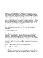
6.4.2. Mapping Hue/Saturation to a New Color Model
The Hue/Saturation adjustment layer can be used to completely remap the colors in
the image. This can often be a wonderful punk or fantasy effect. Note that there are
two color spectrum ramps at the bottom of the Hue/Saturation dialog (Figure 6-
28).
If you go to the Master menu (above the sliders) you will see the names of all the
adjustable color ranges. Choose one and the lower color ramp will become
bracketed; this will allow you to adjust the bracket to widen or narrow the range of
colors. Then, as you move the Hue slider the colors within that target spectrum are
remapped.
Figure 6-28. The Hue Saturation dialog.
After playing with the possibilities for a while, try changing the Opacity and Fill of
the Hue/Saturation layer. You can also try painting black or dark gray into the
Layer Mask to bring portions of the image back to the original colors. In the before
and after image in Figure 6-29, all of these adjustments have been done in the
righthand image.
Figure 6-29. In the after image, the colors for yellow have been remapped by
moving the Hue slider. Also, details in some of the shadows, such as the interior of
the closest sailboat, have been brought back to life by masking them from the
effects of the Hue/Saturation adjustment layer.
NOTE
You can use the eyedropper in the Hue/Saturation dialog to pick a color to
transform instead of choosing a more general color from the Master menu. This is
a good way to change the color of the sky from red to pink, for example. Wi
th a bit
of masking, you could even use it to change the color of an object, such as a car or
shirt.
6.5. Color Balance Techniques
It's often hard to adjust color balance correctly because one part of the image is lit
by a different color of light than another. I'm not talking about changing the color
balance of a specific area but correcting all the areas of the image that were lit by a
light source of a different color than the main light source. Examples of this would
be colors reflected from walls, clothing, or tablecloths. Another common example
would be a portrait taken by window light. The highlights might be lit by daylight
and the shadows by the tungsten bulbs lighting the interior.
6.5.1. Using a Color Balance Adjustment Layer
The Color Balance adjustment layer is nondestructive, but not all that controllable
when it comes to color balancing a specific brightness range in the image. You can
choose whether the adjustments affect highlights, midtones, or shadows. You can
also check a Preserve Luminosity box so the brightness range doesn't change as
you make your adjustments.
In Figure 6-30, I've rebalanced the highlights so that the skin tones are warmer in
the highlights, while the rest of the image has retained the original color balance.
The end result is that the picture looks even more romantic.
Figure 6-30. On the right, the Highlights radio button was turned on and the
Yellow slider increased by about 25 percent. Notice the warmer tones in the
highlight areas and especially in the models' faces.
6.5.2. Using the Curves Adjustment Layer for Color Balance
I don't usually think of Curves as a way to adjust color balance, but you and I both
should. It's too easy to forget that you can pick a single color channel from the
drop-down menu on the Curves dialog and apply the curves to that color. This
allows you to easily increase or decrease particular ranges of color. If your purpose
in changing color balance is to set a different mood, changing small areas of color
in the image can do it. It's also a good device for correcting colors in a limited
spectrum in the image that might be caused by reflections or stray light. In Figure
6-31, the reds in the tree bark and the green of the vegetation and moss were both
intensified in their own channels of the Curves layer.
Figure 6-31. The original image (left) and the same image after disproportionately
changing color in two of the channels.
6.5.3. Levels Adjustment Layer
The Levels adjustment layer is also a good way to control color in a single channel.
Again, you just choose the desired channel from the pop-up menu on the Levels
dialog box. You can also control the range of that color a bit more accurately by
moving the Highlight, Shadow, and Midtone sliders to limit the range of colors that
will be affected in each channel. Figure 6-32 is an example of the sort of fantasy
effects that can be created this way.
Figure 6-32. In the after image, each color channel was limited to about one-third
of its normal brightness range. The adjustments were totally arbitrary.
6.5.4. The Auto Commands in Levels
If you followed my recommendations for adjusting the Levels adjustment layer in
the Layers Workflow layers by adjusting each of the color channels individually,
you have already come pretty close to attaining perfect color balance. If you
haven't, I strongly suggest you go to the "Levels for Shadow, Highlight, and
Overall Brightness" section of this chapter. There is a quicker way to do this,
which is totally destructive: by using the Auto Color command in the Image
Adjustments menu. Of course, nothing in Photoshop is quite what it appears to be
and if you look carefully at the Levels dialog you'll see a button labeled Auto. The
default for this command is to do exactly what Auto Color does by clipping each
channel Histogram at its minimum and maximum values. In fact, you can easily
incorporate that adjustment into the Workflow Layers action so that this button is
clicked as soon as the Levels layer is created. Now, when you're really in hurry,
you'll have all your images auto color corrected. Figure 6-33 shows the result of
clicking the Auto button using the default Enhance Per Channel options. To change
the defaults, click the Options button.
Figure 6-33. A subtle but dynamic change in the color balance using the
Te
mperature and Tint sliders in Camera Raw compared to using the Auto button in
a Levels adjustment layer (right).
NOTE
Levels can be used to correct or subjectively change the overall (midtone) tint of
the images channel by channel, just as you do when using the Color Balance
command. Go back to the individual color channels and drag the midtone sliders.
Be sure to have the preview box checked so that you can see the result.
6.5.5. When to Use Hue Instead of Color Balance
Since both Hue/Saturation and Color Balance adjustment layers change the overall
color balance of the image, you may wonder when to use one instead of the other.
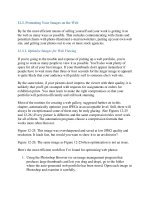
Use Hue/Saturation when you want to:
Color balance a CMYK image for fine-tuning output to offset printing
devices (see Chapter 12).
Create an effect that changes one set of basic colors to another. See Figure 6-
34 for another example of this.
Figure 6-34. An image as it came out of Camera Raw adjustment (left) and
using the basic workflow layers in conjunction with the Hue/Saturation
adjustment layer (right).
Change the color balance or a range of colors and add or subtract saturation.
Subdue the effect by lowering the opacity or fill of the adjustment layer.