Dot Net Nuke for Dummies phần 5 potx
Bạn đang xem bản rút gọn của tài liệu. Xem và tải ngay bản đầy đủ của tài liệu tại đây (1.07 MB, 41 trang )
Adding an announcement
Here’s how to add an announcement to the Announcements module:
1. Select Add New Announcement from the module menu.
This takes you to the Edit Announcements page.
2. Enter a title for the announcement into the Title text box.
The title of the announcement is displayed on the page. For example, if
you enter First Home Buyer Grant as the title, this is the text displayed
on the page.
3. Enter a description of the announcement into the Description text box.
The description is displayed in the module below the title. The descrip-
tion can include links, images, and all the usual RTE formatting options.
4. (Optional.) Select the Link Type.
Selecting a link for an announcement is optional. If you leave the Link
Type set to None, no link is added. See “Getting Around with Links” ear-
lier in this chapter for details on the other types of links you can set.
5. Click the Calendar
link and select the Publish Date.
The date you select here will be displayed beside the announcement
title for this item and the announcement will not be displayed on the
Web site until that date. This means you can create announcements in
advance to ensure that your Web site information is always up-to-date.
Figure 5-7:
The
Announce-
ment module
displays a
list of
announce-
ments with
an optional
link to
read more.
141
Chapter 5: Delivering Content Right Out of the Box
10_798439 ch05.qxp 3/22/07 9:13 PM Page 141
6. (Optional.) Enter the position of the announcement into the View
Order text box.
This step is optional. Entering a number here sets the order of each
announcement. For example, enter 1 to make it the top announcement. If
you don’t enter a number here, the announcements are all given a zero
(0) and order themselves according to their publish date, with the most
recent publish date at the top of the module.
7. Click the Update
link.
The announcement is now displayed in the Announcements module. The
current date is displayed beside the module title and a Read Mor
e . . .
link provides access to the link.
Setting the displayed announcements
Each Announcements module includes two settings that enable you to con-
trol which announcements are displayed based on their publish date.
Here’s how to set the displayed announcements:
1. Select Settings from the module menu of an Announcements module.
This takes you to the Module Settings page for this module.
2. Click the Maximize button beside Announcements Settings.
This displays the different settings available for this module.
3. Enter a number into the History (Days) text box.
The number controls how many days’ old displayed announcements can
be. For example, entering 3 displays announcements from today, yester-
day, and the day before. Any older announcements will not be displayed.
4. Check the Display Future Items check box if required.
Check this box to set this module to display announcements that have
not reached their publish date yet. This lets you use the module to
announce upcoming events in advance. Leaving this box unchecked
keeps future announcements hidden. This setting doesn’t affect the
History setting above.
5. Click the Update
link.
The announcements module will now be displayed and any existing
announcements affected by your changes will be hidden or displayed
accordingly.
142
Part II: Putting the Power of DotNetNuke to Work
10_798439 ch05.qxp 3/22/07 9:13 PM Page 142
Listing Your Contacts
For many people, your Web site is the first place they come to find out about
your business. If they like what they see, you want to make it easy for them to
contact you. We find it really annoying when a Web site doesn’t provide you
with a way to contact anyone who actually works there. This is fine for multi-
nationals, but for most businesses, you want to encourage customers to
come to you. The Contacts module, shown in Figure 5-8, is a great way to give
visitors quick access to contact information. Alternatively, you can use the
module on pages that are only visible to your customers or your staff,
thereby limiting who can access the information.
Here’s how to add a contact to the Contacts module:
1. Select Add New Contact from the module menu.
This takes you to the Edit Contacts page.
2. Enter the person’s full name in the Name text box.
You can enter the person’s name however you like; for example title,
first name, last name; or last name, first name, and no title. For instance,
you could enter the name as either Mr. Luke Marshall, or as Marshall,
Luke. Keep in mind that the contacts will be listed in alphabetical order
based on the name you enter. The Name field is the only mandatory field
on this module, so you can choose what other information you want to
fill in for each contact.
3. Enter the person’s role within your business into the Role text box.
For example, Senior Accountant.
4. Enter the person’s e-mail address into the E-mail text box.
For example,
Figure 5-8:
The
Contacts
module
displays a
list of
Contacts
within your
business
and their
contact
details.
143
Chapter 5: Delivering Content Right Out of the Box
10_798439 ch05.qxp 3/22/07 9:13 PM Page 143
5. Enter the person’s telephone numbers into the Telephone 1 and
Telephone 2 text boxes.
6. Click the Update
link.
The contact will now be displayed in the Contacts module. Users can
click on the E-mail address to send an e-mail to the person.
The E-mail address field has been created in a tricky way to prevent spam-
ming software from reading it and sending you buckets of spam.
Downloading with Documents
The Documents module displays a list of documents, shown in Figure 5-9,
that are located either within your Web site or on another Web site. Each doc-
ument listing includes a link to view the document and one to download it.
Here’s how to add a document to the Documents module:
1. Select Add New Document from the module menu.
This takes you to the Edit Documents page.
2. Enter a title for the document into the Title text box.
The title of the document is displayed on the page. For example, if you
enter Newsletter as the title, this will be the text displayed on the page.
This field and the Link field are both mandatory. All other fields are
optional.
Figure 5-9:
The
Documents
module
displays
a list of
documents
with links to
browse
or down-
load the
document.
144
Part II: Putting the Power of DotNetNuke to Work
10_798439 ch05.qxp 3/22/07 9:13 PM Page 144
3. (Optional.) Enter a description of the document into the Description
text box.
The description is not displayed in the module by default.
You can change which fields are visible by using Module Settings.
4. (Optional.) Enter a category for the document into the Category text box.
For example, PDF format. The category will be displayed in the module
by default.
5. (Optional.) Click the Change Owner
link and select a new owner if
required.
Your first and last name is displayed in the Owner column for each docu-
ment you add. This setting lets you change the owner to any other user.
You may want to do this if you are loading a bunch of documents that
belong to other people. For example, if you are a Web site Administrator
and need to manage a list of documents for someone else, you would
change the Owner field to that person so that users of the module know
who to talk to about the document.
6. Set the Link by using the Link Type control.
See “Getting Around with Links” for details on the types of links you
can set.
7. Click the Update
link.
The document is now displayed in the Documents module. Other infor-
mation such as the Owner (your name), the date the document record
was last updated, and the size of the document will also be displayed.
Click on the document title to view the document in a Web browser, or
click the Download link to download it to your computer.
If the document is located on an external resource, the size of the document
will be displayed as Unknown.
Sneaking a Peek with IFrame
The IFrame module can frame either a page from another Web site or a file
within your Web site inside a page on your site, as shown in Figure 5-10. In
other words, the IFrame module displays a page from another Web site on a
page of your Web site. If the IFrame frames a Web site page, that page still has
all of its functionality intact, so you can navigate around the Web site all from
the armchair comfort of your own Web page.
145
Chapter 5: Delivering Content Right Out of the Box
10_798439 ch05.qxp 3/22/07 9:13 PM Page 145
Here’s how to display another Web site within a page on your Web site:
1. Select Edit IFrame Options from the module menu.
This displays the Edit IFrame page.
2. Select URL (A Link to an External Resource) as the Link Type for the
Source field.
This displays a text box.
3. Enter the URL for the Web site into the text box below Location: (Enter
the Address of the Link).
Ensure that you have entered http:// only once for the URL.
4. Enter a number to set the width in pixels for the IFrame into the
Width text box.
For example, enter 500 to set the width to 500 pixels. You can also set
the width as the full width of the pane by entering 100%.
5. Enter a pixel amount to set the height of the IFrame into the Height
text box.
For example, enter 800 to set the width to 800 pixels. You cannot enter a
percentage in this field.
Figure 5-10:
The IFrame
module
displays a
page from
another
Web site on
a page of
your Web
site.
146
Part II: Putting the Power of DotNetNuke to Work
10_798439 ch05.qxp 3/22/07 9:13 PM Page 146
6. Choose to hide or display vertical and horizontal scroll bars on the
IFrame by selecting an option from the Scrolling drop-down box.
This field is set to Auto by default, which displays scroll bars only when
required to view the whole Web page. The other options are No, which
doesn’t display any scroll bars, and Yes, which always displays scroll bars.
7. Choose to hide or display a thin border around the Web page by set-
ting the Border drop-down box.
Select No to hide the border or Yes to display the border.
8. Click the Update
link.
This displays the Web page within the IFrame. You might need to change
the settings a few times to get it to look right.
Showing Pictures, Movies, and
More with the Media Module
The Media module allows you to display image, video, and audio files, shown
in Figure 5-11, on your Web page. The media can either be located on another
Web site, or uploaded to your Web site. The Media module also lets you add a
link from an image.
Displaying an image with a
link to another Web site
Here’s how to display an image with a link to another Web site:
1. Select Edit Media Options from the module menu.
This displays the Edit Media page.
Figure 5-11:
The Media
module
displaying
an audio file.
147
Chapter 5: Delivering Content Right Out of the Box
10_798439 ch05.qxp 3/22/07 9:13 PM Page 147
2. Select a Link Type at the Media field and enter or select the image.
The image can either be located in the Administrator’s File Manager
(File) or on another Web site (URL). See “Getting Around with Links” for
more information on how to select the image.
Make sure your media files have their file extensions such as jpg in
lowercase.
3. Enter a description of the link into the Alternate Text text box.
This is the text that displays when the user mouses over the image; for
example, Click Here to Search for Property.
4. (Optional.) Enter a width in pixels for the image into the Width text box.
This field lets you modify the width of the displayed image. Leave this
field blank to display the true width of the image.
5. (Optional.) Enter a height in pixels for the image into the Height
text box.
This field lets you modify the height of the displayed image. Leave this
field blank to display the true height of the image.
6. (Optional.) Select the Link Type for the link at the Link field.
The link can go to another Web site, another page on this Web site, or to
a file on this Web site. See “Getting Around with Links” for more informa-
tion on how to set the Link Type.
7. Click the Update
link.
The image is now displayed, as shown in Figure 5-12. Clicking on it takes
the user to the selected link.
The Media module provides a simple way to create buttons. Just hide the
module container, and voilà! See Chapter 4 for more details.
Displaying a movie
Your Web site hosting company controls the formats you can upload to and
display on your Web site. If you want to include MP3 or WMV movie files, you
need to ask your host set this up for you. See Chapter 3 for more details.
Here’s how to display a movie that has been uploaded to your File Manager
by using the Media module:
148
Part II: Putting the Power of DotNetNuke to Work
10_798439 ch05.qxp 3/22/07 9:13 PM Page 148
1. Select Edit Media Options from the module menu.
This displays the Edit Media page.
2. Select File (A File on Your Site) as the Link Type and select the movie.
See “Getting Around with Links” for more information on how to set the
link to the movie.
3. Enter a description of the movie into the Alternate Text text box.
This is the text that displays when the user mouses over the movie.
Note: At the time of writing, the Alternate Text wasn’t actually display-
ing, but was still a required field.
4. Enter a width in pixels for the movie into the Width text box.
This field lets you set the width of the movie. Leave this field blank to
display the standard size for this movie.
5. Enter a height in pixels for the image into the Height text box.
This field lets you set the height of the movie. Leave this field blank to
display the standard size for this movie.
6. Click the Update
link.
The movie is now displayed on the page inside your usual media player,
as shown in Figure 5-13. You have buttons to control the playback of the
movie.
Figure 5-12:
The Media
module
displaying
an image
with a link.
This is a
simple way
of creating
buttons.
149
Chapter 5: Delivering Content Right Out of the Box
10_798439 ch05.qxp 3/22/07 9:13 PM Page 149
Figure 5-13:
The Media
module
displaying a
movie from
another
Web site on
a page of
your Web
site.
150
Part II: Putting the Power of DotNetNuke to Work
10_798439 ch05.qxp 3/22/07 9:13 PM Page 150
Chapter 6
Adding Bells and Whistles
to Your Site
In This Chapter
ᮣ Remembering dates with events
ᮣ Subscribing with news feeds (RSS)
ᮣ Going ad hoc with User Defined Tables
ᮣ Sharing spreadsheets and data with XML/XSL
ᮣ Creating online surveys
ᮣ Leveraging partnerships with the Banners module
ᮣ Seeing who’s at home with UsersOnline
T
here are a lot of sites out there on the World Wide Web today. We haven’t
quite managed to count them all, but there are millions! Standing out
among the crowd can sometimes be difficult. Luckily the modules included
with DNN let you add some special touches to your Web site.
The modules covered in this chapter offer interesting, attractive, and useful
ways to do it. This chapter shows you how to use seven modules that are
included with DNN. These modules require a small amount of configuration
but aren’t at all complicated.
The Events and User Defined Tables modules present content in an interest
and interactive layout. The News Feeds module and XML/XML modules dis-
play data created outside of DNN. The Survey module lets you create online
surveys, and the UsersOnline module displays information and statistics on
your user membership. Read on to find out how to make your Web site stand
out with these great modules.
This chapter also explains how to add vendor accounts to your Web site.
Vendors are companies that have advertising banners or messages on your
Web site. The Administrator manages the vendor account, the uploading of
banners, and has access to banner reports.
11_798439 ch06.qxp 3/22/07 9:16 PM Page 151
Keeping Track of Dates
with the Events Module
The Events module displays a list of events in a monthly calendar, as shown
in Figure 6-1. Users can click through different months, go to events for any
day, or view a list of all events for any given day.
This module has a large number of settings on the Module Settings page that
provide you with ways to make your Events module more interactive, or you
can let your users choose to be notified of events or to enroll for events.
These settings are out of the scope of this book.
Setting up the events calendar
You have to update the module settings page of the Events module before
you can see the event calendar inside the module. You can do this simply by
going to the page and clicking Update; however, it is a good idea to set the
General Settings at this point.
Here’s how to set the general settings of the Events module:
Figure 6-1:
The Events
module
displays a
monthly
calendar of
events.
152
Part II: Putting the Power of DotNetNuke to Work
11_798439 ch06.qxp 3/22/07 9:16 PM Page 152
1. Add an Events module to a page.
The module displays the message Please Select Settings to configure
Events Module .
2. Select Settings from the Events module menu.
This takes you to the Module Settings page.
3. Click the Maximize button beside the Event Module Settings section.
This takes you to the Module Settings page. If you want to perform a
super-speedy setup, you can accept all the default general settings and
skip to Step 9.
4. Enter a time interval in minutes into the Edit Time Interval.
This setting controls the time periods displayed when you are adding
events to the calendar. For example, entering 60 enables you to schedule
events only on the hour. The default setting is 30 minutes.
5. Select one or more of the following options, which can be updated later:
• Display Tooltip: Select to display additional event information as a
mouseover tooltip.
• Disable Month View Cell Display: Select this option to display the
calendar with event details below. Don’t select this option if you
want to display the events inside the calendar.
• Set Event Cell Background Color: Select a background color for
calendar dates with an event. This is useful if you want the events
to stand out in the calendar.
• Disable Event Month View Inline Styles: Select to prevent styles
being changed in the calendar design and includes the above field.
• Disable Event Month View Navigation Controls: Select to hide the
V
iew Week, Today, and View Date links displayed above the calendar.
• Disable Event Month View Table for non-edit users: Select to hide
a list of events below the calendar. The list will still be displayed to
users with edit rights to this module.
• Permit Recurring Events: Select to enable recurring events to
be added.
• Prevent Schedule Conflict: Select to stop overlapping events
being added to the calendar.
• Show Events on Next Month (or Prev Month): Select to display all
events in the displayed calendar month including events that
occur in the previous or subsequent month.
• Enable DNN Search: Select to make these events searchable by
using the Search module and DNN Searching.
• Weekend Starts Friday: Select to set the weekend as Friday and
Saturday. The default setting is Saturday and Sunday.
153
Chapter 6: Adding Bells and Whistles to Your Site
11_798439 ch06.qxp 3/22/07 9:16 PM Page 153
6. Click the Update link.
This displays a monthly calendar.
Adding event categories
When you add an event, you can select a category for the event. You need to
add the categories yourself. The selected category is displayed on the Event
Detail page.
Here’s how to add event categories:
1. Select Edit Categories from the module menu.
This displays the Edit Categories page.
2. Enter a title for the category into the Category text box.
The title is displayed in the Categories drop-down box on the Edit
Events page where you add and edit the event.
3. (Optional.) Select a color for the event from the drop-down box.
This sets the background color of the event details displayed in the
calendar but not the whole day cell. Leave the field as None for no
background color.
4. Click the Update
link.
This displays category below.
5. Repeat Steps 2 through 4 for each new category.
You can delete categories but you can’t edit them. To change the name or
color of a category, you must delete it and then add it again with the new
details. Unfortunately, this removes it from any associated events. Reduce
or avoid this by planning and adding them before adding events.
Adding event locations
When you add an event, you have the option of selecting a location for the
event. You need to add the locations yourself. Location can be created with
an option link that displays a map of the location.
Here’s how to add event locations:
1. Select Edit Locations from the module menu.
This displays the Edit Locations page.
2. Enter a title for the location into the Location text box.
154
Part II: Putting the Power of DotNetNuke to Work
11_798439 ch06.qxp 3/22/07 9:16 PM Page 154
The title is displayed in the Location drop-down box on the Edit Events
page where you add and edit the event. Locations can be general or
specific. They can be a list of different rooms in your building, such as
Board Room or Conference Room 1; or they can be full addresses such
as Lvl 1, 11 St Kilda Rd, Melbourne, Australia.
3. (Optional.) Enter a URL to a map or directions to the location into the
Map URL text box.
You can add any URL here. It may be to a page on your Web site where
you have directions and more information on the location. Alternatively,
it may link to a Web site such as Google Maps (www.google.com/maps),
which enables you to locate a map and link to that page.
4. Click the Update
link.
This displays the location on this page and adds it to the location drop-
down box.
5. Repeat Steps 2 through 4 for each new location.
You can delete locations but you can’t edit them. To change the title or map
URL of a location, you must delete it and then add it again with the new
details. Unfortunately, this removes it from any associated events. Reduce
or avoid this by planning ahead and adding locations before adding events.
Adding events
Here’s how to add an event to the calendar:
1. Select Add Events from the module menu.
This displays the Edit Events page, as shown in Figure 6-2.
2. Enter a title for the event into the Title text box.
The title of the event is displayed on the page. For example, if you
enter Learn How to Fly a Kite as the title, this is the text displayed
in the calendar.
3. Select the start date and time of the event from the Start Date/Time field.
This is the first date when the event is listed in the calendar. The time is
also displayed.
4. Select the end date and time of the event from the End Date/Time field.
This is the last date when the event is listed in the calendar. The time is
also displayed.
155
Chapter 6: Adding Bells and Whistles to Your Site
11_798439 ch06.qxp 3/22/07 9:16 PM Page 155
5. Set the Time Zone field to the correct time zone for the event.
If you don’t set the time zone field, it defaults to the user’s own time
zone, which he can set on his Profile page.
6. Select an option from the Importance drop-down box.
Select Low, Normal, or High as the importance of this event. The
selected option is displayed on the Event Detail page. If the user
chooses to export details of the event to the desktop of his computer,
the importance is also saved.
7. Select a category from the Category drop-down box.
The Category name is displayed on the Event Detail page, as shown in
Figure 6-3. See “Adding event categories” earlier in this chapter to find
out how to add categories to this list. If the user chooses to export
details of the event to the desktop of her computer, the category infor-
mation is not saved.
8. Select a location from the Location drop-down box.
The location name is displayed on the Event Detail page. See “Adding
event locations” earlier in this chapter to find out how to add locations
to this list. If the user chooses to export details of the event to the desk-
top of her computer, the location information is not saved.
9. (Optional.) Enter any additional information into the Notes RTE.
Notes entered here will be displayed in the calendar.
10. (Optional.) Display an image for the event by setting these Images
settings or skip to Step 11 if you don’t want to add an image.
a. Click the Maximize button beside the Image Settings section.
b. Select the Display Image? check box.
c. Choose a Link type and select the Image URL.
d. (Optional.) Enter the pixel width into the Width field.
This setting overrides the original image width.
e. (Optional.) Enter the pixel height into the Height field.
This setting overrides the original image height.
11. Click the Update
link.
This displays the event in the calendar. Click on the linked event title to
view full details of the event.
156
Part II: Putting the Power of DotNetNuke to Work
11_798439 ch06.qxp 3/22/07 9:16 PM Page 156
Figure 6-3:
Clicking the
event in the
calendar
displays this
detailed
event page.
Figure 6-2:
The Edit
Event page,
where you
add new
events and
edit existing
ones.
157
Chapter 6: Adding Bells and Whistles to Your Site
11_798439 ch06.qxp 3/22/07 9:16 PM Page 157
Subscribing to News Feeds
The News Feeds module enables you to easily display content from other
Web sites on your Web site. The News Feeds module uses Really Simple
Syndication (RSS), which lets you display news that is syndicated by another
Web site. Such Web sites supply a URL that is entered into the News Feeds
module to displays their news. This is a great way of displaying instant con-
tent without writing a word!
If this module is not installed, see Chapter 3 for more on how to install
included modules.
Displaying a news feed
A news feed typically consists of a summary of news items, as shown in
Figure 6-4. Each item has a link to read more about that news item. Clicking
on the link takes the visitor away from your Web site and to the Web site
providing the news service.
Here’s how to display a news feed in the News Feeds module:
1. Select Edit News Feed from the News Feeds module menu.
This takes you to the Edit News Feeds screen.
2. Select URL (A Link to an External Resource) as the Link Type for the
News Feed Source field.
This displays the Location: (Enter The Address Of The Link) field.
3. Enter the URL of the news feed into the Location: (Enter the Address
of the Link) text box.
In this example, we use the free Latin American and Canadian News
from World Press Review. The URL is www.worldpress.org/feeds/
americas.xml. Look for news feeds that display the commonly used
little orange XML button beside them as this indicates that the feed will
work in this module.
4. If a style sheet is required, set the Link Type to the required style
sheet at the News Feed Style Sheet field.
Some news feeds require you to set a style sheet here so that the news
feed displays correctly on the Web page. If this is the case, you can get
the link to the style sheet file or download the style sheet file from the
news feed service.
If you are using our sample URL, you won’t need to do this step.
158
Part II: Putting the Power of DotNetNuke to Work
11_798439 ch06.qxp 3/22/07 9:16 PM Page 158
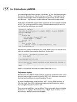
5. Click the Update link.
The news feed is now displayed on your Web page. Click on a link to see
how the news feed works. Note: The link will open inside the same Web
browser.
Subscribing to a news feed
News feeds are available on every topic you can imagine. When we did a
Google search on “free news feeds” at the time of writing, we got more than
50,000 results! If, on the other hand, you choose to subscribe to a paid news
feed service, the News Feeds module includes security options that allow you
to enter your account information for the paid service.
Here’s how to set the security options on a news feed:
1. Select Edit News Feed from the News Feeds module menu.
This takes you to the Edit News Feeds screen.
2. Add the news feed.
Set the details of the news feed as described in Steps 2 through 4 in the
preceding section.
Figure 6-4:
The News
Feeds
module.
159
Chapter 6: Adding Bells and Whistles to Your Site
11_798439 ch06.qxp 3/22/07 9:16 PM Page 159
3. Set the account information in the Security Options (optional) section.
Enter the username and password details provided by the news service.
4. Click the Update
link.
The news feed is now displayed on your Web page. Click on a link to see
how the news feed works. Note: The link will open inside the same Web
browser.
Going Ad Hoc with the User
Defined Table Module
The User Defined Table (UDT) module provides Administrators with the ability
to design and populate a table of information, as shown in Figure 6-5. Using this
module is a great alternative to the Table tool provided in the RTE because you
can design and manage the table separately from its content. Columns are set
to enable one of these types of information to be entered or selected: Text,
Rich Text (HTML), Integer, Decimal, Date and Time, Date, Time, True/False,
Email, Currency, URL, Image, file Download, or a Calculated Column.
After the table is designed, you can add one or more rows of information into
the table, similar to the way you add a row of information to the Contacts
module or the Documents module.
If this module is not installed, see Chapter 3 for more on installing the
included modules.
Building a UDT table
Here’s how to build a table in the UDT module:
1. Select Manage User Defined Table from the module menu.
Figure 6-5:
A table
designed by
using the
User Defined
Table
module.
160
Part II: Putting the Power of DotNetNuke to Work
11_798439 ch06.qxp 3/22/07 9:16 PM Page 160
This takes you to the Manage User Defined Table page, shown in Figure 6-6,
where you can build and edit the table design. The page displays an area
where you can add columns to the table, as well as Global Settings and
Display Settings, which set the way information is displayed in the table.
Four existing table columns are displayed at the top of this page. These
columns cannot be deleted but they are not displayed in the UDT unless
you set them as Visible.
2. Click the Add New Column
link.
This creates a row of text boxes where you can enter values for this
column.
3. Check the Required box if this row is mandatory.
Mandatory fields must be filled in when entering data into the table. If
you don’t check this option, the field will be optional.
4. Enter a unique column title in the Title text box.
The title is displayed at the top of this column when the table is saved.
5. Select the type of information that will be entered into this column
into the Type text box.
There are 14 different options to select from, including Text, Decimal,
Date, Time, and so on. Choose the type that reflects the information you
plan to add to this column.
Figure 6-6:
Design and
manage the
UDT on the
Manage
User
Defined
Table
screen.
161
Chapter 6: Adding Bells and Whistles to Your Site
11_798439 ch06.qxp 3/22/07 9:16 PM Page 161
Avoid the Calculated Column field if you can. It requires some pro-
gramming to make it work. If you want to find out more about this
option, visit the Project page of the User Defined Table Module on
the DNN Web site (www.dotnetnuke.com/DotNetNukeProjects/
ModuleUserDefinedTable/tabid/877/Default.aspx). Click the
Pr
oject Downloads link and download the User Manual, which has more
information on this field.
6. (Optional.) Enter the default information for this column in the
Default text box.
The information entered here is displayed in this column when you are
entering data into the table later. You can delete or change the default
value at any time.
Do not enter a default value for a Download type field as it will cause an
error. If you do choose to enter a default value for other types, make
sure that it is the right value for the field type. For example, if the field
type is set to Date, you can only enter a date in the Default field.
Entering text, such as “Enter a date here,” will cause an error.
Here are examples of default values for each column type:
• Text: Enter any text. For example, Enter your text here.
• Rich Text (HTML): Enter any text or HTML. For example, <b>Enter
a short description here</b>.
• Integer: Enter any whole number. For example, 1129.
• Decimal: Enter any decimal number. For example, 1129.11.
• E-mail: Enter an e-mail address here. For example, Jessie.
• Date and Time: Enter a date and/or time. For example, 01/01/2007
09:00 AM.
• Date: Enter a date. For example, 01/01/2007 09:00 AM.
• Time: Enter a time. For example, 09:00 AM.
• True/False: Enter either true or false to display either a selected or
unselected check box, respectively. For example, True.
• Currency: Enter a currency amount. For example, 80.00.Currency
type will automatically be displayed in each row. See Chapter 4 to
find out how to update this setting.
• URL: Enter a URL. For example, www.dotnetnuke.com.
• Image: Enter a URL to an image. For example,
www.dotnetnuke.com/Portals/_default/Skins/
DNN-Minimal/images/dotnetnukelogo.gif.
• Download: Do not enter a default value as it will cause an error.
This field enables an uploaded file to be downloaded.
162
Part II: Putting the Power of DotNetNuke to Work
11_798439 ch06.qxp 3/22/07 9:16 PM Page 162
7. Click the Save button to the left of this row of text boxes to save the
column.
The column is now saved and displayed on the page.
8. Repeat Steps 2 through 7 to add additional columns.
9. Click the Save Settings and Retur
n link to return to the Web page.
Do not change the Type setting on a column as this will display a Warning
message and may require you to rebuild your table. Be sure to design and
build your table before you start adding information (rows) to it.
Adding data to a UDT table
The first couple of times you enter data into the table, you may want to have
a piece of paper with the structure of the table written down to remind you
what type of information needs to entered into each column. This depends
on how big your table is, how many different information types you are using,
and how self-explanatory the titles of the columns are.
Here’s how to add data to a UDT table:
1. Select Add New Row from the module menu.
This opens the Edit User Defined Table page shown in Figure 6-7.
The first four lines of information (CreatedBy, CreatedAt, ChangedBy,
ChangedAt) are automatically recorded when you save the data for
this row. You can see this information each time you edit this row.
2. Enter data into each field.
Required fields are denoted by an asterisk (*) and must be completed.
Usually you can guess the types of data permitted by the type of text
field displayed beside the column title. For example, if the Link Type tool
is displayed for the field and only displays images, you can guess that it
is an image data field.
Number and decimal fields display entered values in the right side of the
field, whereas text fields display data to the left of the field.
3. Click the Update
link to save the data.
This returns you to your Web page. If the wrong type of information has
been entered into a field, you will remain on the Edit User Defined Table
page. In this case, an error message is displayed at the top of the page
detailing which data needs to be modified.
163
Chapter 6: Adding Bells and Whistles to Your Site
11_798439 ch06.qxp 3/22/07 9:16 PM Page 163
Sharing Spreadsheets and
Data with XML/XSL
The XML/XSL module, shown in Figure 6-8, enables the data within an XML
file to display on a Web page by applying an XSL style sheet to it. Although
we’ve been building Web sites by using DNN for several years, we still find
the title of this module a bit intimidating. Never fear! You can use this module
even if, like us, you don’t really understand XML or XSL.
So what are XML and XSL, you ask? XML stands for eXtensible Markup
Language, which may sound a bit confusing. Any search on the Web will give
you a detailed explanation of XML, but, in a nutshell, XML is like HTML in that
it is a computer language that marks up text with special tags. The difference
between the two technologies is that HTML uses the same tags to mark up
the text, whereas XML creates unique tags to mark up the text, depending on
the type of data you are saving.
XSL is an acronym for eXtensible Stylesheet Language. For this module, XSL
or XSLT (eXtensible Stylesheet Language Transformation) refers to a style
sheet designed to transform an XML file into HTML so it can be displayed
on a Web page. Without the XSL file, the data doesn’t display correctly on
the Web page.
Figure 6-7:
Add data to
your table
on the Edit
User
Defined
Table
screen.
164
Part II: Putting the Power of DotNetNuke to Work
11_798439 ch06.qxp 3/22/07 9:16 PM Page 164
To summarize, you need an XML file with a matching XSL file to display data
by using this module. If you don’t know how to create an XSL file, you either
need to find out how to write one or get someone else to write one for you.
Creating an XML file from an
Excel spreadsheet
Many different programs can be used to create XML files. In this example, we
use Excel to create an XML file. Here’s how to transform an Excel spreadsheet
into an XML file:
1. Create an Excel spreadsheet, enter your data, and save the file.
You may want to download our sample Excel spreadsheet from
/>to use for this example.
2. Select File➪Save As from the Main menu.
This opens the Save As dialog box.
3. Navigate to the location where you want to save the XML file.
Figure 6-8:
The
XML/XSL
module.
165
Chapter 6: Adding Bells and Whistles to Your Site
11_798439 ch06.qxp 3/22/07 9:16 PM Page 165


