A Guide to Microsofl Excel 2002 for Scientists and Engineers phần 4 pps
Bạn đang xem bản rút gọn của tài liệu. Xem và tải ngay bản đầy đủ của tài liệu tại đây (1.01 MB, 33 trang )
88
A
Guide to Microsoft Excel
2002
for
Scientists and Engineers
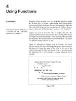
16 lSum
of
3 largest
Exercise
IO:
Array
Formulas
30
I
OR
do
not
act in
the
expected way
when used in array formulas- they
always return a single value, never
an array.
For more array-formula examples
including interesting uses
of
OR
visit www.emailoffice,com/excel/
arrays-bobumlas. html
We have seen some functions which use an array for their input.
The simplest of these are
SUM
and COUNT. In Exercise
8
of
Chapter
4
we used the
MMULTI
function which uses an array for
input but also produces an array
of
values as output. It
is
also
possible to create from simple functions formulas that input arrays.
This
is
a very broad topic
so
we can only touch upon it
in
the next
example.
You may wish to review
Exercise
8
of Chapter
4
before
continuing. For example, have you remembered that we must use
I5J+[aJ+[W]
to complete an array formula entry?
To
investigate array formula we will imagine we have some data
and we need the following quantities: (i) sum
of
the cubes, (ii) a
count of how many values lie
in
a ceratin range (let this be
5
to
IO),
(iii) the sum of the squares of values that lie within that range, and
(iv) the sum of the
N
largest values. Generally one would use an
array formula only with a large data set but it
is
more convenient
to demonstrate it
on
a small set to show how one can check that the
array formula has been constructed correctly.
(a) Set up a worksheet as shown
in
Figure
5.12.
Enter the values
in
A2:AlO
and name this range as
data.
(b) In row
2
enter these formulas and copy them down to row
10:
B2:
=A2"3
C2: =IF(AND(A2>=5), A2<=10, 1,O)
D2: =IF(AND(A2>=5),
A2<=10,
A2"2,0)
Decision Functions
89
In
row
11,
use the SUM function to sum the
B,
C
and
D
columns.
(c) Now we
see
that we can obtain these summations without the
intermediate data. The formulas in the lower part
of
the sheet
are:
C
13:
{=SUM(dataA3)}
C
14:
{=SUM((data>=5)*(data<=lO))}
C
15:
(=SUM((data>=5)*(dat<=l O)*dataY)}
C16:
{=SUM(LARGE(data,{l,2,3}))}
Remember to enter the formulas without the braces and
complete each one with
[+[QShift+[].
Observe how the results from the first three agree with the
summation in line
11.
We could have found the sum of the three
largest values with the non-array formula =LARGE(data,l)
+
LARGE(data,2)
+
LARGE(data,3). However, had we wanted the
sum
of
the 10 largest, an array formula would have been more
convenient.
It
is
instructive to investigate how Excel performs these
calculations. Read all
of the next step before you proceed.
(d) Select
C13 and
in
the formula bar use the mouse to select the
dutaA3
portion
of
the formula. Press
IF9]
to calculate this
part of the formula. Excel responds by displaying
=SUM((8;27;125;216;1000;1331;729;216;125}).
Excel has
generated an array in which each item is the cube
of
the
corresponding item in the
data
range. Press to undo the
evaluation; use the Undo tool if you forget to
do
this.
Experiment with portions
of
the other formulas.
Users
of
Excel
XP
have access to a tool that performs these
evaluations more conveniently. Make
C15 the active cell and
use the command ToolslFormula AgditinglEvaluate Formula.
Click the
Evaluate
button on the dialog box and observe the
result
in
the window. After four evaluations we will have
=SUM({FALSE;
FALSE;TRUE;TRUE;TRUE;TRUE;TRUE;
TRUE;TRUE)*{TRUE;TRUE;TRUE;TRUE;TRUE;FALSE;
TRUE;TRUE;TRUE)*dataA2).
The seventh evaluation gives
=SUM({O;O;1;1;1
;0;1;1;1)*(49;9;25;36;100;121;81;36;25}).
The
next evaluation gives
=SUM({0;0;25;36;100;0;81;36;25})-note
how this matched the data
in
D2:DlO.
Finally we get the result
303.
90
A
Guide to Microsoft Excel
2002
for Scientists and Engineers
1
2
Problems
A
B
C
D
X
Y
z
Result
1.9
12
0
Pass
1
.*
2.*
3.*
4.*
5.*
To
compute the value
of
sin(x)/x, a student uses
=SIN(Al)/Al.
However, this will not give the correct value of
1
when
A1
has
a
value
of
zero. Correct the formula.
Simplifl the formula
in
1
above using
AND
twice.
This problem is for electrical engineers. (a) Using
IF
functions
without
AND
or
OR,
show that the output
(F)
in
the
voter
circuit
below is
YES
(1)
only when the majority of the inputs
are
YES.
(b) Can you suggest a method using
AND
and
OR
without
IF?
A
B
C
D
0
-
0
0
’-
0
The worksheet depicted
in
the figure below can be used to
compute the value
of
a resistor
from
its coloured bands. The
user enters the abbreviation for the colours
in
row 19. Row
2
1
serves the purpose
of
showing the user how the abbreviations
were interpreted. Row
22
returns the first and second digits
and the multiplier. Row
3
displays the resistor’s value and
tolerance. What are the formulas
in
rows
2
1,22
and
23?
Decision Functions
19 Ir
91
r
lo
I
none
20
21
22
23
1
red red orange no colour
j
2
2
1000
I
Value 22000
20%
I
6. Textbooks on numerical computing quite correctly warn ofthe
round-off errors that can occur when subtracting
two
numbers
that are very close
in
size. When the traditional method
is
used
to solve a quadratic equation where
b2
>>
4ac,
the root
of
smallest magnitude
is
found by subtracting from
b
a number
that differs little from it. To avoid this, we first find the
quantity
Q
=
-(b+sign(b)
x
sqrt(b2
-
4ac))D,
and then
compute the roots as
x1
=
Q/a
and
x2
=
c/Q.
AI
B
IC1
D
E
F
IGl
H
I
1
Quadratic Equation
Solver
2
3a
b
C
41 256 1.25E-06
-
-
Construct a worksheet similar to that shown below to compare
the two methods. You will need to look
in
Help for
information on the
SIGN
function. Use an
IF
statement
in
B8
and
B9
such that
B8
contains the numerically larger root
to
facilitate comparison with the alternative method.
5
6 Traditional Alternative
7
disc
6.55360000€+04
Q
-2.56000000E+02
8 Root 1 -2.56000000E+02 Test 1 -2.2422E-12 Root 1 -2.56000000E+02 Test 1 -2.2422E-12
9 Root
2
-4.88282126E-09 Test 2 -2.2421E-12 Root
2
-4.88281250E-09 Test
2
0.0000E+OO
-
Charts
Concepts
Types
of
Charts
This chapter shows how to create graphs from data in a worksheet.
So
why does the chapter have the title
Charts?
Whereas business
people show charts at their meetings, scientists and engineers use
graphs to display their data. The term you use depends on your
occupation but the object is the same. Since the largest market for
Microsoft Excel is the business world, it uses the term charts. We
will do the same
so
that you will remember to look under this term
in the Help facility.
Microsoft Excel offers the user some 300 chart formats including
Line,
XY
(Scatter), Column, Bar and Pie charts. Some of the chart
types are shown in Figure
6.1.
We concentrate on
XY
charts since
these are generally the most useful for scientists and engineers.
When you have mastered this chapter, you
will be able to create
charts of other types with a little experimentation.
Figure
6.1
Line and
XY
(Scatter)
Many Excel beginners are confused by the
two
terms
Line
chart
and
XY
(Scatter) chart.
Let us agree to drop the
scatter
part of the
name; this is a term from statistics and generally has no meaning
to the scientific or engineering users. The diagrams in Figure
6.1
Charts
94
A
Guide to Microsoft Excel
2002
for Scientists and Engineers
Line
chart
!
8
~-1
6-
4-
2-
0,
I
1
2
3
4
add to the confusion about a
Line
and an XYchart. Both types are
capable of displaying their data in line or marker format. Indeed,
we shall see that you can use both lines and markers in a chart.
Line
chart
35
g
15
-
10
-
5-
0,
1
4
9
10
So
how do the two types differ? The XY chart is another name for
the
graph
(or more correctly the
coordinate graph)
with which we
are familiar. This
is
what we need to plot ordered pairs of data to
observe the dependence of one value on another.
A Line chart
is
generally used when the x-values are textual (days
of the week, names of companies, places, etc.). Furthermore, even
when the x-values in a Line chart are numbers, they are treated
as
text. Each x value
is
placed one after the other on the x-axis,
regardless of value. It takes practice to make a Line chart with
numeric x-values since Excel will think there are two y-value
ranges. The trick
is
to make an XY chart first and convert it to a
Line chart. By default, the data points are between the tick marks
on the x-axis but this can be changed.
Moral:
When the x-values are
rw-mk
YOU
normally require
an
XY
chart.
In Figure
6.2
we have charts produced from
two
data sets. The XY
and Line charts made from the first set are very similar but observe
the difference when the x-values have non-regular intervals.
Fl
4
11
XY chart
12
7
0
'1
0
1
2345
XI
Y
II
5
10
32
XY chart
35
10
5
~~
0
0
5
10
Charts
95
Embedded Charts
and Chartsheets
A
chart may be created either on a worksheet or on a separate
chartsheet. In the former case we say the chart is
embedded.
We
shall make all our charts embedded since it is then easier to see
how the chart changes when the data
is
altered. The steps for
creating and modifying a chart in its own sheet are essentially the
same as for an embedded chart. This is explained in Exercise
1.
Anatomy
of
a Chart
Objects
You know that the x-axis is the horizontal axis while the y-axis is
vertical. You are also familiar with the terms
titles, legends
and
gridlines.
However, the terms
chart area
and
plot area
may be
new. Their meaning
is
demonstrated in Figure 6.3. Collectively,
these items are called
objects.
The chart area is everything within
the border. The plot area is everything other than the titles and
legend. In this chart, the plot area has a pattern. If you do not need
the pattern you must set pattern to None, as is explained in
a
later
exercise. Gridlines are optional; you may include vertical and/or
horizontal gridlines.
Chart Title
7
6
5
$4
c
$
2
1
0
0
2
4
6
8
X
Axis
Title
-
Chartarea
-
Data series
-
Plot area
-
Legend
-
Gridline
-
X-axis
Figure
6.3
Markers and lines
The data in this chart is plotted with both
markers
and a
line.
You
may opt to have one or both of these. You can also specify neither
markers nor line in which case the data disappears! The colour of
each may be specified separately. There are a number of styles
(e.g. solid or dotted) and width options for the line. Similarly, the
shape
of
the markers may be changed. The scale (maximum and
minimum values) of each axis may be changed, and there are
96
A
Guide to Microsoft Excel
2002
for Scientists and Engineers
options to change the number and placement
of
the
tick
mark
on
each axis.
Smoothing Option
One
of
the options for changing the appearance
of
a chart
is
smoothing.
This option may be selected as the chart is made or
later using either the
Chart type
or the
Format Data Series
dialog.
In
most cases we will want to smooth our data but there may be
occasions when it is inappropriate to smooth experimental data.
Figure
6.4
shows the effect
of
this option when plotting the
functiony
=
3x2
+
4.
You may wish to experiment with this feature
when working through the exercises.
D
"
2-
n
-2
-1
0
1 2
I
21
I
-2
-1
0
1
2
Figure
6.4
It
is
most important that you understand that the smooth line
is
not
necessarily the line
of
best fit. In general the smooth line
is
a
cubic
spline
which is a series
of
curves constructed to join seamlessly.
The line
of
best fit
is
called the
trendline
in
Excel. We explore this
in the next chapter.
Exercise
1
:
Creating
In this exercise we will create an
XY
chart. Figure
6.5
shows the
data we will plot and the chart that will result.
(a)
Start a new workbook.
In
the range
A
1
:B6
type the data shown
an
XY
Chart
in
Figure
6.5.
(b)
Select the range
A1
:B6.
Click the Chart icon which is on the
Standard toolbar. This will invoke the Chart Wizard -a series
of
four dialog boxes that help you construct the chart. You may
later change any of the options selected
in
these four steps.
Charts
97
(c)
In
Step
1
of
the Chart Wizard (Figure
6.6)
we specify the type
and subtype
of
chart. For this exercise we require an
XY
type
chart. For the subtype, select chart with smoothed lines and
markers. Press the
Press and Hold to View Sample
button to
get a thumbnail sketch
of
how the chart will appear.
I
0
1
2
3
4
5
12
I
X
values
13
I
I
I
I
I
I
Figure
6.5
Figure
6.6
(d) Click the
Next
button to bring up Step
2
as shown in Figure
6.7.
Generally, one need
do
nothing in Step
2
except press the
next button.
98
A
Guide to Microsoft Excel
2002
for
Scientists and Engineers
Graph
I
12
10
8
6
4
2
0
0
*
3
d
5
x
takt5
Figure
6.7
(e) Step
3
of the Chart Wizard (Figure
6.8)
offers a number of
options. We began the exercise by selecting a range of data
together with headers; Excel has taken the text in the second
column as the title. Click
in
the
Title
box and make the title
Graph
I.
Add the
two
axes titles.
Figure 6.8
Charts
99
when
dragging a chart,
be
moved parallel
to
column or the row
Holding down
chart
is
aligned
with
when
it
is
moved or resize
'tricks' help when
align several charts
chart
is
outlined
in
colour-coded
rangefinders
-
see Figure
6.10.
(f)
Open the
Gridline
tab of the dialog box and click the
appropriate boxes to remove all gridlines. If you have jumped
ahead to Step
4,
use the Back button to return to Step
3.
Now
open the
Legend
tab and click the box to remove the legend. A
legend is redundant when there is only one data series.
Figure
6.9
(g) Use the
Next
button to proceed to Step
4
(Figure
6.9).
It is here
that we may specify if the chart is to be embedded in the
worksheet or to be placed on a separate chartsheet. We will opt
for the former. Press
Finish
to complete the Chart Wizard.
At this point the chart is displayed with eight solid boxes
(handles)
around its border. When they are showing, we speak
of the chart as being
selected
or
activated.
A Chart toolbar is probably visible.
If
not, use YiewlToolbars
and click on Chart
so
that this toolbar appears whenever a
chart is selected. We will use this in the next exercise.
IO0
A
Guide to Microsoft Excel
2002
for Scientists and Engineers
(h)
In
all likelihood, you will be disappointed with the product.
Do
not despair, it can quickly be made very acceptable. If the
handles are absent, click just inside the chart.
Hold down the mouse button and drag the chart to the desired
position. Pull any of the handles to resize the chart.
Click on the inner border (the border of the plot area) and it
will display handles. Carefully drag the handles
in
the centre
of the bottom and top borders (Figure 6.10) to improve the
appearance of the chart. The maximum x-axis value will be
5
or 6, depending on what size you make your chart. We will see
how to specify a constant value in the next exercise.
Exercise 2:
We saw at the end
of
Exercise
1
how to change the position
of
a
chart, and size of the chart and the plot areas. In this exercise we
will make other changes to the chart created
in
that exercise. The
process of altering the appearance of objects on a chart
is
called
formatting.
Modifying
a
Chart
1.
Format Plot Area
By
default, Microsoft Excel gives the plot area a grey shaded
background. While this looks fine on the screen, generally it is less
pleasing on a printed page. We will remove this
so that the plot
area has the same appearance as the chart area.
(a) Click anywhere within the plot area. If you are not sure that
you have the correct area, let the mouse rest for a few seconds
and a screen tip displaying
Plot Area
will appear. If you can
see the Chart toolbar, click on the Format Plot Area tool as
shown in Figure 6.1
1.
Otherwise, use the menu command
-
FormatlSelected Plot Area to bring up the Format Plot Area
dialog box as shown in Figure 6.12.
&-mat
Plot
Areal
I
Figure
6.11
(b) Click on the
None
radio button within the
Area
region of the
dialog box.
Charts
IO
I
(c) Before clicking the OK button you may wish to explore the
options that appear when you use the
Fill Effects
button.
Figure
6.12
2.
Format Data Series
Perhaps you would prefer hollow circles rather than solid diamond
shapes used for the markers or
you
may wish to have no markers.
Maybe you would like to have a dotted line or you may wish to
have no line joining the markers.
To format a data series we could begin by clicking on the line
or a marker of the data series and proceeding as before.
Instead, we will right click on the line or one
of
the markers to
activate a popup menu. The first item should be
Format Data
Series.
If it
is
Format Data Point,
you have mistakenly clicked
twice and will need to click elsewhere and start again.
The Patterns tab of the Format Data Series dialog box
is
shown
in
Figure
6.13.
There is one area for the line and another for
the markers. Click the radio button next to
None
to remove
either the line or the marker. Use the pull down arrow next to
Style
to change the type of line or the shape
of
the markers.
Similarly the colour used for either the line or the markers may
be changed. To get hollow markers make the background
colour white. The
Size
value sets the marker size.
I02
A
Guide to Microsoft Excel
2002
for
Scientists and Engineers
Figure 6.13
3.
Format
Axis:
change scale
We noted earlier how the maximum value
of
the
x-axis
will depend
on the size you have made your chart. Now we wish to
fix
the
maximum value.
Figure 6.14
Charts
103
(a) This time we will go straight to the popup menu by right
clicking on the x-axis. Select Format
Axis
and open the Scale
tab to get the dialog box
-
Figure
6.14.
(b) Replace the value
(5
or
6)
in the Maximum box with
4.
Note
how the Auto box becomes unchecked.
(c) Does the x-axis of your chart display the number 1,2,3,
or
does it display 2,
4,
etc.? If the latter is the case, change the
value in Major unit from
2
to
1.
Click the
OK
button.
4.
Chart
Options
We can addhubtract or change many features ofthe chart. Here are
two
ways to change the Chart and axes titles.
(a) For the first method, right click anywhere on the chart to open
the popup menu. Locate the item Chart Options. This opens
the same dialog box that we saw
in
Step
3
of
the Chart Wizard.
It will resemble Figure
6.8
except that the box title will read
simply Chart Options. Make any changes you wish here and
close the dialog box.
(b) For the second method, select the chart title by clicking on it.
A
box with handles appears. When the mouse pointer touches
the border, the point changes to an open arrow. Now you can
drag the title to a new location on the chart. Note the slight
inconsistency
-
normally when
you
are dragging an object the
mouse pointer turns into a four-headed arrow but
in
this case
it remains as
a
large open arrow.
With the box still showing, start typing a new title (perhaps,
An Example
of
anXYChart). At first you may think nothing is
happening but look in the Formula box. Press the formula bar's
green check mark when you have completed the title.
(c) We next try a modification of the second method. Click on the
x-axis
title to bring up the
fill
handles, then click inside their
box and start typing. Give the axis the title Speed km/hr. Now
repeat the process but use the title Speed
km
h-1
and then
select the last
two
characters. Use the menu command
Fy-matlSelected Axis Title to turn these characters into
superscripts thus making the title Speed km h-'.
Using what was learned
in
the last step, you should now be able to
change the font for any one
of
the titles.
I04
A
Guide to Microsofr Excel
2002,
for
Scientists
and
Engineers
5.
Linking
a
Chart Title to
a
Cell Value
There are times when it
is
convenient to have a chart or an axis
title linked to a cell on a worksheet. You may wish the title to be
dynamic
-
change as the cell value changes. Alternatively, you
may wish to use symbols as we did
in
Exercise 13 of Chapter
2;
these are not possible in regular titles.
(a) Type some text (e.g.
My
XY
Chart)
in
A9.
(b) Click on the existing chart title to bring up the
fill
handles.
In
the Formula box type an equal sign
(=).
Now use the mouse to
point at cell A9. The Formula box displays
=Sheet1
!A9.
Click
the green check mark on the formula bar to complete the
process. Experiment with changing the value
in
A9 and
observe that the chart title changes. To use this linkingmethod,
the chart must have some title beforehand. Unfortunately, any
formatting done
in
A9 is not reflected
in
the title.
6.
Extending a Data Series Range
We will see how to include some new values into a data series on
an
existing chart.
(a) Quickly make
a
new chart from the data
in
A
1
:
B6.
(b) Add new data values
5
and I3 into A7 and B7, respectively.
(c) Click
on
the chart. Note the coloured range finder lines around
thex-values A2:A6 and they-values
B
1
:B6. The cell B
1
is
also
outlined since this is used to name the data series. Pull down
the
fill
handle (lower right corner) of the x-range and of they-
range. Sometimes you are lucky and pulling the x-range also
pulls down the y-range. Observe the chart to see that it has
been extended.
The
Source
Data
dialog (Figure 6.13) may also be used to change
the data series range. It is the appropriate tool to use when making
more extensive changes.
Exercise
3:
Line
in this exercise you are asked to plot the data
in
the table
in
Figure
6.15 and create a chart similar to that
in
the figure. You learnt most
of the required techniques
in
Exercise
1.
(a) Enter the data on Sheet2 of the CHAP6.XLS workbook. Rows
2 and
15
are blank but we shall use them
so
that the Jan and
Chart with
Two
Data
Series
Charts
105
Dec axis labels do not overlap the plot area border. We shall
see that this adds a small complication.
Figure
6.15
Figure
6.16
(b) Select Al:Cl5, start the Chart Wizard and, in Step
1,
choose
a Line chart with markers and lines. We do not have the option
of
smooth lines when initially making a Line chart. We shall
address this in (e) below. Press the
Press and Hold
to
View
Sample
button. To our surprise and annoyance, there are three
data series. The
Month
series runs along the x-axis. The
blank
I06
A Guide to Microsoft Excel
2002
for
Scientists and Engineers
$
We could avoid this problem by
putting dummy text into
A2
and
A15
while creating the chart and
deleting
it
when the chart was
ready. However,
YOU
into
this problem when making a Line
chart when the x-category values
are numeric,
so
it is useful
to
learn
how
to
solve the problem another
way.
cell$ in A2 has confused Microsoft Excel into thinking we
have numeric data in column A. We solve this in Step
2
so
press
Next
to continue.
(c) Open the
Series
tab of Step
2
-
see Figure 6.16. Select the
Month
series and remove it. Locate the text box labelled
Category
(4
axis labels
and enter
SheeU!$A$2:$A$15.
Pointing is the easiest way to do this.
(d) Move on to Step
3.
Add the title, remove the gridlines and
position the legend at the top. The legend can be dragged into
position later. In Step
4
have the chart placed on the
worksheet.
(e) There is some tidying up to do:
(i) Position the chart where you want it and resize it.
(ii) Format the plot area to remove the grey
fill
and the
border.
(iii)
Enlarge the plot area, if needed.
(iv) Open the Format Data Series dialog for each line and
uncheck the smoothing option-inappropriate here.
(v) Drag the legend to the top right corner.
(vi) Format the
two
axes.
You
may need to decrease the font
size of the labels. Excel seems to want to make
presentation charts with large fonts whereas we mainly
use charts in reports and need smaller fonts. You will
also need to adjust the alignment
of the x-axis labels.
Exercise
4:
XY
Chart
In this exercise we graph the data in Figure 6.17. Note the range of
values for
Temp
is about 10 to
25,
while for
Light
we have
0
to
120.
The first chart produced will resemble the upper chart of the
figure. We then modifL it to show the
two
y-axes.
with Two Y-axes
(a) On Sheet3 of CHAP6.XLS, enter the data and create an XY
chart similar to the upper one
in
the figure.
(b) Right click on the
Light
data line. Select
Format Data Series
from the popup menu.
In
the dialog box, select the
Axis
tab and
click on the
Secondary Axis
radio button. Click the
OK
button.
(c) Now we have a chart with
two
y-axes but it needs more work.
Right click on the plot area and choose
Clear
from the popup
menu to remove both the grey
fill
and the plot area border.
Charts
107
(d) Again right click on the
Light
data line and use the
Patterns
tab to make the markers open squares so they stand out from
the other data series.
Figure
6.17
Right click on the x-axis. On the
Scale
tab, set the minimum to
0
and the maximum to 24. Set the major unit to 2. On the
Font
tab change the font size if necessary.
Format the left y-axis
so that the minimum is
0
and the
maximum is 40. When a chart is made, the axis labels take on
the format of the values on the worksheet but this may be
changed. Format the labels to display zero decimals.
Format the right y-axis
so
that the minimum is
0
and the
maximum is 140. Adjust the font size if needed.
Add appropriate titles to the x-axis and the
two
y-axes. Move
the x-axis title.
Maximize the plot area. The y-axis titles can be moved if
required. The size
of
the legend box may be changed and the
border removed
-
right click and select
Format Legend.
108
A
Guide to Microsoft Excel
2002
for Scientists and Engineers
Exercise
5:
Occasionally, you may wish to have a chart
in
which one data
series is displayed as columns and another as a line. Such
a
chart
may be made by going to the
Custom Type
tab in Step
1
of the
Combination Chart
Chart Wizard and selecting one of the Line and Column types.
However, this does not give you control over which data series
becomes the line and which the columns.
=Light
-
Temp
6o
T
140
120
100
8
E
cn
-
60
40
$
20
0
0)
0
2
4
6 8 10 12 14 16 18
20
22 24
Figure
6.18
(a) Return to Sheet
3
where you completed the previous exercise.
Make a copy of the second chart using Copy and Paste.
(b) Right click on the
Light
data series and from the popup menu
select the
Chart Type
item. Since we currently have a data
series selected, the change we are about to make will affect
only that series, not the entire chart. From the options
presented (the dialog box will resemble Step
1
of the Chart
Wizard
-
Figure
6.8)
select
Column.
(c) The
Light
data series is now a set of columns. Open up the
Format Data Series
dialog box for this series and go to the
Options
tab. Change the value of the
Gap
parameter to zero.
Your chart will now resemble that in Figure
6.18.
Exercise
6:
Chart
In this exercise we explore the options
for
adding error bars.
Although we
will
work only with the y-axis, error bars may be
added to either or both axes.
with Error Bars
Charts
I09
Graph
with
Em
bars
15
~~
10
0246010
Figure
6.19
(a) Enter the required data on Sheet4
of
CHAP6.XLS
and, using
the data in rows
1
and
2
of
Figure
6.19,
construct an
XY
chart
similar to that on the left
of
the figure but without the error
bars.
(b) Open the
Format Data Series
dialog box and move to the
Y
Error Bars
tab
-
see Figure
6.20.
Note the various options.
Error bars have a positive and a negative component and we
may display either, both or none. For the size
of
the error bars
we have many options. For this exercise, choose the first
Display
type (error bars with both plus and minus components)
and under
Error Amount
select
Percentage
with the value
110
A
Guide to Microsoft Excel
2002
for Scientists and Engineers
Y
15%. When you click
OK,
the chart will now have error bars
as shown
in
the
left
of the figure.
-101
-81
-6
I
41
-2
(c) Use Copy and Paste to make a duplicate of the chart. Again
open the
YError Bars
tab. This time use
Custom
for the
Error
Amount.
In the plus text
box
enter
=Sheet4!$B$3:$G$3
and in
the minus area
=Sheet4!$B$4:$G$4
-
the easiest way
is
by
pointing. The resulting chart (right side
of
the figure) has error
bars whose size
is
set by the values in rows
3
and
4.
Right
click
on
an error bar and open the
Format Error Bar
dialog
box. Discover how to make the error bars with and without
markers.
Exercise 7: Changing
There are times when we wish
to
change where one axis crosses
the other. In Figure
6.21
we have plotted a series
of
negative
y-
values. The default for a Microsoft Excel chart
is
for the x-axis to
cross the
y-axis
as shown
in
the left-hand chart. Most
of
us
would
prefer the right-hand chart.
Axis
Crossings
(a) On Sheet5 of
CHAP6.XLS,
enter the data and use Chart
Wizard to create the left-hand
XY
chart.
0
2
4
6
Figure
6.21
(b) Make a copy
of
the chart. We wish to change where the y-axis
crosses the x-axis. Open the
Format Axis
dialog for the y-axis
and move to the
ScaZe
tab. The fifth box down
is
Value
(X)
Axis
Crossing.
Change the value from
0
to
-
I2
and click
OK.
Charts
111
Exercise
8:
Blank
We may find that our data has a missingy-value. How do we wish
our chart to appear? The data in Figure 6.22 represents a survey of
black ducks. An early morning class prevented
us
from doing the
Cells in a Data Series
count on Thursday.
Day
I
Mon
I
Tue
I
Wed
I
Thu
I
Fri
I
Sat
I
Sun
Count
I
23
I
30
I
12
I I
24
1
20
I
18
Black Ducks
in
Harbour
35
T
15
10
L+-,++
Mon
Tue
Wed
Thu
Fn
Sat
Sun
35
T
Black Ducks
in
Harbour
10
5
!/!c
0
Mon
Tue
Wed
Thu
Fri
-
Sat
Sun
Figure
6.22
There
is
also
an
Option
in
the
-
Toolsmenu formaking charts with
empty
cells
plot
in
this manner.
The chart must be selected before
opening the dialog
box.
(a) Construct the Line chart shown on the left in the figure on
Sheet6. Note the gap produced by the missing data.
(b)
If
we wish to join the Wednesday and Friday data, as in the
right-hand chart, we need to add the formula
=NA()
(it will
display as #N/A) to the empty Thursday data cell.
Exercise
9:
Selecting
Non-adjacent
Data
In
the exercises above, the
x
and y-values have been in
neighbouring columns or rows. Often the data we wish to plot is
not adjacent on the worksheet. There are
two
ways to select such
data.
(a) On Sheet7 of CHAP6.XLS, enter the values], 2,3,4
in
AI :A4
and 2,4, 6,
8
in
C1 :C4.
(b) The first way of selecting the
two
ranges is:
(i) Select the first range AI :A4.
(ii) While holding down
IGtrl],
select the second range (C1 :C4).
(c) The second way looks more complicated but is often the best
method.
(i)
From the Edit menu choose the
Go
To command.
(ii)
In
the
Reference
box type the two ranges, separated by a
comma, e.g. AI :A4, C1 :C4. Click the
OK button.
I12
A
Guide to Microsoft Excel
2002
for Scientists and Engineers
Exercise
10:
A
Chart
(a) On Sheet8
of
CHAP6.XLS, enter the text and values shown
in
Figure
6.23.
Make
an
XY chart using the data in
A3:B6
in
the
usual way. Note the secondary tick marks on the x-axis.
with Two X-Ranges
Figure
6.23
(b) Select the range
C3:D6
and click the
Copy
button.
(c) Click on the chart to select it. Use the menu command
-
EditlPaste Special. The
two
radio buttons
Add
Cells
as
New
Series
and
Values
of
Y
in Columns
will have been selected.
Similarly, there will be a check mark in the box
for
Series
Names
in
First
Row.
You must ensure that there is a check
mark in the box
Categories
(X
Values) in First Column.
Click
the
OK
button. Your chart should resemble that
in
the figure.
See
also
Problem
2
for
another
way
to
add
a
data
series.
Exercise
11
:
Chart with
a
Difference
A
Bar
The techniques learned in this exercise may be applied to make a
variety
of
Bar
charts including critical-path (Gantt) charts. We will
make the chart shown in Figure
6.24.
Phenolphthalein
Thymol
blue
(2)
Methyl
red
Methyl
orange