beginning drupal 7 phần 7 ppsx
Bạn đang xem bản rút gọn của tài liệu. Xem và tải ngay bản đầy đủ của tài liệu tại đây (10.43 MB, 33 trang )
CHAPTER 12 ■ PANELS
180
• Optional features: Features that we can enable for our panel page include access
control (restricting who can see the panel page), visible menu item (putting a link
to the panel page on a menu), selection rules, and contexts. Selection rules and
contexts are advanced topics that you can read more about at
For our demonstration, we will leave all of the
optional items unchecked.
Figure 12-3. Creating a new panel page
After clicking the Continue button, you will be taken to the page shown in Figure 12-4, where you
can select the layout that you want to use for your new page. For our example panel page, we’ll use the
first option, the “Two columns stacked” layout.
CHAPTER 12 ■ PANELS
181
Figure 12-4. List of default panel layouts
After clicking the Continue button, you are taken to the page that you will use to assign “things” to
the various panel panes on your new panel page. As you can see from Figure 12-5, you have a panel pane
across the top, two columns below the top row, and a single panel pane across the entire panel page at
the bottom. Before moving away from this page, click the Finish button to save your panel page,
returning you to the main configuration page for this panel page (shown in Figure 12-5). Enter About Us
in the title field and click the “Update and save” button.
Figure 12-5. Panel page ready to assign content to panes on the page
CHAPTER 12 ■ PANELS
182
For our first pass through this exercise, we will create a new node and assign pre-built components
that ship with Drupal core into panel panes. To create a new node, either open a new browser window or
a new browser tab and use this shortcut URL to get to the content creation form for a new page content
type: http://localhost/node/add/page (replace “localhost” with the appropriate domain name if you are
not using your desktop/laptop as your server). Enter the URL and click Enter. Add a title and body text,
say a paragraph or two. Your new content should look something like Figure 12-6, only with your
content and title.
Figure 12-6. Creating a node to assign to the panel page
Click the Save button to create your new node.
To begin the process of assigning “things” to each of the panel panes (Top, Left side, Right side, and
Bottom), click on the gear icon at the left edge of the top panel pane. Clicking on the gear reveals a pop-
up menu with an option to assign content and an option to change the style. We want to assign content,
so click on the “Assign content” link (see Figure 12-7).
CHAPTER 12 ■ PANELS
183
Figure 12-7. The “Add content” link appears after clicking the gear for a pane
Next you see the “Add content to Top page,” where “Top” represents the pane that we clicked on to
add content. See Figure 12-8.
Figure 12-8. Add Content Screen
Before adding anything to a pane, let’s walk through the items that are available for you to assign to
a pane. On the “Add content to Top” page (see Figure 12-9) you will see a menu of options in the left
column. Click on the Activity link to reveal a list of items that you can assign to the pane.
Figure 12-9. Assigning activity components to a pane
CHAPTER 12 ■ PANELS
184
The list of items includes recent comments posted on the site, a list of new users who were recently
added to the site (“Who’s new”), and a list of currently logged-in users (“Who’s online”). If you’ve
installed contributed modules, you may find additional items that are enabled through the additional
modules.
Next, click on the Menus link in the left column. This reveals a list of all the menus that are present
on the site. The two menus that you can assign to a pane are the Main menu and Secondary links.
Next, select the “Page elements” link in the left menu to reveal the following list of items:
• Breadcrumb is a list of links that represents how the user got to this page. For
example, they may have clicked on “About us” on the home page, resulting in a
breadcrumb that would just show “Home.”
• Help displays the help text associated with an item on the page that provides
context-sensitive help.
• Mission displays the mission statement for the organization as defined on the
theme configuration option page.
• Page footer message is another item that is defined on the theme configuration
options page.
• Page title displays the page title for this page.
• Site slogan is another item that is defined on the theme configuration options
page.
• Status messages displays any messages that Drupal or a module generates to
represent the results of an action (for example, your updates were successfully
saved).
• Finally, tabs. There are various modules that provide a tabbed interface to access
various pages on a form.
In most cases, all of these elements are exposed to the visitor through the theme instead of through
a panel page. You should consult your theme definition to see if these elements are already included.
The next link in the left column is the Widgets category. Clicking on Widgets displays the following
list of items:
• A powered-by-Drupal widget that displays “Powered by Drupal” and the Drupal
icon.
• A syndicate widget that provides a site-wide RSS feed showing new content posted
on your site.
• A user login widget that provides a form for users to log on to your site.
The links below the Widgets link provide the ability to insert an existing node or add new custom
content. To insert the node that we created a few minutes ago, click on the “Existing node” link,
revealing the page shown in Figure 12-10.
CHAPTER 12 ■ PANELS
185
Figure 12-10. Add an existing node
To insert the node that we created earlier, enter the title or, if you don’t remember the whole title,
enter a word or two that reveals a drop-down list of all nodes with those words in the title. This is a great
feature when you have hundreds of nodes to pick from. The example node we created had “About us” as
the title, so go ahead and enter that in the “Enter the title or NID of a node” box. (If you know the node
ID, you can enter that number instead of the title, but typically the title is the easiest method for
assigning a node to a pane.) We’ll leave the other options alone, as we don’t want to override the title, we
don’t want to duplicate the node title, we only want to show the teaser, and we want to provide the
ability to add a comment. When you’ve entered the Node ID, you’re ready to click the Save button,
which brings you back to the main Panel Page configuration page. You’ll note in Figure 12-11 that the
node that we assigned in the previous step now shows up in the Top pane of the page.
CHAPTER 12 ■ PANELS
186
Figure 12-11. The About Us node is assigned to the Top pane of the page
To demonstrate the layout, repeat the process above for the Left side, Right side, and Bottom panel
panes. Click on the gear for the Left side pane, then click on the Activity link in the left column and select
the “Who’s new” item. Leave the title as is and click the Finish button. Do the same for the Right side,
only this time select the “Who’s online” item. Finally, do the same thing for the Bottom pane, and add
the “Powered by Drupal” widget. After you’ve added your node to each of the other three panel panes,
your page should look like Figure 12-12.
CHAPTER 12 ■ PANELS
187
Figure 12-12. The About Us page with items added to each pane
We are now ready to save our panel page and test it. Click on the “Update and save” button to
complete the configuration, which returns you to the main Panel Page configuration page. Once saved,
we can now test the page. Visit the page at http://localhost/about-us (if you’re not running the site on
your desktop or laptop, then change “localhost” to the appropriate domain name). The final result
should look something like Figure 12-13.
CHAPTER 12 ■ PANELS
188
Figure 12-13. The completed panel page with content
Congratulations, you just created your first panel page! The process that we just went through shows
how simple it is to create amazing layouts without having to touch a single line of code, HTML, or CSS.
Modifying an Existing Panel Page
Things change, and it is likely that, at some point in the life of your website, you’ll want to change the
layout of a page, or the content that is on that page. For our example, let’s say we decide that we need to
• Insert a second node in the top row under the existing About us node.
• Display the user login form, the “Who’s online,” and the “Who’s new” widgets in
the right, center, and left columns. Because we only have two columns, we’re
going to have to add a third one to meet the new requirements.
To begin the process, we’ll click on the Edit Panel link at the top of our page (if you are not on the
page that we want to change, enter the URL of the page in your browser’s address bar), revealing the
Panel Page configuration page, as shown in Figure 12-14.
Before adding the new elements to the page, we’ll change the layout so we have a place to put the
login form. To change the layout, click on the Layout link in the left column of the panel page
configuration area. Clicking this link reveals the standard layout options provided by the Panels module
(see Figure 12-4). Select the three column 33/34/33 stacked option. After clicking on the radio button for
the new layout option, click on the Continue button at the bottom of the page. You are now presented
with a page that asks you where in the new layout you want to move the content that was present in the
previous layout.
CHAPTER 12 ■ PANELS
189
Figure 12-14. Moving content from the old layout to the new
In our example, we’ll leave the content that was in the top panel. We’ll move the “Who’s new” item
to the center column by grabbing the title bar of the “Who’s new” block and dragging it and dropping it
on the center column. The next step is to add the User login component to the left column. Follow the
same process that you used in the previous example to add elements to the panel. The User login
component is under the Widgets menu item. After adding the widget, it’s a good idea to click the
“Update and save” button.
The last step in our updates is to add a second node to the top pane. Let’s see if you were paying
attention in the previous steps. Create a new node and assign it to the top area and arrange it so that it
appears under the top item. A good example that you could use is the Company’s contact information
(e.g., address, phone, fax). After adding the node, don’t forget to click the “Update and save” button. The
resulting screen should look something like Figure 12-15.
CHAPTER 12 ■ PANELS
190
Figure 12-15. Revised panel page with new content added
Clicking “Update and save” takes us back to the Panel Page configuration page, with the Login
widget now shown in the right column.
Repeat this process (clicking on the gear icon for the right-side panel pane and clicking the add
content link), this time selecting Activity from the left menu instead of Widgets, and select first the
“Who’s online” item. When that item is added to the right column, repeat the steps for the “Who’s new”
item.
Before proceeding, click the Update button as a safety measure before proceeding to the process for
adding a second node to the top panel pane. We’re now ready to add the second node. First create a new
node to insert in the top area by either opening a new window or a new tab in your browser and, in the
address bar, entering the following URL to get to the Node add form for the Page content type:
http://localhost/node/add/page (if you are hosting your Drupal site, you will need to replace “localhost”
with the appropriate domain name). On the Page creation form, enter a title and body text. When
CHAPTER 12 ■ PANELS
191
complete, click the Save button, remembering the title you used for the new node. You can now click the
gear icon for the top panel pane and the “Add content” link.
SelectClick the “Existing node” link and then enter either the node ID of the node you just created or
the title of the node in the top text box. In Figure 12-16, you can see that entering the first word from the
node’s title reveals a drop-down list of all nodes with that word in the title. You can select the node from
the list by clicking on it. Once selected, you can then skip the other options and click the Finish button.
Figure 12-16. Adding an existing node to a panel pane
You will be returned to the Panel Page configuration screen, which now shows your second article in
the top panel pane, below the previously submitted node.
We have completed the changes that we set out to accomplish, so you can once again click the
Update button. Finally, click the Save button at the bottom of the page to complete the updates.
If you return to the About Us page (http://localhost/about-us), you will see results of our changes
reflected on the page. See Figure 12-17.
CHAPTER 12 ■ PANELS
192
Figure 12-17. The revised About Us page
■ Note To see the User login form in the left column, you will need to log out. The Login form only displays when
you are logged out of the site.
Using the Flexible Layout Option
There may be situations where one of the eight pre-defined layouts available in the Panels module do
not meet the layout needs of a particular page. In these situations, you can use the flexible layout option,
which provides the ability to create virtually any layout you can imagine. To create a new flexible layout
page, follow the steps outlined in the previous section for creating a new panel page (click on the
Structure link in the top menu, followed by Panels on the Structure link, and the Add link on the Panels
page). Fill out the main panel creation form as we did previously using “Products and services” as the
administrative title, “products_and_services” as the Machine name, and “products-and-services” as the
URL of the page. Click the continue button revealing the panels layout page. See Figure 12-18.
CHAPTER 12 ■ PANELS
193
Figure 12-18. Panel page layout options
In the figure, you can see the flexible layout listed as the last option. This option provides you with
essentially a blank canvas on which you can “draw” the rows and columns you need on your layout.
Clicking Flexible followed by the Continue button brings you to the Flexible Layout configuration page.
See Figure 12-19.
Figure 12-19. Configuring a flexible panel layout
Right now the panel page has a single panel pane (named Center). To add new rows and columns,
click on the “Show layout designer” button, revealing the layout designer page shown in Figure 12-20.
CHAPTER 12 ■ PANELS
194
Figure 12-20. Flexible panel layout designer
On this page, we can add new regions (for example, we could add a left and right region to the row
where our Center region is), new rows, and new columns. If we wanted to add a new region to the left of
the existing Center region, we would click on the Row link to expose a list of options. See Figure 12-21.
Figure 12-21. Adding a region to a row
The options allow us to add a new region to the left or the right of the existing region. Selecting a
new region to the left reveals the configuration options for the new region. In Figure 12-22, the title was
CHAPTER 12 ■ PANELS
195
set to Left and the width was set to Fluid (the column width will expand or shrink based on the content
in that column).
Figure 12-22. Configuring the new region
This results in a layout that now appears like that shown in Figure 12-23.
Figure 12-23. Panel configuration page with the new region added to the left
CHAPTER 12 ■ PANELS
196
You could continue to add regions to this row, add new rows, and move things around on this form
until you have a layout that matches your requirements. Once you have the layout set, click the “Hide
layout designer” button to return to the page where you assign items to your various panel panes, just as
we did with the stock layouts that we used in previous examples.
Adding Other Things to Panel Panes
There are virtually no limits to what you can assign to panel panes. A common assignment is to insert a
view into a panel page. One of the features included in the Chaos Toolset module that we installed in a
previous chapter is the ability to assign a view to a panel pane. Once installed and configured, views will
appear on the page where you can select items to assign to a panel pane.
Other modules may provide components that you can insert into a panel pane, or you can create
your own custom component for a specific panel pane using the “Custom content” option (under “Add
existing node”).
Summary
Panel pages are a “must have” feature for most websites. The Panels module is one of the contributed
modules that will likely become one of your “always install this module before starting a new site”
module.
You now have the knowledge required to embark on the journey of creating interesting and creative
pages on your new website. With all those interesting pages, you are surely going to see a wave of site
visitors. To prepare yourself for the onslaught of activity on your site, I’ll take you through the common
activities involved in managing your new site in the next chapter.
C H A P T E R 13
■ ■ ■
197
Theming
One of the most significant challenges you are likely to encounter while building your new Drupal site is
deciding on the visual design. Using Drupal, the general term that is associated with creating the look of
your site is “theming.” The concept applies to the overall visual design of your site, as well as to how an
individual element on a page is displayed, such as a title. In this chapter I’ll walk you through the process
of taking an off-the-shelf Drupal theme and customizing the overall look, as well as the look for
individual elements on a page. This is your chance to take the concepts covered in this book and apply
them to your site, taking it from ho-hum to sizzle!
Picking the Starting Point
To get started, you can do any of the following:
Use an off-the-shelf theme from Drupal.org/project/themes. There are
hundreds of free themes that you can download and use on your site. It’s likely
that you’ll find a theme that either matches what you’re looking for or is close
enough that minor modifications will fulfill your specific requirements.
Use a starter theme from Drupal.org/project/themes. Starter themes are
barebones templates that lack any graphical elements, but provide a basic non-
graphical skeleton that you can expand on. Think of a start theme as a new
house that has been framed and sheet rocked, all ready for you to pick the paint
colors, flooring, cabinets, and fixtures.
Create your own theme from scratch. If you can’t find a pre-built or starter
theme that provides the look or structure that you want, you can build your
theme from scratch.
For most beginning to intermediate Drupal developers, the easiest approach is to pick an existing
theme and modify it to meet the specific requirements of the site you are building. For situations where
you can’t find a theme that is close to what you’re trying to create, a starter theme may be the best
approach. Starter themes provide all of the scaffolding and structure required to create a theme, without
having to start from a blank sheet of paper. To start this chapter, I will take you through the steps of
using a starter theme. Although slightly more complicated than using an off-the-shelf theme, the
concepts you will learn in this chapter will be applicable to modifying an off-the-shelf theme.
CHAPTER 13 ■ THEMING
198
A starter theme has all of the elements necessary to create a Drupal theme; it’s just missing
attributes like colors, fonts, and images. The starter theme that I have picked to demonstrate the
theming process is Genesis. There are other Drupal starter themes that you can choose from, and each
takes a slightly different approach. Two other popular starter themes are Zen and Fusion. Genesis
happens to be my personal favorite, as it is based on a CSS-grid approach and the structure of the theme
is easy to understand.
Looking At Starter Themes
There are several starter themes that you can select from. Each provide different capabilities and features.
The top three starter themes that you’ll find on Drupal.org are:
Before You Get Started
Before taking your first step, there are few things that you’ll need to know about theming. Creating or
updating a theme does require knowledge of HTML, CSS, and, to some extent, PHP. The complexity of
what you are trying to accomplish will drive the depth and breadth of knowledge required to create the
desired effects and capabilities in your theme. If you’re new to HTML, CSS, or PHP, I suggest picking up
Getting StartED with CSS by David Powers, Beginning HTML with CSS and XHTML: Modern Guide and
Reference by David Schultz and Craig Cook, PHP for Absolute Beginners by Jason Lengstorf, and
Beginning PHP and MySQL: From Novice to Professional, Third Edition by W.J. Gilmore. All are excellent
references that provide the background knowledge necessary to succeed at Drupal theming.
In the following sections I’ll assume that you have at least a basic understanding of HTML and CSS. If
you don’t, take a quick trip to the bookstore.
The Standard Drupal Theme Files
Drupal themes are composed of several files, all of which reside in a directory with the same name as the
theme itself. You can find the Genesis directory in the /sites/all/themes directory of your Drupal
installation.
• Zen: The granddaddy of all starter themes. Zen provides a feature-rich base using
a classic CSS tableless design approach.
• Fusion: A feature-rich starter theme that is based on the 960-grid system (a CSS
library that makes laying out complex page designs significantly easier). Fusion
also provides the ability to use the Skinr module.Genesis: My personal favorite, as
it offers a simple structure that is easy to learn, yet powerful enough to develop
complex themes.
• Genesis: My personal favorite, as it offers a simple structure that is easy to learn
yet powerful enough to develop complex themes.
CHAPTER 13 ■ THEMING
199
■ Note Base themes that are shipped with Drupal 7 core reside in the themes directory at the root of your
website. Contributed themes or custom themes that you develop from scratch should reside in the
/sites/all/themes directory of your website. This ensures that upgrades to core Drupal do not wipe out your custom
themes.
There are several files associated with a Drupal theme. Each file must conform to Drupal’s naming
and content standards. In the case of the Genesis theme, the key files that we’ll be modifying are listed in
Table 13-1.
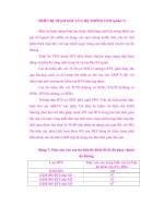
Table 13-1. Standard Drupal Files
File Description
<themename>.info Every Drupal theme must have a .info file, and the file name must be
the same as the name of the theme. For the Genesis theme, the file is
named genesis.info. Within the info file, you will define attributes of
your theme including the
name of the theme (e.g., Genesis),
version of Drupal core that the theme
supports (e.g., 7.x),
name and location for all the CSS files that are
required by the theme,
name and location of the JavaScript files used
by the theme, and
names of the regions that are used on the
theme (see Chapters 6 and 7 for a description
of how regions are used).
The key element that we will focus on in this chapter is the list of
regions.
page.tpl.php Each Drupal theme must have a page.tpl.php file. The file contains a
mixture of HTML and PHP code, and defines the overall layout and
structure of a page on your website. This file also brings other key
Drupal core components into your theme through a number of include
files. If you look inside the file, you’ll see that there are several
instances of code that looks like the following:
<?php print $somevariable; ?>
Continued
CHAPTER 13 ■ THEMING
200
File Description
Where the value of $somevariable changes depending on where you
are in the page.tpl.php file. For example you will find the
<?php print $styles; ?>
statement in the file. This line of code pulls all of the CSS files defined
in the themes .info file into the page as it is rendered by Drupal. Other
variables perform similar functions.
In this chapter I will focus on how the regions defined in your .info file
are incorporated and displayed on the site and how the CSS attributes
are applied to those regions. An example of how regions are displayed
is
<?php print render($page['footer']); ?>
This code takes the elements assigned to the footer region and renders
them on the page at the point where this line of code appears.
For an in-depth understanding of page.tpl.php file, please visit the
theme guide on drupal.org/theme-guide.
node.tpl.php This file is composed of a combination of HTML and PHP snippets.
The contents of the file define how nodes are laid out when displayed
on your site; for example, the placement of the title, the author
information, the taxonomy terms, the body, and pictures included with
the node.
In this chapter I will show you how to define the layout for a node.
style.css All of your sites’ CSS markup should be stored in one or more CSS files
in your theme directory. A typical Drupal theme will have at minimum
a style.css file. You may choose to call the file something else, and you
can have multiple CSS files if you wish (e.g., you might want to put CSS
overrides for Internet Explorer in its own CSS file).
There may be other optional files in your theme’s directory. Examples include theme files (often
referred to as .tpl files) for individual components (such as a block). In this chapter I will focus on the
core files listed in the table.
Configuring the Genesis Theme
If you haven’t done so already, follow the instructions in Chapter 6 and install the Genesis theme
(www.drupal.org/project/genesis). You’ll notice that the installation process creates two versions of it:
Genesis base and Genesis subtheme. A majority of Drupal starter themes use subthemes as the
mechanism for creating a new theme based on the foundation provided by the base theme. This allows
you to create one or several new themes using the same underlying foundation without having to start
CHAPTER 13 ■ THEMING
201
from scratch each time you want to create a new theme. I will follow the Drupal standard approach in
this chapter, using the off-the-shelf subtheme that is created by during the Genesis installation process.
To create a custom subtheme using the Genesis starter theme, you must follow these steps:
1. Copy the genesis_SUBTHEME directory in the /sites/all/themes/genesis
directory to your /sites/all/themes directory.
2. Rename the copied directory to genesis_mytheme (I’ll use “mytheme” as the
name of the new theme that I am creating).
3. In the /sites/all/themes/mytheme directory, rename the
genesis_SUBTHEME.info file to genesis_mytheme.info. The .info file must be
named the same as the directory in which it resides.
4. Edit the genesis_mytheme.info file and change the following values:
a. Change the value of name from Genesis SUBTHEME to Genesis
mytheme;
b. Change the description of the theme to My Genesis Subtheme.
5. Edit the template.php file. Using search and replace, change every occurrence
of genesis_SUBTHEME to genesis_mytheme.
6. Copy the following files from the /sites/all/themes/genesis/templates
directory to your /sites/all/themes/genesis_mytheme directory:
a. page.tpl.php
b. node.tpl.php
c. block.tpl.php
d. field.tpl.php
e. region.tpl.php
f. comment.tpl.php
g. html.tpl.php
The next step in the process is to enable the Genesis base theme as well as your new Genesis
subtheme. Click on the Appearance link in the top menu and scroll down to the “disabled themes”
section. You should see three versions of the Genesis theme: base, the off-the-shelf subtheme, and your
new derivative of the subtheme named mytheme. Click on the “Enable and set default” link for your new
subtheme and return to the home page of your site. Your site should look something close to Figure 13-1.
CHAPTER 13 ■ THEMING
202
Figure 13-1. The standard Genesis theme
The Genesis theme is pretty stark in its out-of-the-box state, but that’s a positive aspect of using a
starter theme. You have the opportunity to create a theme that displays your site exactly how you want,
without trying to make an off-the-shelf theme behave the way you want it to. Next I will show you how to
use the Genesis starter theme to create a site that looks like Figure 13-2.
Figure 13-2. A sample site using the updated theme
CHAPTER 13 ■ THEMING
203
Modifying the Base Theme
Before starting the modification process, it’s important to understand the basic structure of the starter
theme. The first thing that I look at when modifying a theme is the list of regions defined by the starter
theme. In the case of Genesis, I open and look at the genesis_mytheme.info file, which can be found in
the /sites/all/themes/genesis_mytheme directory. The starter theme defines the following 12 regions:
Page top
Leaderboard
Header
Help
Secondary content
Highlighted content
Content
First sidebar
Second sidebar
Tertiary content
Footer
Page bottom
Figure 13-3 shows the positioning of the standard regions.
Figure 13-3. Position of the standard Genesis regions on a sample page
CHAPTER 13 ■ THEMING
204
One of the reasons that I like the Genesis theme is it provides several powerful features that are
simple to use, including the ability to pick the layout of your new site. Genesis provides nine basic layout
options in three categories, as shown in Figure 13-4.
Figure 13-4. Standard Genesis layout options
I’ll choose the genesis-1c layout. It is a standard three-column layout using fixed-width sidebars.
Depending on the requirements for your site, you could select another layout option.
To set the desired layout, I’ll edit the html.tpl.php file in the /sites/all/themes/genesis_mytheme
directory. In the html.tpl.php file I’ll change the CSS ID assigned to the body tag from 1a to 1c, as shown
here:
<body id="genesis-1c" <?php print $attributes;?>>
