html xhtml and css for dummies 7th edition phần 5 ppsx
Bạn đang xem bản rút gọn của tài liệu. Xem và tải ngay bản đầy đủ của tài liệu tại đây (1.88 MB, 41 trang )
144
Part III: Taking Precise Control Over Web Pages and Styles
External style sheets
An external style sheet holds all your style rules in a separate text document
that you can reference from any HTML file on your site. You must maintain a
separate style sheet file, but an external style sheet offers benefits for over-
all site maintenance. If your site’s pages use the same style sheet, you can
change any formatting characteristic on all pages with a change to the style
sheet.
We recommend using external style sheets on your sites.
Linking
To reference an external style sheet, use the link element in the Web page
header, like this:
<html>
<head>
<title>External Style Sheet Example</title>
<link rel=”stylesheet” type=”text/css” href=”styles.css” />
<head>
<body>
<! Document content goes here >
</body>
</html>
Use inline styles carefully
You can attach individual style rules, called an inline style, to individual elements in an HTML docu-
ment. An inline style rule attached to an element looks like this:
<p style=”color: green;”>Green text.</p>
Adding style rules to an element isn’t really the best approach. We generally recommend that you
choose either internal or (preferably) external style sheets for your rules instead of attaching the
rules to individual elements in your document. Here are a few reasons:
✓ Your style rules get mixed up in the page and are hard to find.
✓ You must place the entire rule in the value of the style attribute, which makes complex rules
hard to write and edit.
✓ You lose all the benefits that come with grouping selectors and reusing style rules in external
style sheets.
16_9780470916599-ch09.indd 14416_9780470916599-ch09.indd 144 11/30/10 12:25 AM11/30/10 12:25 AM
145
Chapter 9: Introducing Cascading Style Sheets
The href attribute in the <link> element can take either
✓ A relative link (a style sheet on your own site)
✓ An absolute link (a style sheet that doesn’t reside on your own site)
Usually, you shouldn’t use a style sheet that doesn’t reside on your Web
site because you want control of your site’s look and feel.
To quickly add style to your Web page (or to experiment to see how brows-
ers handle different styles), use an absolute URL to point to one of the W3C’s
Core Style sheets. Read more about them at www.w3.org/StyleSheets/
Core.
Chapter 6 covers the difference between relative and absolute links.
Importing
The @import statement instructs the browser to load an external style sheet
and use its styles. You use it within the <style> element but before any of
the individual style rules, like so:
<style>
@import “ /></style>
Style rules in an imported style sheet take precedence over any rules that
come before the @import statement. So, if you have multiple external style
sheets referenced with more than one @import statement on your page,
rules apply from the later style sheets (the ones farther down the page).
Understanding the Cascade
Multiple style sheets can affect page elements and build upon each other. It’s
like inheriting styles within a Web page. This is the cascading part of CSS.
Take this real-world example of a Web site for a university English depart-
ment. The English department is part of the School of Humanities, which
is one school in the university. Each of these entities — the university, the
school, and the English department — has its own style sheet.
1. The university’s style sheet provides style rules for all pages in the site.
2. The school’s style sheet links to the university’s style sheet (using an
@import statement), and adds more style rules specific to the look the
school wants for its own site.
16_9780470916599-ch09.indd 14516_9780470916599-ch09.indd 145 11/30/10 12:25 AM11/30/10 12:25 AM
146
Part III: Taking Precise Control Over Web Pages and Styles
3. The English department’s style sheet links to the school’s style sheet.
Thus, the department’s pages both have their own style rules and inherit
the style rules from both the school’s and the university’s style sheets.
But what if multiple style sheets define rules for the same element? What if,
for example, all three style sheets specify a rule for the h1 element? In that
case, the nearest rule to the page or element you’re working on wins:
✓ If an h1 rule exists on the department’s style sheet, it takes precedence
over the school and university h1 styles.
✓ If an individual page within the department applies a style rule to h1 in a
<style> tag, that rule applies.
16_9780470916599-ch09.indd 14616_9780470916599-ch09.indd 146 11/30/10 12:25 AM11/30/10 12:25 AM
Chapter 10
Using Cascading Style Sheets
In This Chapter
▶ Getting a handle on using CSS
▶ Positioning objects on a page
▶ Creating font rules
▶ Creating style sheets for print
▶ Understanding aural style sheets
U
nderstanding the structure and syntax of CSS is easy. Learning about
the properties that CSS can apply to (X)HTML documents takes a little
more time and effort, though. However, where the learning curve really gets
interesting is when it comes to learning how to use CSS to take a plain or
ordinary Web page and kick it up a notch. This chapter deals with how to put
CSS to work, rather than focusing on its structure and inner workings.
If you need a refresher of CSS style rules and properties, read Chapter 9 (a
high-level overview of CSS and how it works). Then you can return to this
chapter and put CSS into action.
Now it’s time to make a page and give it some style!
To use CSS efficiently, follow these general guidelines:
✓ When you test how a page looks, use internal styles so you can tweak
to your heart’s delight. (This chapter shows internal style sheets, but
Chapter 9 covers internal and external style sheets in greater detail.)
✓ When your test page looks just right, move those internal styles to an
external sheet, and then apply them throughout your site, or to as many
pages in that site as make sense.
17_9780470916599-ch10.indd 14717_9780470916599-ch10.indd 147 11/30/10 12:25 AM11/30/10 12:25 AM
148
Part III: Taking Precise Control Over Web Pages and Styles
Managing Layout and Positioning
You can use CSS to lay out your pages so that images and blocks of text
✓ Appear exactly where you want them to
✓ Fit exactly within the amount of space you want them to occupy
After you create styles within a document, you can create an external style
sheet to apply the same styles to any page.
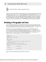
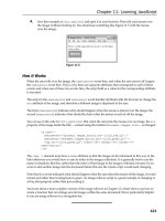
Listing 10-1 shows a Web page without any defined styles. This basic page is
shown in Figure 10-1.
Listing 10-1: A Fairly Dull Page
<!DOCTYPE html PUBLIC “-//W3C//DTD XHTML 1.0 Transitional//EN”
“ /><html
xmlns=” lang=”en” xml:lang=”en
”
>
<head>
<title>
Pixel’s Page
</title>
<meta http-equiv=”Content-Type” content=”text/html; charset=ISO-8859-1” />
</head>
<body>
<h1>
I’m Pixel the Cat. Welcome to my page.
</h1>
<div id=”navBar”>
<p>
Links of interest:
</p>
<p><a href=” />Google
</a></p>
<p><a href=” />Amazon
</a></p>
<p><a href=” />Bing
</a></p>
</div>
<img src=”/images/pixel1.jpg” alt=”The Cat” width=”320” height=”240”
id=”theCat” />
</body>
</html>
Creating links for your Web pages is covered in detail in Chapter 6. There,
you’ll find everything you need to know about creating great links. For ques-
tions regarding Cascading Style Sheets and the power they can bring to your
Web site content, turn to Chapter 9.
The cat looks great, but the page certainly doesn’t show off his possibilities.
The addition of some styles improves this page immensely. Here’s how!
17_9780470916599-ch10.indd 14817_9780470916599-ch10.indd 148 11/30/10 12:25 AM11/30/10 12:25 AM
149
Chapter 10: Using Cascading Style Sheets
Figure 10-1: This style-free page doesn’t
maximize this cat’s possibilities.
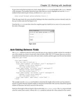
Visual layouts
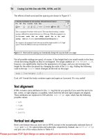
Instead of the links appearing above the image, as they do in Figure 10-1, we
want them on the left, a typical location for navigation tools. The following
markup floats the text for the search site links to the left of the image (see
Figure 10-2):
<style type=”text/css”>
#navBar {
background-color: #CCC;
border-bottom: #999;
border-left: #999;
border-width: 0 0 thin thin;
border-style: none none groove groove;
display: block;
float: left;
margin: 0 0 0 10px;
padding: 0 10px 0 10px;
width: 107px;
line-height: 0.2em;
}
</style>
17_9780470916599-ch10.indd 14917_9780470916599-ch10.indd 149 11/30/10 12:25 AM11/30/10 12:25 AM
150
Part III: Taking Precise Control Over Web Pages and Styles
Figure 10-2: The navigation bar now looks more like standard
left-hand navigation.
In the preceding rules, we
✓ Added a <style> element
✓ Defined the navBar id inside the <style> element
✓ Used the navBar id to instruct the content to float to the left of images,
which causes them to appear in the same part of the page to the left,
rather than above the graphic
This rule says that anything on the page that belongs to the navBar id (as
shown in Figure 10-2) should display with
✓ A light-gray background
✓ A thin, grooved-line border at bottom and left, in a darker gray
✓ No top or right border
✓ A block that floats to the left (so everything else on the page moves
right, as with the image in Figure 10-2)
✓ A left margin of 10 pixels (px)
✓ Padding at top and bottom of 10px each
✓ A navbar area 100px wide
17_9780470916599-ch10.indd 15017_9780470916599-ch10.indd 150 11/30/10 12:25 AM11/30/10 12:25 AM
151
Chapter 10: Using Cascading Style Sheets
You’ll note that we also set the line-height at 0.2em. This ensures that menu
line entries are compact, without too much white space between individual
elements.
Note that several properties in the declaration, called shorthand properties,
take multiple values, such as margin and padding. Shorthand properties col-
lect values from multiple related CSS properties (such as margin-height,
margin-width, and so forth). See our online materials for a complete list.
Those values correspond to settings for the top, right, bottom, and left edges
of the navbar’s box. margin creates an empty zone around the box, and
padding defines the space between the edges or borders of the box and the
content inside the box. Here are the rules that explain how to associate values
with properties that deal with margins, borders, padding, and so forth:
✓ If all the sides have the same value, a single value works.
✓ If any side is different from the others, every side needs a separate value.
It’s okay to set some or all of these values to 0 (zero) as you see fit; this
can often help to ensure that pages display consistently across a wider
range of browsers (and browser versions).
To remember what’s what, think of the edges of an element box in clock-
wise order, starting with the top edge: top, right, bottom, and then left.
Notice that we define margins and padding using px (pixels) rather than pt
(points) or em (default character m’s width) as our unit of measure. This is
a deliberate departure from best practices that we recommend elsewhere in
this book (Chapter 11). That’s because margins and padding usually involve
small increments or values and because those things relate very strongly to
individual actual displays within specific browsers. Experiment with these
values to get them just right, and be sure to check them on as many different
browsers and platforms as you can to ensure that visitors to your Web site
see what you intended.
Positioning
CSS provides several ways to specify exactly where an element should
appear on a page. These controls use various kinds of positioning based on
the relationships between an element’s box and its parent element’s box
to help page designers put page elements where they want them to go. The
kinds of properties involved are discussed in the following sections.
Location
You can control the horizontal and vertical locations of an image. However,
when you use absolute positioning with any page element, you specify
exactly where that element must sit, relative to the upper-left corner of the
17_9780470916599-ch10.indd 15117_9780470916599-ch10.indd 151 11/30/10 12:25 AM11/30/10 12:25 AM
152
Part III: Taking Precise Control Over Web Pages and Styles
browser window. Thus, instead of letting it be drawn automatically to the
right of the navigation bar, you can place an image down and to the left, as
in Figure 10-3. But absolutely positioned items always percolate to the top
layer when items overlap, which is why Pixel’s picture shows up on top. We
change this default order later in the chapter.
#theCat {position: absolute; top: 120px; left: 107px;}
Figure 10-3: The image is more striking in this
location.
You might be wondering why the navbar rule (defined in the listing in the
earlier section, “Visual layouts”) and the theCat rule (in the code snip-
pet immediately preceding Figure 10-3) both start with a pound symbol
(also known as a hash mark or octothorpe). That’s because the pound
symbol applies to an id attribute. You use a period to start a class rule,
and it will apply to every instance of that class wherever it appears on a
page. Thus, although you can apply either a class or an id to specific
elements, the difference between these two is that a class can be used
repeatedly. Comparatively, an id can appear only once on a page. You
can’t have anything else on the page that uses theCat as its id. The differ-
ence, quite simply, is that a class lets you refer to every instance of some
(X)HTML element with a single reference, but an id can address only a
single instance for an element.
Overlapping
Two objects can be assigned to the same position in a Web page. Although
this may sound like a problem, overlap can produce interesting design
17_9780470916599-ch10.indd 15217_9780470916599-ch10.indd 152 11/30/10 12:25 AM11/30/10 12:25 AM
Downloa d f r o m W o w ! e B o o k < w w w.woweb o o k . c o m >
153
Chapter 10: Using Cascading Style Sheets
effects — as you’ll see with our navbar and photo in code and screenshots
that follow. When overlap occurs, the browser must determine the display
order and which objects to show and which ones to hide.
Using z-index, added to any rule, tells CSS how you want any object stacked
over and under other objects that occupy the same space on the page:
✓ Lower numbers move down the stack.
✓ Higher numbers move up the stack.
✓ The default value for z-index is auto, which means it’s the same as for
its parent element.
Giving theCat a z-index value of -1 automatically puts it behind everything
else on the page (as shown in Figure 10-4) for which the z-index isn’t set (see
the HTML source for Figure 10-4 on the book’s Web site for the details).
Figure 10-4: The cat is peeking out from behind
the navigation bar.
Changing Fonts for Visual Interest
and Better Readability
You can make a page more interesting by replacing old, boring, default fonts.
Start by specifying a generic body font as well as setting some other default
rules, such as background color and text color.
17_9780470916599-ch10.indd 15317_9780470916599-ch10.indd 153 11/30/10 12:25 AM11/30/10 12:25 AM
154
Part III: Taking Precise Control Over Web Pages and Styles
Body text
Here’s an example that sets the style for text within the body element:
body {font-family: verdana, geneva, arial, helvetica, sans-serif;
font-size: 1em; line-height: 1.33em; background-color: white;
color: teal;}
Because the body element holds all content for any Web page, this affects
everything on the page. The preceding rule instructs the browser to show all
text that appears within the body element as follows:
✓ The text is rendered using one of the fonts listed. We placed Verdana
at the head of the list because it’s the preferred choice, and browsers
check for available fonts in the order listed. Note: A generic font — in
this case, sans-serif — almost always appears last in such lists
because the browser can almost always supply such a font itself.
You can list more than one font. The browser uses the first font from
your list that’s available in the browser. For example, the browser looks
for fonts from our list in this order:
1. Verdana
2. Geneva
3. Arial
4. Helvetica
5. The browser’s default sans serif font
✓ 1.33em line height
The lines are spaced as though the fonts are 1em high, so there’s more
vertical space between lines.
Figure 10-5 shows that
✓ All changes apply to the entire page, including the navigation bar.
✓ The font-family changes in the h1 heading.
Because headers have specific defaults for font-size and line-
height, another rule is needed to modify them.
In shooting Figure 10-5, the HTML used for our screen capture includes an
additional tweak for Internet Explorer (IE). That’s because a bug in Internet
Explorer for Windows that doesn’t occur in other browsers causes heading
(h1) text to get truncated at the top. (Try the source (X)HTML for Figure 10-5
17_9780470916599-ch10.indd 15417_9780470916599-ch10.indd 154 11/30/10 12:25 AM11/30/10 12:25 AM
155
Chapter 10: Using Cascading Style Sheets
in IE to see what we mean; we had to add CSS markup that set line-
height: 105%; for h1 to create this display.) Unfortunately, CSS rendering
can be unpredictable enough that you must test style rules in various brows-
ers to see how they look — and then tweak accordingly.
Figure 10-5: The fonts are nicer, but they could
still use a little more work.
Headings
If we explicitly assign style properties to the h1 element, display results are
more predictable. Here’s a sample set of styles:
h1 {font-family: “trebuchet ms”, verdana, geneva, arial, helvetica, sans-serif;
font-size: 2em; line-height: w.167em;}
Figure 10-6 shows a first-level heading using the font family and type size that
we want: 2em Trebuchet MS, with a 2
1
⁄6 em line height. If we didn’t have the
Trebuchet MS font on our system, the heading would appear in Verdana.
When a font name includes spaces (like trebuchet ms or times new
roman), the full name must be within quotation marks. (See Chapter 11 for
more information.)
Hyperlinks
We think that having the hyperlinks underlined — which is normal — makes
the menu look a little cluttered. Luckily, we can turn underlines off with CSS,
but we still want the hyperlinks to look like hyperlinks, so we tell CSS to
17_9780470916599-ch10.indd 15517_9780470916599-ch10.indd 155 11/30/10 12:25 AM11/30/10 12:25 AM
156
Part III: Taking Precise Control Over Web Pages and Styles
✓ Make links bold.
✓ Make underlines appear when the cursor is over a link.
✓ Show links in specific colors.
Figure 10-6: Declaring a rule for h1 makes it
appear just how we like it.
The following style rules define how a browser should display hyperlinks:
a {text-decoration: none; font-weight: bold}
a:link {color: blue}
a:visited {color: #93C}
a:hover {text-decoration: underline}
What’s going on here? Starting from the top, we’re setting two rules for the
<a> tag that apply to all links on the page:
✓ The text-decoration declaration sets its value to none.
This gets rid of the underlining for all the links.
✓ The font-weight declaration has a value of bold.
This makes all the links on the page appear in bold.
The remaining rules in the preceding code are pseudo class selectors. Their
most common usage is to modify how links appear in their different states.
(For more information on pseudo classes, see Chapter 11.) Here we change
the color when a link has been visited. We also turn on underlining when the
mouse pointer hovers over link text to identify hyperlinks when the cursor is
in clicking range. Figure 10-7 shows how the page appears when the previous
style rules are applied.
17_9780470916599-ch10.indd 15617_9780470916599-ch10.indd 156 11/30/10 12:25 AM11/30/10 12:25 AM
157
Chapter 10: Using Cascading Style Sheets
Figure 10-7: The final version of our page.
Externalizing Style Sheets
When the final page is the way you want it, you’re ready to cut and paste
your tested, approved, internal style sheet into an external style sheet. The
benefits of using an external style sheet are that
✓ Every page of the site can use the whole style sheet with the addition of
only one line of code to each page.
✓ Changes can be made site-wide with one change in the external style sheet.
To create an external style sheet from a well-tested internal style sheet,
follow these steps:
1. Copy all text that sits between the <style> and </style> tags.
2. Paste that text into its own new document.
This text should include only CSS markup, without any HTML tags or
markup.
3. Append a .css suffix to the document’s name (for example,
myStyles.css) when saving.
The suffix shows at a glance that it’s a CSS file.
So you have your external style sheet. Time now to link your HTML file to
said external style sheet. You have two options available to you:
17_9780470916599-ch10.indd 15717_9780470916599-ch10.indd 157 11/30/10 12:25 AM11/30/10 12:25 AM
158
Part III: Taking Precise Control Over Web Pages and Styles
✓ Use the <link> tag.
All CSS-capable browsers understand the link tag.
✓ Use the <style> tag with the @import keyword.
Only newer browsers understand the <style> and @import combination.
See Chapter 9 for more on these two methods.
Sometimes style sheets can get complicated and long. That’s when the
@import keyword comes in handiest: You can create a master stylesheet and
then use multiple @import statements to bring in individual stylesheets for
headers, footers, body copy, menus, and so forth. Each @import references
a subsidiary style sheet for one of those various categories for page content.
This is probably overkill for most small-scale or personal Web sites, but as
sites get “big and hairy,” this technique can be very helpful.
Using CSS with Multimedia
You can specify how you want your Web pages to look or behave on different
media types depending on the medium.
Table 10-1 lists all the media types and their uses.
Table 10-1 Recognized Media Types
Media Type Description
All
Suitable for all devices
aural
For speech synthesizers
braille
For Braille tactile-feedback devices
embossed
For paged Braille printers
handheld
For handheld devices (such as those with a small screen, mono-
chrome monitor, and limited bandwidth)
For paged, opaque material and for documents viewed onscreen
but in Print Preview mode
projection
For projected presentations, such as projectors or transparencies
screen
For color computer screens
Tty
For media that use a fixed-pitch character grid, such as teletypes,
terminals, or portable devices with limited display capabilities
Tv
For television-type devices (such as those with low resolution,
color capability, limited-scrollability screens, and some sound
available)
17_9780470916599-ch10.indd 15817_9780470916599-ch10.indd 158 11/30/10 12:25 AM11/30/10 12:25 AM
159
Chapter 10: Using Cascading Style Sheets
CSS can make changes to customize how the same pages
✓ Render onscreen
A nifty color background might make your page a mess when it’s printed
on a black-and-white laser printer, but proper use of print-media styles
can keep this sort of thing from happening!
✓ Sound when read out loud
Visual media styles
Table 10-2 lists the CSS properties that you’re most likely to use in a typical
Web page. Our online content for this book includes brief descriptions of the
most commonly used CSS properties and (X)HTML tags and attributes.
Table 10-2 Visual Media Styles
Property Values Default Value Description
Background-
color
Any color, by name
or hex code
transparent
Background
color of the
associated
element
Background-
image
URL
none
Image URL as
background
for element
Color
Any color, by name
or hex code
Up to you! Color of the
foreground text
font-family
Any named font,
cursive
fantasy
monospace
sans-serif
serif
Up to you! (Stick
to common fonts.)
Font for ren-
dering related
element
content
font-size
Number + unit,
xx-small
x-small
small smaller
medium large
larger
x-large
xx-large
% Length
(px, em, cm)
medium
Size of the font
for rendering
related ele-
ment content
(continued)
17_9780470916599-ch10.indd 15917_9780470916599-ch10.indd 159 11/30/10 12:25 AM11/30/10 12:25 AM
160
Part III: Taking Precise Control Over Web Pages and Styles
Table 10-2 (continued)
Property Values Default Value Description
font-weight normal bold
bolder
lighter 100
200 300 400
500 600 700
800 900
normal 400
is the same
as normal
700 is the
same as bold
Weight (how
bold or light)
the font should
appear
line-height Normal number
+ unit % Length
(px, em, cm)
normal
Vertical spac-
ing between
lines of text
text-align left right
center
justify
Up to you; normal
text direction
Determines
how text on
the page gets
aligned
text-
decoration
None
underline
overline
line-through
blink
none
Special text
effects
list-style-
image
URL
none
URL for an
image to dis-
play as a list
bullet
list-style-
position
Inside
outside
outside
Wrap list
text inside or
outside bullet
points
list-style-
type
Disc circle
square
decimal
decimal-
leading-zero
lower-alpha
upper-
alpha none
armenian
georgian
lower-greek
lower-latin
lower-roman
upper-latin
upper-roman
disc
Bullet type on
lists
17_9780470916599-ch10.indd 16017_9780470916599-ch10.indd 160 11/30/10 12:25 AM11/30/10 12:25 AM
161
Chapter 10: Using Cascading Style Sheets
Property Values Default Value Description
Display block inline
none
inline
Format of a
defined sec-
tion for a block
element
Top
Number and unit
auto
auto
Absolute posi-
tioning: sets
top edge of
element above/
below top edge
of containing
element; rela-
tive positioning:
sets top edge
of an element
above/below
its normal
position
Right
Percentage
number + unit
auto
Auto
Absolute posi-
tioning: sets
right edge of
element to
width next to
right edge of
containing ele-
ment; relative
positioning:
sets right edge
of element
to width next
to right edge
of its normal
position
Bottom
Percentage
number + unit
auto
Auto
Absolute posi-
tioning: sets
bottom edge of
element below
bottom edge of
its containing
element; rela-
tive positioning:
sets bottom
edge of below
its normal
position
(continued)
17_9780470916599-ch10.indd 16117_9780470916599-ch10.indd 161 11/30/10 12:25 AM11/30/10 12:25 AM
162
Part III: Taking Precise Control Over Web Pages and Styles
Table 10-2 (continued)
Property Values Default Value Description
Left
Percentage
number + unit
auto
Auto
Absolute posi-
tioning: sets
left edge of ele-
ment to right of
left edge of its
containing
element; rela-
tive positioning:
sets top edge
of above/below
its normal
position
Position Static abso-
lute rela-
tive fixed
static
Method by
which element
box is laid
out, relative
to positioning
context
Visibility Collapse
visible
hidden
inherit
inherit
Indicates
whether object
will display on
the page
z-index Number auto Auto
Stacking order
for objects
(–1 always
puts object at
the very back)
border-style none dotted
dashed solid
double
groove ridge
inset outset
Not defined Style displayed
for object
borders. Can
be broken out
into border-
top-style,
border-
right-
style,
border-
bottom-
style, and
border-
left-style
17_9780470916599-ch10.indd 16217_9780470916599-ch10.indd 162 11/30/10 12:25 AM11/30/10 12:25 AM
163
Chapter 10: Using Cascading Style Sheets
Property Values Default Value Description
border-width Thin medium
thick Number
Not defined Width of
border around
an object. Can
be broken out
into border-
top-width,
border-
right-
width,
border-
bottom-
width, and
border-
left-width
border-color
Any color, by
name or hex code
transparent
Not defined Color of
object’s
border. Can
be broken out
into border-
top-color,
border-
right-
color,
border-
bottom-
color, and
border-
left-color
Border Border-width
+ border-
style + bor-
der-color
Not defined Combined
features for
border around
object. Can be
broken out into
border-top,
border-
right,
border-
bottom, and
border-left
Float left right
none
none
Specifies
whether object
should float
to one side or
other for
document
(continued)
17_9780470916599-ch10.indd 16317_9780470916599-ch10.indd 163 11/30/10 12:25 AM11/30/10 12:25 AM
164
Part III: Taking Precise Control Over Web Pages and Styles
Table 10-2 (continued)
Property Values Default Value Description
Height
Number + unit
auto
Auto
Display height
for object
Width
Number + unit
auto
Auto
Display width
for object
Margin
Number + unit
auto
Not defined Display mar-
gins for object.
Can be broken
out into
margin-top,
margin-
right,
margin-
bottom, and
margin-
left
Padding
Number + unit
auto
Not defined Display blank
space around
object. Can
be broken out
into pad-
ding-top,
padding-
right,
padding-
bottom, and
padding-
left
Cursor Auto cross-
hair default
pointer move
text help
URL e-resize
n-resize
ne-resize
nw-resize
progress
s-resize
se-resize
sw-resize
w-resize
inherit
Auto
Cursor
appearance
in browser
window
17_9780470916599-ch10.indd 16417_9780470916599-ch10.indd 164 11/30/10 12:25 AM11/30/10 12:25 AM
165
Chapter 10: Using Cascading Style Sheets
Some browsers don’t support all CSS properties. If you’re using CSS fea-
tures, test your pages with the browsers that you expect your visitors will
use. Use the CSS features that work on as many browsers as possible, and
ignore the rest.
If you want to take an extremely thorough guide to CSS everywhere you go,
put it on your iPod! Westciv’s free podGuide is a folder of small text files.
Download the zipped file and follow the instructions on how to install it,
and you have complete documentation with you at all times. (You also
win the title of “World’s Biggest CSS Geek.”) The podGuide is online at www.
westciv.com/news/podguide.html.
Paged media styles
CSS can customize how a page looks when it’s printed. We recommend these
guidelines:
✓ Replace sans serif fonts with serif fonts.
Serif fonts are easier to read than sans serif fonts.
✓ Insert advertisements that
• Make sense when they aren’t animated
• Are useful without clicking
In general, paged media styles help ensure that text looks as good when it’s
printed as it does in a Web browser. Paged media styles also help you hide
irrelevant content when pages are printed (banners, ads, and so forth), thus
reducing wasted paper and user frustration. See Table 10-3 for an explanation
of paged media properties in CSS that you can use to help your users make
the most when printing Web pages.
Table 10-3 Paged Media Styles
Property Values Default
Value
Description
orphans Number 2
The minimum number of lines in a
paragraph that must be left at the
bottom of a page
page-
break-
after
Auto always
avoid left
right
auto
The page-breaking behavior after
an element
page-
break-
before
Auto always
avoid left
right
auto The page-breaking behavior
before an element
(continued)
17_9780470916599-ch10.indd 16517_9780470916599-ch10.indd 165 11/30/10 12:25 AM11/30/10 12:25 AM
166
Part III: Taking Precise Control Over Web Pages and Styles
Table 10-3 (continued)
Property Values Default
Value
Description
page-
break-
inside
Auto avoid auto
The page-breaking behavior
inside an element
widows Number 2
The minimum number of lines in
a paragraph that must be left at
the top of a page
The example in Listing 10-2 uses these options for paged media styles:
✓ Make the output black text on a white background.
✓ Replace sans serif fonts with serif fonts.
Listing 10-2: Adding a Print Style Sheet
<!DOCTYPE html PUBLIC “-//W3C//DTD XHTML 1.0 Transitional//EN”
“ /><html
xmlns=” lang=”en” xml:lang=”en”>
<head>
<title>
This is my page
</title>
<meta http-equiv=”Content-Type” content=”text/html; charset=ISO-8859-1” />
<style type=”text/css”>
body {background-color: black; color: white; font-family: sans-serif;}
@media print {
body {background-color: white; color: black; font-family: serif}
}
</style>
</head>
<body>
This page will look very different when sent to the printer.
</body>
</html>
If you’re now wondering why none of the properties in Table 10-3 were
set but other properties were, it’s because (in this example) their defaults
worked fine. And just because those page properties can be set doesn’t mean
that you can’t set other properties also — it isn’t an either/or.
17_9780470916599-ch10.indd 16617_9780470916599-ch10.indd 166 11/30/10 12:25 AM11/30/10 12:25 AM
167
Chapter 10: Using Cascading Style Sheets
Aural (speech-sound) styles
Aural browsers and styles aren’t just for the
visually impaired. They’re also useful for Web
users who
✓ Have reading problems
✓ Need information while driving
The following example recommends voices to
be played using male and female characters to
make it clear which characters are speaking:
<style>
@media aural {
p.stanley {voice-family: male;}
p.stella {voice-family: female;}
}
</style>
Usually, you don’t have to worry much about
adding aural styles to your page. The default
readers should work just fine if
✓ Your page is mostly text.
✓ You don’t have a strong opinion about how
it sounds, so that any clearly male or female
voice will do.
That said, you can find a complete listing of all
aural style properties on this book’s companion
Web site.
17_9780470916599-ch10.indd 16717_9780470916599-ch10.indd 167 11/30/10 12:25 AM11/30/10 12:25 AM
168
Part III: Taking Precise Control Over Web Pages and Styles
17_9780470916599-ch10.indd 16817_9780470916599-ch10.indd 168 11/30/10 12:25 AM11/30/10 12:25 AM

