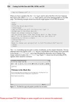
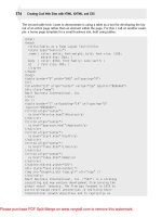
html xhtml and css for dummies 7th edition phần 6 pdf
Bạn đang xem bản rút gọn của tài liệu. Xem và tải ngay bản đầy đủ của tài liệu tại đây (4.28 MB, 41 trang )
185
Chapter 11: Getting Creative with Colors and Fonts
Figure 11-6: All hyperlinks are bolded.
Syntax for applying italic
This style declaration uses the font-style property:
selector {font-style: value;}
The value of the font-style property may be one of the following:
✓ italic: Renders the text in italics (a special font that usually slopes to
the right)
✓ oblique: Renders the text as oblique (a different slanted version of a
normal font; seldom if ever used for font definitions)
✓ normal: Removes any italic or oblique formatting
Markup for applying italic
The following example assigns an italic font style to the first-level heading:
body {color: #808000; font-family: Verdana, sans-serif; font-size: 85%;}
h1 {color: teal; font-family:
“
MS Trebuchet
”
, Arial, Helvetica, sans-serif;
text-transform: uppercase; font-style: italic; font-weight: 800;
font-size: 2em; line-height: 30pt; text-align: center;}
Changing capitalization
You use the text-transform property to set capitalization in your document.
18_9780470916599-ch11.indd 18518_9780470916599-ch11.indd 185 11/30/10 10:42 AM11/30/10 10:42 AM
Downloa d f r o m W o w ! e B o o k < w w w.woweb o o k . c o m >
186
Part III: Taking Precise Control Over Web Pages and Styles
Syntax for changing capitalization
This style declaration uses the text-transform property:
selector {text-transform: value;}
The value of the text-transform property may be one of the following:
✓ capitalize: Capitalizes the first character in every word
✓ uppercase: Renders all letters of the text of the specified element in
uppercase
✓ lowercase: Renders all letters of the text of the specified element in
lowercase
✓ none: Keeps the value of the inherited element
Markup for changing capitalization
The following example renders the first-level heading in uppercase (shown in
Figure 11-7):
body {color: black; font-family: Arial, sans-serif; font-size: 85%;}
a {font-weight: bold;}
a:link {color: olive; text-decoration: underline;}
a:visited {color: green; text-decoration: none;}
h1 {font-family: “Trebuchet MS”, verdana, geneva, arial, helvetica, sans-
serif;
font-size: 2em; line-height: 2.5em; color: teal; text-transform: uppercase;
text-align: center}
Figure 11-7: The first-level heading is rendered in all uppercase.
18_9780470916599-ch11.indd 18618_9780470916599-ch11.indd 186 11/30/10 10:42 AM11/30/10 10:42 AM
187
Chapter 11: Getting Creative with Colors and Fonts
Getting fancy with the text-decoration property
The text-decoration property allows for text formatting that’s a tad cra-
zier. It isn’t used often.
Syntax for text decoration
This style declaration uses the text-decoration property:
selector {text-decoration: value;}
The value of the text-decoration property may be one of the following:
✓ underline: Underlines text
✓ overline: Renders the text with a line over it
✓ line-through: Renders the text with a line through it
✓ blink: Blinks the text onscreen
Are you sure you want blinking text?
• blink isn’t supported by all browsers.
• blink can be dreadfully annoying and distracting.
✓ none: Removes any text decoration
Markup for text decoration
The following example changes the link when the mouse hovers over it. In
this case, it turns off any underlining for a link:
body {color: #808000; font-family: Verdana, sans-serif; font-size: 85%;}
a:link {color: olive; text-decoration: underline;}
a:visited {color: olive; text-decoration: underline;}
a:hover {color: olive; text-decoration: none;}
The Catchall Font Property
Many font properties can be summarized in one style declaration by using
the shorthand font property. When it’s used, only one style rule is needed
to define a combination of font properties:
selector {font: value value value;}
18_9780470916599-ch11.indd 18718_9780470916599-ch11.indd 187 11/30/10 10:42 AM11/30/10 10:42 AM
188
Part III: Taking Precise Control Over Web Pages and Styles
The value of the font property is a list of any values that correspond to the
various font properties:
✓ The following values must be defined in the following order although
they don’t have to be consecutive:
• font-size (required)
• line-height (optional)
• font-family (required)
The font-family value list must end with a semicolon.
Use commas to separate multiple font family names. For example, you
can use the following style declaration to create a specific style for para-
graph text that specifies font-size, line-height, and font-family in that
(required) order:
p {font: 1.5em bold 150% Arial, Helvetica, sans-serif;}
✓ The following values are optional and may occur in any order within the
declaration. Individual values are separated by spaces:
• font-style
• font-variant
• font-weight
For example, you can use the following style declaration to create a specific
style for a first-level heading that mixes the optional values in among the
required ones (font-style and font-weight before line-height and font-family in
this case, with font-size and font-variant omitted):
h1 {font: italic bold 150% Arial, Helvetica, sans-serif;}
18_9780470916599-ch11.indd 18818_9780470916599-ch11.indd 188 11/30/10 10:42 AM11/30/10 10:42 AM
Part IV
Scripting and (X)HTML
19_9780470916599-pp04.indd 18919_9780470916599-pp04.indd 189 11/30/10 12:25 AM11/30/10 12:25 AM
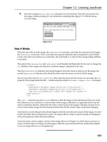
In this part . . .
H
ere, we introduce and describe the types of script-
ing languages that work on Web pages, and dig
lightly into JavaScript — by far the most popular of all
Web-scripting languages. Scripting languages help static,
unchanging Web pages become active, dynamic docu-
ments that can solicit and respond to user input.
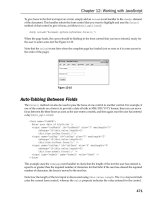
Next, you dig more deeply into working with forms so you
can understand how to solicit — and deal with — input
from your users. The following chapter shows how to
embed third-party services and information — such as
Flickr, Twitter, Google Maps, and YouTube — to make
your pages more dynamic and interesting while leveraging
the work of others.
The next chapter shows you ways to put JavaScript to
work in your Web pages. You pick up the basic concepts
and techniques for creating dynamic HTML (sometimes
called DHTML) and using client-side JavaScripts and pre-
fabricated code to perform basic tasks, such as displaying
date and time information, counting site visitors, or tabu-
lating current statistics. Part IV concludes with an over-
view of Web-based content management systems (CMS),
including WordPress, Joomla!, and Drupal.
19_9780470916599-pp04.indd 19019_9780470916599-pp04.indd 190 11/30/10 12:25 AM11/30/10 12:25 AM
Chapter 12
Top 20 CSS Properties
In This Chapter
▶ Digging into backgrounds and borders
▶ Fiddling with fonts, spacing, and positioning
▶ Managing text color and line-height
▶ Linking up with pseudo classes
▶ Making the most of online CSS resources
A
s you can see in Chapters 9–11, there’s an awful lot you can do with
Cascading Style Sheet (CSS) markup to manage and control how Web
pages behave inside users’ browsers. In this chapter, we single out a small
subset of 20 specific CSS properties that you’re most likely to encounter —
and use — on even fairly simple Web pages. Of course, we know this won’t
be enough for real Web-heads, or even aspiring ones, so this chapter also
includes a tasty set of nonpareil CSS references where you can dig up more
details and learn about other properties to your heart’s content.
Eric A. Meyer not only wrote the Foreword for this book, but he’s also
authored numerous gems of his own on the subject of CSS. Be sure to check
out his many CSS-related titles, especially the invaluable Smashing CSS:
Professional Techniques for Modern Layout (Wiley).
Background Properties
As a CSS concept, background refers to numerous properties (six in all)
introduced with CSS 1.0 to manage what goes behind elements on display in
a Web page. Table 12-1 lists all the background properties, after which we
provide examples and details for two of the properties. To read more about
background properties and other CSS markup, visit the “Best CSS Resources”
section at the end of this chapter for additional information and useful tips.
20_9780470916599-ch12.indd 19120_9780470916599-ch12.indd 191 11/30/10 12:25 AM11/30/10 12:25 AM
192
Part IV: Scripting and (X)HTML
Table 12-1 Background Properties
Property Description
background
Shorthand placeholder for all background
properties
background-attachment
Determines whether background image
remains fixed or scrolls with the page
background-color
Sets background color for related element
background-image
Supplies background image for related ele-
ment as URL
background-position
Sets starting position for background image
background-repeat
Determines how background image repeats
on page
background-color
The background-color property allows you to establish a solid color for an
element’s background, including any associated padding and border settings
that go with it. Colors may be assigned by name, as described and illustrated
on the online Cheat Sheet at www.dummies.com/cheatsheet/html (aqua,
black, blue, fuchsia, and so forth) or by hex code number. (Color values and
hex code numbers are discussed in more detail in Chapter 11.)
In the code for the Web page displayed in Figure 12-1, we set the text color
for the body element to olive (#808000) for text. We then define a basic
style rule for the default level one (h1) heading shown at the top with a
gray background-color, and black text. The second heading uses a class
instance named alt-h1 to set large margins, padding, and borders to create
a large silver background area around the text and an indent to the left.
Visit the Web site for this book at www.dummieshtml.com, and then check
the listings for Chapter 12 for easy access to all source code used to pro-
duce screenshots in this book (find links for figures by number: 12-1, 12-2,
and so on).
background-image
Use the background-image property to use an image instead of a solid
color as the background for an element. We take the code from Figure 12-1,
make alt-h1 text italic, and replace background-color: silver; with
background-image: url(texture.jpg);, where a photographic texture
is the background (see Figure 12-2).
20_9780470916599-ch12.indd 19220_9780470916599-ch12.indd 192 12/2/10 10:47 PM12/2/10 10:47 PM
193
Chapter 12: Top 20 CSS Properties
Figure 12-1: A general style rule defines h1
appearance, further refined by instance
alt-h1.
When using images as background, repetitive textures or relatively quiet
abstract images work best, particularly if you want users to be able to read
foreground text.
Figure 12-2: This time, the alt-h1 instance
picks up a photo as the background.
Border and Outline Properties
Borders and outlines define the edges and help to make boundaries around
elements visible. You’ll find all kinds of controls for individual edges as
well as for color, style, and width. To keep the jargon straight, a border falls
20_9780470916599-ch12.indd 19320_9780470916599-ch12.indd 193 11/30/10 12:25 AM11/30/10 12:25 AM
194
Part IV: Scripting and (X)HTML
just inside the edge of an element box, whereas an outline includes that
edge. Table 12-2 lists the various border and outline properties along with a
description of what they do.
Table 12-2 Border and Outline Properties
Property Description
border
Shorthand for all border properties
border-bottom
Sets all bottom border properties
border-bottom-color
Sets bottom border color
border-bottom-style
Sets bottom border style
border-bottom-width
Sets bottom border width
border-color
Sets color for all four borders
border-left
Sets all left border properties
border-left-color
Sets left border color
border-left-style
Sets left border style
border-left-width
Sets left border width
border-right
Sets all right border properties
border-right-color
Sets right border color
border-right-style
Sets right border style
border-right-width
Sets right border width
border-style
Sets style for all four borders
border-top
Sets all top border properties
border-top-color
Sets top border color
border-top-style
Sets top border style
border-top-width
Sets top border width
border-width
Sets width for all four borders
outline
Sets all outline properties
outline-color
Sets outline color
outline-style
Sets outline style
outline-width
Sets outline width
20_9780470916599-ch12.indd 19420_9780470916599-ch12.indd 194 11/30/10 12:25 AM11/30/10 12:25 AM
195
Chapter 12: Top 20 CSS Properties
border
For CSS, border is a shorthand property: That is, it combines width, style, and
color in a single declaration. Each of these three components applies to the
top, right, bottom, and left edges of an element box, in that order. Here’s a
mnemonic: We use TRBL — that’s right, trouble — as shorthand for the order
of top, right, bottom, and left.
This single CSS property actually permits as many as 12 subsidiary proper-
ties to be set at the same time. In the example shown in Figure 12-3, we sur-
round paragraphs with thin dashed purple lines, thereby addressing width
(thin), color (purple), and style (dashed) in a single declaration. Although
you can control settings for each such characteristic per edge (in TRBL
order), it’s seldom necessary to do so.
Figure 12-3: Paragraphs get a thin purple
dashed outline on this page.
Feel free to explore other border and outline properties as you see fit. There
are quite a few of them, so give yourself some time to learn and play.
Dimension
Dimension properties define size information — namely, height and width —
to control where elements are placed on a Web page. In addition to basic
height and width, maximum and minimum values for such properties can
also be set. Sometimes called “min-max” properties, using these can be help-
ful to ensure that display areas are always at least as large as some minimum
value to make sure visual information doesn’t get lost. Min-max can be espe-
cially useful when text or images must float on a page. (Also check out the
CSS overflow, overflow-clip, clip, and visibility properties later
in this chapter, in Chapter 20, and on www.dummieshtml.com to see how to
handle odd, unexpected, or unwanted floating behavior.) Table 12-3 provides
a listing of dimension properties.
20_9780470916599-ch12.indd 19520_9780470916599-ch12.indd 195 11/30/10 12:25 AM11/30/10 12:25 AM
196
Part IV: Scripting and (X)HTML
Table 12-3 Dimension Properties
Property Description
height
Sets element height
max-height
Sets maximum element height
max-width
Sets maximum element width
min-height
Sets minimum element height
min-width
Sets minimum element width
width
Sets element width
height and width
We handle both height and width in a single example, where the image
(img) element is sized to occupy 10 percent of a paragraph for each of these
properties. This resizes the image to occupy no more than 10 percent of
the horizontal dimension of the browser’s display window, where height is
maintained to preserve the original aspect ratio (see Figure 12-4). Height and
width can also be specified using various absolute units of measure (pixels,
points, picas, ems, and so forth). Min-max values make sure that elements
never get too big or too small.
Figure 12-4: Use height and width properties to set element
size and preserve aspect ratio.
These properties are best played within an editor, along with resizing your
browser window, to best understand how things work.
20_9780470916599-ch12.indd 19620_9780470916599-ch12.indd 196 11/30/10 12:25 AM11/30/10 12:25 AM
197
Chapter 12: Top 20 CSS Properties
Fonts and Font Properties
CSS not only allows you to manage font properties galore, it also allows you
to associate fonts with specific (X)HTML elements, and even define arbitrary
sequences of fonts to use for those elements.
If you want to reference a font whose name includes any embedded spaces,
enclose that name in double quotation marks (not smart quotes) so that
browsers can identify and use them if available on their host machines.
As you can see in Table 12-4, the shortcut font property covers a huge range
of values, so dig into this carefully and master to use it!
Table 12-4 Font Properties
Property Description
font
Shortcut for all font properties
font-family
Sets font family (generic or by name)
font-size
Sets font size (using typical units of measure)
font-style Sets font style (normal, italic, oblique)
font-variant Turns small caps on or off (small-caps, normal)
font-weight Sets font weight (bold, bolder, lighter, 100-900)
font-family
Use the font-family property to select fonts by name from your users’
installed collection. You can assign multiple comma-separated values (CVSs)
to this property in CSS markup. The browser will use the first match it finds,
starting from the leftmost specification. Always end a string of font speci-
fications with a generic font name, such as serif or sans-serif, so that
a local system can always use a default selection should all else fail (or be
absent). In Figure 12-5, we select Arial as our level one heading font, and we
use Lucida Console as our body (paragraph) font, but also show off a variety
of fonts including also Arial Black, Book Antiqua, Tahoma, Times New Roman,
Comic Sans, and Cooper Black.
20_9780470916599-ch12.indd 19720_9780470916599-ch12.indd 197 11/30/10 12:25 AM11/30/10 12:25 AM
198
Part IV: Scripting and (X)HTML
Figure 12-5: Fonts on display include heavy black fonts (Cooper and
Arial) plus other serif and sans serif choices.
font-weight
The font-weight property determines how light or heavy type is drawn
on a page. In our example in Figure 12-6, we identify all the named font-
weights as well as all the recognizable numeric font-weight values. Notice
that you really can’t tell much difference between bold and bolder, and that
the numeric values don’t show uniform gradations either. For most page
designers, bold is bold enough, and numbers 200–500 and 600–900 appear
interchangeable. Font designers often build black versions of font faces (for
example, Arial Black or Cooper Black), which might be better used with its
plain-vanilla counterpart (Arial or Cooper) to create heavier font weights or
more weight variations.
font-size
The font-size property is the setting that manages how big or small a font
looks onscreen. For truly small type, use points (pt) for sizing; most normal
paragraph fonts are usually 10pt to 12pt. Fonts smaller than 6pt are hard to
see onscreen. Sizing fonts in whole ems can get out of hand pretty quickly.
You can use the source page for the example shown in Figure 12-7 to conduct
your own font-sizing experiments pretty quickly, if you like.
20_9780470916599-ch12.indd 19820_9780470916599-ch12.indd 198 11/30/10 12:25 AM11/30/10 12:25 AM
199
Chapter 12: Top 20 CSS Properties
Figure 12-6: Although font weights are many, there isn’t
much difference onscreen.
Figure 12-7: Usable font sizes must be big enough to see,
and small enough not to overwhelm the page.
20_9780470916599-ch12.indd 19920_9780470916599-ch12.indd 199 11/30/10 12:25 AM11/30/10 12:25 AM
200
Part IV: Scripting and (X)HTML
Spacing Properties: Margin and Padding
Margins define space around the edges for block elements that background
colors don’t fill. Padding defines space around the edges for block elements
that background colors do fill. Table 12-5 holds these properties. Although
we discuss these two shorthand properties and their constituent properties
separately in the text that follows, we combine them in a single example in
Figure 12-8 to better compare and contrast them and also to show how they
work together. We also include borders to show where element box outlines
reside as well.
Table 12-5 Margin and Padding Properties
Property Description
margin
Shortcut for all margin properties (TRBL)
margin-bottom
Sets element bottom margin
margin-left
Sets element left margin
margin-right
Sets element right margin
margin-top
Sets element top margin
padding
Shortcut for all padding properties (TRBL)
padding-bottom
Sets element bottom padding
padding-left
Sets element left padding
padding-right
Sets element right padding
padding-top
Sets element top padding
margin
Like padding, margin is a shortcut property, where the constituent values
address TRBL (as we discuss earlier: top, right, bottom, and left) edges, in
that order. If you supply a single value for margin, it applies to all four edges
alike. Thus, for example, the CSS margin: 0.5em; is identical to margin-
top: 0.5em; margin-right: 0.5em; margin-bottom: 0.5em;
margin-left: 0.5em;.
padding
Like margin, padding is a shortcut property, where the constituent values
address TRBL edges, in that order. If you supply a single value for padding,
it applies to all four edges alike. Here again, the CSS padding: 0.5em; is
20_9780470916599-ch12.indd 20020_9780470916599-ch12.indd 200 11/30/10 12:25 AM11/30/10 12:25 AM
Downloa d f r o m W o w ! e B o o k < w w w.woweb o o k . c o m >
201
Chapter 12: Top 20 CSS Properties
identical to padding-top: 0.5em; padding-right: 0.5em; padding-
bottom: 0.5em; padding-left: 0.5em;.
Close inspection of the figure shows that padding extends the text box around
the element, including the background. Using margin, on the other hand,
moves the edges of the text box away from the edge of the parent text box so
that content is indented all the way around. The combination of the two (see
the final pair of elements in Figure 12-8) extends the background around the
elements (padding) and moves the edges to accommodate their margins.
Figure 12-8: Margin and padding at work separately and together.
Positioning
Positioning controls (see Table 12-6) define where elements appear on a page,
how elements relate to one another, and how text flows (or doesn’t) around
various elements. The TRBL properties (top, right, bottom, and left) come
into play here, and elements may be positioned absolutely (with reference to
the origin, or upper-left corner of the page) or relatively (with reference to
whatever element encloses them).
HTML source code for all of the figures in this chapter (and the rest of the
book) are available at www.dummieshtml.com. There, you can find the rel-
evant source in the Chapter 12 section (labeled Figure 12-1, Figure 12-2, and
so on).
20_9780470916599-ch12.indd 20120_9780470916599-ch12.indd 201 11/30/10 12:25 AM11/30/10 12:25 AM
202
Part IV: Scripting and (X)HTML
Table 12-6 Positioning Properties
Property Description
bottom
Sets bottom margin edge for positioned box
clear
Blocks element edges to other floating elements
clip
Clips absolutely positioned element
cursor
Selects type of cursor for display
display
Selects what box type an element should generate
float
Turns box float on or off
left
Sets left margin edge for positioned box
overflow
Controls how content overflows an element box
overlow-clip
Controls how content overflows an element box
position
Selects positioning type for an element
right
Sets right margin edge for a positioned box
top
Sets top margin edge for a positioned box
visibility
Turns element visibility on or off
z-index
Assigns stack order for an element (numeric)
float
Use float to direct how text flows around an element. Floating has been
around ever since the days when various Web browsers provided nonstan-
dard HTML “extensions” to permit page designers to “float” images to the
right- or left-hand side of a Web page. CSS makes this standard, and applies it
equally to text blocks (such as paragraphs or lists) and to images. float can
take the values left, right, or none (the default) as we show in Figure 12-9.
Notice that both left and right float push atop the background for the h1
headings in Figure 12-9. (We show you how to fix this in the upcoming sec-
tion, “clear.”) This illustrates that managing float (and where img elements
get placed in paragraphs) can be important. Our final paragraph with no float
shows how graphics can plop onto the page wherever they’re called: That’s
not ideal, either, even if it doesn’t overlap with other elements on the page.
z-index
When you start positioning multiple elements on a page (as we did in Chapter
10 with a menu and a photograph), overlap can occur, and may sometimes
even be desirable. The z-index adds a third dimension for positioning,
along the lines of depth as in 3D coordinates (x, y, and z). On a Web page, the
20_9780470916599-ch12.indd 20220_9780470916599-ch12.indd 202 11/30/10 12:25 AM11/30/10 12:25 AM
203
Chapter 12: Top 20 CSS Properties
z-index value is purely relative. It’s used to manage display order, so higher
values sit “closer” to the front of the screen, and lower ones sit closer to the
back. In other words, when drawing boxes in which elements sit, a browser
gives precedence to those with higher numbers when some boxes with
lower numbers occupy the same space. In Chapter 10, we show how to use
z-index with a menu and a photo, and explain in the markup for Figure 10-4
that a negative z-index goes behind everything with a positive z-index.
For a quick illustration, check it out!
Figure 12-9: Float settings make it easy to move
items inside text blocks, but also show why
other positioning tools are absolutely necessary.
Exercise caution when using z-index, and make certain it’s defined for your
CSS menu (or anything else with dynamic properties that might overlap an
embedded object when performing a function call). Furthermore, an unde-
fined z-index can cause display issues when using CSS with Flash. Flash
often includes a default z-index in its action-script that may conflict.
clear
To solve the problem illustrated in Figure 12-9, where the images floated into
the heading backgrounds in the second and third paragraphs, using clear
enables designers to prevent such impingement. clear can take these
values: left, right, both, and none (the default). Because overlap occurs
after an image and text flows from left to right, adding clear: right; to
image markup fixes this problem, as shown in Figure 12-10.
20_9780470916599-ch12.indd 20320_9780470916599-ch12.indd 203 11/30/10 12:25 AM11/30/10 12:25 AM
204
Part IV: Scripting and (X)HTML
Figure 12-10: Use clear to enforce the margin
around an element.
cursor
Using the cursor property changes the appearance of the mouse cursor in
a Web browser as it hovers over specific elements. Numerous values can
be assigned to this property, so experiment to see how they look in various
browsers and whether you can use them to good effect. Figure 12-11 uses
four texture images, each with a different cursor so you can see how this
looks for yourself onscreen. (It’s hard to show dynamic behavior in a book,
so we made a collage of screenshots from the same underlying page.)
CSS supports as many as 17 different cursor styles, so be sure to spend some
time experimenting with different values that the cursor property can take.
Text
Some people might argue that text properties are the most important ele-
ments in the CSS collection. We don’t want to fight about this, for sure, but
instead recommend that you dig into Table 12-7 to see what’s available for
controlling text appearance and behavior while it’s on display using CSS. We
think you’ll be amazed, but we hope you’ll also be pleased.
20_9780470916599-ch12.indd 20420_9780470916599-ch12.indd 204 11/30/10 12:25 AM11/30/10 12:25 AM
205
Chapter 12: Top 20 CSS Properties
Figure 12-11: A composite of multiple
screenshots shows various cursor styles.
Table 12-7 Text Properties
Property Description
color
Sets text color of text (name or hex code)
direction Specifies text/writing direction (ltr or rtl)
letter-spacing
Manages space between characters in text
line-height
Sets line height
text-align Sets horizontal alignment (left, right, justify,
center)
text-decoration
Specifies decoration added to text
text-indent
Sets indent for first line in a text-block
text-shadow
Sets text shadow effect added
text-transform
Controls text capitalization
vertical-align Sets vertical element alignment
white-space
Manages space between words in text
word-spacing
Manages space between words in text
20_9780470916599-ch12.indd 20520_9780470916599-ch12.indd 205 11/30/10 12:25 AM11/30/10 12:25 AM
206
Part IV: Scripting and (X)HTML
color
Use color to, um, establish color for text within elements, where colors
may be assigned by using names or hex codes. (See the online Cheat Sheet at
www.dummies.com/cheatsheet/html for a sizable list of such names and
values.) We show this capability throughout Chapters 9–11, and this chapter
as well, so we don’t illustrate it here.
line-height
The line-height property sets the height for the inline boxes (those allo-
cated for each line of text) in a text block of some kind. Use line-height as
an easy way to expand or compress the space between lines of text, as the
example in Figure 12-12 shows.
Figure 12-12: Various line heights show the
effects of varying this property.
20_9780470916599-ch12.indd 20620_9780470916599-ch12.indd 206 12/2/10 10:47 PM12/2/10 10:47 PM
207
Chapter 12: Top 20 CSS Properties
Pseudo Classes
Pseudo classes in CSS may seem a little strange at first: They take some get-
ting used to because they modify (X)HTML elements. That explains why Table
12-8 starts each pseudo class name with a colon (it acts as a delimiter with
the element it modifies, and it signals the presence of a CSS pseudo class).
Generally, pseudo classes serve to make content on Web pages more dynamic
and interactive, as you’ll discover when you get comfortable with them.
Table 12-8 CSS Pseudo Classes
Pseudo Class Description
:active
Adds a style to an activated element
:after
Adds content following an element
:before
Adds content preceding an element
:first-child
Adds a style to first child element inside another element
:first-letter
Adds a style to first character in a text sequence
:first-line
Adds a style to first line in a text sequence
:focus
Adds a style to element with keyboard input focus
:hover
Adds a style to element as you mouse over it
:lang
Adds a style to any element with a specific language
attribute
:link
Adds a style to unvisited link
:visited
Adds a style to visited link
By far, the most widely used pseudo classes apply to (X)HTML links. In the
example in the next section, we combine :hover, :link, and :visited to
show how this works (and looks).
:hover, :link, and :visited
The pseudo classes :hover, :link, and :visited all apply to hyperlinks.
✓ :hover comes into play when the mouse cursor hovers over a hyperlink.
✓ :link applies style to a hyperlink that has not yet been visited.
✓ :visited applies style to a hyperlink that has been visited.
20_9780470916599-ch12.indd 20720_9780470916599-ch12.indd 207 11/30/10 12:25 AM11/30/10 12:25 AM
208
Part IV: Scripting and (X)HTML
All these behaviors are readily visible in the code created for Figure 12-13.
In our example, we change font-variant for visited links to small caps, and
use the linethrough (strikethrough) text decoration. Unvisited links use a
larger font with an underline. When you hover over a link, it turns bold and
red, and the cursor changes from a pointer to a hand.
Figure 12-13: Link-related pseudo classes change
the appearance of hyperlinks in response to
visitation state and mouse activity.
Best CSS Resources
The following collection of Web sites offers some outstanding references on
CSS and its proper use on well-crafted Web pages. The very first reference
from W3Schools.com is terrific, and provided much of the raw material on
which Tables 12-1 through 12-8 were based.
W3Schools.com
www.w3schools.com/css/css_reference.asp
This is a great online resource that offers CSS definitions and usage, related
pages, browsers supported, examples, and even the ability to “try it yourself”
in a controlled environment (beats fiddling HTML documents manually) at
www.w3schools.com/css/tryit.asp?filename=trycss_background.
20_9780470916599-ch12.indd 20820_9780470916599-ch12.indd 208 11/30/10 12:25 AM11/30/10 12:25 AM
209
Chapter 12: Top 20 CSS Properties
Firebug
This is by far the best browser resource for debugging and figuring out why
in the world your CSS or HTML pages aren’t behaving like you think they
should. Using this Firefox plugin, you can select elements on a page and see
which CSS properties are currently assigned, by file (if you have multiple
style sheets) or even by specific line in the source document. You can also
instruct this tool to temporarily add or ignore CSS declarations, which makes
it very easy to experiment with and debug your CSS markup.
Eric Meyer’s Reset
/>This URL above is a great example of a reset style sheet. A reset style sheet
seeks to reduce browser inconsistencies for settings that include default
line heights, margins, font sizes in headings, and so on. The general reason-
ing behind reset is discussed in Meyer’s May 2007 blog post entitled “Reset
Reloaded” ( />reset-reloaded). Reset styles appear quite often in CSS frameworks, and
Meyer’s original “meyerweb reset” was incorporated into the Blueprint
home page (www.blueprintcss.org), among many others. Reset style
sheets are definitely worth learning about as well as applying to your own
Web design efforts. If you click the preceding link, you’ll see a text listing of
the entire reset.css style sheet.
Spoon Browser Sandbox
www.spoon.net/browsers
Unfortunately, CSS sometimes displays differently in different browsers.
To avoid designing what you think is a really great site only to discover
that everything gets jumbled in some other browser you didn’t try out, use
this site. Right now, Spoon Browser Sandbox is PC-only, but it allows you
to remotely launch Web browsers that aren’t even installed on your com-
puter. Use it to see what your pages look like in multiple versions of Internet
Explorer, Firefox, Opera, Chrome, and Safari.
W3C CSS Validation Service
/>Check CSS and (X)HTML documents with style sheets with this fine, free,
online tool. Point it at publicly accessible Web pages, upload files to it, or
drop code into a text box to check its contents.
20_9780470916599-ch12.indd 20920_9780470916599-ch12.indd 209 11/30/10 12:25 AM11/30/10 12:25 AM

