Data mining discovering and visualizing patterns with python
Bạn đang xem bản rút gọn của tài liệu. Xem và tải ngay bản đầy đủ của tài liệu tại đây (1.87 MB, 7 trang )
CONTENTS INCLUDE:
n
n
n
n
n
n
Whats New in JPA 2.0
JDBC Properties
Access Mode
Mappings
Shared Cache
Additional API and more...
Getting Started with
JPA 2.0
By Mike Keith
Getting Started with JPA 2.0
Get More Refcardz! Visit refcardz.com
#127
DZone, Inc.
|
www.dzone.com
Data Mining: Discovering and Visualizing Patterns with Python
Get More Refcardz! Visit refcardz.com
#183
Data Mining
CONTENTS INCLUDE:
❱ Data Importing and Visualization
❱ Classifications
Discovering and Visualizing Patterns with Python
❱ Clustering
❱ Regression
❱ Correlation
By: Giuseppe Vettigli
❱ Dimensionality Reduction... and more!
In the example above we created a matrix with the features and a vector
that contains the classes. We can confirm the size of our dataset looking at
the shape of the data structures we loaded:
INTRODUCTION
Data mining is the extraction of implicit, previously unknown, and
potentially useful information from data. It is applied in a wide range
of domains and its techniques have become fundamental for several
applications.
print data.shape
(150, 4)
print target.shape
This Refcard is about the tools used in practical Data Mining for finding
and describing structural patterns in data using Python. In recent years,
Python has become more and more used for the development of data
centric applications thanks to the support of a large scientific computing
community and to the increasing number of libraries available for data
analysis. In particular, we will see how to:
•
•
•
•
•
(150,)
We can also know how many classes we have and their names:
print set(target) # build a collection of unique elements
set([‘setosa’, ‘versicolor’, ‘virginica’])
Import and visualize data
Classify and cluster data
Discover relationships in the data using regression and
correlation measures
Reduce the dimensionality of the data in order to compress
and visualize the information it brings
Analyze structured data
An important task when working with new data is to try to understand what
information the data contains and how it is structured. Visualization helps
us explore this information graphically in such a way to gain understanding
and insight into the data.
Each topic will be covered by code examples based on four of the major
Python libraries for data analysis and manipulation: numpy, matplotlib,
sklearn and networkx.
Using the plotting capabilities of the pylab library (which is an interface to
matplotlib) we can build a bi-dimensional scatter plot which enables us
to analyze two dimensions of the dataset plotting the values of a feature
against the values of another one:
DATA IMPORTING AND VISUALIZATION
from pylab import plot, show
plot(data[target==’setosa’,0],data[target==’setosa’,2],’bo’)
plot(data[target==’versicolor’,0],data[target==’versicolor’,2],’
ro’)
plot(data[target==’virginica’,0],data[target==’virginica’,2],’
go’)
show()
Usually, the first step of a data analysis consists of obtaining the data and
loading the data into our work environment. We can easily download data
using the following Python capability:
from urllib2 import urlopen
from contextlib import closing
url = ‘ />with closing(urlopen(url)) as u, open(‘iris.csv’, ‘w’) as f:
f.write(u.read())
This snippet uses the first and the third dimension (sepal length and sepal
width) and the result is shown in the following figure:
In the snippet above we used the library urllib2 to access a file on the
website of the University of Berkley and saved it to the disk using the
methods of the File object provided by the standard library. The file
contains the iris dataset, which is a multivariate dataset that consists of 50
samples from each of three species of Iris flowers (Iris setosa, Iris virginica
and Iris versicolor). Each sample has four features (or variables) that are
the length and the width of sepal and petal, in centimeters.
The dataset is stored in the CSV (comma separated values) format. It is
convenient to parse the CSV file and store the information that it contains
using a more appropriate data structure. The dataset has 5 columns.
The first 4 columns contain the values of the features while the last row
represents the class of the samples. The CSV can be easily parsed using
the function genfromtxt of the numpy library:
from numpy import genfromtxt, zeros
# read the first 4 columns
data = genfromtxt(‘iris.csv’,delimiter=’,’,usecols=(0,1,2,3))
# read the fifth column
target = genfromtxt(‘iris.csv’,delimiter=’,’,usecols=(4),dtype=s
tr)
DZone, Inc.
|
www.dzone.com
Data Mining
2
CLASSIFICATION
Classification is a data mining function that assigns samples in a dataset
to target classes. The models that implement this function are called
classifiers. There are two basic steps to using a classifier: training and
classification. Training is the process of taking data that is known to
belong to specified classes and creating a classifier on the basis of that
known data. Classification is the process of taking a classifier built with
such a training dataset and running it on unknown data to determine class
membership for the unknown samples.
The library sklearn contains the implementation of many models for
classification and in this section we will see how to use the Gaussian Naive
Bayes in order to identify iris flowers as either setosa, versicolor or virginica
using the dataset we loaded in the first section. To this end we convert the
vector of strings that contain the class into integers:
t = zeros(len(target))
t[target == ‘setosa’] = 1
t[target == ‘versicolor’] = 2
t[target == ‘virginica’] = 3
In the graph we have 150 points and their color represents the class; the
blue points represent the samples that belong to the specie setosa, the red
ones represent versicolor and the green ones represent virginica.
Now we are ready to instantiate and train our classifier:
Another common way to look at data is to plot the histogram of the single
features. In this case, since the data is divided into three classes, we can
compare the distributions of the feature we are examining for each class.
With the following code we can plot the distribution of the first feature of
our data (sepal length) for each class:
from sklearn.naive_bayes import GaussianNB
classifier = GaussianNB()
classifier.fit(data,t) # training on the iris dataset
The classification can be done with the predict method and it is easy to test
it with one of the sample:
from pylab import figure, subplot, hist, xlim, show
xmin = min(data[:,0])
xmax = max(data[:,0])
figure()
subplot(411) # distribution of the setosa class (1st, on the top)
hist(data[target==’setosa’,0],color=’b’,alpha=.7)
xlim(xmin,xmax)
subplot(412) # distribution of the versicolor class (2nd)
hist(data[target==’versicolor’,0],color=’r’,alpha=.7)
xlim(xmin,xmax)
subplot(413) # distribution of the virginica class (3rd)
hist(data[target==’virginica’,0],color=’g’,alpha=.7)
xlim(xmin,xmax)
subplot(414) # global histogram (4th, on the bottom)
hist(data[:,0],color=’y’,alpha=.7)
xlim(xmin,xmax)
show()
print classifier.predict(data[0])
[ 1.]
print t[0]
1
In this case the predicted class is equal to the correct one (setosa), but it
is important to evaluate the classifier on a wider range of samples and to
test it with data not used in the training process. To this end we split the
data into train set and test set, picking samples at random from the original
dataset. We will use the first set to train the classifier and the second one to
test the classifier. The function train_test_split can do this for us:
The result should be as follows:
from sklearn import cross_validation
train, test, t_train, t_test = cross_validation.train_test_
split(data, t, …
test_size=0.4, random_state=0)
The dataset have been split and the size of the test is 40% of the size of the
original as specified with the parameter test_size. With this data we can
again train the classifier and print its accuracy:
classifier.fit(train,t_train) # train
print classifier.score(test,t_test) # test
0.93333333333333335
In this case we have 93% accuracy. The accuracy of a classifier is given by
the number of correctly classified samples divided by the total number of
samples classified. In other words, it means that it is the proportion of the
total number of predictions that were correct.
Looking at the histograms above we can understand some characteristics
that could help us to tell apart the data according to the classes we have.
For example, we can observe that, on average, the Iris setosa flowers have
a smaller sepal length compared to the Iris virginica.
DZone, Inc.
Another tool to estimate the performance of a classifier is the confusion
matrix. In this matrix each column represents the instances in a predicted
class, while each row represents the instances in an actual class. Using the
module metrics it is pretty easy to compute and print the matrix:
|
www.dzone.com
Data Mining
3
The snippet above runs the algorithm and groups the data in 3 clusters (as
specified by the parameter k). Now we can use the model to assign each
sample to one of the clusters:
from sklearn.metrics import confusion_matrix
print confusion_matrix(classifier.predict(test),t_test)
[[16 0 0]
[ 0 23 3]
[ 0 0 18]]
c = kmeans.predict(data)
And we can evaluate the results of clustering, comparing it with the labels
that we already have using the completeness and the homogeneity score:
In this confusion matrix we can see that all the Iris setosa and virginica
flowers were classified correctly but, of the 26 actual Iris versicolor flowers,
the system predicted that three were virginica. If we keep in mind that all
the correct guesses are located in the diagonal of the table, it is easy to
visually inspect the table for errors, since they are represented by the nonzero values outside of the diagonal.
from sklearn.metrics import completeness_score, homogeneity_score
print completeness_score(t,c)
0.7649861514489815
A function that gives us a complete report on the performance of the
classifier is also available:
print homogeneity_score(t,c)
from sklearn.metrics import classification_report
print classification_report(classifier.predict(test), t_test,
target_names=[‘setosa’, ‘versicolor’, ‘virginica’])
precision
recall f1-score
support
setosa
versicolor
virginica
1.00
1.00
0.81
avg / total
1.00
0.85
1.00
0.95
1.00
0.92
0.89
0.93
0.93
0.7514854021988338
The completeness score approaches 1 when most of the data points that
are members of a given class are elements of the same cluster while the
homogeneity score approaches 1 when all the clusters contain almost only
data points that are member of a single class.
16
27
17
60
We can also visualize the result of the clustering and compare the
assignments with the real labels visually:
Here is a summary of the measures used by the report:
•
•
•
Precision: the proportion of the predicted positive cases that
were correct
Recall (or also true positive rate): the proportion of positive
cases that were correctly identified
F1-Score: the harmonic mean of precision and recall
figure()
subplot(211) # top figure with the real classes
plot(data[t==1,0],data[t==1,2],’bo’)
plot(data[t==2,0],data[t==2,2],’ro’)
plot(data[t==3,0],data[t==3,2],’go’)
subplot(212) # bottom figure with classes assigned automatically
plot(data[c==1,0],data[c==1,2],’bo’,alpha=.7)
plot(data[c==2,0],data[c==2,2],’go’,alpha=.7)
plot(data[c==0,0],data[c==0,2],’mo’,alpha=.7)
show()
The support is just the number of elements of the given class used for the
test. However, splitting the data, we reduce the number of samples that
can be used for the training, and the results of the evaluation may depend
on a particular random choice for the pair (train set, test set). To actually
evaluate a classifier and compare it with other ones, we have to use a more
sophisticated evaluation model like Cross Validation. The idea behind the
model is simple: the data is split into train and test sets several consecutive
times and the averaged value of the prediction scores obtained with the
different sets is the evaluation of the classifier. This time, sklearn provides
us a function to run the model:
The following graph shows the result:
from sklearn.cross_validation import cross_val_score
# cross validation with 6 iterations
scores = cross_val_score(classifier, data, t, cv=6)
print scores
[ 0.84
0.96
1.
1.
1.
0.96]
As we can see, the output of this implementation is a vector that contains
the accuracy obtained with each iteration of the model. We can easily
compute the mean accuracy as follows:
from numpy import mean
print mean(scores)
0.96
Observing the graph we see that the cluster in the bottom left corner has
been completely indentified by k-means while the two clusters on the top
have been identified with some errors.
CLUSTERING
REGRESSION
Often we don’t have labels attached to the data that tell us the class of
the samples; we have to analyze the data in order to group them on the
basis of a similarity criteria where groups (or clusters) are sets of similar
samples. This kind of analysis is called unsupervised data analysis. One of
the most famous clustering tools is the k-means algorithm, which we can
run as follows:
Regression is a method for investigating functional relationships among
variables that can be used to make predictions. Consider the case where
we have two variables, one is considered to be explanatory, and the other
is considered to be a dependent. We want to describe the relationship
between the variables using a model; when this relationship is expressed
with a line we have the linear regression.
from sklearn.cluster import KMeans
kmeans = KMeans(k=3, init=’random’) # initialization
kmeans.fit(data) # actual execution
In order to apply the linear regression we build a synthetic dataset
composed as described above:
DZone, Inc.
|
www.dzone.com
Data Mining
4
The function corrcoef returns a symmetric matrix of correlation coefficients
calculated from an input matrix in which rows are variables and columns
are observations. Each element of the matrix represents the correlation
between two variables.
from numpy.random import rand
x = rand(40,1) # explanatory variable
y = x*x*x+rand(40,1)/5 # depentend variable
Now we can use the LinearRegression model that we found in the module
sklear.linear_model. This model calculates the best-fitting line for the
observed data by minimizing the sum of the squares of the vertical
deviations from each data point to the line. The usage is similar to the other
models implemented in sklearn that we have seen before:
Correlation is positive when the values increase together. It is negative
when one value decreases as the other increases. In particular we have
that 1 is a perfect positive correlation, 0 is no correlation and -1 is a perfect
negative correlation.
When the number of variables grows we can conveniently visualize the
correlation matrix using a pseudocolor plot:
from sklearn.linear_model import LinearRegression
linreg = LinearRegression()
linreg.fit(x,y)
from pylab import pcolor, colorbar, xticks, yticks
from numpy import arange
pcolor(corr)
colorbar() # add
# arranging the names of the variables on the axis
xticks(arange(0.5,4.5),[‘sepal length’, ‘sepal width’, ‘petal
length’, ‘petal width’],rotation=-20)
yticks(arange(0.5,4.5),[‘sepal length’, ‘sepal width’, ‘petal
length’, ‘petal width’],rotation=-20)
show()
And we can plot this line over the actual data points to evaluate the result:
from numpy import linspace, matrix
xx = linspace(0,1,40)
plot(x,y,’o’,xx,linreg.predict(matrix(xx).T),’--r’)
show()
The plot should be as follows:
The following image shows the result:
Looking at the color bar on the right of the figure, we can associate the
color on the plot to a numerical value. In this case red is associated with
high values of positive correlation and we can see that the strongest
correlation in our dataset is between the variables “petal width” and “petal
length.”
In this graph we can observe that the line goes through the center of our
data and enables us to identify the increasing trend.
We can also quantify how the model fits the original data using the mean
squared error:
DIMENSIONALITY REDUCTION
from sklearn.metrics import mean_squared_error
print mean_squared_error(linreg.predict(x),y)
In the first section we saw how to visualize two dimensions of the iris
dataset. With that method alone, we have a view of only a part of the
dataset. Since the maximum number of dimensions that we can plot at the
same time is 3, to have a global view of the data it’s necessary to embed
the whole data in a number of dimensions that we can visualize. This
embedding process is called dimensionality reduction. One of the most
famous techniques for dimensionality reduction is the Principal Component
Analysis (PCA). This technique transforms the variables of our data into
an equal or smaller number of uncorrelated variables called principal
components (PCs).
0.01093512327489268
This metric measures the expected squared distance between the
prediction and the true data. It is 0 when the prediction is perfect.
CORRELATION
We study the correlation to understand whether and how strongly pairs of
variables are related. This kind of analysis helps us in locating the critically
important variables on which others depend. The best correlation measure
is the Pearson product-moment correlation coefficient. It’s obtained by
dividing the covariance of the two variables by the product of their standard
deviations. We can compute this index between each pair of variables for
the iris dataset as follows:
This time, sklearn provides us all we need to perform our analysis:
from sklearn.decomposition import PCA
pca = PCA(n_components=2)
In the snippet above we instantiated a PCA object which we can use to
compute the first two PCs. The transform is computed as follows:
from numpy import corrcoef
corr = corrcoef(data.T) # .T gives the transpose
print corr
pcad = pca.fit_transform(data)
[[ 1.
-0.10936925 0.87175416 0.81795363]
[-0.10936925 1.
-0.4205161 -0.35654409]
[ 0.87175416 -0.4205161
1.
0.9627571 ]
[ 0.81795363 -0.35654409 0.9627571
1.
]]
And we can plot the result as usual:
DZone, Inc.
|
www.dzone.com
Data Mining
5
The output of this snippet is the following:
plot(pcad[target==’setosa’,0],pcad[target==’setosa’,1],’bo’)
plot(pcad[target==’versicolor’,0],pcad[target==’versicolor’,1],’
ro’)
plot(pcad[target==’virginica’,0],pcad[target==’virginica’,1],’
go’)
show()
92.4616207174 %
97.7631775025 %
99.481691455 %
100.0 %
The result is as follows:
The more PCs we use the more the information is preserved, but this
analysis helps us to understand how many components we can use to
save a certain amount of information. For example, from the output of the
snippet above we can see that on the Iris dataset we can save almost 100%
of the information just by using three PCs.
MINING NETWORKS
Often, the data that we have to analyze is structured in the form of
networks, for example our data could describe the friendships between a
group of facebook users or the coauthorships of papers between scientists.
Here, the objects to study are described by nodes and by edges that
describe connections between them.
In this section we will see the basic steps for the analysis of this kind of
data using networkx, which is a library that helps us in the creation, the
manipulation and the study of the networks. In particular, we will see how
to use a centrality measure in order to build a meaningful visualization
of the data and how to find a group of nodes where the connections are
dense.
We notice that the figure above is similar to the one proposed in the first
section, but this time the separation between the versicolor specie (in red)
and the virginica specie (in green) is more clear.
Using networkx, we can easily import the most common formats used for
the description of structured data:
The PCA projects the data into a space where the variance is maximized
and we can determine how much information is stored in the PCs looking
at the variance ratio:
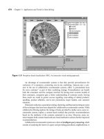
G = nx.read_gml(‘lesmiserables.gml’,relabel=True)
In the code above we imported the coappearance network of characters
in the novel Les Miserables, freely available at />lesmiserables.gml.zip, in the GML format. We can also visualize the loaded
network with the following command:
print pca.explained_variance_ratio_
[ 0.92461621 0.05301557]
Now we know that the first PC accounts for 92% of the information of the
original dataset while the second one accounts for the remaining 5%. We
can also print how much information we lost during the transformation
process:
nx.draw(G,node_size=0,edge_color=’b’,alpha=.2,font_size=7)
The result should be as follows:
print 1-sum(pca.explained_variance_ratio_)
0.0223682249752
In this case we lost 2% of the information.
At this point, we can apply the inverse transformation to get the original
data back:
data_inv = pca.inverse_transform(pcad)
Arguably, the inverse transformation doesn’t give us exactly the original
data due to the loss of information. We can estimate how much the result
of the inverse is likely to the original data as follows:
print abs(sum(sum(data - data_inv)))
2.8421709430404007e-14
We have that the difference between the original data and the
approximation computed with the inverse transform is close to zero.
In this network each node represents a character of the novel and the
connection between two characters represents the coappearance in the
same chapter. It’s easy to see that the graph is not really helpful. Most of
the details of the network are still hidden and it’s impossible to understand
which are the most important nodes. In order to gain some insights about
our data we can study the degree of the nodes. The degree of a node is
considered one of the simplest centrality measures and it consists of the
number of connections a node has. We can summarize the degrees
distribution of a network looking at its maximum, minimum, median, first
quartile and third quartile:
It’s interesting to note how much information we can preserve by varying
the number of principal components:
for i in range(1,5):
pca = PCA(n_components=i)
pca.fit(data)
print sum(pca.explained_variance_ratio_) * 100,’%’
DZone, Inc.
|
www.dzone.com
Data Mining
6
deg = nx.degree(G)
from numpy import percentile, mean, median
print min(deg.values())
print percentile(deg.values(),25) # computes the 1st quartile
print median(deg.values())
print percentile(deg.values(),75) # computes the 3rd quartile
print max(deg.values())
This time the graph is more readable. It makes us able to observe the most
relevant characters and their relationships.
It is also interesting to study the network through the identification of its
cliques. A clique is a group where a node is connected to all the other ones
and a maximal clique is a clique that is not a subset of any other clique
in the network. We can find the all maximal cliques of the our network as
follows:
from networkx import find_cliques
cliques = list(find_cliques(G))
From this analysis we can decide to observe only the nodes with a degree
higher than 10. In order to display only those nodes we can create a new
graph with only the nodes that we want to visualize:
Gt = G.copy()
dn = nx.degree(Gt)
for n in Gt.nodes():
if dn[n] <= 10:
Gt.remove_node(n)
nx.draw(Gt,node_size=0,edge_color=’b’,alpha=.2,font_size=12)
And we can print the biggest clique with the following command:
print max(cliques, key=lambda l: len(l))
[u’Joly’, u’Gavroche’, u’Bahorel’, u’Enjolras’, u’Courfeyrac’,
u’Bossuet’, u’Combeferre’, u’Feuilly’, u’Prouvaire’,
u’Grantaire’]
We can see that most of the names in the list are the same of the cluster of
nodes on the right of the graph.
Other Resources
•
•
•
•
•
•
The image below shows the result:
ABOUT THE AUTHOR
IPython: interactive shell; browser-based notebook
NLTK (Natural Language Toolkit): modules, data,
documentation for natural language processing.
OpenCV: popular library for image processing and computer
vision.
Pandas: data structures for working with “relational” or
“labeled” data
Scipy: huge collection of algorithms and facilities for advanced
math, signal processing, optimization and statistics (built on
numpy)
Statsmodels: rich module for descriptive statistics, statistical
tests, plotting functions, result statistics
RECOMMENDED BOOK
This book introduces how to manipulate, process,
and clean data using Python. It is written by the
author of one of the most used libraries for data
manipulation (Pandas) and guides the reader with a
lot of practical cases studies. It is ideal for any level
of programmer, analysts and researcher and it is
suitable for who already knows Python and for who
already knows Python programmers but is new to
scientific computing and data analysis.
Giuseppe Vettigli works at Cybernetics Institute of the
Italian National Research Council. His research is focused
on Artificial Intelligence and he combines Data Mining and
Software Engineering in order to design new models and
applications for the analysis of structured and unstructured
data. You can check his blog about Python programming
and data visualization at
or follow him on Twitter /> Buy Here
Browse our collection of over 150 Free Cheat Sheets
Upcoming Refcardz
Free PDF
C++
Cypher
Clean Code
Subversion
DZone, Inc.
150 Preston Executive Dr.
Suite 201
Cary, NC 27513
Copyright © 2013 DZone, Inc. All rights reserved. No part of this publication may be reproduced, stored in a retrieval
system, or transmitted, in any form or by means electronic, mechanical, photocopying, or otherwise, without prior
written permission of the publisher.
888.678.0399
919.678.0300
Refcardz Feedback Welcome
$7.95
DZone communities deliver over 6 million pages each month to
more than 3.3 million software developers, architects and decision
makers. DZone offers something for everyone, including news,
tutorials, cheat sheets, blogs, feature articles, source code and more.
“"DZone is a developer's dream",” says PC Magazine.
Sponsorship Opportunities
Version 1.0