Nghệ thuật thư pháp tranh typo
Bạn đang xem bản rút gọn của tài liệu. Xem và tải ngay bản đầy đủ của tài liệu tại đây (37.66 MB, 355 trang )
typographic
design:
FORM AND COMMUNICATION
6TH
EDITION
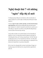
Saint Barbara.
Polychromed walnut
sculpture, fifteenthcentury German or
French. The Virginia
Museum of Fine Arts.
typographic
design:
FORM AND COMMUNICATION
Rob Carter
Philip B. Meggs
Ben Day
Sandra Maxa
Mark Sanders
6TH
EDITION
Cover design: Sandra Maxa and Mark Sanders
This book is printed on acid-free paper.
Copyright © 2015 by John Wiley & Sons, Inc. All rights reserved
Published by John Wiley & Sons, Inc., Hoboken, New Jersey
Published simultaneously in Canada
No part of this publication may be reproduced, stored in a retrieval system,
or transmitted in any form or by any means, electronic, mechanical, photocopying,
recording, scanning, or otherwise, except as permitted under Section 107 or 108 of
the 1976 United States Copyright Act, without either the prior written permission
of the Publisher, or authorization through payment of the appropriate per-copy fee
to the Copyright Clearance Center, 222 Rosewood Drive, Danvers, MA 01923, (978)
750-8400, fax (978) 646-8600, or on the web at www.copyright.com. Requests to the
Publisher for permission should be addressed to the Permissions Department, John
Wiley & Sons, Inc., 111 River Street, Hoboken, NJ 07030, (201) 748-6011, fax (201)
748-6008, or online at www.wiley.com/go/permissions.
Limit of Liability/Disclaimer of Warranty: While the publisher and author
have used their best efforts in preparing this book, they make no representations
or warranties with the respect to the accuracy or completeness of the contents
of this book and specifically disclaim any implied warranties of merchantability
or fitness for a particular purpose. No warranty may be created or extended
by sales representatives or written sales materials. The advice and strategies
contained herein may not be suitable for your situation. You should consult with a
professional where appropriate. Neither the publisher nor the author shall be liable
for damages arising herefrom.
For general information about our other products and services, please contact
our Customer Care Department within the United States at (800) 762-2974, outside
the United States at (317) 572-3993, or fax (317) 572-4002.
Wiley publishes in a variety of print and electronic formats and by print-ondemand. Some material included with standard print versions of this book may not
be included in e-books or in print-on-demand. If this book refers to media such as
a CD or DVD that is not included in the version you purchased, you may download
this material at . For more information about Wiley
products, visit www.wiley.com.
Library of Congress Cataloging-in-Publication Data:
Carter, Rob.
Typographic design : form and communication / Rob Carter, Ben Day, Philip
Meggs, Sandra Maxa, Mark Sanders. -- Sixth edition.
pages cm
Includes bibliographical references and index.
ISBN 978-1-118-71576-5 (paperback) -- ISBN 978-1-118-71581-9 (pdf) -- ISBN
978-1-118-71579-6 (epub)
1. Graphic design (Typography) I. Day, Ben. II. Meggs, Philip B. III. Maxa,
Sandra. IV. Sanders, Mark (Mark Allen) V. Title.
Z246.C217 2015
686.2’2--dc23
2014012636
Printed in the United States of America
10 9 8 7 6 5 4 3 2 1
“The whole duty of typography, as with
calligraphy, is to communicate to the
imagination, without loss by the way,
the thought or image intended to be
communicated by the Author.”
Thomas James Cobden-Sanderson
75
CONTENTS
Foreword, Rob Carterviii
Introductionix
5
Syntax and Communication
85
Typographic syntax
86
1
The Evolution of Typography
1
Typographic space
96
From the origins of writing to Gutenberg’s invention of
movable type
2
Visual hierarchy
100
ABA form
106
Typography from Gutenberg to the nineteenth century
7
6
The Typographic Message
111
A multidimensional language
112
Verbal/visual equations
114
Function and expression
118
7
The Evolution of Typographic Technology
121
Hand composition
122
Machine composition
123
The nineteenth century and the Industrial Revolution
12
Typography in the twentieth century
18
A new century and millennium begin
27
2
The Anatomy of Typography
31
Letterforms analyzed
32
The typographic font
35
Historical classification of typefaces
38
Typographic measurement
42
The type family
45
3
Legibility
49
Basic principles of legibility
50
Legibility and digital typography
60
Typographic details
62
4
The Typographic Grid
65
Background
66
67
Structure and space
Proportion
68
The square
69
Single column grids
71
Multicolumn grids
74
Modular grids
78
Improvisational structures
84
Phototypesetting
125
Digital typesetting
128
Screen-based typography
131
8
Typography on Screen
133
Rendering type on screen
134
Reading on screen
137
Selecting typefaces
138
Legibility factors for on-screen typography
141
Web design technology
145
Structuring web pages
146
Case studies
148
9
Typography in Time and Motion
155
Background
156
Using type in time-based media
159
How type changes and moves
163
Legibility factors
167
Expression
vi
169
10 Case Studies in Typographic Design
171
Integrating type and image in poster design
172
The U.S. National Park Service Unigrid system
176
Book design: VAS: An Opera in Flatland179
Typographic film titles
183
Buenos Aires Underground (Subte)
186
Information design: Metropolitan World Atlas
190
A typographic program for the 17th Street Farmers’ Market 194
11 Typographic Design Education
197
Letter/digit configurations
198
Urban letterform studies
198
Flowering typography
199
12 Typographic Design Process
221
Inventing sign systems
199
A traditional model
222
Comparative relationships: type and image
200
Exploring typographic permutations
229
Sequential typographic forms in space
201
Exploring typographic transformation
234
Typography and image transformations
201
Ludd: a typographic expedition
241
Unity of form and communication
202
Composites
249
Syntactic explorations using onomatopoeic terms
203
13 Type Specimens
255
Visual structure motion studies
204
Old Style
256
Type chronology booklet
205
Garamond
258
Typographic hierarchy
206
Additional Old Style fonts
264
Calendar deconstruction
207
Sans serif
266
Experimental compositions with found typography
208
Franklin Gothic
268
Directional poster: from your house to the university
209
Univers
274
Visual organization and grid structures
209
Meta
280
New York Times grid analysis
210
Futura
286
Environmental grids
211
292
Banknote design
212
Transitional
294
Observing systems in our surroundings
213
Baskerville
296
Typographic cubes
214
302
Blending Latin and non-Latin typographic forms
214
Modern
304
Type and image in the third dimension
215
Bauer Bodoni
306
Typezine: my favorite typeface
216
Additional Modern fonts
312
Typeface design: mind/machine
217
Egyptian
314
Experimental typographic system
218
Serifa
316
Expressive typography: form amplifies message
219
Additional Egyptian fonts
322
Type as metaphor
219
Selected Decorative fonts
324
Form and counterform, scale and proportion:
“Ne var, ne yok?”
220
Additional sans serif fonts
Additional transitional fonts
Glossary326
Bibliography
332
Credits
334
Index
338
vii
FOREWORD
During the late 1970s and early 1980s, I was a youthful assistant
professor of graphic design and typography at Virginia Commonwealth
University. At that time, typography held special significance in the
graphic design curriculum, and faculty spent much effort writing
content for the typography courses. With perhaps the exception of Emil
Ruder’s Manual of Typographical Design, a masterful book based on
Ruder’s philosophy and typographic instruction during the 1960s at
Basel School of Design, my colleagues Philip Meggs, Ben Day, and I
could not find a text that moved typography beyond what was generally
considered a technical discipline. Our concern was to teach typography
as both a technical and theoretical discipline, one that focused on form
(syntax) and communication (semantics). Finally, during a meeting
sometime in 1982, we made a decision to write our own typography
textbook, based on our collections of notes from our classes.
While the three of us shared a passion for typography and a
commitment to typographic education, each of us also brought our
own unique vision, which produced a synergistic and dynamic
interaction. Researching, articulating, and blending ideas did not come
easily. During weekends and long into countless nights, we struggled to
invent a vocabulary and approach to typographic education that would
move the discipline forward and provide students with a text that not
only covered basics but also presented information within a muchneeded theoretical and historical framework.
Three years later, the first edition of Typographic Design: Form
and Communication was published. The book, with its gray cover and
elemental TD, was eventually referred to as the “Carter, Day, Meggs”
book, or simply “the gray book.” It soon became a classic, one that has
inspired, enlightened, and educated thousands of students over thirty
years.
I am proud and grateful that my former graduate students Sandra
Maxa and Mark Sanders have taken up the mantle of authorship for this,
the sixth edition of Typographic Design: Form and Communication.
As articulate and committed design educators and practitioners,
they have preserved the spirit of previous editions while brilliantly
introducing vital new content. Readers who thoughtfully enter into
this volume will gain the knowledge necessary for an informed and
inspired typographic design practice.
Rob Carter
viii
INTRODUCTION
Typography is a constantly evolving discipline, and this book aims
to provide a concise yet comprehensive overview of the information,
vocabulary, tools, and methods used in effective typographic-design
practice. Included in the following chapters are the history and
anatomy of typography; principles of visual organization and legibility;
a study of the intersection of form, meaning, and media; projects that
explore a variety of contexts; and case studies devoted to traditional
and nontraditional typographic design processes.
This book’s sixth edition reflects a view of typography that
transcends specific technologies or media. A knowledge of typographic
fundamentals is key to communicating in all environments—static,
dynamic, or kinetic—and the first few chapters address the basics of
form, syntax, how type communicates, and its potential for expression.
Current typographic design practice can be better understood if one
understands the evolution of earlier typesetting processes, and Chapter
7 provides that background for new designers, many who will work
primarily in digital environments. Chapters specific to on-screen and
kinetic typography provide the designer with an expanded awareness
of legibility factors and enable compelling new ways to communicate.
Case studies in applied problem solving are meant to inspire and
show readers how to use their newfound knowledge to communicate
visually. Theoretical and structural problem-solving approaches,
evolved by design educators, reinforce the underlying concepts in this
book. An understanding of typographic classification and subtlety of
form is gained from the study of type specimens.
Through the thirteen chapters of this book, the authors share
a compilation of information and examples with practitioners and
students. It yields both insights and inspiration, bringing order to the
complex and diversified subject of typographic design.
ix
The Evolution of Typography
1
Typography is an evolution of the written word, and as such it
participates in a history of visual communication extending thousands
of years. That evolution is presented here in the form of a timeline that
traces a development from hand, to mechanical, to digital practice, in
the context of world-historical and art-historical events.
The history treated in the first section of the timeline predates
typography. It begins with the invention of writing over five thousand
years ago and ends with the invention of movable type in Europe
during the middle of the fifteenth century. The second section
covers the long era of the handpress and hand-set metal types. This
period, from Gutenberg’s invention of movable type to the end of the
eighteenth century, lasted about 350 years. In the third section, the
Industrial Revolution and nineteenth century are revealed as an era
of technological innovation and an outpouring of new typographic
forms. The fourth section begins with the year 1900 and covers the
twentieth century, a time when type was shaped by the aesthetic
concerns of modernism, the need for functional communication,
technological progress, and the digital revolution in typography.
The final section showcases typographic design in the twenty-first
century, as it expands to mobile devices and embraces the many
possibilities afforded by digital production.
1
From the origins of writing to
Gutenberg’s invention of movable
type: 3150 BCE–1450 CE
1-4
1-8
c. 3150 BCE
1-1
1-6
1-3 c. 2600 BCE:
Completion of the
pyramids at Giza, Egypt.
1-1 c. 3150 BCE:
The earliest written
documents, impressed
clay tablets from Sumer.
The impressions represent
clay tokens, which were
used for record keeping
before the invention of
writing.
1-2
1-2 c. 3000 BCE:
Cuneiform, a very early
writing system utilizing
wedge-shaped marks on
clay tablets, was invented
by the Sumerians.
1-4 c. 2400 BCE: Falsedoor stele inscribed with
hieroglyphic writing,
from Old Kingdom
Egypt.
1-5 c. 2100 BCE:
Cuneiform tablet listing
expenditures of grain and
animals.
1-6 c. 1800–1400 BCE:
Stonehenge, a megalithic
monument of 30-foot-tall
stones set into circular
patterns.
1-8
1-7 c. 1570–1349 BCE:
Polychromed wood
sculpture from New
Kingdom Egypt, with
hieroglyphic inscriptions.
1-8 c. 1450 BCE:
Detail, The Book of the
Dead of Tuthmosis III,
hieroglyphic writing on
papyrus.
1-5
c. 2500 BCE: Egyptians
begin to make papyrus,
a new writing material
derived from the stems
of the papyrus plant.
1-3
1-7
2
1-14
1-11
1-15
c. 1500 BCE
1-9
1-12
1-16
1-12 448–432 BCE: The
Parthenon, temple of
the goddess Athena, on
the Acropolis in Athens,
Greece.
1-9 c. 1500 BCE: The
twenty-two characters of
the Phoenician alphabet.
c. 800 BCE: Homer
writes the Iliad and the
Odyssey.
540 BCE: The first public
library is established in
Athens, Greece.
1-10 389 BCE:
Inscription in the
Phoenician alphabet on
a fragment of a marble
bowl.
1-13 414–413 BCE:
Fragment of a Greek
record of sale, carved on
stone.
1-11 Fourth century
BCE: Greek manuscript
writing.
a new writing material
made from animal skins,
is developed in the
Greek state of Pergamum.
c. 160 BCE: Parchment,
44 BCE: Julius Caesar is
murdered.
1-10
1-14 c. 50 BCE–500 CE:
Roman square capitals
(capitalis quadrata) were
carefully written with a
flat pen.
1-15 c. 79 CE: Brush
writing from a wall at
Pompeii, preserved by
the volcanic eruption of
Vesuvius.
c. 33 CE: Crucifixion
of Christ.
105 CE: Ts’ai Lun
invents paper in China.
1-16 c. 100–600:
Roman rustic writing
(capitalis rustica)
conserved space by using
condensed letters written
with a flat pen held in an
almost vertical position.
150 CE: The Roman
codex, with folded
pages, begins to be used
alongside the rolled
scroll.
1-13
THE EVOLUTION OF TYPOGRAPHY 3
118 CE
1-19
1-20
1-17
1-21
1-19 312–15: Arch
of Constantine, Rome.
Carved into marble,
monumental Roman
capitals survived the
thousand-year Dark
Ages.
325: Emperor Constantine
1-17 118–25:
The Pantheon, Rome.
1-18 Undated:
The fluid gestural quality,
harmonious proportions,
and beautiful forms
of Roman writing are
effectively translated
into the permanent stone
carving of monumental
capitals (capitalis
monumentalis).
1-18
adopts Christianity as
the state religion of the
Roman Empire.
c. 400–1400: During the
thousand-year medieval
era, knowledge and
learning are kept alive in
Christian monasteries,
where manuscript books
are lettered in scriptoria.
452: Attila the Hun
invades and ravages
northern Italy.
476: Emperor Romulus
Augustulus, last ruler
of the western Roman
Empire, is deposed by
the Ostrogoths.
1-20 533–49: Church
of Sant’Apollinare in
Classe, Ravenna, Italy.
1-21 Third–sixth
centuries: Uncials are
rounded, freely drawn
majuscule letters.
1-22
1-2
1-23
4
1-22 Third–ninth
centuries: Half-uncials,
a lettering style of
the Christian Church,
introduce pronounced
ascenders and
descenders.
1-23 Sixth–ninth
centuries: Insular
majuscules, a formal
style with exaggerated
serifs, are developed by
Irish monks from the
half-uncials.
732 CE
1-32
1-24
1-24 c. 800: Portrait
of Christ from the
Book of Kells, a Celtic
manuscript.
868: The earliest
extant printed text, of
the Diamond Sutra, is
printed in China.
732: The Battle of Tours
ends the Muslim advance
into Europe.
1-25 Tenth century:
High Cross at Kells,
Meath County, Ireland.
800: Charlemagne is
crowned emperor of the
Holy Roman Empire by
Pope Leo III.
1-31
1-26 c. Eleventh
century: Round tower
on the Rock of Cashel,
county Tipperary,
Ireland, a lookout and
refuge against Viking
invaders.
1-27 Eighth–twelfth
centuries: Caroline
minuscules become the
standard throughout
Europe after Charlemagne
issues his reform decree
of 796, calling for a
uniform writing style.
1034: Bi Sheng (Pi
Sheng) invents movable
type in China.
1-30 Twelfth century:
Bronze and copper
crucifix from northern
Italy.
1-28 1163–1250:
Construction of Notre
Dame Cathedral, Paris.
1215: The Magna Carta
1-29 Eleventh–twelfth
centuries: Early Gothic
lettering, a transitional
style between Caroline
minuscules and Textura,
has an increased vertical
emphasis.
1-31 Thirteenth–
fifteenth centuries:
Gothic Textura Quadrata,
or Textura, the lateGothic style with
rigorous verticality and
compressed forms.
grants constitutional
liberties in England.
1-32 Thirteenth
century: Byzantine
school, Madonna and
Child on a Curved
Throne.
1347–51: First wave
of the Black Death, a
plague that decimates the
European population.
1096–99: The First
Crusade.
1-25
1-27
1-26
1-29
1-28
1-30
THE EVOLUTION OF TYPOGRAPHY 5
1-38
c. 1200
1-35
1-33
1-34 Fourteenth
century: Lippo Memmi,
Saint John the Baptist.
1-35 1420–36:
Filippo Brunelleschi,
dome of Florence
Cathedral.
1431: Joan of Arc is
burned at the stake.
1-33 Thirteenth–
1-36 Fifteenth
fifteenth centuries:
century: First page of a
Rotunda, a more rounded
Gothic letter, flourishes
in southern Europe.
block book, the biblical
book of Apocalypse.
Woodblock printing
probably appeared in
Europe before 1400.
1-37
Fra Filippo Lippi,
Madonna and Child.
Johann Gutenberg
invents movable type in
Mainz, Germany.
1-38 c. 1450–55: Page
from Gutenberg’s fortytwo-line Bible, the first
European typographic
book.
1-39 Woodblock print of
the hand printing press,
with compositors setting
type from a typecase in
the background.
1-37
1-39
1-34
1-36
1-40
6
1-40 The cathedral
in the medieval city of
Mainz, Germany.
Typography from Gutenberg to the
nineteenth century: 1450–1800 CE
The humanist philosophy that flowered during
the Renaissance embraced the study of classical
literature, a belief in human dignity and worth, a spirit
of individualism, and a shift from religious to secular
concerns.
1465
1-47
1-41
1-45
1-42
1-45 c. 1485: Filippino
Lippi, Portrait of a Youth.
1-43
1-41 1465: Germans
Konrad Sweynheym
and Arnold Pannartz
design the first type in
Italy. It had some Roman
features.
1-44
1-42 1467: Konrad
Sweynheym and Arnold
Pannartz, the first truly
Roman-style type,
influenced by Roman
inscriptional capitals and
manuscripts written in
Caroline minuscules.
1-43 1470: Nicolas
Jenson, early Venetian
roman typeface.
1-44 1475: William
Caxton, typography from
the first book printed in
the English language.
1-46 1486: Erhard
Ratdolt, the earliest
known specimen sheet
of printing types.
1492: Christopher
Columbus lands in
America.
1-47 c. 1494: Scholar
and printer Aldus
Manutius established the
Aldine Press in Venice
to publish works by the
great Greek and Roman
thinkers.
1-48 1495: Francesco
Griffo (punch cutter for
Aldus Manutius), roman
type first used in De
aetna by Pietro Bembo.
1-46
1-48
THE EVOLUTION OF TYPOGRAPHY 7
1501
1-55
1-56
1-49
1-55 1519–47: Pierre
Nepveu, château of
Chambord, France.
1-50 Home of Albrecht
Dürer, Nuremberg,
Germany.
1-49 1501: Francesco
Griffo, the first italic
typeface, based on
chancery script
handwriting.
1-51 Woodblock
initial by Geoffroy
Tory, who returned to
France from study in
Italy in 1505, inspired
by Roman letterforms
and Renaissance design
ideals.
1-52 1523: Lodovico
Arrighi, an Italian writing
master, introduces his
formal chancery italic
type.
1-53 1525: Albrecht
Dürer, construction of the
letter B.
1-54 1529: Geoffroy
Tory, construction of the
letter B.
1-53
1-54
1517: Martin Luther
posts his ninety-five
theses on the door
of Wittenberg Castle
Church, launching the
Reformation.
1-50
8
1-51
1-52
1-56 c. 1480–1561:
Claude Garamond,
outstanding designer
of Old Style typefaces
during the French
Renaissance.
1-59
1-60
1-62
c. 1540
1-60 After 1577: El
Greco, Saint Martin and
the Beggar.
1-57
1-57 c. 1540: Titian,
portrait, Cardinal Pietro
Bembo.
1543: Nicolaus
Copernicus publishes
his theory of the
heliocentric solar
system.
1-58 1544: Simone de
Colines, title page with
woodcut border.
1-59 1546: Jacques
Kerver, typography,
illustration, and
decorative initials, which
were combined with
rare elegance during the
1582: Pope Gregory Xlll
initiates the Gregorian
calendar, which is still
1-62 1607: Carlo
Maderna, façade of St.
in use.
Peter’s, the Vatican.
1584: Sir Walter Raleigh
sends explorers to the
North American coast.
1609: Regular weekly
newspapers appear in
Strasbourg, Germany.
1-61 1595: Johann
Theodor de Bry,
illustrative initial E.
1-63 1621: Jean Jannon,
typefaces upon which
twentieth-century
Garamonds are based.
1603: William
1-64 1628: The Vatican
Press, specimen of roman
capitals.
Shakespeare writes
Hamlet.
French Renaissance.
1-58
1-61
1-63
1-64
THE EVOLUTION OF TYPOGRAPHY 9
During the eighteenth century, type design went
through a gradual transition from Old Style to Modern
Style fonts designed late in the century.
1-67
1-71
1632
1-65
1-66 c. 1630: Sir
Anthony van Dyck,
portrait, Henri ll de
Lorraine.
1639: The first printing
press in the British
Colonies is established
in Massachusetts.
1-65 1632–43: The Taj
Mahal, India.
1-68
1-67 c. 1664: Jan
Vermeer, Woman Holding
a Balance.
1666: The Great Fire of
London.
1657: First fountain pen
1667: Milton publishes
is manufactured, in Paris.
Paradise Lost.
1-68 c. 1670: Christoffel
van Dyck, Dutch Old
Style type.
1686: Sir Isaac Newton
1-69 1675–1710:
Sir Christopher Wren,
St. Paul’s Cathedral,
London.
1-71 1709: Matthaus
Poppelmann, Zwinger
Palace, Dresden,
Germany.
1700: The emergence of
the Rococo style.
1709: England adopts
the first copyright law.
1-70 1702: Philippe
Grandjean (punch
cutter), Romain du Roi,
the first transitional face.
1-72 1720: William
Caslon, Caslon Old
Style types, which from
this date were used
throughout the British
Empire.
sets forth his law of
gravity.
1-66
1-70
10
1-69
1-72
1-75
1-76
1722
1-77
1-73
1-82
1-73 1722: Castletown,
near Dublin, Ireland.
1738: First spinning
machines are patented
in England.
1-75 1750: François
Boucher, The Love Letter.
1-74 1744: Benjamin
Franklin, title page using
Caslon type.
1-76 1750s: John
Baskerville creates
extraordinary transitional
typefaces.
1-74
1-77 1765: Thomas
Cottrell introduces
display types two inches
tall (shown actual size).
1-80 1774: John
Holt, broadside of the
American revolutionary
era, using Caslon type.
1-81 1784: François
Ambroise Didot, the
first true Modern Style
typeface.
1-78 1768: Pierre
Simon Fournier le Jeune,
ornamented types.
1775: James Watt
1789: The fall of the
constructs the first
efficient steam engine.
Bastille launches the
French Revolution.
1-79 1773: Johann
David Steingruber, letter
A from Architektonisches
Alphabet.
1776: American
Declaration of
Independence is signed.
1-82 1791: Giambattista
Bodoni, Modern Style
typefaces of geometric
construction, with
hairline serifs.
1791: American Bill
of Rights guarantees
freedoms of religion,
speech, and the press.
1793: French King
Louis XVI and Marie
Antoinette are sent to
the guillotine.
1796: Aloys Senefelder
invents lithography.
1799: Nicolas-Louis
Robert invents the
papermaking machine.
1-78
1-79
1-80
1-81
THE EVOLUTION OF TYPOGRAPHY 11
The nineteenth century and
the Industrial Revolution:
1800–1899 CE
1-88
The Industrial Revolution had a dramatic impact upon
typography and the graphic arts. New technology
radically altered printing, and designers responded
with an outpouring of new forms and images.
1803
1-84 1812: JacquesLouis David, Napoleon
in His Study (detail).
1-89
1814: Friedrich Koenig
invents the steampowered printing press.
1-83
1-83 c. 1803: Robert
Thorne designs the first
fat face.
1804: Napoleon
Bonaparte crowned
emperor of France.
1808: Ludwig van
Beethoven composes
his Fifth Symphony.
1-85
1-86
1-87
12
1-85 1815: Vincent
Figgins shows the first
Egyptian (slab-serif)
typefaces.
1-86 1815: Vincent
Figgins shows the earliest
shaded type.
1-87 1816: William
Caslon IV introduces the
first sans serif type.
1-88 1818: Page from
Manuale Tipographico,
which presented the
lifework of Giambattista
Bodoni.
1-89 1821: Robert
Thorne, Tuscan style
with splayed serifs.
1-91
1-94
1-92 1827: Darius Wells
invents the mechanical
router, making the
manufacture of large
display wood types
possible.
1-93 1833: Vincent
Figgins introduces
outline types.
1-95
1822
1-90 1822: Thomas
Jefferson, rotunda of the
University of Virginia
in the neoclassical style
based on Greek and
Roman architecture.
1822: Joseph-Nicéphore
Niépce produces the first
photographic printing
plate.
1-91 c. 1826: Bower,
Bacon and Bower, early
reversed type entitled
White.
1826: Joseph-Nicéphore
Niépce takes the first
photograph from nature.
1-90
1-94 1836: Davy and
Berry, poster printed
with wood type.
1-95 1836: Vincent
Figgins, perspective type.
1-96 1837: Handbill set
in fat face.
1837: Victoria crowned
1830s–80s: Wood-type
queen of England.
posters and broadsides
flourish in America and
Europe.
1-92
1-93
1-96
THE EVOLUTION OF TYPOGRAPHY 13