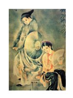
Nghệ thuật thư pháp tranh thuxiodd calligraphy magic how to create lettering knotwork coloring and more
Bạn đang xem bản rút gọn của tài liệu. Xem và tải ngay bản đầy đủ của tài liệu tại đây (11.6 MB, 130 trang )
A RT TE CHNI Q U ES
EASY Lettering Techniques
for TIMELESS BEAUTY
Includes instructions
for creating your own
computer fonts
Transform ordinary handwritten pieces into unique, artistic
keepsakes. Calligraphy Magic makes the art of decorative
lettering fun and achievable—even if you’re a beginner.
Take it one simple pen-stroke at a time. Following Cari
Buziak’s clear visual instruction, you’ll learn how to embellish
every project with beautifully hand-lettered words, logos and
decorative illustrations. Detailed demonstrations include:
✽ A precise list of the tools and materials you’ll need
✽ Colorful illustrations that show how to form every stroke
✽ 15 complete alphabets—from basic to elaborate—such as
Italic, Gothic and Versal
✽ Step-by-step instruction for adding exciting decorative
touches such as Celtic knotwork, gold leafing and
eye-popping colors
✽ 12 step-by-step projects that show how to create gorgeous
calligraphic treatments for wedding invitations, greeting
cards, thank you notes, awards, certificates and much more
✽ Plus, a full chapter that walks you through using a
computer to create your own calligraphy fonts
BUZIAK
There are even pre-printed practice pages you can
photocopy to help you perfect every stroke. It’s all here in
Calligraphy Magic. Take your decorative lettering to new
heights of precision and beauty, and create timeless pieces
for family and friends to treasure and admire.
US $22.99
Z7246
(CAN $25.99)
ISBN-13: 978-1-4403-0496-5
ISBN-10: 1-4403-0496-3
35313 64965
Z7246 CM Calligraphy Magic.indd 1
3
Ideas. Inspiration. Instruction.
www.artistsnetwork.com
9
01
02
03
04
FnL1
JUYrVyBQdWJsaWNhdGlvbnMsIEluYyAo
SW9sYSBkaXZpc2lvbikPR3JlZ29yeSBL
cnVlZ2VyAE1CyBMEMTAuNAI4MAExBkVB
Ti0xMw05NzgxNDQwMzA0OTY1AA==
04 0124
0
01
02
03
04
FnL1
cnVlZ2VyAE1CyEYCMTMDMTAwATEFVVBD
LUEMMDM1MzEzNjQ5NjUzRA==
JUYrVyBQdWJsaWNhdGlvbnMsIEluYyAo
SW9sYSBkaXZpc2lvbikPR3JlZ29yeSBL
04 0120
UPC
EAN
52299
781440 304965
2/11/11 10:41:14 AM
Calligraphy Magic
Z7246i 001-007 Front Matter.indd1 1
2/1/11 4:57:36 PM
Z7246i 001-007 Front Matter.indd2 2
2/1/11 4:57:40 PM
Calligraphy Magic
How to Create Lettering, Knotwork, Coloring and More
Cari Buziak
CINCINNATI, OHIO
www.artistsnetwork.com
Z7246i 001-007 Front Matter.indd3 3
2/1/11 4:57:48 PM
Table of Contents
Introduction
6
Glossary of Terms
7
CHAPTER 1
Calligraphy Tools and Supplies
8
CHAPTER 2
How to Make Calligraphy Strokes
16
CHAPTER 3
15 Alphabets from Basic to Fancy
24
CHAPTER 4
Ornamentation, Gilding and Coloring 42
4
Learn more about calligraphy at
Z7246i 001-007 Front Matter.indd4 4
2/1/11 4:57:55 PM
CHAPTER 5
12 Calligraphy Projects Step by Step
62
STATIONERY AND EVENT ANNOUNCEMENTS
Bookplates / Greeting Cards / Bookmarks / Logos / Business Cards and
Letterhead / Wedding Announcements, Invitations, Place Cards and
Thank-You’s
DISPLAY PIECES
Monograms / Quotations / Certificates / Lettering with
Celtic Decoration / Illustrated Poems / Lettering with Dragon Artwork
CHAPTER 6
Creating Your Own Computer Fonts
92
Pre-printed Celtic Knotwork Grid Paper
106
Pre-ruled Calligraphy Practice Pages
108
Index
124
About the Author / Dedication / Acknowledgments
127
For a free downloadable issue of The Artist’s Magazine, visit www.artistsnetwork.com/newsletter_thanks
Z7246i 001-007 Front Matter.indd5 5
5
2/1/11 4:58:01 PM
Introduction
Calligraphy is a fun craft to learn, as well as a useful one. Far from being
an obsolete skill, more and more people today are picking up the pen and
creating their own greeting cards, wedding invitations, fine art projects,
and even creating their own computer fonts!
In the old days, calligraphy tools were unique and specifically crafted
to their task. Today, a calligrapher has a wide variety of tools from which
to choose, from traditional to completely modern, even digital! Calligraphers can now experiment with their artistic expression, freely mixing
creative ideas and elements together to explore new artforms with their
projects. In this book we’ll examine the basic techniques of calligraphy,
covering calligraphy hands suitable for a wide variety of projects and easy
for a beginner or intermediate calligrapher to practice and learn. We’ll
also cover easy decorative techniques such as watercolor painting, Celtic
knotwork, gold leafing and illustration ideas to create a “toolkit” of creative techniques. You’ll learn how to make your own wedding stationery,
create a painted greeting card or a birth announcement, design a logo
for your own business, and so much more! We’ll cover all the steps from
basic layout to design choices to the final completed piece in easy stepby-step examples.
Calligraphy is a way of expressing yourself and learning something new
in an art field that has lots of potential for new discoveries—finding new
ways to embellish your lettering, learning a new alphabet, or creating
memorable keepsakes with a handmade touch for yourself, family and
friends.
6
Learn more about calligraphy at
Z7246i 001-007 Front Matter.indd6 6
2/1/11 4:58:07 PM
Glossary of Terms
Ascenders & Descenders
Serif
A letter has three main parts: the x-height, the
ascender, and the descender. The main body of the letter fills the x-height (for example, the lowercase “o”);
the ascender rises up above the x-height (the stem of
the “d”); and the descender falls below the x-height
(the stem on the lowercase “p”).
A small stroke at the beginning or end of a main
stroke. A serif can be made in many ways and often
gives a particular alphabet its characteristic look.
Glyph
Any graphic within a font. This can be a letter, number,
or a symbol such as a dollar sign or punctuation.
Font
A typeface (alphabet) used on a computer (as opposed
to letters used on a printing press, or hand written).
Font Family
A font family includes a number of related font faces,
such as a bold version, condensed, italic, light, etc.
Cursive
A more fluid or script style of writing, developed as a
faster way to write by monks. Cursive usually has a
looser and less formal look. It’s useful for projects that
need letters that flow and move in the design without
looking too formal or stiff.
Encoding
Each glyph is encoded with instructions so that the
computer knows to type an “A” when you press the
“A” key on your keyboard. At one time Macs and PCs
used different encoding instructions or standards; however the new Unicode Standard is a universal standard
that both Macs and PCs will recognize and understand
and what we’ll be using in our discussions here.
Metrics
Spacing rules that you want your font letters to follow
so that they’re spaced correctly when you type words
and paragraphs.
Majuscule
Color Hue/Tint/Shade
Capital or uppercase letters in an alphabet. Also great
for creating a splash at the beginning of a text with a
larger or more detailed letter. Often used for monograms, or a detailed piece in stand-alone uses where
there may not be any other text or designs in a project.
A highly decorated Majuscule used at the beginning of
a word or sentence is called a “Display Capital.”
Hue is pure color. Tint is color plus white. Shade is
color plus black.
Complementary Colors
Colors opposite each other on the color wheel. Complementaries can create strong and bold color pairings.
Triad Colors
Minuscule
Lowercase letters in an alphabet. Some minuscule
letters lend an informal look to a piece of text, and can
be used in projects where a lighter or more inviting
feel is desired.
Uncial
A style of writing characterized by full, rounded letters. Capitals from our modern Latin alphabet are
derived from Uncial style letterforms.
Three colors, each one-third away from each other
on the color wheel. Triads can also create a very bold
color combination.
Split Complementary Colors
Instead of using the direct complementary color, you
use the two colors to either side of the complementary. This combination is more subtle, and good for
more reserved pieces.
Gilding
The application of tissue-thin sheets of metal (gold,
silver, copper) to a sticky surface.
For a free downloadable issue of The Artist’s Magazine, visit www.artistsnetwork.com/newsletter_thanks
Z7246i 001-007 Front Matter.indd7 7
7
2/1/11 4:58:13 PM
CHAPTER
1
Calligraphy Tools and Supplies
Calligraphy is not an expensive craft to learn. With some basic pen supplies and
papers you can immediately begin learning how to create beautiful letters.
Sketching Tools
To sketch your designs and plan your layout you’ll
need a pencil or two and a good eraser. These actually
come in a much wider variety than what we’ve all
used in grade school! Having a few choices in pencil
leads and a good eraser to use can mean the difference
between fighting your materials while you work, and
getting into the groove of your project, so it’s more
than worth the small cost to purchase these.
TYPES OF PENCILS
You can buy your pencils as normal pencils that are sharpened
with a pencil sharpener, a holder that can accept leads of any
hardness, or a mechanical pencil. I prefer to work with mechanical pencils because they don’t have to be sharpened. I buy a few of
those brightly colored plastic mechanical pencils in different colors
and color-code what pencil holds which hardness of lead.
6H
4H
VINYL ERASERS
2H
HB
Vinyl erasers are a standard for sketching. They come in a variety
of sizes, however I find the easiest thing to do is buy a big block and
then use a utility knife to cut it down to whatever size I need. I also
trim off the corners of the rectangular eraser into small wedges
that I use to erase in tiny places—very handy for detail work when
drawing embellishments and designs!
2B
KNEADABLE
ERASERS
4B
6B
PENCIL HARDNESS
Pencils come in different hardnesses of lead, from 6B (which draws
very soft, smudgy black lines) to 6H (which draws hard, thin, silvery lines). For calligraphy or for sketches that will be colored over,
buying a normal HB pencil and a 2B or 2H will suffice.
8
Although a kneadable eraser
is sold in a rectangular form,
you can knead it into any
shape you want! Rather than
rubbing it across your work
like a normal eraser, press it
against your pencil lines, then lift it off.
Since it only removes a bit of the drawn lines at a time you
have a lot of control with how much you lighten or remove. It’s
also great for sensitive papers because it gently removes the pencil
lines on delicate papers that could be abraded or ruined by rubbing.
Learn more about calligraphy at
Z7246i 008-015 Ch 1 Tools & Supp8 8
2/1/11 4:58:23 PM
Calligraphy Pens
Calligraphy can be written with any wide chisel-shaped
tool, whether it’s a pen, a felt, or the reed from a musical
instrument! The key is the chisel-shaped edge used to
make the letters. By holding the chisel edge at a consistent angle and moving it around your paper, it will
create thin and thick lines automatically for you.
The three main types of pens used in calligraphy
are the traditional dip pen, a cartridge style pen, and a
felt tip pen. Try each to see what you’re most comfortable with across a variety of uses. For practicing and
planning pieces it’s handy to whip out some text with
a felt pen, while expressive works and works needing
a wide range of nib widths would work better with a
dip style pen. A cartridge style pen is handy for long
pieces of text that need consistent letters because you
just load it up and start writing!
Each is useful in its own way, but if you can only
buy one style, I would recommend buying the dip pen
holder and some nibs and ink because it’s the most
flexible to work with overall. Once you become more
familiar with calligraphy, experiment with any chisel
shaped objects you can find!
FELT TIP PENS
The felt tip pen is like an ordinary felt pen, except that the tip has a
wide chisel edge, not a point. A great tool for beginners, these pens
are inexpensive, do not require reloading or filling with ink, and
come in a variety of colors and widths. However, because the tip is
made from felt, it can wear down and soften over time and you’ll
lose your nice crisp edge for lettering. Also, the ink isn’t archival so
it’s not suitable for important projects
CARTRIDGE STYLE PENS
The cartridge style pen works like a fountain pen, except that it has
a chisel nib for making calligraphic letters. To use these, you insert
ink cartridges into the pen and add your preferred nib. Inks come
in a variety of colors, and nibs in a variety of widths.
These pens are nice for students because you get an automatic
flow of ink as you write, and you can write for a very long time
without having to change ink cartridges. However, it can be tedious
to change colors or nib widths because the ink chamber and nib
must be thoroughly cleaned and flushed free of any ink that could
dry inside.
For a free downloadable issue of The Artist’s Magazine, visit www.artistsnetwork.com/newsletter_thanks
Z7246i 008-015 Ch 1 Tools & Supp9 9
9
2/1/11 4:58:30 PM
Calligraphy Pens
DIP STYLE PENS
A dip style pen, the kind you see in old movies that is usually associated with calligraphy, has a handle with a small opening at one end where the calligraphy pen nib is
inserted. It’s very simple to change nib widths and colors because the nib is accessible
and easy to clean. However it does take a bit of practice to figure out how much ink to
load into the nib, and to gauge when you’re going to run out and need to redip.
DIP STYLE NIBS
Dip style nibs of any brand have common features. They each have
a shaft that fits into the pen holder, the main part of the nib head
that has the ink reservoir, and the chisel tip. The chisel tip can be
purchased in a wide variety of widths, depending on the kind of
letters you’ll be making and how big they’ll be. Most nibs have the
ink reservoir already attached, however some brands, such as the
Mitchell nibs, have a small separate piece that slides on to the nib
to create the reservoir.
Nib Care
Before using your nibs for the first
time, you’ll need to clean the man
ufacturer’s grease and varnish from them
for
the ink to flow properly. You can
do this
by holding the nib tip in a cup of
boiling
water for a short time and then wip
ing it
dry, or you can add a few drops of
gum
arabic to the nib and then wipe it
off; no
need to rinse.
In between colors or after use, you
nib should be thoroughly cleaned
an old toothbrush and soapy wat
patted dry. It’s especially importa
r
with
er, and
nt not
to let waterproof ink dry on you
r nibs or
they’ll be very difficult to clean or
use.
10
Learn more about calligraphy at
Z7246i 008-015 Ch 1 Tools & Supp10 10
2/1/11 4:58:36 PM
Inks
A dip style calligraphy pen can be used with a number
of liquid mediums, however most commonly you’ll be
looking for ink. Ink can be sold by the stick or bottle,
and in any color of the rainbow! What ink you choose
depends on your project and on what you find works
best for how you like to work.
WATERPROOF OR
WATER SOLUBLE ?
Whether you choose to work in
waterproof or water-soluble
ink depends on your project.
Water-soluble inks can
be good for practice work because you don’t have to be as careful
about the ink drying on the pen nib, and it’s easier to clean up and
change colors. Waterproof inks are hard to clean off your nib if left
to dry, so are best used for finished work where you need the ink to
stay in place no matter what.
INK STICKS
Ink sold in stick form must be liquified
before use. This is done against a special
stone that has a well in the center. The well
is filled partway with water, and the ink
stick is lightly rubbed against the stone
into the water until the fresh ink has the
consistency desired.
PIGMENTED INKS VS . DYES
Inks can be made from pigments, or dyes. Pigments can
make the ink feel a little grainy when you write with it
because it’s an ink made up of tiny particles that give the
ink its color. It can also settle out both in the jar (always
make sure you shake well!) and on the page, which can
give interesting effects if you use a textured paper. Dyebased inks are not lightfast, so will fade over time.
PAINTS AS INKS
You can also use watercolor,
gouache or liquid acrylic with your
dip pens (use artist-quality or
student-grade to ensure strong colors
and ease of workability). Each comes
in a wide array of colors and opacities,
and needs to be thinned before use with
your pen. Use a paintbrush to fill the
reservoir of your dip pen nib with
paint. When using acrylic, always
wash your dip pen nib thoroughly after
use, or even during use, as the paint dries quickly
and can clog your pen.
Cartridge
Pen Inks
le pens is
The ink sold for cartridge sty
dry up in the
water soluble so it doesn’t
e of the fine
pen and ruin it. Also, becaus
ge style pen
mechanism within a cartrid
, the cartridges
that allows the ink to flow
ich can fade.
contain a dye based ink wh
letters to
Choose black if you need the
ht colors
last for a long time as the brig
fading!
are the worst offenders for
For a free downloadable issue of The Artist’s Magazine, visit www.artistsnetwork.com/newsletter_thanks
Z7246i 008-015 Ch 1 Tools & Supp11 11
11
2/1/11 4:58:45 PM
Papers
There are numerous options of suitable papers to use
for calligraphy, depending on your project, personal
preference, and budget. The paper you choose can
add character or even color to your piece, and can be a
source of inspiration for future projects.
PASTEL PAPER
Pastel paper is a light paper that’s offered in a wide array
of colors. It usually has a smoother side and a textured side,
so it’s easy to test both and decide which you prefer for your
project.
WATERCOLOR PAPER
Watercolor paper comes in different finishes: very smooth
(called smooth, or hot press), a medium texture (cold press),
or very textured (rough). If your project involves a lot of fine
detail and very small lettering, you may want to choose a
smoother paper so you’re not fighting the texture while adding your details. Textured paper, however, can give wonderful
irregular edges to larger letters!
REAL VELLUM
Although a little more costly, real vellum or parchment is a
true delight to work with. Made from real calf or deer skin,
the translucent nature of the surface makes the letters and
colors seem to float above it. There are still a few sources that
sell sheets or even full skins of prepared vellum—try a simple
search on the Internet.
HANDMADE PAPERS
CALLIGRAPHY PAPER PADS
Paper specifically for calligraphy can be purchased in convenient pads. These are wonderful for practicing on because
you have a large number of sheets to work with and they
come in a number of different sized pads depending on how
big you like to work. As a rule, try to buy a larger pad for
practice: 11 x 14 inches (28 x 36cm) or even 16 x 20 inches
(41 x 51cm). You’ll be able to make nice, large, comfortable
strokes as you feel your way around the letters.
12
Before choosing a handmade paper,
always be sure to test it with the
style of pen and type of ink you plan
to use to make sure the paper reacts
properly—some work wonderfully,
while others are soft enough to make
the ink bleed or clog your pen.
Learn more about calligraphy at
Z7246i 008-015 Ch 1 Tools & Supp12 12
2/1/11 4:58:58 PM
Other Supplies
Basic tools aside, there are a few
additional supplies that can be bought
if you’re really enjoying yourself and
want to take your calligraphy further.
These items can make it a bit easier
to work on larger or more involved
projects.
ANGLED BOARD
If you’re doing a lot of calligraphy, having an angled board can save your posture!
You can purchase a board in plastic, Masonite or wood, or you can easily build
your own. Either way, try to get a board that’s adjustable so you can change the
angle depending on your project or preference.
GRAPHITE TRANSFER PAPER
Graphite paper is one of my favorite time savers! It allows you to trace a design and transfer it to a new
sheet of paper. Because it’s made with graphite like your pencil, it’s fairly erasable, and each sheet is
reusable for quite a long time. To use it:
1. Place your good paper on the bottom, a sheet of graphite paper (graphite side down) on top of that,
and your original sketch on the top (see photo below).
2. Tape the sketch and graphite layers to the bottom good paper with low tack tape or drafting tape.
3. Use a blue or red medium ballpoint pen to trace over your sketch lines (the color makes it easier to see
where you’ve traced already).
4. Untape your “transfer sandwich” and your sketch should now be ready to ink and paint!
When tracing your sketch onto your good paper, trace just a few lines, then very carefully lift a corner
to make sure that it’s transferring properly. There’s nothing more frustrating than tracing out an entire
design only to discover that you had your graphite paper facing the wrong way and nothing transferred!
It’s also a good way to make sure you’re pressing hard enough to transfer the design, but not so hard that
you’re leaving grooves in the paper.
Using a Light Box
ing and
A light box helps with trac
ch of lines for
layout. You can rule a bun
t sheet underyour lettering and place tha
work so
neath your good paper as you
hout having to
the lines show through wit
er. You can
draw them on your good pap
, almost like a
also assemble many pieces
on top and
collage, lay your good paper
t you want to
then trace the elements tha
You can buy
keep onto your good paper.
n from a
light boxes, or make your ow
, inserting a
shallow box with a glass top
or two inside.
long fluorescent lightbulb
work as a
Any large window can also
light box.
Z7246i 008-015 Ch 1 Tools & Supp13 13
2/3/11 3:27:44 PM
Adding Color
In addition to the basic supplies, there are a number
of fun things that you can use to embellish and add
color to your calligraphy projects. We’ll cover how to
use these different tools more extensively in upcoming
chapters.
ADDING COLOR WITH PAINT
Not only can watercolors, gouache and liquid acrylics be used as ink,
you can use paint to make large colored washes on your background
or to add small colored details (you’ll want to use artist’s quality or
student grade paints to ensure strong color and ease of use).
You’ll also need a small selection of brushes. I recommend goodquality synthetic brushes in size nos. 0, 2 and 6 to start with. I also
use a palette for mixing colors.
ADDING COLOR WITH COLORED PENCILS
Colored pencils can be used to shade in color, draw colored lines, and add fine hairline details in your work. Choose
as high a quality pencil as you can afford; better quality gives you a deeper color range and stronger leads and lightfastness. Colored pencils are available in packs or as singles so you can pick the exact shade you want for a project.
WATERCOLOR PENCILS
These are fantastic! If you’re worried that watercolors are too tricky to use, then you might want to try watercolor
pencils (also known as “water-soluble colored pencils”). These are used much like standard colored pencils, but after
you’ve shaded in an area, take a wet paintbrush and run it over your shading. The water will actually liquify the
pencil marks and give it a watercolor appearance. It’s a great way to get a watercolor effect, but with more control.
14
Learn more about calligraphy at
Z7246i 008-015 Ch 1 Tools & Supp14 14
2/1/11 4:59:18 PM
List of Supplies
CALLIGRAPHY PENS
Dip pens and nibs
Cartridge pens
Felt-tip pens
INKS & PAINTS
PIGMENTED PENS
I use pigmented pens for all my outlining. As opposed to a regular black ink pen, these are
made with a quality pigmented ink that won’t fade, is waterproof, and archival. When
you’re working on a special project and putting that much work into it, you want to use
materials that are made to last. Poor quality inks can fade over time, or cause the paper
around the ink line to age and make your nice crisp black lines have dirty yellow halos in
as little as a few years!
Pigmented inks
Dye-based inks
Water-soluble ink
Waterproof ink
Ink cartridges
Ink sticks
Watercolor paints (tubes or pans)
Liquid acrylic paints
PENS AND PENCILS
Pigmented pens
Metallic pens
Gel pens
Colored pencils
Watercolor pencils
Sketching pencils in HB, 2B, 2H
BRUSHES
METALLIC AND GEL PENS
Metallic pens can be found in either gel form, or a xylene base (the xylene ones smell and
need to be shaken to work as they have a ball inside that keeps the metallic particles from
clogging). You can also find gel pens that come in opaque colors and a number of sparkly
metallic shades. None of these pens are archival, and so are not appropriate for fine works
you wish to be permanent. For a really good project it’s better to use a fine brush and
metallic gouache for some shimmer, or to gild the area with gold leaf if you want a lot of
shine. However, for fun projects that aren’t meant to last for a long time, metallic and gel
pens offer a quick way to add details and shimmer to your work!
nos. 0, 2, 6 watercolor brushes
no. 0 or 2 round nylon brush
PAPERS
Calligraphy paper pads
Watercolor paper
Pastel paper
Vellum and parchment
Handmade papers
MISCELLANEOUS
Watercolor palette
Vinyl and kneadable erasers
Graphite transfer paper
Angled workboard
Light box
Gold leaf and adhesive size
For a free downloadable issue of The Artist’s Magazine, visit www.artistsnetwork.com/newsletter_thanks
Z7246i 008-015 Ch 1 Tools & Supp15 15
15
2/1/11 4:59:30 PM
CHAPTER
2
How to Make Calligraphy Strokes
Many strokes and shapes of letters are similar between alphabets. Keep practicing
these stroke exercises and each letterform will become easier and faster to do as your
hand gets used to these new movements.
Pen Angle
Every calligraphy hand (or alphabet) is written with
the pen nib held at a specific angle. By consistently
holding the pen at this angle, the chiseled pen nib will
automatically create thick and thin places on each letter, which will give the letter its characteristic look.
o
5
25
o
o
40
THIN LINES
Hold the pen nib at the given angle and slide it sideways along the thin nib edge.
5
o
o
o
25
40
THICK LINES
Thick lines are drawn using the full width of the nib. Try not to rock the pen nib from side to side or it will make
irregular edges on your stroke. Keep the nib edge flat on the paper as you write to make a smooth even line.
5
o
o
25
o
40
CURVES
Curved lines are also drawn using the full width of the nib. Try to hold the actual pen nib at the same angle and it
will make the thick-to-thin changes for you automatically.
16
Learn more about calligraphy at
Z7246i 016-023 Ch 2 Calligraphy 16 16
2/1/11 4:59:40 PM
Nib Width
Every alphabet has a standard height that it’s usually
written at, based on the width of the nib used to write it.
This is called its “nib width.” When you’re learning a new
letterform you’ll be given its nib width, as well as the pen
angle, as a kind of formula or guide to writing the letters.
MAKE A LADDER
Once you have the nib width, hold your pen nib horizontally and
make a series of squares, each offset from the next or stacked in
a row. This is called a “ladder.” Each square will be exactly the
width of your pen nib, hence the name “nib width.” Make as
many squares or nib widths as you were given for the letterform
you’re writing.
or
wide pen nib
narrow pen nib
DRAW GUIDELINES
With your nib widths established, use the ladder to draw the writing lines on your page. This ensures that your
letters will be the correct proportional height for the letter style and the pen nib you’ve chosen to write with,
regardless of how tiny or enormous your letters are!
ascender
GOTHIC
nib width: 5
ascender/descender nib width: 7
pen angle: 45°
x-height
descender
baseline
ASCENDERS AND DESCENDERS
A letter has three main parts: the x-height, ascender, and descender. The main body of the letter fills the x-height
(for example the lowercase “o”); the ascender rises up above the x-height (the stem of the “d”); and the descender
falls below the x-height (the stem on the lowercase “p”).
For a free downloadable issue of The Artist’s Magazine, visit www.artistsnetwork.com/newsletter_thanks
Z7246i 016-023 Ch 2 Calligraphy 17 17
17
2/1/11 5:00:00 PM
Building Strokes
Each letter in any letterform is made up of a series of
strokes. The strokes may be straight or curved, and are
usually drawn in a particular order so each subsequent
stroke can be landmarked off of the preceding stroke.
1
2
STROKE ORDER
When following the examples in this book, draw your letters using the numbered arrows as construction guides.
Starting at arrow no.1, draw the stroke as shown from start to finish. Then draw arrow no. 2, and so on.
2
1
PRACTICE STROKES
There are a number of basic strokes and shapes that make up most letters. These can be used to practice your pen
control and also make a great warm-up when you first sit down to a calligraphy session! Unless you’re practicing
a particular letter style, you don’t need to worry about which nib width or angle to use.
18
Learn more about calligraphy at
Z7246i 016-023 Ch 2 Calligraphy 18 18
2/1/11 5:00:04 PM
Letter Construction In Depth
Let’s begin with some “Uncials” to practice our strokes
and to see in-depth how a letter comes together. We
will examine more alphabets and additional letters
in the next chapter, but let’s take a few sample letters
here and really break it down.
Mark four nib widths on the upper left hand corner
of your page and use these to draw a pair of writing
lines. Mark an additional one nib width above and
below these lines to mark where our ascenders and
descenders will extend to.
1
2
LETTER
or
or
2
“a”
1 Holding your pen nib at an angle of 5 degrees, begin this
2 The second stroke begins about halfway down the previ-
stroke with a very small slide of the pen nib along the thin
edge, pull it downward at an angle, and then finish with a
tiny slide along the nib edge.
ous stroke and makes a small loop or oval to finish our letter “a.” If you like, you can make variations on this bottom
loop by changing the shape of the second stroke to give
your “a” some personality.
2
1
LETTER
2
2
“c”
LETTER
1 The first stroke of the letter “c” is used as the first stroke of
a number of letters. It is essentially a smooth curve from
top to bottom, ending in a nice taper.
2 The second stroke begins with a slide to the right and
finishes with a small downward pull to make the cap.
or
“d”
1 The “d” begins the same as the letter “c.”
2 The second stroke begins with a small slide to the left and
then sweeps around to meet with the bottom of the first
stroke. This second stroke can also be made as just a large
curving sweep down to the bottom of the first stroke.
For a free downloadable issue of The Artist’s Magazine, visit www.artistsnetwork.com/newsletter_thanks
Z7246i 016-023 Ch 2 Calligraphy 19 19
2
1
19
2/1/11 5:00:08 PM
3
1
LETTER
4
2
“N”
1 The letter “N” begins with a simple downward stroke,
extending slightly past the line and ending with a small
slide to the left. If you prefer a more modern look to the
“N,” you can end it right at the baseline and omit the small
slide at the end.
2 The second stroke is a straight line, ending at the baseline.
3 The letter “N” has serifs in its construction, which in the
Uncial alphabet is a strong wedge on the top lefthand side
of straight strokes. For our third stroke we will add a small
wedge to the top of our second stroke: slide the pen a
little way to the left from the top of the second stroke, and
then bring it in to rejoin the vertical stroke.
4 Begin your fourth stroke with a slide to the left from your
first stroke, and then sweep it down to meet the bottom tip
of the second straight stroke to finish the letter.
2
3
1
Halfway
4
LETTER
“R”
1 The letter “R” begins much like the “N” did, with a straight
stroke extending past the baseline.
2 Because this is a straight line, we’re going to add a wedge
serif to the top.
3 The bowl of the “R” should come to at least the halfway
point in the x-height, or even further down for a nice, fat
curve.
4 The last leg of the “R” kicks out from below the curve and
ends at the baseline.
You can see that many letters are made using the
same strokes as in previous letters, in a way recombining them to create the new letter. This is true with
all alphabets that you’ll learn, which makes it easier
to master a new letterform and gives you a guide to
check against as you work on new letters. You’ll know
20
that often the “O” shares characteristics with the “C”;
the “V” and “U” share characteristics with the “W”;
the “M” shares with the “N,” and so on. Use this to
spot the similarities between letters you have already
practiced and the new ones you tackle, and this will
help keep your letters consistent.
Learn more about calligraphy at
Z7246i 016-023 Ch 2 Calligraphy 20 20
2/1/11 5:00:12 PM
Lettering Terms
Here are some additional terms used in calligraphy
that are helpful to know before you begin working on
the different alphabets.
MINUSCULE
Minuscules are the lowercase letters in an alphabet. Some
miniscule letters lend an informal look to a piece of text, and
can be used in projects where a lighter or more inviting feel
is desired.
MAJUSCULE
Majuscules are the capital or uppercase letters in an
alphabet. They’re great for creating a splash at the
beginning of a text with a larger or more detailed
letter, monograms, or a detailed piece in stand-alone
uses where there may not be any other text or designs
in a project.
DISPLAY CAPITAL
A highly decorated Majuscule used at the beginning
of a word or sentence is called a Display Capital.
For a free downloadable issue of The Artist’s Magazine, visit www.artistsnetwork.com/newsletter_thanks
Z7246i 016-023 Ch 2 Calligraphy 21 21
21
2/1/11 5:00:16 PM
CURSIVE
A more fluid or script style of writing, cursive was developed as a
faster way to write by monks. It usually has a looser and less formal look. Cursive is useful for projects needing letters that flow and
move in the design without looking too formal or stiff.
SERIF
A serif is a small stroke at the beginning or end of a
main stroke. A serif can be made in many ways and
often gives a particular alphabet its characteristic look.
clubbed
hook
wedged
squared
wedge
squared
hook
BUILT - UP LETTERS
A built-up letter is created by drawing the strokes by hand, rather
than with a broad nib. The letter is essentially “built” by a series of
hand drawn lines.
22
Learn more about calligraphy at
Z7246i 016-023 Ch 2 Calligraphy 22 22
2/1/11 5:00:20 PM
Letter Spacing
Have you ever typed out a word on your computer in
a fancy font, and the letters were spaced out funny?
When a font is made, the computer calculates what
the average distance will be between letters as they’re
typed. A well-made font anticipates problematic
combinations such as “TI” and “AT,” whereas a poorly
made font can leave too big of a gap between a pair
of letters and make a word look broken and choppy
when read. With calligraphy, you’re writing a series
of letters manually and you need to plan where your
letters are going to go so when you write your word
or sentence, there are no unusual gaps or too-tight
places.
WELL - SPACED LETTERS
Here the letters are evenly spaced yet are
close enough to relate to each other and
form a word, without being crowded too
closely. The letter “g” which is shaped
uniquely compared to the rest of the letters,
is slightly nestled underneath the preceding
“r” and hugs the “e” closely.
TOO MUCH SPACE
Although evenly spaced, the letters in this
example are too far apart. The letters don’t
work together, but instead stand too isolated
from each other, making it more difficult
to read.
IRREGULAR SPACING
Make sure not to leave an irregular gap
between a pair of letters or it will make a
visual “hole” in your word. It can be helpful to write your word(s) out on a test sheet
to plan for letter spacing both between the
letters in your words as well as between the
words in a sentence. This plan can then be
posted in your workspace while completing
your final piece, or used as a guide underneath your paper if you’re working on a
light box. Your spacing sample will show
through and give you a guide to follow
when writing your good text.
For a free downloadable issue of The Artist’s Magazine, visit www.artistsnetwork.com/newsletter_thanks
Z7246i 016-023 Ch 2 Calligraphy 23 23
23
2/1/11 5:00:25 PM
3
CHAPTER
15 Alphabets from Basic to Fancy
These fifteen alphabets are arranged by difficulty, but don’t let that frighten
you! Remember that a letter is nothing but a series of strokes. If your pen angle
remains constant and you take the time to draw each stroke in the order given,
you can accomplish any of these alphabets. Don’t worry if your strokes wiggle
or your vertical lines are slightly off kilter—these things will improve with
practice. Take your time and soon your letters will look more uniform
and you’ll be making your own beautiful cards and projects!
Foundational
FOUNDATIONAL
nib width: 5
ascender/descender nib width: 7
pen angle: 30°
300
Created by Edward Johnston, the Foundational hand
is based on the Ramsay Psalter, a 10th Century manuscript. The letters are clean, very readable, and not
overly formal nor casual, making them suitable for a
wide variety of projects and a great beginner hand to
learn.
2
4
2
1
2
3
1
2
1
2
2
3
3
1
2
4
1
1
1
3
2
3
3
2
3
2
2
3
2
1
2
3
2
1
3
2
2
2
1
1
2
3
3
1
1
1
4
2
1
3
1
3
4
2
2
1
3
2
1
4
1
1
4
2
1
1
3
1
4
1
3
2
2
1
1
2
3
24
Learn more about calligraphy at
Z7246i 024-041 Ch 3 Alphabets.in24 24
2/2/11 2:44:25 PM