IELTS WRITING TASK 1 line graph over time
Bạn đang xem bản rút gọn của tài liệu. Xem và tải ngay bản đầy đủ của tài liệu tại đây (195.52 KB, 10 trang )
1
IELTS WRITING TASK 1: LINE GRAPH
A. GETTING TO KNOW
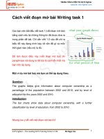
Task 1: The graph below shows the proportion of the population aged 65 and over between
1940 and 2040 in three different countries.
Summarise the information by selecting and reporting the main features, and make
comparisons where relevant. Write at least 150 words.
Sample answer:
The graph compares the percentage of elderly people in USA, Sweden, and Japan. Overall, the
proportion of elderly citizens in the three countries increase from 1940 to 2040.
In 1940, the percentage of ageing people in USA was below 10%, while in Japan it was 5%.
However, Sweden came between them. In the following years the proportion of elderly in both
USA and Sweden increased dramatically and reached a peak of 15% and nearly 13%
respectively. Meanwhile, the rate in Japan decreased slightly over the same period.
Afterwards, from 2000, all the countries expect to increase and make a new peak. In the
following three decades there will be a significant increase in ageing in each of the three
countries. Japan will reach the highest level, which is more than 25%, and USA and Sweden will
be below this, at 23% and 25% respectively.
Do Thi Thu Ha – IELTS Writing
Exercise 1: Read the sample again and identify these parts:
1. Introduction of topic
2. Overall trend
3. Detailed description from 1940 to 2000
4. Detailed description from 2000 to 2040
Exercise 2: Complete the outline of a line graph description
1. ……………………….
a. …………………………………..
b. …………………………………..
2. ………………………..
Detailed description of changes or movements
3. Conclusion (optional)
B. WRITING THE INTRODUCTION
1. Introduction of topic
Example: The graph shows the proportion of the population aged 65 and over
what
between 1940 and 2040 in three different countries
when
where
Introductory expressions:
The graph shows/ illustrates/ indicates/ reveals/ gives information about….
What:
The proportion/ percentage of …
The rate/ ratio of….
The number/ amount of….
The statistics/ figures/ data of….
Or
The population of…
Leisure activities of different age groups….
When:
From…….to…….
Between ………and………
In……….
During ……..years from………
Since………..
Where:
At……….
In………
Among…………….
Practice 1: Write a possible introduction for each question:
1. The graph shows life expectancy for males and females in the UK from 1901 to
2025.
…………………………………………………………………………………………
…………………………………………………………………………………………
2. The graph shows the percentage change in serious crimes recorded in European
Union countries between 1996 and 2000
…………………………………………………………………………………………
…………………………………………………………………………………………
3. The graphs shows the number of underweight children aged 5 or below in seven
regions of the world.
…………………………………………………………………………………………
…………………………………………………………………………………………
Vocab notes:
Life expectancy = ……………………………: tuổi thọ
Males and females = ………………………...: cả nam và nữ
Serious crimes = ……………………………..: các tội nghiêm trọng
Underweight = ………………………………...: thiếu cân, suy dinh dưỡng
Children aged 5 or below = …………………..: trẻ em bằng hoặc dưới 5 tuổi
Regions = ………………………………………: các vùng, miền
2. Overview
Look at these examples and identify main trends.
Example 1:
Overall, the proportion of elderly citizens in the three countries increase from 1940 to 2040.
Example 2:
It can be clearly seen that the rates of smoking for both men and women is currently
declining and fewer women have smoked throughout the period.
Example 3:
The overall trend shows fluctuation with slight increase towards the end of the period.
Note down lead-in phrases
………………………...........................................................................................................
............................................................................................................................................
SENTENCE STRUCTURE FOR DESCRIBING TRENDS
1. (Time period) + Subject + Verb + Adverb
Between January and May, sale increased slightly.
The figures grew quickly in the first five years.
2. (Time period) + There + Tobe + Adjective + Noun.
From January to May, there was a slight increase in sale.
In the first five years, there was an upward trend in the number of learners.
3. Time + witness + a/an + Adjective + Noun + in + Noun
The year 2005 witnessed a sudden boom in the population of European countries.
4. (Time period) Subject + show/ experience/ undergo... + a/an + Adjective + Noun
During the given period, the percentage of elderly in Japan showed a dramatic growth.
Vocab notes:
Degree of changes
Speed of changes
Adjectives
Adverbs
Adjectives
Adverbs
Dramatic
Dramatically
Rapid
Rapidly
Sharp
Sharply
Quick
Quickly
Significant
Significantly
Sudden
Suddenly
Moderate
Moderately
Steady
Steadily
Slight
Slightly
Gradual
Gradually
Practice 2: Describe the overall trends in the following graphs
Line graph #1:
………………………………………………………………………………………………………
………………………………………………………………………………………………………
Line graph #2:
………………………………………………………………………………………………………
……………………………………………………………………………………………………..
Practice 3:
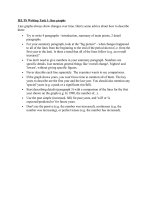
The graph below gives information about water use worldwide.
Summarise the information by selecting and reporting the main features, and make
comparisons where relevant.
a. Write the introduction
………………………………………………………………………………………………………
………………………………………………………………………………………………………
………………………………………………………………………………………………………
………………………………………………………………………………………………………
………………………………………………………………………………………………………
b. Fill in the blanks with suitable words from the box to complete detailed description
significant changes
remained nearly constant
Peak
rose
dramatically
similar to
Water
use
in
agriculture,
industrial
and
domestic
fields
all
increased
………………….during this time. The figures for agriculture show the most
……………………….of all. Between 1900 and 1950 its quantity ……..………….to
around 1,000 km3 and then there was a …………….….rise of 2,000 km3 in 2000. The
pattern for industrial and domestic were very……………….. each other. Starting at
almost 100 and 50 km3 respectively in 1900 and had ……………………until 1950. After
that, the former jumped noticeably to around 110 km3 in 2000. Likewise, the latter
reached its ………….., rising by nearly 5 times (from approximately 50 to 250 km3) in
the same time.
Practice 4
You should spend about 20 minutes on this task.
The graph below shows the differences in wheat exports over three different areas.
Write a report for a university lecturer describing the information shown below.
Write at least 150 words.
Your writing:
______________________________________________________________________________
______________________________________________________________________________
______________________________________________________________________________
______________________________________________________________________________
______________________________________________________________________________
______________________________________________________________________________
______________________________________________________________________________
______________________________________________________________________________
______________________________________________________________________________
______________________________________________________________________________
______________________________________________________________________________
______________________________________________________________________________
______________________________________________________________________________
______________________________________________________________________________
______________________________________________________________________________
______________________________________________________________________________
______________________________________________________________________________
______________________________________________________________________________
______________________________________________________________________________
______________________________________________________________________________
______________________________________________________________________________
______________________________________________________________________________