Data Preparation for Data Mining- P9
Bạn đang xem bản rút gọn của tài liệu. Xem và tải ngay bản đầy đủ của tài liệu tại đây (321.95 KB, 30 trang )
allocated for squashing out-of-range values is highly exaggerated to illustrate the point.)
Figure 7.4 The transforms for squashing overrange and underrange values are
attached to the linear part of the transform. This composite “S”-shaped transform
translates most of the values linearly, but also transforms any out-of-range values
so that they stay within the 0–1 limits of the range.
This sort of “S” curve can be constructed to serve the purpose. Writing computer code to
achieve this is somewhat cumbersome. The description shows very well the sort of effect
that is needed, but fortunately there is a much easier and more flexible way to get there.
7.1.8 Softmax Scaling
Softmax scaling is so called because, among other things, it reaches “softly” toward its
maximum value, never quite getting there. It also has a linear transform part of the range.
The extent of the linear part of the range is variable by setting one parameter. It also
reaches “softly” toward its minimum value. The whole output range covered is 0–1. These
features make it ideal as a transforming function that puts all of the pieces together that
have been discussed so far.
The Logistic Function
It starts with the logistic function. The logistic function can be modified to perform all of the
work just described, and when so modified, it does it all at once so that by plugging in a
variable’s instance value, out comes the required, transformed value.
An explanation of the workings of the logistic function is in the Supplemental Material
section at the end of this chapter. Its inner workings are a little complex, and so long as
what needs to be done is clear (getting to the squashing “S” curve), understanding the
logistic function itself is not necessary. The Supplemental Material can safely be skipped.
Please purchase PDF Split-Merge on www.verypdf.com to remove this watermark.
The explanation is included for interest since the same function is an integral part of
neural networks, mentioned in Chapter 10. The Supplemental Material section then
explains the modifications necessary to modify it to become the softmax function.
7.1.9 Normalizing Ranges
What does softmax scaling accomplish in addressing the problems of range
normalization? The features of softmax scaling are as follows:
The normalized range is 0–1. It is the nature of softmax scaling that no values outside this
range are possible. This keeps all normalized values inside unit state space boundaries.
Since the range of input values is essentially unlimited and the output range is limited, unit
state space, when softmax is normalized, is essentially infinite.
•
The extent of the linear part of the normalized range is directly proportional to the level
of confidence that the data sample is representative. This means that the more
confidence there is that the sample is representative, the more linear the normalization
of values will be.
•
The extent of the area assigned for out-of-range values is directly proportional to the
level of uncertainty that the full range has been captured. The less certainty, the more
space to put the expected out-of-range values when encountered.
•
There is always some difference in normalized value between any two nonidentical
instance values, even for very large extremes.
As already discussed, these features meet many needs of a modeling tool. A static model
may still be presented with out-of-range values where its accuracy and reliability are
problematic. This needs to be monitored separately during execution time. (After all,
softmax squashing them does not mean that the model knows what to do with them—they
still represent areas of state space that the model never visited during training.) Dynamic
models that continuously learn from the data stream—such as continuously learning,
self-adaptive, or response-adaptive models—will have no trouble adapting themselves to
the newly experienced values. (Dynamic models need to interact with a dynamic PIE if the
range or distribution is not stationary—not a problem to construct if the underlying
principles are understood, but not covered in detail here.)
At the limits of the linear normalization range, no modeling tool is required to aggregate
the effect of multiple values by collapsing them into a single value (“clipping”).
Softmax scaling does the least harm to the information content of the data set. Yet it still
leaves some information exposed for the mining tools to use when values outside those
within the sample data set are encountered.
Please purchase PDF Split-Merge on www.verypdf.com to remove this watermark.
7.2 Redistributing Variable Values
Through normalization, the range of values of a variable can be made to always fall
between the limits 0–1. Since this is a most convenient range to work with, it is assumed
from here on that all of a variable’s values fall into this range. It is also assumed that the
variables fall into the linear part of the normalized range, which will be true during data
preparation.
Although the range is normalized, the distribution of the values—that is, the pattern that
exists in the way discrete instance values group together—has not been altered.
(Distributions were discussed in Chapters 2 and 5.) Now attention needs to be turned to
looking at the problems and difficulties that distributions can make for modeling tools, and
ways to alleviate them.
7.2.1 The Nature of Distributions
Distributions of a variable only consist of the values that actually occur in a sample of
many instances of the variable. For any variable that is limited in range, the count of
possible values that can exist is in practice limited.
Consider, for example, the level of indebtedness on credit cards offered by a particular
bank. For every bank there is some highest credit line that has ever been offered to any
credit card customer. Large perhaps, but finite. Suppose that maximum credit line is
$1,000,000. No credit card offered by this bank can possibly have a debit balance of more
than $1,000,000, nor less than $0 (ignoring credit balances due, say, to overpayment).
How many discrete balance amounts are possible? Since the balance is always stated to
the nearest penny, and there are 100 pennies in a dollar, the range extends from 0
pennies to 100,000,000 pennies. There are no more than 100,000,000 possible discrete
values in the entire range.
In general, for any possible variable, there is always a particular resolution limit. Usually it
is bounded by the limits of accuracy of measurement, use, or convention. If not bounded
by those, then eventually the limits of precision of representation impose a practical limit
to the possible number of discrete values. The number may be large, but it is limited. This
is true even for softmax normalization. If values sufficiently out of range are passed into
the function, the truncation that any computer requires eventually assigns two different
input values to the same normalized value. (This practical limitation should not often
occur, as the way in which the scale was constructed should preclude many far
out-of-range values.)
However many value states there are, the way the discrete values group together forms
patterns in the distribution. Discrete value states can be close together or far apart in the
range. Many variables permit identical values to occur—for example, for credit card
balances, it is perfectly permissible for multiple cards to have identical balances.
Please purchase PDF Split-Merge on www.verypdf.com to remove this watermark.
A variable’s values can be thought of as being represented in a one-dimensional state
space. All of the features of state space exist, particularly including clustering of values. In
some parts of the space the density will be higher than in other parts. Overall there will be
some mean density.
7.2.2 Distributive Difficulties
One of the problems of distribution is outlying values or outlying clumps. (Figure 2.5
illustrates this.) Some modeling techniques are sensitive only to the linear displacement of
the value across the range. This only means that the sensitivity remains constant across
the range so that any one value is as “important” as any other value. It seems reasonable
that 0.45 should be as significant as 0.12. The inferences to be made may be
different—that is, each discrete value probably implies a different predicted value—but
the fact that 0.45 has occurred is given the same weight as the fact that 0.12 has
occurred.
Reasonable as this seems, it is not necessarily so. Since the values cluster together,
some values are more common than others. Some values simply turn up more often than
others. In the areas where the density is higher, values occurring in that area are more
frequent than those values occurring in areas of lower density. In a sense, that is what
density is measuring—frequency of occurrence. However, since some values are more
common than others, the fact that an uncommon one has occurred carries a “message”
that is different than a more common value. In other words, the weighting by frequency of
specific values carries information.
To a greater or lesser degree, density variation is present for almost all variables. In some
cases it is extreme. A binary value, for instance, has two spikes of extremely high density
(one for the “0” value and one for the “1” value). Between the spikes of density is empty
space. Again, most alpha variables will translate into a “spiky” sort of density, each spike
corresponding to a specific label.
Figure 7.5 illustrates several possible distributions. In Figure 7.5(d) the outlier problem is
illustrated. Here the bulk of the distribution has been displaced so that it occupies only half
of the range. Almost half of the range (and half of the distribution) is empty.
Please purchase PDF Split-Merge on www.verypdf.com to remove this watermark.
Figure 7.5 Different types of distributions and problems with the distribution of a
variable’s values across a normalized range: normal (a), bimodal or binary
variable (b), alpha label (c), normal with outlier (d), typical actual variable A (e),
and typical actual variable B (f). All graphs plot value (x) and density (y).
Many, if not most, modeling tools, including some standard statistical methods, either
ignore or have difficulty with varying density in a distribution. Many such tools have been
built with the assumption that the distribution is normal, or at least regular. When density
is neither normal nor regular, as is almost invariably the case with real-world data
sets—particularly behavioral data sets—these tools cannot perform as designed. In many
cases they simply are not able to “see” the information carried by the varying density in
the distribution. If possible, this information should be made accessible.
When the density variation is dissimilar between variables, the problem is only intensified.
Between-variable dissimilarity means that not only are the distributions of each variable
irregular, but that the irregularities are not shared by the two variables. The distributions in
Figure 7.5(e) and 7.5(f) show two variables with dissimilar, irregular distributions.
There are tools that can cope well with irregular distributions, but even these are aided if
the distributions are somehow regularized. For instance, one such tool for a particular
data set could, when fine-tuned and adjusted, do just as well with unprepared data as with
prepared data. The difference was that it took over three days of fine-tuning and adjusting
by a highly experienced modeler to get that result—a result that was immediately
available with prepared data. Instead of having to extract the gross nonlinearities, such
tools can then focus on the fine structure immediately. The object of data preparation is to
expose the maximum information for mining tools to build, or extract, models. What can
be done to adjust distributions to help?
7.2.3 Adjusting Distributions
Please purchase PDF Split-Merge on www.verypdf.com to remove this watermark.
The easiest way to adjust distribution density is simply to displace the high-density points
into the low-density areas until all points are at the mean density for the variable. Such a
process ends up with a rectangular distribution. This simple approach can only be
completely successful in its redistribution if none of the instance values is duplicated.
Alpha labels, for instance, all have identical numerical values for a single label. There is
no way to spread out the values of a single label. Binary values also are not redistributed
using this method. However, since no other method redistributes such values either, it is
this straightforward process that is most effective.
In effect, every point is displaced in a particular direction and distance. Any point in the
variable’s range could be used as a reference. The zero point is as convenient as any
other. Using this as a reference, every other point can be specified as being moved away
from, or toward, the reference zero point. The required displacements for any variable can
be graphed using, say, positive numbers to indicate moving a point toward the “1,” or
increasing their value. Negative numbers indicate movement toward the “0” point,
decreasing their value.
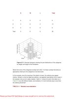
Figure 7.6 shows a distribution histogram for the variable “Beacon” included on the
CD-ROM in the CREDIT data set. The values of Beacon have been normalized but not
redistributed. Each vertical bar represents a count of the number of values falling in a
subrange of 10% of the whole range. Most of the distribution shown is fairly rectangular.
That is to say, most of the bars are an even height. The right side of the histogram, above
a value of about 0.8, is less populated than the remaining part of the distribution as shown
by the lower height bars. Because the width of the bars aggregates all of the values over
10% of the range, much of the fine structure is lost in a histogram, although for this
example it is not needed.
Figure 7.6 Distribution histogram for the variable Beacon. Each bar represents
10% of the whole distribution showing the relative number of observations
(instances) in each bar.
Please purchase PDF Split-Merge on www.verypdf.com to remove this watermark.
Figure 7.7 shows a displacement graph for the variable Beacon. The figure shows the
movement required for every point in the distribution to make the distribution more even.
Almost every point is displaced toward the “1” end of the variable’s distribution. Almost all
of the displaced distances being “+” indicates the movement of values in that direction.
This is because the bulk of the distribution is concentrated toward the “0” end, and to
create evenly distributed data points, it is the “1” end that needs to be filled.
Figure 7.7 Displacement graph for redistributing the variable Beacon. The large
positive “hump” shows that most of the values are displaced toward the “1” end of
the normalized range.
Figure 7.8 shows the redistributed variable’s distribution. This figure shows an almost
perfect rectangular distribution.
Figure 7.8 The distribution of Beacon after redistribution is almost perfectly
rectangular. Redistribution of values has given almost all portions of the range an
equal number of instances.
Please purchase PDF Split-Merge on www.verypdf.com to remove this watermark.
Figure 7.9 shows a completely different picture. This is for the variable DAS from the
same data set. In this case the distribution must have low central density. The points low
in the range are moved higher, and the points high in the range are moved lower. The
positive curve on the left of the graph and the negative curve to the right show this clearly.
Figure 7.9 For the variable DAS, the distribution appears empty around the
middle values. The shape of the displacement curve suggests that some
generating phenomenon might be at work.
A glance at the graph for DAS seems to show an artificial pattern, perhaps a modified sine
wave with a little noise. Is this significant? Is there some generating phenomenon in the
real world to account for this? If there is, is it important? How? Is this a new discovery?
Finding the answers to these, and other questions about the distribution, is properly a part
of the data survey. However, it is during the data preparation process that they are first
“discovered.”
7.2.4 Modified Distributions
When the distributions are adjusted, what changes? The data set CARS (included on the
accompanying CD-ROM) is small, containing few variables and only 392 instances. Of the
variables, seven are numeric and three are alpha. This data set will be used to look at
what the redistribution achieves using “before” and “after” snapshots. Only the numeric
variables are shown in the snapshots as the alphas do not have a numeric form until after
numeration.
Figures 7.10(a) and 7.10(b) show box and whisker plots, the meaning of which is fairly
self-explanatory. The figure shows maximum, minimum, median, and quartile information.
(The median value is the value falling in the middle of the sequence after ordering the
values.)
Please purchase PDF Split-Merge on www.verypdf.com to remove this watermark.
Figure 7.10 These two box and whisker plots show the before and after
redistribution positions—normalized only (a) and normalized and redistributed
(b)—for maximum, minimum, and median values.
Comparing the variables, before and after, it is immediately noticeable that all the median
values are much more centrally located. The quartile ranges (the 25% and 75% points)
have been far more appropriately located by the transformation and mainly fall near the
25% and 75% points in the range. The quartile range of the variable “CYL” (number of
cylinders) remains anchored at “1” despite the transformation—why? Because there are
only three values in this field—“4,” “6,” and “8”—which makes moving the quartile range
impossible, as there are only the three discrete values. The quartile range boundary has
to be one of these values. Nonetheless, the transformation still moves the lower bound of
the quartile range, and the median, to values that better balance the distribution.
Figures 7.11(a) and 7.11(b) show similar figures for standard deviation, standard error,
and mean. These measures are normally associated with the Gaussian or normal
distributions. The redistributed variables are not translated to be closer to such a
distribution. The translation is, rather, for a rectangular distribution. The measures shown
in this figure are useful indications of the regularity of the adjusted distribution, and are
here used entirely in that way. Once again the distributions of most of the variables show
considerable improvement. The distribution of “CYL” is improved, as measured by
standard deviation, although with only three discrete values, full correction cannot be
achieved.
Please purchase PDF Split-Merge on www.verypdf.com to remove this watermark.
Figure 7.11 These two box and whisker plots show the before and after
redistribution positions—normalized only (a) and normalized and redistributed
(b)—for standard deviation, standard error, and mean values.
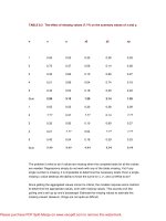
Table 7.4 shows a variety of measures about the variable distributions before and after
transformation. “Skewness” measures how unbalanced the distribution is about its center
point. In every case the measure of skewness is less (closer to 0) after adjustment than
before. In a rectangular distribution, the quartile range should cover exactly half the range
(0.5000) since it includes the quarter of the range immediately above and below the
median point. In every case except “Year,” which was perfect in this respect to start with,
the quartile range shows improvement.
TABLE 7.4 Statistical measures before and after adjustment.
BEFORE:
Mean
Median
Lower
quartile
Upper
quartile
Quartile
range
Std.
dev.
Skew-
ness
CYL
0.4944
0.2000
0.2000
1.0000
0.8000
0.3412
0.5081
CU_IN
0.3266
0.2145
0.0956
0.5594
0.4638
0.2704
0.7017
HPWR
0.3178
0.2582
0.1576
0.4402
0.2826
0.2092
1.0873
WT_LBS
0.3869
0.3375
0.1734
0.5680
0.3947
0.2408
0.5196
Please purchase PDF Split-Merge on www.verypdf.com to remove this watermark.
ACC
0.4518
0.4706
0.3529
0.5294
0.1765
0.1624
0.3030
YEAR
0.4983
0.5000
0.2500
0.7500
0.5000
0.3070
0.0197
AFTER:
Mean
Median
Lower
quartile
Upper
quartile
Quartile
range
Std.
dev.
Skew-
ness
CYL
0.6789
0.5998
0.4901
1.0000
0.5099
0.2290
0.2851
CU_IN
0.5125
0.5134
0.2518
0.7604
0.5086
0.2912
–0.0002
HPWR
0.5106
0.5123
0.2488
0.7549
0.5062
0.2907
–0.0359
WT_LBS
0.4740
0.4442
0.1939
0.7338
0.5400
0.2985
0.1693
ACC
0.5586
0.5188
0.3719
0.7875
0.4156
0.2799
–0.2109
YEAR
0.4825
0.5185
0.2704
0.7704
0.5000
0.3197
0.0139
The variable “Year” was distorted some small amount from an already perfectly rectangular
distribution. The distortion is minor, but why did it happen? In fact, the variable “Year” is
monotonic. There are a similar number of instances in each of several years. This gives the
appearance of a perfectly rectangular distribution. Redistribution notices a weighting due to
the monotonicity and attempts to “correct” for it. Another clue that this variable may need
further investigation is that the standard deviation increases and moves further from the
optimum point. The standard deviation measure for a normalized rectangular distribution is
approximately 0.2889. However, altogether the adjustment is very minor and almost
certainly does no harm. Being monotonic, the variable may need to be dealt with in some
other way before modeling anyway.
7.3 Summary
What has been accomplished by using the techniques in this chapter? The raw values of
a variable have been translated in range and distribution. This has useful benefits.
First, all values are normalized over a range of 0–1. Some modeling techniques require
such a normalizing transformation; for others, it’s only a convenience. In all cases, it puts
the full magnitude of the change in a variable on an equal footing for all variables in the
Please purchase PDF Split-Merge on www.verypdf.com to remove this watermark.
data set.
Second, one of the limitations of sampling was dealt with: the problem that values not
sampled, and outside the range of those in the sample, are sure to turn up in the
population. The specific problem that unsampled out-of-range values cause for a model
depends on where in the process of building or applying a model the unsampled
out-of-range value is discovered. Softmax scaling, developed out of linear scaling and
based on the logistic function, provides a convenient method for ensuring that all values,
sampled or not, are correctly normalized. This does not overcome the out-of-range
problem, but it makes it more tractable.
While looking at softmax scaling, we explored the workings of the logistic function. This is
a very important function for understanding the inner workings of neural networks.
Introduced here for the softmax squashing, it is also important for understanding the
techniques introduced in Chapter 10. (Not absolutely necessary, as those techniques can
still be applied without a full understanding of how they work.)
Third, and very important for maximum information exposure, the individual variable
distributions are transformed. This transformation makes the between-variable
information far more accessible to many modeling tools. Many of the problems with value
clusters are removed, and almost all of the problems that outliers present are very
significantly reduced, if not completely ameliorated. A miner may glean useful insights into
the nature of a variable by looking at similarities, differences, and structures in the
variable distributions, although looking at these is really part of the data survey and not
further considered here.
By the time the techniques discussed in this chapter are applied to a data set, a suitably
sized sample is selected (discussed in Chapter 5). The sample is fully represented as
numeric (discussed in Chapter 6), and fully normalized in both range and distribution (this
chapter). The last problem to look at in the data, before turning our attention to preparing the
data set as a whole, is that some of the values may be missing or empty. Chapter 8 looks at
plugging these holes. Although it is the individual variables that are considered, attention
now must be turned to the data set as a whole since that is where the information needed is
discovered.
Supplemental Material
The Logistic Function
The logistic function is usually written as
Please purchase PDF Split-Merge on www.verypdf.com to remove this watermark.