Adobe Dreamweaver CS3 Unleashed- P10 docx
Bạn đang xem bản rút gọn của tài liệu. Xem và tải ngay bản đầy đủ của tài liệu tại đây (698.72 KB, 50 trang )
Designing Tableless Web Pages Using AP Elements
One of the biggest trends in web development is that of designing websites that don't use antiquated tables
to control the structure of the site, but instead rely on AP Elements and CSS positioning properties to control
the layout and flow of web pages. In the next few sections, you'll learn how Dreamweaver—in conjunction
with the <div> tag and a little CSS—can create standards-compliant web designs.
Note
The term given to the process used for handling layout in CSS-based page designs is referred to as
CSS-P (P for "positioning"). Technically, AP Elements in Dreamweaver use CSS-P for their
positioning. In fact, if you select an AP Element in the Document window, you'll notice that label
"CSS-P Element" is shown in the upper-left corner of the Property inspector.
Designing AP Elements Using a Style Sheet
In the previous sections of this chapter, you learned how easy it was to insert AP Elements using either the
Insert, Layout Objects, AP Div command or the Draw AP Element option available from the Layout category
in the Insert bar. Although these are viable options for designing a site using AP Elements, they aren't the
best choice. The reason for this is simple: When you use either of these methods to insert AP Elements on
the page, Dreamweaver automatically assigns document-wide CSS positioning properties for each AP
Element. As a result, the page becomes inflexible and nearly impossible to modify globally when numerous
pages exist within the site.
A better alternative to inserting or drawing AP Elements onto the page is to create an external style sheet
(which we already have for our project) and define numerous ID selectors that define the various sections of
the page. For instance, we know our site will contain the following major sections based on the design we've
been working with up to this point:
Header— We know we'll have a header that resides near the top of the page. The header will have a
width of 100% and a height of 227 pixels. We also know that the header will have a background image
that spans the entire width of the browser. Finally, the header will contain the header.gif image that
defines the logo and company name.
Navigation— Just under the header but to the left of the page, we'll have a simple navigation menu.
In this scenario, we can add an AP Element that will serve as a container for the five navigation links.
Although the height doesn't matter in this case, we'll want to set the width at 200 pixels.
Content— The third major section in the page is reserved for the content. This section will reside
under the header but just to the right of the navigation area. Because our navigation area has a set
width of 200 pixels and we want to keep the entire width of the page to a universally accessible 760
pixels, we'll set the content area's width to 560 pixels (200 pixels + 560 pixels = 760 pixels). Again,
because a user will naturally scroll up and down the web page, the height for this section is irrelevant.
Now that we've outlined the major sections for our page, let's begin outlining the CSS rules. Because we
know we'll have at least three major sections in the page (Header, Navigation, and Content), we can
surmise that we'll need at least three CSS rules represented by three unique IDs titled header, nav, and
content, respectively. To begin creating these selectors, follow these steps:
1.
Create a new HTML page by choosing File, New. When the New Document dialog appears, select the
HTML option from the Basic Page category, choose the <none> option from the Layout list, and click
Create. Immediately save the page as index.html.
2.
Attach the existing styles.css style sheet by opening the CSS Style panel, selecting the Attach Style
Sheet icon, browsing for the styles.css file, and clicking OK.
3.
Create a new CSS rule by clicking the New CSS Rule button in the CSS Styles panel. The New CSS Rule
dialog appears.
4.
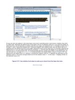
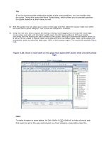
Choose the Selector Type: Advanced option and enter the name #Header into the Selector text box.
Remember that the pound symbol represents ID (thus, the ID selector name is Header). When you
finish making your modifications, the dialog should resemble Figure 7.11.
Figure 7.11. Create a new selector ID called Header.
5.
Click OK. You're now ready to start defining the properties that will make up the Header rule and
ultimately define the Header AP Element at the top of the page.
6.
Switch over to the Positioning category. Set the property for Type to absolute, the width to 100%, the
height to 227 pixels, the Visibility to Visible, and Top and Left Placement properties to 0. When you
finish, the Positioning screen resembles Figure 7.12.
Figure 7.12. Modify the Positioning attributes for the Header rule.
[View full size image]
7.
Set the background image that will appear within the Header AP Element. You can do this by switching
to the Background category. Browse to the header_bg.gif file from the Background Image field.
Finally, choose the Repeat-x option from the Repeat menu to guarantee that the background image will
tile only horizontally and never vertically.
8.
Click OK. The new ID appears in the CSS Styles panel and styles.css is automatically opened in a
new tab behind your current document.
That's it! You're now ready to define the style rules for the remaining AP Elements. To define the Nav rule,
follow these steps:
1.
Create a new CSS rule by clicking the New CSS Rule button in the CSS Styles panel. The New CSS Rule
dialog appears.
2.
Choose Selector Type: Advanced, if necessary, and enter the name #Nav into the Selector text box.
3.
Click OK. You're now ready to start defining the properties that will make up the Nav rule and
ultimately define the navigation AP Element.
4.
Switch over to the Positioning category. Set the property for Type to absolute, the Width to 190 pixels
(we'll add a padding of 10 pixels to the left of this AP Element shortly), the Visibility to visible, the Top
Placement property to 227, and the Left Placement property to 0. When you finish, the screen should
resemble Figure 7.13.
Figure 7.13. Modify the Positioning attributes for the Nav rule.
[View full size image]
5.
So that our navigation items don't run up against the left edge of the browser window, let's add some
padding to this style rule. To do this, switch to the Box category. Disable the Same For All check box in
the Padding category and enter a value of 10 pixels for the Left property.
6.
Click OK. The new ID appears in the CSS Styles panel.
To finish up the design, let's define the Content style rule:
1.
Create a new CSS rule by clicking the New CSS Rule icon in the CSS Styles panel. The New CSS Rule
dialog appears.
2.
Choose Selector Type: Advanced, if necessary, and enter the name #Content into the Selector text
box.
3.
Click OK. You're now ready to start defining the properties that will make up the Content rule and
ultimately define the content AP Element.
4.
Switch over to the Positioning category. Set the property for Type to absolute, the Width to 560 pixels,
the Visibility to visible, the Top Placement property to 227, and the Left Placement property to 200.
5.
Click OK. The new ID appears within the CSS Styles panel.
Now that we've outlined the properties for the three major sections of the site, we're ready to insert the
tags that will act as containers for the content. The properties we've outlined will serve as the formatting
and positioning attributes for the <div> tags we'll add next.
Inserting DIV Tags
Because we've already outlined the style rules using ID selectors in an external style sheet, we need only to
insert three <div> tags into the page with IDs that match the ID selector names we created. To
demonstrate this, let's insert a <div> for the Header portion of our page. You can do this by choosing Insert,
Layout Objects, Div Tag. Alternatively, you could also click the Insert Div Tag icon (the first icon to the right
of the Standard and Expanded buttons) in the Layout category of the Insert bar. Either method you choose
produces the same result; the Insert Div Tag dialog launches and appears similar to Figure 7.14.
Figure 7.14. Use the Insert Div Tag dialog to create a new <div> tag in the page.
Although the dialog allows you to enter a class name and pick an insertion point for the tag, all we care
about is entering the ID name that represents the ID selector we've defined within our style sheet. Because
we're creating the header of the page, select the Header option from the ID drop-down menu (see Figure
7.14) and click OK. The AP Element is created, complete with the dimensions, placement properties, and the
background image we defined.
By default, Dreamweaver adds the text Content for id "Header" Goes Here within the AP Element. Select this
text and delete it so that we can add the header.gif image into the AP Element. When you've deleted the
text, drag the header.gif image, located in the Images folder, into the AP Element. The result of the design
resembles Figure 7.15.
Figure 7.15. Add the header.gif image into the Header AP Element.
[View full size image]
Now you're ready to create the second <div> tag that will define the navigation section. To do this, click the
Insert Div Tag icon located in the Layout category of the Insert bar. When the Insert Div Tag dialog appears,
select the Nav option from the ID drop-down menu and click OK. As you'll see, the Nav AP Element is added
just below the Header AP Element.
Again, remove the Content for id "Nav" Goes Here text so that we can begin to define the navigational
elements that will appear within this AP Element. When the placeholder text is deleted, add the first
navigation element, Home, to the AP Element. Do this by following these steps:
1.
Add the icon_arrow.gif image to the AP Element.
2.
Select the image, add a V Space value of 2, and choose the Absolute Middle option from the Align
menu in the Property inspector. Setting these two properties gives you some spacing between arrow
images vertically in the AP Element. Also, by setting the alignment to Absolute Middle, we'll be able to
add our Home link just to the right of the image so that it lines up to the absolute center of the arrow
image.
3.
Select the arrow image, copy it, place your cursor next to the image, press Shift+Enter (Shift+Return)
to create a line break, and then choose Edit, Paste. Repeat this process a few more times until you
have a total of five arrows spanning vertically down the AP Element.
4.
Insert the text Home just to the right of the first arrow image.
5.
Highlight the text and type the link index.html into the Link text box in the Property inspector. Also
choose the Link option from the Style menu in the Property inspector to associate the correct style rule
for the navigation link.
Now you can add the rest of the navigation elements: About Us (aboutus.html), Solutions
(solutions.html), Support (support.html), and Contact Us (contactus.html). When you finish adding the
navigation items, the result appears similar to Figure 7.16.
Figure 7.16. Add the rest of the navigational items to the Nav AP Element.
[View full size image]
Finally, let's add the content section. Again, you can accomplish this task by clicking the Insert Div Tag icon
in the Insert bar. When the Insert Div Tag dialog appears, choose the After Tag option from the Insert
menu, choose the <div id="Nav"> option from the menu that becomes enabled (this is done purely as a
means of forcing Dreamweaver to organize the code properly), and choose the Content option from the ID
drop-down menu. Click OK. The new AP Element is added below the Header AP Element but just to the right
of the Nav AP Element. With the AP Element firmly in place, you can add the content that will fill that area.
For instance, you might want to add the subheader_welcome.gif image as the subheader within the AP
Element. You might also decide to add the text contained in the home.txt file in the Assets folder. When
you've finished, the result should closely resemble Figure 7.17.
Figure 7.17. Add text and images to the new Content AP Element.
[View full size image]
With your design complete, test the page in a browser by pressing F12 (Option+F12). As you'll see, the
design renders without problems (refer back to Figure 7.1).
Of course, our design efforts don't have to stop here. We might want to create another AP Element with
associated properties for our company events. Furthermore, we might want to add yet another AP Element
with associated properties for the footer of the page. As you can begin to see, the design and
implementation is simple.
Even better than the implementation is what has been added to the HTML. Switch to Code view and notice
that the code is much cleaner and is minimized to roughly 30 lines of code (mostly text for the Content AP
Element) in contrast to the 100 or so lines associated with the design when we were working with tables.
Converting AP Elements to Tables for Backward Compatibility
In the previous sections, we used AP Elements to create a standards-compliant, tableless web page.
Although the design was simple to create, it doesn't do us or our users much good if they're using older
browser versions such as Netscape 4. As you saw back in Figure 7.2, the page doesn't look very good in
Netscape 4.
To solve this problem, we have to re-create the site using a backward-compatible model in tables. Before
you become frustrated at the thought of having to rebuild the page using tables, know that there's an easy
and automated way of accomplishing this task in the Convert AP Divs to Tables feature. Using this feature in
conjunction with the Check Browser behavior, we can guarantee that our users will see the appropriately
formatted page regardless of what browser version they are using. To run through this process, choose
Modify, Convert, AP Divs to Table. The Convert AP Divs to Table dialog appears, similar to Figure 7.18.
Figure 7.18. The Convert AP Divs to Table dialog facilitates the process of converting our CSS-
based design to one that uses tables.
The following functionality is revealed in the Convert AP Divs to Table dialog:
Table Layout: Most Accurate— Clicking this option button creates a cell for every AP Element, plus
an additional cell for any spacing required to fill out the area.
Table Layout: Smallest: Collapse Empty Cells— Clicking this option button specifies that the AP
Elements' edges should be aligned if they are positioned within the specified number of pixels. We'll
choose this option and leave the pixel width at the default of 4.
Table Layout: Use Transparent GIFs— Checking this box ensures that the last row of the table has
a 1 pixel by 1 pixel transparent GIF added to its cell. This is especially useful for guaranteeing
consistent widths across all browser versions. For our purposes, uncheck this option now.
Table Layout: Center on Page— Click this box to center the table on the page. Leave this option
unchecked.
The rest of the features in this dialog exist for the reverse process (that is, converting tables to AP Divs). In
this scenario, these check boxes merely provide viewable options such as the AP Elements panel, the grid,
snapping, and so on. When you finish making the necessary adjustments, click OK. Immediately, our AP
Elements-based page is converted to a table with a few minor discrepancies. For instance, it seems as
though we lost our background image for the header. This is largely because the background image is
attached to the ID selector in the style sheet. Dreamweaver has no way of knowing which cell in our new
table to apply the background image to. To add it back in, select the header row within the table and use
the point-to-file icon in the Bg field to browse to the header_bg.gif image. You may also need to merge
the two cells that were created within the header row into one cell. You can do this by selecting both cells
and choosing Modify, Table, Merge Cells. Finally, you'll need to position the border between the navigation
cell and the content cell so that the navigation and content cells are closer together. After you've made
those modifications, save your work as index_netscape.html. Now try testing the page in an older version
of Netscape.
Tip
If you don't have an older version of Netscape, you can download all archived versions at the
following URL: browser.netscape.com/downloads/archive/.
As you can see from Figure 7.19, the page looks as it did in newer browser versions using AP Elements.
Figure 7.19. The page using tables looks as good in Netscape 4.7 as it did in newer browser
versions using AP Elements.
[View full size image]
Note
Although Dreamweaver does its best to convert your CSS-based design to tables, it's certainly not
perfect. In many cases, additional tweaking of your design is mandatory to get the specific layout to
look the way you want it to look in older browsers such as Netscape 4.
The last thing you'll want to do is add the Check Browser behavior to the index.html page. This behavior
allows us to create functionality so that when the user visits the index.html page using a Netscape 4
browser, the user is automatically redirected to index_netscape.html. However, if users visit the
index.html page using a newer browser, they stay right where they are, on the CSS-based index.html
page. To add this behavior, follow these steps:
1.
Open index.html.
2.
Open the Behaviors panel by choosing the Behaviors option from the Window menu.
3.
Choose the <body> tag from the Tag Selector and choose the Check Browser option located within the
~Deprecated submenu in the Add Behavior list within the Behaviors panel. The Check Browser dialog
appears.
4.
In the dialog, enter the value 4.7 (the version that you should be using) into the Netscape Navigator
Version text box. Also select the Stay on This Page option from the Otherwise menu. Because Internet
Explorer 4 can display the AP Elements page just fine, select the Stay on This Page option from both
Internet Explorer menus. Also select the Stay on This Page option from the Other Browser menu.
Finally, type the index_netscape.html path in the URL text box.
5.
Because most other browsers can also display AP Elements, choose the Stay on This Page option from
the Other browsers menu as well. When you finish, the Check Browser dialog resembles Figure 7.20.
Figure 7.20. Configure the Check Browser behavior so that users visiting your site
using Netscape 4 browsers are automatically redirected to the correct page.
[View full size image]
6.
Click OK.
With the CSS-based page still open, try to preview your page in Netscape 4. Notice that you are
automatically redirected to the index_netscape.html page.
Note
Obviously, if this were a full site with numerous pages, you'd want to convert all of the pages and
links within the site.
Built-In CSS Page Layouts
One of the hottest web-development techniques is the process of laying out web page structures using CSS
instead of traditional HTML-based methods such as tables or frames. As the Web evolves, so too does the
process of creating web pages. Therefore, tables are viewed as an archaic method of page structuring. As a
web developer you should be aware of that fact and begin learning and integrating standards-compliant
methods into your site designs. In the previous few sections we began to do just that. As you might recall,
you looked at ways of building web pages that rely on CSS for the positioning and structuring of web pages.
What little HTML we used was meant purely for integrating CSS rules or for adding imagery and media
elements to your pages. As you might also recall, the learning curve for creating standards-compliant CSS
page designs is relatively higher as compared to tables or frames. To help you along, Dreamweaver CS3
integrates a collection of carefully crafted and comment-rich CSS Page Layouts.
This section will get you up to speed with Dreamweaver's CSS page layouts. As you'll see, working with
CSS-based structuring techniques has never been easier—thanks to this new collection of page layouts. To
build a new web page based on prestructured CSS-based layout, start by selecting File, New. The New
Document dialog appears. Select the HTML option from the Blank Page category. Up to this point in the book
we've usually selected the <none> option from the Layout list and clicked Create. This time, however, take
a closer look at the additional options within the list. As you can see from Figure 7.21, additional prebuilt
CSS-structured options exist.
Figure 7.21. Choose from a list of prebuilt CSS-structured page layouts.
[View full size image]
Numerous options exist within this dialog for creating and handling the CSS that results, including the
following:
Layout— The Layout list contains 32 prebuilt CSS-structured layouts for you to use. For our purposes,
select the 2 column elastic, left sidebar, header and footer option.
Preview— The previous window displays an iconic representation of the selection you make from the
Layout list. This preview is a rough approximation of what your design will be structured around.
Layout CSS— Choose an option from this menu to instruct Dreamweaver as to how to handle the CSS
that will accompany your layout. Options include Add to Head (adds all the CSS to the head of the
page creating a document-wide style sheet), Create New File (adds all the CSS to a new external style
sheet file), and Link to Existing File (adds all the CSS to an existing external style sheet file). When
you select the Link to Existing File option, you'll be required to browse to the existing CSS style sheet
using the Attach Style Sheet button available from the Attach CSS file group of options. For our
purposes, choose the Add to Head option.
Attach CSS file— When you choose the Link to Existing File option from the Layout CSS menu, this
group of options becomes immediately available. You can choose the Attach Style Sheet icon to
browse to and attach an existing style sheet. Alternatively, you can delete a style sheet from this list
by clicking the Remove Style Sheet icon.
Now that we have a layout selected and we've instructed Dreamweaver as to where it should place the
accompanying CSS, click Create. Immediately, a new Document window is created, complete with your
selected layout, similar to Figure 7.22.
Figure 7.22. A new document window instance is created complete with your selected layout.
[View full size image]
At a glance, you can see that the content is placed within DIV tags. And, like you saw in the previous
section, the positioning and structure of those DIV tags are controlled using a series of carefully crafted
classes, also visible in the CSS panel in Figure 7.22. Now try switching to Code view. Immediately you'll
notice how many comments have been added to guide you through the relatively new process of using CSS
to structure web pages. Now comes the fun part—removing the default text that appears in the DIV tags
and replacing it with the Vecta Corp content. See if you can accomplish this task on your own!
Summary
As you've seen in this chapter, AP Elements offer a clean, standards-compliant alternative to developing
websites. Using CSS in conjunction with <div> tags affords you the capability to cleanly separate positioning
and formatting properties from structural code.
In this chapter, you learned about the various methods for inserting AP Elements, modifying properties
outlined by AP Elements, and structuring pages using AP Elements and CSS positioning properties.
Furthermore, you looked at some of the new Dreamweaver CS3 CSS-based page layouts and how building
CSS-based designs is not only easy, but also effortless when you take advantage of them.
In the next few chapters, we'll begin to shy away from CSS and take a much different direction by beginning
to discuss important concepts as they relate to team collaboration and task automation.
Chapter 8. Working with Frames and Framesets
IN THIS CHAPTER
Understanding Framed Websites
Creating Frames and Framesets
Adjusting Frame Attributes
Adjusting Frameset Attributes
Adding Content to Frames
Saving Frames and Framesets
Targeting Frames
IFrames
Targeting Browsers That Don't Support Frames
In the mid 1990s, Netscape introduced a proprietary HTML extension known as frames. The idea was that
web pages at the time used up far too much memory and required excessive bandwidth to be viewed within
a time span that didn't bore the user. On top of that, Netscape hoped that framed sites could be viewed only
within Netscape, further positioning its browser implementation as the standard of the time.
Designers of the time fell right in line with the concept, using framed websites to present consistent
unmoving navigation bars that remained static even when content within a separate frame was scrolled.
Even better, users visiting sites using 14.4 or 28.8 Kbps modems enjoyed the fact that although framed
sites had an initial load time, they ran much smoother and loaded quicker during the viewing experience.
Although frames definitely offer another page structuring option for the web designer, disadvantages have
emerged. This chapter aims at demystifying framed sites, discussing the advantages, disadvantages, and
even how to build them within Dreamweaver.
Understanding Framed Websites
Framed websites are generally easy to spot; chances are you've probably used one and may or may not
have known it. A framed website generally consists of numerous parts, starting with the frameset. As you've
seen up to this point, browsers typically open one page at a time. When a site uses frames, this concept is
no different. However, rather than opening numerous files at one time as you might think may occur with
framed sites, a browser generally opens a frameset. The frameset is usually split into numerous frames that
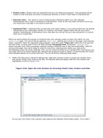
make up the content of the site within the frameset. Figure 8.1 illustrates a framed website in use.
Figure 8.1. The MSDN Library website is a good example of a framed website.
[View full size image]
Microsoft's MSDN Library website is a good example of a framed website. From the callouts in Figure 8.1,
you can clearly see that the page is split into three frames, each making up important parts of the frameset.
The frame near the top contains important top-level navigation items that relate directly to Microsoft and
the major sections within the overall site. The frame on the left makes up the navigational structure for the
MSDN Library specifically. Finally, the frame on the right makes up the content that appears when a link
within the navigational tree on the left is clicked. Navigation items in the top and left frames always remain
static, even when content within the right frame is scrolled up and down or left to right. Even better, the
navigational structure represented in the top and left frames loads once and only once. Only the content in
the right frame is loaded every time a navigation item within the left tree is clicked, essentially improving
load time and the overall user experience. Furthermore, the frame that makes up the navigation menu on
the left can be manually resized by the user. Shown in Figure 8.2, resizing the frame allows for easier
reading of the navigation menu.
Figure 8.2. You can resize the frame to make the navigation tree easier to read.
[View full size image]
Although this example represents a classic and advantageous use of a framed website, it has disadvantages.
Let's dissect the advantages and disadvantages next.
The Advantages of Frames
The advantages of setting up a website that uses frames can be profound. As you can see from the MSDN
Library website, all elements that are constant throughout the web experience, such as the navigation menu
at the top and left, do not have to be reloaded every time a link is clicked. This navigation structure
provides advantages for both author and user. From the author's viewpoint, if a navigation bar needs to be
changed, perhaps to add or remove a menu item, only one document has to be amended. If the navigation
bars were integrated into each page (as would be likely if the page had been developed using tables), then
every site document would have to be changed (unless you were using library items or templates, which are
covered in a future chapter). From a user's standpoint, framed navigation menus result in much "lighter"
documents compared to pages with static navigation menus because the pages don't contain an excess of
HTML required to set up the table layouts. This can also be advantageous for users with dial-up modems,
which by the latest statistics, still averages about 50% of Internet users. By having the navigation menu
reside within a separate frame and new content appear within a larger, autonomous frame, the site can
appear more complete and will load quicker per navigation click. Accessing new documents and swapping
them out of the same location saves download time and offers an easier navigation experience for the Web
user.
In addition to the benefits presented thus far, the site is somewhat configurable. As you saw in Figure 8.2,
the navigation frame can be resized by the user. Again this is advantageous to both the developer and the
user. From a developer's standpoint, there are no concerns with respect to limiting the size of the links to fit
within the frame. From a user's standpoint, if the content within the navigation frame does exceed the size
of the frame, you merely resize the border to expand the viewable area of that frame.
Although the advantages presented would be enough to convince anyone to want to use frames, there are
numerous disadvantages. In fact, as you'll see, the disadvantages overshadow these few advantages.
The Disadvantages of Frames
Along with all the advantages frames can provide, they also offer numerous disadvantages to the user and
several challenges for a web designer. The most important of these challenges is search engine placement.
Search engines use web crawlers and robots to index pages on websites. Crawlers are programs that
wander from site to site, gathering information on web pages and return that information to the search
engine for indexing. These programs often don't index frameset documents because framesets contain no
content, only instructions to create frames, so there's little or nothing to index. Robots, however, index
documents with content, and when links to these documents appear in search results, the search engine
user is taken directly to the page, bypassing the frameset and ultimately the content (including navigation)
that was meant to be seen.
Another disadvantage is bookmarks. Browsers bookmark only the frameset document on a framed website,
not the pages showing in the frames. If you navigate through the MSDN Library site and try to bookmark
particular pages, the bookmark will point only to the relevant frameset and not to the page itself, so you'll
never be able to bookmark the page you wanted unless you open it in a fresh browser window using the
right-click (Control+click) context menu. To fix this problem, the MSDN website exposes a link within the
page itself. The link titled Add to Favorites and shown in Figure 8.3 points to JavaScript code that allows the
user to bookmark the frameset with the selected page.
Figure 8.3. Sites get around the bookmark issue in frames by creating their own link so that users
can manually add the bookmark to the their favorites.
[View full size image]
Yet another disadvantage when working with framed websites is printing. This issue stems from the same
problem exposed by bookmarks in that, when you go to print a page, the browser has no idea what page
within the frameset you are referring to. Ultimately, what prints out is a blank page that represents the
frameset and not the intended page. To be sure that you print the document contained within a frame, you
really need to open the document in a new browser window, away from the frameset, and print from there.
From a developer standpoint, you can add a Print This Page link (similar to the one shown in Figure 8.3) that
makes use of JavaScript code to print out the correct page (frame).
Finally, framed websites present problems for the visually impaired. Traditional screen readers lack the
capability to distinguish between the frames within a frameset and end up locking a significant number of
users out of the website unless a "noframes" alternative is available (discussed later in the chapter). Modern
screen readers, such as JAWS on Windows or VoiceOver on a Mac, are more sophisticated and can handle
frames. However, you shouldn't assume that every visually impaired user makes use of a modern screen
reader.
Chapter 8. Working with Frames and Framesets
IN THIS CHAPTER
Understanding Framed Websites
Creating Frames and Framesets
Adjusting Frame Attributes
Adjusting Frameset Attributes
Adding Content to Frames
Saving Frames and Framesets
Targeting Frames
IFrames
Targeting Browsers That Don't Support Frames
In the mid 1990s, Netscape introduced a proprietary HTML extension known as frames. The idea was that
web pages at the time used up far too much memory and required excessive bandwidth to be viewed within
a time span that didn't bore the user. On top of that, Netscape hoped that framed sites could be viewed only
within Netscape, further positioning its browser implementation as the standard of the time.
Designers of the time fell right in line with the concept, using framed websites to present consistent
unmoving navigation bars that remained static even when content within a separate frame was scrolled.
Even better, users visiting sites using 14.4 or 28.8 Kbps modems enjoyed the fact that although framed
sites had an initial load time, they ran much smoother and loaded quicker during the viewing experience.
Although frames definitely offer another page structuring option for the web designer, disadvantages have
emerged. This chapter aims at demystifying framed sites, discussing the advantages, disadvantages, and
even how to build them within Dreamweaver.
Understanding Framed Websites
Framed websites are generally easy to spot; chances are you've probably used one and may or may not
have known it. A framed website generally consists of numerous parts, starting with the frameset. As you've
seen up to this point, browsers typically open one page at a time. When a site uses frames, this concept is
no different. However, rather than opening numerous files at one time as you might think may occur with
framed sites, a browser generally opens a frameset. The frameset is usually split into numerous frames that
make up the content of the site within the frameset. Figure 8.1 illustrates a framed website in use.
Figure 8.1. The MSDN Library website is a good example of a framed website.
[View full size image]
Microsoft's MSDN Library website is a good example of a framed website. From the callouts in Figure 8.1,
you can clearly see that the page is split into three frames, each making up important parts of the frameset.
The frame near the top contains important top-level navigation items that relate directly to Microsoft and
the major sections within the overall site. The frame on the left makes up the navigational structure for the
MSDN Library specifically. Finally, the frame on the right makes up the content that appears when a link
within the navigational tree on the left is clicked. Navigation items in the top and left frames always remain
static, even when content within the right frame is scrolled up and down or left to right. Even better, the
navigational structure represented in the top and left frames loads once and only once. Only the content in
the right frame is loaded every time a navigation item within the left tree is clicked, essentially improving
load time and the overall user experience. Furthermore, the frame that makes up the navigation menu on
the left can be manually resized by the user. Shown in Figure 8.2, resizing the frame allows for easier
reading of the navigation menu.
Figure 8.2. You can resize the frame to make the navigation tree easier to read.
[View full size image]
Although this example represents a classic and advantageous use of a framed website, it has disadvantages.
Let's dissect the advantages and disadvantages next.
The Advantages of Frames
The advantages of setting up a website that uses frames can be profound. As you can see from the MSDN
Library website, all elements that are constant throughout the web experience, such as the navigation menu
at the top and left, do not have to be reloaded every time a link is clicked. This navigation structure
provides advantages for both author and user. From the author's viewpoint, if a navigation bar needs to be
changed, perhaps to add or remove a menu item, only one document has to be amended. If the navigation
bars were integrated into each page (as would be likely if the page had been developed using tables), then
every site document would have to be changed (unless you were using library items or templates, which are
covered in a future chapter). From a user's standpoint, framed navigation menus result in much "lighter"
documents compared to pages with static navigation menus because the pages don't contain an excess of
HTML required to set up the table layouts. This can also be advantageous for users with dial-up modems,
which by the latest statistics, still averages about 50% of Internet users. By having the navigation menu
reside within a separate frame and new content appear within a larger, autonomous frame, the site can
appear more complete and will load quicker per navigation click. Accessing new documents and swapping
them out of the same location saves download time and offers an easier navigation experience for the Web
user.
In addition to the benefits presented thus far, the site is somewhat configurable. As you saw in Figure 8.2,
the navigation frame can be resized by the user. Again this is advantageous to both the developer and the
user. From a developer's standpoint, there are no concerns with respect to limiting the size of the links to fit
within the frame. From a user's standpoint, if the content within the navigation frame does exceed the size
of the frame, you merely resize the border to expand the viewable area of that frame.
Although the advantages presented would be enough to convince anyone to want to use frames, there are
numerous disadvantages. In fact, as you'll see, the disadvantages overshadow these few advantages.
The Disadvantages of Frames
Along with all the advantages frames can provide, they also offer numerous disadvantages to the user and
several challenges for a web designer. The most important of these challenges is search engine placement.
Search engines use web crawlers and robots to index pages on websites. Crawlers are programs that
wander from site to site, gathering information on web pages and return that information to the search
engine for indexing. These programs often don't index frameset documents because framesets contain no
content, only instructions to create frames, so there's little or nothing to index. Robots, however, index
documents with content, and when links to these documents appear in search results, the search engine
user is taken directly to the page, bypassing the frameset and ultimately the content (including navigation)
that was meant to be seen.
Another disadvantage is bookmarks. Browsers bookmark only the frameset document on a framed website,
not the pages showing in the frames. If you navigate through the MSDN Library site and try to bookmark
particular pages, the bookmark will point only to the relevant frameset and not to the page itself, so you'll
never be able to bookmark the page you wanted unless you open it in a fresh browser window using the
right-click (Control+click) context menu. To fix this problem, the MSDN website exposes a link within the
page itself. The link titled Add to Favorites and shown in Figure 8.3 points to JavaScript code that allows the
user to bookmark the frameset with the selected page.
Figure 8.3. Sites get around the bookmark issue in frames by creating their own link so that users
can manually add the bookmark to the their favorites.
[View full size image]
Yet another disadvantage when working with framed websites is printing. This issue stems from the same
problem exposed by bookmarks in that, when you go to print a page, the browser has no idea what page
within the frameset you are referring to. Ultimately, what prints out is a blank page that represents the
frameset and not the intended page. To be sure that you print the document contained within a frame, you
really need to open the document in a new browser window, away from the frameset, and print from there.
From a developer standpoint, you can add a Print This Page link (similar to the one shown in Figure 8.3) that
makes use of JavaScript code to print out the correct page (frame).
Finally, framed websites present problems for the visually impaired. Traditional screen readers lack the
capability to distinguish between the frames within a frameset and end up locking a significant number of
users out of the website unless a "noframes" alternative is available (discussed later in the chapter). Modern
screen readers, such as JAWS on Windows or VoiceOver on a Mac, are more sophisticated and can handle
frames. However, you shouldn't assume that every visually impaired user makes use of a modern screen
reader.
Working with Frames and Framesets
Now that you have an idea about how frame-based websites work, and you're aware of the advantages and
disadvantages of them, let's begin working with them within Dreamweaver.
Like the rest of the chapters within this book, you can work with the examples in this chapter by
downloading the files from www.dreamweaverunleashed.com. You'll want to save the files for Chapter 8 in
an easy-to-find location. I'll place mine in C:\VectaCorp\Chapter08. Also, don't forget to update your site
definition so that it points to the new Chapter08 folder.
Dreamweaver makes working with framed websites a snap. Initially, everything begins with the Frames
panel, which is available by choosing Window, Frames. The Frames panel allows you to easily select and
work with frames and framesets.
As you may have noticed, the Frames panel looks fairly useless. It's not until you've actually created a new
frameset document that the panel comes alive. Let's do that now.
Creating a New Website Using Prebuilt Framesets
The quickest and easiest way to create a new framed website is to use one of the prebuilt framesets
available from the New Document dialog. To create a new frameset using this method, follow these
instructions:
1.
Choose File, New. The New Document dialog appears.
2.
Choose the Page from Sample section on the left and then choose Frameset from the Sample Folder
category.
3.
Pick a frameset type from the Sample Page category. Although 15 prebuilt framesets exists, the most
popular, by far, is the option that reads Fixed Top, Nested Left, shown in Figure 8.4. Select it.
Figure 8.4. The most popular frameset is the Fixed Top, Nested Left option.
[View full size image]
4.
Click Create. The new frameset will appear within the Document window, split into the three frames
shown in the preview icon in the New Document dialog. You'll also notice that the Frames panel, shown
in Figure 8.5, visually displays the frameset as it appears within the Document window.
Figure 8.5. The Frames panel displays a visual representation of the design within the
Document window.
[View full size image]
Note
After you click Create, by default Dreamweaver displays accessibility options as they relate to frames
and framesets. Remember, if you don't find yourself working with Accessibility features at this point,
this dialog can be turned off by navigating to the Preferences dialog (available from the Edit menu),
choosing the Accessibility category, and unchecking the Frames check box. If you didn't see this
dialog, it's because you've already configured these preferences within Chapter 2, "Building a Web
Page."
Although this is certainly not the only way of creating framed websites, it is by far the simplest. The next
section explores alternative methods of creating framesets.
Alternate Methods of Creating Framesets
Although using one of Dreamweaver's prebuilt frameset files is certainly easy enough, it's hard to ignore
three other methods for generating framesets within a web page. Regardless of which method you choose,
you can create a similar frameset design.
The first alternative method involves options from the Insert menu. To see this method in action, follow
these steps:
1.
Create a new blank HTML document by selecting File, New. Choose the Blank Page section followed by
HTML from the Page Type list, then <none> from the Layout category and then click Create. A new
blank HTML page appears.
2.
Select Insert, HTML, Frames, Top Nested Left.
The result of this command is similar to the Fixed Top, Nested Left option available from the New Document
dialog. In fact, the Frames menu contains 13 options similar to those found within the list of prebuilt
framesets in the New Document dialog.
The second method for generating a frameset document involves the Modify menu. To use this method,
follow these steps:
1.
Create a new blank HTML document by selecting File, New. Choose HTML from the Page Type list,
available by choosing the Blank Page category, ensure that <none> is selected in the Layout category,
and click Create. A new blank HTML page appears.
2.
Place your cursor within the page and select Modify, Frameset, Split Frame Up.
3.
Place your cursor in the bottom frame and choose Modify, Frameset, Split Frame Left.
This design is similar to the previous options covered thus far.
Finally, you can create the same frameset structure by choosing an option from the Frames icon located
within the Layout category within the Insert bar. As you can see from Figure 8.6, most of the options
available from the list of prebuilt frameset files are available from this list.
Figure 8.6. Use the Frames icon within the Layout category in the Insert bar to pick from a list of
prebuilt frameset files.


