Photoshop CS4 Studio Techniques- P11 ppt
Bạn đang xem bản rút gọn của tài liệu. Xem và tải ngay bản đầy đủ của tài liệu tại đây (1.98 MB, 30 trang )
286
Chapter 8 Color Manipulation
With this select-and-adjust approach, you use the adjust-
ment layer to mask out areas of color (Figure 8.32), and
then you refi ne the result by painting on the adjustment
layer’s mask with a black brush. If you remove too much of
the colorization, just paint with white. Painting with white
causes the adjustment to apply to a larger area of the image,
whereas black limits which areas are adjusted. If the color is
too intense, simply paint with a shade of gray on the adjust-
ment layer, which causes the adjustment to apply in dif-
fering amounts. The darker the shade of gray, the less the
adjustment will apply. Another option is to double-click the
thumbnail icon for the adjustment layer (to the left of the
layer name) to modify the settings that are being applied.
With this type of adjustment, usually there will be too
much color in the darkest and brightest areas of the image.
To limit the amount of color applied to these areas, choose
Layer > Layer Style > Blending Options while the adjust-
ment layer is active (Figure 8.33). Pull in the lower-left
slider in the Blend If area until all the color is disappear-
ing from the darkest areas of the image. You don’t want
to remove the color completely, so hold down Option/
Alt and drag the left edge of the slider that you just moved
until you get a smooth transition in the shadow areas of the
image. Before you click OK, move the right slider a short
distance and then Option/Alt-drag its right edge until the
color blends into the brightest parts of the image. With
a little experimentation, you’ll be able to fi nd the setting
that looks best for the image (Figures 8.34 and 8.35).
Figure 8.32 By using the Adjustments
panel, you can instantly create an
adjustment layer to mask out areas
of color.
Figure 8.33 Use the Blending Options
to balance areas with too much color.
287
III: Grayscale, Color, and Print
Figure 8.34 The color of the backdrop
could be a little less saturated.
Figure 8.35 After reducing the
amount of color in the shadow areas,
the image looks better.
Replacing Color
If you like the general ideas discussed so far, but didn’t
have complete success isolating areas based on hues, try
choosing Image > Adjustments > Replace Color (Figure
8.36). In essence, Replace Color combines the Color
Range command with the color-shifting capability found
in the Hue/Saturation controls. The advantage of using
Replace Color is that instead of having to fi gure out the
exact Hue, Saturation, and Lightness settings necessary to
get the desired result, you just defi ne the desired color by
clicking the color swatch at lower right in the dialog.
Figure 8.36 The Replace Color dialog
is a combination of the Color Range
command and the Hue/Saturation
controls in the Adjustments panel.
Here, the green leaves are selected,
and the hue is adjusted to make them
purple. (©2008 Dan Ablan.)
288
Chapter 8 Color Manipulation
Unfortunately, Replace Color is not available as an adjust-
ment layer, so you might not want to use it often. You
might prefer to use the Color Range command (Select >
Color Range) and then create a Hue/Saturation adjust-
ment layer, which gives you much more fl exibility if you
ever need to fi ne-tune the initial adjustment. Another
option is to duplicate a layer, apply Replace Color, and
create a layer mask for added blending control.
Both Hue/Saturation and Replace Color effectively rotate
the color wheel to shift the colors in an image. Now let’s
take a look at how we can shift the general color of an
image toward one of the primary colors (red, yellow,
green, cyan, blue, magenta).
Variations
If you like simple and easy features, you’ll enjoy using the
Variations command (Image > Adjustments > Variations).
The Variations dialog displays your original image in the
middle of a seven-image cluster (Figure 8.37). When you
click one of the surrounding images, Variations replaces
the one in the middle and repopulates the surrounding
views with new alternatives (Figure 8.38). To control how
different the alternatives are from the center image, adjust
the Fine/Coarse slider at upper right in the dialog.
This type of adjustment concentrates on either the bright-
est areas of the image (highlights), the middle brightness
levels (midtones), or the dark areas of the image (shad-
ows). You can adjust all three areas with one adjustment,
but you’ll have to choose them one at a time and make
an adjustment before clicking OK. After you’ve made a
change to the image, you’ll be able to compare the original
to your current selection by comparing the two images that
appear at upper left in the dialog.
Variations can change the brightness and saturation of
the image. However, Levels and Curves are far superior
for adjusting brightness, and Hue/Saturation gives you
much more control over which colors become saturated.
But the techniques discussed here provide a quick way to
adjust color.
Figure 8.37 The Variations dialog
presents simple previews of multiple
adjustments.
Figure 8.38 After you click one of
the choices, the surrounding views
repopulate with new choices.
289
III: Grayscale, Color, and Print
If you notice intense colors in areas where they don’t
belong (Figure 8.39), Photoshop most likely is warning you
that you might be losing detail in that area. If you’d rather
not see those unusual colors, turn off the Show Clipping
option at upper right in the dialog.
Use Variations for very basic chores where you might pre-
fer a simple visual interface; for example, when you want
to tint a grayscale photo. All you have to do is change the
mode of the image to RGB (Image > Mode > RGB), go to
Variations (Image > Adjustments > Variations), and click
away until you get the color tint you want (Figure 8.40).
Figure 8.39 If colors look out of place,
it’s usually an indication that clipping
has occurred, which is a sign that you
might be losing detail in those areas.
(©2008 Dan Ablan.)
Figure 8.40 Adding color to a gray-
scale image is easy with Variations.
(©2008 Dan Ablan.)
Color Balance
Most of the time, you might pass over Variations in favor
of the Color Balance controls in the Adjustments panel
(Figure 8.41), which make future changes much easier. Just
as in Variations, the Color Balance controls allow you to
shift the color of highlights, midtones, or shadows toward
one of the primary colors; the only difference is that you’ll
have to look at the main screen to get a preview. Moving a
Figure 8.41 The Color Balance panel
is a good alternative to the Variations
dialog.
290
Chapter 8 Color Manipulation
slider to +15 or –15 is approximately the same as making
one click in the Variations dialog with the default setting
on the Fine/Coarse slider. But because you’re not forced
to make adjustments in preset increments, it’s much easier
to be precise with Color Balance than with Variations.
Both Variations and Color Balance effectively shift the
colors of the image toward one side of the color wheel. It’s
almost as if you start at the center of the color wheel and
then shift toward one of the primary colors (Figure 8.42).
All the colors in the image move toward that color, whereas
Hue/Saturation and Replace Color spin the color wheel,
which shifts all the colors in unusual ways (not just toward
one particular color).
A bunch of other commands allow you to shift toward cyan
or red, magenta or green, and yellow or blue in a less obvi-
ous way. Let’s take a look at a few of the adjustments that
allow you to work with those primary colors.
Levels/Curves and Color
Choosing Image > Adjustments > Curves (or selecting
Curves in the Adjustments panel) allows you to pick
between red, green, and blue; or cyan, magenta, and yel-
low (depending on which mode the image uses) in the
Channel pop-up menu (Figure 8.43). When you work on
the Red channel, you’ll be able to shift the overall color of
the image toward either red or cyan by moving the curve
up or down; if you work on the Green channel, you’ll be
able to shift toward green and magenta; and the Blue chan-
nel allows you to shift toward blue and yellow.
Command/Ctrl-click the area of the image where you’d
like to concentrate the adjustment. That action will add a
point to the curve in the specifi c location needed to focus
accurately on the area you clicked. Once you’ve done
that, use the up- and down-arrow keys to shift the colors
toward one of the primary colors—which one depends
on the choice you made in the Channel pop-up menu
(Figure 8.44).
Figure 8.42 Color Balance pushes the
colors in the image toward one of the
primary colors.
Figure 8.43 Move the curve up or down to push
the colors in the image toward or away from the
color you chose in the Channel pop-up menu.
(©2008 Dan Ablan.)
291
III: Grayscale, Color, and Print
Figure 8.44 Command/Ctrl-click the image to add a point to the curve; then use
the arrow keys to shift the color. (©2008 Dan Ablan.)
You can make similar changes by using the Levels com-
mand (Image > Adjustments > Levels). This technique also
allows you to choose from the channels (RGB or CMYK)
that make up the image (Figure 8.45). With an image in
RGB mode, moving any of the upper sliders toward the
left will push the color of the image toward the color you
have chosen from the Channel pop-up menu. Moving the
sliders toward the right will shift the colors toward the
opposite color.
Auto Color Correction
Using Levels or Curves to make color adjustments might
be problematic because the image can change in unex-
pected ways, due to the fact that you’re not just controlling
the highlights/midtones/shadows, as with many other
adjustments. If you’re having trouble getting the overall
look you want, click the Options button in either Levels or
Curves to open the Auto Color Correction Options dialog.
Set the Algorithms setting to Enhance Monochromatic
Contrast to avoid getting rid of color in the highlights or
shadows of the image. Then, to shift the overall color of
the image, turn on the Snap Neutral Midtones check box
and click the color swatch next to Midtones. It should start
with gray, but if you shift that color toward another color,
the general atmosphere of the photo should change as you
introduce a color cast (Figures 8.46 and 8.47). This tech-
nique is great for changing the overall feeling of a photo
Figure 8.45 Levels can make adjust-
ments similar to those available with
Curves.
The Options button appears in
a dialog when you access it via
the Image > Adjustments menu.
However, you need to Alt/Option-
click the Auto button when using
an adjustment layer.
292
Chapter 8 Color Manipulation
to make it appear more warm (toward red/orange) or cool
(toward blue/cyan).
Check Save as Defaults in the dialog (Figure 8.48) only
if you plan to shift the overall look of a large number of
photos. Otherwise, when you use Auto Color for color
correction, it will introduce color casts instead of getting
rid of them.
Auto Color also is handy when you’re combining two
images that differ in general color (Figures 8.49 and
8.50). If one image has a desirable color cast and the
Figure 8.46 The original image.
(©2008 Dan Ablan.)
Figure 8.47 Using Auto Color to shift
the image toward warm tones.
Figure 8.48 Don’t check Save as
Defaults unless you want to introduce
a color cast to every image you adjust
with Auto Color.
293
III: Grayscale, Color, and Print
other doesn’t, the two images won’t look like they belong
together (Figure 8.51). You want Photoshop to transfer
the desirable color cast to the second image by analyzing
what’s going on in the brightest and darkest areas of the
image, because a color cast contaminates those areas that
otherwise wouldn’t contain any color. Here’s how to do it.
Place the images side by side so both documents are visible
at the same time. Then, with the image that doesn’t have
a color cast active, choose Image > Adjustments > Curves,
click the Options button, set Algorithms to Find Dark &
Light Colors, and turn off the Snap Neutral Midtones
check box (Figure 8.52).
Figure 8.50 This image is more cool (blue) than the one in
Figure 8.49. (©2008 Dan Ablan.)
Figure 8.51 When the two images are combined, they
don’t look like they belong together.
Now all you have to do is plug in the right colors in the
highlights and shadows. Click the Shadows color swatch to
access the color picker, move your mouse over the image
containing the desirable color cast, and click the darkest
area of the image (Figure 8.53). Next, click the Highlights
color swatch to access the color picker again, and this
time click the brightest area of the image that contains the
desirable color cast (Figure 8.54)—avoiding areas that are
blown out to pure white—and then click OK. That action
should change the color of the active photo so that it will
have a color cast similar to that of the other image (Figure
8.55). In this example, the devil girl now looks as if she’s
photographed outside with a fi ll fl ash.
Figure 8.49 This image has a warm
color cast. (©2008 Dan Ablan.)
Figure 8.52 Auto settings for match-
ing two images.
294
Chapter 8 Color Manipulation
Figure 8.53 Click the Shadows swatch and then click the
darkest part of the image that has the color cast.
Figure 8.54 Click the Highlights swatch and then click the
brightest area of the image.
Figure 8.55 After adjusting the color, the two images have similar color qualities.
Selective Color
Auto Color isn’t the only way to force colors into the
brightest, darkest, and neutral gray areas of an image. If
you choose Image > Adjustments > Selective Color, you can
select which general colors you’d like to change from the
Colors pop-up menu and then shift them toward a primary
color (Figure 8.56). Moving the sliders toward the right
shifts the selected color toward the color listed to the left
295
III: Grayscale, Color, and Print
of the slider. Moving the slider toward the left shifts it away
from the color listed and toward its exact opposite. So, even
though this dialog only lists cyan, magenta, yellow, and
black, you can still shift toward red, green, and blue by mov-
ing the sliders toward the left. If the Relative radio button is
selected, you’ll change areas relative to where they started.
If you have 50% cyan and you move the Cyan slider to 10%,
for instance, you’ll end up with 55% cyan, because 10%
of 50% is 5%. On the other hand, if you use the Absolute
setting, you’ll simply add the exact amount that you select.
For example, if you have 50% cyan and you move the Cyan
slider to 10%, you’ll end up with 60% cyan, because Photo-
shop added the exact amount of cyan that you selected.
One nice aspect of Selective Color is the capacity to shift the
color of the blacks in an image. All you have to do is choose
Blacks from the Colors pop-up menu, move the Black slider
toward the left to lighten the area, and then move whichever
color sliders you’d like to use toward the right to push color
into those areas (Figures 8.57 and 8.58). If you’re working
in CMYK mode, moving the Cyan slider toward the right
makes the black areas of the image richer. This adjustment
is commonly used when creating large areas of black in an
image that will be printed on a commercial printing press.
For those areas, 40% cyan is a good setting.
Figure 8.58 Use Selective Color to
shift the color of black areas.
Figure 8.57 The original image.
(©2008 Dan Ablan.)
Figure 8.56 With Selective Color, you
can push certain colors toward any of
the primary colors.
296
Chapter 8 Color Manipulation
Selective Color also brightens highlights. Choose Whites
from the Colors menu and then move the Cyan, Magenta,
and Yellow sliders toward the left (Figures 8.59 to 8.61).
This change can be useful for metallic objects, where the
brightest areas need to be pure white in order to make the
object appear to be highly polished and therefore shiny.
Figure 8.59 The original image.
(©2008 Dan Ablan.)
Figure 8.60 After adjusting the whites,
the highlights are much brighter, mak-
ing the object look more polished.
Figure 8.61 The Selective Color
adjustment used to brighten the
highlights.
Match Color
Match Color attempts to match the general color and con-
trast of two images. Let’s start with simple examples and
then progress into more complex and unusual solutions.
Suppose you have two images, one of which has a very cool
feeling and the other of which is rather neutral, but both
images have similar lighting conditions (Figures 8.62 and
8.63). In order to match the general feeling of the two
images, open both images, click the image you’d like to
change, and choose Image > Adjustments > Match Color
(Figure 8.64). At the bottom of the Match Color dialog,
change the Source pop-up menu to show the name of the
image whose color you’d like to match. If the image con-
tains adjustment layers, be sure to choose Merged from the
Layer pop-up menu. That’s all there is to it (Figure 8.65)!
297
III: Grayscale, Color, and Print
Figure 8.62 This image has an overall
color that we want to match. (©2008
Dan Ablan.)
Figure 8.63 This image needs adjust-
ing. (©2008 Dan Ablan.)
After you’ve produced an acceptable match between the
two images, adjust the Image Options settings as needed to
fi ne-tune the end result. The Luminance slider changes the
brightness of the image; the Color Intensity slider controls
how saturated the colors are. If you don’t want to match the
reference photo precisely, but instead want to head in that
general direction, try increasing the Fade setting. If you set
Fade to 100, you’ll see the original unchanged image (plus
any Luminance and Color Intensity adjustments). Lowering
the Fade setting pushes the image toward the look of the
reference image. Just move the Fade slider around until you
like the amount of change you’re getting.
On occasion, you might need to adjust a multitude of
images to match a single source image. When that’s the
case, set Source to the name of the image you want to
match; then click the Save Statistics button and name that
preset. Now, at any time in the future, you can click the
Load Statistics button to use the general feeling of that
photo again, and Photoshop won’t need to open the fi le.
It’s easy to have a bunch of these fi les saved—one for warm,
sunset-like images; another for cool, water-like images; yet
another for high-contrast, less-colorful images; and so on.
Use this technique to get a certain effect without having to
remember which photo you originally matched.
The Match Color dialog is designed to match two photo-
graphs, but it’s also useful on single images. Set Source to
None and then play with the Image Options settings as you
like. You might prefer the Color Intensity setting here ver-
sus the Saturation setting in the Hue/Saturation controls
in the Adjustments panel.
Figure 8.64 The Match Color dialog.
Figure 8.65 The result of matching
the color between the two images.
298
Chapter 8 Color Manipulation
If an image has an obvious color cast, such as a photo
taken underwater, try turning on the Neutralize check box.
That option will cause the Match Color dialog to attempt
to color-correct the image. The results aren’t always per-
fect, but it’s often a good start for images that have massive
color casts.
Match Color is also good for colorizing grayscale photo-
graphs. Open a full-color reference photo and select an
area (such as a patch of skin that contains both bright
and dark areas) so Photoshop knows what you’d like to
match (Figure 8.66). Then switch to the grayscale photo
and choose Image > Mode > RGB so that the image is in
a mode that can contain color. Now make a very precise
selection of the area where you’d like to add color, and
choose Image > Adjustments > Match Color. To make sure
that Photoshop colors only the selected areas, turn on the
two check boxes at the bottom of the dialog and turn off
the check box at the top. This technique produces a result
that’s superior to what you’d get with other tools because,
instead of applying a generic color across the entire area, it
will usually apply a slightly different color to the bright and
dark areas of an object (Figure 8.67).
Figure 8.67 Convert the grayscale image to RGB mode, make a precise selection, and then match the color.
(©2008 Dan Ablan.)
Figure 8.66 Make a selection on the
reference photograph to indicate the
color you’d like to match. (©2008 Dan
Ablan.)
299
III: Grayscale, Color, and Print
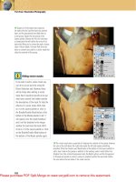
Red Eye Tool
Photoshop’s Red Eye tool (which is grouped with the Heal-
ing Brush and Patch tool) is designed to quickly and easily
remove red eye (Figure 8.68). All you have to do is click
near the eye and Photoshop will search for the closest red
circle, remove all the color, and then darken the area. This
tool is only sensitive to red areas and therefore is not useful
for the green or orange eyes that often result from animals
being photographed using an on-camera fl ash. (In those
cases, use the Color Replacement tool, which is coming up
next in this chapter.)
Figure 8.68 The Red Eye tool has only two settings
available in the options bar.
The Darken Amount setting determines how dark the
pupil will become (Figure 8.69). If your results look solid
black, choose Edit > Undo, use a lower Darken Amount
setting, and then try again.
Figure 8.69 Left, the original image with red eye. Darken Amount settings from
left to right: 10%, 40%, 80%. (Note: Contrast of these images has been increased
to make the differences more obvious, since the onscreen difference is rather
subtle and might be difficult to see in printed form.)
Low settings for Pupil Size usually produce more detail in
the pupil of the eye, whereas higher settings leave little or
no detail. Settings between 10% and 20% usually produce
an acceptable amount of detail, and settings of 50% or
above produce an almost solid black pupil.
Color Replacement Tool
The Color Replacement tool allows you to paint across
an area and change its color. What’s really nice about this
tool is that you don’t have to be overly precise with your
300
Chapter 8 Color Manipulation
painting, because you’re only going to affect the painted
area. Photoshop will replace only the colors that you
mouse over with the crosshair that shows up in the center
of the brush cursor.
When you paint, Photoshop uses your foreground color
to change what’s in the active layer, based on the setting
in the Mode pop-up menu in the options bar at the top of
your screen (Figure 8.70):
Figure 8.70 The options bar settings determine how the Color Replacement tool
will interact with the image.
. Hue. Changes the basic color of an area without chang-
ing the brightness (Figure 8.71). This option doesn’t
let you change how colorful an area is or introduce
color into an area that didn’t already have it. This
choice is useful when you’d like to change the basic
color of an object in a non-colorful scene, where it
wouldn’t look appropriate to intensify or mellow out
the original colors.
. Saturation. Makes an area as colorful as your fore-
ground color or removes the colors from certain areas
of a photo. This option doesn’t allow you to change the
basic color or brightness of an area. You don’t have to
be very careful when painting, because this feature uses
the same technology as the Background Eraser. To force
areas to black-and-white, just paint with black, white,
or any shade of gray. Because your foreground color
doesn’t contain any color, the color will be removed
from the area you paint (Figures 8.72 and 8.73).
Figure 8.72 The original image.
(©2008 Dan Ablan.)
Figure 8.73 Color is removed from the
background, using Saturation mode
and painting with black.
This tool applies your foreground
color to the active layer, so
remember that you can change the
foreground color by holding down
the Option/Alt key and clicking an
area in the image that contains the
desired color.
Figure 8.71 The dull jacket of the man
crossing the street becomes a shiny
purple color with a few clicks of the
mouse. (©2008 Dan Ablan.)
301
III: Grayscale, Color, and Print
. Color. Changes both the basic color and the saturation
of the color, but not the brightness. In essence, this
option applies the paint color to the brightness of the
original image. This choice is useful when you need
to push a lot of color into a particular area. Just paint
with a relatively vivid version of a new color so the area
becomes as colorful as the original image (Figure 8.74).
. Luminosity. Changes the brightness of an area to match
the brightness of the paint color. This mode won’t allow
you to shift the colors at all. This option might not be
used very often, but it can be helpful if you need to fi x
a portion of an image that’s just too intense, such as a
bright red baseball uniform (Figure 8.75).
If you’re having trouble getting good results with this tool,
you need to learn more about the setting that determines
which areas are changed and which are ignored. This tool
uses the same technology as the Background Eraser tool,
which we’ll cover in detail in Chapter 9, “Enhancements
and Masking.” So go check out that chapter and then
come back and try these ideas again.
Channel Mixer
So far, most of the adjustments in this chapter have been
relatively straightforward. You tell Photoshop what you
want to change (midtones, highlights, and so on) and what
direction to shift the colors. But the Channel Mixer is a dif-
ferent beast (Figure 8.76). It forces you to think about how
Photoshop works behind the scenes. The Channel Mixer
lets you literally mix the contents of the channels that show
up in the Channels panel (Window > Channels).
Choose Image > Adjustments > Channel Mixer and choose
the desired channel from the Output Channel pop-up
menu. Then move the Source Channels sliders to brighten
or darken the output channel:
. Because RGB mode creates the image out of red,
green, and blue light, moving sliders toward the right
adds more light and therefore brightens the output
channel based on the contents of the channel whose
Figure 8.74 The top half of the red
bus was painted blue with the mode
set to Color. (©2008 Dan Ablan.)
Figure 8.76 The Channel Mixer dialog.
Figure 8.75 A few clicks on the bright
red uniform reduce its intensity.
(©2008 Dan Ablan.)
302
Chapter 8 Color Manipulation
slider you moved. Moving the slider in the opposite
direction reduces the amount of light being applied to
the output channel.
. CMYK mode creates the image out of four colors of
ink, so moving a slider toward the right adds ink to the
output channel, thereby darkening it. Moving a slider
to the left in CMYK mode lessens the amount of ink
in the output channel, effectively brightening it. This
design might sound complicated at fi rst, but once you
see a few examples you should start to understand the
simplicity behind it.
Let’s say you have a CMYK mode image of a banana (Figure
8.77) and you’d like to reproduce it using only two colors
of ink. That way you could save money and show your
friends that you’ve really mastered Photoshop. You’d prob-
ably end up using yellow ink for the banana, and then use
some black ink so you can get shadows that are darker than
the yellow ink. Start by choosing Image > Adjustments >
Channel Mixer, choose Cyan from the Output Channel
pop-up menu, and move the Cyan Source Channels slider
all the way to the left to indicate that you don’t want to
use any of what was originally in the Cyan channel (Figure
8.78). Then choose Magenta from the Output pop-up
menu and move the Magenta slider all the way to the left to
clear out the Magenta channel (Figure 8.79).
Figure 8.78 Moving the Cyan slider all the way to the left
removes all cyan from the image.
Figure 8.79 Moving the Magenta slider all the way to the
left removes all magenta from the image.
Figure 8.77 The original banana
image is in CMYK mode. (©2007
Photospin.)
303
III: Grayscale, Color, and Print
Now the image should be made out of just yellow and black
ink, but it most likely looks quite light because there’s not
enough black ink to compensate for not using any cyan or
magenta ink. To fi x that problem, choose Black from the
Output Channel pop-up menu, and then slide the Cyan
and Magenta sliders toward the right until the brightness
looks as close to the original as you can get (Figure 8.80).
Turn the Preview check box off and back on again to
compare the original to the end result. Once you have the
image as close as you can get to the look of the original,
click OK and then drag the Cyan and Magenta channels to
the trash at the bottom of the Channels panel. Finally, to
get a more appropriate shade of yellow, double-click to the
right of the name of the Yellow channel in the Channels
panel, so you can pick a new color and experiment until
the image looks the best it can (Figure 8.81).
Figure 8.80 Adding what used to be in the Cyan and
Magenta channels to the Black channel will compensate for
using fewer inks.
Figure 8.81 The final image is made out of only
two colors of ink!
Now that you’ve seen one example, let’s use the Channel
Mixer to convert a full-color image into a grayscale version.
While you might think that you could just choose Image >
Mode > Grayscale and be done with it, you’ll get better
quality by experimenting with the Channel Mixer. But
before you get started, go open the Channels panel and
click through all the channels. You’ll need to start with one
of those channels as the base of your grayscale conversion,
With Photoshop CS4, the Black
and White adjustment is the best
option, but the Channel Mixer is a
good alternative to other grayscale
conversion methods.
304
Chapter 8 Color Manipulation
so make note of which one displays the best grayscale ver-
sion of the image. In Figure 8.82, the Red channel provides
the best starting point.
Choose Image > Adjustments > Channel Mixer, and turn on
the Monochrome check box at the bottom of the dialog to
remove all the color from the image. To start with the chan-
nel you liked best, move the appropriate slider to the 100%
position and move the other sliders to 0%. Now experiment
with moving the sliders to the right and left to see how
they affect the image (Figure 8.83). As you move a slider
toward the right, the image gets brighter, necessitating that
you move another slider toward the left to compensate. By
using different mixes of the channels, you’ll get different
grayscale results. There’s no obvious formula for getting
the best results; you just have to experiment until you like
the detail, contrast, and brightness (Figure 8.84). A good
general rule is that getting the sliders to add up to 100%
should deliver an image that’s close to the same brightness
as the original image. Once you like what you have, click
OK and then choose Image > Mode > Grayscale.
Figure 8.83 Start with the channel that looked the best,
such as the Red channel.
Figure 8.84 One of many end results you could get with a
few minutes of experimentation.
Figure 8.82 The Red channel of a
color RGB image. (©2008 Dan Ablan.)
305
III: Grayscale, Color, and Print
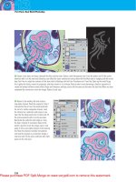
Gradient Map
The Gradient Map (Image > Adjustments > Gradient Map)
does a rather simple and unusual thing: It fi rst converts an
image to grayscale, and then replaces the shades of gray in
the image with different colors that show up in a gradient
(Figure 8.85). When you fi rst open the dialog, it defaults
to a black-and-white gradient, which should just make the
image look grayscale. If you click the down arrow to the
right of the gradient preview, you’ll be able to choose a
preset gradient to replace the shades of gray that were in
the original image (Figures 8.86 and 8.87). If you prefer to
bypass the preset gradients and create your own gradient,
click in the middle of the gradient preview to access the
Gradient Editor. To learn how to create your own gradi-
ents, read about the Gradient tool in Chapter 1, “Tools and
Panels Primer.”
Figure 8.86 The original image.
(©2008 Dan Ablan.)
Figure 8.87 Gradient Map replaces
brightness levels with different colors.
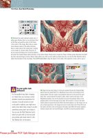
You can use the Gradient Map command to transform a
backlit image into one that looks like it was taken at sunset
(Figures 8.88 and 8.89). All you have to do is create a
gradient that starts with black and slowly fades to orange
and then yellow (Figure 8.90). If you want more of a
silhouetted image, just slide the black color swatch in the
Figure 8.85 The Gradient Map dialog.
306
Chapter 8 Color Manipulation
Gradient Editor toward the right until you no longer see
much detail in the subject of the photo (Figure 8.91).
Figure 8.88 The original image. (©2008 Dan Ablan.) Figure 8.89 The result of applying a black, orange, yellow
gradient map.
Figure 8.90 The three-color gradient
used to create Figure 8.89.
Figure 8.91 The result of dragging the black slider toward the middle of the
gradient.
The Next Step
As you’ve seen in this chapter, a mind-boggling multitude
of techniques exist for manipulating the colors in your
images. You don’t have to know or remember how to use
all of these techniques—just try the ones that seem most
comfortable and stick with them for a while. Then, once
you feel confi dent with those tricks, read this chapter again
and add a few more techniques to your adjustment arsenal.
Some of the best methods to use on a regular basis are
Hue/Saturation, Auto Color, and the Color Replacement
tool. But don’t just use those three; instead, try them all
and fi nd your own favorites.
Chapter 9: Enhancements and Masking 309
Chapter 10: Collage Effects 357
Chapter 11: Retouching Techniques 391
Creative Techniques
IV
This page intentionally left blank
CHAPTER
9
Enhancements and Masking
310
Just build a classic horseshoe of wood and plaster,
and fi ll it with statuary and curtains, then sit
back and savor the beautifully blended results.
—Michael Walsh
Enhancements and Masking
P
hotoshop has so many ways available to enhance an
image that the possibilities are endless, limited only by
your willingness to experiment.
This chapter is fi lled with enhancement techniques. Photo-
shop’s blending modes kick off the chapter, followed by
information on layer masks. Blending modes comprise one
of the most powerful features in Photoshop—and, when
mixed with layer masks, provide tremendous opportunities
for image manipulation, color correction, and more.
Blending Modes
Blending modes work when you have two or more layers.
The blending mode you choose determines how the active
layer will interact with an underlying image. Previous
chapters have looked briefl y at the Blending Mode pop-up
menu located at the top of the Layers panel. Chapter 5,
“Adjustment Layers,” pointed out that certain blending
modes can be especially useful when applying adjustment
layers, since the blending mode allows you to limit how
much those layers affect the image.
Let’s dig a little deeper into the blending modes now.
Once you understand how the various modes work, you
can jump in and start using them.
As with most Photoshop features, the blending modes are
accessible in a variety of ways. In most situations, you’ll use
the Blending Mode pop-up menu at the top of the Layers
panel, or the Blend Mode pop-up menu in the Layer Style