Creative Photoshop: Digital Illustration and Art Techniques Photoshop Cs4- P5
Bạn đang xem bản rút gọn của tài liệu. Xem và tải ngay bản đầy đủ của tài liệu tại đây (7.06 MB, 50 trang )
This page intentionally left blank
Please purchase PDF Split-Merge on www.verypdf.com to remove this watermark.
PART THREE
Real World
Photoshop
Please purchase PDF Split-Merge on www.verypdf.com to remove this watermark.
Please purchase PDF Split-Merge on www.verypdf.com to remove this watermark.
Sketch and Dry
Brush Effects
A
t this point, I’m going to assume that you’ve all seen the effects of third party prefab
sketch filters. Granted, these products have improved over the years, but personally, I
can spot filters like these a mile away. The reality is that to the experienced eye, these
filters really don’t look anything at all like authentic sketch effects. In this chapter, I have
taken it upon myself to tell you that there is a much better w
ay to d
o things. The old saying “ if you
want something done right, do it yourself ” comes to mind when one ponders creating authentic sketch
and brush effects in Photoshop. That is why, rather than rely on a prefab filter effect, I go back to the
drawing table and get those trusty old pencils out.
There are those who will argue that
some digital tools, combined with a pressure-sensitive tablet can
indeed result in an authentic sketch look. This is somewhat true, but before you go this route, hold up a
piece of onionskin paper and look at the fine random and fibrous texture within it. Draw a few lines on
it and look at how different each stroke is from the next. The same rings true when it comes to creating
dry brush or splattered paint ef
fects. Start with the real thing and in the long run
you’ll be much happier.
When it comes to Photoshop, a vast array of tools and features are ideally suited to the creation of
convincingly tactile art. However, the secret to success lies in understanding what the most ef
fectiv
e
and efficient procedure is, even before you launch Photoshop. By preparing certain image components
ahead of time, in just the right manner, you’re setting up your Photoshop workflow ahead of time.
Then, when you launch Photoshop and get to work, the process is a pleasure, not a struggle, and the
results are impressi
ve indeed.
Chapter 12
You’ll need a basic understanding of how the Layers palette works; however,
things like alpha channel uses are explained in enough detail that even fi rst-
timers should be able to work their way through this chapter. A very basic
understanding of shape layers, path creation, and the Lasso tool is required.
Please purchase PDF Split-Merge on www.verypdf.com to remove this watermark.
192
Part Three: Real World Photoshop
12
What you’ll learn in this chapter
Creative Techniques and Working Methods
Preparation of image components
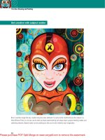
As you read through this chapter and begin the process of creating the featured illustration on the previous page, you’ll not only
create something impressive but also gain an understanding of this fundamental process. The tactile art components that are
prepared ahead of time act as building blocks within the Photoshop environment.
In this case, the building blocks are pencil sketches, dry marker drawings, dry brush strokes, and paint drips. Although the
materials and processes used to create these initial components add considerably to the feeling of this particular illustration,
the actual content could be anything you like. It is the way in which these materials are prepared, and the fact that they are
prepared separately is important. So when you complete this chapter, you’ll take away with you the knowledge required to
execute this process utilizing any tactile art material.
You’ll think about how black will translate into a selection when placed in an alpha channel. You’ll ponder how sketches will
overlap when using the multiply layer blending mode. You’ll imagine how shape layers will work alongside your drawings. And,
perhaps most importantly, you’ll have a clear vision of the results in mind before you enter the Photoshop workspace.
Photoshop Tools, Features, and Functions
Channel options
Control the behavior of your alpha channels before you generate selections from them. Knowing
how to set up Channel options to suit your resources will expedite your workflow in the long run.
Shape areas
Understanding which shape area functions to use and when to use it will help you master working
with shape layers. Create new layers when you begin to draw with the Pen tool, or edit existing
layers with clear intent. This feature allows you to add to, or subtract from, shape layers with ease.
Free-Transform opacity
The capabilities within the Free-Transform operation are vast and certainly no secret. However, few
people realize that you can alter layer opacity while performing transformations at the same time.
Please purchase PDF Split-Merge on www.verypdf.com to remove this watermark.
193
Chapter 12: Sketch and Dry Brush Effects
12
PART ONE: Preparing the actual drawings
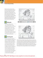
1 It all starts with a sketch. Having a plan is very important. If you go into this with
no plan, you’ll find yourself throwing things together and the final composition
will suffer. The initial sketch can be very rough, but it should give you a basic idea
of where the image components will fall within the canvas area, and how they
will look.
2 Because I wanted to maximize detail in the sketched components, and really draw
attention to the roughness and random textures inherent within pencil dr
awings,
I worked at a larger size than the final output. First, sections of the sketch were
enlarged and printed out on separate sheets of paper.
Project files
All of the files needed to follow
along with this chapter and create
the featured image are available for
download on the accompanying Web
site in the project files section. Visit
www.creativephotoshopthebook.com.
Skipping ahead
The first two parts of this chapter
describe the process of preparing and
creating art before entering Photoshop.
If you aren’t interested in this aspect
and just want to get busy creating the
featured image, go ahead and skip
forward to Part Three of this chapter.
However, those of you interested in using
these methods to generate original
works of your own, follow along from the
beginning, substituting your own content
prepared in the same manner.
Please purchase PDF Split-Merge on www.verypdf.com to remove this watermark.
194
Part Three: Real World Photoshop
12
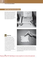
3 The next stage involves placing a sheet of tracing paper over each sketch and sourcing
an appropriate drawing tool. I prefer to use a relatively soft graphite pencil like a 2H to
trace each sketch. The advantage of this is that the lead is deposited generously and the
paper tends to get a little dirty as your hand brushes up against your pencil strokes. All
of these real-world imperfections will contribute nicely to the authentic feel of the final
result.
4 In order to prevent the tracing paper from moving, I have found that it is a good
idea to tape the tracing paper to your printout. Using some low-adhesion tape will
ensure that you don’t tear the paper. I began to trace one of the printouts.
Tape preparation
If your tape selection is limited, you can
use a fairly adhesive tape, provided you
prepare it properly first. Simply take
a piece of tape and stick it on your
clothing somewhere. Jeans or cotton
T-shirts work well for this. Peel the tape
off your clothing and due to the amount
of fibers and lint that remain on the
tape, it is noticeably less adhesive. Now
it is safe to use for affixing your tracing
paper to your printout.
Please purchase PDF Split-Merge on www.verypdf.com to remove this watermark.
195
Chapter 12: Sketch and Dry Brush Effects
12
5 After tracing the basic outlines and details, I began to embellish the drawing a
little. Thickening up the outlines around prominent areas made them stand out. In
this case, the outlines of the skull, the eye sockets, the nose, teeth, and the wrestler
underneath. I began to add shading as well.
6 Removing the tracing from the printout allows you to have a clear look at it and
see what needs to be done from here. This is the ideal time to enhance any shaded
areas, now that you can see the drawing clearly. This is also the time to erase
anything you think looks overdone or cluttered.
Tracing advice
Sometimes, when tracing, you’ll find that
the underlying printout is simply too
strong for you to clearly see what you’re
drawing on your sheet of onionskin or
tracing paper. When this happens, simply
tear off an additional sheet or two of
tracing paper and place it between the
printout and the sheet you’re drawing
on. The added sheets will decrease the
strength of the printout as seen through
the tracing paper, but it will still remain
visible enough to draw over.
Please purchase PDF Split-Merge on www.verypdf.com to remove this watermark.
196
Part Three: Real World Photoshop
12
7 Don’t be afraid to make more than one
attempt at drawing something. Sometimes
you’ll need to trace something a few times
to get it right. Trace the image and then
trace the tracing. Repeat this process,
improving upon it each time until it is
perfect. If you are creating art of your
own, scan all of your finished drawings.
If not, you will be prompted to open the
downloadable project files by name soon
enough.
PART TWO: Working with markers and ink
8 Now we’ll move from pencils to dried
up magic markers. Some people discard
markers when they lose moisture, but
these are valuable tools. Save your
drying markers to create nice dry brush
style line work with them. Convincing
dry brush effects are very difficult to
create digitally. So start with the real
thing instead. Here I’ve drawn a section
of detail that can be repeated over and
over again to form a pattern in the image
background.
Please purchase PDF Split-Merge on www.verypdf.com to remove this watermark.
197
Chapter 12: Sketch and Dry Brush Effects
12
9 To create convincing dry brush effects, you’ll
have to use a drying brush. Whether you use
watercolor paints or India ink doesn’t matter.
Black is ideal, but color will also work as the
scanned art will ultimately be converted to
grayscale along the way as it enters an alpha
channel later on. You’ll need a rough brush, ink
or paint, and some paper.
10 To create a convincing dry brush stroke, dip your brush and then begin painting.
When you start to run out of paint or ink, keep on painting, these strokes will give
you the best effect. Paint strokes until your brush is completely dry before you
dip it again and repeat the process. Have some fun creating interesting brush
stroke – based shapes.
While you’re at it
When I’m creating messy tactile
components to incorporate into digital
art, I tend to create a lot more resources
than are required for the current project.
Basically, if I’m going to make a mess
with ink, I’ll create an abundance of
these things while I’m at it; the more
diverse the better. Then I archive all of
the results and save them as possible
resources for future projects. This saves
you the trouble of dealing with messy
materials again in the future and can
help to expedite your next project.
Please purchase PDF Split-Merge on www.verypdf.com to remove this watermark.
198
Part Three: Real World Photoshop
12
11 To create a dripping or splattered paint effect, dip your brush until it is dripping wet. Then shake it over the top of your page to
add some paint drops to it. There will be areas that are as thick as puddles. Gently tilt the paper to make the paint run and blow on it to
accelerate the effect. Be warned, this can get very messy.
1 2 Now, take a rag or cloth and crumple it up into your hand. Dip the cloth or rag into a puddle of ink or paint. Then, using a circular
motion, rub ink or paint onto a separate sheet of paper. This is an excellent way to create wispy cloud shapes. Scan everything when it
dries.
Please purchase PDF Split-Merge on www.verypdf.com to remove this watermark.
199
Chapter 12: Sketch and Dry Brush Effects
12
PART THREE: Building the background
13 Now, if you have created your own image
components, now is the time to scan them all
and save them as separate files. You will need to
substitute them as required as we work through the
rest of the chapter. If you’re using the project files,
now is the time to download them if you haven’t
already. Open up the sketch.jpg file. This will act as
our template on the bottom while assembling the
image components on a series of layers.
14 Choose the Solid Color option from the Create
New Fill or Adjustment Layer menu at the bottom
of the La
yers palette. When the picker appears,
choose a pink color and click OK. This will create
a solid pink layer that covers the sketch. This pink
layer will act as the illustration’s background,
but remember the sketch is always underneath.
Whenever you need a template to assist with
placing an element into the composition, you can
temporarily disable the visibility of the pink layer,
allowing you to see the sketch below.
Please purchase PDF Split-Merge on www.verypdf.com to remove this watermark.
200
Part Three: Real World Photoshop
12
15 Click the Create a New Layer button at the bottom of the Layers palette to create a new layer. Ensure that this new layer is targeted in
the Layers palette and select the Gradient tool. In the toolbar, select the Foreground to Transparent Gradient preset, and the Radial Gradient
option. Click on the Foreground Color swatch and select a purple color from the picker. Create a gradient on the new layer in the upper
left of the canvas. Then repeat this process to select very light pink foreground colors and create a series of gradients on the new layer,
similar to those shown here.
PART FOUR: Creating a pattern
Controlling channel-based selections
How selections are generated can be changed beforehand or afterward, whichever you prefer.
1 When you generate a selection from
an image pasted into a channel, by
default, white areas are selected and
black areas are not. The degree to
which they are selected depends upon
just how white or black they are. If this
image were loaded as a channel-based
selection, the background would be
selected instead of the drawing.
2 If you want the art to be selected
instead of the backgr
ound, you can
simply inv
ert the selection after the
selection has been generated by
choosing Select Ͼ Inverse from the
menu. Alternatively, you can invert
the image within the channel before
a selection is generated from it by
choosing Image Ͼ Adjustments Ͼ Invert.
3 By double-clicking on a channel
thumbnail in the Channels palette
,
you can open the options for that
channel. Color Indicates is set to
Masked
Areas by default; this means
that selections are generated from
white areas. However, if you want to
generate selections from the dark
regions instead, simply switch the
Color Indicates to Selected Areas.
Please purchase PDF Split-Merge on www.verypdf.com to remove this watermark.
201
Chapter 12: Sketch and Dry Brush Effects
12
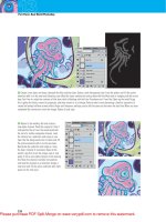
16 Click on the Create New Channel button at
the bottom of the Channels palette. Your new
channel will automatically become targeted
in the palette and visible in the image window.
Open up the scan4.jpg file. Now, we are going
to paste this image into the new channel,
but because it is a black sketch on a white
background, the pasted art will appear as it
is, white background and all, sitting against
a larger, black background. To remedy this,
choose Image Ͼ Adjustments Ͼ Invert from the
menu. Now that the drawing is white against
a black background, select all by typing
Control(PC)/Command(Mac)-A and copy by
typing Control(PC)/Command(Mac)-C .
17 Return to your working file and type Control(PC)/Command(Mac)-V to paste the
copied art into your new alpha channel. Control(PC)/Command(Mac)-click on the
channel thumbnail in the Channels palette to load it as a selection. Return to the
Layers palette and create a new layer. Select a very light pink foreground color
from the picker. Ensure that the new layer is targeted and then type Alt(PC)/
Option(Mac)-Delete to fill the selection with the new foreground color on the new
layer. Type Control(PC)/Command(Mac)-D to deselect.
Please purchase PDF Split-Merge on www.verypdf.com to remove this watermark.
202
Part Three: Real World Photoshop
12
18 Now, zoom out so that you can see the entire canvas area. This will give you a
good understanding of the size relationship between your newly created pattern
component and the rest of the image. You want it to be quite small when compared
to the size of the canvas so type Control(PC)/Command(Mac)-T to access Free-
Transform. Shift-drag a corner handle inward to reduce the size. When you’re
satisfied right-click(PC)/Control-click(Mac) inside the bounding box. When the
pop-up menu appears, choose the Flip Horizontal option and then press the Enter
key on the keyboard to apply the transformation.
19 Press the “ v ” key to quickly access the
Move tool. Hold down Alt(PC)/Option(Mac), and
then click on the pattern component. While
holding down the mouse and keyboard button,
drag to duplicate the layer. Position it beside
the original, taking into account the angle.
Repeat this process a number of times until
you’ve created a row out of duplicate layers.
Control(PC)/Command(Mac)-on all of the other
layers that make up this row in the Layers
palette so that they are all selected and then
type Control(PC)/Command(Mac)-E to merge
them into one.
Please purchase PDF Split-Merge on www.verypdf.com to remove this watermark.
203
Chapter 12: Sketch and Dry Brush Effects
12
20 Now perform the same operation to make a
number of duplicates of your newly merged layer.
Position them so that they are slightly offset from
each other, yet they fill the entire canvas area.
Select the original merged layer and all of the
duplicates in the Layers palette and merge them
into a single layer like you did on the previous
page. With this layer targeted, also target the
layer with the gradients as well as the solid pink
layer in the Layers palette. When all three are
targeted, type Control(PC)/Command(Mac)-G
to group them. Double-click the name of the
group to highlight the name. While the text is
highlighted, enter a new name. Feel free to name
the group something appropriate.
PART FIVE: Incorporating scanned sketches
21 Temporarily disable the visibility of your
new group by clicking on the visibility icon to
the left of it in the Layers palette. Next, open up
the scan1.jpg file. Select all and copy. Return
to the working file and paste the copied art
in as a new layer. Enable the Free-Transform
command to resize and position the pasted
art based on the underlying sketch. Note
that you can reduce the opacity of your layer
while the Free-Transform command is active.
This will help you see the sketch underneath
even as you’re resizing. When you’re satisfied,
return the opacity to 100% and then apply the
transformation. If you do not return the opacity
to 100% before you apply the transformation,
you can do it afterward. It is up to you, the order
does not matter.
Please purchase PDF Split-Merge on www.verypdf.com to remove this watermark.
204
Part Three: Real World Photoshop
12
22 Open up the scan2.jpg file. Copy the
art and paste it into the working file as a
new layer. Use Free-Transform to resize
and position it according to the template
beneath. To rotate, simply click and drag
outside the bounding box. Remember that
you can alter layer opacity at any point
to assist you. Apply the transformation
and change the layer blending mode to
multiply.
23 Open up the scan3.jpg file. Repeat
the process to paste the art from this file
into the working file as a new layer. Use
Free-Transform to resize and position the
art at the top left of the canvas. Change
the layer blending mode to multiply. You’ll
notice that changing the blending modes
of these two layers makes the underlying
sketch far too prominent. Fear not, we’ll
address that.
24 Target the three sketch layers in
the Layers palette and merge them.
The
multiply effect, where the three layers
overlap each other, is preserved within
the new layer. However, the blending
mode of the new layer is defaulted back
to normal, so the multiply effect applied
to underlying layers is lost. Enable the
visibility of the underlying background
group once again, hiding the unsightly
sketch.
Please purchase PDF Split-Merge on www.verypdf.com to remove this watermark.
205
Chapter 12: Sketch and Dry Brush Effects
12
25 Change the blending mode of the layer to
multiply. Click on the Add Layer Mask button at
the bottom of the Layers palette to mask the
layer. Target the layer’s mask in the Layers
palette and select the Gradient tool. Enable the
radial method and choose the Foreground to
Transparent Gradient preset in the Tool Options
bar. Set the foreground color to black. Begin to
create small, radial gradients within the mask to
hide edge areas of the overlapping pages that
appear too dark against the background.
PART SIX: Adding authentic dry brush strokes
26 Open up the scan5.jpg file. Use the Lasso
to draw a closed selection around a large dry
brush shape. Copy the selected area. Return
to your working file and create a new alpha
channel. Double-click the channel’s thumbnail
in the Channels palette to access the Channel
options. Change the Color Indicates option to
Selected Areas and click OK. When you exit the
Channel options you’ll notice that your channel,
which used to appear black, is now white. Paste
the copied art into the new channel. While the
selection is active, enable the visibility of the
CMYK composite channel by clicking in the
column to the left of it in the Channels palette.
Now that you can see the image, use it as your
guide as you resize, rotate, and position the
pasted art in the channel via Free-Transform.
Please purchase PDF Split-Merge on www.verypdf.com to remove this watermark.
206
Part Three: Real World Photoshop
12
27 After you apply the transformation, load the channel as a selection. Disable the
visibility of the composite channel and then return to the Layers palette. While the
selection is active, create a new solid color layer with a light yellow fill. Reduce
the opacity of the layer slightly and then duplicate the layer by dragging it onto the
Create a New Layer button at the bottom of the Layers palette. Reduce the opacity
of the duplicate layer even more and then use Free-Transform to flip it horizontally,
rotate, resize, and reposition it on the canvas.
28 Create a new alpha channel. Paste your copied dry brush stroke into the new
channel. Because you haven’t copied anything since copying the last brush stroke,
this will be pasted each time you paste until you copy something else. Again, use
Free-Transform to resize the pasted art in the channel. Load it as a selection and
then create a white solid color layer while the selection is active. Drag it beneath the
yellow layers in the Layers palette and drag the sketch layer to the top of the stack.
Please purchase PDF Split-Merge on www.verypdf.com to remove this watermark.
207
Chapter 12: Sketch and Dry Brush Effects
12
29 Create another new, empty channel and then return to scan5.jpg.
Select different dry brush strokes with the Lasso, one by one. Copy
them. Paste them into the new channel in the working file. Resize,
reposition, and rotate them via Free-Transform. Do this until your
channel contains four brush strokes and looks a little like this. Load
the channel as a selection and then, while the selection is active,
create a new dark pink solid color layer. Drag it beneath the rest and
change the blending mode of this layer to multiply.
30 Repeat this process again. Select dry brush strokes from the scan5.
jpg file, copy them, and paste them into a new channel. Use Free-
Transform to alter them. This time arrange them so that the channel
looks a bit like this. Load the channel as a selection and then, while the
selection is active, create a new solid color layer. This time, specify a
light orange fill color and change the layer blending mode to multiply.
Please purchase PDF Split-Merge on www.verypdf.com to remove this watermark.
