Creative Photoshop: Digital Illustration and Art Techniques Photoshop Cs4- P4
Bạn đang xem bản rút gọn của tài liệu. Xem và tải ngay bản đầy đủ của tài liệu tại đây (7.99 MB, 50 trang )
138
Part Two: Unconventional Methods
9
PART ONE: Real thermal fax effects
1 The first step is to print out all of the original
sketches. Then, take the printed sketches to a
thermal fax machine. One at a time, insert each
sketch into the thermal fax machine and press
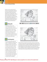
the Copy button. This will make an exact copy
of your original sketch on thermal paper. In
addition to copying your sketches, make a few
copies of a blank piece of paper, simply to get a
couple of blank thermal pages as well.
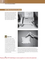
2 Tape one of your blank pages to a wall or another flat surface. Plug in your
hairdryer and ensure that it is set to the hottest setting. Activate the hairdryer and
move it close to the paper. Immediately you’ll begin to see the paper darken when
the hot air hits it. Use this technique to darken the blank sheets of thermal paper
around the edges only. These will be used later to create a dark edge effect on the
pages within the illustration.
Project files
All of the files needed to follow
along with this chapter and create
the featured image are available for
download on the accompanying Web
site in the project files section. Visit
www.creativephotoshopthebook.com .
The initial sketch files can be found
there. And for those of you who don’t
have access to a thermal fax machine,
hairdryer, or simply want to focus on
the Photoshop work in this chapter
only, all the scanned thermal pages are
included in this folder.
Please purchase PDF Split-Merge on www.verypdf.com to remove this watermark.
139
Chapter 9: Antique Effects
9
3 Now tape your thermal copies of the sketches
to the wall or another flat surface. When using
the hairdryer on these, concentrate on burning
the centers of each page. Try moving the
hairdryer back and forth quickly. It is fine if the
image becomes obscured by the burn effect.
You’ll notice the paper will ripple slightly and
the high points of the ripples will be darkest.
4 Open up the background.jpg file. This shot was carefully set up on an antique
wooden trunk to lend a sense of authenticity to the final result. The pages you
see here are already looking a bit aged. The corners are rounded slightly and the
pages are a bit darker around the edges. Notice how the empty pages are set up to
overlap each other. Each page will provide the background for one of the sketches
and have an antique effect applied to it.
Fax quality
Most fax machines, even old thermal
ones, will have a number of quality
settings to choose from. The best
quality is not necessarily required for
what we are doing here. When you are
copying your sketches to thermal paper,
experiment with a variety of settings.
What you’re after is something that,
although it may omit lighter details
from the sketches, copies the majority
of the artwork so that it is dark and
legible. The scans included on this CD
were copied on an old fax machine
using the medium-quality setting, which
provided the clearest result.
Please purchase PDF Split-Merge on www.verypdf.com to remove this watermark.
140
Part Two: Unconventional Methods
9
5 If you’ve done your own thermal effects using
the hairdryer and copies of the illustrations,
the next step is to scan each piece of paper.
Envision the destination of each sketch within
the background and actually rotate your pages
on the scanner to approximate the angle before
you scan them. You can rotate them in Photoshop
later if necessary, so don’t worry about being
too accurate. Also, scan your blank pages with
the thermal effects applied to them.
PART TWO: Incorporating the first drawing
6 Open up the man.jpg file. Choose Select Ͼ All and Edit Ͼ Copy from the menu.
Return to the background.jpg file, your working file. In the Channels palette, click
on the Create New Channels button to create a new alpha channel. With the new
alpha channel targeted in the Channels palette, click in the column to the left of
the CMYK composite channel to enable the visibility of all channels. Your alpha
channel will be visible as a red overlay, similar to traditional rubylith.
Scanning and tonal
adjustments
If you’re scanning your own burned
thermal fax pages, ensure that they are
scanned and saved in grayscale mode.
This isn’t absolutely necessary, but it
is helpful as the scans are destined
for alpha channels. Also, it would be
ideal if you could adjust your scanner
driver preferences so that an automatic
tonal adjustment is performed ensuring
that the white backgrounds within
your files contain 0% black. If you
don’t have this option, simply perform
a very quick tonal adjustment via the
Brightness/Contrast option in the
Image Ͼ Adjustments menu.
Please purchase PDF Split-Merge on www.verypdf.com to remove this watermark.
141
Chapter 9: Antique Effects
9
7 With your new channel targeted in the
Channels palette, choose Channel options from
the Channels Palette menu. In the Channel
options, you’ll notice that the default setting
is for color to indicate masked areas. Change
this so that color indicates selected areas
instead. When you click OK, you’ll immediately
notice that the red overlay disappears from the
image window as the background of your alpha
channel becomes white instead of black.
8 With your alpha channel targeted, choose Edit Ͼ Paste from the menu. You’ll
notice the colored areas within the pasted sketch appear as a red overlay in the
image window. Choose Edit Ͼ Free-Transform from the menu. Hold down the Shift
key while you drag a corner point inward to reduce the size of the pasted art
proportionately. Move the mouse pointer to the outside of the bounding box until
it changes to indicate rotation. Click and drag to rotate the contents to the same
angle as the large page. Click in the center of the box and drag it onto the main
page to position it.
Select, copy, and paste
As you add sketches and scanned
thermal effects into each channel, you’ll
be doing a lot of copying and pasting.
Therefore, it is beneficial to familiarize
yourself with some keyboard shortcuts:
• Control(PC)/Command(Mac)-a is
“ select all ”
• Control(PC)/Command(Mac)-c is
“ copy ”
• Control(PC)/Command(Mac)-v is
“ paste ”
Please purchase PDF Split-Merge on www.verypdf.com to remove this watermark.
142
Part Two: Unconventional Methods
9
9 When you’re satisfied, press the Enter key to apply the transformation. Although
viewing the new channel against the rest of the image is handy for positioning,
disable the visibility of the CMYK composite channel by clicking on the eye in the
left column. This will allow you to view the channel by itself. Click the Load Channel
as a Selection button at the bottom of the Channels palette. You’ll notice that
because you changed color to indicate selected areas, the black regions of the
channel are selected rather than the white regions.
10 Return to the Layers palette and click on the
Create a New Layer button at the bottom of the
Layers palette. As soon as you create a new layer,
the CMYK composite channel will become visible
once again, and your alpha channel’s visibility will
be automatically disabled. This is a handy way to
return to the regular workspace. With the current
selection active, target your new layer. Select the
Eyedropper tool and click on a brown area of the
background to sample it. The foreground color will
automatically change to your newly sampled color.
Sampling color
When you click on a color with the
Eyedropper tool, the foreground color
is automatically replaced with the new
color. However, if you hold down the
Alt(PC)/Option(Mac) key and click on a
color within the image, the background
color will be replaced instead of the
foreground color.
Please purchase PDF Split-Merge on www.verypdf.com to remove this watermark.
143
Chapter 9: Antique Effects
9
11 Ensure that your new layer is targeted and
choose Edit Ͼ Fill from the menu. In the Fill
dialog box, use your current foreground color,
a blending mode of normal, and 100% opacity.
Pay attention to these settings as you’ll use them
over and over again while filling selections
throughout this chapter. Type Control(PC)/
Command(Mac)-d to deactivate the current
selection and change the blending mode of the
layer to multiply. Click the Add Layer Mask button
at the bottom of the Layers palette to add a
mask to the layer.
12 Target the layer mask in the Layers palette and select the Gradient tool. In the
Tool Options bar, choose the radial method and the Foreground to Transparent
Gradient preset. When you target the mask, your foreground color automatically
switches to black because you have changed what color indicates in the Channel
options earlier . This is perfect for masking. Click and drag with the Gradient tool
to draw small, black to transparent, radial gradients within the mask in areas that
you wish to gently fade from view. For a more subtle masking effect, try using the
Gradient tool with a lower opacity setting.
About filling
When you choose Edit Ͼ Fill from the
menu, you have a number of choices
as to how to go about filling. You can
choose a color, a blending mode,
and an opacity setting. However,
throughout this chapter, we’ll be using
the default settings, which are the
current foreground color, a normal
blending mode, and an opacity setting
of 100%. If you use the keyboard
command Alt(PC)/Option(Mac)-Delete,
your current layer or active selection
is automatically filled using these
settings.
Please purchase PDF Split-Merge on www.verypdf.com to remove this watermark.
144
Part Two: Unconventional Methods
9
PART THREE: Thermal effects via channels and layers
13 Open up the man-thermal.jpg file or a scan
of your own version of this thermal-affected
sketch. Select all and copy. Return to the
working file and create a new alpha channel
in the Channels palette. Paste your copied
image into the new channel and then enable the
visibility of the composite channel within the
Channels palette. Choose Edit Ͼ Free-Transform
from the menu. Use the visible CMYK image as
your guide to resize, rotate, and reposition the
image you pasted into the channel. Do your best
to get it to match up nicely with the sketch on
the main page within the image.
14 Load your new channel as a selection. In the Layers palette, create a new
layer. Ensure that your selection is active and that the new layer is targeted. Use
the Eyedropper to sample a beige color from the image and then fill the active
selection with the new foreground color on the new layer. Change the layer
blending mode to color burn and reduce the opacity of the layer to 46%.
Color opacity
In the Channel Options dialog box,
you’ll notice that at the bottom, there
is an area where you can change the
opacity of the red overlay. When you are
displaying the CMYK composite channel
at the same time as your alpha channel,
there may be instances where you
find that the red is too faint to really
see what you’re doing. Increasing the
opacity in the Channel Options will help
with channel visibility. The downside,
however, is that the more you increase
the opacity, the less transparent the
overlay becomes. Ideally, you’ll address
this on an as-needed basis depending
upon your existing channel preview
circumstances.
Please purchase PDF Split-Merge on www.verypdf.com to remove this watermark.
145
Chapter 9: Antique Effects
9
15
With the current selection still active,
create a new hue/saturation adjustment layer
by clicking on the Hue/Saturation button in the
Adjustments palette. Increase the saturation
by 61 and reduce the lightness by 9. When you
create an adjustment layer, your active selection
is used to create a mask and then becomes
deactivated. Right-click(PC)/Control-click(Mac)
on the adjustment layer’s mask thumbnail and
then choose the Add Layer Mask To Selection
option from the pop-up menu that appears.
This will reload your selection. With the new
selection active, create a new layer and ensure
that it is targeted in the Layers palette.
16 Change the blending mode of the new layer to color burn and reduce the
opacity to 30%. Use the Eyedropper to sample a slightly darker brown color from
within the image and then select the Gradient tool. Ensure that the Foreground to
Transparent Gradient preset is selected and that the radial method is enabled in
the Tool Options bar. Click and drag to create a few gradients within the selection
on the current layer. This will add a darkening effect in these areas. Add as many
as you think are needed and then type Control(PC)/Command(Mac)-d to deactivate
the selection.
Individual channel options
Earlier on, we changed what color
indicates in your channels by
accessing the Channel options via the
Channels Palette menu. When you do
it this way, every subsequent channel
you create uses the same options.
However, you can edit the options for
individual channels after the fact. To do
this, simply double-click on any alpha
channel in the Channels palette. The
Channel Options dialog box opens up,
allowing you to alter the options for
that specific channel only.
Please purchase PDF Split-Merge on www.verypdf.com to remove this watermark.
146
Part Two: Unconventional Methods
9
17 Drag the current layer onto the Create
a New Layer button in the Layers palette to
duplicate it. Change the blending mode to
multiply to darken the effect further and then
choose Filter Ͼ Blur Ͼ Gaussian Blur from the
menu. Enter a radius value sufficient enough
to considerably soften the contents of the
duplicated layer. Now that the overall page is
looking good, it is time to begin darkening the
edges. Open up the edge1.jpg file or a desktop
scan of your own. Select all and copy.
1
Create a new channel in your
working file and paste the copied
image into it. Enable the visibility of
the composite channel and position
it over the appropriate area. This
included scan was already rotated
on the scanner; however, you may
need to rotate your own.
2 Load the channel as a selection
and create a new layer. Target the
layer and fill the active selection
with a newly sampled, dark brown
foreground color. Change the layer
blending mode to color burn and
reduce the opacity to 15%. Deselect.
3 Duplicate this layer and change the
blending mode to multiply to darken
the eff
ect. Add a layer mask and then
use the Gradient tool to add radial,
black to transparent gradients into
the mask to soften any areas on this
layer that appear too dark.
Begin darkening the edges of the page
Now the blank thermal page scans that were burned around the edges only, will be put to good use.
Please purchase PDF Split-Merge on www.verypdf.com to remove this watermark.
147
Chapter 9: Antique Effects
9
18 Open up the edge2.jpg file or use another
of your own scans. Again, select all and copy.
Return to your working file and paste it into
a new alpha channel. Enable the visibility of
the CMYK composite to aid you in positioning
the contents of the channel on the page. The
included file was rotated on the scanner;
however, especially if you’re using your own
file, you may need to use Free-Transform to
resize and rotate the channel contents. Load the
channel as a selection and then create a new
layer in the Layers palette.
19 Use the Eyedropper to sample a different dark brown color and fill the active
selection with that color on the new layer. Deselect and reduce the opacity of the
layer to 16%. Duplicate the layer, change the blending mode to color burn, and
increase the opacity to 24%. Open up the edge4.jpg. Again, copy the image and
paste it into a new channel within your working file. Position it using the CMYK
composite channel as your guide. Load it as a selection and fill the selection with
dark brown on a new layer. Change the blending mode to multiply and deselect.
Channel color
Sometimes, when previewing an alpha
channel against the CMYK composite
channel, red simply isn’t going to be
as visible as another color would be.
You can alter the color overlay of your
channel by clicking on the Color swatch
in the Channel options. This launches
the picker, allowing you to change the
display color of your channel to another
color that will be more visible against the
CMYK composite channel. Your display
color can vary from channel to channel;
they don’t all have to be the same.
Please purchase PDF Split-Merge on www.verypdf.com to remove this watermark.
148
Part Two: Unconventional Methods
9
20 Create a new layer and select the Gradient
tool. Ensure that the gradient is still set to radial
and that the Foreground to Transparent preset
is selected in the Tool Options bar. Set the
blending mode of the layer to darken and ensure
that you have a dark brown foreground color
specified. Click and drag on this layer, creating
gradients in various sizes, using varying opacity
settings, to darken areas of the page on the
underlying layers with smooth blends of color.
21 Target your top layer, hold down the Shift
key and click on the initial sketch layer, which
sits directly above the background layer in
the Layers palette. This will target both the
layers and all the layers in-between. Choose
Layer Ͼ New Ͼ Group From Layers from the menu
to add them to a group. Select the Pen tool,
ensure that it is set to create paths, and that the
Add to Path Area option is enabled in the Tool
Options bar. Carefully trace the outer edge of
the page with the Pen tool, drawing a closed
path. Choose Layer Ͼ Vector Mask Ͼ Current Path
from the menu to clip the group.
Cleaning up channels
When you are working with a file
like this, it doesn’t take long for the
Channels palette to fill up and for file
size to swell. Go ahead and delete
any alpha channels you wish from
the palette after they’ve been used.
You don’t need to hang onto them as
storage areas for your selections once
you’ve filled a selection with color on
a layer. You can load a selection from
the layer at any point by Control(PC)/
Command-clicking on its thumbnail in
the Layers palette.
Please purchase PDF Split-Merge on www.verypdf.com to remove this watermark.
149
Chapter 9: Antique Effects
9
PART FOUR: Repeat the process
22 Now repeat what you’ve done with different resource materials. Follow the same process that you used to create the antique man
illustration, using different resource files and a different position on the canvas. Use the hand.jpg and hand-thermal.jpg files for your
first two channels and subsequent layers. Then follow the process employed previously to build up layers with varying colors, masks, and
blending modes to create the antique effect. To build up the edge effect on a series of layers, use the edge4.jpg file as your resource.
When finished, add the layers to a group and clip it with a vector mask.
Examining the hand group
Although the contents of your group will likely differ, this is exactly how I achieved the effect.
a
The channel-based hand sketch selection is filled with brown
on this layer. The blending mode is set to multiply and a mask is
used to soften areas that are too strong.
b
The channel-based thermal hand selection is filled with a
lighter brown on this layer. The blending mode is set to color
burn and the layer opacity is reduced to 77%.
c
Brown to transparent, radial gradients reside on this layer.
The layer blending mode is set to multiply, thus darkening the
underlying layers.
d
The channel-based edge selection is filled with brown on
this layer. The layer blending mode is set to color burn and the
opacity setting is 28%. The layer is duplicated and the blending
mode of the duplicate layer is set to multiply. The opacity is
increased to 51% and both the layers are masked. Gradients are
used within each mask to hide areas that are too prominent.
e
All of these layers are added to a group and a path is drawn around the edge of the page. The path is used as the basis for a
vector mask that clips the group and ensures that no artwork extends beyond the edge of the page.
a
b
c
d
e
Please purchase PDF Split-Merge on www.verypdf.com to remove this watermark.
150
Part Two: Unconventional Methods
9
23 Now it is time to repeat the entire procedure for a third time. This time, use the head.jpg file, the head-thermal.jpg file, the edge5.jpg
file, and the edge6.jpg file to create the same effect on the remaining page. Use the now familiar method of creating channel-based
selections and building up the antique effect on a stack of layers. Experiment with different colored fills, various blending modes, layer
masks, and opacity settings. When you’re finished, add all of these layers to a group as well. Then clip the group with a vector mask so
that the drawing and the age effect do not stray beyond the edge of the page.
Where to go from here
The methods used to create this effect lend themselves nicely to repetition and experimentation.
a
Use sections of some of your resource files to generate
selections and a new stack of layers, adding an antique effect
to the page that is partially visible at the lower left of the image.
When finished, clip it with a vector mask.
b
Use the same method to add the antique effect to all of the
little bits of pages that are sticking out beneath the main pages.
This will ensure that all pages, wholly or partially visible, will
have the same antique effect applied to them. Carefully clip the
desired areas with a vector mask.
c
Because this file is built as a series of layer groups, you can
edit any layer at any time. If you feel that an effect needs to be
made stronger or weaker, alter the blending modes and opacity
settings of the necessary layers to make it so. Have some fun
experimenting here.
d
If you’re not entirely satisfied with the accuracy of your vector masks, never be afraid to zoom in closely and edit the vector
mask’s individual points and line segments with the Direct Selection tool.
c
d
a
b
Please purchase PDF Split-Merge on www.verypdf.com to remove this watermark.
151
Chapter 9: Antique Effects
9
Focus on the edges
To create this image , the same thermal fax technique was used, but instead of copying sketches and then burning them
with the hairdryer, only blank sheets of thermal paper were used. This provides the ability to focus only on the edges when
creating multilayered burn effects, leaving the actual sketch unaffected.
Please purchase PDF Split-Merge on www.verypdf.com to remove this watermark.
152
Part Two: Unconventional Methods
9
Another method for ageing paper is to stain it before you scan it. The two scanned pages shown here are simple,
unbleached paper samples purchased at a Japanese paper shop. The edges were torn off and then a pot of tea was brewed.
The wet tea bags were removed from the teapot and then rubbed along the edges of the paper, allowing it to bleed into
the paper from the edges inward. Then a brush was used to paint the tea over the entire paper area. Once the pages had
dried, they were scanned. As you can see here, the tea stain method produces a convincing antique paper background
effect, without the aid of alpha channels or layer stacks.
Staining paper ahead of time
Please purchase PDF Split-Merge on www.verypdf.com to remove this watermark.
153
Chapter 9: Antique Effects
9
These two images are excellent examples of the tea-stained papers in use. Although the effect is quite different than the
thermal fax paper effect, the antique and aged feeling is certainly there.
Putting the stained paper to good use
Please purchase PDF Split-Merge on www.verypdf.com to remove this watermark.
Please purchase PDF Split-Merge on www.verypdf.com to remove this watermark.
Photocopier
Meets Photoshop
P
hotoshop, to many, represents perfection. But while we strive to achieve
perfection, let us not overlook the beauty of imperfection. If you’re an urban
dweller, pay attention to what is surrounding you as you wander the streets.
You’ll notice photocopied flyers and posters plastered all over the place. You’d
be hard pressed to find a better example of imperfect, yet beautiful, artwork. This is the
art of the underground scene. Local bands and underground artists do what they can with
what they have. There is an evident do-it-yourself aesthetic inherent in the majority of
urban poster art.
This low-fidelity appearance is more a result of available tools and failing monetary
resources rather than a conscious attempt at style. Regardless of intent, a certain style
prevails. Poor registration, inferior image quality, and cut-and-paste typography all
contribute to the urban underground look. However, the most prominent element is the
look achieved by using a poor-quality photocopier to put it all together. Generally these
collages are photocopied on machines in desperate need of servicing or even dangerously
low on toner. Not the sort of thing found at a professional copy shop, but rather like
something you’ll find in a local convenience store.
Remember, just because Photoshop has an arsenal of tools that lend themselves to
achieving perfection, it doesn’t mean that you cannot turn the tables and create convincing
imperfection. The limit to what you can achieve with Photoshop’s tools and functions
is dictated by your own willingness to explore less-than-obvious methods. To create
tactile and distressed underground poster art effects, all you need is access to a good old-
fashioned photocopier, an enthusiasm for Photoshop, and a willingness to experiment.
Chapter 10
Although this chapter is a simple montage, you’ll need to know how to
create text layers and change fonts. You’ll also need to know how to use
simple selection tools and some very basic experience with the Free-
Transform command will be helpful. A bit of experience drawing simple
paths is benefi cial toward the end as well.
Please purchase PDF Split-Merge on www.verypdf.com to remove this watermark.
156
Part Two: Unconventional Methods
10
What you’ll learn in this chapter
Deterioration tactics
When you run artwork through a photocopier, there is always some deterioration in quality. In
general, this is the type of thing we are conditioned to avoid. However, this chapter will get you
thinking about the beauty within the result of that deterioration and have you searching for
ways to emulate and enhance the effect. After you create copies for a number of generations,
it is almost impossible to ignore the unique quality of the deterioration and you can’t help but
notice the potential in the random distress that occurs.
Creative Techniques and Working Methods
Virtual scissors and glue
In order to get that authentic cut-and-paste look, you have to take a very simplistic
approach to isolating elements and compositing in Photoshop. When isolating different bits
and pieces, you’ll learn that rough selections are more believable than precise ones. A bit
of white space around a dark rectangle or an accidentally angled cut will help the finished
composition look convincing. When you piece things together, you’ll quickly see the merit in
this sort of hasty montage technique. This is no place for precise selection tools or grids
to assist in perfect alignment. This is intended to look like a real photocopied do-it-yourself
gig poster. If you’re used to creating slick, photographic compositions in Photoshop, this
chapter will definitely open your eyes to new possibilities.
Photoshop Tools, Features, and Functions
Brightness/Contrast
With infinitely better tonal adjustment tools like curves and levels available, it isn’t very often
we reach for something as simple as the brightness/contrast adjustment. However, this time,
it is a simplistic result that we’re after. Here, the goal of the image is an inferior, not superior,
appearance. Enabling this feature’s legacy format deteriorates the quality even further.
Smart objects
Placing the finished poster file into the large background image allows you to create a flexible final
composition quite easily. Keeping the poster as a smart object allows you to tweak the poster design
at any point, even long after you think you’re finished.
Blending and opacity
Authentic results are not always the result of complicated procedures. Creating the
effect of the poster being glued to a surface can be as simple as overlaying the image
with a texture layer. The secret to success is combining just the right layer blending
mode with the perfect opacity setting.
Please purchase PDF Split-Merge on www.verypdf.com to remove this watermark.
157
Chapter 10: Photocopier Meets Photoshop
10
PART ONE: Prepare, print, and photocopy
2 Return to the neinphoto.jpg file. Hold down the Control(PC)/Command(Mac) key.
Click inside the selection border and drag the contents of the selection into your new
grayscale file as a new layer. Continue to hold down the Control(PC)/Command(Mac)
key and position the layer on the canvas to allow space for the band members. Use this
method to add each band member to the grayscale file. To fit them on the canvas, you’ll
likely have to rotate one band member. To do so, target the appropriate layer in the
Layers palette and then choose a 90° rotation option from the Edit Ͼ Transform menu.
All of the files needed to follow
along with this chapter and create
the featured image are available for
download on the accompanying Web
site in the project files section. Visit
www.creativephotoshopthebook.com.
You can follow along from the
beginning, creating and printing out
your own grayscale files. Or, if you
don’t want to seek out a photocopier on
your own, you can access the already
photocopied and scanned files in the
same archive. These supplied files
will be referred to by name throughout
the tutorial. Feel free to use them or
substitute files of your own as you work.
Project files
When you have a type layer targeted
in the Layers palette and the Type tool
selected, you can edit any of the type
options in the Tool Options bar. This will
affect the entire contents of the type
layer. However, if you click on an area
of type on the canvas, which activates
the type layer, it becomes necessary to
select type in order to edit it. Either click
and drag to select a portion of the text
or double-click to select it. Once your
text is selected, it can then be edited.
Editing text
1 Open up the neinphoto.jpg file. This is a press photo used by an American band
known as The Nein. The Nein will act as the subject for the urban poster art you’ll
be creating here. To simulate the appearance of cutting with scissors, use the
Polygonal Lasso tool to draw a very rough polygonal selection around the outside
of a single band member in the image. Now, create a new file. Specify a white
background and grayscale color mode. Set the canvas size to something that is
similar in size to the paper you’ll be printing everything out on.
Source : Nein press photo courtesy of Casey
Burns/The Nein.
Please purchase PDF Split-Merge on www.verypdf.com to remove this watermark.
