Photoshop CS4 Studio Techniques- P12 ppsx
Bạn đang xem bản rút gọn của tài liệu. Xem và tải ngay bản đầy đủ của tài liệu tại đây (2.57 MB, 30 trang )
316
Chapter 9 Enhancements and Masking
Figure 9.19 Top text layer set to
Normal mode.
Figure 9.20 Top text layer set to
Multiply mode.
This is a simple way to make text or graphics “overprint”
on the underlying image instead of covering it up (Fig-
ures 9.19 and 9.20). You can also use it anytime you have
scanned text or other graphics that you’d like to print on
something else.
The main problem is areas that are not completely white.
Any area that is darker than white will darken the under-
lying image, so you’ll occasionally need to choose Image >
Adjustments > Levels and move the upper-right slider
to make sure that the background is pure white. As an
example, let’s take the tattoo from Figure 9.21 and put it
on Figure 9.22. We place the tattoo on a layer above the
second image, setting the blending mode of that layer
to Multiply (Figure 9.23), choose Image > Adjustments >
Desaturate, and then adjust the image using Levels until
only the tattoo appears and the background surrounding it
disappears (Figure 9.24).
Figure 9.22 Image to which the
tattoo will be applied. (©Stockbyte,
www.stockbyte.com.)
Figure 9.23 Result of setting the
tattoo layer to Multiply mode.
Figure 9.24 Result of desaturating
and then adjusting the image with
Levels.
Figure 9.21 This tattoo will be trans-
planted to another image.
(©Stockbyte, www.stockbyte.com.)
If some areas don’t disappear,
eradicate them with the Eraser tool.
317
IV: Creative Techniques
Earlier chapters talked about how both your screen and
printer simulate a wide range of colors using only red,
green, and blue light; or cyan, magenta, and yellow ink.
To demonstrate this, we could create an image containing
three circles, one per layer: cyan, magenta, and yellow.
But they don’t act like ink when they overlap (Figure 9.25).
So we simply set the blending mode for each layer to
Multiply, and then everything works the way it should
(Figure 9.26).
Now let’s use Multiply to create a contour drawing out of
a photograph (Figure 9.27). Because we’re going to end
up with black lines and no color information, choose
Image > Mode > Grayscale. To get contours, choose Filter >
Stylize > Trace Contour, and move the slider around a bit
(Figure 9.28). Trace Contour puts a black line around the
edge of a particular shade of gray. But there are two prob-
lems: The contours aren’t usually smooth, and there’s only
one contour for the entire image. To fi x the fi rst problem,
smooth out the image by applying the Gaussian Blur or
the Median fi lter. The latter requires a little more effort,
and that’s where we can start putting the Multiply blending
mode to work.
Figure 9.27 A photograph converted to a contour drawing. (©2008 Dan Ablan.)
Figure 9.25 In Normal mode, the three
circles don’t interact with each other.
Figure 9.26 Result of setting each
layer to Multiply mode.
Figure 9.28 The Trace Contour dialog.
318
Chapter 9 Enhancements and Masking
Duplicate the layer enough times so that you have one
layer for each contour that you want. Then apply the Trace
Contour fi lter to each layer, using a different level setting
each time in the Trace Contour dialog. Each layer now
contains a different contour (Figure 9.29). To combine
those images into one, set the blending mode of each layer
to Multiply so they print on top of each other, which will
make the white areas disappear (Figure 9.30).
Figure 9.30 Result of combining all the layers in Multiply mode.
Here’s another way of using blending modes with fi lters.
Let’s say you’ve opened an image and then chosen Filter >
Stylize > Find Edges. Now you have a bunch of black lines
representing the edges of all the objects that were in the
photo (Figure 9.31). But what if you wanted those black
lines to print on top of the original image? Immediately
after applying the fi lter, choose Edit > Fade Find Edges and
set the blending mode to Multiply. Photoshop applies the
fi ltered image to the original as if you had printed on top
of it (Figure 9.32).
If you want six contours, for
example, press Command/Ctrl-J five
times to end up with six layers total.
Figure 9.29 All the layers that are
needed to create the drawing.
319
IV: Creative Techniques
Figure 9.31 Result of applying the
Find Edges filter. (©2008 Dan Ablan.)
Figure 9.32 Result of fading the edges
in Multiply mode.
Multiply mode is used quite a bit in Photoshop’s layer
styles, which can be confusing when you’re trying to do
something unusual. Say you have some black text on
a deep blue background, and you want to add a drop
shadow. With the text layer active, choose Layer > Layer
Style > Drop Shadow. But a black drop shadow with dark
text makes the text hard to see (Figure 9.33), so you
decide to change the shadow color to white. The shadow
disappears! That’s because its mode is automatically set
to Multiply (in the Layer Style dialog), and white disap-
pears in Multiply mode. To get things to work the way you
wanted, change the mode to Normal (Figure 9.34).
Color Burn Mode
Color Burn mode isn’t easy to describe or understand,
but can be very useful nonetheless. As with all the darken
blending modes, white doesn’t do anything in Color Burn
mode. Black leaves any red, green, or blue numbers that
are 255 alone, forcing all others to zero. When you paint
with a primary color (pure red, green, or blue), you’ll end
up with the amount of that primary color that was in the
underlying image—and nothing else. When you paint with
a color that’s made out of two primaries, Photoshop strips
the third primary color out of the underlying image.
Here’s where the goodies come in. Paint with shades of
gray to darken and intensify the colors that are in the
underlying image. This can work wonders for darkening
bland-looking skies, making them more colorful while at
Figure 9.33 The black drop shadow
doesn’t contribute to the legibility of
the text.
Figure 9.34 A white shadow isn’t
possible in Multiply mode, so the
mode has been changed to Normal.
You can use Color Burn mode to
colorize grayscale images. Be sure
to change the mode of the image
from grayscale to RGB or CMYK.
Lower the opacity of your painting
tool; otherwise, you’ll end up with a
rather dark result.
320
Chapter 9 Enhancements and Masking
the same time maintaining the bright white clouds (Figures
9.35 and 9.36). Shadows can look good using Color Burn.
If a shadow is falling on a textured background, more of
the texture will come through, because it will maintain
more of the highlights (Figures 9.37 and 9.38).
Figure 9.37 Shadow applied in
Multiply mode.
Figure 9.38 Shadow applied in Color
Burn mode.
Linear Burn Mode
Linear Burn mode acts much like Multiply mode but has
a greater tendency to make areas pure black. It main-
tains more of the color from the underlying image. Use it
anytime you’d think about using Multiply mode but want a
higher-contrast result. If standard shadows (which usually
use Multiply mode) look a little too gray, try Linear Burn;
you might like the result better (Figures 9.39 and 9.40),
although you’ll need to lower the Opacity setting to avoid
getting an overly dark result.
Figure 9.39 Shadow applied in
Multiply mode, with Opacity reduced.
(Compare the result to Figure 9.37.)
Figure 9.40 Shadow applied in Linear
Burn mode.
Figure 9.35 The original image.
(©2008 Dan Ablan.)
Figure 9.36 Result of painting with
gray across the sky in Color Burn mode.
321
IV: Creative Techniques
Lighten Blending Modes
Each of the darken blending modes (Darken, Multiply,
Color Burn, and Linear Burn) has an equally useful
opposite mode. With all the lighten blending modes, black
simply disappears, and anything brighter than black has
the potential to brighten the underlying image.
Lighten Mode
Lighten mode compares the active layer to the underly-
ing image and allows the areas of the active layer to show
up that are brighter than the underlying image. But it
looks at the red, green, and blue components of the image
separately, which makes for some unpredictable results.
Lighten mode can be a lifesaver when working with trans-
parent surfaces, such as those of a 3D render. The only
problem with combining a multiple-pass render with glass
is to get both to show up at once (Figures 9.41 and 9.42).
With both images loaded into Photoshop, one atop the
other, set the blending mode of the top layer to Lighten,
and—bingo, the render comes together (Figure 9.43).
Figure 9.41 Image with bulb visible.
(©2008 Luxology.com.)
Figure 9.42 Image with filament
visible.
Figure 9.43 Result of combining the
two images in Lighten mode.
Try Lighten mode when experimenting with fi lters. For
instance, choosing Filter > Stylize > Glowing Edges cre-
ates bright lines where the edges of an object were in an
image (Figure 9.44). Use this fi lter to add extra interest
to an image by choosing Edit > Fade Glowing Edges, and
then setting the blending mode to Lighten immediately
after applying the fi lter (Figure 9.45). You get the bright
edge effect while maintaining the overall look of the
original image.
322
Chapter 9 Enhancements and Masking
Figure 9.44 The colors shift when the
Glowing Edges filter is applied. (©2008
Dan Ablan.)
Figure 9.45 More of the original
image is visible after Lighten mode
is used.
The same concept works great when you’re using the
Lighting Effects fi lter, which usually brightens or darkens
an image. In Lighten mode, you can force that fi lter to
brighten only (Figures 9.46 and 9.47). Use it after applying
the Blur fi lter, to add a soft-focus look (Figure 9.48).
Figure 9.46 The original image.
(©2008 Dan Ablan.)
Figure 9.47 The Lighting Effects filter
brightens and darkens the image.
Figure 9.48 Result of fading the Light-
ing Effects filter in Lighten mode.
Lighten mode can be wonder-
ful when sharpening an image.
Duplicate the layer twice, set the
top layer to Lighten and the middle
layer to Darken, and then sharpen
the top two layers. Then you can
control the dark and bright halos
separately by lowering the opacity
of each of those two layers.
323
IV: Creative Techniques
Screen Mode
If Multiply mode acts like ink, Screen mode is its opposite,
acting like light instead. In this mode, black simply disap-
pears, whereas anything brighter than black brightens the
underlying image. Screen mode is useful when an image
has a black background with anything that resembles light
within it. Use it with things like sparklers and lightning; put
the sparkler on a layer above another image, set the layer
mode to Screen, choose Image > Adjustments > Levels, and
pull the upper-left slider in until the background of the
sparkler disappears (Figures 9.49 and 9.50).
Figure 9.49 Result of using Normal
mode to combine images on two
layers. (©2008 Dan Ablan.)
Figure 9.50 Result of applying Screen
mode to the top layer. The black
disappears.
Screen mode is used in many of Photoshop’s layer styles.
Say you want to add a glow around some text by choosing
Layer > Layer Style > Outer Glow. That technique works
fi ne as long as you choose a bright color like white or
yellow, but doesn’t look good if you use a dark color like
navy blue (Figure 9.51). Because Photoshop uses Screen
mode as the default method for applying the glow to the
underlying image, shining a dark blue light at something
isn’t going to change it much. To remedy the situation,
change the blending mode to either Normal or Multiply
(Figure 9.52).
324
Chapter 9 Enhancements and Masking
Figure 9.51 Dark Outer Glow on text
won’t be very visible in Screen Mode
Figure 9.52 Changing the blending
mode to Multiply allows the Outer
Glow to be visible.
Remember the overlapping circles from Figures 9.25 and
9.26? There we were thinking ink (Multiply mode). Sup-
pose we want circles of light instead? By setting each of the
layers to Screen mode, you can get the circles in Figure
9.53 to interact with each other as if they were circles of
light (Figure 9.54).
Color Dodge Mode
Color Dodge mode usually brightens the underlying image
while at the same time making the colors more saturated.
It’s very useful because it doesn’t change the darkest part
of the image very much, which allows you to brighten an
area while still maintaining good contrast. Use the Paint-
brush tool and paint with a dark shade of gray on a layer
set to Color Dodge mode (Figures 9.55 and 9.56). It’s use-
ful for adding more interest to otherwise dull-looking hair.
(Photographers often use a separate light source to add
highlights to hair.) Use Color Dodge mode as a replace-
ment for Screen mode when you’re adding an Outer Glow
layer style to text (Figures 9.57 and 9.58).
Figure 9.55 The original image.
(©2008 Dan Ablan.)
Figure 9.56 The water was brightened
with gray paint in Color Dodge mode.
Figure 9.53 In Normal mode, the three
circles don’t interact with each other.
Figure 9.54 Result of switching each
layer to Screen mode.
325
IV: Creative Techniques
Figure 9.57 Yellow glow created in
Screen mode. (©2008 Dan Ablan.)
Figure 9.58 The same yellow glow
created in Color Dodge mode.
Figure 9.59 The same yellow glow
from the earlier figures, this time cre-
ated in Linear Dodge mode.
Linear Dodge Mode
Linear Dodge mode works much like Screen mode, but
has a greater tendency to make areas pure white. Use it any
time you’re considering Screen mode but want a higher-
contrast result (Figure 9.59).
Contrast Blending Modes
The majority of blending modes on the next section of the
menu combine the ideas used as examples in the darken
and lighten blending modes. In all of these modes, 50%
gray simply disappears, and anything darker than 50% has
the potential of darkening the underlying image, whereas
areas brighter than 50% have the potential to brighten the
underlying image. In essence, these modes increase the
contrast of the underlying image by brightening one area
while darkening another.
Overlay Mode
In Overlay mode, the information on the underlying
image is used to brighten or darken the active layer. Any
areas darker than 50% gray will act like ink (or Multiply
mode), whereas any areas brighter than 50% gray will
act like light (or Screen mode). Overlay mode is use-
ful when you want to add color to the underlying image
326
Chapter 9 Enhancements and Masking
while maintaining its highlights and shadows (Figures 9.60
and 9.61), or when working with layer styles. If you use
both a pattern fi ll and a color overlay, the color overlay
always completely covers up the pattern underneath it.
But if you apply the color using the Overlay blending
mode, it allows the highlights and shadows from the tex-
ture to brighten and darken the color that you’re applying
(Figures 9.62 and 9.63). This allows you to create many
grayscale patterns and then colorize them with the Color
Overlay layer style.
Figure 9.60 The original image.
(©2008 Dan Ablan.)
Figure 9.61 Result of copying the
image layer and applying it as an
overlay.
Figure 9.62 When you use color overlay and a pattern fill,
the color obstructs your view of the pattern.
Figure 9.63 Applying the color overlay in Overlay mode
allows it to combine with the underlying pattern.
Distinguishing Between the
Contrast Blending Modes
Here’s some general guidelines to help you know
when to use which contrast blending mode:
. Overlay makes the underlying image more
prominent than the active layer. Hard Light
does the opposite, making the active layer
more prominent. Soft Light usually makes
both layers equally prominent.
. Vivid Light acts a lot like Hard Light but
increases the saturation of the colors while
preserving more of the highlights and shad-
ows from the underlying image. Linear Light is
also like Hard Light, but has a greater tendency
to make areas pure black and pure white.
. Pin Light and Hard Mix are the loners in this
group. Hard Mix increases the saturation of the
colors and posterizes the image while lighten-
ing the underlying image in the highlight
areas of the active layer and darkening the
underlying image in the shadow areas. Pin
Light compares the two layers, brightens the
underlying image in the highlight areas of
the active layer, and darkens the underlying
image where shadows exist in the active layer
(in a rather unpredictable way, though).
327
IV: Creative Techniques
Soft Light Mode
As with the other modes in this category, Soft Light
mode makes 50% gray disappear while making brighter
areas brighten and darker areas darken the underlying
image. It usually does this with more subtle results than
those in either Overlay or Hard Light mode. Use this
mode for applying textures to photographs. Create a new,
empty layer above the photograph. Press D to reset your
foreground and background colors, and then choose
Filter > Render Clouds. Now choose Filter > Stylize > Find
Edges, and then Filter > Stylize > Emboss. Set the angle to
45°, the height to 1, and the amount as high as it can go
(probably around 500). If you’ve done everything right,
you should end up with a texture that resembles that
on most “fi ngerprint-proof” refrigerators. To apply that
texture to the underlying image, set its blending mode
to Soft Light at the top of the Layers panel (Figures 9.64
and 9.65).
Soft Light mode is also useful when you’re attempting to
add a refl ection. Place the image you want to refl ect on a
layer above the object that should be refl ected, and set its
blending mode to Soft Light (Figures 9.66 and 9.67).
Figure 9.66 Two layers, both set to
Normal mode. (©2008 Dan Ablan.)
Figure 9.67 Result of switching the
top layer to Soft Light mode.
Figure 9.64 A texture applied in its own layer,
above a photograph with the blending mode set to
Normal. (©2008 Dan Ablan.)
Figure 9.65 The same texture now blends nicely
with the photograph when the blending mode is
set to Soft Light.
328
Chapter 9 Enhancements and Masking
Figure 9.68 The original image.
(©2008 Dan Ablan.)
Figure 9.69 The Emboss filter delivers
a gray result.
Figure 9.70 Result of applying the
Emboss filter in Hard Light mode.
Hard Light Mode
Hard Light mode might become one of your favorite
blending modes. In essence, it’s a combination of Multi-
ply mode (which acts like ink) and Screen mode (which
acts like light). In Hard Light mode, areas that are 50%
gray will disappear, areas darker than 50% will darken
the underlying image, and areas brighter than 50% will
brighten the underlying image. Use this mode anytime
you use the Emboss fi lter, for example. When you choose
Filter > Stylize > Emboss, you end up with a gray image that
has almost no hint of the colors from the original image
(Figures 9.68 and 9.69). But the resulting gray gunk hap-
pens to be exactly 50% gray in RGB mode, which means
that you can choose Edit > Fade Emboss and set the mode
to Hard Light, and…bingo! The gray is gone (Figure 9.70).
So Hard Light mode allows you to emboss an image while
maintaining its color qualities.
You can go one better by duplicating the layer before you
emboss it. Then choose Image > Adjustments > Desaturate
to ensure that there won’t be any color shifts (Figure 9.71).
Set the duplicate layer to Hard Light mode, and then apply
the Emboss fi lter. You’ll get a real-time preview instead
Figure 9.71 Desaturating the image
prevents color residue.
329
IV: Creative Techniques
of staring at a bunch of gray stuff while you’re applying
the fi lter.
Vivid Light Mode
Vivid Light mode is a combination of Color Dodge and
Color Burn. In Vivid Light mode, areas darker than 50%
darken and the colors become more saturated; areas
brighter than 50% brighten and the colors become more
saturated. This mode is great when an image really needs
some kick. Duplicate the layer and set it to Vivid Light
mode. You’ll most likely need to turn down the Opacity set-
ting to get an acceptable result (Figures 9.72 and 9.73).
Use Vivid Light when you want to apply a texture to an
image and you’re concerned that Overlay, Soft Light, or
Hard Light mode will make the colors look a little too
dull. For example, create a new layer above the image
you want to texturize. Choose Filter > Render > Clouds,
and then apply Filter > Sharpen > Unsharp Mask with
settings of 500, 1.5, and 0 to create a noise pattern.
Finish by applying Filter > Stylize > Emboss with settings
of 145, 1, and 500. Set the texture layer to Vivid Light
mode to add texture and enhance the colors in the image
(Figures 9.74 and 9.75).
Figure 9.74 The original image could
use a little texture. (©2008 Dan Ablan.)
Figure 9.75 Result of duplicating the
layer and setting it to Vivid Light mode.
Figure 9.72 Vivid Light mode used on a duplicate
layer.
Figure 9.73 Opacity is reduced slightly to prevent
the image from being overly saturated.
330
Chapter 9 Enhancements and Masking
Linear Light Mode
Linear Light mode combines Linear Dodge and Linear
Burn. Use this mode anytime you’re considering using
Hard Light mode but want a higher-contrast result. This is
another mode that’s great with textures; the highlights and
shadow areas of the texture become pure white and pure
black, which usually makes the texture look extra crisp.
Create a new layer above the image you want to enhance,
and then fi ll that layer with white. To make the texture,
choose Filter > Artistic > Sponge, using settings of 2, 12,
and 5 to pull out some contrast; then choose Image >
Adjustments > Levels, and click the Auto button. Finish
it off with Filter > Stylize > Emboss with settings of 135, 1,
and 65. Set the blending mode to Linear Light to see the
result (Figures 9.76 and 9.77).
Figure 9.76 The texture that will be applied to a photo. Figure 9.77 Applying the texture in Linear Light mode
produces more saturated colors. (©2008 Dan Ablan.)
Pin Light Mode
Pin Light mode combines Lighten and Darken. Use this
mode when working with fi lters. For example, duplicate
the original layer, set the top layer to Pin Light, and leave
the bottom layer set to Normal. With the top layer active,
choose Filter > Sketch > Note Paper, using settings of 25,
5, and 2 to create 3D highlights. Too much of the gray
background shows up (Figure 9.78), so choose Image >
Adjustments > Levels and move the middle slider until the
background disappears (Figure 9.79).
331
IV: Creative Techniques
Figure 9.78 The Note Paper filter delivers a result contain-
ing large areas of gray.
Figure 9.79 Applying the filter in Pin Light mode and
adjusting the image with Levels. (©2008 Dan Ablan.)
Hard Mix Mode
Hard Mix mode posterizes the underlying layers based on
the Fill Opacity setting of the layer that uses Hard Mix.
A high Fill Opacity delivers extreme posterization,
whereas lower settings deliver a smoother-looking image
(Figures 9.80 and 9.81). If the brightness of the layer is
near 50% gray, the brightness of the underlying image
won’t change. Anything brighter than 50% gray will
brighten the under lying image, whereas anything darker
will darken it (Figures 9.82 and 9.83). A layer fi lled with
50% gray (RGB = 128, 128, 128) will neither brighten nor
darken the underlying image, although varying the Fill
Opacity will still control posterization.
Figure 9.82 Original image. (©2008
Dan Ablan.)
Figure 9.83 Using a shade darker
than 50% gray darkens the underlying
image.
Use Hard Mix to create a “clipping display” like what you’d
get when you Option/Alt-drag one of the sliders in Levels
(Image > Adjustments > Levels) or the Camera Raw dialog.
Figure 9.80 Original image. (©2008
Dan Ablan.)
Figure 9.81 Using 50% gray leaves the
brightness of the underlying image
unchanged.
332
Chapter 9 Enhancements and Masking
Choose Layer > New Fill Layer > Solid Color, set the Mode
pop-up menu to Hard Mix, and then work with a shade of
gray. Using black shows all the areas that are being blown
out to white, whereas using white shows all the areas that
are plugged up to black. Simply create two layers at the top
of the Layers panel and turn them on whenever you need
to check to see if you’ve lost detail in the highlights or
shadows. This technique will be useful to you only if you’re
knowledgeable about clipping; read Chapter 4, “Using
Camera Raw 5.0,” if you need a refresher.
Using Hard Mix mode with a 50% Fill Opacity often looks
identical to the results you get using the Vivid Light blend-
ing mode at 100% Fill Opacity. For that reason, try Hard
Mix and experiment with the Fill Opacity setting anytime
you’re experimenting with the Vivid Light blending mode.
Comparative Blending Modes
The Difference and Exclusion blending modes are very sim-
ilar to each other. In general, they compare the active layer
to the underlying image, looking for areas that are identical
in both. Those areas appear as black, and all non-matching
areas show up as shades of gray or color. The closer the
non-matching areas are to being black in the end result,
the more similar the areas are to the underlying image. In
these modes, white on the active layer will invert whatever
appears on the underlying image, but black on the active
layer will not change the underlying image.
Figure 9.84 Painting on a layer below some clouds that are
set to Difference mode.
Figure 9.85 Pulling in the upper-left slider in Levels isolates the
“lightning.”
333
IV: Creative Techniques
Difference Mode
Let’s use Difference mode to create some homemade
lightning. Start with a new document that contains a
white background. Create a new layer, and reset your
foreground and background colors by pressing D; then
choose Filter > Render Clouds and set the layer contain-
ing the clouds to Difference mode. Using a large, soft-
edged brush, paint with black on the bottom layer. You
should end up with a cloudy-looking image that has black
areas around the edges of the area where you’ve painted
(Figure 9.84).
Now it’s time to transform those black areas into lightning.
You’ll start the process by inverting the image to make
black areas white. To do this, click the top layer and choose
Layer > New Adjustment Layer > Invert and then Layer >
New Adjustment Layer > Levels. In the Adjustments panel,
move the upper-left slider to the right until all you can see
is the white “lightning” (Figure 9.85). Now you can con-
tinue painting on the bottommost layer to create more and
more lightning. When you’re done, choose Layer > Merge
Visible to combine the layers. To apply the lightning to
another image, place your lightning on a layer above and
then set the blending mode of the layer to Screen, so it acts
like light.
Exclusion Mode
Like Diffuse mode, Exclusion mode often sits around
collecting dust. Let’s use it to create a psychedelic, tripped-
out ’60s look. Create a new document. Press D to reset
the foreground and background colors, choose Filter >
Render Clouds, choose Filter > Noise > Median, and use
a setting around 10 (Figure 9.86). To spice things up,
select Filter > Sketch > Chrome with settings of 4 and 7.
Choose Edit > Fade Chrome and try both Difference and
Exclusion modes (Figure 9.87). Then choose Layer > New
Adjustment Layer > Gradient Map and use the Color Burn
blending mode. Finally, create a gradient that goes from
orange to yellow, experimenting until you like what you see
(Figure 9.88).
Figure 9.86 Smooth out the clouds by
using the Median filter.
Figure 9.87 Fading the Chrome filter
in Exclusion mode.
Figure 9.88 The end result after appli-
cation of a gradient map.
334
Chapter 9 Enhancements and Masking
Hue/Saturation/Brightness Blending Modes
The fi nal set of modes divides the colors of an image
into three components: hue, saturation, and brightness.
Photoshop applies only one or two of these qualities to the
underlying image. These are wonderfully helpful modes,
with practical and obvious uses.
Hue Mode
Hue mode looks at the basic colors contained on the active
layer and applies them to the brightness and saturation
information on the underlying layers. Think of hue as the
pure form of a color. To get to that pure form, you have
to ignore how dark the color is and how vivid it is, so you
can concentrate on its basic color. This mode is great for
changing the colors of objects that are already in color.
Create a new layer above the image, set it to Hue mode,
and then paint away with the desired color (Figure 9.89).
Use the Gradient tool to create a two-tone look (Figure
9.90). Set the Gradient tool to Foreground to Transparent
in order to shift one area and have it slowly fade out to the
original color of the image. After painting on the layer, you
can really refi ne things by using the Eraser tool to bring
areas back to normal (Figure 9.91).
A few things might mess you up when you’re using Hue
mode:
. Hue mode cannot introduce color into an area that
doesn’t already contain color. (To do this, it would
need to change the saturation of the area.)
. It won’t change the saturation of the underlying image.
If an area has only a hint of color, it will still have only a
hint of color after using Hue mode, because you’ll only
have shifted that color to a different hue.
. Hue mode can’t change an area’s brightness. This
means that painting across a white area won’t change
the image, because there’s no way to introduce color
into a white area without darkening it. Use this mode
when you need to shift the color of something that
already contains color.
Figure 9.89 Changing the color of
an image by painting in Hue mode.
(©2008 Dan Ablan.)
Figure 9.90 Adding a gradient set to
Foreground to Transparent.
Figure 9.91 Final result after the Eraser
tool was used to remove the color
change on unwanted areas, such as
the bricks.
335
IV: Creative Techniques
Saturation Mode
Saturation mode ignores how bright colors are and con-
centrates on how vivid they are. It changes the colors in
the underlying image until they become as saturated as
those on the active layer. If you paint with the most vivid
green you can fi nd, the colors in the underlying image
will become just as vivid—but bear in mind that the only
areas that will end up as green will be those areas that were
green to start (Figures 9.92 and 9.93). Saturation mode
can’t shift any of the basic colors: Reds stay red, blues stay
blue, and so on. They just become more or less vivid to
match the quality of the active layer.
One common use for this mode is to force areas of an
image to appear in black-and-white. Create a new layer,
set its blending mode to Saturation, and then paint with
any shade of gray. Because grays don’t contain any color
(they’re pure brightness information), they’ll change the
underlying image to grayscale (Figure 9.94). If you don’t
want to take the image all the way to grayscale, lower the
Opacity setting of your painting tool (Figure 9.95). You can
even use the Gradient tool to make the transition fade out.
Set it to Foreground to Transparent, and drag across the
layer that’s set to Saturation mode (Figure 9.96).
Figure 9.94 Painting with black on a
layer set to Saturation mode changes
the painted areas to grayscale. Here
we’ve removed the color from the
police officer in the foreground.
(©2008 Dan Ablan.)
Figure 9.95 Lowering the opacity of
the painted layer brings back a hint
of color.
Figure 9.96 Applying a gradient
causes the color to fade gradually.
Figure 9.92 The original image with a
layer of green. (©2008 Dan Ablan.)
Figure 9.93 Applying a vivid green
color to half the image in Saturation
mode.
336
Chapter 9 Enhancements and Masking
Color Mode
In essence, Color mode applies the color (both hue and
saturation) of the active layer to the brightness informa-
tion of the underlying image. It’s like Hue mode, except
that Color mode can change the saturation of an area and
therefore introduce color into an area that didn’t have it.
The most common (and fun) use for this mode is to color-
ize grayscale photographs. Change the mode of the image
from grayscale to RGB or CMYK, create a new layer, set it to
Color, and then paint away (Figure 9.97). If the color is too
vivid, lower the opacity of your brush (Figure 9.98). If you
can’t get enough color into an area, try using Color Burn
mode instead (Figure 9.99). If the highlights and shadows
of the underlying image don’t look right, try Overlay mode
(Figure 9.100).
Figure 9.99 Color applied in Color Burn
mode with a medium Opacity setting.
Figure 9.98 Lowering the opacity
reduces the amount of color applied.
Figure 9.100 Color applied in Overlay
mode.
Figure 9.97 Color applied in Color
mode at 100% opacity. (©2008 Dan
Ablan.)
337
IV: Creative Techniques
Luminosity Mode
Luminosity mode applies the brightness information of
the active layer to the color in the underlying image. It
can’t shift colors or change how saturated those colors are.
All it can do is change their brightness. Luminosity mode
can always help you, no matter what the project. Here are
a few examples:
. Immediately after sharpening an image, choose Edit >
Fade Unsharp Mask and set the mode to Luminosity.
This prevents the sharpening from adding odd colors
to the edges of objects (Figures 9.101 and 9.102).
Figure 9.101 Typical sharpening halos
appear after using Unsharp Mask.
Figure 9.102 Use Fade Unsharp Mask
with the mode set to Luminosity to
eliminate the halo effect.
. A lot of people sharpen images after converting them
to LAB mode, but you can achieve the same result
using the technique just mentioned. Any time you
adjust the brightness or contrast of an image using
Levels, Curves, or anything else, choose Edit > Fade
and set the mode to Luminosity to keep the colors from
becoming too vivid.
. If you’re using an adjustment layer instead of applying
the adjustment directly to the image, set the blending
mode of the adjustment layer to Luminosity instead of
using the Fade feature.
. If you apply a fi lter and it’s shifting the color of the
image, choose Edit > Fade, and then use Luminos-
ity mode to limit the fi lter so that it changes only the
brightness of the image.
Whew! That’s the last of the blending modes. By now you
should have a good understanding of which mode to use
when. Let’s move on and look at another crucial tool for
enhancing images: masking.
338
Chapter 9 Enhancements and Masking
Choosing the Right Masking Tool
The key to getting good at masking is to be familiar with as
many masking tools as possible, with a good grasp of each
tool’s intended purpose, so you can choose the right tool
for the job at hand. Let’s take a brief look at what’s avail-
able, and then we’ll dig deeper and explore each feature
in depth:
. Background Eraser: Best for crisp-edged objects that
have a noticeable difference in color or brightness from
the surrounding background. With this tool, you have
to paint around the edges of objects to tell Photoshop
which areas should be deleted, and Photoshop will try
to fi gure out what should be kept.
. Blending sliders: A quick-and-dirty way to isolate objects
that are radically different in brightness from their
surroundings. The most obvious use is for things like
fi reworks, lightning, and text on a plain background.
. Channels: The old-fashioned way to remove the back-
ground on images. Useful when the Background Eraser
would be too time-consuming. Channels are useful in a
multitude of situations.
. Pen tool: Best with crisp-edged objects that have mainly
straight lines and very smooth curves. Ideal for images
that are in focus and contain manmade objects such as
cars and computers.
. Layer masks: Mainly used to refi ne the results from the
other masking tools. Used by themselves, layer masks
are similar to manually erasing the background with
the Eraser tool; however, when combined with other
tools, layer masks become a powerhouse that can make
the difference between mediocre and spectacular
results.
Now that you have a general idea of what differentiates the
various masking tools, let’s jump in and explore them.
339
IV: Creative Techniques
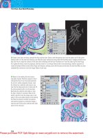
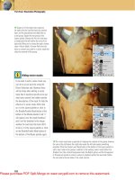
The Background Eraser
Hiding under the normal Eraser tool is a special version
known as the Background Eraser. Click and hold down
the Eraser tool until you see a drop-down menu—the
Background Eraser is the middle tool shown in that menu
(Figure 9.103). When you move your cursor over an image,
the Background Eraser gives you a round brush with a
crosshair in the middle. When you click and drag the
Background Eraser on the image, Photoshop watches the
color under the crosshair and deletes everything within the
circle that’s similar to that color (Figure 9.104). Trace near
the edge of the object you want to keep. It’s okay if the
circular part of the cursor overlaps the subject. Just don’t
let the crosshair hit the subject; otherwise, Photoshop will
start to delete that area as well (Figure 9.105). The set-
tings in the options bar determine what should be kept or
erased (Figure 9.106).
Figure 9.104 Clicking deletes the
color under the crosshair. Here we’re
erasing the light blue background.
Figure 9.106 Options bar settings for the Background Eraser tool.
Figure 9.105 Be careful not to let the
crosshair hit the subject of the photo.
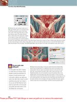
Tolerance Settings
Getting the right Tolerance setting on the options bar is
essential to using the Background Eraser tool successfully.
This setting determines how much Photoshop will be able
to stray from the color under the crosshair. If the back-
ground is very similar to the subject in brightness or color,
use a low Tolerance setting. If the background is quite
different from the subject, try a higher Tolerance setting,
so that you can quickly remove the background without
Figure 9.103 The Background Eraser
tool is hidden under the Eraser tool.
The Background Eraser tool uses the
Brush Presets panel that appears
in the options bar. You can quickly
change the size of your brush
(eraser) by using the bracket keys
on your keyboard ([]). To change
how hard the edge of the brush is,
use Shift in conjunction with the
bracket keys.
340
Chapter 9 Enhancements and Masking
having to be overly careful about dragging over the subject
of the image. A good starting value is 50%.
Protect Foreground Color
On occasion, the Tolerance setting may not be enough to
isolate the subject from the background (Figure 9.107).
In that case, use the Protect Foreground Color check box
on the options bar. Photoshop deletes the color under the
crosshair and keeps the foreground color (Figure 9.108).
While the Background Eraser tool is active, you can hold
down Option/Alt and click the part of the image you want
to save—that will change your foreground color and there-
fore prevent the color you click from being deleted.
Figure 9.107 The green area here
was too similar to the background
for the Background Eraser to isolate it
successfully.
Figure 9.108 Result of sampling a
color from the brightest part of the
green area and turning on the Protect
Foreground Color check box.
Sampling
If Photoshop is forcing you to be overly precise with your
mouse movements, use the Sampling icons (Figure 9.109).
The default Continuous setting causes Photoshop to
watch the color under the crosshair as you’re moving your
mouse (Figures 9.110 and 9.111). That setting works great
with images that have multicolored backgrounds. If the
image’s background doesn’t vary much in color, try the
Once setting to make Photoshop pay attention to only
the color under the crosshair at the exact moment that
you click. It won’t stray from that color, so you can click
the background and then paint back and forth across the
It’s easy to forget that you’re pro-
tecting the foreground color, which
is a problem if you start working on
a different part of the image where
the color you’re protecting is similar
to the background you’re attempt-
ing to delete.
Figure 9.109 The Sampling icons
from left to right: Continuous, Once,
Background Swatch.