The Adobe Illustrator CS Wow- P8 pps
Bạn đang xem bản rút gọn của tài liệu. Xem và tải ngay bản đầy đủ của tài liệu tại đây (4.07 MB, 30 trang )
You can also release an object from a Text thread by
selecting it, then choosing Type > Threaded Text > Release
Selection. Or, if you want to remove the threading from
an object while leaving text in place, select it and choose
Type > Threaded Text > Remove Threading.
WRAPPING TEXT AROUND OBJECTS
Illustrator CS handles text wrapping a little differently
from previous versions. Text wrapping is now an object
attribute and is set specifically for each object that will
have text wrapped around it (known as a wrap object).
First, make sure that the object you want to wrap text
around is above the text you want to wrap around it
in the Layers palette. Then select the wrap object and
choose Object >Text Wrap >Make Text Wrap. The Text
Wrap Options dialog box will appear. Here, you'll choose
the amount of offset and also have the option to choose
Invert Wrap (which reverses the side of the object that
text wraps around). You can also wrap text around a
group of objects. In order to add a new object to the text
wrapped group, just drag its icon in the Layers palette
into the group. To release an object from text wrapping,
select it and choose Object > Text Wrap > Release Text
Wrap. To change the options for an existing wrap object,
select it and choose Object > Text Wrap > Text Wrap
Options. (For more information on text wrapping, see the
User Guide.)
CHARACTER AND PARAGRAPH STYLES
As in previous versions, Illustrator's Character and Para-
graph palettes (Window > Type > Character and Win-
dow > Type > Paragraph) let you format text by changing
one attribute at a time. Illustrator CS takes formatting to
the next level by introducing Character and Paragraph
styles. Now you can apply multiple attributes to text sim-
ply by applying the appropriate style.
You can access the new Character Styles and Para-
graph Styles palettes via Window > Type > Character
Styles, or Window > Type > Paragraph Styles. New styles
Type tool juggling
To toggle a Type tool between its
vertical and horizontal mode, first
make sure nothing is selected.
Hold the Shift key down to toggle
the tool to the opposite mode.
Path type and closed paths
Keep in mind that Path type can
be applied to both open and
closed paths—even though the
feedback you get from your
cursor may seem to indicate that
this Path type can only be applied
to open paths.
Making a new text object
Re-select the Type tool to end
one text object; the next click will
start a new text object. Or, dese-
lect the current text by holding
down the (Mac)/Ctrl (Win) key
(temporarily turning your cursor
into a selection tool) and clicking
outside the text block.
Chapter 6 Type 185
The quick-changing Type tool
When using the regular Type
tool, look at your cursor very
carefully in these situations:
• If you move the regular
Type tool over a closed
path, the cursor changes
to the Area type icon.
• If you move the Type tool
over an open path, the
cursor will change to the
Path type icon.
Legacy text
Illustrator's new text engine
makes a lot of new type features
possible. But it also means that
text is handled very differently
from previous versions, so legacy
text (text created in earlier ver-
sions of Illustrator) needs to be
updated before it can be edited
in Illustrator CS. When you open a
file containing legacy text, a dia-
log box warns you that it contains
text that needs to be updated.
The dialog box gives you the
choice of updating the text then
and there by clicking "Update," or
waiting till later by clicking "OK."
Text that hasn't been updated can
be viewed, moved, and printed,
but it can't be edited. When se-
lected, legacy text is displayed
with an X through its bounding
box. When text is updated, you
may see the following types of
changes:
• Changes to leading, tracking,
and kerning
• In Area type: words overflow-
ing, shifting between lines or to
the next linked object
You can choose to update all
legacy text at any time by choos-
ing Type > Legacy Text > Update
All Legacy Text. Update specific
legacy text by clicking it with the
Type tool. You'll also have the op-
tion to preserve legacy text on a
layer below the updated text for
comparison.
can either be created from scratch or based on existing
styles. To create a new style with a default name (that can
be changed later if you like), click the Create New Style
button in either the Character Styles or the Paragraph
Styles palette. If you want to name your new style from
the get-go, choose New Character Style from the Charac-
ter Styles palette menu, or New Paragraph Style from the
Paragraph Styles palette menu. Type a name for your new
style in the dialog box that appears, click OK, and your
new style will appear in the Character Styles or Paragraph
Styles palette.
To create a new style based on an existing one, select
the existing style in the Character Styles or Paragraph
Styles palette. Then choose Duplicate Character Style or
Duplicate Paragraph Style from the palette menu. Your
new "cloned" style will appear in the palette.
To change the attributes of a new or existing style,
select its name in the Character Styles or Paragraph Styles
palette, and choose Character Style Options or Paragraph
Style Options from the palette menu. The Options dia-
log box will let you set all your desired attributes for the
style—everything from basic characteristics, such as font,
size, and color, to OpenType features.
To apply a style to text, just select the text you want to
format, click the name of the style in the Character Styles
or Paragraph Styles palette, and voilal—your formatting
is applied to the selected text. (This won't work if the type
has overrides—extra formatting—applied, in which case
you may need to remove the override by clicking a second
time. For more information on overrides and other ele-
ments of using Character and Paragraph Styles, see the
User Guide.)
TAKING ADVANTAGE OF OPENTYPE
As mentioned previously, underneath Illustrator CS's
hood lies a powerful new text engine. And one of the
main reasons Adobe revamped the way Illustrator
handles text was to allow users to take full advantage of
the sophisticated features of OpenType fonts. (To under-
Chapter 6 Type186
score the point, Illustrator CS ships with a bundle of free
OpenType fonts, so you can put them to work immedi-
ately.) One great benefit of OpenType fonts is that they're
platform-independent, so they can move easily between
Mac and Windows.
When you use any OpenType font, Illustrator CS
will automatically set standard ligatures as you type (see
example at right). You can set options for other OpenType
features via the OpenType palette, which is nested by
default with the Character and Paragraph palettes, and
accessible via Window > Type > OpenType. The OpenType
palette includes two pop-up menus that let you control
the style and positioning of numerals, and buttons that let
you choose whether or not to use standard ligatures (for
letter pairs such as fi, fl, ff, ffi, and ffl), optional ligatures
(for letter pairs such as ct and st), swashes (characters
with exaggerated flourishes), titling characters (for use
in uppercase titles), stylistic alternates (alternative ver-
sions of a common character), superscripted ordinals,
and fractions.
If you'd like more information on what the various
commands in the OpenType palette do, we've included
a helpful guide by Sandee Cohen on the Wow! CD
(OpenType_Guide.pdf). These pages, taken from Cohen's
InDesign CS Visual QuickStart Guide, give you a primer
in how to work with OpenType fonts.
THE GLYPHS PALETTE
Illustrator's new Glyphs palette gives you quick access
to a wide variety of special characters, including any
ligatures, ornaments, swashes, and fractions included in
that OpenType font. Choose Window >Type > Glyphs to
display the palette. With the Type tool, click to place the
insertion point where you want the special character to
appear, and then double-click the character you want in
the Glyphs palette to insert it in the text. You'll find many
specialty characters (like or ) that once required sep-
arate fonts, sitting there in your Glyphs palette. See the
User Guide for more information on the Glyphs palette.
Character Styles palette
Paragraph Styles palette
OpenType palette
OpenType fonts automatically set standard liga-
tures as you type (unless you turn this feature
off in the OpenType palette). In the example
above, the type on the top row is set using the
standard version of Adobe's Minion font. The
bottom row is set using Minion Pro, one of the
OpenType fonts included with Illustrator CS.
Minion Pro supplies the ligatures for "ff" and
"ffl" (visible in the bottom row), which give the
type a more sophisticated look
Glyphs palette
Chapter 6 Type 187
Multinational font support
Illustrator supports multinational
fonts, including Chinese, Japa-
nese, and Korean. Check the Show
Asian Options box in the Type &
Auto Tracing area of Preferences
to reveal Asian text options in the
Character palette (if necessary,
click on the double arrows on the
Palette tab to fully expand it). To
utilize multinational font capa-
bilities you must have the proper
fonts and language support acti-
vated on your system. Even then,
some multinational options won't
work with fonts that don't sup-
port the appropriate languages,
including most fonts intended
primarily for English and Western
European languages.
THE EVERY-LINE COMPOSER
Illustrator CS offers two composition methods for deter-
mining where line breaks occur in blocks of text: the old
Single-line Composer and the new Every-line Composer.
The Single-line Composer applies hyphenation and
justification settings to one line of text at a time, as Illus-
trator did by default in previous versions. But this can
result in uneven, ragged-looking blocks of text, so the
new Every-line Composer thinks ahead by automati-
cally determining the best combination of line breaks
across the entire run of text. The result is even-looking
text blocks with minimal hyphenation and consistent
line lengths and spacing, without having to fine-tune line
breaks by hand. However, if you're into micromanaging
your text and you want manual control over every line
break, you still have the option to choose the old Single-
line Composer.
To choose between composition methods, select the
text to be composed and choose Adobe Every-line Com-
poser or Adobe Single-line Composer from the Paragraph
palette menu.
MORE TYPE FUNCTIONS (TYPE & WINDOW MENUS)
Find Font: If you try to open a file and don't have the cor-
rect fonts loaded, Illustrator warns you, lists the missing
fonts, and asks if you still want to open the file. You do
need the correct fonts to print properly; so if you don't
have the missing fonts, choose Find Font to locate and
replace them with ones you do have.
Find Font's dialog box displays the fonts used in the
document in the top list; an asterisk indicates a missing
font. The font type is represented by a symbol to the right
of the font name. You can choose to replace fonts with
ones on your system or used in the document. To dis-
play only the font types you want to use as replacements,
uncheck those you don't want to include in the list. To
replace a font used in the document, select it from the top
list and choose a replacement font from the bottom list.
You can individually replace each occurrence of the font
Chapter 6 Type
The same text composed using Every-line
Composer, which automatically creates less
ragged-looking text blocks with more uniform
line lengths
188
by clicking Change and then Find. Otherwise, simply
click Change All to replace all occurrences.
Note: When you select a font in the top list, it becomes
selected in the document.
• Type Orientation lets you change orientation from
horizontal to vertical, or vice versa, by choosing Type >
Type Orientation > Horizontal or Vertical.
• Change Case: You can change the case of text selected
with the Type tool via the new Type >Change Case sub-
menu, which offers four choices: UPPERCASE, lower-
case, Title Case, and Sentence case.
• Fit Headline is a quick way to open up the letter spacing
of a headline across a specific distance. First, create the
headline within an area, not along a path. Next, set the
type in the size you wish to use. Select the headline by
highlighting it, then choose Type > Fit Headline, and the
type will spread out to fill the area you've indicated. This
works with both the Horizontal and Vertical Type tools.
• Show Hidden Characters reveals soft and hard returns,
word spaces, and an oddly-shaped infinity symbol indi-
cating the end of text flow. Toggle it on and off by choos-
ing Type > Show Hidden Characters.
CONVERTING TYPE TO OUTLINES
You can use the Appearance palette to apply multiple
strokes to editable type (see the Transparency & Appear-
ances chapter for details about working with multiple
strokes or fills). You can also reliably mask with live,
editable type! So although there are fewer and fewer
reasons to convert your type to outlines, there are still
some times when converting type to outlines is your
best option (see "Why convert type to outlines?" fol-
lowing). As long as you've created type with fonts you
have installed on your system (and can print) and you've
finished experimenting with your type elements (e.g.,
The Find Font dialog box
If you don't have the fonts
Missing fonts? You can still open,
edit, and save the file, because
Illustrator remembers the fonts
you were using. However, the
text will not flow accurately and
the file won't print correctly until
you load or replace the missing
fonts. Type objects that use miss-
ing fonts will be highlighted when
Highlight Substituted Fonts is
checked in the Type area of Docu-
ment Setup.
Choose text carefully!
Having access to dozens of fonts
doesn't necessarily make you a
type expert, any more than hav-
ing a handful of pens makes
you an artist. Experiment all you
want, but if you need professional
typographic results, consult a
professional. I did. Barbara Sudick
designed this book.
Chapter 6 Type
189
Paint bucket and Eyedropper
To set what the Eyedropper picks
up and the Paint Bucket applies,
double-click either tool to open
the Eyedropper/Paint Bucket
Options dialog box.
Eyedropper text
To restyle part of a text string or
block, pick up a new sample with
the Eyedropper tool, hold down
the Option (Mac)/Alt (Win) key to
select the Paint Bucket tool and
drag the cursor (as you would
with the Type tool) over the text
to be restyled. —David Nelson
Reflow text as in page layout
Resize a text block by its bound-
ing box handles (see the Illustra-
tor Basics chapter) and the text
will reflow. —Sandee Cohen
The appearance of stroked text
To add strokes to type without
distorting the characters, use the
Appearance palette to "Add New
Stroke," move this new stroke
below the original, and set the
new color and weight.
adjusting size, leading, or kerning/tracking), you have
the option to convert your live type to Illustrator objects.
Your type will no longer be editable as type, but instead
will be constructed of standard Illustrator Bezier curves
that may include compound paths to form the "holes" in
objects (such as the transparent center of an О or P). As
with all Illustrator paths, you can use the Direct Selec-
tion tool to select and edit the objects To convert type
to outlines, select all blocks of type you wish to outline
(it doesn't matter if non-type objects are selected as well)
and choose Type > Create Outlines. To fill the "holes" in
letters with color, select the compound path and choose
Object >Compound Path >Release (see the Drawing &
Coloring chapter for more about compound paths).
Note: Outlining type is not recommended for small font
sizes—see the Tip "Don't outline small type."
Why convert type to outlines?
Here are several cases where this option may be useful:
• So you can graphically transform or distort the indi-
vidual curves and anchor points of letters or words.
Everything from minor stretching of a word to extreme
distortion is possible. See the lower right M on the facing
page, and Galleries later in this chapter. (Warp Effects
and Envelopes can sometimes be used for these purposes,
too; see the Live Effects & Graphic Styles chapter.)
• So you can maintain your letter and word spacing
when exporting your type to another application.
Many programs that allow you to import Illustrator
type as "live" editable text don't support the translation
of your custom kerning and word spacing. Convert text
to outlines before exporting Illustrator type in these
instances to maintain custom word and letter spacing.
• So you don't have to supply the font to your client or
service bureau. Converting type can be especially useful
when you need to use foreign language fonts, when your
Chapter 6 Type
190
image will be printed while you're not around, or when
you don't have permission to embed all of your fonts. If
your service bureau doesn't have its own license for a font,
in most cases your own license for the font won't allow
you to give it to them. So converting the type to outlines
may be necessary at that point. (See the Model United
Nations logo at lower right and lessons and Galleries later
in this chapter.)
USING THE APPEARANCE PALETTE WITH TYPE
When you work with type, you work with the letter char-
acters or with the container that holds the characters—or
with both. Understanding the difference between char-
acters and their container, the "type object," will help
you access and edit the right one when you style type. To
help understand the difference, you'll need to watch the
Appearance palette as you work.
Characters
You work directly with the letter characters when you
click with the Type tool and enter text. In the Appearance
palette, you'll see a blank Stroke and a black Fill listed
underneath the Characters line in the palette. You can
apply a color or pattern to the characters' fill and stroke.
To edit a characters' fill and stroke, drag across the text
with the Type tool or double-click Characters in the
Appearance palette.
There are some things you can't do when working
with the characters (although you can with their con-
tainers). You can't move the stroke under the fill or the
fill above the stroke in the Appearance palette. You can't
apply an Effect to characters' fill or stroke. And you can't
apply a gradient fill to the characters, or add multiple fills
or strokes directly to the characters.
Type Object
All text is contained in a Point, Area, or Path type
object. You work with the object when you select the text
with the Selection tool and move it on your page.
Don't outline small type
If you're printing to a high-resolu-
tion imagesetter or using larger
type sizes, you can successfully
convert type objects to outlines.
However, for several technical
reasons, a small type object con-
verted to outlines won't look as
good on the computer screen, or
print as clearly to printers of 600
dots per inch or less, as it would
have if it had remained a font.
Making one text block of many
To join separate Area text boxes
or Point type objects, select all
the text objects with any selection
tool and Copy. Then draw a new
Area text box and Paste. Text will
flow into the new box in the origi-
nal stacking order that it appeared
on the page. (It doesn't matter if
you select graphic elements with
your text—these elements won't
be pasted.) —Sandee Cohen
Transporting foreign
or unusual fonts
(artwork by Kathleen Tinkel)
Filling with patterns or gradients
Masking with type Transforming outlines
(artwork by Min Wang (artwork by Javier
for Adobe Systems) Romero Design Group)
Chapter 6 Type
191
The Appearance palette showing the Spiral pat-
tern filling the type object and the resulting type
object filled with the Spiral pattern
The Appearance palette showing the Spiral pat-
tern filling the type character and the resulting
type character filled with the Spiral pattern
See Gordon's "Floating Type" lesson in the
Transparency & Appearances chapter to learn
how to create transparent backgrounds for your
area type objects
You can think of the type object as a group whose
members are the letter characters. There are things you
can do to this group that you couldn't do when working
directly with the letter characters.
For example, you can add another fill (choose Add
New Fill from the Appearance palette pop-up menu).
Notice that the Appearance palette changes—now there
is another listing of Fill and Stroke, but this time they
are positioned above the Characters line in the palette.
The fill and stroke you worked with at the character
level still exist. You can reveal them by double-clicking
Character in the palette. Doing so, however, brings you
back to character editing; re-select the type object with
the Selection tool to return to editing the type object
rather than its characters.
When you add a new fill or stroke to the type object,
its color or effects interact with the color of the charac-
ters. You can predict the visual results of changes to the
type object and characters by knowing that all the fills
and strokes applied to type are painted, with those listed
at the top of the palette painted on top of those listed
below (including the stroke and fill you see listed when
you double-click Characters in the palette). So if you add
a new fill and apply red to it, the type now appears red
(the red fill of the type object is stacked above the black
fill of the characters).
To experiment with how this works, create two type
objects in a large font size (72 pt, for example). Next, edit
at the character level by dragging through one of the
objects with the Type tool, and then in the Appearance
palette applying the Spiral pattern to the default black
fill. (The Spiral pattern in the Swatches palette ships with
Illustrator.) Notice the red spiral appears surrounded by
white inside the letter characters.
To edit at the type object level instead, select the other
type object with the Selection tool. Add a new fill (choose
Add New Fill from the Appearance palette menu) and
apply the same Spiral pattern. When the type object fills
with the spiral, the red spiral lines appear surrounded by
Chapter 6 Type
192
black. This is because Illustrator paints the spiral pattern
on top of the black of the characters.
Knowing the difference between a type object and its
characters rewards you in this experiment. And it will
help you understand later why bad things seem to happen
to good type (like the black surrounding the red spirals)
so that you can make good things happen to type. Read-
ing and working through the lessons and galleries that
follow will help you master the difference between char-
acters and their type object.
EXPORTING ILLUSTRATOR TYPE
While the new Illustrator CS Type engine opens the door
to new levels of typographic control and flexibility, send-
ing your typography out into the world may seem any-
thing but controlled or flexible. Type objects in files that
you export to legacy versions of Illustrator (version 10 and
before) or as EPS files will either be broken into groups of
point or path type objects, or converted to outlines. Your
only control is to select File > Document Setup >Type and
choose Preserve Text Editability or Preserve Text Appear-
ance from the Export menu.
As the illustration at right shows, choosing Preserve
Text Editability breaks the word "typography" into a
group of eight separate Point type objects. Choosing
Preserve Text Appearance, by contrast, will convert all
type to outlines. In either case, your type will be severely
limited for others who need to use it in older versions of
Illustrator.
You should test bringing Illustrator CS type into other
applications before proceeding during a critical project or
urgent deadline. While you may not need to edit the type
in another program, you should ensure that it imports
correctly and looks as it did in Illustrator CS.
Penciling in changes
With all of the changes to the way
that Illustrator controls type, one
editing function is missing: You
can no longer reshape Path type
with the Pencil tool. Instead, use
the Direct Selection tool to select
points on the path and adjust
their handles. Also, you can ma-
nipulate points on a path using
the Anchor Point tools (click and
hold the mouse down on the Pen
tool in the Tool palette to find the
Anchor Point tools).
The original Illustrator CS point type object at
the top; in the middle, the same type object
exported using Preserve Text Editability; at the
bottom, the type object exported using Preserve
Text Appearance
Chapter 6 Type
193
Custom Text Paths
Trickling Type with Variations of Type Style
Overview: Prepare and Place text;
create a set of evenly-spaced paths;
copy and paste text into appropriate
path lines; adjust text baseline paths
and placement of text on the paths.
Placed text creates a new rectangle which con-
tains the type; choose a font and size while the
text is still selected
Option-drag /Alt-drag to create a second path
below the first; use Object >Transform >Trans-
form Again (or -DI Ctrl-D) to repeat this step
Grab the I-beam to move the text along the path
Adjust curved paths and
text placement along
those paths using the
Direct Selection tool
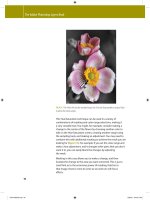
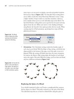
Laurie Szujewska placed type on curved Bezier paths to
emulate the shaped lines of Lewis Carroll's original hand-
lettered poem from Alice's Adventures Underground (an
early version of Alice in Wonderland).
1 Preparing your type. Use a word processor to proofread
and spell-check your text. In Illustrator, choose File >
Place and select your text document; this creates a rect-
angle containing your text. Choose a typeface and size.
2 Creating your baselines and placing your type. Next to
your type, draw a curved path with the Pen tool (see
"Zen Lessons" on the Wow! CD folder for Pen help).
With the Path Type tool, click on your Bezier path and
type a few characters. To determine the spacing between
lines, switch to the Selection tool, grab the path, hold the
Option/Alt key and drag the selected path downward,
until the second path is spaced correctly (release the
mouse button while still holding down the key). To dupli-
cate the path and the spacing between paths, press -D/
Ctrl-D (Object >Transform >Transform Again), repeating
until you've created the desired number of text paths.
Switch to the Type tool, select the text you want for
the top path and Copy. Now click on the top path and
Paste. Repeat with the remaining lines.
3 Adjusting the type. With all text placed, use the Direct
Selection tool to adjust the curves. If you wish to see all
of the text paths at once (whether selected or not), switch
to Outline View. To move the starting point for lines of
text, click on the path with the Selection tool and drag
the I-beam along the path. For downward curving text,
Szujewska's adjusted the path, then individually selected
the last words, progressively reducing them in size.
Chapter 6 Type
194
Chapter 6 Type
195
Stretching Type
Fitting Type by Converting to Outline
Overview: Enter type onto individ-
ual lines of point type objects; trans-
form type into outlines; custom justify
type by Lassoing or Direct-selecting
partial paths and stretching the hori-
zontal strokes of the letterforms using
the Arrow keys.
Weinstein began by pulling out a set of verti-
cal guides from the rulers. He then entered the
body text line by line to avoid unattractive line
breaks and hyphenation
Though there are more ways than ever to modify your
type characters while keeping the text "live" for future
editing, there are still some adjustments that require you
to "outline" your type characters.
To create this beautiful Ketubah (traditional Hebrew
wedding certificate), Ari M. Weinstein had to observe
strict design guidelines, since the Ketubah needed to
serve the dual role of legal document and work of art.
The guidelines required the text to be fully justified and
enclosed within a decorative border. Traditionally, in
order to justify Hebrew text, calligraphers elongated
the horizontal strokes of individual letterforms, instead
of using paragraph justification (which would result in
non-uniform word and letter spacing). To replicate this
method, Weinstein needed to outline the type, so he
could stretch individual horizontal strokes.
1 Placing the text. Having chosen a calligraphic-style
Hebrew font, Weinstein entered his text line by line on
unconnected Point type paths in order to avoid automatic
196 Chapter 6 Type
text wrap. This allowed him to maintain control over
word placement from one line to the next. He inserted
two lines below the main text for witness signatures.
2 Converting the text to outlines. Since converting type
to outlines is permanent, make sure that you carefully
proof and spell-check your text first. After proofing his
text, Weinstein selected each single line of text and chose
Type > Create Outlines ( -Shift-O/Ctrl-Shift-O) to con-
vert each line of characters to outlines. Converting each
line separately automatically groups the converted char-
acters together.
3 Stretching a letter's horizontal strokes. Weinstein was
now able to replicate the traditional scribal method of
crafting the length of each line by stretching the horizon-
tal strokes on the letterforms. In order to stretch a hori-
zontal stroke, Weinstein used the Direct Selection and
the Lasso tools to select the left side of a letter's outline.
With these portions of the letterform selected, he then
stretched them in 1 pt increments using the left Arrow
key. He adjusted the spacing between entire words and
individual characters by using the Group Selection tool
and similarly moving them using the Arrow keys. Wein-
stein was able to justify the text block perfectly, using the
ruler guides to the left and right of the main body text.
4 Finalizing the Ketubah. Weinstein was required by
tradition to omit one leg of the letter Kuf in a word near
the end of the text (the eighth word from the right on the
last line of the main text). This letter segment was to be
drawn by hand on the wedding day in front of the rabbi.
The vertical stroke of the letter was selected and deleted.
Weinstein brought his calligraphy tools along to the wed-
ding to officially complete the Ketubah as part of the pre-
nuptial proceedings. The dove at the top of the Ketubah
encloses the bride's and groom's initials, hand drawn by
Weinstein.
Direct-selecting the path segments of the cross-
strokes and stretching them with the Arrow keys
After Direct-selecting the vertical cross-stroke of
the letter Kuf, Weinstein deleted it
Chapter 6 Type
One by one, the individual lines of copy were
Direct-selected and converted to outline. Each
resulting set of paths was automatically grouped
for easier selection later
197
John Burns
Lettering artist John Burns developed this logo
for PlanTea, an organic fertilizer for plants that
is brewed in water, like tea. He began by typ-
ing the name and then converted the letters to
outlines (Type>Create Outlines). After drawing
a leaf and placing it on the stem of each letter
a, he selected and copied the artwork, pasted
it in back (Edit > Paste in Back) to form the drop
shadows, and offset them down and to the
right. Burns then filled the copied letterforms
with 40% black. To prevent the drop shadows
from touching the black letterforms (creating a
more stylized look), he selected the black art-
work and again pasted it behind (but in front
of the drop shadows) and then applied a white
fill and thick white stroke to the pasted letter-
forms. The stages of his process, here applied
to the I, are shown above left. Finally, Burns
used the Direct Selection tool to reshape some
of the drop shadow shapes, adjusting the thick-
ness of some of the shadow letter strokes and
hiding slivers of shadows that stuck out a little
behind the black letters (the P directly above
shows the shadow before and after reshaping).
198 Chapter 6 Type
Hornall Anderson Design Works /
John Hornall (Art Director)
Designers at Hornall Anderson Design Works
set the name "Yves" for this healthy, vegetarian
line of foods in Gill Sans and then modified the
letterforms to fit the logo design. First, they
placed the text along a curve and then con-
verted the font characters to outlines (Type >
Create Outlines). To create the shadows on
the left side of the name's characters, design-
ers used the Scissors tool to cut the character
paths, the Direct Selection tool to move cut
pieces, and the Pen tool to connect points and
close objects. Another way to accomplish a
similar effect is to Copy the original letterforms
and Paste in Back twice. Give the top copy a
white Fill and a thick white Stroke; while still
selected, choose Object >Path >Outline Path
and set the new outline stroke to a small width.
Chapter 6 Type 199
Move the bottom copy of the letterforms to
the left. Then select the two copies and choose
the Minus Front command from the Pathfinder
palette. Lastly, delete extraneous objects and
use the Scissors and Direct Selection tools to
reshape the remaining objects.
Masking Letters
Masking Images with Letter Forms
Overview: Create a large letter on
top of a placed TIF image; convert the
letter to outlines; select all and make
the letter form into a clipping mask
for the placed image.
Placing the TIF image; creating Point Type letter
Converting the letter "S" to outlines
Selecting both the letter form and the image
beneath; making a clipping mask
Selecting an object using the Layers palette,
then moving it with the Direct Selection tool
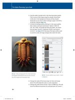
This "S is for Surfing" was created by Cher Threinen-
Pendarvis for an alphabet poster. Although you can mask
with "live" type, Threinen-Pendarvis converted her type
to outlines. For additional lessons on masking, see the
Gallery opposite and the Advanced Techniques chapter.
1 Positioning elements and converting a large letter to
outlines. Place a TIF image into your Illustrator file by
using File > Place. Using the Type tool, click on top of
your image to create a Point Type object and type one
letter. Choose a typeface with enough weight and a point
size large enough for the bottom image to show through
the letter form itself. Select the letter with a Selection tool
and choose Type > Create Outlines.
2 Creating the clipping mask and adjusting the image
position. The topmost object in a selection becomes the
mask when you make a clipping mask. If your letter isn't
the top object, select it, Cut, then Edit > Paste in Front. To
create the mask, select the outlined letter and the images
to be masked and choose Object > Clipping Mask >Make;
the mask and masked objects will be grouped. To adjust
the position of an object or the mask, select it from the
Layers palette or with the Direct Selection tool, then use
the Direct Selection tool to move it. Threinen-Pendarvis
ended by applying Effect > Stylize > Drop Shadow (default
settings) to a filled copy of the S below the mask group,
above a TIF background created in Procreate's Painter.
200 Chapter 6 Type
Gary Newman
Artist Gary Newman combined a compound
path and masking to create this title illustra-
tion. First, Newman typed the word "Careers"
and converted the text to outlines (Type >
Create Outlines). Next, he made a single com-
pound path by choosing Object >Compound
Path > Make. Newman masked a copy of his
background artwork with this compound path.
With the compound object on top and all
elements selected, he chose Object >Clipping
Mask > Make. He then selected the masked
background objects and used Filter>Colors>
Adjust Colors, increasing the black percent-
age. Newman added a drop shadow by lay-
ering a black-filled copy of the type behind
the background-filled type. He set the words
"Changing" and "at mid-life" in black type,
and added drop shadows behind them;
drop shadows can also be made using the
Transparency palette to adjust Blending
Modes and Opacity (for help with Blending
Modes and Opacity, see the Transparency &
Appearances chapter).
Chapter 6 Type
201
Book Cover Design
Illustrator as a Stand-alone Layout Tool
Overview: Set your document size;
place guides and crop marks; place
EPS files and make Area type for
columns and Point type for graphic
typography; visually track type to fit.
Setting up the Artboard and layout specs
Page layout programs such as InDesign and QuarkXPress
are essential for producing multipage, complex docu-
ments. However, Rob Day and Virginia Evans often use
Illustrator for single-page projects such as book jackets.
1 Setting up your page. Choose File>Document Setup to
set up the Artboard for your design. Click on landscape
or portrait page orientation and enter your Artboard size,
making sure it's large enough for crop and/or registration
marks (the "Size" parameter will automatically switch
to "Custom"). Choose View >Show Rulers and "re-zero"
your ruler origin to the upper left corner of where your
page will begin (see the Basics chapter for more on reposi-
tioning the ruler origin), and use View > Outline/Preview
to toggle between Outline and Preview modes. Although
you can generate uniform grids with Preferences > Guides
& Grid, for columns of varying sizes, Day and Evans
numerically created two sets of rectangles: one for bleeds,
one for trims. With the Rectangle tool, click to make a
box sized for a trim area (see the Basics chapter for Rect-
angle tool help), then immediately Option-click/Alt-click
on the center of the trim area box to numerically specify
a box .125" larger in each dimension in order to create a
Chapter 6 Type202
bleed area box. Day and Evans made trim and bleed boxes
for the front, back, flaps, and spine. To place an overall
trim mark, select the boxes that define the entire trim
area and choose Filter > Create > Crop Marks.
2 Customizing your guides. Select your trim and bleed
boxes (not the crop marks) and create Guides by choosing
View > Guides >Make Guides.
3 Placing and refining the elements. Choose File>Place
to select an EPS image to import into your layout. Create
rectangles or other objects which will define the area for
columns of text. Click on the path of one of these objects
with the Area Type tool. Once the text cursor is placed,
you can type directly or paste text (see "Custom Text
Paths" in this chapter). Area Type is used in this layout
for columns of type on the flaps. Alternately, click with
the Type tool to create Point type, which is used to place
lines of type for titles and headlines, and other individual
type elements. To track type visually to fit a space, select a
text object and use Option/Alt- For help with rotat-
ing or scaling objects (this applies to text objects as well),
see the Zen chapter and the Zen Lessons on the Wow! CD.
Creating "Crop Marks" versus "Crop Area"
Every time you choose Filter >Create >Crop Marks,
you'll make a set of visible (selectable) Illustrator crop
marks that indicate the bounding area of your cur-
rent selection. Use Object >Crop Area >Make to create
one set of non-selectable crop marks that are visible
in Illustrator, but invisibly mark the crop area when
placed into programs such as Photoshop (see "Soft-
ware Relay" lesson in the Illustrator & Other Programs
chapter). You can specify the area with a selected rect-
angle, or if nothing is selected, the crop area will be
sized to the Artboard. To remove a "crop area," choose
Object >Crop Area > Release, or, since there can be
only one Crop Area per file, make a new selection and
choose Object >Crop Area > Make.
Converting trim and bleed boxes into Guides
All of the elements placed into the layout
Close-ups of an Area Type object
Close-ups of Point Type objects
Tracking a line of Point Type with Arrow keys
Chapter 6 Type
203
Brushed Type
Applying Brushes to Letterforms
Overview: Create centerlines for font
characters; customize art brushes and
apply brushes to the centerlines and
outlines of the letterforms to simulate
hand-rendered lettering.
For a map title that looked artistic, Steven Gordon
blended the traditional artistry of pencil and brush with
the classicism of serif font characters. Because Illustrator
applies brushes as strokes, not fills, Gordon drew center-
lines for the font characters before painting the center-
lines with natural-looking customized brushes.
Original characters from Garamond font, filled
with gray
Letterform centerlines hand drawn with the Pen-
cil tool on a layer above the font characters
Font characters with a radial gradient replac-
ing the original gray fill on a layer below gray-
stroked copy of font characters
Top, the default Splash brush; below, the edited
brush with color fills
1 Creating letter centerlines and outlines. To re-create
Gordon's painted lettering, begin by typing text in a serif
font (Gordon chose Garamond Bold Condensed Italic and
112 pt from the Character palette.) Select the text and give
it a 20% black Fill so you can see the letterforms while
drawing the centerlines later. Copy the layer with the text
by dragging the layer onto the Create New Layer icon at
the bottom of the palette. To create the font outline, select
the text on the copied layer and convert the characters to
outlines (Type >Create Outlines), then change their Fill
to None and Stroke to gray. Now create a new layer (click
the Create New Layer icon in the Layers palette) and drag
this layer between the other two. On this new layer, draw
centerlines for each font character with the Pen or Pencil
tool. The paths don't have to be smooth or centered inside
the letterforms because you will paint them with an irreg-
ularly shaped brush in the next step. Finally, change the
gray fill of the bottom layer letters to another color or to a
gradient (as Gordon did).
2 Creating and applying custom brushes and effects.
Gordon looked to Illustrator's brushes to give the let-
ter centerlines the color and spontaneity of traditional
Chapter 6 Type
204
brushwork. He opened the Artistic_Paintbrush brush
palette (Window > Brush Libraries > Artistic_Paintbrush)
and selected the Splash brush. To customize a brush, first
drag the brush from the palette to the canvas. Select each
brush object with the Direct Selection tool and replace the
gray with a color. Next, drag the brush artwork into the
Brushes palette and select New Art Brush from the New
Brush dialog box. In the Art Brush Options dialog box,
further customize the brush by changing Width to 50%,
enabling the Proportional brush setting, and clicking OK.
(You won't see the change in width displayed in the dialog
box's preview.) Make several brush variations by copying
the brush and then editing brush Direction, Width and
other parameters. Now individualize your letterforms by
selecting the first centerline and clicking on a brush from
the Brushes palette. Try several of the brushes you created
to find the best "fit." Continue applying brushes to the
remaining centerlines.
To create the look of loose pencil tracings for the char-
acter outlines on the top layer, Gordon edited the Dry
Ink brush from the Artistic_PaintBrush library palette,
changing its Width to 10% in the Art Brush Options
dialog box. He completed the look by selecting each char-
acter outline and applying the Roughen Effect (Size=l%,
Distort=10%, Smooth). (See the Transparency & Appear-
ances, and Graphic Styles & Effects chapter to learn more
about applying Effects and using the Appearance palette.)
3 Finishing touches. Gordon selected all the centerlines
and offset them up and left while moving the font out-
lines down and right from the original font characters on
the bottom layer, suggesting a loose style. He also simu-
lated the appearance of hand-rendering by adjusting the
transparency and blending modes of the brushed letter-
forms: Gordon selected the centerline objects, and in the
Transparency palette, chose Multiply mode and reduced
transparency to 75%. This caused the colors of brushed
centerline paths to darken where they overlapped, mim-
icking the effect of overlapping transparent inks.
Experimenting by applying different brushes to
centerlines to lend individuality to the letter
On top, the Dry Ink brush; left, the customized
brush applied to the font outline; right, the
Roughen Effect applied to the brushed outline
Artwork on three layers, from bottom layer (left)
to top layer (right)
Left, the horizontal and vertical centerlines of
the letter "t" with Normal blending mode and
100% opacity; right, strokes placed to form
letter "t" and with Multiply blending mode and
70% opacity
Finished lettering on three layers, shown in
composite view
Chapter 6 Type
205
Joachim Muller-Lance
The original characters of Joachim Muller-
Lance's Flood typeface were drawn with a
worn felt marker during a type seminar hosted
by Sumner Stone. Two years later Muller-Lance
rediscovered the drawings when Adobe asked
him for new font ideas. Realizing that the origi-
nal character traces were not of font quality, he
redrew all of the characters using Illustrator's
Pen and Pencil tools. He composed many of
the characters as separate, black-filled objects,
which he moved around while also adjusting
width, slant, and scale until he got the look he
wanted. He used the Merge command from
the Pathfinder palette to join the overlapping
objects of each character into a single shape.
He also drew the holes and streaks as white-
filled objects above the black-filled objects and
used Minus Front (also from the Pathfinder pal-
ette) to knock out the holes and streaks in the
characters. Then Muller-Lance copied the art-
work for each character and pasted it directly
into the appropriate character slot in Fontogra-
pher, where he completed the font.
Chapter 6 Type
206
Tim Girvin /
Tim Girvin Strategic Branding & Design
Designer Tim Girvin began the logo for this
futuristic film by setting the title in Times
New Roman and converting the type outlines
to paths (Type>Create Outlines), He drew
objects with the Rectangle and other tools
that he used with the Divide command from
the Pathfinder palette to break the letterforms
into pieces. After modifying some of their
shapes with the Direct Selection tool, Girvin
repositioned the pieces to form the asymmetri-
cal letterforms of the logo.
Jennifer Bartlett /
Tim Girvin Strategic Branding & Design
Jennifer Bartlett set this logo using a propri-
etary Girvin font. To keep the letters of the
tagline upright but parallel to the wave of the
background banner, Bartlett selected individual
characters by dragging with the Text tool
and adjusted their vertical positions by enter-
ing positive values (to move characters up) or
negative values (to move characters down)
in the Character palette's Baseline Shift field,
accessed by choosing Window >Type Charac-
ter and choosing Show Options from the Char-
acter palette's pop-up menu.
Chapter 6 Type 207
Louis Fishauf / Reactor Art + Design
Asked to create the visual identity for a pro-
posed news cafe and media tower, designer
Louis Fishauf drew the letters for the name
with the Pen tool, first assigning a thick stroke
to the paths and then outlining the strokes
(Object >Path >Outline Stroke). He moved
points in the letter tips using the Direct Selec-
tion tool, angling the tips parallel to the black
lines behind the name. To convey perspective,
Fishauf pasted copies of the letters t and H
behind the name, filled them with black, and
manually offset each of these shadows to the
left or right. For the letters R and c, Fishauf
drew the shadows with the Pen tool, keeping
the curves parallel to the white letterforms
in front.
208 Chapter 6 Type
Ellen Papciak-Rose / In The Studio
Ellen Papciak-Rose created the title
"Zimbabwe" using geometric objects she drew
with the Rectangle, Ellipse, and other tools.
She composited the objects and used Minus
Front and other commands from the Pathfinder
palette to knock out parts of the objects, form-
ing the title letterforms. Papciak-Rose then
painted the strokes of the objects with two
custom-built variations of a Charcoal-Rough
brush found in the Artistic_ChalkCharcoalPen-
cil library (Window > Brush Libraries >Artis-
tic_ChalkCharcoalPencil). In the four panels of
the poster, Papciak-Rose painted outlines of
characters from the Sand font with the two
custom-built rough charcoal brushes.
Chapter 6 Type
209