Sử dụng photoshop cs5 part 1 ppsx
Bạn đang xem bản rút gọn của tài liệu. Xem và tải ngay bản đầy đủ của tài liệu tại đây (792.49 KB, 9 trang )
ptg
color management
IN THIS CHAPTER
Launching Photoshop . . . . . . . . . . . . 1
Displays, modes, and channels . . . . . . 2
Introduction to color management . . . 5
Setting a camera’s color space to
Adobe RGB . . . . . . . . . . . . . . . . . 5
Calibrating your display . . . . . . . . . . . 7
Choosing a color space for
Photoshop . . . . . . . . . . . . . . . . . 10
Synchronizing color settings . . . . . . 12
Customizing your color policies . . . . 13
Saving custom color settings . . . . . . 14
Acquiring printer profi les . . . . . . . . . 14
Changing color profi les . . . . . . . . . . 16
1
Welcome to Photoshop! In this chap-
ter, you’ll launch the application and
familiarize yourself with Photoshop
color basics, such as displays, docu-
ment color modes, and channels.
Most
important, before you start editing images — and
also before outputting any les — you need to incor-
porate color management into your workow. You’ll
accomplish this by calibrating your display, choosing
color settings, and downloading the necessary printer
proles.
Launching Photoshop
To launch Photoshop in Windows:
Do one of the following:
In a 32-bit version of Windows, click the Start button
on the taskbar, choose All Programs, then click Adobe
Photoshop CS5.
In a 64-bit version of Windows, click the Start button,
choose All Programs, then click Adobe Photoshop CS5
(64-bit).
Double-click a Photoshop le icon.
To launch Photoshop in the Mac OS:
Do one of the following:
Click the Photoshop icon in the Dock. (If you
haven’t created the icon yet, open the Adobe
Photoshop CS5 folder in the Applications folder, then
drag the Adobe Photoshop CS5 application icon into
the Dock.)
Open the Adobe Photoshop CS5 folder in the
Applications folder, then double-click the Adobe
Photoshop CS5 application icon.
Double-click any Photoshop le icon.
WANT TO SEE MORE ONSCREEN?
If you want to open a fi le quickly to make the screen
more “live” as you read through this chapter, navigate
to the Samples folder inside the Photoshop applica-
tion folder, then double-click a .psd image fi le, such
as “Fish.psd.” (Don’t worry…you’ll soon learn how to
open photos and create documents.)
FINDING THE NEW STUFF
This symbol
★
identifi es Photoshop features that are
new or improved.
ptg
2 Chapter 1
variables as the temperature of the display, the
lighting in the room, and even the colors on your
wall. Moreover, many colors that you see in the
natural world or that can be displayed onscreen
can’t be printed (have no ink equivalents), and
conversely, some printable colors can’t be displayed
onscreen. e color management techniques that
we outline in this chapter will help smooth out the
kinks in the color workow from digital input to
display onscreen, then nally to print.
➤ In Photoshop, you can choose colors using the
Grayscale, RGB (red-green-blue), HSB (hue-
saturation-brightness), CMYK (cyan-magenta-
yellow-black), or Lab (lightness, a-component,
and b-component) color model, and you can
choose colors from a color matching system,
such as PANTONE.
Photoshop channels
All Photoshop images are composed of one, three,
or four channels (see the sidebar below). In an
RGB image, for example, the three channels store
the intensity of red, green, or blue at each pixel
as a level of gray. Most likely you will work with
images that store 256 levels of gray for each chan-
nel. Because the 256 gray levels are represented by
8 bits (short for “binary digits”) of computer data,
the bit depth of such an image is said to be 8 bits
per channel. Files that have a higher bit depth of
16 or 32 bits per channel contain more color infor-
mation (see page 19).
➤ Open an RGB Color image and display the
Channels panel. Click Red, Green, or Blue
on the panel to display only that channel, then
click the topmost channel name on the panel
to restore the composite display. Although you
Displays, modes, and channels
Onscreen, your Photoshop image is a bitmap —
a g e o m e t r i c a r r a n g e m e n t , o r m a p p i n g , o f d o t s o n
a rectangular grid. Each dot, or pixel, represents a
dierent color or shade. If you drag with a painting
tool, such as the Brush, across an area of a layer,
pixels below your pointer are recolored. With a
high zoom level chosen for your document, you can
see (and edit) individual pixels.
A
Bitmap programs
like Photoshop are best suited for editing and pro-
ducing photographic, painterly, or photorealistic
images that contain subtle gradations of color,
which are called “continuous tones.” e images
you edit in Photoshop can originate from a digital
camera, from a photo print that you have scanned,
from a le saved in another application, or from
scratch using program features, such as painting
and cloning tools.
To enable color images to be viewed onscreen,
your display projects red, green, and blue (RGB)
light. Combined in their purest form, these addi-
tive primaries produce white light. If you were to
send your Photoshop le to a commercial print
shop for four-color process printing, it would be
rendered with cyan (C), magenta (M), yellow (Y),
and black (K) inks. Because computer displays use
the RGB model, they can only simulate the CMYK
inks that are used in commercial printing.
e successful translation of a digital image to a
printed one isn’t as simple as you might think. To
begin with, the same document may look surpris-
ingly dierent on dierent displays due to such
A
In this extreme close-up of a photo in Photoshop, you
can see the individual pixels that the image is made of.
DEFAULT NUMBER OF CHANNELS FOR
EACH IMAGE MODE
One Three Four
Bitmap
RGB CMYK
Grayscale Lab
Duotone Multichannel Multichannel
Indexed Color
ptg
Color Management 3
can make adjustments to individual channels,
normally you will edit all the channels at once
while viewing the composite image.
In addition to the core channels we just discussed,
you can add two other types of channels. You can
save a selection as a mask in a grayscale (alpha)
channel, or add channels for individual spot
colors.
A
e more channels a document contains, the
larger its le storage size is. A document in RGB
Color mode, which contains three channels (Red,
Green, and Blue), will be three times larger than
it would be if converted to Grayscale, a single-
channel mode. If you were to convert it to CMYK
Color mode, the le would contain four channels
(Cyan, Magenta, Yellow, and Black) and would be
larger still.
Photoshop document color modes
A document can be converted to, displayed in,
and edited in any of these color modes: Bitmap,
Grayscale, Duotone, Indexed Color, RGB Color,
CMYK Color, Lab Color, or Multi channel. e ones
you will work in the most are RGB Color and CMYK
Color. To convert a document to a dierent mode,
use the Image > Mode submenu.
B
If a mode is
dimmed on the menu, it means you must convert
B
Use the Mode submenu to change the color mode of
your document.
Continued on the following page
A
An alpha channel
A spot color channel
Main image channels
the le to a dierent mode rst in order to make it
available. For example, a le must be in Grayscale
mode to be converted to Duotone mode. e avail-
ability of some Photoshop commands and options
will vary depending on the color mode of your
document.
Some mode conversions can cause noticeable
color shifts. For example, if you convert a le from
RGB Color mode to CMYK Color mode, printable
colors will be substituted for RGB colors. e fewer
times you convert a le, the better, as its color
data is altered with each conversion change. Some
conversions atten layers, such as a conversion
to Indexed Color, Multichannel, or Bitmap mode.
Other conversions give you the option to preserve
layers via a Don’t Flatten button in an alert dialog.
Digital cameras and medium- to low-end scan-
ners produce RGB images. For faster editing, and in
order to access all the lters in Photoshop, we rec-
ommend keeping your les in RGB Color mode. In
fact, most desktop color inkjet printers, especially
those that use six or more ink colors, can process
RGB Color les directly from Photoshop.
➤ To “soft-proof ” your RGB document as a simu-
lation of CMYK Color mode without perform-
ing an actual mode change, see pages 404–405.
ptg
4 Chapter 1
details), the colors green to red, and the colors
blue to yellow. e lightness and color values can
be edited independently of one another. Although
Photoshop uses Lab Color to produce conversions
between RGB and CMYK color modes internally,
there’s rarely a need for Photoshop users like us to
convert our les to Lab Color mode.
Multichannel images contain multiple 256-level
grayscale channels. If you convert an image from
RGB Color to Multichannel mode, its Red, Green,
and Blue channels are converted to Cyan, Magenta,
and Yellow. As a result, the image may become
lighter and the contrast may be reduced. Some
Photoshop pros assemble individual channels from
several images into a single composite image by
using this mode, but this takes expertise.
With this foundation in color basics, you’re
ready to take the plunge into color management.
e following is a brief summary of the color
modes that a document can be converted to in
Photoshop:
In Bitmap mode, pixels are either 100% black or
100% white, and no layers, lters, or adjustment
commands are available. (To convert a le to this
mode, you must convert it to Grayscale mode rst.)
In Grayscale mode, pixels are black, white, or
up to 254 shades of gray (a total of 256). If you
convert a le from a color mode to Gray scale mode
and then save and close it, its luminosity (light and
dark) values will be preserved, but its color infor-
mation will be deleted permanently. In Chapter 13,
we’ll show you how to convert a layer to grayscale
without changing the document color mode.
To produce a duotone, two or more extra plates
are added to a grayscale image to enhance its rich-
ness and tonal depth. is requires special prepara-
tory steps in Photoshop and expertise on the part
of your commercial printer.
Files in Indexed Color mode contain
a single
channel, as well as an 8-bit color table (which con-
tains a maximum number of 256 colors or shades).
When you optimize a le in the GIF format via
the Save for Web & Devices dialog, the le is con-
verted to this color mode automatically (see pages
423–424).
RGB Color
A
is the most versatile mode of all
and the one you’ll use most often. It’s the mode in
which digital cameras save your photos, the only
mode in which all the Photoshop tool options and
lters are accessible, the mode of choice for online
output, and the mode of choice for export to video
and multimedia programs.
In Photoshop, although you can display and edit
your les in CMYK Color mode,
B
we recommend
editing them in RGB Color mode, then converting
a copy of them to CMYK Color mode only when
required for commercial printing or for export to
a page layout application. Exceptions to this rule
are images that are saved by high-end scanners
in CMYK Color mode; keep them as CMYK to
preserve their original color data.
Lab Color is a three-channel mode that was
developed for the purpose of achieving consis-
tency among various devices, such as printers and
displays. Lab Color les are device-independent,
meaning their color denitions stay the same
regardless of how each output device denes
color. e channels represent lightness (the image
A
Because the mode of this document is
RGB Color, it contains three channels.
B
We converted the document to CMYK
Color mode; now it contains four channels.
ptg
Color Management 5
Introduction to color management
Problems with color inconsistency can arise due
to the fact that hardware devices and software
packages read or output color dierently. If you
were to compare how an image looks in an assort-
ment of imaging programs and Web browsers, the
colors might look completely dierent in each case,
and worse still, may not match the picture you
originally shot with your digital camera. Print the
image, and you’ll probably nd the results are dif-
ferent yet again. In some cases, these dierences
might be slight and unobjectionable, but in other
cases such color shifts can wreak havoc with your
design or turn a project into a disaster!
A color management system can prevent most
color discrepancies by acting as a color interpreter.
It knows how each particular device and program
interprets color, and adjusts those colors when
necessary. e result is that the colors in your les
will display and output more consistently as the
les are shuttled among various programs and
devices. Applications in Adobe Creative Suite 5 use
standardized ICC (International Color Consortium)
proles, which tell your color management system
how each specic device denes color.
Each particular device ca n capture and repro-
duce only a limited range (gamut) of colors, which
in the jargon of color management is known as
the color space. e mathematical description of
the color space of each device, in turn, is called
its color profile. Furthermore, each input device,
such as a camera, attaches its own prole to the
les it produces. Photoshop will use that prole in
order to display and edit the colors in your docu-
ment; or if the document doesn’t contain a prole,
Photoshop will use the current working space (a
color space you choose for Photoshop) instead.
Color management is especially important when
the same image is used for multiple purposes, such
as for online output and print output. Note: For
print output, be sure to consult with your prepress
service provider or commercial printer (if you’re
using one) about color management to ensure that
your color management setup works smoothly with
theirs.
e “meat” of this chapter consists of instruc-
tions for choosing color management options,
which we strongly recommend you follow before
editing your images in Photoshop. Our instructions
are centered on using Adobe RGB as the color space
for your image-editing work to create color consis-
tency throughout your workow. We’ll show you
how to set the color space of your digital camera to
Adobe RGB, calibrate your display, specify Adobe
RGB as the color space for Photoshop, acquire the
proper proles for your inkjet printer and paper
type, and assign Adobe RGB as the prole of choice
for les that don’t use that color space.
You’ll need to focus on color management again
when you prepare your le for printing. In Chapter
25 (Print), you will create a soft-proof setting for
your particular inkjet printer and paper using the
acquired proles, and then use it to view a soft
proof of your document onscreen. e prole will
also be used for outputting les to a color inkjet
printer, a device that expects les to be in RGB
color. Finally, we’ll show you how to use the appro-
priate proles when outputting either to the Web
or to a commercial press.
e rst step in color management is to estab-
lish Adobe RGB as the color space for your camera.
Setting a camera’s color space to
Adobe RGB
Most high-end, advanced amateur digital cam-
eras and digital SLR cameras have an onscreen
menu, which you can use to customize how the
camera processes digital images. Although we’ll
use a Nikon D700 as our representative model for
setting a camera to the Adobe RGB color space, you
can follow a similar procedure to set the color space
for your camera.
Note: If you shoot photos in the JPEG format,
you should choose Adobe RGB as the color space
for your camera, regardless of which model it is. If
you shoot raw les, these steps are optional, as you
will have the opportunity to assign the Adobe RGB
color space when you convert your photos via the
Camera Raw plug-in (see page 66).
Continued on the following page
ptg
6 Chapter 1
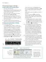
To set a camera’s color space to Adobe RGB:
1. On the back of your Nikon camera, press the
Menu button to access the menu on the LCD
screen, and then, if necessary, press the up or
down arrow on the multi selector to select the
Shooting Menu tab.
2. On the Shooting Menu, press the down arrow
on the multi selector to select the Color Space
category
A
(Canon EOS Rebel cameras label this
category as Parameters). Press the right arrow
on the multi selector to move to the submenu.
3. Press the down arrow to select Adobe RGB.
B
4. Press the OK button to set your choice,
C–D
then press the Menu button to exit the Menu
screen.
B
We pressed the right arrow, then chose Adobe
RGB from the Color Space submenu.
A
On the Nikon Shooting Menu, we selected the
Color Space category.
NIKON D700
C
After pressing OK, the Color Space for our
camera is now Adobe RGB.
D
On a Canon EOS Rebel, we selected the
Parameters category, pressed Set to get to the sub-
menu, then chose Adobe RGB from the submenu.
CANON EOS REBEL
ptg
Color Management 7
Calibrating your display
Display types
ere are two main types of computer displays: a
CRT (cathode ray tube, as in a traditional TV set)
and the more common LCD (liquid crystal display,
or at panel display). e display performance of
a CRT uctuates due to its analog technology and
the fact that its display phosphors (which produce
the glowing dots that you see onscreen) fade over
time. A CRT display can be calibrated reliably for
only around three years.
LCD displays use a grid of xed-sized liquid
crystals that lter color coming from a back light
source. Although you can adjust only the bright-
ness on an LCD (not the contrast), the LCD digital
technology oers more reliable color consistency
than a CRT, without the characteristic ickering of
a CRT. e newest LCD models provide good view-
ing angles, display accurate color, use the desired
daylight temperature of 6500K for the white point
(see below), and are produced under tighter manu-
facturing standards than CRTs. Moreover, the color
prole that’s provided with an LCD display (and
that is installed in your system automatically) usu-
ally describes the display characteristics accurately.
➤ Both types of displays lose calibration gradu-
ally, and you may not notice the change until
the colors are way o. To maintain the color
consistency of your display, stick to a regular
monthly calibration schedule. ankfully, our
calibration software reminds us to recalibrate
our display via a monthly onscreen alert.
Understanding the calibration settings
r e e b a s i c c h a r a c t e r i s t i c s a r e a d j u s t e d w h e n a
display is calibrated: e brightness (white level) is
set to a consistent working standard; the contrast
(dark level) is set to the maximum value; and
a neutral gray (gray level) is established using equal
values of R, G, and B. To adjust these characteris-
tics, calibration devices evaluate the white point,
black point, and gamma in the display.
➤ e white point data enables the display
to project a pure white, which matches
an industry-standard color temperature.
Photographers favor using D65/6500K as the
temperature setting for the white point.
➤ e black point is the darkest black a display
can project. All other dark shades are lighter
than this darkest black, which ensures that
shadow details display properly.
➤ e gamma denes how midtones are dis-
played onscreen. A gamma setting of 1.0 repro-
duces the linear brightness scale that is found
in nature. Human vision, however, responds
to brightness in a nonlinear fashion, so this
setting makes the screen look washed out. A
higher gamma setting redistributes more of
the midtones into the dark range, which our
eyes are more sensitive to, and produces a more
natural-looking image. Photography experts
recommend using a gamma setting of 2.2 for
both Windows and Macintosh displays.
Buying a calibration device
e only way to calibrate a display properly is by
using a hardware calibration device, which pro-
duces a prole containing the proper white point,
black point, and gamma settings for your display.
e Adobe color management system, in turn, will
use that prole to display colors in your Photoshop
document more accurately.
If you’re shopping for a calibration device,
you’ll notice a wide range in cost, from a $100 to
$300 colorimeter to a much more costly, but more
precise, high-end professional gadget, such as a
spectrophotometer. A colorimeter and its step-
by-step wizard tutorial will enable you to calibrate
your display more precisely than you could by using
subjective “eyeball” judgments.
Among moderately priced calibrators, our
informal reading of hardware reviews and other
industry publications has yielded the follow-
ing as some of the current favorites: Spyder3Pro
and Spyder3Elite by Datacolor; i1 Display2 and
i1 Display LT by X-Rite; and hueyPro, which was
developed jointly by
PANTONE and X-Rite.
Note: If, after calibrating your display, you
intentionally or unintentionally adjust the display’s
brightness and contrast settings or change the
room lighting (or repaint your walls!), remember
to recalibrate it!
For Mac OS users who don’t have a calibration
device, your system supplies a display calibra-
tion utility; look for it in System Preferences >
Displays > Color. Click Calibrate and follow the
instructions that appear onscreen.
ptg
8 Chapter 1
e steps outlined here apply loosely to the three
hardware display calibrators that are mentioned on
the preceding page. We happen to use Spyder3Pro.
To calibrate your display using a hardware
device:
1. Set the room lighting to the level that you nor-
mally use for work. If you have a CRT, let it warm
up for 30 minutes for the display to stabilize.
2.
Increase the brightness of your display to its
highest level. In the Mac OS, if you have an Apple
display, choose System Preferences > Displays
and drag the Brightness slider to the far right.
For a third-party display or any Windows display,
use either a mechanical button on the display or a
menu command in the OnScreen Display (OSD).
3.
Launch the calibration application that you’ve
installed, then follow the straightforward instruc-
tions on the step-by-step wizard screens.
A–B
You will need to tell the application the follow-
ing important information: your display type
(CRT or LCD), the white point to be used (choose
D65/6500K), and the desired gamma value
(choose 2.2 for both Windows and Macintosh).
For a CRT display, you may see a few more
instructional screens requesting further display
setting choices.
4.
After entering your display information (
A
,
next page), you’ll be prompted to drape the col-
orimeter (hardware calibration sensor) over the
monitor (
B
, next page). For an LCD, if a bae
is included with the calibration device, clip it on
to prevent the suction cups from touching and
potentially damaging the screen. Follow the
instructions to align the sensor with the image
onscreen. Click OK or Continue to initiate the
series of calibration tests, which will take from
5 to 8 minutes.
5.
After removing the calibration sensor, you’ll
be prompted to name your new display prole
(
C
, next page). Include the date in the prole
name, for your own reference. e application
will place the new prole in the correct loca-
tion for your Windows or Macintosh operating
system. e wizard will step you through one
or two more screens, and then you’re done.
When launched, Photoshop will automatically
be aware of the new display prole.
A
After launching the Sypder3Pro applica-
tion, we answered questions on the Display
Type screens to tell the wizard software
what type of monitor we have and what
features it has. We clicked Next to progress
from screen to screen.
B
On this Methods of Attachment screen, we clicked No Suction Cup.
ptg
Color Management 9
A
e r e s u l t i n g s e t t i n g s a p p e a r e d
on this
Current Settings screen. Click
Continue with ese Settings.
Note: If you have already used the
device to calibrate your monitor, a
screen entitled CheckCAL will appear
instead of this one. Click CheckCAL –
Check Current Calibration.
B
When this Measuring Display screen
appeared, we draped the colorimeter
over the monitor and aligned it with the
onscreen image, then clicked Continue
to initiate the actual calibration process.
C
When the calibration was nished,
we clicked Next, and this
Specify Prole
Name
screen appeared. In our prole
name, we included the monitor name
and the current date.
After we clicked Next again, the
SpyderProof screen appeared. We
clicked Switch to compare the pre- and
postcalibration results. Finally, we
clicked Next, chose Quit, then clicked
Next one last time to exit the software.