Photoshop cs5 cho nhiếp ảnh gia part 6 pot
Bạn đang xem bản rút gọn của tài liệu. Xem và tải ngay bản đầy đủ của tài liệu tại đây (594.41 KB, 6 trang )
26
c h a p t e r 1: THINKING DIGITALLY ■
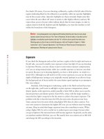
Figure 1.19 The white balance here was accidentally set to Tungsten. A mistake like this can be deadly if the image is shot
in JPEG.
If you’ve ever gotten up before dawn to go out and photograph in the beauti-
ful, warm, early-morning light, you know that nature photographers aren’t always
seeking to make neutrally colored images. Often, nature photographers want a color
cast in their images, particularly a warm cast, as shown in Figure 1.20. This is one
of the reasons we prefer to shoot in raw mode; we don’t have to make a final deci-
sion about the precise white balance until we’re converting the image, whereas with
JPEG mode, the white balance is “baked” into the image. We retain the option to set
the final white balance to be as accurate as possible or to set it to reflect the mood we
want to portray rather than the exact lighting conditions at the time.
If you are shooting in JPEG, you may want to experiment with using the
auto white balance feature, along with setting the white balance specifically. You
may not only want to set the white balance for an accurate rendition of the scene,
but you may also want to experiment a little. For example, if you use the Cloudy or
Shade setting in fairly sunny conditions, it’s similar to adding an 81A or 81B filter
to your camera lens; these settings will add a warm cast to your picture. Product
photographers must be concerned with absolute color accuracy in their photography.
Nature photographers have the luxury of being able to be creative with the white
balance and create, augment, or remove color casts as it suits their vision. You can
use the white balance settings rather than filters to do this both with JPEG and
with RAW.
607343c01.indd 26 4/11/10 11:02:47 PM
27
■ COLOR MANAGEMENT
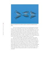
Figure 1.20 This picture, taken at dawn, actually has a warmer, pinker color cast than what existed at the time, but the result is
pleasing. Altering the white balance lets you convey a mood eectively.
Ph ot o b y EllE n An o n
When you capture your images as raw files, because the white balance you
selected in the camera is not actually applied until you convert the image, you have
the luxury of time to adjust the white balance as you want. Most raw converters pro-
vide continuous temperature and tint sliders to set the white balance that best fits the
mood of the image. You can tweak it in small increments to precisely obtain the effect
you want. Because of this, many photographers elect to leave their cameras on auto
white balance and then use the sliders in the converters to impart or remove color
casts. Others still select what they believe is the best white balance setting while in the
field so they can recall what the lighting was and how the image actually appeared.
They prefer to have their images be as close to accurate, realistic color as possible.
Who’s right? Both are! It’s a matter of your personal goals and preferences with your
photography.
Note: If you are using auto white balance, using a warming or cooling filter may have no effect,
because most cameras will compensate for the filter and try to make everything neutral!
Color Management
For any photographer, achieving accurate color is a key concern. You need to know
that the way the image looks on your monitor is how it will look when it’s output.
607343c01.indd 27 4/11/10 11:02:47 PM
28
c h a p t e r 1: THINKING DIGITALLY ■
While you may take artistic license in how you optimize an image, you want to
ensure that a print or image you show in a slideshow or on the Web is an accurate
reflection of your interpretation of the image. That means producing output that
matches the monitor display to the extent possible. This is the job of color manage-
ment, and it can help you achieve greater consistency in your workflow. The work-
flow and settings we recommend throughout the book will help you establish a
color-managed workflow.
Monitor Calibration
The first step in a color-managed workflow is to calibrate and profile your moni-
tor. We can’t stress how important this is. If you don’t have a calibrated display, the
images you are evaluating and optimizing are likely to be at least slightly—and pos-
sibly significantly—inaccurate. They might look good to you on your monitor, but
your prints are unlikely to match what you see. If you don’t calibrate your monitor,
you also have no valid reason to complain about prints that don’t match your monitor.
Calibrating your monitor is a critical first step to producing the results you are looking
for with your images.
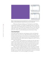
As far as we’re concerned, calibrating your monitor is done properly only by
using a package that uses a colorimeter (a type of sensor) to measure the color values
of your monitor so that appropriate compensation can be applied (see Figure 1.21).
There are several packages available that include a colorimeter, and we’re perfectly
comfortable with any of them. We asked Jon Canfield, an expert on color manage-
ment, to describe some of the current devices.
Figure 1.21 For monitor calibration, use a software package that includes a colorimeter to measure
the color behavior of your monitor and apply compensation to ensure an accurate display.
607343c01.indd 28 4/11/10 11:02:48 PM
29
■ COLOR MANAGEMENT
Color-Management Essentials
by Jon Caneld
Ph o t o b y Jo n cAn f i E l d
Having a calibrated monitor is a critical part of the digital workflow. There are plenty of options,
from the free Adobe Gamma on Windows (included with Photoshop in the Extras folder), to the
Color Calibration Assistant that ships with Apple’s OS X. Both of these programs let you make
adjustments to your display by visually comparing different color patches. While this is better
than nothing, it’s far from ideal.
The best option is hardware calibration. These small devices measure different colors directly
from the screen with a colorimeter, evaluating them for accuracy. Once this is done, a profile is
created that sets your monitor to the optimum settings. At the low end in cost is the PANTONE
huey. At less than $100, it does a good job of calibrating your monitor and has a feature to
adjust the display as the ambient light changes. The next step up in accuracy and options are
the X-Rite i1Display 2 and the Datacolor Spyder3Elite. Both of these devices give you the option
to set color temperature and gamma. By using more color patches, both of these tools can cre-
ate very accurate profiles. Expect to pay approximately $250 for either of these products. The
final option is a spectrophotometer, which can also create printer profiles. Your choices here
include the X-Rite ColorMunki, the Spyder3Studio SR, and the i1Photo. The ColorMunki is a
recent addition to the field and can profile monitors, printers, and digital projectors as well as
do spot color measurements. If you use specialty papers, at less than $500, the ColorMunki can
easily pay for itself with custom profiles. It’s priced substantially less than the i1Photo.
607343c01.indd 29 4/11/10 11:02:49 PM
30
c h a p t e r 1: THINKING DIGITALLY ■
Note: Although Adobe Gamma is no longer installed by default in PCs, it may still be in your
Startup folder if you are using an older version of the OS. If it’s present, it overrides any custom profiles
you try to use. To remove it, do the following:
1. Click Start.
2. Select All Programs.
3. Select Startup.
4. Right-click on Adobe Gamma and select Delete.
Working Conditions
A calibrated monitor display ensures accurate color (to the greatest extent possible)
but doesn’t ensure consistent color. That may sound a bit contradictory, but it empha-
sizes the importance of working under consistent conditions. As a nature photogra-
pher, you are well aware of the considerations of good lighting. You look for optimal
conditions, with the sun at an optimal angle to produce a golden glow, for example.
Just as varying lighting conditions can affect both the appearance of your subject and
the ultimate quality of your photos, the conditions under which you work can affect
the appearance of your monitor display. Different ambient lighting conditions will
cause you to perceive the colors and tonalities differently on your monitor.
It is very important that you work under lighting conditions that are as con-
sistent as possible, and ideally somewhat dim. The monitor you are using as the basis
of all your evaluations about an image emits light, and your perception of that light
can be influenced by the light in the room. If the room is too bright, you won’t be able
to see subtle details on the monitor. If the light isn’t relatively neutral, it can have an
effect on the color appearance of the monitor display.
The ideal situation is to work in an environment that is consistently somewhat
dark. That doesn’t mean you need to work in absolute darkness. It just means that you
want to minimize the lighting to the extent you are comfortable with, and do every-
thing you can to ensure the lighting is neutral and remains consistent from one session
to the next. If you work on an image with early-morning light filling the room and
making the image on your monitor look warmer than it really is, you may overcom-
pensate by adjusting the image to look too cool.
If you can minimize the amount of artificial light in the room, perhaps by using
a dimmer to keep the light at an appropriate level, that is an excellent start. If you
have windows in the room where you’re working on your images, it is a good idea to
close the blinds (or install blinds) so you can minimize the influence of outside light.
The bottom line is that you want to be working in an environment where the
monitor is accurate by virtue of the fact that it has been calibrated, and is consistent
because your working conditions are likewise consistent. This helps ensure that you
are seeing accurate color on your monitor, which is the reference both for adjustments
you’re making to your images and for evaluating the accuracy of your prints.
607343c01.indd 30 4/11/10 11:02:49 PM
31
■ PHOTOGRAPHING IMAGES TO COMPOSITE LATER
Photographing Images to Composite Later
How many times have you looked up and commented on the great clouds or beautiful
sunset but not taken the picture because foreground elements were missing? Or the
opposite—you found a great subject, perhaps a bird posing wonderfully or a gorgeous
scene, but the sky or background was completely blah? Or you could tell there was
just too much contrast to be able to capture the picture in a single shot? When you
are in the field with your camera, it’s important to remember that Photoshop enables
you to combine images in a seemingly infinite variety of ways. You have to adjust your
thinking to include seeing the potential for an image.
Expanding Camera Capabilities
Sometimes you see a situation and know that you can’t capture it in a single shot
because of the technical limitations of your equipment. Photoshop provides ways to
combine shots to create images close to what you can see but that are not possible to
capture with a single exposure.
Your eyes can see a much greater range of tonalities than can your camera,
where the dynamic range is limited to five to six stops of lights for digital captures and
slide film. This means although your eyes may be able to see detail in both the high-
lights and the shadows in a scene, today’s cameras may not be able to do so within a
single exposure. The solution is to take a series of exposures, making sure you capture
detail in all parts of the pictures. This could mean two or more exposures varying at
least one stop each.
Dynamic Range and HDR Images
It’s helpful to understand exactly what “dynamic range” means and what constitutes an HDR
image.
Dynamic Range The range between the brightest and darkest points of an image.
High Dynamic Range (HDR) Images An HDR image contains a far wider dynamic range than can
be displayed on a screen or printed on a printer. HDR images are often created from multiple
exposures of one scene and are stored in special file formats. They are of interest to photogra-
phers because you can convert them back to 8-bit or 16-bit images and compress the dynamic
range, allowing you to create images with detail in both shadow and highlight areas of an
image, more like what your eye saw when looking at the scene or possibly even with more detail
than you’re usually aware of seeing.
If you’re dealing with a static subject and shooting from a stable platform, you
can take a series of exposures to later combine using Merge to HDR to create a 32-bit
file. This file is called a high dynamic range (HDR) file, and we’ll discuss it more
in Chapter 8. In addition, there are several other ways to combine 16-bit exposures
607343c01.indd 31 4/11/10 11:02:49 PM