Manning Windows Forms Programming (phần 10) ppsx
Bạn đang xem bản rút gọn của tài liệu. Xem và tải ngay bản đầy đủ của tài liệu tại đây (601.3 KB, 50 trang )
416 CHAPTER 13 TOOLBARS AND TIPS
with the parent toolbar. Image lists are used by a number of Windows Forms controls
to manage the images displayed or available within the control. As a result, we will
hold off on creating our toolbar buttons until section 13.3 in order to take a look at
this rather important construct.
13.2 IMAGE LISTS
There are a number of controls that require one or more images in order to display
their contents. Often, the requirement is for a set of images, rather than a single image.
For example, the set of toolbar buttons in a
ToolBar object, or the images required
for a set of
Button controls on a form. The Windows Forms namespace provides the
ImageList class for managing such collections of images. As we shall see in chapters
14 and 15, this class is also utilized by the
ListView and TreeView controls.
This section examines the
ImageList class in some detail, and creates a set of
images for use in the toolbar we created in the previous section.
13.2.1 T
HE IMAGELIST CLASS
The ImageList class, summarized in .NET Table 13.4, provides a convenient way to
store and access images required by various objects. An
ImageList component
.NET Table 13.4 ImageList class
The ImageList class represents a collection of Image objects. Typically, this class is used to
support one or more Windows Forms controls in the management and display of images
within the control. Classes that use image lists include the
Button, ToolBar, ListView, and
TreeView classes. This class is part of the System.Windows.Forms namespace, and inherits
from the
System.ComponentModel.Component class.
Public Properties
ColorDepth Gets or sets the color depth for images in the list.
Handle Gets the Win32 handle for the image list.
HandleCreated Gets whether the underlying Win32 handle has been
created.
Images Gets the collection of images for this image list. Use
this collection to add, remove, and otherwise
manage the list’s images programmatically.
ImageSize Gets or sets the size for images in the list.
ImageStream Gets or sets the
ImageListStreamer object to
associate with this list. This object manages the data
associated with the list.
TransparentColor Gets or sets the color to treat as transparent in the
list’s images.
Public Methods
Draw Draws an indicated image in a specified
Graphics
object.
Public Events
RecreateHandle Occurs when the underlying Win32 handle is
recreated for the list.
IMAGE LISTS 417
works much like an array of
Image objects, and can be thought of as such. Classes
that use this construct specify an index into the list, designating which image they
wish to display. Typically, a class that uses such a list provides an
ImageList prop-
erty to specify a list to use, and classes that display an image out of such lists provide
an
ImageIndex property to indicate which image to display.
In Visual Studio .NET, an
ImageList can be associated with a Form graphically
and assigned to one or more controls within that form using the Windows Forms
Designer and the Properties windows. Visual Studio creates the list within the set of
components for the Form, so that it is disposed when the application disposes of the
Form via the Close or Dispose methods. We will look at the code generated for this
purpose in a moment.
13.2.2 C
REATING AN IMAGE LIST
For the ToolBar object we created in our MainForm class, we need an ImageList
containing the set of images required for our ToolBarButton objects. We will use
some of the bitmaps and icons in the common image directory provided with Visual
Studio. If you skipped chapter 12, or were simply not paying attention, this directory
is typically “C:\Program Files\Microsoft Visual Studio .NET\Common7\Graphics.”
The following steps create an
ImageList and associate the required image files
with it.
Set the version number of the MyPhotos application to 13.2.
CREATE AN IMAGE LIST FOR OUR TOOLBAR
Action Result
1 Associate an
ImageList
component with the
MainForm
form in the MainForm.cs
[Design] window.
Note: Windows Forms compo-
nents such as the
ImageList
class are available from the
Toolbox window, just like Win-
dows Forms controls.
The new image list is shown in the component tray area
below the form.
2 Set the
(Name) property for the
image list to
imageListToolBar.
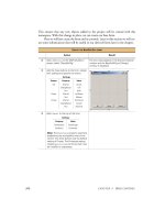
3 Display the Image Collection
Editor window.
How-to
Click the … button next to the
Images item in the Properties
window.
A blank Image Collection Editor dialog box appears. This
dialog with all eight images added is shown in step 5.
418 CHAPTER 13 TOOLBARS AND TIPS
This creates a collection of all the images we will need for our toolbar. An excerpt of
the code generated by these changes is as follows.
. . .
namespace MyPhotos
{
. . .
public class MainForm : System.Windows.Forms.Form
{
. . .
private System.ComponentModel.IContainer components = null;
. . .
private System.Windows.Forms.ImageList imageListToolBar;
. . .
protected override void Dispose( bool disposing )
{
if( disposing )
{
4 Add an image for creating a new
album to the collection.
The image appears as member 0 within the Image
Collection Editor dialog.
5 Similarly, add the following
images files to the collection.
6 Click the OK button to save the
changes.
The assigned images are stored in the image list.
CREATE AN IMAGE LIST FOR OUR TOOLBAR (continued)
Action Result
How-to
a. Click the Add button.
b. In the file dialog, locate the
NEW.BMP file under the
common image directory in
the “bitmaps/OffCtlBr/Small/
Color” directory.
c. Click the Open button to add
the image.
• bitmaps/OffCtlBr/Small/Color/
OPEN.BMP
• bitmaps/OffCtlBr/Small/Color/
SAVE.BMP
• icons/arrows/ARW08LT.ICO
• icons/arrows/ARW08RT.ICO
• icons/Writing/BOOK02.ICO
• icons/Traffic/TRFFC10C.ICO
• icons/Traffic/TRFFC10A.ICO
IMAGE LISTS 419
if (components != null)
{
components.Dispose();
}
}
base.Dispose( disposing );
}
. . .
private void InitializeComponent()
{
. . .
this.imageListToolBar
= new System.Windows.Forms.ImageList(this.components);
. . .
//
// imageListToolBar
//
this.imageListToolBar.ColorDepth
= System.Windows.Forms.ColorDepth.Depth8Bit;
this.imageListToolBar.ImageSize = new System.Drawing.Size(16, 16);
this.imageListToolBar.ImageStream
= ((System.Windows.Forms.ImageListStreamer)
(resources.GetObject("imageListToolBar.ImageStream")));
this.imageListToolBar.TransparentColor
= System.Drawing.Color.Transparent;
. . .
}
The annotated lines merit some additional discussion.
b
This line disposes of the components container, which in turn disposes of any com-
ponents contained within this object. The controls on the form are contained within
the
Form object itself. As a result, the resources allocated to the controls in the form
are disposed by the
Form.Dispose method itself. This works for components such
as the
MainMenu and StatusBarPanel objects as well, since the menu is assigned
to the form, and status bar panels are contained within status bar controls.
c
This line initializes an ImageList object and assigns it to the components con-
tainer. This is required to ensure that the list is properly disposed of by the
Form
object’s Dispose method. If you create your own ImageList objects manually, be
sure to dispose of the object when you are finished in order to free any Windows or
file system resources assigned to the list.
d
Like the bitmap files we created in the previous chapter, a ResourcesManager
object is used to retrieve the stream of image data from a .resources file. This data is
retrieved as an
ImageListStream object. This object is assigned to the Imag-
eStream
property and used internally by the ImageList class to manage and access
the images in the collection.
b
Dispose of the
components object
Create the image
list within the
components container
c
Load the
image stream
for the list
d
420 CHAPTER 13 TOOLBARS AND TIPS
On this last point for our code, note that the MyPhotos project directory in the file
system contains a MainForm.resx file that defines the binary form of the image
stream for our list. This is very similar to how our bitmap images were defined for our
Button objects in the previous chapter. An excerpt of this file follows. In addition to
the definition of the image stream, note how the positioning of objects displayed in
the component tray area of Visual Studio, such as the location of our
imageList-
ToolBar
object, are also stored in this file
<?xml version="1.0" encoding="utf-8"?>
<root>
. . .
<data name="imageListToolBar.Location" type="System.Drawing.Point,
System.Drawing,
Version=1.0.3300.0, Culture=neutral,
PublicKeyToken=b03f5f7f11d50a3a">
<value>255, 17</value>
</data>
<data name="imageListToolBar.ImageStream"
mimetype="application/x-microsoft.net.object.binary.base64">
<value>
AAEAAAD/////AQAAAAAAAAAMAgAAAFpTeXN0ZW0uV2luZG93cy5Gb3JtcywgVmVyc2lvbj0xLjAuMzMw
MC4wLCBDdWx0dXJlPW5ldXRyYWwsIFB1YmxpY0tleVRva2VuPWI3N2E1YzU2MTkzNGUwODkFAQAAACZT
eXN0ZW0uV2luZG93cy5Gb3Jtcy5JbWFnZUxpc3RTdHJlYW1lcgEAAAAERGF0YQcCAgAAAAkDAAAADwMA
. . .
</value>
. . .
</root>
This completes our discussion on image lists for now. Let’s get back to the ToolBar
for our application and create the ToolBarButton components using the images we
just assigned to our list.
13.3 TOOLBAR BUTTONS
Now that we have some understanding of image lists, we can return to the topic of
toolbar buttons. This section adds the ten buttons, both images and separators, we
decided to place on our toolbar. The discussion is divided into two parts. First we will
look at the most basic of styles, the push button. Then we’ll tackle the dropdown and
toggle styles of
ToolBarButton objects.
13.3.1 A
DDING A PUSH BUTTON
We have a toolbar and we have an image list, so let’s get to it. We will start with the
push buttons related to the File menu, and later hook up these buttons to their corre-
sponding menu item, after which we will create the buttons associated with the Next
and Previous menu items.
TOOLBAR BUTTONS 421
Set the version number of the MyPhotos application to 13.3.
Our ToolBar now contains three toolbar buttons. Visual Studio displays the images
associated with each button in the designer window. If text is assigned to a button,
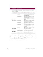
ADD THE TOOLBAR BUTTONS FOR THE FILE MENU
Action Result
1 In the MainForm.cs [Design]
window, modify the properties
for the
toolBarMain control.
The images in our image list are now available to any
buttons placed on the toolbar.
2 Display the ToolBarButton
Collection Editor window.
How-to
In the toolbar’s Properties
window, click the … button
associated with the Buttons
item.
Note: You can modify the properties for these
objects in the collection editor or in the Properties
window. The collection editor is shown here. To use
the Properties window, create the buttons, click OK
to close the window, and then simply select the
desired toolbar button from the list at the top of the
Properties window.
3 Click the Add button three times
to create three new
ToolBarButton objects.
4 Click OK to close the editor. The new buttons appear on the form.
Settings
Property Value
ButtonSize 16, 16
ImageList imageListToolBar
Settings
Button Property Value
0 (New) (Name) tbbNew
ImageIndex 0
ToolTipText Create
album
1 (Open) (Name) tbbOpen
ImageIndex 1
ToolTipText Open
album
2 (Save) (Name) tbbSave
ImageIndex 2
ToolTipText Save
album
422 CHAPTER 13 TOOLBARS AND TIPS
Visual Studio will display this as well, assuming the button provides room for the text
to appear.
The next step is to link these to operations within our form. The
ButtonClick
event in the ToolBar class is used for this purpose. Event handlers for this event
receive a
ToolBarButtonClickEventArgs parameter that contains a Button
property. This property retrieves the ToolBarButton instance clicked by the user.
One means for handling our button clicks uses a series of
if statements. The code
would look something like the following:
private void toolBarMain_ButtonClick(object sender,
System.Windows.Forms.ToolBarButtonClickEventArgs e)
{
// Determine which button was clicked – not our approach
if (e.Button == tbbNew)
{
menuNew.PerformClick();
}
else if (e.Button == tbbOpen)
{
menuOpen.PerformClick();
}
else if (e.Button == tbbSave)
{
menuSave.PerformClick();
}
}
This can get a bit unwieldy as the number of buttons increase. A more elegant
approach takes advantage of the
Tag property for ToolBarButton instances. This
property holds an
object instance, and in particular can hold a MenuItem object to
associate with the button. Since we would like our buttons to perform the same
action as the corresponding menu item, we will associate the proper menu item with
each of our buttons. Continuing our prior steps:
SET THE TAG PROPERTY FOR THE TOOLBAR BUTTONS
Action Result
5 Create a new
InitToolBarButtons
method in the MainForm.cs code window.
private void InitToolBarButtons()
{
6 Set the Tag property for each toolbar
button to the corresponding
MenuItem
object.
tbbNew.Tag = menuNew;
tbbOpen.Tag = menuOpen;
tbbSave.Tag = menuSave;
}
7 Add a call to this new method from the
MainForm instance constructor.
public MainForm()
{
. . .
InitToolBarButtons();
}
TOOLBAR BUTTONS 423
Our implementation of the
ButtonClick handler for our toolbar can now take
advantage of these settings to simply invoke the
Click event handler associated with
the corresponding menu item.
Note how the
as keyword is used to ensure that the Tag property does, in fact, refer
to a
MenuItem object. If a new button is added without an associated menu, then
this code is safely ignored.
We can also use this method for the Next and Previous toolbar buttons. The follow-
ing steps also define a separator button to differentiate between these two sets of buttons.
HANDLE THE BUTTONCLICK EVENT FOR THE TOOLBAR
Action Result
8 Add a
ButtonClick event handler for
the
ToolBar control.
How-to
This is the default event for toolbars, so
simply double-click the toolbar control
in the MainForm.cs [Design] window.
private void toolBarMain_ButtonClick
(object sender, System.Windows.Forms.
ToolBarButtonClickEventArgs e)
{
9 Implement this handler using the Tag
property of the
ToolBarButton
component.
// Handle menu buttons
MenuItem mi = e.Button.Tag as MenuItem;
if (mi != null)
mi.PerformClick();
}
ADD THE NEXT AND PREVIOUS TOOLBAR BUTTONS
Action Result
10 In the ToolBarButton Collection Editor,
add three new toolbar buttons.
11 Update the
InitToolBarButtons
method for these new buttons.
private void InitToolBarButtons()
{
tbbNew.Tag = menuNew;
tbbOpen.Tag = menuOpen;
tbbSave.Tag = menuSave;
tbbPrevious.Tag = menuPrevious;
tbbNext.Tag = menuNext;
}
Settings
Button Property Value
3 Style Separator
4 (Prev) (Name) tbbPrevious
ImageIndex 3
ToolTipText Previous
image
5 (Next) (Name) tbbNext
ImageIndex 4
ToolTipText Next image
424 CHAPTER 13 TOOLBARS AND TIPS
Our ButtonClick event handler automatically handles these buttons based on their
associated menu items, so no further changes are needed. Compile and run the pro-
gram to make use of these buttons. Note how the tool tips pop up when the mouse
hovers over these buttons.
TRY IT!
Two things to try here. First, modify the Appearance property for the
toolbar to be
Flat. The buttons will no longer have a three-dimensional
appearance, and the separator will be a line between the two sets of buttons.
Second, modify the
Dock property for the toolbar to be Left. This
places the control on the left side of the form. Run the program to verify
that everything still works as expected.
There are two other types of toolbar buttons, namely the DropDownButton and Tog-
gleButton
styles. The next two sections take a look at these alternate button styles.
13.3.2 A
DDING A DROPDOWN BUTTON
To create a dropdown menu on our form, we will make use of our existing Images
submenu displayed via the
menuImages menu item created way back in chapter 3,
and updated in chapter 6. The changes are detailed by the following steps, and dis-
cussed in the subsequent text.
ADD A DROPDOWN BUTTON
Action Result
1 In the MainForm.cs [Design] window,
add a new
ContextMenu object to the
MainForm window.
A second context menu appears in the
component tray.
2 Set the
(Name) for the menu to
ctxtMenuImage.
3 Assign the
menuImage_Popup event
handler as the
Popup event handler for
the
ctxtMenuImage menu.
Note: If you look at our implementation of
this event handler back in chapter 3, you
will find that we cast the
sender parame-
ter to a
Menu object, rather than a Menu-
Item
object, so that it would work with any
type of menu.
4 Modify the
DefineContextMenu
method to copy the contents of the
menuImage menu into the new context
menu.
Note: This clones the submenus of the
menuImage object and assigns them to
the
ctxtMenuImage object. We created
and discussed this method in chapter 3.
private void DefineContextMenu()
{
//Copy View menu into ctxtMenuView
. . .
// Copy Image menu into ctxtMenuImage
foreach (MenuItem mi in
menuImage.MenuItems)
{
ctxtMenuImage.MenuItems.
Add(mi.Index, mi.CloneMenu());
}
}
TOOLBAR BUTTONS 425
Our new toolbar button requires a new context menu, which we use as the dropdown
menu for our new button. Even though the
DropDownMenu property for the Tool-
BarButton
class is defined as a type of Menu object, a ContextMenu instance is
required to properly display a dropdown menu beneath the button. We could have
used the
ctxtMenuView context menu, although we would then display the entire
View menu beneath the toolbar button.
Compile, run, open, click, and otherwise make sure the new button works. The
.NET Framework does all the hard work here. When the button is clicked, the menu
item collection associated with the
ctxtMenuImage menu is displayed. This causes
the
Popup event associated with this menu to fire, invoking the menuImage_Popup
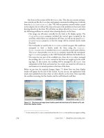
event handler. Figure 13.2 shows the application with the popup menu displayed for
our new button.
5 In the ToolBarButton Collection Editor,
add two new toolbar buttons.
Note: The down arrow to the right of the
image appears because the toolbar’s
DropDownArrow property is true. Set this
property to
false to display the button
without the arrow.
ADD A DROPDOWN BUTTON (continued)
Action Result
Settings
Button Property Value
6 Style Separator
7 (Image)
(Name) tbbImage
DropDownMenu ctxtMenuImage
ImageIndex 5
Style DropDownButton
ToolTipText Set display mode
Figure 13.2
When the down arrow for a toolbar but-
ton is shown, as it is here, the user must
click on this arrow to display the associ-
ated menu.
426 CHAPTER 13 TOOLBARS AND TIPS
Of course, you don’t always have an existing menu in your menu bar to clone and use
in your dropdown toolbar buttons. A custom
ContextMenu object can be created and
assigned to the button. If desired, you can also draw your own menu items similar to
how we drew a custom status bar panel in chapter 4 and list box items in chapter 10.
Alternately, you may wish to forgo a menu entirely and create a custom window
to associate with your button. This can be done as well. The
ButtonDropDown event
occurs for the parent
ToolBar control whenever a dropdown menu on the control is
clicked. Event handlers for this event receive a
ToolBarButtonClickEvent-Args
class instance as the event parameter. This class contains a Button property to retrieve
the dropdown
ToolBarButton instance that was clicked. The Rectangle property
for the button identifies the location of the button and can be used to properly place
a small window or other graphical object at the proper location.
Our last style of button is a toggle button.
13.3.3 A
DDING A TOGGLE BUTTON
Our final toolbar button will illustrate the ToggleButton style to show and hide
the pixel data dialog created in chapter 8. Toggle buttons, as you may recall from
chapter 9, provide two different states: one when the button is pressed in, and one
when it is not.
We will do something a little different here that seems appropriate for our exam-
ple. If you are keeping track of the images available in our image list, you may realize
there are two images left, while only one more button. We will use one image when
the button is pushed in, and the other when it is not. Figure 13.3 shows our applica-
tion with the button pressed in and the
PixelDlg form displayed.
Figure 13.3
The toggle button on our toolbar
displays a green light when the
pixel dialog is shown, and a red
light otherwise.
TOOLBAR BUTTONS 427
This will require some coordination with the rest of the application to make sure the
button is never pressed when the pixel dialog is hidden. We’ll begin by creating the
button and implementing the
ButtonClick event support.
ADD THE TOGGLE TOOLBAR BUTTONS
A
CTION RESULT
1 In the ToolBarButton Collection Editor,
add two new toolbar buttons.
2 Implement an
AssignPixelData
method in the MainForm.cs code
window to adjust the button settings
based a specified value.
How-to
Display the green light icon when the
button is pushed, and the red light
otherwise.
Note: This will be used by various meth-
ods to update the toggle button as the
state of the pixel data dialog changes.
protected void
AssignPixelToggle(bool push)
{
tbbPixelData.Pushed = push;
if (push)
{
tbbPixelData.ImageIndex = 7;
tbbPixelData.ToolTipText
= "Hide pixel data";
}
else
{
tbbPixelData.ImageIndex = 6;
tbbPixelData.ToolTipText
= "Show pixel data";
}
}
3 Update the ButtonClick event handler
to adjust the state of both the dialog and
the button when the toggle is clicked.
private void toolBarMain_ButtonClick
(object sender,
ToolBarButtonClickEventArgs e)
{
// Handle menu buttons
. . .
// Handle Pixel Data button
if (e.Button == tbbPixelData)
{
if (e.Button.Pushed)
{
// Display pixel dialog
menuPixelData.PerformClick();
}
else if (this._dlgPixel != null
&& _dlgPixel.Visible)
{
// Hide pixel dialog
_dlgPixel.Hide();
}
// Update the button settings
AssignPixelToggle(e.Button.Pushed);
}
}
Settings
Button Property Value
8 Style Separator
9 (Pixel)
(Name) tbbPixelData
ImageIndex 6
Style ToggleButton
ToolTipText Show pixel data
How-to
a. When the button is pushed, invoke
the Pixel Data menu to ensure the
dialog is displayed.
b. Otherwise, hide the dialog if it is cur-
rently displayed.
c. Also call the
AssignPixelToggle
method to update the button settings.
428 CHAPTER 13 TOOLBARS AND TIPS
These changes implement the correct functionality for the button. When the button
is pushed, a
Click event for the menuPixelData menu is performed, which dis-
plays the dialog. When the button is unpushed,
1
the dialog is hidden using the Hide
method. In this later case we ensure that the dialog exists and is shown before trying
to hide it. The
AssignPixelToggle method adjusts the image and the tool tip to
reflect the new state of the button.
You can run the program to see the button in action. If you do, you may notice
that there are two problems we still need to address:
• The button is not pushed when the pixel data dialog is displayed using the
View menu item.
• The button is not unpushed when the dialog is closed manually.
For the first problem, we simply need to adjust the button in the
Click event han-
dler for this menu. Let’s do this before we discuss the second problem.
Our second problem, that of the user closing the pixel data dialog by hand, is more
problematic. Since this dialog is a nonmodal window, this dialog can be closed at
any time. So we need a mechanism for notifying our main window whenever the
dialog is closed.
If you recall, and as shown in step 5 in the previous table, the
MainForm form
is defined as the owner of the
PixelDlg form. This ensures that both windows are
1
I know, I know. There is no such word as “unpushed.” You know what I mean. I thought about the
word “released,” but unpushed seems much more packed with meaning.
UPDATE THE TOGGLE BUTTON WHEN THE PIXEL DATA MENU IS SELECTED
Action Result
4 Locate the
menuPixelData_Click
event handler in the MainForm.cs
code window.
private void menuPixelData_Click
(object sender, System.EventArgs e)
{
5 Update this method to adjust the
toggle button settings.
if (_dlgPixel == null
|| _dlgPixel.IsDisposed)
{
_dlgPixel = new PixelDlg();
_dlgPixel.Owner = this;
}
_nPixelDlgIndex = _album.CurrentPosition;
Point p = pnlPhoto.PointToClient(
Form.MousePosition);
UpdatePixelData(p.X, p.Y);
AssignPixelToggle(true);
_dlgPixel.Show();
}
TOOLBAR BUTTONS 429
shown when either window is displayed or minimized. We can take advantage of this
relationship to ensure that our main window is notified when the pixel dialog is closed.
The trick is to force the
MainForm window to activate whenever the PixelDlg
dialog is closed. Our main form will then receive an Activated event, at which time
we can update our button. Since the
MainForm class derives directly from Form, we
can handle this event by overriding the protected
OnActivated method.
The following steps implement this mechanism.
This code ensures that whenever the user closes the
PixelDlg form, the main form
is activated and the toggle toolbar button immediately updated. Compile and run the
application to ensure that it works as expected.
TRY IT!
Add two new menus to the top of the View menu called menuToolBar
and menuStatusBar. Implement these menus to show and hide the cor-
responding controls in the application. Use the
Visible property inher-
ited from the
Control class to identify the control’s current state and set
it to the opposite one. If you are careful, you can implement a single
Click
UPDATE THE TOGGLE BUTTON WHEN THE PIXELDLG FORM IS CLOSED
Action Result
6 In the PixelDlg.cs code window,
override the
OnClosing method to
activate the owner of the dialog, if any.
Note: Since the dialog may not be
fully closed here if the
Main-
Form.OnActivated method runs
immediately, we set the
Visible
property to
false to ensure the cor-
rect behavior occurs.
Also note that overriding the
OnClosed method instead does not
work because the
Owner property is
no longer valid once the dialog has
been closed.
protected override void OnClosing
(CancelEventArgs e)
{
Visible = false;
if (this.Owner != null)
Owner.Activate();
base.OnClosing(e);
}
7 Back in the MainForm.cs code
window, override the
OnActivated
method.
protected override void
OnActivated(EventArgs e)
{
8 If the pixel dialog does not exist,
then make sure our button is not
pushed down.
// Update toggle button if required
if (_dlgPixel == null
|| _dlgPixel.IsDisposed)
{
AssignPixelToggle(false);
}
9 Otherwise, set the button state
based on the
Visible property of
the pixel dialog.
else
AssignPixelToggle(_dlgPixel.Visible);
base.OnActivated(e);
}
430 CHAPTER 13 TOOLBARS AND TIPS
handler for both menus by using the sender parameter and observing that
both objects are Control instances. When you run the program with
these changes, note how the control shows or hides their contained buttons
or panels as well.
This completes our discussion of toolbars. We now move on to the mostly unrelated
but similarly named
ToolTip class.
13.4 TOOL TIPS
You never know when a good tip might come in handy. In Windows applications, tool
tips provide short and quick explanations of the purpose of a control or other object. A
number of classes provide their own tool tip mechanism through a
ToolTipText
property, in particular the StatusBarPanel, TabPage, and ToolBarButton
classes. For classes derived from the Control object, the ToolTip class handles this
logic in a general fashion.
.NET Table 13.5 ToolTip class
The ToolTip class is a component that provides a small popup window for a control. This window nor-
mally contains a short phrase describing the purpose of the control, and appears whenever the mouse hovers
over the control for a configurable amount of time. This class is part of the
System.Windows.Forms
namespace, and supports the
IExtenderProvider interface. The ToolTip class derives from the
System.ComponentModel.Component class.
Public
Properties
Active Gets or sets whether the
ToolTip is currently active. When
false, no tool tips will appear. The default is true.
AutomaticDelay Gets or sets the default delay time in milliseconds.
Whenever this property is set, the
AutoPopDelay,
InitialDelay, and ReshowDelay properties are initialized.
The default is 500.
AutoPopDelay Gets or sets the time in milliseconds before a displayed tool
tip will disappear. The default is ten times the
AutomaticDelay setting.
InitialDelay Gets or sets the time in milliseconds before a tool tip will
appear when the mouse is stationary. The default is the
AutomaticDelay setting.
ReshowDelay Gets or sets the time in milliseconds after the first tool tip is
displayed before subsequent tool tips are displayed as the
mouse moves from one assigned control to another. The
default is one-fifth (1/5) the
AutomaticDelay setting.
ShowAlways Gets or sets whether to display the tool tip for an inactive
control. The default is
false.
Public
Methods
GetToolTip Retrieves the tool tip string associated with a given control.
RemoveAll Removes all tool tip strings defined in this component.
SetToolTip Associates a tool tip string with a given control.
TOOL TIPS 431
13.4.1 T
HE TOOLTIP CLASS
An overview of the ToolTip class is provided in .NET Table 13.5. Note that a
ToolTip object is not strictly speaking a control, although it is sometimes referred to
as such. Normally, a single
ToolTip object is used to create the tips for all controls in
a single
Form.
13.4.2 Creating tool tips
While it is certainly possible to assign tool tips for our
MainForm controls in the
MyPhotos project, this would not be a very exciting example. Since menu objects are
not controls, we cannot assign tool tip text to our menu items. As we saw earlier in
this chapter and in chapter 4, the
ToolBar and StatusBar controls provide their
own tool tip mechanism. That leaves the
Panel object, which is only a single control.
Instead, we will look to our now-famous MyPhotoAlbum library for a rich source
of tool tip hungry controls. Figure 13.4 shows the
PhotoEditDlg form with a tool
tip displayed for the Date Taken text box.
Let’s crank up an Action-Result table and create a
ToolTip object for this dialog.
Once the tool tip exists, we can discuss how to associate specific messages with indi-
vidual controls.
Figure 13.4
The framework displays tool tip text just
below the mouse cursor, which in most
cases will not obscure the control’s con-
tents from view.
432 CHAPTER 13 TOOLBARS AND TIPS
Set the version number of the MyPhotoAlbum library to 13.4.
As usual, the new object is defined within the PhotoEditDlg class and initialized in
the
InitializeComponent method.
private System.Windows.Forms.ToolTip toolTipPhotos;
. . .
private void InitializeComponent()
{
. . .
this.toolTipPhotos = new System.Windows.Forms.ToolTip(this.components);
. . .
}
As we saw for the ImageList in our MyPhotos application, the ToolTip is created
within the
Form object’s components container to ensure that the object is disposed
of when the
Form itself is disposed.
We can add a series of tool tip strings for our controls using Visual Studio
directly. This table continues our previous steps.
ADD A TOOL TIP OBJECT TO THE PHOTOEDITDLG FORM
Action Result
1 In the PhotoEditDlg.cs [Design]
window, add a
ToolTip object
to the form.
The new object appears in the component tray below the
form designer.
2 Set the (Name) for the tool tip to
“toolTipPhotos.”
TOOL TIPS 433
That’s all it takes. Visual Studio .NET generates the code as is shown in the table. Of
course, you can define tool tips explicitly in your code using the
SetToolTip
method without using Visual Studio. The steps used here simply demonstrate the
support provided by the development environment.
Compile and run the program to make sure your tool tips work. Open an album
and display the
PhotoEditDlg dialog for a photo. Place the mouse over a control and
watch the tool tip appear. As you look at the tool tips we just defined, note the fol-
lowing features:
• There is a short pause, about half a second, before the tool tip text appears, and
then it disappears after about 5 seconds. These intervals are controlled by the
InitialDelay and AutoPopDelay properties.
ADD TOOL TIP STRINGS TO THE FORM’S CONTROLS
Action Result
3 Add the tool tip “Previous photo” for the
Prev button control on the form.
:
4 Define tool tip strings for the other controls
on the form.
Note: You can assign tool tips to
Label
controls as well. Since the user cannot nor-
mally interact with such controls, it is typi-
cally not appropriate to do so.
Visual Studio .NET generates the code
required for each tool tip in the
InitializeComponent method.
private void InitializeComponent()
{
. . .
this.toolTipPhotos.SetToolTip(
this.btnNext, "Next photo");
. . .
this.toolTipPhotos.SetToolTip(
this.txtNotes,
"Details about this photo");
. . .
}
How-to
a. Display the properties for the button in
the Properties window.
b. Locate the new entry “ToolTip on toolTip-
Photos” that is now present
c. Enter the string “Previous photo.”
Settings
Control ToolTip String
btnNext Next photo
txtPhotoFile Image file containing
photo
txtCaption Short caption for photo
dateTimeTaken When photo was taken
cmbxPhotographer Person who took photo
txtNotes Details about this photo
434 CHAPTER 13 TOOLBARS AND TIPS
• Display a tool tip, then move the mouse to another control and note how the
tool tip for the second control appears almost immediately. This secondary delay
defaults to 100 milliseconds, and is specified by the
ReshowDelay property.
• The tool tips for the Next and Prev buttons do not appear when these buttons
are inactive. The behavior for inactive controls is determined by the
ShowAl-
ways
property.
TRY IT!
Create a ToolTip object for the AlbumEditDlg form and set tool tip
text for the nonlabel controls in this form. Note that you can set tool tips
for
Panel and GroupBox objects, although this may confuse users and is
probably not a good idea for this form.
That’s pretty much all you need to know about tool tips. You may wonder if you can
create balloon-style or custom drawn tool tips. Right now the answer is no, at least
within the
ToolTip class. We might see this type of support in a future release of the
framework, or you can build a custom control for this purpose yourself.
More .NET
The HelpProvider class is a component that provides popup help using
a mechanism similar to the ToolTip class. The HelpProvider class pro-
vides a SetHelpString method for this purpose, in a manner similar to
the SetToolTip method for the ToolTip component. You can see this
by dragging a
HelpProvider component onto a form and modifying the
HelpString entry that appears in the Properties window. This string will
appear when the user hits the F1 key while the control has the focus.
The
Form class also provides a related HelpButton property. When
the MinimizeBox and MaximizeBox properties for a form are false,
setting the
HelpButton property to true will cause a Help button to ap-
pear in the title bar. Clicking on this button and then on a control displays
the popup help string assigned to that control.
It is also worth noting that the
HelpProvider class supports more so-
phisticated help for an application. In particular, this class can specify a link
into an HTML file where help text on specific elements of a form is available.
Consult the online documentation for more information on this feature.
13.5 RECAP
This completes chapter 13 as well as part 2 of the book. We’ve come a long way from
figure 1.1 on page 4, and hopefully have learned how to create Windows applications
with a large variety of controls and behaviors.
In this chapter we looked at the
ToolBar and ToolTip classes. We created a
toolbar in our MyPhotos application, and used the four different styles of toolbar but-
tons supported by .NET. We also saw how to dynamically change the image displayed
on a button.
RECAP 435
We then created some tool tips for our
PhotoEditDlg form. We associated a
ToolTip instance with our form, and saw how to assign tool tips to the various con-
trols contained within this form.
Along the way we examined the
ImageList class as a way to store and manage
a collection of
Image objects on behalf of a control or other object. We again looked
at the resource file generated by Visual Studio .NET to contain the images assigned
to such a list, and we created an image list for use within our
ToolBar control.
In addition, we pointed out how
Component objects such as ImageList and
ToolTip instances are disposed of when created within Visual Studio. Such objects
are contained within the form’s
components member to ensure they can be tidied up
when the
Dispose method is invoked.
I would encourage you to experiment with the controls and features discussed
here and in earlier chapters in this book. The foundation presented so far is critical to
developing and understanding Windows Forms applications, and will come in handy
as we discuss the concepts presented in part 3.
PA RT
Advanced Windows Forms
I
f you have actually read this book from the beginning, then I applaud your forti-
tude and welcome you to the third and final part of this book. For those readers who
have jumped directly to this page, I would encourage you to actually read the earlier
chapters, as they build a foundation for much of the discussion that will occur in this
part of the book. Of course, if you are browsing this book with the idea of buying it,
then feel free to look around.
In part 3 we look at what might be considered advanced topics. If you have a firm,
or at least decent, grasp of the material from part 2 of this book, then this section
should be quite understandable.
Chapter 14 kicks off our discussion with the topic of “List views.” This chapter cre-
ates a new MyAlbumExplorer application incorporating a
ListView control, and
demonstrates various means of displaying and interacting with objects in this control.
Chapter 15 on “Tree views” extends the MyAlbumExplorer application to support
a standard explorer-style interface. The
Splitter and TreeView controls are dis-
cussed, and various interactions between the
ListView and TreeView controls in
the MyAlbumExplorer application are examined.
Chapter 16 turns to the topic of “Multiple document interfaces.” This chapter dis-
cusses the support provided by the .NET Framework for multiple document interface,
or MDI, applications in Windows Forms. Here we return to our MyPhotos applica-
tion from part 2 and convert it into an MDI application, using our
MainForm class
as the child window.
3
438 PART 3 ADVANCED WINDOWS FORMS
The topic of “Data binding” is taken up in chapter 17. This discusses complex data
binding by way of the
DataGrid control, and simple binding of data to Windows
Forms controls in general. This chapter will illustrate how to provide transactional
updates within a class and automatically invoke these updates from a bound control.
A new MyAlbumData application is constructed over the course of this chapter.
Chapter 18 is called “Odds and ends .NET,” and completes our discussion with
a review of various topics that should be of further interest. These include printing,
Windows Forms timers, drag and drop, and ActiveX controls. An example for each
topic is provided using the MyPhotos MDI application built in chapter 16.
Following this last chapter are four appendices with some additional information
on C#, an overview of .NET namespaces, a class hierarchy chart of the Windows
Forms namespace, and resources for additional information on C# and the .NET
Framework.
439
CHAPTER 14
List views
14.1 The nature of list views 440
14.2 The ListView class 443
14.3 ListView columns 453
14.4 Selection and editing 464
14.5 Item activation 472
14.6 Recap 483
To kick off the advanced section of the book, we take a detailed look at the List-
View
class. This class is used by applications such as Windows Explorer to present a
collection of items in list form. We will examine this class in detail, including the fol-
lowing topics:
• Various styles supported by the
ListView class.
• Members of the
ListView class.
• Defining list view columns in Visual Studio and programmatically.
• Selecting and editing items in the list.
• Activating list view items.
• Dynamically switching the contents of a list view.
We will start from scratch here and build a new application called MyAlbumEx-
plorer. In this chapter we will display both albums and photographs in the main
window. The next chapter will add support for a
TreeView control to this applica-
tion to create a window much like the Windows Explorer application utilizes for file
system objects.
440 CHAPTER 14 LIST VIEWS
14.1 THE NATURE OF LIST VIEWS
In many ways, a list view is a more glamorous version of a list box. Other than the
fact that they are both controls, there is no relation from a class hierarchy perspective,
but conceptually both present a scrollable list to the user. The
ListBox class stores a
collection of
object instances, while the ListView class contains a collection of
ListViewItem instances, which in turn contains a collection of ListViewSub-
Item
objects.
Another difference is how their contents are displayed. The
ListBox control dis-
plays a string associated with each object by default, and supports an owner-drawn
style to display other formats. The
ListView control displays its items in one of four
views represented by the
View enumeration, as described by .NET Table 14.1. When
the
Details view is displayed, the collection of subitems appears in a configured set
of
ColumnHeader objects associated with the control.
.NET Table 14.1 View enumeration
The View enumeration specifies the different ways the contents of a ListView control can
appear. This enumeration is part of the
System.Windows.Forms namespace. The following
table provides an example obtained from the Windows Explorer application.
Enumeration
Values
LargeIcon Each item appears as a large icon with a label below it. By
default, items can be dragged around and placed at any location
within the control.
SmallIcon Each item appears as a small icon with a label at the right. By
default, items can be dragged and placed at any location in the
control.


