Visual C++ and MFC Fundamentals programming phần 10 doc
Bạn đang xem bản rút gọn của tài liệu. Xem và tải ngay bản đầy đủ của tài liệu tại đây (1.31 MB, 86 trang )
Chapter 20: List-Based Controls Visual C++ and MFC Fundamentals
654 © FunctionX, Inc.
4. To declare and associate a variable for a control, right-click the Container combo
box and click Add Variable
5. In the Category combo box, select Value
6. In the Variable Type combo box, select int
7. In the Variable Name, type m_ContainerValue
8. Click Finish
9. On the dialog box, right-click the Flavor combo box and click Add Variable
10. In the Category combo box, accept the Control selected. In the Variable Name, type
m_Flavors and press Enter
11. Add the following variables for the other controls (all the Value Variables are
CString type):
ID Control Variable Value Variable
IDC_TOPPING m_Topping
IDC_SCOOPS m_Scoops
IDC_TAX_RATE m_TaxRate
IDC_SUB_TOTAL m_SubTotal
IDC_TAX_AMOUNT m_TaxAmount
IDC_ORDER_TOTAL m_OrderTotal
12. Save All
20.2.3 Combo Box Methods
A combo box is based on the CComboBox class. Therefore, if you want to dynamically
create this control, declare a variable or a pointer to CComboBox using its default
constructor. To initialize the control, call its Create() method. Here is an example:
BOOL CExerciseDlg::OnInitDialog()
{
CDialog::OnInitDialog();
SetIcon(m_hIcon, TRUE); // Set big icon
SetIcon(m_hIcon, FALSE); // Set small icon
Visual C++ and MFC Fundamentals Chapter 20: List-Based Controls
© FunctionX, Inc. 655
// TODO: Add extra initialization here
CComboBox *Majors = new CComboBox;
Majors->Create(WS_CHILD | WS_VISIBLE |
WS_VSCROLL | CBS_DROPDOWNLIST,
CRect(10, 50, 100, 150), this, 0x1448);
return TRUE; // return TRUE unless you set the focus to a control
}
After creating the control, probably the next action to take consists of creating its items.
To add a string to a combo box, you can call the CComboBox::AddString() method that
uses the same syntax as the CListBox::AddString() member function. Here is an
example:
BOOL CExerciseDlg::OnInitDialog()
{
CDialog::OnInitDialog();
SetIcon(m_hIcon, TRUE); // Set big icon
SetIcon(m_hIcon, FALSE); // Set small icon
// TODO: Add extra initialization here
CComboBox *Majors = new CComboBox;
Majors->Create(WS_CHILD | WS_VISIBLE |
WS_VSCROLL | CBS_DROPDOWNLIST,
CRect(10, 50, 100, 150), this, 0x1448);
Majors->AddString("Accounting");
Majors->AddString("Art Education");
Majors->AddString("Finance");
Majors->AddString("Biology");
return TRUE; // return TRUE unless you set the focus to a control
}
Most other methods are implemented as they are for the CListBox class.
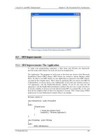
Practical Learning: Using Combo Box Methods
1. To create the list of flavors, in the OnInitDialog() event of the dialog class, type the
following:
CClarksvilleIceScream2Dlg::CClarksvilleIceScream2Dlg(CWnd* pParent /*=NULL*/)
: CDialog(CClarksvilleIceScream2Dlg::IDD, pParent)
, m_ContainerValue(0)
, m_TaxRate(_T("0.00"))
, m_SubTotal(_T("0.00"))
, m_TaxAmount(_T("0.00"))
, m_OrderTotal(_T("0.00"))
{
m_hIcon = AfxGetApp()->LoadIcon(IDR_MAINFRAME);
}
. . .
Chapter 20: List-Based Controls Visual C++ and MFC Fundamentals
656 © FunctionX, Inc.
BOOL CClarksvilleIceScream2Dlg::OnInitDialog()
{
CDialog::OnInitDialog();
// Set the icon for this dialog. The framework does this automatically
// when the application's main window is not a dialog
SetIcon(m_hIcon, TRUE); // Set big icon
SetIcon(m_hIcon, FALSE); // Set small icon
// TODO: Add extra initialization here
m_Topping.SetCurSel(0);
m_Scoops.SetCurSel(0);
m_Flavors.AddString("French Vanilla");
m_Flavors.AddString("Cream of Cocoa");
m_Flavors.AddString("Chocolate Chip");
m_Flavors.AddString("Cherry Coke");
m_Flavors.AddString("Butter Pecan");
m_Flavors.AddString("Chocolate Cooky");
m_Flavors.AddString("Chunky Butter");
m_Flavors.AddString("Vanilla Strawberry");
m_Flavors.AddString("Macedoine");
m_Flavors.AddString("Mint Chocolate");
m_Flavors.SetCurSel(6);
return TRUE; // return TRUE unless you set the focus to a control
}
2. Save All
20.2.4 Combo Box Messages and Events
When you add or create a combo box, an amount of space is allocated and during the
lifetime of your application, the combo box uses some memory to processing its
assignments. If at one time there is not enough memory for these processings, the combo
box sends an ON_CBN_ERRSPACE message.
Like any control, for the user to use the combo box, it must first have focus. This can be
done by the user clicking its edit part, its list part (for a Simple combo box) or its down
pointing arrow (for a drop type combo box). When the combo box receives focus, its
sends the ON_CBN_SETFOCUS message.
Once the control has focus, if the user clicks or had clicked the edit side of the combo
box that already had a selected item, if the user starts typing, which would modify the
string of the item that was already selected, the combo box would send the
ON_CBN_EDITCHANGE message (remember that the user can change the string only
if the combo box was not created as Drop List). If the user finishes typing or changing the
string, just before the altered string is validated, the combo box sends the
ON_CBN_EDITUPDATE message.
To select an item from a drop type combo box, the user usually clicks the down pointing
arrow button to display the control’s list. When the user clicks that button, just before the
list displays, the control sends the ON_CBN_DROPDOWN message. After this click
and this message, the list part of a drop combo box displays and the user must make a
decision:
Visual C++ and MFC Fundamentals Chapter 20: List-Based Controls
© FunctionX, Inc. 657
?? If the user finds the desired item in the list, he or she must let the combo box
know. This is done by highlighiting it. To do this, the user can either click (with
the mouse) or press the arrow keys (on the keyboard) to indicate his or her
choice. When this highlighting occurs, the combo box sends the
ON_CBN_SELCHANGE message, notifying the application that the combo
box’ selection may be changed soon
?? Once the user has found the desired item and has possibly highlighted it, if using
the mouse, he or she can click to select it. If using the keyboard, after locating
the item, the user can press Enter. Clicking the desired item or pressing Enter on
the highlighted string means that the user has made a definite selection. This
causes the control to send an ON_CBN_SELENDOK message, notifying the
application that the user has made his or her decision.
?? If the user did not find the desired item, he or she may want to dismiss the
combo box without making a selection. There are three main ways the user can
invalidate a selection. If the user clicks another control or another application, if
the list was displaying, it would retract and not selection would be made, event
if the user had already highlighted an item. If the user clicks either the edit box
part of the combo box for a Drop List type or the down pointing button, the
selection is dismissed and if the list of a drop type was displaying, it would
retract. If the user presses Esc, the selection would be dismissed.
Any of these actions causes the selection to be dismissed or the user to cancel
the selection action. This causes the combo box to send an
ON_CBN_SELENDCANCEL message.
Once the user has clicked an item or pressed Enter to validate a selection, if the combo
box was created not as Simple, the list part of the controls retracts to hide itself. At this
time, the combo box sends an ON_CBN_CLOSEUP message.
If the user finishes using the combo box and moves to another control, the combo box
sends an ON_CBN_KILLFOCUS message, notifying the application that it (the combo
box) has lost focus.
20.3 Image Lists
20.3.1 Introduction
An image list is an array of pictures of the same size. The pictures are created as a single
icon or bitmap and each icon or bitmap can be located using its index. The array is zero-
based, meansing that the first picture has an index of 0. The second has an index of 1, etc.
An image list is not a traditional control. It does not display to the user who in fact is
never aware of it. It is used to complement a control that needs a series of pictures for its
own display.
Practical Learning: Introducing Image Lists
1. Start a new MFC Application and name it AirCraft1
2. Create it as a Single Document based on CView, without the initial toolbar, and
change the Main Frame Caption to Air Craft Review
Chapter 20: List-Based Controls Visual C++ and MFC Fundamentals
658 © FunctionX, Inc.
3. Access the PreCreateWindow() event of the CMainFrame class and change it as
follows:
BOOL CMainFrame::PreCreateWindow(CREATESTRUCT& cs)
{
if( !CFrameWnd::PreCreateWindow(cs) )
return FALSE;
// TODO: Modify the Window class or styles here by modifying
// the CREATESTRUCT cs
cs.style &= ~FWS_ADDTOTITLE;
cs.cx = 420;
cs.cy = 280;
return TRUE;
}
4. Test the application and return to MSVC
20.3.2 Image List Creation
In an MFC application, an image list is based on the CImageList class. This object is
created in two main steps that do not necessarily follow each other. On one hand, you
must have the pictures that will make the list. On the other hand, you must have a
CImageList variable or pointer.
The easiest way is probaly to first create the picture. There are two kinds: masked or
nonmasked. A nonmasked image list is designed as an array of pictures where all pictures
have the same width and the same height but the pictures do not have to be square. Here
is an example:
A masked image list contains two pictures of the same with and height. Unlike the
unmasked image list, both pictures of the masked image normally represent the same
illustration. The first picture is in color and the second would be monochrome. Here is an
example:
To actually create an image list, declare a CImageList variable or pointer and call one of
its Create() methods to initialize it. It is provided in various versions as follows:
BOOL Create(int cx, int cy, UINT nFlags, int nInitial, int nGrow );
BOOL Create(UINT nBitmapID, int cx, int nGrow , COLORREF crMask );
BOOL Create(LPCTSTR lpszBitmapID, int cx, int nGrow , COLORREF crMask );
BOOL Create(CImageList& imagelist1, int nImage1,
CImageList& imagelist2, int nImage2, int dx, int dy);
BOOL Create(CImageList* pImageList);
The first version of this method allows you to describe the type of image list that will be
created. This is done by specifying the width (cx) of each picture, the height (cy) of each
picture, and a flag for the type of image list to create. The nInitial argument is the number
Visual C++ and MFC Fundamentals Chapter 20: List-Based Controls
© FunctionX, Inc. 659
of images that the image list will contain. The nGrow argument represents the number of
images by which the image list can grow.
If you had designed an unmasked bitmap using the image editor and you want to
initialize it, call the second or the third versions of the Create() method. The nBitmapID
argument is the identifier of the bitmap. If you want to provide the string that contains the
identifiers of the images, pass it as the lpszBitmapID argument. The cx value represents
the width of each picture. The crMask is the color used to mask the transparency of the
picture. Each pixel of the picture that matches this color will turn to black. Here is an
example of using this Create() method:
BOOL CAnimation1Dlg::OnInitDialog()
{
CDialog::OnInitDialog();
SetIcon(m_hIcon, TRUE); // Set big icon
SetIcon(m_hIcon, FALSE); // Set small icon
// TODO: Add extra initialization here
CImageList ImgList;
ImgList.Create(IDB_IMGLIST, 48, 4, RGB(255, 55, 5));
return TRUE; // return TRUE unless you set the focus to a control
}
Besides, or instead of using, the Create() method, you can call CImageList::Add() to
add a bitmap to the CImageList variable. Its syntaxes are:
int Add(CBitmap* pbmImage, CBitmap* pbmMask);
int A dd(CBitmap* pbmImage, COLORREF crMask);
int Add(HICON hIcon );
The pbmImage argument represents the bitmap to be added, unless you want to add an
icon, in which case you would use the third version. The pbmMask argument is the
bitmap that will be used to mask the image list. You can use a color instead, in which
case you would pass a COLORREF value as the second argument to the second version.
If you want to remove a picture from the image list, call the CImageList::Remove()
method. Its syntax:
BOOL Remo ve(int nImage);
The nImage argument is the index of the picture to be removed. Instead of removing a
picture, you can just replace it with another picture. This is done using the
CImageList::Replace() method whose syntaxes are:
BOOL Replace(int nImage, CBitmap* pbmImage, CBitmap* pbmMask);
int Replace(int nImage, HICON hIcon);
Once an image list is ready, you can use it directly in an application or make it available
to a control that can use it. One way you can use an image list is to display one or more of
its pictures on a dialog box, a form, or a view. To do this, you would call the
CImageList::Draw() method. Its syntax is:
BOOL Draw(CDC* pdc, int nImage, POINT pt , UINT nStyle);
Chapter 20: List-Based Controls Visual C++ and MFC Fundamentals
660 © FunctionX, Inc.
The first argument, pdc, specifies the device context on which you are drawing. The
nImage argument is the index of the picture you want to draw. The pt argument is a
POINT or a CPoint value that specifies the location of the new picture. The nStyle
argument is a flag that specifies how the picture will be drawn.
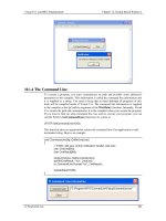
Practical Learning: Using an Image List
1. From the AirCraft folder that accompanies this book, import the following bitmaps
and change their IDs as follows:
File ID
AH64.bmp IDB_AH64
AH64SIDE.bmp IDB_AH64SIDE
AKIOWA.bmp IDB_AKIOWA
COMANCHE.bmp IDB_COMANCHE
2. In the header file of the view class, declare a private CImageList variable and name
it ImgList
3. In the header file of the view class, declare another private int variable and name it
nImage
4. In the constructor of the view class, initialize the image list and the nImage variable
as follows:
CAirCraft1View::CAirCraft1View()
{
// TODO: add construction code here
ImgList.Create(400, 180, ILC_COLOR, 4, 1);
CBitmap Bmp[4];
Bmp[0].LoadBitmap(IDB_AH64);
ImgList.Add(&Bmp[0], RGB(0, 0, 0));
Bmp[1].LoadBitmap(IDB_AH64SIDE);
ImgList.Add(&Bmp[1], RGB(0, 0, 0));
Bmp[2].LoadBitmap(IDB_AKIOWA);
ImgList.Add(&Bmp[2], RGB(0, 0, 0));
Bmp[3].LoadBitmap(IDB_COMANCHE);
ImgList.Add(&Bmp[3], RGB(0, 0, 0));
nImage = 0;
}
5. In the OnPaint() event of the view class, display an image by calling the
CImageList::Draw() method as follows:
void CAirCraft1View::OnDraw(CDC* pDC)
{
CAirCraft1Doc* pDoc = GetDocument();
ASSERT_VALID(pDoc);
ImgList.Draw(pDC, nImage, CPoint(255, 255, 255), ILD_NORMAL);
// TODO: add draw code for native data here
}
6. Open the IDR_MAINFRAME menu. Under the Status Bar menu item of View, add a
separator, followed by a new menu item captioned as &AH64 and press Enter
Visual C++ and MFC Fundamentals Chapter 20: List-Based Controls
© FunctionX, Inc. 661
7. Right-click the new menu item and click Add Event Handler…
8. Accept the Message Type as COMMAND. In the Class List, click CAirCraft1View.
Accept the name of the function. Then click Add And Edit and implement the event
as follows:
void CAirCraft1View::OnViewAh64()
{
// TODO: Add your command handler code here
nImage = 0;
Invalidate();
}
9. Again, under the View menu, create a new menu item with a caption as
A&H64 Side and press Enter
10. Add a COMMAND Event Handler for the new menu item. Associate it with the
view class and implement it as follows:
void CAirCraft1View::OnViewAh64side()
{
// TODO: Add your command handler code here
nImage = 1;
Invalidate();
}
11. Again, under the View menu, create a new menu item with a caption as A&kiowa
and press Enter
12. Add a COMMAND Event Handler for the new menu item. Associate it with the
view class and implement it as follows:
void CAirCraft1View::OnViewAkiowa()
{
// TODO: Add your command handler code here
nImage = 2;
Invalidate();
}
13. Again, under the View menu, create a new menu item with a caption as
&Commanche and press Enter
14. Add a COMMAND Event Handler for the new menu item. Associate it with the
view class and implement it as follows:
void CAirCraft1View::OnViewCommanche()
{
// TODO: Add your command handler code here
nImage = 3;
Invalidate();
}
15. Test the application
Chapter 20: List-Based Controls Visual C++ and MFC Fundamentals
662 © FunctionX, Inc.
16. Close it and return to MSVC
Visual C++ and MFC Fundamentals Chapter 21: Tree and List Controls
© FunctionX, Inc. 663
Chapter 21:
Tree and List Controls
? The Tree Control
? The Tree View
? The List Control
? The List View
Chapter 21: Tree and List Controls Visual C++ and MFC Fundamentals
664 © FunctionX, Inc.
21.1 The Tree Control
21.1.1 Overview
A tree control is an object that displays a hierarchical list of items arranged as a physical
tree but a little upside down. The items display in a parent-child format to show those that
belong to interrelated categories, such as parent to child and child to grandchild, etc; or
folder to subfolder to file. Here is an example of a tree list:
Figure 57: A Tree List With One Root
The starting item of the tree is sometimes called the root and represents the beginning of
the tree. While most tree list have one root, it is not unusual to have a tree list that has
many roots, as long as the tree creator judges it necessary. Here is an example:
Figure 58: A Tree List With Various Roots
Each item, including the root, that belongs to the tree is referred to as a node. An item
that belongs to, or depends on, another can also be called a leaf. In the following charts,
the down arrow means, "has the following child or children":
Visual C++ and MFC Fundamentals Chapter 21: Tree and List Controls
© FunctionX, Inc. 665
A tree list is not limited to a one-to-one correspondence. Not only can an item have more
than one dependency, but also a child can make the tree stop at any category. Categories
of a tree list are organized by levels. The most used trees have one parent. Here is an
example representing the world and some countries:
The children of a parent are recognized by their belonging to the same level but can have
different behaviors; for example, while one child might have another child (or other
children), an item on the same level does not necessarily abide by a set rule. Everything
usually depends on the tree designer.
The concept of a tree list is implemented in the MFC library by the CTreeCtrl. To create
a tree list on a dialog box or a form, at design time, on the Controls toolbox, click the
Tree Control button and click the desired area on a dialog box or a form:
Chapter 21: Tree and List Controls Visual C++ and MFC Fundamentals
666 © FunctionX, Inc.
Figure 59: A Newly added Tree Control
Alternatively, to programmatically create a tree list, declare a variable or a pointer to
CTreeCtrl. To initialize the control, call its Create() method. Here is an example:
private:
CTreeCtrl *TreeSoft;
};
CControlsDlg::CControlsDlg(CWnd* pParent /*=NULL*/)
: CDialog(CControlsDlg::IDD, pParent)
{
//{{AFX_DATA_INIT(CControlsDlg)
// NOTE: the ClassWizard will add member initialization here
//}}AFX_DATA_INIT
m_hIcon = AfxGetApp()->LoadIcon(IDR_MAINFRAME);
TreeSoft = new CTreeCtrl;
}
CControlsDlg::~CControlsDlg()
{
delete TreeSoft;
}
BOOL CControlsDlg::OnInitDialog()
{
CDialog::OnInitDialog();
SetIcon(m_hIcon, TRUE); // Set big icon
SetIcon(m_hIcon, FALSE); // Set small icon
// TODO: Add extra initialization here
TreeSoft ->Create(WS_CHILD | WS_VISIBLE | WS_BORDER | WS_TABSTOP,
CRect(10, 10, 240, 280), this, 0x1221);
return TRUE; // return TRUE unless you set the focus to a control
}
Practical Learning: Creating a Tree List
1. Create a new Dialog Based MFC Application named CarInventory2 without the
About Box and set the Dialog Title to Car Inventory
Visual C++ and MFC Fundamentals Chapter 21: Tree and List Controls
© FunctionX, Inc. 667
2. Resize the dialog box to 430 x 230
3. On the dialog box, delete the TODO line and the OK button
4. Change the caption of the Cancel button to Close
5. From the Controls toolbox, click the Tree Control button and click on the left
area of the dialog box
6. Change its ID to IDC_CAR_TREE
7. Set its location to 7, 7 and its dimensions to 114 x 216
21.1.2 Tree List Properties
As mentioned already, a tree list is meant to
display items in a list driven by a root and
followed by one or more leaves. The items are
mainly made of text. Optionally, to display a
check box on the left side of the text, set the
Check Boxes property to True or add the
TVS_CHECKBOXES style (if you are using
MSVC 6 and you had added the Tree Control
button to the form or dialog box, open the
resource file as text and manually add this style
because it may not be available on the
Properties window).
To guide the user with the tree items, the control uses tool tips. If you will need access to
the information stored in tool tips, set the Info Tip property to True or add the
TVS_INFOTIP style. If you do not want to display tool tips, set the Tool Tips property
to False or create it with the TVS_NOTOOLTIPS style.
Chapter 21: Tree and List Controls Visual C++ and MFC Fundamentals
668 © FunctionX, Inc.
When a node has children or leaves, to show this, you
may want to display lines connecting these
relationships. To do this at design time, set the Has
Lines proeprty to True:
If you are programmatically creating the control and
you want to display lines among related nodes, add
the TVS_HASLINES style.
A node that has dependent children can display or
hides them. To display its leaves, a node must be
expanded. To hide its leaves, a node must collapse.
These operations must be obvious to the user but
something should indicate whether a node has
dependent or not. This can be illustrated by a button
that accompany such a node. To add these buttons to
the control, at design time, set the Has Buttons
property to True. This is equivalent to dynamically
creating a tree list with the TVS_HASBUTTONS
style:
Unless you have a reason to do otherwise, it is usually
a good idea to combine both the Has Buttons (or
TVS_HASBUTTONS) and the Has Lines (or
TVS_HASLINES ) styles:
To show which item is the root, or which items play the roles of roots, of the tree list, you
can display a line from the root(s) to the child(ren). To do this, at design time, set the
Lines At Root property to True or add the TVS_LINESATROOT style. The line from
the root(s) to to the child(ren) can display only if the control has the Has Lines property
set to True or the TVS_HASLINES style.
When using the list, the user typically selects an item
by clicking it. If you want the mouse cursor to turn into
a pointer finger and to underline the item when the
mouse is over the node, set the Track Select property
to True or create the control with the
TVS_TRACKSELECT style.
Once the mouse pointer is on top of the desired item,
the user can click to select it.
When the user clicks another control or another application, the node that was selected
would lose its selection as the tree control would have lost focus. If you want the tree to
always show the selected item even if the control loses focus, set its Show Selection
Visual C++ and MFC Fundamentals Chapter 21: Tree and List Controls
© FunctionX, Inc. 669
Always property to True or create the control with the TVS_SHOWSELALWAYS
style.
Besides selecting an item, when a node has children, to expand it, the user can double-
click the node or click its button if available. Simply selecting the node does not expand
it. If you want the selected node to automatically expand without the user having to
double-click or click its button, set its Single Expand property to True or create it with
the TVS_SINGLEEXPAND style.
When the items of a tree control display or when the nodes expand, they may span
beyond the allocated rectangle of the control. When this happens, a vertical and/or a
horizontal scroll bars may automatically display. This is because, by default, the Scroll
property is set to True. If you do not want any scroll bar, set the Scroll property to False
or create the control with the TVS_NOSCROLL style.
Another operation the user can perform on a node consists of changing its text. If you
want to allow this, set the control’s Edit Labels to True or add the TVS_EDITLABELS
style to it.
A user can be allowed to add items to the list by drag-n-drop operations. If you want to
prevent this, set the Disable Drag Drop property to True or create the control with the
TVS_DISABLEDRAGDROP style.
Practical Learning: Configuring a Tree Control
1. On the dialog box, click the tree control to select it. On the Properties window set the
Has Buttons, the Has Lines and the Lines At Root properties to True
2. Also set the Client Edge and the Modal Frame properties to True
3. Add a Control Variable to the tree object and name it m_CarTree
4. Save All
21.1.3 Tree Controls Methods
After adding or creating a tree control, you may want to fill it with the necessary items.
Each node of the control is an HTREEITEM. To create a new node, call the
CTreeCtrl::InsertItem() method. It comes in various versions. One of them is:
HTREEITEM InsertItem( LPCTSTR lpszItem, HTREEITEM hParent = TVI_ROOT,
HTREEITEM hInsertAfter = TVI_LAST );
The easiest way to add an item consists of calling the InsertItem() method with a null-
terminated string as argument because this is the only required argument of this version.
Here is an example:
BOOL CControlsDlg::OnInitDialog()
{
CDialog::OnInitDialog();
SetIcon(m_hIcon, TRUE); // Set big icon
SetIcon(m_hIcon, FALSE); // Set small icon
// TODO: Add extra initialization here
TreeSoft ->Create(WS_CHILD | WS_VISIBLE | WS_BORDER | WS_TABSTOP |
Chapter 21: Tree and List Controls Visual C++ and MFC Fundamentals
670 © FunctionX, Inc.
TVS_HASLINES | TVS_HASBUTTONS | TVS_LINESATROOT |
TVS_SINGLEEXPAND | TVS_SHOWSELALWAYS |
TVS_TRACKSELECT,
CRect(10, 10, 200, 100), this, 0x1221);
TreeSoft ->InsertItem("Office Production");
return TRUE; // return TRUE unless you set the focus to a control
}
In this case, the item would appear as the root. You can add as many nodes like that and
each would appear as a root:
BOOL CControlsDlg::OnInitDialog()
{
CDialog::OnInitDialog();
SetIcon(m_hIcon, TRUE); // Set big icon
SetIcon(m_hIcon, FALSE); // Set small icon
// TODO: Add extra initialization here
TreeSoft ->Create(WS_CHILD | WS_VISIBLE | WS_BORDER | WS_TABSTOP |
TVS_HASLINES | TVS_HASBUTTONS | TVS_LINESATROOT |
TVS_SINGLEEXPAND | TVS_SHOWSELALWAYS |
TVS_TRACKSELECT,
CRect(10, 10, 200, 100), this, 0x1221);
TreeSoft ->InsertItem("Office Production");//, TVI_ROOT);
TreeSoft ->InsertItem("Company Management");
TreeSoft ->InsertItem("Software Development");
TreeSoft ->InsertItem("Human Interaction");
return TRUE; // return TRUE unless you set the focus to a control
}
Figure 60: A Tree List With All Items As Roots
When calling this version of the InsertItem() method, if you do not pass the second
argument, the node is created as root. This is because the root item has an HTREEITEM
value of TVI_ROOT, which is passed as default. You can also pass the second argument
as NULL, which would produce the same effect.
The InsertItem() method returns an HTREEITEM value. You can use this value as a
parent to a leaf item. This is done by passing it as the second argument when creating a
leaf. Here is an example:
BOOL CControlsDlg::OnInitDialog()
{
CDialog::OnInitDialog();
Visual C++ and MFC Fundamentals Chapter 21: Tree and List Controls
© FunctionX, Inc. 671
SetIcon(m_hIcon, TRUE); // Set big icon
SetIcon(m_hIcon, FALSE); // Set small icon
// TODO: Add extra initialization here
TreeSoft ->Create(WS_CHILD | WS_VISIBLE | WS_BORDER | WS_TABSTOP |
TVS_HASLINES | TVS_HASBUTTONS | TVS_LINESATROOT |
TVS_SINGLEEXPAND | TVS_SHOWSELALWAYS |
TVS_TRACKSELECT,
CRect(10, 10, 200, 200), this, 0x1221);
HTREEITEM hTree, hCompany;
hTree = TreeSoft ->InsertItem("Software Production", TVI_ROOT);
hCompany = TreeSoft ->InsertItem("Microsoft", hTree);
TreeSoft ->InsertItem("Office", hCompany);
TreeSoft ->InsertItem("Visual Studio", hCompany);
TreeSoft ->InsertItem("Servers", hCompany);
hCompany = TreeSoft ->InsertItem("Jasc", hTree);
TreeSoft ->InsertItem("Paint Shop Pro", hCompany);
TreeSoft ->InsertItem("Animation Shop", hCompany);
hCompany = TreeSoft ->InsertItem("Lotus", hTree);
TreeSoft ->InsertItem("Notes", hCompany);
TreeSoft ->InsertItem("Smart Office", hCompany);
hCompany = TreeSoft ->InsertItem("Macromedia", hTree);
TreeSoft ->InsertItem("Flash", hCompany);
return TRUE; // return TRUE unless you set the focus to a control
}
When using the InsertItem() method as we have done so far, the items are added in the
order of their appearance. Besides creating new nodes, the InsertItem() methods also
allows you to control the order in which to insert the new item. The new leaf can be
added as the first or the last child of a node. To do this, pass a third argument to this
version of the InsertItem() method and give it the TVI_FIRST to be the first child or
TVI_LAST to be the last child of the current parent node. Consider the following
example:
BOOL CControlsDlg::OnInitDialog()
{
CDialog::OnInitDialog();
SetIcon(m_hIcon, TRUE); // Set big icon
Chapter 21: Tree and List Controls Visual C++ and MFC Fundamentals
672 © FunctionX, Inc.
SetIcon(m_hIcon, FALSE); // Set small icon
// TODO: Add extra initialization here
TreeSoft ->Create(WS_CHILD | WS_VISIBLE | WS_BORDER | WS_TABSTOP |
TVS_HASLINES | TVS_HASBUTTONS | TVS_LINESATROOT |
TVS_SINGLEEXPAND | TVS_SHOWSELALWAYS |
TVS_TRACKSELECT,
CRect(10, 10, 220, 200), this, 0x1221);
HTREEITEM hTree, hCompany;
hTree = TreeSoft ->InsertItem("Software Production", TVI_ROOT);
hCompany = TreeSoft ->InsertItem("Microsoft", hTree);
TreeSoft ->InsertItem("Office", hCompany);
TreeSoft->InsertItem("Graphics Manipulation", hCompany, TVI_LAST);
TreeSoft ->InsertItem("Project Management", hCompany);
TreeSoft ->InsertItem("Software Develoment", hCompany);
TreeSoft->InsertItem("Operating Systems", hCompany, TVI_FIRST);
TreeSoft ->InsertItem("Software Documentation", hCompany);
hCompany = TreeSoft ->InsertItem("Jasc", hTree);
TreeSoft ->InsertItem("Paint Shop Pro", hCompany);
TreeSoft ->InsertItem("Animation Shop", hCompany);
hCompany = TreeSoft ->InsertItem("Lotus", hTree);
TreeSoft ->InsertItem("Notes", hCompany);
TreeSoft ->InsertItem("Smart Office", hCompany);
hCompany = TreeSoft ->InsertItem("Macromedia", hTree);
TreeSoft ->InsertItem("Flash", hCompany);
return TRUE; // return TRUE unless you set the focus to a control
}
Practical Learning: Configuring a Tree Control
1. To create the items for the tree control, access the OnInitDialog() event of the
CCarInventory2Dlg class and type the following:
BOOL CCarInventory2Dlg::OnInitDialog()
{
CDialog::OnInitDialog();
// Set the icon for this dialog. The framework does this automatically
// when the application's main window is not a dialog
Visual C++ and MFC Fundamentals Chapter 21: Tree and List Controls
© FunctionX, Inc. 673
SetIcon(m_hIcon, TRUE); // Set big icon
SetIcon(m_hIcon, FALSE); // Set small icon
// TODO: Add extra initialization here
HTREEITEM hItem, hCar;
hItem = m_CarTree.InsertItem("Car Listing", TVI_ROOT);
hCar = m_CarTree.InsertItem("Economy", hItem);
m_CarTree.InsertItem("BH-733", hCar);
m_CarTree.InsertItem("SD-397", hCar);
m_CarTree.InsertItem("JU-538", hCar);
m_CarTree.InsertItem("DI-285", hCar);
m_CarTree.InsertItem("AK-830", hCar);
hCar = m_CarTree.InsertItem("Compact", hItem);
m_CarTree.InsertItem("HG-490", hCar);
m_CarTree.InsertItem("PE-473", hCar);
hCar = m_CarTree.InsertItem("Standard", hItem);
m_CarTree.InsertItem("SO-398", hCar);
m_CarTree.InsertItem("DF-438", hCar);
m_CarTree.InsertItem("IS-833", hCar);
hCar = m_CarTree.InsertItem("Full Size", hItem);
m_CarTree.InsertItem("PD-304", hCar);
hCar = m_CarTree.InsertItem("Mini Van", hItem);
m_CarTree.InsertItem("ID-497", hCar);
m_CarTree.InsertItem("RU-304", hCar);
m_CarTree.InsertItem("DK-905", hCar);
hCar = m_CarTree.InsertItem("SUV", hItem);
m_CarTree.InsertItem("FE-948", hCar);
m_CarTree.InsertItem("AD-940", hCar);
hCar = m_CarTree.InsertItem("Truck", hItem);
m_CarTree.InsertItem("HD-394", hCar);
return TRUE; // return TRUE unless you set the focus to a control
}
2. Execute the program to test the tree control
3. Close it and return to MSVC
Chapter 21: Tree and List Controls Visual C++ and MFC Fundamentals
674 © FunctionX, Inc.
4. Import the cars from the Cars folder that accompany this book and change their IDs
accordingly to their file name. An example would be IDB_CIVIC for the civic.mdb
5. Design the rest of the dialog box with additional controls as follows:
Control ID Caption Other Properties
Picture 238 x 216
Static Text Make:
Edit Box IDC_MAKE
Static Text Model:
Edit Box IDC_MODEL
Static Text Year:
Edit Box IDC_YEAR Align Text: Right
Number: True
Static Text Doors:
Edit Box IDC_DOORS Align Text: Right
Number: True
Static Text Mileage:
Edit Box IDC_MILEAGE Align Text: Right
Number: True
Static Text Transmission:
Combo Box IDC_TRANSMISSION Type: Drop List
Data: Automatic;Manual
Group Box Options
Check Box IDC_AC Air Condition Left Text: True
Check Box IDC_AIR_BAGS Air Bags Left Text: True
Check Box IDC_CRUISE_CONTROL Cruise Control Left Text: True
Check Box IDC_CONVERTIBLE Convertible Left Text: True
Check Box IDC_CASSETTE Cassette Left Text: True
Check Box IDC_CD_PLAYER CD Player Left Text: True
Picture IDC_PICTURE Type: Bitmap
Image: IDB_ESCORT
Center Image: True
Dimensions: 210x 86
6. Add a variable to each non-static control as follows:
Value Variable Control Variable
ID
Type Name Type Name
IDC_MAKE CString
m_Make
IDC_MODEL CString
m_Model
Visual C++ and MFC Fundamentals Chapter 21: Tree and List Controls
© FunctionX, Inc. 675
IDC_YEAR int m_Year
IDC_DOORS int m_Doors
IDC_MILEAGE long m_Mileage
IDC_TRANSMISSION int m_Transmission
IDC_AC BOOL m _AC
IDC_AIR_BAGS BOOL m _AirBags
IDC_CRUISE_CONTROL
BOOL m _CruiseControl
IDC_CONVERTIBLE BOOL m _Convertible
IDC_CASSETTE BOOL m _Cassette
IDC_CD_PLAYER BOOL m _CDPlayer
IDC_PICTURE BOOL CStatic m_Picture
7. Save All
21.1.4 Tree Control Messages
Most messages of the tree controls are notification messages that are sent to its parent
window. For example, the NM_CLICK message is sent to the dialog box or the form,
that acts as the parent, that the tree control has been clicked. If the click was done with
the right mouse button, the NM_RCLICK message is sent instead. In the same way, if
the user double-clicks the control an NM_DBLCLK message is sent. If the user double-
clicked with the right mouse button, the NM_CDBLCLK message is sent.
As mentioned already, the user has the ability to expand a node that has at least one child.
When the user initiates an action that would expand a node, the tree control sends a
TVN_ITEMEXPANDING. After the item has expanded, the control sends the
TVN_ITEMEXPANDED message.
Practical Learning: Using Tree Control Messages
1. On the dialog box, right-click the tree control and click Add Event Handler…
2. In the Message Type list box, click TVN_SELCHANGED. In the Class List, make
sure CCarInventory2Dlg is selected
3. In the Function Handle Name, change the name to OnCarSelectedChange and click
Add And Edit
4. Implement the OnPaint and the OnCarSelectedChange events as follows:
void CCarInventory2Dlg::OnPaint()
{
CPaintDC dc(this); // device context for painting
// Change the car picture based on the selected tag
CTreeCtrl *pTree = re interpret_cast<CTreeCtrl
*>(GetDlgItem(IDC_CAR_TREE));
HTREEITEM hTree = pTree->GetSelectedItem();
CString ItemSelected;
CBitmap Bmp;
ItemSelected = pTree->GetItemText(hTree);
if( ItemSelected == "BH-733" )
Chapter 21: Tree and List Controls Visual C++ and MFC Fundamentals
676 © FunctionX, Inc.
{
Bmp.LoadBitmap(IDB_FOCUS);
m_Picture.SetBitmap(Bmp);
}
else if( ItemSelected == "HD-394" )
{
Bmp.LoadBitmap(IDB_EMPTY);
m_Picture.SetBitmap(NULL);
}
else if( ItemSelected == "SD-397" )
{
Bmp.LoadBitmap(IDB_EMPTY);
m_Picture.SetBitmap(NULL);
}
else if( ItemSelected == "PD-304" )
{
Bmp.LoadBitmap(IDB_GRANDMARQUIS);
m_Picture.SetBitmap(Bmp);
}
else
{
Bmp.LoadBitmap(IDB_EMPTY);
m_Picture.SetBitmap(NULL);
}
if (IsIconic())
{
SendMessage(WM_ICONERASEBKGND,
reinterpret_cast<WPARAM>(dc.GetSafeHdc()), 0);
// Center icon in client rectangle
int cxIcon = GetSystemMetrics(SM_CXICON);
int cyIcon = GetSystemMetrics(SM_CYICON);
CRect rect;
GetClientRect(&rect);
int x = (rect.Width() - cxIcon + 1) / 2;
int y = (rect.Height() - cyIcon + 1) / 2;
// Draw the icon
dc.DrawIcon(x, y, m_hIcon);
}
else
{
CDialog::OnPaint();
}
}
// The system calls this function to obtain the cursor to display while the user drags
// the minimized window.
HCURSOR CCarInventory2Dlg::OnQueryDragIcon()
{
return static_cast<HCURSOR>(m_hIcon);
}
void CCarInventory2Dlg::OnCarSelectedChange(NMHDR *pNMHDR, LRESULT
*pResult)
{
LPNMTREEVIEW pNMTreeView = reinterpret_cast<LPNMTREEVIEW>(pNMHDR);
// TODO: Add your control notification handler code here
Visual C++ and MFC Fundamentals Chapter 21: Tree and List Controls
© FunctionX, Inc. 677
*pResult = 0;
CTreeCtrl *pTree = reinterpret_cast<CTreeCtrl
*>(GetDlgItem(IDC_CAR_TREE));
HTREEITEM hTree = pTree->GetSelectedItem();
CString ItemSelected;
CBitmap Bmp;
ItemSelected = pTree->GetItemText(hTree);
if( ItemSelected == "BH-733" )
{
m_Make.Format("%s", "Ford");
m_Model.Format("%s", "Focus");
m_Year = 2000;
m_Doors = 4;
m_Mileage = 72804;
m_Transmission = 1;
m_AC = TRUE;
m_AirBags = TRUE;
m_CruiseControl = FALSE;
m_Convertible = FALSE;
m_Cassette = FALSE;
m_CDPlayer = FALSE;
}
else if( ItemSelected == "HD-394" )
{
m_Make.Format("%s", "Ford");
m_Model.Format("%s", "F150");
m_Year = 2002;
m_Doors = 4;
m_Mileage = 28845;
m_Transmission = 0;
m_AC = TRUE;
m_AirBags = TRUE;
m_CruiseControl = FALSE;
m_Convertible = FALSE;
m_Cassette = TRUE;
m_CDPlayer = FALSE;
}
else if( ItemSelected == "SD-397" )
{
m_Make.Format("%s", "Daewoo");
m_Model.Format("%s", "Lanos");
m_Year = 2000;
m_Doors = 4;
m_Mileage = 94508;
m_Transmission = 1;
m_AC = TRUE;
m_AirBags = TRUE;
m_CruiseControl = FALSE;
m_Convertible = FALSE;
m_Cassette = TRUE;
m_CDPlayer = FALSE;
}
else if( ItemSelected == "PD-304" )
{
m_Make.Format("%s", "Mercury");
Chapter 21: Tree and List Controls Visual C++ and MFC Fundamentals
678 © FunctionX, Inc.
m_Model.Format("%s", "Grand Marquis");
m_Year = 2000;
m_Doors = 4;
m_Mileage = 109442;
m_Transmission = 0;
m_AC = TRUE;
m_AirBags = TRUE;
m_CruiseControl = TRUE;
m_Convertible = FALSE;
m_Cassette = TRUE;
m_CDPlayer = FALSE;
}
else
{
m_Make.Format("%s", "");
m_Model.Format("%s", "");
m_Year = 0;
m_Doors = 0;
m_Mileage = 0;
m_Transmission = 0;
m_AC = FALSE;
m_AirBags = FALSE;
m_CruiseControl = FALSE;
m_Convertible = FALSE;
m_Cassette = FALSE;
m_CDPlayer = FALSE;
}
CRect RectPicture;
m_Picture.GetWindowRect(&RectPicture);
ScreenToClient(&RectPicture);
InvalidateRect(&RectPicture);
UpdateData(FALSE);
}
5. Test the application
6. Close it and return to MSVC


