Creative Photoshop CS4 Digital Illustration and Art Techniques - phần 6 pdf
Bạn đang xem bản rút gọn của tài liệu. Xem và tải ngay bản đầy đủ của tài liệu tại đây (7.7 MB, 44 trang )
208
Part Three: Real World Photoshop
12
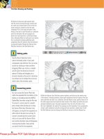
31 Return to the scan5.jpg file. Draw a lasso-based
selection around the small dry brush stroke in the upper
left-hand corner. Copy it and return to the working file.
Paste this into a new alpha channel. Load a selection
from the channel and, while the selection is active,
create a new solid color layer. This time, specify a
purple fill. Drag this layer up above all of the other
fill color layers in the Layers palette so that it resides
directly beneath the sketch layer. Use Free-Transform to
adjust the size, rotation, and positioning of the stroke so
that it is similar to that which is shown here.
Stacking and blending layers
By duplicating layers and varying blending modes, you can enhance and brighten specific image components.
1 Change the blending mode of the
current layer to linear burn. Don’t be
alarmed just yet. We’ll improve upon
this right now. Duplicate the layer and
then change the blending mode of the
duplicate to hard light. There, that’s
better. Now, duplicate the layer again
and select the Move tool.
2 Use the Move tool to move the
contents of the newly duplicated
layer up and toward the right of the
canv
as, creating an offset effect.
Now, duplicate this layer and then
double-click on the newly duplicated
layer’s thumbnail to access the
picker. Change the layer’s fill color
to orange.
3 Change the blending mode of the layer to
multiply and mo
ve it down and to the right
with the Mo
ve tool. Duplicate this layer and
then move it up and to the left a little. And
finally, duplicate this layer and use Free-
Transform to scale it down and move it
over near the eye at the right of the canvas.
209
Chapter 12: Sketch and Dry Brush Effects
12
PART SEVEN: Adding painted, wispy clouds
32 For the sake of order, select all of the dry
brush solid color layers in the Layers palette
and group them. Name the group something
appropriate. Next, open up the scan6.jpg file.
The initial procedure here is exactly like what
you did previously with the dry brush strokes.
Draw a lasso-based selection around a section
of painted cloud. Copy it and return to the
working file. Paste it into a new channel. Load
the channel as a selection, but don’t create a
solid color layer this time. In the Layers palette,
create a new layer. Click on the Foreground
Color swatch in the toolbar to open the picker.
Select a very light yellow color from the picker.
Type Alt(PC)/Option(Mac)-Delete to fill the
active selection on the new layer with the new
foreground color. Do not deselect.
33 Select the Move tool. Your selection border will likely be visible only in small
c
lusters due to the nature of this channel-based selection. P
osition the Move tool
over a selected area. When you are confident that the tool lies completely inside a
selection border, hold down the Alt(PC)/Option(Mac) key and drag to another area
of the canvas. This will duplicate the contents of the selection within the same layer.
Make a number of duplicates using this method, and feel free to alter size, shape,
and rotation via Free-Transform. Repeat this entire process to create different cloud
shapes on this layer, generated from different portions of the scan6.jpg file. Try filling
some of the new channel-based selections with white instead of yellow. The results
are subtle, but add to the overall tactile, painterly feel. Deactivate any active selection.
Move carefully
When you are trying to duplicate the
contents of an active selection within
the same layer, it is very important that
you Alt(PC)/Option(Mac)-drag while
clicking inside a selection border. If
you accidentally Alt(PC)/Option(Mac)-
drag outside of a selected area with the
Move tool, it will duplicate the entire
layer. You may not notice this in the
image window right away, but have a
look in the Layers palette and you’ll see
that your layer has been copied.
210
Part Three: Real World Photoshop
12
PART EIGHT: Color via shape layers
34 Select the Pen tool. In the Tool Options bar,
ensure that the Pen tool is set to create shape
layers as you draw. The Shape Area option will
automatically be set to create a new shape layer.
At the right, in the Tool Options bar, click on the
Color swatch. This will open the picker. Select
a lime green color from the picker. After you’ve
specified the color of the new shape layer,
zoom in on the figure at the lower left. Carefully
draw a closed shape that fills the inside of his
head with color. It doesn’t have to be perfect as
imperfection is part of the overall feel of this
image. However, try not to stray outside of the
black outline on the sketch layer above.
35 In the Tool Options bar, enable the Add to Shape Area option. This will allow
you to cr
eate further shapes on the same layer in addition to the existing shapes.
Use the Pen tool to create a solid shape that fills this figure’s glove with the same
green color. Repeat the process with the other two figures, adding green fill areas
to torsos, arms, and legs.
Editing shapes
When you’re using the Pen tool to create
shapes, you can edit the line segments,
points, or Bezier handles quickly with
the Direct Selection tool. To temporarily
access the Direct Selection tool while
the Pen tool is selected, simply hold
down the Control(PC)/Command(Mac)
key. When you are finished editing your
shape components directly, release the
Control(PC)/Command(Mac) key and the
Pen tool will return.
211
Chapter 12: Sketch and Dry Brush Effects
12
36 Return to the Tool Options bar. Click on the Create New Shape Area option and set
the color of the new shape layer to a light orange. Use the Pen tool to draw a closed
shape around the head of the figure at the upper left of the canvas, filling it with
orange. Then, enable the Add to Shape Area operation and draw some more closed
shapes within the same layer. Create shape areas that fill the right figure’s gloves
and the center of the flowers on the skull with color.
37 Repeat this process to create another new shape layer.
This time, specify a purple fill color. Initially create a shape
that fills the figure’s hand at the upper left with color. Then,
enable the Add to Shape Area operation and draw a closed
shape that fills the figure’s shirt at the lower left with purple.
This figure’s pants have a strap that comes up over one
shoulder. Rather than meticulously draw around that area,
just let it be filled with purple for now. We’ll fix that up with
another shape layer next.
212
Part Three: Real World Photoshop
12
38 Again, enable the Create New Shape Layer operation in the Tool Options bar, and specify a light blue fill color. Carefully draw a
closed shape around the skull. Ensure that you do not include the large flowers within the shape area as you draw. Carefully draw around
them. When you have closed this shape, enable the Add to Shape Area operation in the Tool Options bar. Now, draw additional closed
shapes within the same shape layer that fill remaining areas of the figures with light blue. Pay special attention to filling the pants and
shoulder strap of the figure at the bottom left. Although this area is filled with purple on the underlying layer, this obscures it perfectly.
39 Next, enable the Subtract from Shape Area operation in the Tool Options bar. With this function enabled, draw a closed shape around
the perimeter of one of the eye holes in the skull. As you begin to draw, you’ll immediately notice the results of the Subtract operation as
it literally cuts a hole in the shape surrounding it. With this operation enabled, draw closed shapes around the other regions of the skull
that should not be filled with blue.
213
Chapter 12: Sketch and Dry Brush Effects
12
PART NINE: Add shading and painted details
40 Let’s continue to impose order on the chaos
inside the Layers palette. Group all of the shape
layers and name the group. This is also a good
time to name the clouds layer if you haven’t
already. Now, the shape layers we just created are
an excellent way to fill areas with color. However,
when I look at the illustration in its current state,
it seems a little too flat, lacking fine detail. To
remedy this, we’re going to paint some shaded
regions, highlights, and colored details onto the
figures. Begin by selecting the Brush tool. Select
a hard, round Brush preset from the list of options
in the Brush Preset picker in the Tool Options bar.
Open up the Brushes palette and have a look at
the properties of the Brush preset you’ll be using.
I use a pressure-sensitive tablet and here you can
see that the stylus pressure controls the size of
the brush I’m using. If this is not your cup of tea,
feel free to disable shape dynamics.
41 Also, it is important to point out that we’re not doing any form of advanced painting here; so if you don’t use a tablet, it doesn’t matter.
Create a new layer and zoom in on a region of the image that requires flat, colored detail. Set your brush tip diameter accordingly and select
an appropriate foreground color from the picker. Set the opacity of the brush to around 70% or 80% in the Tool Options bar. This will still
allow for a subtle layered effect to be built up within the layer as you paint strokes that overlap each other. Carefully paint some solid color
into the desired region on the new layer. When you’re finished, apply some paint into other regions that require the same color. After that,
choose a different foreground color for another region. Repeat this process until all of the solid detail regions are painted.
214
Part Three: Real World Photoshop
12
42 Create a new layer. This time, either select a
very soft, round Brush Tip preset from the Brush
Preset picker, or simply reduce the hardness
of your current brush to zero. Also reduce the
opacity of the brush to around 40% in the Tool
Options bar. We are going to gently build up paint
in shaded regions on this new layer. The process
is the same as before. Simply select a color and
start to paint it into the appropriate region on this
layer. Take your time and paint the appropriate
dark colors into areas that require shading,
changing your brush size and opacity as required.
Choose lighter colors to paint highlights onto
raised or protruding areas within the image. To
create a very dark or very light region, build up
numerous strokes in the same area.
PART TEN: Throw some paint around
43 Open up the scan7.jpg file. This file contains all the
drips and paint splatters. We’re going to use these to
further the overall feeling of tactile imperfection within
the image. Use the Lasso to draw a rough selection
border around a single paint drip, cluster of drops, or
section of splatter. Copy it and return to the working
file. Create a new alpha channel and paste the copied
art into it. Feel free to alter the size of the pasted art in
the channel via Free-Transform. Load the channel as a
selection and then return to the Layers palette. Create
a new layer and fill the selection on the new layer with
the color of your choice. Feel free to alter the blending
mode to give the splatter a translucent appearance.
This selection was filled with blue before I deactivated
it. Then the blending mode was changed to multiply.
215
Chapter 12: Sketch and Dry Brush Effects
12
44 Repeat this procedure over and over again until you have a multicolored splatter effect across the entire canvas. Feel free to move your
splatter layers above or below each other. When you’re finished, select all of the splatter layers in the Layers palette and group them. Name the
group and then drag it above the sketch layer so that it sits
at the top of the stack in the Layers palette
.
PART ELEVEN: Final adjustments
45 Now that the sketches, paint drips, dried marker drawing, and dry brush strokes have been used effectively; take a break and have a
good look at the final result. In my opinion, the color is lacking overall. It looks a little faded or washed out. In the Adjustments palette,
click on the Hue/Saturation button to create a new hue/saturation adjustment layer. When the sliders appear in the Adjustments palette,
increase the saturation greatly by around 40. You will immediately notice the color within the image spring to life. Now the only thing
lacking is the density of the blacks within the image. To remedy this, duplicate the sketches layer. Reduce the opacity of the duplicate layer
to around 40% so that the results are not overpowering.
216
Part Three: Real World Photoshop
12
A practical application
Bits and pieces of this technique can come in handy when you are creating something a little more conventional. In this
editorial illustration, the method of using the sketch on a layer with a multiply blending mode works well. Although this
chapter’s illustrated patterns and brush stroke effects are entirely absent in this composition, the way that the sketch
blends with the photographed page looks authentic and conveys a tactile feeling.
217
Chapter 12: Sketch and Dry Brush Effects
12
Same techniques, different media
Although the media has changed in this instance from dry brush India ink and pencil sketches to felt-tipped pen and
watercolor, the core of the process remains more or less the same. The solid regions of the alien bodies were filled using
shape layers, then detail and shading was painted onto a series of layers above. This process of building an image from
scanned tactile components can incorporate almost any form of traditional media.
Chapter 13: Simulated Screen-Printing
13
Simulated
Screen-
Printing
M
any years ago, I used to work as a one-man art
department at a silkscreen-printing house. This was
so long ago that for the first year or so there was no
computer at all in the art department. I used to do all of
the original artwork and color separations manually. When it came
to adding shading to the designs, I used to have all of these great
peel-and-stick halftone sheets made by Letraset at my disposal.
There were different densities to mimic different percentages of color
where required. There were different patterns to choose from, mainly
dominated by dots and lines. But for some reason, I always tended
to gravitate toward the line patterns. There was just something about
them that captivated me.
Perhaps even more important than the act of working with those
primitive materials were the wonderfully primitive results at the end
of it all. Thick inks were squeezed onto garments through the fine
line work of the screen patterns. It was hard to keep colors in register
throughout the duration of the print run, and the artwork often had
gaps between colors or unwanted overlaps. At the time it used to
frustrate me, and when we e
ventually began using digital tools,
quality was much easier to maintain. However, with many years of
using Photoshop under my belt, I find myself coming full circle.
Those halftone line patterns still interest me.
S creen-printing is a process that is fraught with limitations.
However, it is those very limitations that provide the beauty.
Compelled by imperfect beauty, I de
veloped a process to ef
fectively
emulate this aesthetic in Photoshop. I guess the romance of cutting
out those pieces of halftone screen with an x-acto knife just stuck
with me somehow.
Chapter 13
Even though features like alpha channels are used, fi rst-timers will
likely be able to fi gure things out by following along carefully. You need
a basic understanding of selection tools, image modes, layers, and the
Color picker to make your way through this chapter with ease. The thing
that you’ll need the most is patience as core techniques are used over
and over again for different elements.
220
Part Three: Real World Photoshop
13
What you’ll learn in this chapter
Creative Techniques and Working Methods
Positive thinking
When a design is color separated for screen-printing,
a film positive is created for each color. Areas of 100%
black are going to reproduce as 100% of that particular
color, and coarse halftone screens are used to create
percentages of those colors. Each positive is used to create
a separate screen in which ink will be forced through with
a squeegee onto the desired surface. Usually all screens
are crudely registered on a carousel-like device, and ink is
applied to the surface, one color at a time.
Now, when it comes to working in Photoshop, we’re going to prepare our separations ahead of time. As a result of this,
it is very important to visualize your design and then create the necessary components ahead of time. Each color or shade
is prepared as a separate piece of black-and-white art. And each scanned piece utilizes layers, channels, bitmap conversion
methods, and other tools to make it part of an authentic-feeling silk-screened design. By the time you finish this chapter, not
only will the preparation stage make sense, but also you’ll walk away with the knowledge necessary to realize ideas of your own
using these techniques.
Photoshop Tools, Features, and Functions
Halftone Screen
This is the lovely feature responsible for all of those great line patterns in
the opening image. When you convert to a bitmap, this is one of the features
available. It really is a powerhouse of control although it may seem primitive.
We’ll make extensive use of the Line option in this chapter, but I encourage
you to check out the other options, especially the dot pattern method.
Controlling density
Back in the old days, you were limited to different screens ready made for
different values of color. In Photoshop we can alter the density of color
ahead of time. This effectively removes any limitations. In this chapter, you will
develop an understanding of how the darkness of the gray will translate into a
halftone pattern, and what to do to the color ahead of time to control this.
221
Chapter 13: Simulated Screen-Printing
13
Manually separated drawings
Project files
All of the files needed to follow
along with this chapter and create
the featured image are available for
download on the accompanying Web
site in the project files section. Visit
www.creativephotoshopthebook.com.
The first step is to draw all of
the different elements within the
illustration. I began by drawing the
outline art for each element with a
black felt-tipped pen. Then, I placed
a sheet of tracing paper over each
drawing. On the tracing paper, with
black marker, I covered areas that
would require halftone shading in
the final composition. Precision isn’t
really important at this stage as the
end result will appear rough and off-
register anyway. Doing this creates the
equivalent of a separate mechanical
“ positive ” for the shading color.
I used this method to create a “ positive ” for each different shade or
highlight color. This resulted in a number of different “ positives ” to
accompany each drawing. Afterward, I scanned all of them separately and
saved them as individual files.
222
Part Three: Real World Photoshop
13
Essential wave and creature components
The large waves are comprised of three different drawings. Here
is the black outline. Although this does not actually appear in the
image as seen here, it is integral to providing a framework for
the shading as well as defining the solid regions of color.
These dark areas will be used to shade the solid
regions beneath the crest of the wave.
Here’s a quick composite of all three files, simply for
reference. Some areas have been lightened in this image to
express the differentiation between the individual files. When
the files are overlaid on each other, it gives you an idea of
how they’ll be positioned together in the final illustration.
The dark areas in this image will be used to create the
shading beneath the curly bits at the top of the wave.
223
Chapter 13: Simulated Screen-Printing
13
Just like the wave on the previous page, the creatures are initially comprised of a series of drawings .
Again, here’s an example of how all of the different pieces will fit together. The finished art will look different when the
halftone effect is generated and different colors are used, but these separate drawings are the building blocks.
224
Part Three: Real World Photoshop
13
PART ONE: Build the first wave
2 Open up the wave1.jpg file. Select all by typing Control(PC)/Command(Mac)-A on the
keyboard. Then copy the selection contents by typing Control(PC)/Command(Mac)-C.
Return to your new, purple working file, and paste the copied art into it as a new layer
by typing Control(PC)/Command(Mac)-V. Quickly select the Move tool by pressing the
“ V ” key on the keyboard. Use the Move tool to drag the wave layer to the left side
of the canvas until it touches the left edge. Drag it upward as well so that it nearly
touches the top of the canvas. Select the Magic Wand tool.
1 To get started, the first thing you’re going
to need is a working file. Create a new file
that is 11 inches wide and 11 inches high,
at a resolution 150 ppi, in CMYK mode. This
resolution is specified assuming you’ll be
using the project files to follow along. However,
if you’re going to use scanned drawings of
your own, feel free to work at a much higher
resolution. Go ahead and leave the background
contents set to white or transparent or
background color, it doesn’t matter. Click on the
Foreground Color swatch in the toolbar. When
the picker opens, select a bluish purple color
and click OK. Type Alt(PC)/Option(Mac)-Delete
to fill the entire background layer with your new
foreground color.
Magic Wand or Quick
Selection tool
Pressing “ W ” on the keyboard is your
shortcut to either the Quick Selection
tool or the Magic Wand tool. Both
tools inhabit the same area within
the toolbar. The first time you launch
Photoshop, the Quick Selection tool is
visible. However, depending upon which
tool was used last, the visible tool
could be one or the other. Pressing “ W ”
on the keyboard will immediately select
whichever tool is visible. However, if
it is the hidden tool that you wish to
access instead, simply hold down the
Shift key while you press the “ W ” key.
225
Chapter 13: Simulated Screen-Printing
13
3 In the Tool Options bar, ensure that the
Contiguous and Anti-alias options are
enabled. You can disable the Sample All
Layers option, but it’s hardly a concern
for the methods we’ll use here. Leave the
tolerance at the default value of 32. Again,
hardly a concern for the way we’re going to
use the Magic Wand tool. Click once inside
the top area of the wave. Ensure that you
click on a white, inner area, and not a black
outline. When the selection is generated,
then hold down the Shift key and click inside
the remaining unselected top areas.
4 Now, while you’re holding down the Shift key, click inside the round bubble shapes as well to add them to the selection. When you’ve
selected the top of the wave and all of the bubbles, disable the visibility of the wave layer and then create a new layer above it by typing
Control(PC)/Command(Mac)-Shift-N. Click on the Foreground Color swatch in the toolbar and select a light blue foreground color from
the picker. With the new layer targeted and the current selection active, type Alt(PC)/Option(Mac)-Delete to fill the selection with the
current foreground color. Deactivate the selection by typing Control(PC)/Command(Mac)-D.
226
Part Three: Real World Photoshop
13
5 Target the wave layer and enable its visibility. Now, use the Magic Wand tool and
the same methods to carefully select all of the lower, vertical curved regions within
the wave. Disable the visibility of the wave layer and create another new layer.
With your new layer targeted and your current selection active, select a dark plum
foreground color from the picker. Fill the active selection on the new layer and then
deactivate the selection when you’re finished.
6 Open up the wave2.jpg file. Choose Image Ͼ Mode Ͼ Grayscale from the menu to
convert the image and discard any color information. Photoshop will likely prompt you
to use the black-and-white conversion method instead. Granted, black and white offers
you much more control when converting but we’re after a quick and dirty method
here. In the dialog box, check the “ don’t show again ” box because we’re going to do
this a lot in this chapter. Then click the Discard button to complete the conversion.
After this, all subsequent conversions will be performed without interruption.
Reset warnings
After disabling a warning, you may find
that at some point you’ll want to enable
it again. Choose Photoshop Ͼ Prefer-
encesϾ General from the menu. Simply
click on the Reset All Warning Dialogs
button at the bottom. This will bring
back any disabled warnings.
If you miss a spot
When you’re generating selections
from the wave layer and then filling
them on other layers, you might miss
a section or two. If this is the case,
you’ll surely notice it when you disable
the visibility of the wave layer. Worry
not, you can use the same procedure
to select missing areas, then just fill
them with the correct colors on the
appropriate layers. And remember, if
the color you’re after is no longer
the current foreground color, you can
quickly sample it from the image with
the Eyedropper tool.
227
Chapter 13: Simulated Screen-Printing
13
PART TWO: Create a halftone effect
7 Now, to create the halftone effect, we’re going to convert the
current grayscale image to a bitmap. But before you do that, you
need to understand how halftone conversion works. Essentially, the
density of the black, meaning how dark the color is, defines how
dense the resulting halftone pattern will be, meaning how close
together the lines within the pattern will be. The idea is that from a
distance, the halftone, even though it is made up of sections of solid
color, looks like a shade or percentage of that color. Why does this
matter? you may ask. Well, the reason is that we need to lighten the
scanned images before converting them, because we want to see the
lines. As you can see here, the grayscale image is more or less solid
black. So, if we were to convert this to a halftone bitmap, it would
look the same because in order for the halftone to appear as black,
or 100% of the color, there would be no space between the lines.
Quick ways to lighten the black
Here are a few efficient methods to create a uniform, gray color from the solid black areas in the image.
3 Choose Image Ͼ Adjustments Ͼ Exposure
from the menu. When the Exposure dialog box
appears, simply begin to drag the offset slider
to the right and you’ll notice that the black
lightens and the result is a very even gray
value within the image.
1 Choose Image Ͼ Adjustments Ͼ Le
vels from
the menu.
When the Levels dialog box appears,
never mind the input levels or the histogram
itself. Simply drag the left output levels
slider to the right and you’ll notice the effect
immediately.
2 Choose Image Ͼ Adjustments Ͼ Curves
from the menu. When the Curves dialog box
appears, click on the little black square at the
upper right of the curve and begin to drag
it straight down. This lightens the output just
like when using Levels. An output box will
appear at the left when you drag. There, you
can enter a numeric value if you’re after a
precise gray value.
228
Part Three: Real World Photoshop
13
8 Use any method mentioned on the previous page to lighten the black within the image. The resulting grayscale value is up to you. If you
wish to closely replicate what I’m doing, shoot for around 50%. Next, choose Image Ͼ Mode Ͼ Bitmap from the menu. When the Bitmap
dialog box appears, leave the resolution set to 150 ppi, or higher if you’ve decided to use your own images. Basically, leave it set to the
same resolution as your file. From the Method menu, choose Halftone Screen. When you click OK, the Halftone options will appear. Set the
frequency to a value of around 20. Set the angle to 135 ° , and choose the Line option from the Shape menu.
Variations in halftone
As mentioned earlier, the density of
your halftone screen is directly linked
to the grayscale value, or density of
your black. If you perform a bitmap
conversion and then decide afterward
that the screen is too sparse or too
dense, you can fix it. Start by undoing
the conversion, and then step back in
the History palette to the state before
you lightened the black. Once you’re
back to the original black art, lighten
to the desired degree and try the
conversion again.
9 I’m going to assume that your Alpha Channels options are left at their default
settings; color within a channel indicates a masked area. If that is the case, invert
your image by typing Command(PC)/Control(Mac)-I. If your Channel options are set
up so that color indicates selected areas, you can ignore this inversion and further
inversions performed in this chapter. Select all, copy, and return to your working file.
In the Channels palette, click on the Create New Channel button at the bottom of the
palette. Target the new channel and paste your copied art into it.
229
Chapter 13: Simulated Screen-Printing
13
10 In the Channels palette, click in the column to the left of the CMYK composite channel. This enables visibility, and your channel
is previewed against the image as a red overlay. Choose the Move tool, or if you’re using a selection tool currently, hold down the
Command(PC)/Control(Mac) key to temporarily switch to the Move tool. Click and drag within the selected area and move the halftone
pattern into place. Use the visible CMYK composite channel as your guide to place the halftone pattern in the appropriate area of the
canvas. Position it so that the lines act as shadows beneath the raised portions of the top of the wave.
11 Command(PC)/Control(Mac)-click on the alpha channel thumbnail in the Channels palette to load it as a selection. With the selection
active, return to the Layers palette and create a new layer. Drag the layer to the top of the stack within the palette. Then change the
foreground color to purple by using the Eyedropper tool to click somewhere in the background. Fill the active selection with the new
foreground color on the new layer and then deselect.
230
Part Three: Real World Photoshop
13
12 Open up the wave3.jpg file. Use a
method of your choice to lighten the
black within the image. Try to keep
it a little darker than the previous
image so that the resulting halftone
pattern is denser. Convert it to
grayscale and then to bitmap mode.
Leave the resolution setting the same
as the document. This will remain a
constant throughout the chapter. In
the Halftone Screen options, set the
frequency to 10 so that the lines are
thicker. Set the angle to 45 ° instead
of 135 ° and click OK. When the
image is converted, invert it. Select
all and copy.
13 Return to the working file. Create a new alpha channel and paste the copied art
into it. Use the visible composite channel as your guide to position the art properly
within the channel. Try to position it in a way that some areas of the halftone
overlap onto the light areas of the wave a little, so that it looks slightly off-register.
Load the new channel as a selection and then create a new layer in the Layers
palette. With the selection active, click on the Foreground Color swatch and select
a light blue foreground color from the picker. Fill the active selection with the new
color. Deselect and change the blending mode of the layer to multiply. Duplicate
the layer by Alt(PC)/Option(Mac)-dragging it to the space above itself in the Layers
palette. Change the blending mode of the duplicate to overlay.
Nudging layers
If you decide after the fact that you’d
like your layer contents in a slightly
different position, you can remedy this
at any point. Simply target the desired
layer in the Layers palette. Then,
while holding down the Control(PC)/
Command(Mac) key use the arrow keys
to nudge the content of the layer in the
desired direction. The amount you nudge
depends upon what percentage you’re
viewing at. For instance, if you nudge
while viewing at 25%, the movement is
much greater than it would have been if
you were viewing at 100%.
231
Chapter 13: Simulated Screen-Printing
13
PART THREE: Organize and repeat
14 With the top layer targeted, Shift-
click on the invisible wave drawing layer
in the Layers palette. This will target all
of the layers that make up the wave. Type
Control(PC)/Command(Mac)-G to group
them. Go ahead and name the group and
then open up the wave4.jpg file. Select
all and then copy. Paste the wave into
the working file as a new layer. Position
it so that it sits against the bottom and
the left edge of the canvas.
15 Now, you are going to essentially repeat the process you used to create the
solid-colored regions of the previous wave. Use the Magic Wand tool to select
all of the white regions that make up the top of this wave and the bubbles too.
Create a new layer and fill the selection with the same light blue you used for the
previous wave. Repeat this procedure again to select the lower regions of the wave
and fill them with the same dark plum color that was used before, on a new layer.
Reduce the opacity of the light blue layer slightly so that you can see a bit of the
underlying wave through it. Disable the visibility of the wave drawing layer.
Altering color
Now, you may be wondering what
happens if you decide to change
your mind about a certain color
within the image. Had we built
this file with masked solid color
layers, you’d simply double-click
the layer to change the color. In
this case, because we’re using
standard layers, a different
approach is required. And don’t
worry; you don’t need to create
a selection. Simply enable the
transparency lock for the layer
that you’d like to alter. Then,
choose a new foreground color
and use the Alt(PC)/Option(Mac)-
Delete keyboard shortcut to fill
the layer with the new color.
Because the transparency lock
is enabled, only areas of pre-
existing color will be affected.
232
Part Three: Real World Photoshop
13
16 Open up the wave5.jpg file. Lighten the black to a similar gray value that you used for the top areas of the first wave. Convert the
image to grayscale, then to a bitmap. Again, specify in the halftone settings, set the frequency to around 20 and the angle to 135 ° .
Select the Line option from the Shape menu. In fact, you’ll be selecting the line method for every conversion you perform throughout
this chapter. Invert the image, select all, and copy it. Return to the working file and paste it into a new channel. Position the art in the
channel accordingly, using the composite channel as your visual guide. Then load a selection from the channel. Target the light blue
layer, the top of the wave. Press the Delete key to erase the selected area from the layer and deselect.
17 Open up the wave6.jpg file and repeat the process again.
Lighten, convert to bitmap, enter the halftone settings, paste
into a new channel in the working file, position the art in
channel, load it as a selection, and create a new layer. Fill the
active selection on the new layer with the same blue that you
used on this section of the previous wave. Deselect and change
the blending mode of the layer to vivid light. Duplicate the
layer and change the blending
mode of the duplicate to hard
light. Reduce the opacity of the
duplicate layer to 25%. This will
result in a similar looking wave,
which has a slightly lighter
presence within the composition.
Add all of these wave layers to a
group and name it.