css web sites with dreamweaver mx 2004 - Phần 2 pot
Bạn đang xem bản rút gọn của tài liệu. Xem và tải ngay bản đầy đủ của tài liệu tại đây (1.29 MB, 22 trang )
To wrap the text in a div, click your mouse cursor at the start of the text and switch into
Code View. Before the first <p> of that boxout, type <div class=”boxout”> and after the
closing, final </p> type </div>. You should end up with a section that looks like this:
<div class="boxout">
<p>Lorem ipsum dolor sit amet, consectetuer adipiscing elit.
Nam sit
amet lorem. Ut sed nulla ut libero tempor egestas.
Phasellus blandit,
purus in facilisis tempus, leo arcu tempor elit, in
bibendum lacus
sem at nunc.</p>
</div>
Now switch back into Design View, you won't see any change to the display as yet – we
now need to create a class to apply to this box. Create a New CSS Class. In the New CSS
Style dialog, name the class '.boxout' and Define in 'global.css'.
Click OK, in the next dialog box select the Category 'Border' and with Same for All
checked set the values to Solid, 2 pixels and color #cccccc as in the image below.
22
Click OK and because we set the name of the div when we created it you should see a
border appear around the text.
To style the text within the box we can use a selector. We want to say “style all the <p>
tags within the div 'boxout' with these rules. Create a new CSS style within Dreamweaver,
choose to 'Use CSS Selector' and type .boxout p into the box.
Click OK and then set the rules for this text in the next dialog. Clicking OK or Apply should
show you the results.
23
When you preview in a web browser you will find some unwanted space at the top and
bottom of the text, before the border, caused by the default margin and padding around
the element.
To remove this space open up the CSS style that we created for .boxout p and select the
category Box. Here you can change the margin and padding for the element. By setting
the top and bottom margin and padding to 1px you will find that the additional space
disappears. You might want to add a couple of pixels padding to the left of the text in
order to move it slightly off the border. The changes you make don't always show up very
accurately in the design view in Dreamweaver MX, as the entire CSS spec has not yet
been implemented, so keep checking your work in a browser to see the effect.
24
Margins and Padding
As you use CSS more, you will often need to change the margin and padding properties
on elements in order to get the layout effects that you want. Browsers give most HTML
elements a default margin and padding and with straight HTML there is often no way to
change it or only a limited set of options – for instance you cannot change the spacing
under an <h1> heading using HTML, and setting the spacing and padding on table cells is
limited to setting cellspacing and cellpadding when you create the table, at which point it
applies to all cells. CSS gives us far more flexibility to change this.
We have used an empty paragraph to separate our navigation and boxout, this is ideally
replaced by adding a margin to the boxout with CSS. Click your cursor in between the
navigation and the box out and switch into Code View, delete the <p> </p> when
you return to Design View you will find that the boxout div now rests right under the
navigation. To get better spacing between these elements we can add a top margin to
the class .boxout. Edit this class and select the category Box. Deselect the Same for All
Checkbox and add 30pixels in the Margin Top section.
25
To see the difference between applying margin and padding to an element, try doing the
same with padding – you will see that while margin adds white space above the element,
padding adds the space between the top of the text and the border, inside the element.
It's worth experimenting with these values on various page elements until you feel
confident about what they do and how you can use them.
Using a list for navigation
Much navigation on a web site is really a list – it's a list of places that you can visit on the
site and so the structural html list tag is a sensible way in which to mark it up. Bearing this
and our aim to remove nested tables from our site in mind, let's turn our navigation into a
list. We will do as we did with the boxout and create the new navigation underneath the
existing in order that we can easily compare them.
Create an HTML list below the navigation table which contains your navigation items and
make them into dummy links by adding # in the Link field of the Property Inspector.
26
First we need to create a class to apply to the list itself – the <ul> tag. We don't want to
style ALL lists in this way so create a new style, select 'Make Custom Style (class)' and call it
.navlist.
In the next dialog we want to give this list a border, so follow the same steps as those to
create a border for .boxout after selecting the 'Border' category. However here set the top
and bottom border to be only 1 pixel width, and the left and right borders at 2pixels.
Now select the category 'List'. Under Type select 'none' - this is to remove the default bullet
point displayed for each list item.
27
Most browsers indent the left margin and/or padding of a list - we want to remove this
default, select the category 'Box' and set the left margin to 0 pixels. Do the same for left
padding.
28
Click OK and then select the <ul> tag and apply the class navlist to it. Most of the change
will display in the Dreamweaver Design View
s
, however the change to the left margin does
ot display so Dreamweaver MX will continue to render that indenting – check your work
in a browser to see it as it will really display.
n
Now we need to style the individual list items. Create a new CSS style, choose 'Use CSS
elector' and name this .navlist li as we only want to style the <li> tags that are within the
lick Ok and in the next dialog select the category background and set the background
In the category Border set the top and bottom border to 1pixel solid #cccccc as in the
screenshot below.
S
list .navlist.
C
color to #ffffff.
In the category Block, set the drop down for Display to 'block'.
29
Click OK and you should see most of the changes appear in the Dreamweaver Design
elf. This style is actually no different to the
ay that the link style was applied to the links within the table cells. The quickest way to
we
av a:visited, .nav
a:hover, .nav a:active, which define how the link is styled when unvisited, when already
visited, when the cursor is over the link and when the link is clicked.
View, preview in a browser for the full effect.
Now we just need to apply a style to the link its
w
recreate that is to look at the stylesheet itself.
In your site files, double click on global.css to open it in Dreamweaver. You will be able to
see all of the different classes that we have created. CSS isn't difficult to understand and if
you read through the stylesheet you should be able to identify the different things that
did within the Dreamweaver interface. Scroll down till you find the section that starts with
the class .nav. You want to select the 4 declarations for .nav a:link, .n
Copy this section then scroll down right to the bottom of the stylesheet and paste them
d to do is change the .nav to .navlist there. Then all you nee
.navlist a:link {
font-family: Georgia, "Times New Roman", Times, serif;
font-size: 16px;
color: #666666;
text-decoration: none;
font-weight: bold;
30
display: block;
padding-left: 6px;
}
.navlist a:visited {
font-family: Georgia, "Times New Roman", Times, serif;
font-size: 16px;
color: #666666;
text-decoration: none;
display: block;
padding-left: 6px;
font-weight: bold;
}
.navlist a:hover {
font-family: Georgia, "Times New Roman", Times, serif;
font-size: 16px;
font-weight: bold;
color: #999999;
display: block;
padding-left: 6px;
}
.navlist a:active {
font-family: Georgia, "Times New Roman", Times, serif;
font-size: 16px;
font-weight: bold;
color: #666666;
text-decoration: none;
display: block;
padding-left: 6px;
}
Save this stylesheet, switch back to Design View and you should see the change, again
preview in a browser to check that it is all working properly. One final thing to do is to
tweak the top and bottom padding on the .navlist a declarations to make the buttons
slightly taller as in the first se
:
ction. I added 4pixels padding to the top and 2 pixels to the
ottom in the Box category for each state - remember that you need to do this for link,
visited, hover and active.
b
31
You can now delete the navigation table, leaving the list navigation in its place - before
you do so you might like to switch into Code View and see how much neater our new
navigation is.
There is a cell above the cell containing the navigation which is only there to push the
navigation further down the page, we can get rid of this and apply the same top margin
as we did to the boxout to create the same spacing. Merge the two cells by selecting
both and clicking 'Merge Table Cells' in the Property Inspector. Then open up the class
.navlist and add a top margin.
Two tables to one
We are still left with two tables in our layout. An outer table that does nothing more than
hold the content in the center of the page and the content table, which is now split into
two cells – navigation and content. We could take this a step further and remove the
outer table, then use CSS to center the content table on the page.
Note: If you need your layout to look more or less 'the same' in earlier browsers - in
particular Netscape 4 there are going to be some layouts where you will need to retain
this kind of nesting. The issue of browser compatibility is one for a separate chapter (see
“CSS and Old Browsers”) but be aware that once you start using more advanced CSS you
must check in several browsers to ensure that your work does not render your page
unreadable in any browser. This is easily achieved in Dreamweaver MX 2004, and in
Dreamweaver MX is a matter of adding to the list of browsers MX can use for Preview by
clicking Edit > Preferences > Preview in Browser then the + button to add another installed
browser to the list. If you don’t have a browser that you need to check against, visit
where there is an archive of almost every browser known to
man.
32
First we need to remove that table, switch into Code View and simply delete the table
mark-up from the top:
and the bottom of the content table.
After doing this, go to the opening table tag (which is now the table containing the
content) and delete all of the attributes of that tag so you are left with the simple <table>
now add a class to that tag <table class=”content”>
33
Switch back to Design View and don't be alarmed by the fact that the content area now
is the same color as the background and at the top of the screen. Create a new class
named '.content'.
In the category Background set the background color to #eeeeee;
In the category Border set the border values as follows:
Style Same for All – solid
Width Top: 50pixels
Right: 100 pixels
Left: 50pixels
Color Same for all - #333366
Click OK and you should see your layout snap back to where it was before (if it doesn't
check that the class .content is applied to that content table).
When we deleted the bottom of our table we removed the contact link. We can put that
back now. In a new paragraph under the table add the text of the contact link, apply the
class .footer to it. The text will change size and color but because it is now not contained
within a table cell it will stick to the left side of the page. To center it edit the class .footer
and in the category Block set Text-align to 'center'.
You can now easily tweak this layout until you are happy with the results. The content is
now very close to the edges of the table because we removed the table cellpadding -
you can put this back by adding padding to the .content class. The advantage of using
CSS to do this is that even if you had created 100 pages from this layout, to make changes
34
to the width of the area around the content, or to the color of that main table
background - you only need to tweak the values in the stylesheet and it will effect all
pages that use that stylesheet.
Final touches
I want to close this chapter with a look at the ways in which you can use CSS to have
greater control over the text on your pages.
Edit the CSS style that is defined for the <p> tag.
In the Type category you will see there is a value for line height - set this to 22 pixels. In
Dreamweaver you should see the spacing between the lines of body text increase,
although MX doesn't calculate this too well so remember to check your work in a browser
too. If you don't want the text in the boxout to be so widely spaced - open up the
class'.boxout p' and set the line-height to something smaller - I've chosen 18 pixels. Take
care not to space your text so widely that it becomes hard to read!
Edit the definition for the <h2> tag - in the category Type under 'Variant' choose 'Small
Caps', and your title will transform into 'small caps' text, with the first letter slightly larger
than the others.
We can put a border around our cork image, create a new custom class and call it
.imgborder - this class can be used for any images that you would like to have enclosed
with a neat border. In the category Border create a solid, 1 pixel border with a color of
#000033. Hit Ok and then apply this class to the <img> tag of our cork picture. As with
many of these things MX doesn't display this - so check in a browser to see the effect.
Here's my final layout.
35
3. Page layout with CSS: Layers and CSS Positioning
In this chapter we will be exploring the subject of CSS layouts in Dreamweaver. We will
take a tables-based layout and rebuild it using CSS, and then explore CSS positioning using
CSS in an external stylesheet, but we take as a starting point the 'layer' feature in
Dreamweaver. After completing this chapter you will understand the basics of CSS
positioning and how to work with these layouts in Dreamweaver.
You may have heard CSS advocates saying that tables were never really meant for
layout, and this is true; tables were developed in the HTML specification for the laying out
of tabular data - something like what you would find in a spreadsheet. Modern, fully
featured graphical web browsers are fine displaying tables when they have been used for
layout. However more limited devices including some PDAs, text-only browsers and
devices such as Braille and screen readers that are used by the visually impaired will simply
read the document starting at the top left hand cell, working across the page and then
moving onto the next line. For a simple layout this may not be a problem – however where
tables have been used in a complex way, nested inside one another the content can
quickly become totally unintelligible to the user.
Some Lynx links
One way to get a feel for how a web page will be read by a screen reader or other text
only device is to look at the page in Lynx ( Lynx is a text-only
browser and you can install a copy of it on your own computer or use the online Lynx
emulator at
If your content is easy to follow and your site navigable when viewed here, then you have
achieved much of what is necessary to create an accessible web site.
As we saw in Chapter 2, if you don't feel confident to move to pure CSS for layout then the
best solution is to move to as clean a tables layout as possible, avoiding nested tables and
bearing in mind the way that the page would display in a device that would read the
page as described above.
It is not impossible to make a tables-based layout accessible, however for a complex
layout that would require nested tables for precise control over page elements it can
become very difficult. CSS gives you the ability to create complex layouts while still
retaining accessibility for all users.
36
CSS Layouts in Dreamweaver
As I mentioned in the introduction to this chapter, we will start by looking at the layer
feature in Dreamweaver – layers are simply Dreamweaver-speak for inline CSS positioning
and not to be confused with the Netscape 4 proprietary layer tag.
Creating a layer
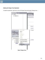
In a new blank document in Dreamweaver, click on the 'Draw Layer' icon on the common
tab of the Insert toolbar.
The Insert Layer icon (circled) on the Insert Toolbar
You will find that your cursor turns into a crosshair and you can draw a box on the Design
View window.
Once you have drawn your layer, you can click inside it to add text or images. If you
select the layer by clicking on the outer edge you can change the background color and
size of the layer in the Property Inspector. You can use percentage or pixel widths for the
layer just as you would for a table cell.
Drawing a Layer in the design view of Dreamweaver MX
Switch into Code View to have a look at what Dreamweaver inserts.
37
The mark-up for the layer shown in the image above looks like:
<div id="Layer1" style="position:absolute; left:122px; top:32px;
width:227px; height:125px; z-index:1; background-color: #6666CC; layer-
background-color: #6666CC; border: 1px none #000000;">this
is a "layer" created in Dreamweaver</div>
You will recognize that this is CSS, – but note that it is applied to the tag itself and not in an
external style sheet.
Netscape 4 and CSS
Dreamweaver also adds a section of JavaScript to the head of the document. This is to
get round a problem with Netscape 4 browsers where if the document is resized and it
contains CSS positioning, the positioned areas all jump to the left hand side of the
document. The 'Netscape Resize Fix' simply reloads the page if the window is resized. If you
are not concerned about Netscape 4 you can remove it, otherwise a good plan is to put it
into an external JavaScript file so that you do not need to have it on every page of your
site.
Another Netscape 4 specific item added by Dreamweaver is the rule layer-background-
color in the CSS – again this is so that Netscape 4's layer tag will pick up the style
information. The CSS will not validate with this in. Again it is up to you whether you decide
to remove it or keep it in.
We can use the layer feature in Dreamweaver to begin to recreate the tables based
layout I in the last chapter.
38
The simple tables based layout created in the last chapter.
In a new document in Dreamweaver, select Draw Layer, and draw a layer roughly in the
center of the Design View.
One thing you need to remember about these layers is that they are absolutely positioned
from the top and left of the document, which means that even if you specify them with
percentage widths they will always remain the same distance from top and left – only the
right hand margin will stretch so set the values for top and left 't' and 'l' in the Property
Inspector to 0px and set the values for height and width 'h' and 'w' to 100% (we will remove
the height and width values later, but if we don't put them in you will find it difficult to work
with the layer in Dreamweaver). While you are in the Property Inspector name the layer
'content'.
We want to add a deep border to this area in order to create a centered box that
stretches with the page. Dreamweaver does not have any function to let you do that,
however it is simple to add it to the rules for this layer. Switch into Code View and at the
end of the style rules for this layer add the following:
39
border-top: 50px solid #333366; border-left: 100px solid #333366; border-
right: 100px solid #333366; border-bottom: 20px solid #333366;"
This makes your entire section for this area look like this:
<div id="content" style="position:absolute; left:0px; top:0px;
width:100%; height:100%; z-index:1; background-color: #eeeeee; layer-
background-color: #eeeeee; border-top: 50px solid #333366; border-left:
100px solid #333366; border-right: 100px solid #333366; border-bottom:
20px solid #333366;"></div>
In Dreamweaver Design View my layer now looks like this:
The #content Layer in Design View
40
Note: when working with a CSS layout in Dreamweaver MX, take care that you do not
accidentally drag the positioned areas around, as Dreamweaver will cope with this by
either altering the inline style properties, often by changing percentage widths to pixel
widths, or add strange values to your external style sheet.
CSS Positioning in an External Style sheet
This method of writing CSS for layout using inline CSS, while perfectly valid, means that you
lose out on many of the benefits of having a CSS layout that you will get should you use
external CSS. Using inline CSS, if you created 20 pages using layers and then wanted to
change the background color of an area of the page you would need to edit each page
individually. Using an external style sheet means that you only need to change the
background-color once and all of the pages that use the style sheet will pick it up. If you
have been styling text in an external style sheet you will understand how easy it is to
change styles of fonts on your entire page just by changing the one style sheet, using CSS
for layout in the external style sheet gives you this same control over your page layout.
Additionally by only needing to write out that information once in your style sheet as
opposed to in every page, you make your file sizes smaller and pages quicker to load.
Let's look at how we can move these rules to our external style sheet.
Moving the rules to an external style sheet
I already have an external style sheet that simply contains some simple rules for text
formatting, the content of that style sheet is below if you wish to copy and paste it, or you
can use your own, or simply create a new blank style sheet and attach it to your page.
body {
font-family: Verdana, Arial, Helvetica, sans-serif;
font-size: 12px;
color: #333366;
background-color: #333366;
margin: 0px;
padding: 0px;
}
p {
font-family: Verdana, Arial, Helvetica, sans-serif;
font-size: 12px;
color: #003366;
line-height: 22px;
}
h1 {
41
font-family: Georgia, "Times New Roman", Times, serif;
font-size: 20px;
color: #003366;
}
h2 {
font-family: Georgia, "Times New Roman", Times, serif;
font-size: 16px;
color: #003366;
margin-bottom: 0px;
padding-bottom: 0px;
font-variant: small-caps;
}
.footer {
font-family: Verdana, Arial, Helvetica, sans-serif;
font-size: 10px;
color: #CCCCCC;
text-align: center;
margin-top: 0px;
padding-top: 0px;
}
a:link {
font-family: Verdana, Arial, Helvetica, sans-serif;
color: #CC6600;
}
a:visited {
font-family: Verdana, Arial, Helvetica, sans-serif;
color: #CC9933;
}
a:hover {
font-family: Verdana, Arial, Helvetica, sans-serif;
color: #CC6600;
}
a:active {
font-family: Verdana, Arial, Helvetica, sans-serif;
color: #CC6600;
}
.footer a:link {
color: #FFFFFF;
}
.nav a:link {
font-family: Georgia, "Times New Roman", Times, serif;
42
font-size: 16px;
color: #666666;
text-decoration: none;
font-weight: bold;
display: block;
padding-left: 6px;
}
.nav a:visited {
font-family: Georgia, "Times New Roman", Times, serif;
font-size: 16px;
color: #666666;
text-decoration: none;
display: block;
padding-left: 6px;
font-weight: bold;
}
.nav a:hover {
font-family: Georgia, "Times New Roman", Times, serif;
font-size: 16px;
font-weight: bold;
color: #999999;
display: block;
padding-left: 6px;
}
.nav a:active {
font-family: Georgia, "Times New Roman", Times, serif;
font-size: 16px;
font-weight: bold;
color: #666666;
text-decoration: none;
display: block;
padding-left: 6px;
}
.boxout {
margin-top: 30px;
border: 2px solid #cccccc;
}
.boxout p {
font-family: Verdana, Arial, Helvetica, sans-serif;
font-size: 10px;
color: #333333;
padding-top: 1px;
padding-bottom: 1px;
margin-top: 1px;
43


