css web sites with dreamweaver mx 2004 - Phần 4 potx
Bạn đang xem bản rút gọn của tài liệu. Xem và tải ngay bản đầy đủ của tài liệu tại đây (777.15 KB, 22 trang )
as is required by the style sheet. Classes allow you to create your own styles
and apply them to selectors as you wish.
b. Redefine HTML Tag - Applies a style to an HTML tag. When you select this
option, you also must select a tag from the Tag field above the style type
selector. These styles are automatically applied to the appropriate tags after
they're defined. This option takes a standard HTML element, such as H1, and
makes it a selector.
c. Use CSS Selector - Applies a style to one of the link types listed in the Selector
field above the style type selector. These styles enable you to remove the
underlining from links and otherwise change the appearance of the various
link states. They're automatically applied after they're defined. This option
allows you to use pre-defined pseudo selectors, mostly used to style links.
4. Click OK.
5. The Style Definition dialog box opens directly to the Type dialog.
Figure 2 shows the CSS Style Definition dialog with Type options available.
Figure 2 - The CSS Style Definition editor Type dialog.
Each of the dialog box options allows you to create CSS rules for the particular class, id, or
HTML selector you wish to style.
66
The options are:
• Font. This property sets the font family, using font groups established in the Font List
settings
• Size. This property sets the font size. If you specify a numerical value (small, larger,
and so forth), you can also set the unit of measure. Choosing a percentage unit of
measure increases or decreases the size of the font relative to the default. The most
common unit is pixels.
• Weight. Weight sets the heaviness of the text boldness. Normal text has a weight of
approximately 400. Bold text has a weight of 700. A weight below 400 results in
lighter text.
• Style. Use style to set the font as normal, italic, or oblique. Normal refers to the
standard font style, usually upright. Italic is a variation of that font specifically
designed to have a slant. Oblique is the slanting of the normal version without any
specific design changes (Figure 3). If you come from a word processing
background, you're used to setting bold type in the same manner as normal and
italics, but this isn't the case here. Boldness is set by weight, not style.
• Variant. This property allows you to set the text to display in small caps. Small caps
have the same appearance as capital letters, but are the size of lowercase letters.
Not all fonts will comply, and not all browsers support this feature, in which case text
will show up however the author formatted the text in the first place. You can type
content in all lower case, all upper case, or sentence case and then apply the small
caps variant and if there is no support for the variant, it will simply appear as the
author typed it in. A good tip here is to use sentence case, or ALL CAPS depending
upon what you want the default results to be.
• Line-height. This helpful CSS property sets the leading before a line of text. Leading is
the space above a letter to separate it from the text above within a paragraph.
• Case. This property sets the text to display in uppercase or lowercase, or with initial
caps.
• Decoration. Using the decoration property, you can set additional properties for the
display of the text, whether it should be underlined, overlined (a line appearing over
the text), line-through (strikethrough), or blinking. Of course most readers know that
blinking text is one of the most annoying options available to web designers, so use
this with caution. Overlined can also be very confusing, especially if the text doesn't
have a large line-height, as it can be confusing to the audience who may think that
it as underline in the text above and click in the wrong place!
67
• Color. This property allows you to set the color for the text using the standard color
picker
Figure 3 - The same font in italic and oblique forms.
You'll also notice that there are a variety of options for sizing. It's important to remember
that there are two kinds of sizing methods: Absolute and relative. Absolute sizing is that
sizing which is inflexible and does not adjust to the screen environment. Relative sizing does
adjust to the screen environment. The sizing options include:
• Pixels (px). Measures the type in pixels, relative to the resolution of the screen, which
makes it a very suitable measurement option for flexible design. Pixels are the most
widely used measurement for CSS screen design because designers can size type in
relation to other design features with greater control. However, pixels cannot be
resized by the user, causing a significant accessibility barrier.
• Points (pt). This is an absolute measurement is mostly used in CSS for print and is not a
suitable option for screen.
• Inches (in). Also an absolute measurement, sets the type in inches, rarely used.
• Centimeters (cm). An absolute measurement that sets the type in centimeters, also
rarely used.
• Millimeters (cm). Sets the type in millimeters, is absolute, and rarely used.
• Picas (pc). Sets the type in picas. One pica is equivalent to 12 points, and as with
points, is more suitable for print.
• Em (em). Em is a relative measurement, equal to the value of the font-size property
of the parent element. Let's say you have style the body to have a 16 pixel font. Ems
will modify the size of any child of the body. Ems are commonly used in CSS for
screen design, especially for sites that are meant to be accessible.
68
However, Ems are problematic in IE browsers if the site visitor has the browser set to font
sizes lower than medium. The text becomes very small and difficult to read as a result, so
many people opt for pixels instead.
• Ex (ex). This is "x-height" which measures a font's size from the baseline to the top its
lower-case "x". Ex is relative, and can be used for screen and print but it's rarely used
in screen CSS.
• Percentage (%). Allows you to use percentages for type sizing. The percentage is
relative to the size defined for the parent element, just as with Ems. This
measurement is used by some CSS designers, especially in combination with Ems to
address scalability and avoid the accessibility problems associated with pixels.
There are several terrific resources to help you make the best choices for your screen and
print type measurements. Jeffrey Zeldman writes his perspective in his article "Give Me
Pixels or Give me Death", and Eric Meyer has an
excellent article, "Going to Print" about print style sheets at A List Apart,
Setting List Properties
Another helpful aspect of the CSS Style Definition editor is that it allows you to easily modify
the way your lists look. There are three options within the List dialog, which you can get to
by going to the Category listing to the left and simply highlighting "list" in the editor.
List properties enable you to control the appearance of bullets and the wrapping of the list
contents.
• Type sets the appearance of bullets in unordered lists from the following options:
disc, circle, square, decimal, lowercase roman (such as "iv"), uppercase roman,
lowercase alpha, and uppercase alpha.
• Bullet Image sets a custom image for unordered list bullets. This image can be any of
the common formats, including animated GIF. Note that bullet images aren't
supported by Netscape 4 browsers, but have been implemented in Netscape 6 and
above. In Netscape 4, the image will simply not appear, but the default bullet style
will.
• Position sets the wrapping of the list item. An outside position wraps the text to the
indent of the list, while an inside indent wraps the text to the page margin.
69
Figure 4 shows examples of list features.
Figure 4 - Bullet images, bullet styles, and list positioning in CSS.
An important and growing area of interest with lists is using them to create navigation. The
rationale behind this is that navigation is essentially a list of links, and that using lists is a
proper structural approach to managing such lists, instead of using paragraphs, breaks, or
numerous table cells.
By styling lists with CSS you can create tabbed or other styles of navigation (Figure 5)
without ever touching a graphic. You can use CSS to set a list's display as inline rather than
block, allowing you to use lists for horizontal navigation, as well as the familiar list style.
Figure 5 - Mark Pilgrim's site (divintomark.org) sports this tabbed navigation, which uses an
unordered list and CSS to style it.
70
Positioning
Positioning is the heart and soul of CSS layout. For the purposes of this chapter, I'm going to
stick to providing you with an explanation of the available options for positioning in
Dreamweaver. In the next few chapters, you'll be working with these features a great deal,
so getting a handle on the fundamentals is important.
Positioning properties form the basis of working with Dreamweaver layers. The options are:
• Type sets the positioning format. The formats are relative, absolute, and static (at its
exact placement within the document, rather than independently of the rest of the
content).
• Visibility sets the visibility of the layer. Layers can inherit the visibility of their parent
elements, or can be set independently of the parent to be either visible or hidden.
• Z-Index sets the stacking order of divisions. A higher z-index means a division is closer
to the top of the page in depth. A lower value means a division could be hidden
under others. This technique is usually used in DHTML.
• Overflow sets the flow of the layer's content when it overflows the dimensions of the
layer. The overflowing content can be hidden, scrolled using scroll bars that are
added to the element, or auto, which automatically applies the appropriate
formatting.
• Placement sets the actual positioning of the layer on the page.
• Clip sets the size of the element, which then determines where the element is
clipped.
Figure 6 shows a site that uses CSS positioning - not tables - for layout.
Figure 6 - uses positioned DIVs for this design.
71
Setting Extensions
CSS Extensions are specialty properties. The options available in Dreamweaver MX are:
• Pagebreaks are used to facilitate printing a web page, this style forces a page
break in a long document.
• Cursor sets the style of cursor that appears to the user while on your page. It's
probably wise not to change this property; most people are well acquainted with
the 'hand' cursor above links (for example) and changing this can make your page
harder to use. Of course, there are always exceptions – if you're making an
experimental, artistic site, you may be eager to challenge your audience's
expectations.
• Filter sets effects independently of Fireworks or other graphics packages. These
effects control the opacity, glow, and masking features of the element (Figure 7).
Figure 7 - A tutorial at
shows this impressive
use of the invert and x-ray filter extensions as applied to images.
CSS Extensions are non-standard, only work in Internet Explorer (and then only in 'quirks'
mode – “
DOCTYPE Switching and MX” later for more information on DOCTYPES ) and
therefore their use is very limited.
72
73
6. Creating a Two-Column Layout, the Box Model Hack
and Using @import to hide styles from Netscape 4
CSS layouts are giving the progressive Web designer both a tool that is changing the world
of Web design, and also challenging us as we work to think in different ways about
designing the Web. You've more than likely read a lot of general information about the
separation of structure from presentation but you’ll also know it's the concept at the heart
of some of the most exciting design going.
Part of the cool factor of clean HTML and XHTML documents with CSS for layouts is that
you can take the information in the markup document and lay it out as well as create
styles for numerous media types including print and wireless devices. A great working
example of this can be seen in Doug Bowman's redesign earlier this year for Wired News.
Not only did he create a rich visual design for the Web (Figure 1), but he also created an
alternate CSS for PDAs (Figure 2).
74
Figure 1 – Wired News Weekend Style
Figure 2 – Wired News PDA Style
Certainly, this kind of flexibility is very appealing, as are the numerous means of creating
layouts with CSS. You can design some very simple layouts (as will in this and the next
chapter) and then style them in unique ways to make them as individual in terms of design
as you like.
Dreamweaver users have an advantage over those using other commercial visual editors
in that Dreamweaver has some decent support for working with style sheets. However,
Dreamweaver MX offers no pre-designed CSS layouts which you can modify. MX 2004
does, but they are not the most inspiring of designs. As a result, developing complex style
sheets or modifying an existing template means balancing the tools that Dreamweaver
does have and taking advantage of additional techniques to manage the rest.
For this example, I began with a two-column layout freely available from the Layout
Reservoir at
bluerobot.com (Figure 3). Rob Chandanais put together this site so people
could begin using the templates as a great starting point for CSS layout design. The value-
added beauty is that Chandanais wrote in to all his templates important workarounds
useful for managing browser quirks - especially those centered around the Box Model, the
visual model within browsers that CSS interacts with in terms of positioning.
75
Figure 3 – The Original Layout Template
So what I did was take his basic two column, left-menu template, modify its rules
somewhat, and then I separated the single template into two distinct CSS documents -
one with just layout and the other with visual styles. The reason for this is to show you how
to use linking and importing using the @import rule in CSS at the same time. This provides
an un-styled but still readable version of your page for those users without CSS or using
Netscape 4.x. This is a very commonly used technique - you may have seen it or if you
work with CSS layouts a lot, you've likely used it yourself. We'll also review some other hacks
and workarounds in the process of building and styling the two-column layout design.
Setting up the Markup
The first step in the process is to attach the sheet with just the styles in it. All the files are
available in the zip folder of files for this chapter, next to the link where you downloaded
this ebook, and I would recommend copying the directory onto your local desk and
76
defining your site within Dreamweaver to get all your assets localized. Make sure you
place all the images in an /images subdirectory, and all the .html and .css files in the main
folder. Once that's done, you're ready to create a new document and attach the style
sheet.
1. From the Main menu select File > New. The New Document dialog appears.
2. Under the Basic Page Category, highlight HTML. If you prefer to work in XHTML, click
the Make Document XHTML Compliant checkbox. Either language is fine for this
exercise so you can use whichever you like. I'm going to use HTML 4.01.
3. Click Create. Dreamweaver will generate your page. Because we're working with
CSS layouts, we will want to tap into DOCTYPE Switching wherever it's available. That
means you will possibly need to modify the DOCTYPE declaration at the top of your
document - this will occur while creating an HTML page. You can do this manually or
use an extension (please see the chapter “
DOCTYPE Switching in MX"). To see if you
need to change the declaration, look to the top of your document. If your
document contains the following DOCTYPE:
<!DOCTYPE HTML PUBLIC "-//W3C//DTD HTML 4.01 Transitional//EN">
Then you do in fact need to modify it for best performance. To do so, simply add the
URL to the HTML 4.01 Transitional DTD(marked in bold in the code snippet below)
underneath this line of markup. Your results will look like this:
<!DOCTYPE HTML PUBLIC "-//W3C//DTD HTML 4.01 Transitional//EN"
"
4. Save your document immediately to the main level of your project folder as
index.html
Linking the Default Styles Sheet
Now you'll attach the default style sheet by linking to it. Browsers that recognize the link
element and have CSS support will pick up on these styles, which are not specific to
layout. Rather, they are the styles of your body styles (background, color, fonts), header
styles, paragraph styles and link styles, all inspired by the default style originally created by
bluerobot.com, but pulled out of the main style sheet for the purposes of demonstrating
the @import workaround. The code for the styles.css style sheet is below, this will serve as
the template from which to base your own visual styles once everything is set up.
77
body {
margin:0px;
padding:0px;
font-family:verdana, arial, helvetica, sans-serif;
color:#333;
background-color:white;
}
h1 {
margin:0px 0px 15px 0px;
padding:0px;
font-size:28px;
line-height:28px;
font-weight:900;
color:#ccc;
}
p {
font:11px/20px verdana, arial, helvetica, sans-serif;
margin:0px 0px 16px 0px;
padding:0px;
}
a {
color:#09c;
font-size:11px;
text-decoration:none;
font-weight:600;
font-family:verdana, arial, helvetica, sans-serif;
}
a:link {
color:#09c;
}
a:visited {
color:#07a;
}
a:hover {
background-color:#eee;
}
78
To link the style document to your main document is easy to do, simply follow these steps:
1. With your newly created index.html document open, switch to Code view if you're
not there currently.
2. Place your cursor directly above the closing
</head> tag.
3. From the Design panel, select the CSS Styles tab.
4. Right-click or hold in the panel to bring up the context menu.
5. Select "Attach Style Sheet" The Link External Style Sheet dialog appears (Figure 4).
Figure 4 – The Link External Style Sheet dialog
6. Click Browse and find the style sheet named styles.css.
7. Highlight the file and click OK.
8. Under Add As, make sure Link is selected. Click Ok.
Your style sheet containing visual styles is now linked to your markup document.
Importing the Layout Styles
Using the @import rule provides a workaround that will deliver a document to Netscape 4,
which doesn't have support for the @import rule but does support the
link element and
some styles. This way, site visitors will see your content with some style but not your nicely
laid-out design. In browsers with no CSS support, this technique will also deliver the basic
page, but the linked styles obviously won't be supported. Again, in this scenario, the
content is available.
What's more - there are various techniques to make these pages look better, such as
ordering your layout divisions in such a way as to have a logical order to them without the
visual presentation, and to use skip links to get to your navigation so people can more
easily deal with the page. I'll be covering all of these issues in more depth throughout the
series.
To tap into the @import trick and import the layout styles for this design:
1. With the index.html document open in Code view, place your cursor below the
link
element and above the closing </head> tag.
2. In the CSS Styles panel, highlight the file "index.html" and bring up the context menu.
Select "Attach Style Sheet."
79
3. Browse to the style sheet named layout.css. Select that file and click OK to return to
the Link External Style Sheet dialog.
4. This time, under the Add As option, click the "Import" option.
Dreamweaver will generate the @import markup, seen here directly beneath the link to
styles.css.
<link href="styles.css" rel="stylesheet" type="text/css">
<style type="text/css">
<!
@import url("layout.css");
>
</style>
Be sure to save your files to update the changes you've made. Now that you've got the
style sheets integrated with your HTML or XHTML document, it's time to add the layout
sections.
Add Divisions
As you are by now aware, positioning is managed by a combination of CSS classes or IDs
attached to divisions. These divisions, created using the
div element, create a box that
can then be positioned within the browser viewport. In the case of the two-column layout
we're using today, there are three important divisions, defined by ID, of which to be
aware:
• #header – This division creates a box across the top of the page where you can add
links, graphics, whatever you like to give the page your own style. Note that the
header is not part of the actual layout per se rather it's an additional element of the
page's basic design. If you don't want it, you can simply choose not to use it.
• #content – This is your main content division.
• #menu – This is your menu. It is the content and menu divisions that, when
combined, create the two-columns.
Note: Remember, ID's can only be applied to one unique element per document,
whereas classes can be applied to numerous elements. While you can use classes or IDs
for positioning boxes, the common practice is to use IDs because it helps keep the specific
ID related to the positioned box in question, rather than allowing those rules to be applied
elsewhere. This will help you avoid mistakes and subsequent debugging frustration.
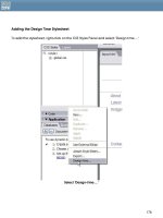
You can add the divisions in a variety of ways. I'll step you through it using the Tag Chooser
and its related Tag Editor, which while I find somewhat cumbersome, I appreciate
80
because it provides a great deal of additional information about the tags you're using. So,
this Dreamweaver tool can in fact be very helpful—especially if you are dedicated to
learning markup and CSS—because you'll learn more about the languages and their
components as you work with this editor.
1. In Code view, place your cursor directly beneath the opening <body> tag.
2. Select Insert > Tag, or hit CTL+E (Win) or CMMD+E (Mac). This brings up the Tag
Chooser (Figure 5).
Figure 5 – The Tag Chooser
3. Highlight HTML Tags in the top left pane of the Tag Chooser. From the list that
appears in the right pane, highlight
div. You'll note a description of the element
within the Tag Info window. Go ahead and read this, it's a decent description of the
element and some of its features.
4. Click Insert. The Tag Editor appears (Figure 6). You can now see why I say the
process is cumbersome - that's two dialogs to do a fairly simple task, but again, there
are some advantages to using this method.
81
Figure 6 – The Tag Editor
5. You'll notice that in the Tag Editor for
div you have several options in the left-hand
pane. Highlight Style Sheet/Accessibility. The Editor will now provide you with several
text fields.
6. In the ID field type "header" – all lower case and without the quotes. Click OK. The
markup will be added to the document by Dreamweaver, and you'll then be
returned to the Tag Chooser.
7. Switch over to Code view, and click once in the document window below the
header division.
8. Switch back to the Tag Chooser, and following the same instructions as in steps 3, 4,
and 5, add the next division, this time naming it "menu".
9. Repeat the process a third time, using an ID with the name of "content".
Your markup should look like this, with the one exception being if you used XHTML, then of
course you'll have different syntax, but the basic structure is the same:
<!DOCTYPE HTML PUBLIC "-//W3C//DTD HTML 4.01 Transitional//EN"
"
<html>
<head>
<title>Two Column CSS Layout</title>
<meta http-equiv="Content-Type" content="text/html; charset=iso-8859-1">
<link href="styles.css" rel="stylesheet" type="text/css">
<style type="text/css">
<!
@import url("layout.css");
>
</style>
</head>
<body>
<div id="header"></div>
82
<div id="content"></div>
<div id="menu"></div>
</body>
</html>
Close out of the Tag Chooser.
I'd like you to switch to Split view at this point, as I want to show you a few things.
First, look at the header, which appears visually because it has been styled with a
background and border. If you examine the header style, you'll see the following:
#header {
margin:50px 0px 10px 0px;
padding:17px 0px 0px 20px;
height:33px;
line-height:11px;
voice-family: "\"; }\"";
voice-family:inherit;
height:14px;
}
body>#header {height:14px;}
Examining this CSS, you see that the header itself has been given margins, padding,
border styles, a background color. But you'll also notice that there are two entries for the
"height" property. What's more, there's a child selector defining the height of the header,
too. How is this possible and why is it even necessary, you're asking?
Well, this is the by-now infamous Box Model Hack created by ”Tantek Çelik. The problem,
as described earlier, is that some browsers, including IE 5 for Windows, incorrectly interpret
the Box Model. The proper way in which a browser should interpret the model is to add the
border and padding values to the width or height of a given box. So a box with a width of
300, a border of 1 pixel, and padding of 10 pixels would display properly as being 311
pixels wide.
Improper interpretations of the Box Model, such as the one that exists in IE 5 for Windows
place the border and padding inside the box. In this case a box with a width of 300, a
border of 1 pixel, and padding of 10 pixels would display as being 289 pixels wide because
the browser is subtracting the border and padding from the total width.
The Box Model Hack "fakes out" browsers and allows you to input both values—the correct
and incorrect value. By using the voice-family property (a CSS aural property), IE 5 and 5.5
83
for Windows will read the first height value in the header rule, and completely ignore
everything after it because of a parsing bug within those browsers. Browsers that don't
have this problem read the correct height of 14 pixels, add the padding and border
values to that properly, and display the box normally.
Finally, the
body>#header provides a means for those browsers that might not interpret
the value in the voice-family property provides the correct height. So you've got your
bases covered! A brilliant hack exploiting browser bugs, but giving you much better
control over the way your boxes are measured.
Other items of interest to note in both the CSS and display of the divisions:
• The header division has no Draw layer icon because it is not a positioned element.
• The menu division does have a Draw layer icon because it is absolutely positioned
(Draw layers in Dreamweaver are simply absolutely positioned boxes in CSS)
• The content division doesn't appear on the page because it has no border or
background styling, and no content in it just yet. You should also examine the
content division rules, and you'll find that in this case, there is no width and therefore
no need for the Box Model Hack, which the menu and header both make use of.
The no-width makes the content area fluid, so the content will flow into the available
browser window space.
84
Go Forth and Modify
I went ahead and created three different versions of the styles. Here's what I came up
with:
Figure 7 - Black and Orange
85
Figure 8 - Pastel
86
Figure 9 - Floral
87


